← Visit Appcues.com
×
×

Introducing: New and improved Flow Analytics
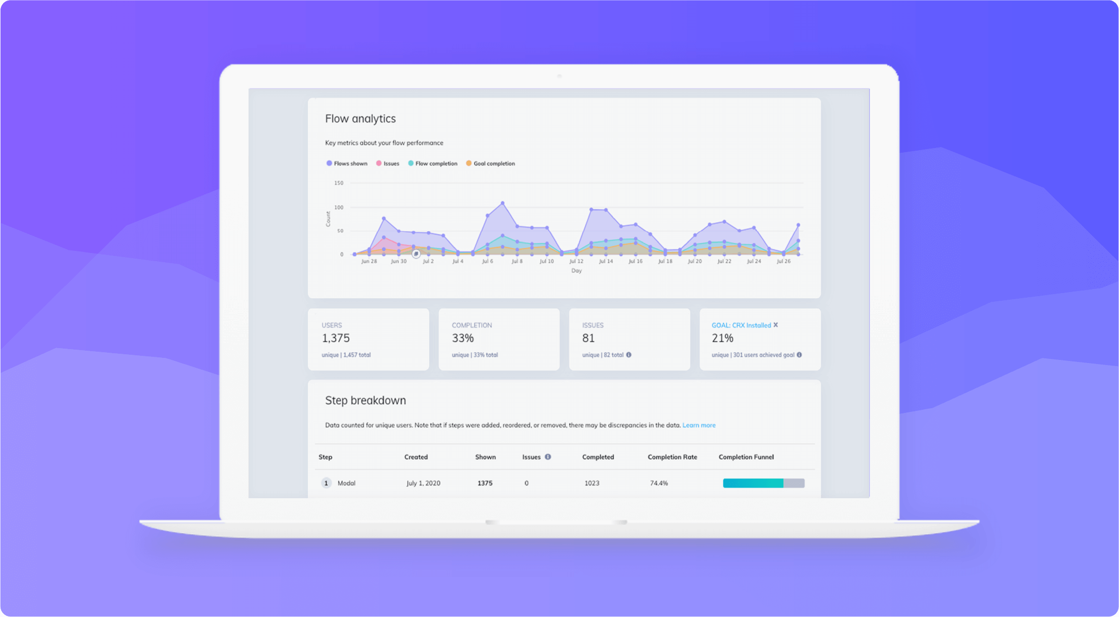
We overhauled our analytics page! Read all about the exciting changes to flow analytics, issues reporting, and more.
Skip to section:

Skip to section:

Before I was a product manager here at Appcues, I was a customer success manager. As a CSM, I acted as a strategic partner for our customers, helping them to identify and achieve their goals. 

One of the biggest challenges I faced in that capacity was showing customers the quantitative impact of their efforts. That’s because our product analytics were limited, and often gave you just enough data to leave you with more questions than you started with. Our analytics page was bound by versions, which showed simple data points, sliced the data in a (frankly) unhelpful way, and provided no indicators of how a flow was helping to drive engagement. 

In other words, our analytics needed a lot of work. 

As a PM who talks to customers weekly, I knew this was a major pain point for our customers.
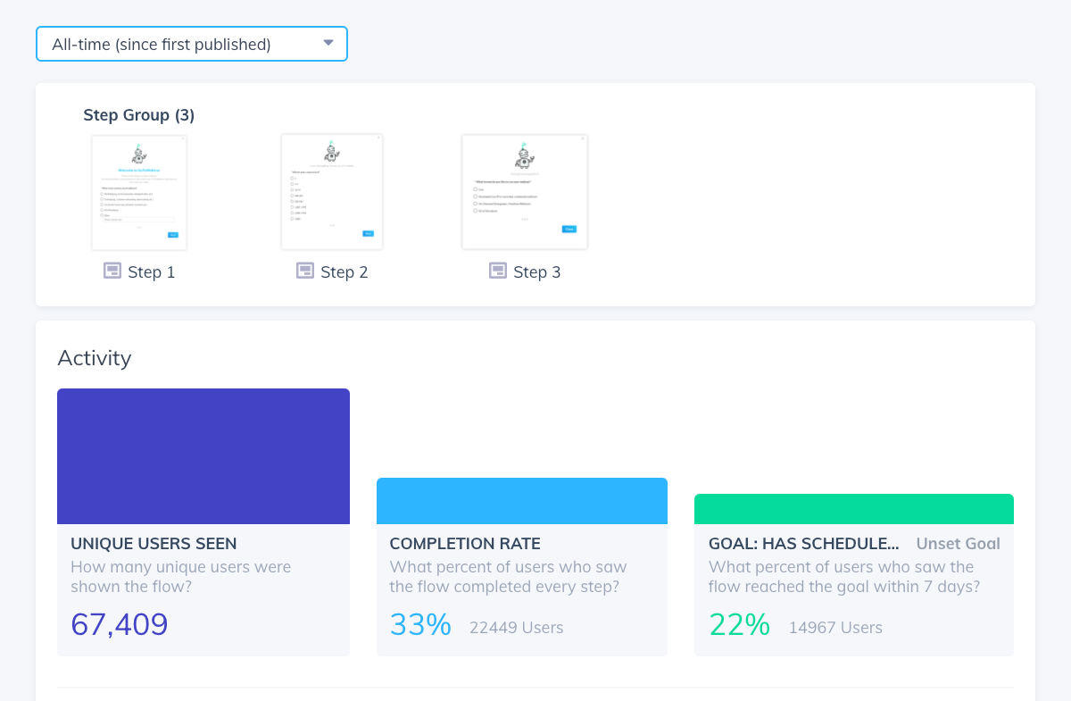
old appcues analytics page with simple bar graphs
The old Appcues analytics page left a lot of questions unanswered.

So, we decided to overhaul the page.

Over the past 3 months, our design, engineering, and product teams worked cross-functionally to design (and re-design), test, and build a new analytics page that we are beyond excited about.

Dogfooding the new analytics page

Before we jump into the big reveal, a few words about our validation process:

To dogfood the new analytics, we enabled the redesigned feature for our internal account and started using it. I was immediately able to identify broken flows that needed fixing, daily interactions with our content, and successful flows driving product engagement. I was elated at what I was able to gain from the new page and couldn’t wait to get more customers using it. 

As the next step in our process, we released the new version to 80 customers in our Early Access program— a group of beta-friendly users who want the latest and greatest, and love giving feedback. 

While the response was overwhelmingly positive, there was one consistent piece of feedback all users had: they needed more information and more details around a newly added data point on the page (Issues) and without it they were extremely confused. 

Whenever the Appcues product team takes on a new piece of work, we always aim to build a SLC (slick) product: Simple, Lovable, Complete. The feedback we got from our Early Access users revleaved the feature wasn’t yet “complete;” it needed more work in order for our customers to adopt and use it regularly. 

After addressing this feedback and a few new additions, we are ready to share our new analytics page with customers—and we couldn’t be more excited!

Introducing: New and improved Flow Analytics

Based on the feedback from our Early Release program, we feel confident that our new analytics page does what we set out to do: Allow customers to better understand the engagement of their flows. 

Some of my favorite components of the new Flow Analytics are: 

The Flow Analytics graph: This enables you to see key data points—such as Flows Shown, Issues, Completion and Goal achievement—over time. This allows you to better understand historical patterns of performance and engagement. 
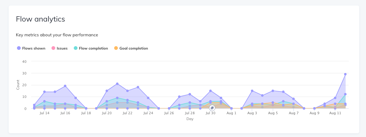
new appcues flow analytics graph showing performance over time example of saas analytics design
View performance over time

Version annotations: We added version annotations to the Flow Analytics graph to help you understand the impact your changes have on performance. 
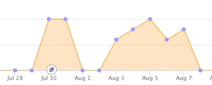
appcues analytics version annotations
Look for the version icon to understand how different versions impact performance

The step breakdown: This chart gives you deeper insight into the engagement of a certain flow, such as where your users are dropping off in the funnel. 
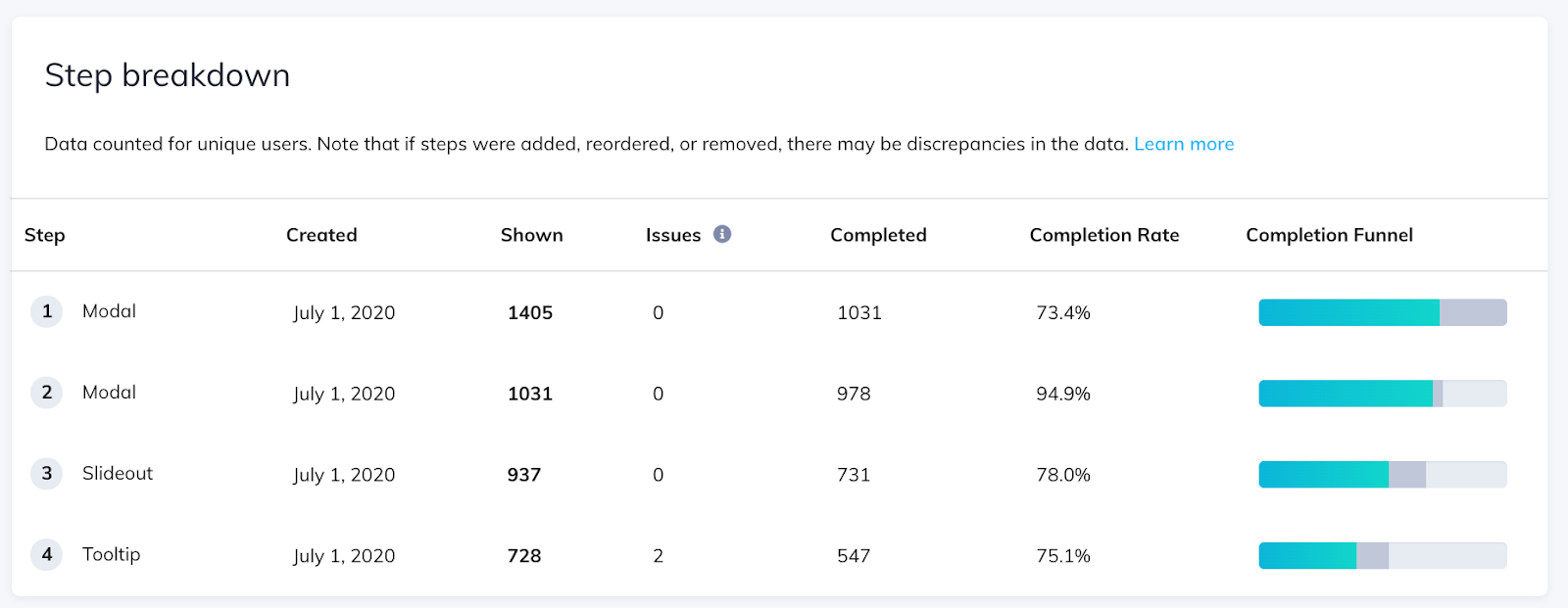
step breakdown appcues engagement analytics
See a step-by-step breakdown of flow engagement

Issues reporting: This report provides a detailed breakdown of the recent issues experienced, including the who, what, and where, so you can take immediate action.
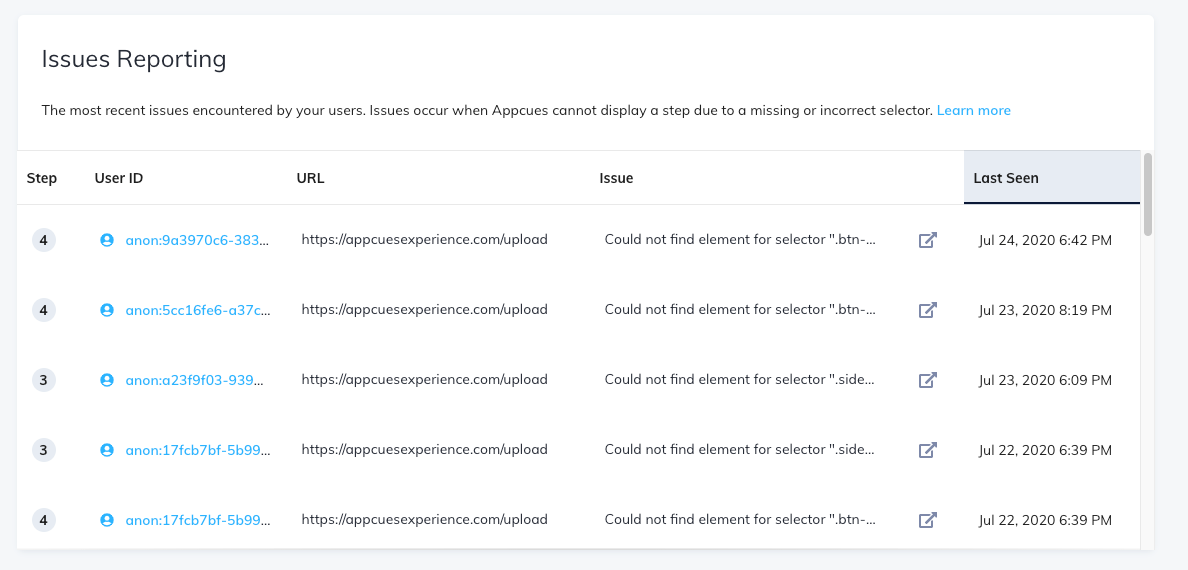
appcues flow issues reporting analytics
Get a more detailed breakdown of recent issues

What’s next

Appcues has roughly 1,200 users who publish at least 1 flow per month. These users want to be able to monitor engagement from the moment they hit ‘publish.’ 

We overhauled our analytics because we knew we needed to do better. We needed to provide our customers with quick insights into performance and enable them to better understand the outcome of their efforts.  

As an Appcues user myself, I feel we succeeded. 

And this is just the beginning. We’re continuing to dig deeper into our analytics, looking for new and better ways to enable our customers to understand their users, product, and impact. 

Watch this space!

See Flow Analytics in action

Log in to your Appcues account or start a free trial to see the new Flow Analytics for yourself!

Lily Rosenbloom
Product Manager
With a background in customer experience and hospitality, Lily is rooted in empathy and cares deeply about the people and product experiences she delivers.
Skip to section:

Skip to section:

Before I was a product manager here at Appcues, I was a customer success manager. As a CSM, I acted as a strategic partner for our customers, helping them to identify and achieve their goals. 

One of the biggest challenges I faced in that capacity was showing customers the quantitative impact of their efforts. That’s because our product analytics were limited, and often gave you just enough data to leave you with more questions than you started with. Our analytics page was bound by versions, which showed simple data points, sliced the data in a (frankly) unhelpful way, and provided no indicators of how a flow was helping to drive engagement. 

In other words, our analytics needed a lot of work. 

As a PM who talks to customers weekly, I knew this was a major pain point for our customers.

old appcues analytics page with simple bar graphs
The old Appcues analytics page left a lot of questions unanswered.

So, we decided to overhaul the page.

Over the past 3 months, our design, engineering, and product teams worked cross-functionally to design (and re-design), test, and build a new analytics page that we are beyond excited about.

Dogfooding the new analytics page

Before we jump into the big reveal, a few words about our validation process:

To dogfood the new analytics, we enabled the redesigned feature for our internal account and started using it. I was immediately able to identify broken flows that needed fixing, daily interactions with our content, and successful flows driving product engagement. I was elated at what I was able to gain from the new page and couldn’t wait to get more customers using it. 

As the next step in our process, we released the new version to 80 customers in our Early Access program— a group of beta-friendly users who want the latest and greatest, and love giving feedback. 

While the response was overwhelmingly positive, there was one consistent piece of feedback all users had: they needed more information and more details around a newly added data point on the page (Issues) and without it they were extremely confused. 

Whenever the Appcues product team takes on a new piece of work, we always aim to build a SLC (slick) product: Simple, Lovable, Complete. The feedback we got from our Early Access users revleaved the feature wasn’t yet “complete;” it needed more work in order for our customers to adopt and use it regularly. 

After addressing this feedback and a few new additions, we are ready to share our new analytics page with customers—and we couldn’t be more excited!

Introducing: New and improved Flow Analytics

Based on the feedback from our Early Release program, we feel confident that our new analytics page does what we set out to do: Allow customers to better understand the engagement of their flows. 

Some of my favorite components of the new Flow Analytics are: 

The Flow Analytics graph: This enables you to see key data points—such as Flows Shown, Issues, Completion and Goal achievement—over time. This allows you to better understand historical patterns of performance and engagement. 

new appcues flow analytics graph showing performance over time example of saas analytics design
View performance over time

Version annotations: We added version annotations to the Flow Analytics graph to help you understand the impact your changes have on performance. 

appcues analytics version annotations
Look for the version icon to understand how different versions impact performance

The step breakdown: This chart gives you deeper insight into the engagement of a certain flow, such as where your users are dropping off in the funnel. 

step breakdown appcues engagement analytics
See a step-by-step breakdown of flow engagement

Issues reporting: This report provides a detailed breakdown of the recent issues experienced, including the who, what, and where, so you can take immediate action.

appcues flow issues reporting analytics
Get a more detailed breakdown of recent issues

What’s next

Appcues has roughly 1,200 users who publish at least 1 flow per month. These users want to be able to monitor engagement from the moment they hit ‘publish.’ 

We overhauled our analytics because we knew we needed to do better. We needed to provide our customers with quick insights into performance and enable them to better understand the outcome of their efforts.  

As an Appcues user myself, I feel we succeeded. 

And this is just the beginning. We’re continuing to dig deeper into our analytics, looking for new and better ways to enable our customers to understand their users, product, and impact. 

Watch this space!

See Flow Analytics in action

Log in to your Appcues account or start a free trial to see the new Flow Analytics for yourself!

Lily Rosenbloom
Product Manager
With a background in customer experience and hospitality, Lily is rooted in empathy and cares deeply about the people and product experiences she delivers.
You might also like...