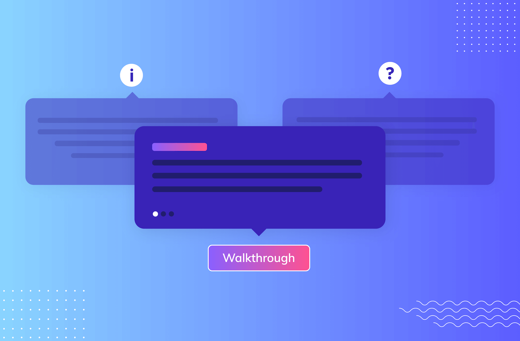
Give users persistent, on-demand help whenever they need it with Pins!
.png)

.png)
Your users' experience with your product doesn’t just stop after their initial onboarding. They’re going to have ongoing questions, stumble through new features, and run into challenges.
You have two ways you can tackle this:
But let’s be honest, neither is ideal or efficient for a scaling business.
Plus, in a world where product experience is so key to success, you need to deeply consider what’s best for your users—like buying a car kinda deep consideration. It’s not about educating them on features and capabilities on your time, but rather on their time—when it actually matters to them.
That’s why we added a new experience type to your toolbelt, Pins!
.gif)
Use Pins to provide contextual, always-available support and help to your users—whether that’s best practice tips, a link to a help article, or a way to trigger an in-app walkthrough.
Simply place them inline in your app, without bugging your engineers! Cool, right?
There are two Pattern types that fall into the Pins category, let’s take a look:
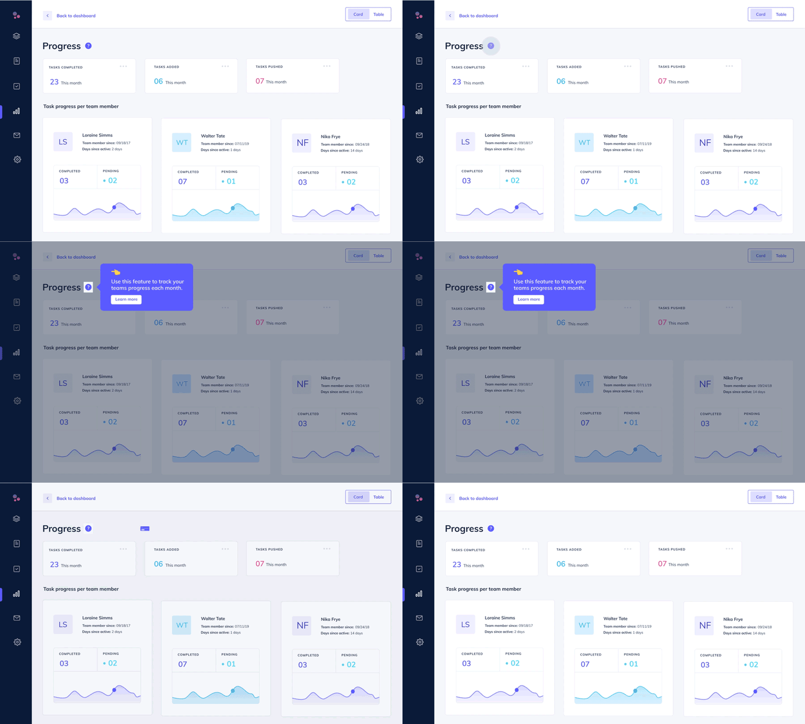
Exactly what it sounds like–an icon with tooltip is a persistent tooltip that includes a question mark, info, or any custom icon you’d like to use alongside it. Icon with tooltips are great for providing subtle help and context where users need it without causing distractions for users.
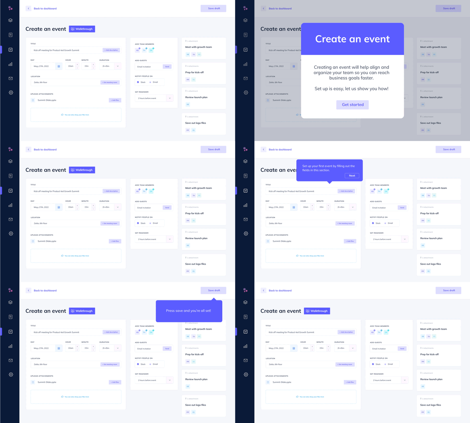
Another no-fuss name here. Buttons are clickable in-app triggers placed either inline or overlayed on your app that let you drive user action. Buttons are perfect for scenarios where the main call-to-action is clear and no additional context is needed. A button that says ‘Take a tour’ button or ‘Learn more’ is pretty straightforward for users and they don’t need any other information so you drive user action, when users need it most.
Both of these Pin types let you guide users to where you want them to go, when they want to go there. That’s what we call a win-win!

Pins open up a world of opportunities and ideas. This experience has a heck ton of use cases, but we rounded up a few favorites to get your wheels turning. Enjoy this list of pinspiration!
Simplify a complex product with tons of bells and whistles by providing contextual help and information for users to consume whenever they’re ready to cross that bridge. Many SaaS products are packed with features and options that can overwhelm users, but icon with tooltip pins provide an easy way to break down this complexity into smaller chunks, without overloading users with content and information they may not need quite yet. Not to mention this can help reduce some of the experience frustrations that occur from having a complex, feature-full product. The quickest place to add this type of Pin is to:
.gif)
Sometimes users just aren’t ready for an onboarding flow right at first login. So give them a chance to replay it on their own terms, when they are ready. You can also build other helpful flows to show tips and trips, use cases, examples, and more. Then craft drop a button and let users engage when its convenient for them.
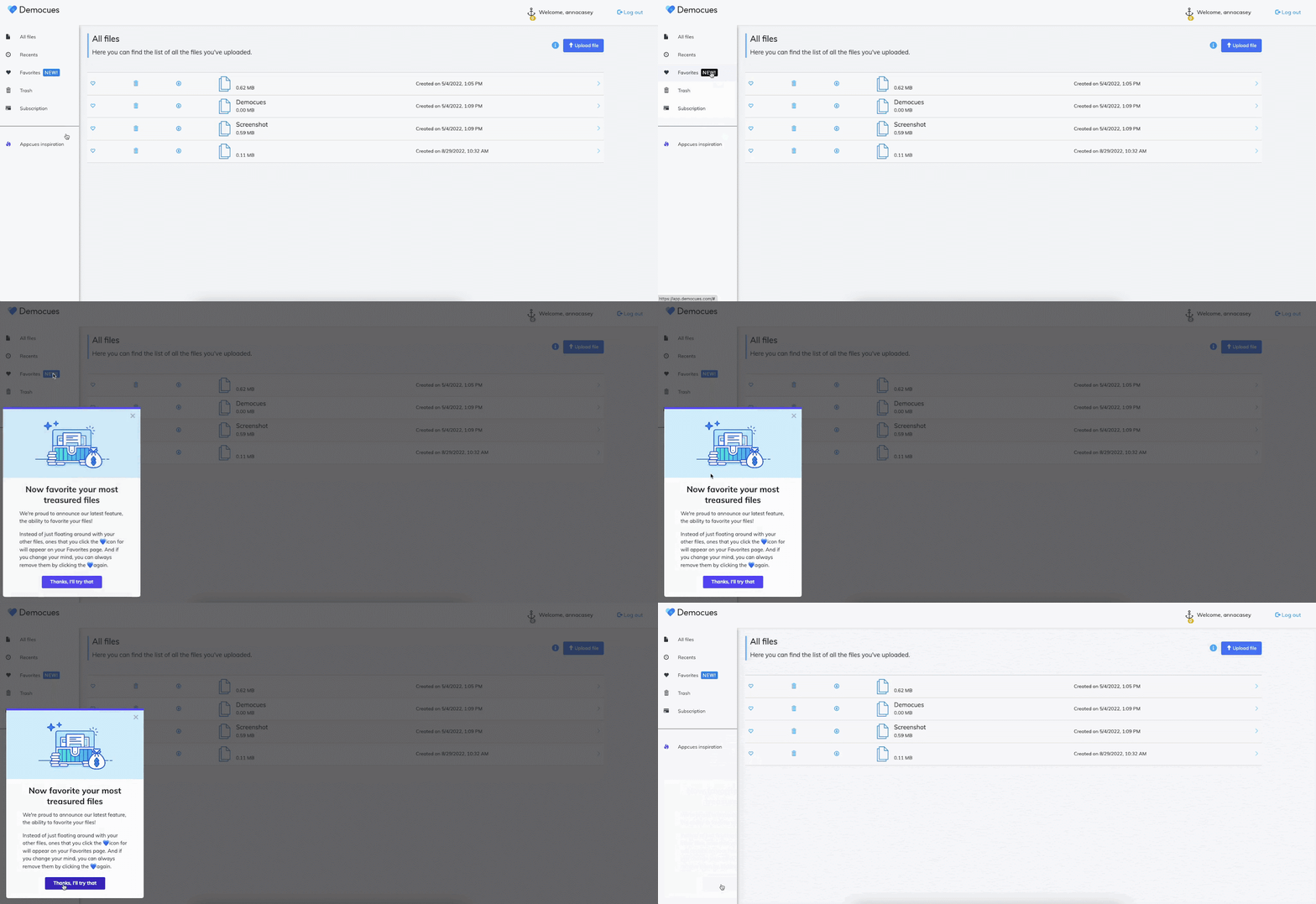
Draw your user’s attention and drive product and feature awareness and adoption through native-looking and permanent labels, tags, and callouts. Place a button to help customers notice a new feature or callout a valuable feature that users aren’t using.
Encourage your users to navigate to other pages and resources–inside or outside of your product.
These are just a handful of creative ways you can use Pins to improve the experience users have with your product. But trust us, there’s even more:
Hopefully, this blog post has done its job and you’re ready to go drop your first Pin in your product. The good news is that Pins are available to all customers on our Essentials, Growth, and Enterprise plans. 🥳 Simply log in and click over to the new Pins menu. Not using Appcues yet? Sign up for a free trial to get started and test drive Pins for yourself!
Also, thank you for bearing with me all the way to the end of this post. My puns were so bad that you could hear a Pin drop…
Okay, that was the last one, I swear. The name is so pun-able that I decided to just go for it!
Finally, we’d love to see how you end up using Pins in your app. Take a screenshot and tag us on it on Twitter or LinkedIn!