← Visit Appcues.com
×
×

Glowing up: The story behind the Appcues rebrand
We got a makeover! Read all about the rebrand process—a 6-month-long labor of love that took us from #EF4546 to Blurple.
Skip to section:

Skip to section:

Appcues was founded by Jonathan Kim and Jackson Noel way way back in 2013—the year of Frozen, the Harlem Shake, and the iPhone 5S.

Small companies naturally take on the personalities of their people—and Jonathan and Jackson are genuinely two of the most approachable, humble, and friendly founders around. (And we swear we’re not being paid to write this. Well … technically we are, but you get the point.)

So that’s what Appcues was, and what it still is at heart: friendly, approachable, refreshing, modern. But our old branding didn’t reflect any of that.

Take a look:
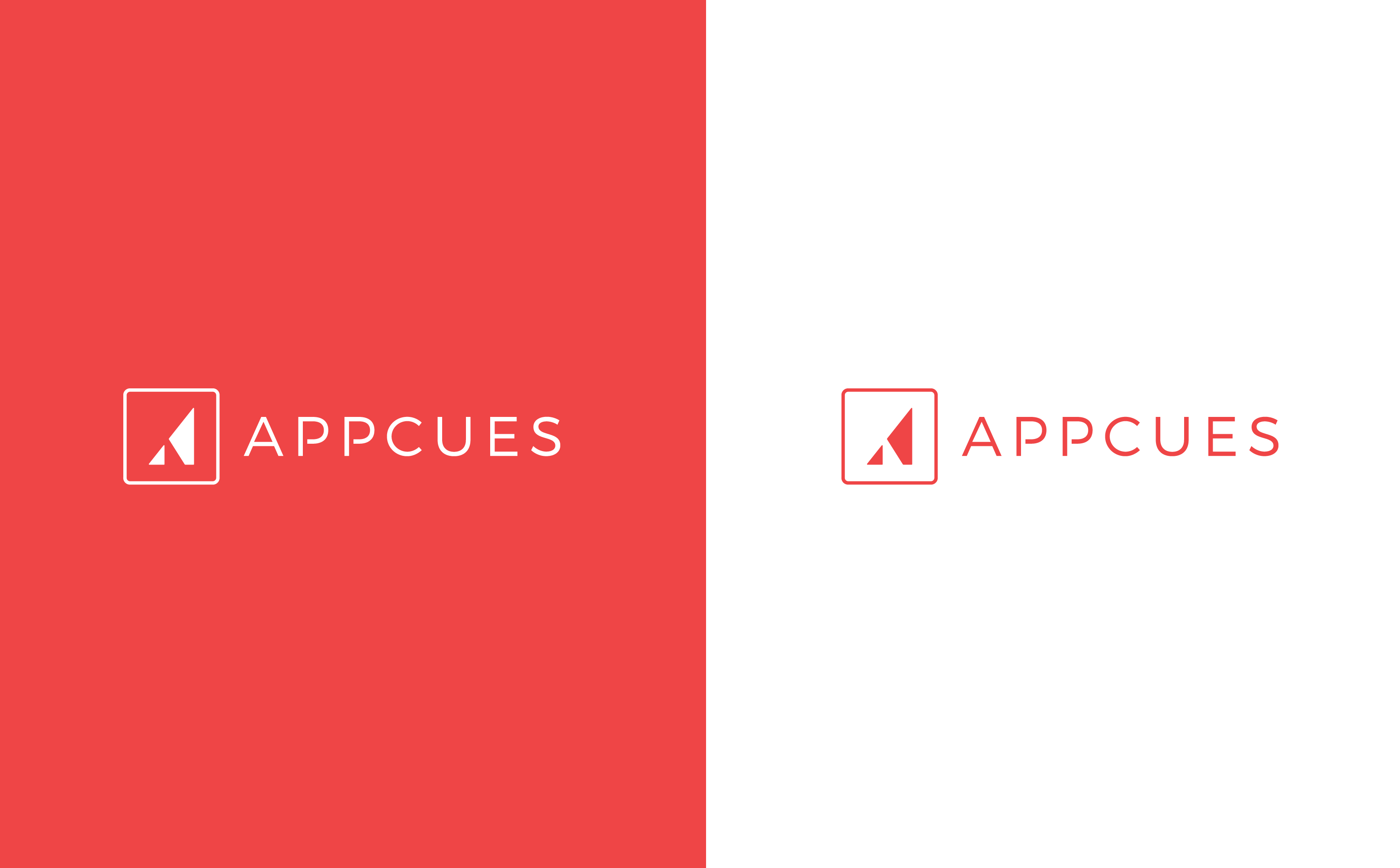
This is our old branding. This image shows the former Appcues logo and our old primary color. On the left is a white logo on a red background, on the right is the red logo and text on a white background.

Companies evolve, and their branding should evolve with them. 

Appcues was no longer the new kid on the block: By the time we began our rebrand in March 2018, Appcues was a fixture of the Boston tech scene, had already helped over 1,000 companies deliver better user experiences to millions of end users, and we were welcoming new team members left and right.

It was time for a fresh new look.

Our core identity

“What is Appcues?”

Before we could look at color swatches and typefaces, we had to figure out who we were—and who we wanted to be.

To do this, we needed to define our core identity—the brand attributes and values that are most likely to remain constant as a company grows. The core identity is the beating heart of any brand and should ultimately inform everything to come.

For the Appcues rebrand, we wanted to make sure that the brand attributes and values were things that really defined us, as individuals and as a whole.

Now, part of what makes Appcues such an amazing place to work (and such a cool company, if we do say so ourselves) is that everyone here really cares. The people here truly believe in this company and feel a strong sense of responsibility for its success.

The uncertainty that comes with rebranding can feel scary at any company. Here, with so many impassioned stakeholders, getting the rebranding right wasn’t just an important business decision—it was a personal one. That’s why we were careful to involve all Appcues employees (aka Appcuties) in the process of defining our core identity. We wanted to know what Appcues meant to the individuals who know and love it best, so we could help the brand grow into a better version of itself.

Our values

We’re proud of the company culture we have at Appcues. Too often, it can feel like a company’s values only exist in employee training docs or on an “inspirational” wall somewhere around the office. At Appcues, our values really do permeate everything we do, as individuals and as a company.

We’ve got five of them:

Customer first: Yes, you can be product-led and customer-first. We solve problems from our customers’ perspectives, not our own. That means being good listeners, and checking our egos at the door.

No permission needed: We give every teammate the autonomy and ownership to do what they believe is right. That’s why we hire capable, trustworthy folks who can be counted on to do the right thing.

Keep no secrets: Secrets, secrets are no fun. We make information readily available and use it to make better decisions on behalf of our customers. Because ignorance may be bliss, but it’s not good for business!

Get it done: We value results, not just effort. We want our product to be the best—plain and simple. That means working hard and delivering on our promises.

Enjoy the journey: We consider this experience unique and intend to cherish it. We have confetti cannons, and we’re not afraid to use them!

Brand attributes

Our values were created when we were a smaller team and have been our guiding lights for much of the Appcues journey. For our rebrand, we wanted to dive even deeper.

If our values are the mottos that we strive to live by, then our brand attributes are the personality traits that we’d like to be known for.

To determine exactly what those traits should be, we sent out a survey to Appcuties and asked them to tell us about what they felt Appcues could be, should be, and would be when we were all grown up.

We asked the following 6 open-ended questions:

  1. If Appcues were a person, who would Appcues be?
  2. How would you describe the Appcues style?
  3. What kind of car would Appcues drive?
  4. What other brands would Appcues hang out with and why?
  5. What 5 key words best describe Appcues?
  6. What does Appcues (and working at Appcues) mean to you?

We put all the responses into a spreadsheet and marked the commonly recurring answers. (Apparently a lot of Appcuties think we’re giving off Lin Manuel Miranda vibes!)

We then sent out the same survey to some of our customers and added their responses to the rebrand databank.

Once we had all the responses together, we realized that trying to pick our brand attributes off a list just wasn’t going to cut it. So the marketing team holed themselves up in a room with a whiteboard and spent hours pouring over the survey results, discussing what each word meant for Appcues as a brand.
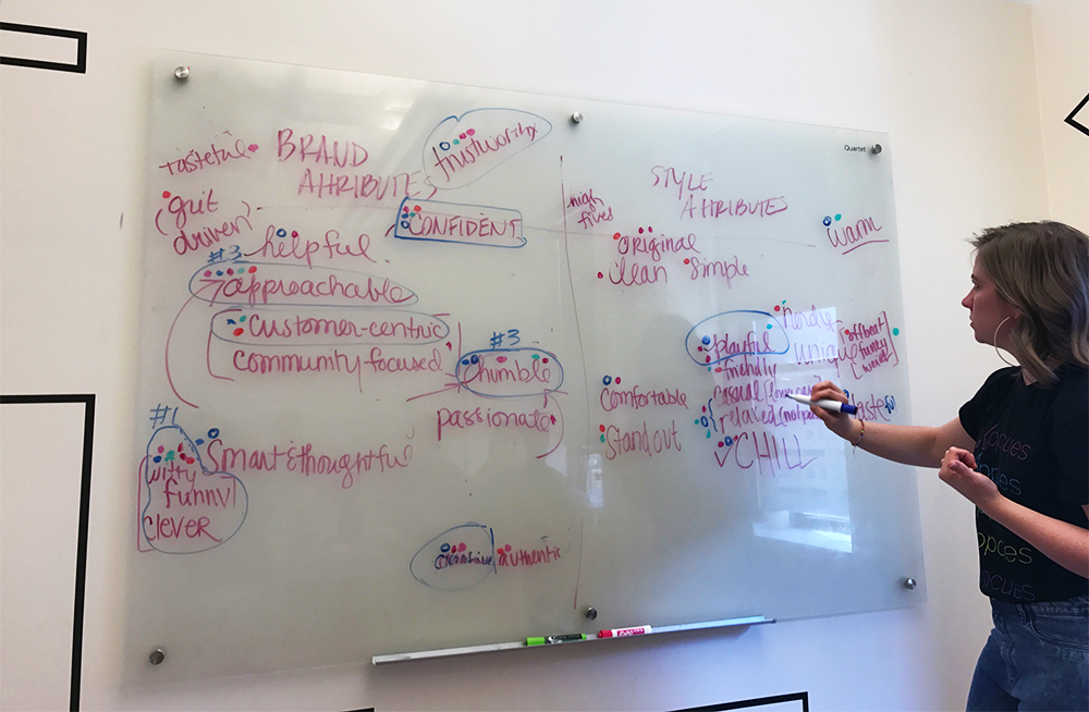
This is a picture of a marketing team brainstorming session. A woman is writing on a whiteboard that has a list of descriptive words. This illustrates a brainstorming technique used in our rebrand process.
Shout out to our scribe, Laura 👋

After many, many rounds of revisions and second guesses, we finally nailed down the 6 brand attributes that we felt best described Appcues and our vision for the future. 

We determined that Appcues is:
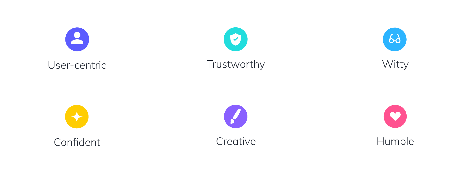
Our 6 brand attributes are depicted through colorful icons. We are user-centric, trustworthy, witty, confident, creative, and humble.

User-centric: We’re focused on providing a positive user experience at every stage of the journey. We care about our customer’s customer.

Trustworthy: There’s no shady business here! We’re honest, transparent, direct, and reliable. We love our customers and want to build strong, honest relationships through authentic and open communication.

Witty: We are smart, quick, and quirky. We love to make people smile, whether that’s with a cheesy pun or a fun video. We’re tactful, situationally aware, and never joke at the expense of others.

Confident: The Appcues team is smart, capable, and motivated. We know we’re good at what we do and aren’t afraid to take on a new challenge. We balance confidence with humility: “We don’t beat our chest, but we will toot our horn.”

Creative: We believe in creative problem solving and want to empower our team and our customers to think outside the box.

Humble:  We are modest, sincere, and reliable. We are open to receiving feedback and are always looking for ways to evolve and improve. No matter how big we get, we never lose sight of where we started. “It’s not about us, it’s about trust, babe.” – Fat Joe

Style attributes

Style deals with the way a company communicates—whether through its design, writing, or people. It's important for style to be consistent and recognizable.

Based on the feedback we got (and after hours of deliberation), we settled on five style attributes that we felt fit our company’s personality:
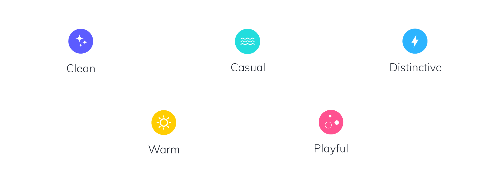
Our brand has five style attributes, represented here by colorful icons. We are clean, casual, distinctive, warm, and playful.

Clean: Appcues is clean, modern, and minimal. We believe in a less-is-more approach to design.

Casual: Appcues is relaxed, comfortable, and friendly. We keep it real.

Distinctive: Appcues is unique, authentic, and inspiring. We are trend-setters, mold-breakers, and thought-leaders. 

Warm: Appcues is warm, approachable, and welcoming. We’re your favorite sweater in company form.

Playful: Appcues is nerdy, fun, and witty. We always try to strike a balance between our right brains and our left.

As you can see, there’s a lot of crossover between our values, brand attributes, and style attributes. And that’s the way it should be: Crossover means consistency and cohesion, which ultimately mean a stronger brand image.

Glowing up

Once we had our core identify defined, it was time for a makeover! And because everyone loves a good makeover montage (early 00’s rom-coms knew what was up), we’re going to share the process with you.

The Appcues logo

First, we had to decide if we were going to do a full cut, or just take a little of the sides. For the Appcues logo, we decided to do the latter. Every major logo rebrand we tested out just didn’t have the same strength or convey the same level of trustworthiness as our existing logo, so we decided to tweak the logo we already had.

The alterations were subtle—a softened edge here, a bit of airiness there—but the effect was a friendlier, more approachable logo that better reflected our personality, all while remaining recognizable to our existing customers.
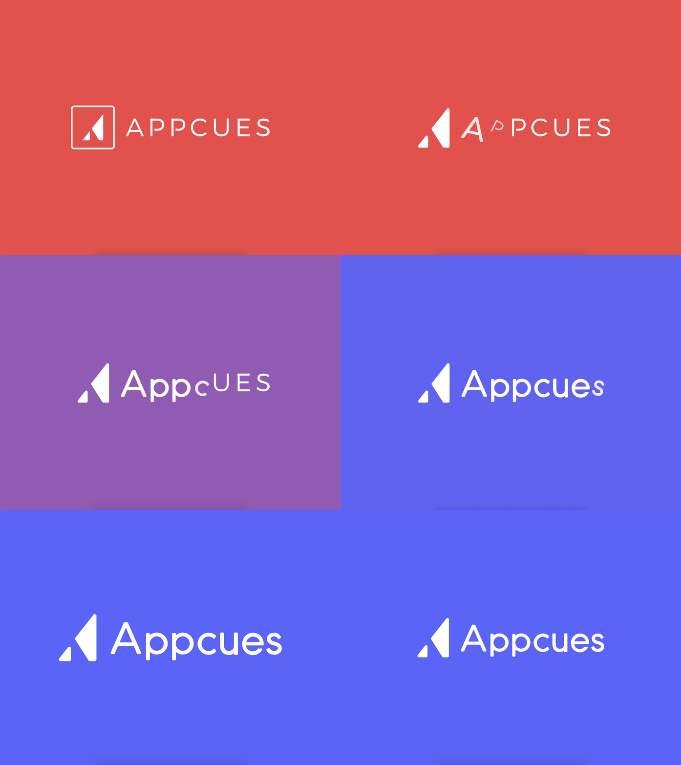
This is a gif showing our old logo and colors turning into our new logo and colors. This is a company logo turning from red to purple with animated text.

It’s amazing what a few slightly rounded corners can do.

Our brand colors

You’re familiar with the big red button trope? Wherein Character A says “whatever you do, do not push that button” and then, sure enough, curious Character B pushes it anyway?

Of course you are—it’s a genre-spanning bit of slapstick that’s made its way into everything from Looney Toons to satirical political cartoons. Popular culture and common sense tell us that red buttons lead to big, and often negative, consequences.

Which is why we probably shouldn’t have been surprised to learn that our users didn’t like clicking on red buttons within the Appcues. Somehow “Next” just felt more ominous in red.

The trouble was, red—#EF4546, to be precise—was our primary brand color! How could our customers not like engaging with buttons in our signature shade? This feedback—which we received during user testing—was one of the motivations behind our rebrand.

Six colored blocks showing our old brand colors. From top left, our old brand colors were red, orange, yellow, navy, blue, and green.

We realized that, not only did our brand colors lack cohesion, but our primary color was actually creating a lot of undo anxiety for our customers! So we decided to do a total overhaul to find a fresh new hue that represented the Appcues we know and love.

Meet Appcues Blurple:

This is the primary Appcues brand color. It is a vibrant blue-ish purple called Blurple.

Our new primary color is a vibrant purple—a blurple, if you will. A combination of calming blue and vibrant red, it evokes feelings of excitement, uniqueness, and creativity, while still being soothing and friendly. This color is unique to Appcues.

Once we settled on our primary brand color, choosing the other colors was pretty easy. We looked for secondary colors that complimented the purple but that had enough personality to stand alone from time to time. 

One of our secondary brand colors is this bright light blue, called Bludacris
Another secondary brand color is this light turqouise/ bright teal color that looks like cucumber spindrift seltzer. We named it cutecumber
Another secondary brand color is this vibrant dark pink. This color is called pink power ranger.
Another secondary brand color is this dark blue-black. It is avery deep, subdued navy that we call Smurf Blood.

And then we have our gradients, which bring depth to flat design. Appcues is an experience layer. Since the concept of layers is synonymous with depth, that was something we wanted to come through in our branding. Gradients, with their many shades and hues, accomplished this perfectly.

Our brand color gradient called Blurple Haze. This gradient goes from a blue purple to a red purple.
Our brand gradient called daba dee daba die (like the song). It is a subtle gradient showing a bright light blue shifting to a cooler, slightly darker light blue.
This is another subtle brand color gradient called Merfolk. It shiftf from a vibrant light turquoise to a cooler light blue.
A gradient called grapefruit. This shows an orange-y pink color shifting toward a bright, deep magenta color.
This brand gradient is called galaxy. It starts as a purple on the left and shifts to a pink on the right.
We called this gradient mood lighting. It shows a cool blue purple turning into a subdued light blue.
Our final gradient shows a deep cool grey/black shifting into a slightly lighter shade. We named this Regulus.
This is our lightes brand gradient. It is a cool gray that transitions to white. We named it Mithril.

We also developed a handful of shades, based on our primary and secondary colors, that bring further nuance to our branding. This expanded color palette gives our brand a consistent and flexible approach to color.

Our typeface

The typeface in our old logo used all-caps and it felt a bit like it was yelling at you. We’re not yellers here. And while there wasn’t anything wrong with our old typeface—source sans pro—but it just wasn’t *us.*

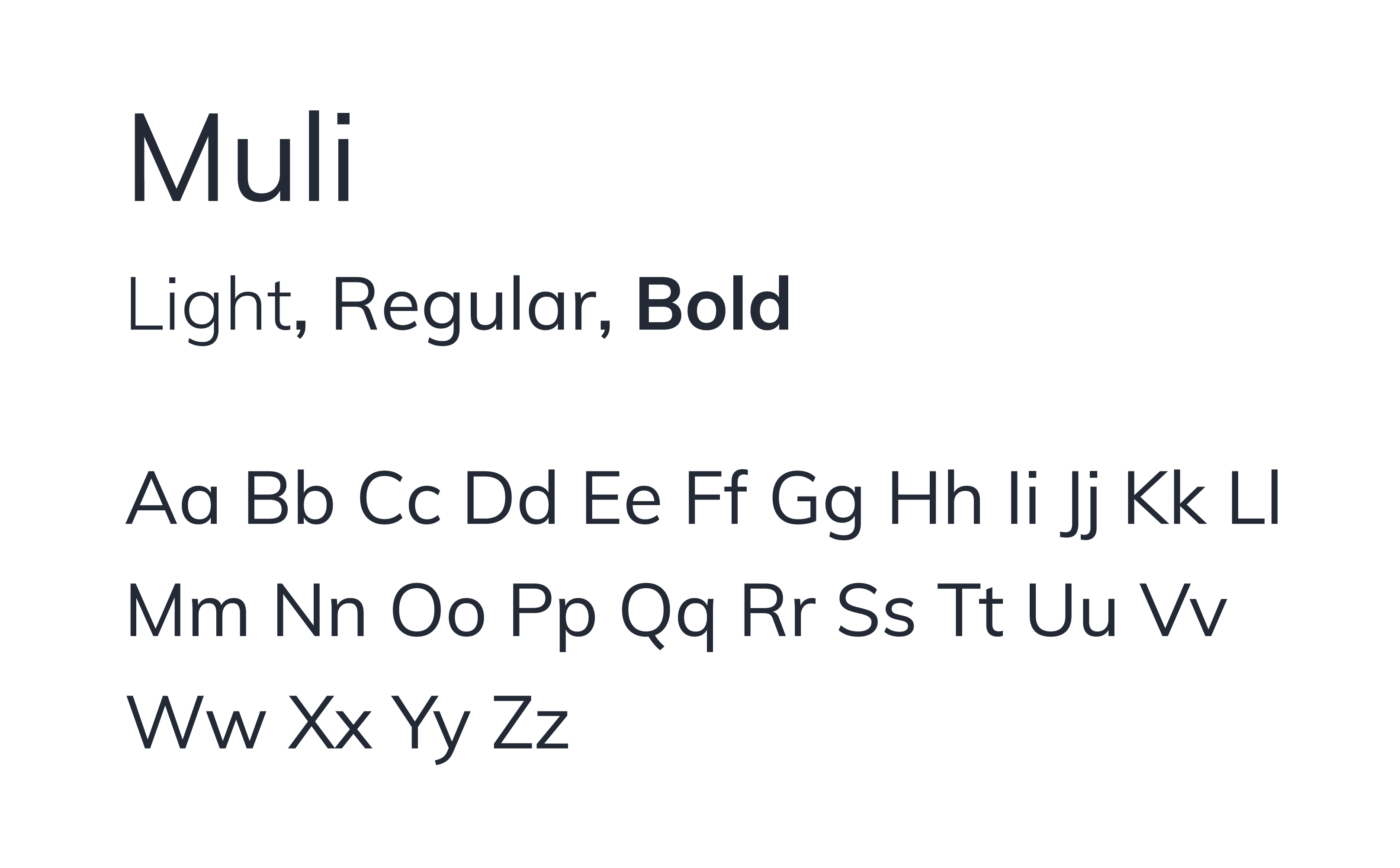
We wanted our new typeface to be softer, but with enough personality that you could immediately pick it out of a line up. When we stumbled upon Muli, it felt like the stars had aligned—it really helped tie all the other rebrand elements together.

This image shows our brand typeface Muli in multiple weights and cases.

Muli is a minimal sans-serif with rounded edges and a lightness that makes it feel fresh, friendly, and approachable. It works equally well for display and text. In other words, it was perfect!

What happens next

There’s a lot of heart at this company. Everybody on the Appcues team cared so much and was so excited about the rebrand project. That energy really carried us through the hours and hours of moodboarding, whiteboarding, and brainstorming that went into each design decision.

That same energy keeps us moving ever forward, often at breakneck speeds. Our work is never finished. We’re still growing and evolving—as a company and as a brand. Now that we’ve decided who we want Appcues to be (and put it in writing, so … no take-backsies) it’s time for the real glow up to begin.

Watch this space!

Note: This rebrand wouldn’t have been possible without the help of the entire Appcues team, especially the marketing and design folks. And huge shoutout to the dogs 🐶 of Appcues for keeping spirits high!

Tanya Higgins
Senior Marketing Designer
Tanya is the senior marketing designer at Appcues. When she’s not musing over color swatches and kerning, she likes to spend time with her pets, watch The Room, and listen to Post Malone.
Skip to section:

Skip to section:

Appcues was founded by Jonathan Kim and Jackson Noel way way back in 2013—the year of Frozen, the Harlem Shake, and the iPhone 5S.

Small companies naturally take on the personalities of their people—and Jonathan and Jackson are genuinely two of the most approachable, humble, and friendly founders around. (And we swear we’re not being paid to write this. Well … technically we are, but you get the point.)

So that’s what Appcues was, and what it still is at heart: friendly, approachable, refreshing, modern. But our old branding didn’t reflect any of that.

Take a look:

This is our old branding. This image shows the former Appcues logo and our old primary color. On the left is a white logo on a red background, on the right is the red logo and text on a white background.

Companies evolve, and their branding should evolve with them. 

Appcues was no longer the new kid on the block: By the time we began our rebrand in March 2018, Appcues was a fixture of the Boston tech scene, had already helped over 1,000 companies deliver better user experiences to millions of end users, and we were welcoming new team members left and right.

It was time for a fresh new look.

Our core identity

“What is Appcues?”

Before we could look at color swatches and typefaces, we had to figure out who we were—and who we wanted to be.

To do this, we needed to define our core identity—the brand attributes and values that are most likely to remain constant as a company grows. The core identity is the beating heart of any brand and should ultimately inform everything to come.

For the Appcues rebrand, we wanted to make sure that the brand attributes and values were things that really defined us, as individuals and as a whole.

Now, part of what makes Appcues such an amazing place to work (and such a cool company, if we do say so ourselves) is that everyone here really cares. The people here truly believe in this company and feel a strong sense of responsibility for its success.

The uncertainty that comes with rebranding can feel scary at any company. Here, with so many impassioned stakeholders, getting the rebranding right wasn’t just an important business decision—it was a personal one. That’s why we were careful to involve all Appcues employees (aka Appcuties) in the process of defining our core identity. We wanted to know what Appcues meant to the individuals who know and love it best, so we could help the brand grow into a better version of itself.

Our values

We’re proud of the company culture we have at Appcues. Too often, it can feel like a company’s values only exist in employee training docs or on an “inspirational” wall somewhere around the office. At Appcues, our values really do permeate everything we do, as individuals and as a company.

We’ve got five of them:

Customer first: Yes, you can be product-led and customer-first. We solve problems from our customers’ perspectives, not our own. That means being good listeners, and checking our egos at the door.

No permission needed: We give every teammate the autonomy and ownership to do what they believe is right. That’s why we hire capable, trustworthy folks who can be counted on to do the right thing.

Keep no secrets: Secrets, secrets are no fun. We make information readily available and use it to make better decisions on behalf of our customers. Because ignorance may be bliss, but it’s not good for business!

Get it done: We value results, not just effort. We want our product to be the best—plain and simple. That means working hard and delivering on our promises.

Enjoy the journey: We consider this experience unique and intend to cherish it. We have confetti cannons, and we’re not afraid to use them!

Brand attributes

Our values were created when we were a smaller team and have been our guiding lights for much of the Appcues journey. For our rebrand, we wanted to dive even deeper.

If our values are the mottos that we strive to live by, then our brand attributes are the personality traits that we’d like to be known for.

To determine exactly what those traits should be, we sent out a survey to Appcuties and asked them to tell us about what they felt Appcues could be, should be, and would be when we were all grown up.

We asked the following 6 open-ended questions:

  1. If Appcues were a person, who would Appcues be?
  2. How would you describe the Appcues style?
  3. What kind of car would Appcues drive?
  4. What other brands would Appcues hang out with and why?
  5. What 5 key words best describe Appcues?
  6. What does Appcues (and working at Appcues) mean to you?

We put all the responses into a spreadsheet and marked the commonly recurring answers. (Apparently a lot of Appcuties think we’re giving off Lin Manuel Miranda vibes!)

We then sent out the same survey to some of our customers and added their responses to the rebrand databank.

Once we had all the responses together, we realized that trying to pick our brand attributes off a list just wasn’t going to cut it. So the marketing team holed themselves up in a room with a whiteboard and spent hours pouring over the survey results, discussing what each word meant for Appcues as a brand.

This is a picture of a marketing team brainstorming session. A woman is writing on a whiteboard that has a list of descriptive words. This illustrates a brainstorming technique used in our rebrand process.
Shout out to our scribe, Laura 👋

After many, many rounds of revisions and second guesses, we finally nailed down the 6 brand attributes that we felt best described Appcues and our vision for the future. 

We determined that Appcues is:

Our 6 brand attributes are depicted through colorful icons. We are user-centric, trustworthy, witty, confident, creative, and humble.

User-centric: We’re focused on providing a positive user experience at every stage of the journey. We care about our customer’s customer.

Trustworthy: There’s no shady business here! We’re honest, transparent, direct, and reliable. We love our customers and want to build strong, honest relationships through authentic and open communication.

Witty: We are smart, quick, and quirky. We love to make people smile, whether that’s with a cheesy pun or a fun video. We’re tactful, situationally aware, and never joke at the expense of others.

Confident: The Appcues team is smart, capable, and motivated. We know we’re good at what we do and aren’t afraid to take on a new challenge. We balance confidence with humility: “We don’t beat our chest, but we will toot our horn.”

Creative: We believe in creative problem solving and want to empower our team and our customers to think outside the box.

Humble:  We are modest, sincere, and reliable. We are open to receiving feedback and are always looking for ways to evolve and improve. No matter how big we get, we never lose sight of where we started. “It’s not about us, it’s about trust, babe.” – Fat Joe

Style attributes

Style deals with the way a company communicates—whether through its design, writing, or people. It's important for style to be consistent and recognizable.

Based on the feedback we got (and after hours of deliberation), we settled on five style attributes that we felt fit our company’s personality:

Our brand has five style attributes, represented here by colorful icons. We are clean, casual, distinctive, warm, and playful.

Clean: Appcues is clean, modern, and minimal. We believe in a less-is-more approach to design.

Casual: Appcues is relaxed, comfortable, and friendly. We keep it real.

Distinctive: Appcues is unique, authentic, and inspiring. We are trend-setters, mold-breakers, and thought-leaders. 

Warm: Appcues is warm, approachable, and welcoming. We’re your favorite sweater in company form.

Playful: Appcues is nerdy, fun, and witty. We always try to strike a balance between our right brains and our left.

As you can see, there’s a lot of crossover between our values, brand attributes, and style attributes. And that’s the way it should be: Crossover means consistency and cohesion, which ultimately mean a stronger brand image.

Glowing up

Once we had our core identify defined, it was time for a makeover! And because everyone loves a good makeover montage (early 00’s rom-coms knew what was up), we’re going to share the process with you.

The Appcues logo

First, we had to decide if we were going to do a full cut, or just take a little of the sides. For the Appcues logo, we decided to do the latter. Every major logo rebrand we tested out just didn’t have the same strength or convey the same level of trustworthiness as our existing logo, so we decided to tweak the logo we already had.

The alterations were subtle—a softened edge here, a bit of airiness there—but the effect was a friendlier, more approachable logo that better reflected our personality, all while remaining recognizable to our existing customers.

This is a gif showing our old logo and colors turning into our new logo and colors. This is a company logo turning from red to purple with animated text.

It’s amazing what a few slightly rounded corners can do.

Our brand colors

You’re familiar with the big red button trope? Wherein Character A says “whatever you do, do not push that button” and then, sure enough, curious Character B pushes it anyway?

Of course you are—it’s a genre-spanning bit of slapstick that’s made its way into everything from Looney Toons to satirical political cartoons. Popular culture and common sense tell us that red buttons lead to big, and often negative, consequences.

Which is why we probably shouldn’t have been surprised to learn that our users didn’t like clicking on red buttons within the Appcues. Somehow “Next” just felt more ominous in red.

The trouble was, red—#EF4546, to be precise—was our primary brand color! How could our customers not like engaging with buttons in our signature shade? This feedback—which we received during user testing—was one of the motivations behind our rebrand.

Six colored blocks showing our old brand colors. From top left, our old brand colors were red, orange, yellow, navy, blue, and green.

We realized that, not only did our brand colors lack cohesion, but our primary color was actually creating a lot of undo anxiety for our customers! So we decided to do a total overhaul to find a fresh new hue that represented the Appcues we know and love.

Meet Appcues Blurple:

This is the primary Appcues brand color. It is a vibrant blue-ish purple called Blurple.

Our new primary color is a vibrant purple—a blurple, if you will. A combination of calming blue and vibrant red, it evokes feelings of excitement, uniqueness, and creativity, while still being soothing and friendly. This color is unique to Appcues.

Once we settled on our primary brand color, choosing the other colors was pretty easy. We looked for secondary colors that complimented the purple but that had enough personality to stand alone from time to time. 

One of our secondary brand colors is this bright light blue, called Bludacris
Another secondary brand color is this light turqouise/ bright teal color that looks like cucumber spindrift seltzer. We named it cutecumber
Another secondary brand color is this vibrant dark pink. This color is called pink power ranger.
Another secondary brand color is this dark blue-black. It is avery deep, subdued navy that we call Smurf Blood.

And then we have our gradients, which bring depth to flat design. Appcues is an experience layer. Since the concept of layers is synonymous with depth, that was something we wanted to come through in our branding. Gradients, with their many shades and hues, accomplished this perfectly.

Our brand color gradient called Blurple Haze. This gradient goes from a blue purple to a red purple.
Our brand gradient called daba dee daba die (like the song). It is a subtle gradient showing a bright light blue shifting to a cooler, slightly darker light blue.
This is another subtle brand color gradient called Merfolk. It shiftf from a vibrant light turquoise to a cooler light blue.
A gradient called grapefruit. This shows an orange-y pink color shifting toward a bright, deep magenta color.
This brand gradient is called galaxy. It starts as a purple on the left and shifts to a pink on the right.
We called this gradient mood lighting. It shows a cool blue purple turning into a subdued light blue.
Our final gradient shows a deep cool grey/black shifting into a slightly lighter shade. We named this Regulus.
This is our lightes brand gradient. It is a cool gray that transitions to white. We named it Mithril.

We also developed a handful of shades, based on our primary and secondary colors, that bring further nuance to our branding. This expanded color palette gives our brand a consistent and flexible approach to color.

Our typeface

The typeface in our old logo used all-caps and it felt a bit like it was yelling at you. We’re not yellers here. And while there wasn’t anything wrong with our old typeface—source sans pro—but it just wasn’t *us.*

We wanted our new typeface to be softer, but with enough personality that you could immediately pick it out of a line up. When we stumbled upon Muli, it felt like the stars had aligned—it really helped tie all the other rebrand elements together.
This image shows our brand typeface Muli in multiple weights and cases.

Muli is a minimal sans-serif with rounded edges and a lightness that makes it feel fresh, friendly, and approachable. It works equally well for display and text. In other words, it was perfect!

What happens next

There’s a lot of heart at this company. Everybody on the Appcues team cared so much and was so excited about the rebrand project. That energy really carried us through the hours and hours of moodboarding, whiteboarding, and brainstorming that went into each design decision.

That same energy keeps us moving ever forward, often at breakneck speeds. Our work is never finished. We’re still growing and evolving—as a company and as a brand. Now that we’ve decided who we want Appcues to be (and put it in writing, so … no take-backsies) it’s time for the real glow up to begin.

Watch this space!

Note: This rebrand wouldn’t have been possible without the help of the entire Appcues team, especially the marketing and design folks. And huge shoutout to the dogs 🐶 of Appcues for keeping spirits high!

Tanya Higgins
Senior Marketing Designer
Tanya is the senior marketing designer at Appcues. When she’s not musing over color swatches and kerning, she likes to spend time with her pets, watch The Room, and listen to Post Malone.
You might also like...