← Visit Appcues.com
×
×

Ideas and inspirations to get the most out of Appcues
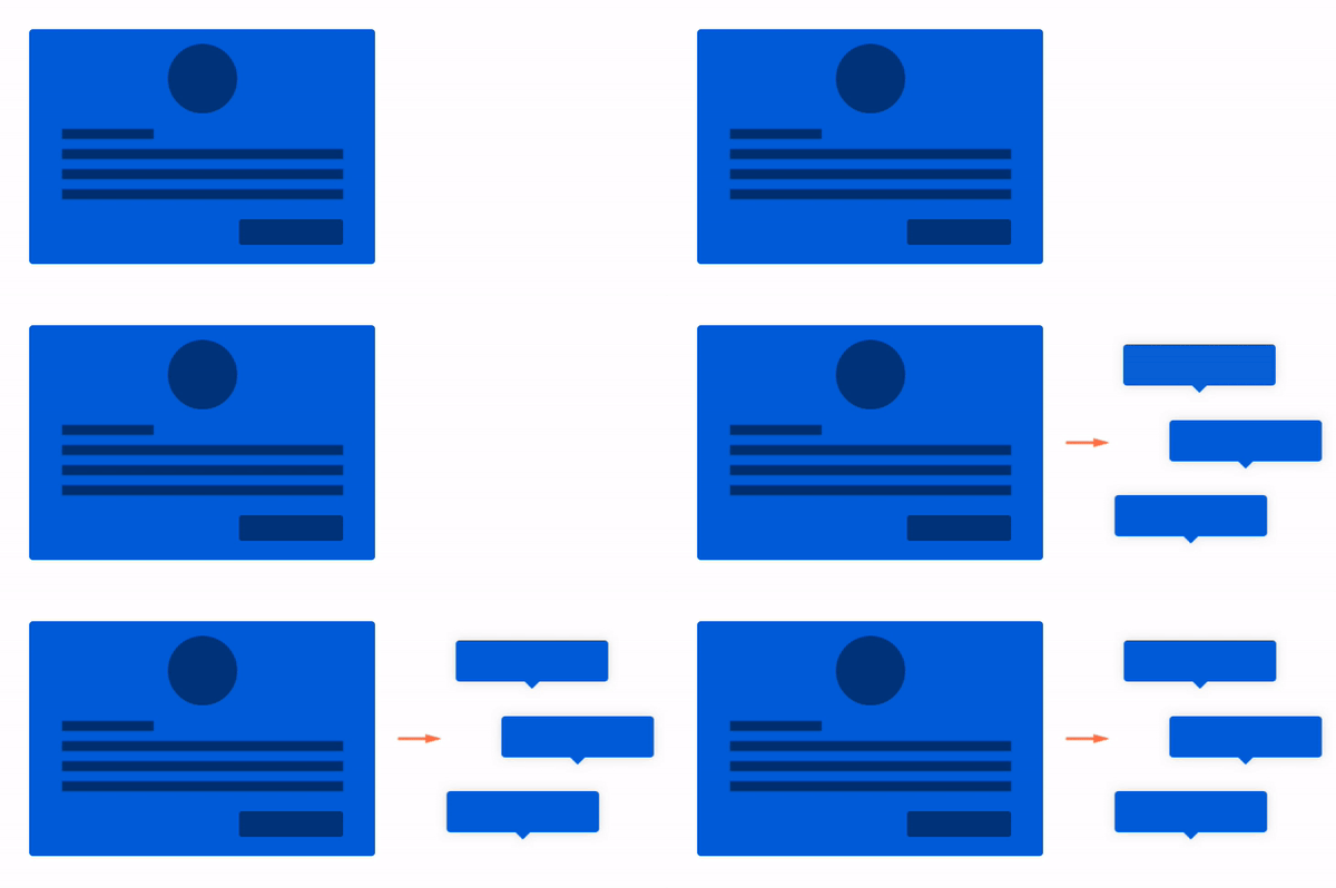
With Appcues, you can accomplish an incredible variety of onboarding and announcement flows for your product. Of course you can dream up...
Skip to section:

Skip to section:

With Appcues, you can accomplish an incredible variety of onboarding and announcement flows for your product. Of course you can dream up your own, but there are so many possibilities that a little inspiration goes a long way. 

Hopefully these help you narrow it down to just the right experience.

Onboarding

Personal touch classic

Personalized welcome modal → Tooltips

When you want to give your users a personal welcome (for example, a message from the CEO, or even their sales rep), nothing beats a welcome modal. Personalizing it with their registered name or company name, or having a few different modal designs based on a role or customer stage can make your message more relevant and meaningful. You can then lead into a tour that takes them through everything they need to know to get started.

modal into tooltips

High-level intro

3-part modal (Welcome, Detail, Action) → Hotspots

This flow gives new users an overview of your whole product in the classic magic number of three steps, followed by subtle hotspot beacons that allow them to explore at their own pace. This works great for products that benefit from a little more explanation of value before people dive in.

Self-guided learning

Slideout welcome → Hotspots

A great method for products aimed at more technical users, the more subtle and less obtrusive slideout is the way to go. That slideout can ask the user if they want a tour—which would send some hotspots around the UI for them to browse. You can even use a permalink to bring up that help slideout again if the user changes their mind after dismissing it. Slick. 

self-guided-learning.gif

Announcements

Small improvement

A single hotspot or tooltip

We’ve seen this trend on many different web and mobile apps for pointing out changes in a subtle, non-disruptive way, and we love it. When something changes or a new feature is added but it’s hidden behind a menu or on a new page, putting up a single hotspot beacon or tooltip can clue users into the change with just enough flare to get their attention. This pattern is 🔥 right now, and for good reason—it results in a great user experience.
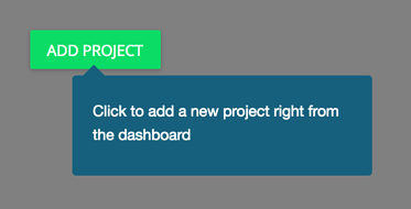
single-tooltip-announcement.png

New feature announcement

Slideout → Tooltip tour

For an exciting feature release, you want your announcement to be highly visible. A slideout is the best of both worlds—it’s not a blocking modal (users can keep working while it’s up) but it’s also not easy to ignore. The slideout can take the user straight to the feature and start a tour immediately, making sure they learn and use it effectively from the start.

Big time release

3-step modal → Redirect → Tooltip tour

When you release something big, like an all new product or major UI change, you want your users to get excited about it and understand all the ins and outs. It’s good to be thorough, and users won’t mind being disrupted if the change is big enough.

A three-step modal is ideal:

  • Tell them what changed
  • Tell them why it matters
  • Call them to take action

Lead right into a tour to show them how to use the feature, and you’ll make it a flawless launch from the start.

three-step-modal.png

Responding to behavior

Some of the most exciting ways to use Appcues take advantage of user behavior and personalization. Our improved Analytics makes it easier to respond to actions, personalize communication, and create a more meaningful connection. Thinking of each user as a person with unique experiences and traits can help you create a more effective UX for all of them. Here are some great ways you can start.

Pick up on users who haven’t used part of your product yet

User hasn’t done event X → Slideout → Tooltip tour

If someone hasn’t explored one of the most valuable parts of your product even after a couple weeks of use, see it as an opportunity to get them more invested at just the right time. Create a slideout message encouraging them to try it out, along with a quick tour to get them started. Target users who signed up after 2 weeks ago but haven’t done an event associated with your feature yet. Users will appreciate the relevance and helpfulness.

Catch frustration sequences and help proactively

User has done something multiple times → Slideout “Need more help?”

Can you imagine a sequence of unfortunate events that might be a clue your user might be getting frustrated? To be honest, I can think of three or four for Appcues itself. You can get extremely specific so you capture just the right situation, and trigger a slideout or even a single tooltip asking them if they need more help. That flow can launch a particular help doc in a new window, or lead them to a support discussion. Being helpful at just the right time can make a huge difference in how users perceive your product.

Help your best users grow and prosper

User has used several advanced features → Slideout to grow or upsell

What if someone is using every one of your features extensively and getting a ton of value from your product? Maybe you have another product you think they’d love to use, or maybe they would benefit from a new strategy. Either way, a simple slideout targeted to users who have done a combo of all your top events can be a great lead-in to quickly grab their attention and offer those opportunities.

Celebrate!

User reached a milestone → Modal to celebrate!

What’s better than celebrating achievements? Positive reinforcement and gamification work well, and add a touch of personality and pizazz to your app.

Trigger your modal on a number of actions completed, number of features used, level of results achieved, or ‘anniversary’ of the user’s signup. For the design of the message, try out an animated confetti gif or a celebratory emoji icon to make it fun. You don’t need a call to action here, but maybe ask for their address in a form to send them some swag. It’s the little things like this that make your experience stand out, and Appcues makes it easy to do.

Tristan Harward
Head of Product Design at Appcues
Skip to section:

Skip to section:

With Appcues, you can accomplish an incredible variety of onboarding and announcement flows for your product. Of course you can dream up your own, but there are so many possibilities that a little inspiration goes a long way. 

Hopefully these help you narrow it down to just the right experience.

Onboarding

Personal touch classic

Personalized welcome modal → Tooltips

When you want to give your users a personal welcome (for example, a message from the CEO, or even their sales rep), nothing beats a welcome modal. Personalizing it with their registered name or company name, or having a few different modal designs based on a role or customer stage can make your message more relevant and meaningful. You can then lead into a tour that takes them through everything they need to know to get started.

modal into tooltips

High-level intro

3-part modal (Welcome, Detail, Action) → Hotspots

This flow gives new users an overview of your whole product in the classic magic number of three steps, followed by subtle hotspot beacons that allow them to explore at their own pace. This works great for products that benefit from a little more explanation of value before people dive in.

Self-guided learning

Slideout welcome → Hotspots

A great method for products aimed at more technical users, the more subtle and less obtrusive slideout is the way to go. That slideout can ask the user if they want a tour—which would send some hotspots around the UI for them to browse. You can even use a permalink to bring up that help slideout again if the user changes their mind after dismissing it. Slick. 

self-guided-learning.gif

Announcements

Small improvement

A single hotspot or tooltip

We’ve seen this trend on many different web and mobile apps for pointing out changes in a subtle, non-disruptive way, and we love it. When something changes or a new feature is added but it’s hidden behind a menu or on a new page, putting up a single hotspot beacon or tooltip can clue users into the change with just enough flare to get their attention. This pattern is 🔥 right now, and for good reason—it results in a great user experience.

single-tooltip-announcement.png

New feature announcement

Slideout → Tooltip tour

For an exciting feature release, you want your announcement to be highly visible. A slideout is the best of both worlds—it’s not a blocking modal (users can keep working while it’s up) but it’s also not easy to ignore. The slideout can take the user straight to the feature and start a tour immediately, making sure they learn and use it effectively from the start.

Big time release

3-step modal → Redirect → Tooltip tour

When you release something big, like an all new product or major UI change, you want your users to get excited about it and understand all the ins and outs. It’s good to be thorough, and users won’t mind being disrupted if the change is big enough.

A three-step modal is ideal:

  • Tell them what changed
  • Tell them why it matters
  • Call them to take action

Lead right into a tour to show them how to use the feature, and you’ll make it a flawless launch from the start.

three-step-modal.png

Responding to behavior

Some of the most exciting ways to use Appcues take advantage of user behavior and personalization. Our improved Analytics makes it easier to respond to actions, personalize communication, and create a more meaningful connection. Thinking of each user as a person with unique experiences and traits can help you create a more effective UX for all of them. Here are some great ways you can start.

Pick up on users who haven’t used part of your product yet

User hasn’t done event X → Slideout → Tooltip tour

If someone hasn’t explored one of the most valuable parts of your product even after a couple weeks of use, see it as an opportunity to get them more invested at just the right time. Create a slideout message encouraging them to try it out, along with a quick tour to get them started. Target users who signed up after 2 weeks ago but haven’t done an event associated with your feature yet. Users will appreciate the relevance and helpfulness.

Catch frustration sequences and help proactively

User has done something multiple times → Slideout “Need more help?”

Can you imagine a sequence of unfortunate events that might be a clue your user might be getting frustrated? To be honest, I can think of three or four for Appcues itself. You can get extremely specific so you capture just the right situation, and trigger a slideout or even a single tooltip asking them if they need more help. That flow can launch a particular help doc in a new window, or lead them to a support discussion. Being helpful at just the right time can make a huge difference in how users perceive your product.

Help your best users grow and prosper

User has used several advanced features → Slideout to grow or upsell

What if someone is using every one of your features extensively and getting a ton of value from your product? Maybe you have another product you think they’d love to use, or maybe they would benefit from a new strategy. Either way, a simple slideout targeted to users who have done a combo of all your top events can be a great lead-in to quickly grab their attention and offer those opportunities.

Celebrate!

User reached a milestone → Modal to celebrate!

What’s better than celebrating achievements? Positive reinforcement and gamification work well, and add a touch of personality and pizazz to your app.

Trigger your modal on a number of actions completed, number of features used, level of results achieved, or ‘anniversary’ of the user’s signup. For the design of the message, try out an animated confetti gif or a celebratory emoji icon to make it fun. You don’t need a call to action here, but maybe ask for their address in a form to send them some swag. It’s the little things like this that make your experience stand out, and Appcues makes it easy to do.

Tristan Harward
Head of Product Design at Appcues
You might also like...