← Visit Appcues.com
×
×

Announcing Appcues 2.0
Today we’re proud to launch Appcues 2.0, the complete platform for better user onboarding. If you’re looking to teach new users your...
Skip to section:

Skip to section:

Today we’re proud to launch Appcues 2.0, the complete platform for better user onboarding. If you’re looking to teach new users your software and existing users your new features without building all those modals and tooltips yourself, Appcues 2.0 can help.

Over the past year, we’ve learned a boatload about how our customers onboard and communicate with their users. They’re doing amazing things with Appcues:

  • Delivering users from sign up to their ‘aha!’ moments with slick experiences
  • Personalizing messages with action-based targeting that pull users into the fold
  • Using analytics to optimize their flows

We wanted to make these easy for every one of our customers to help them be just as successful. So, we did. We’ve focused all our energy on helping you build and optimize the right onboarding and activation experience as easily as possible. Here’s what’s changed:
The Chrome extension editor

appcues-2-editor.gif


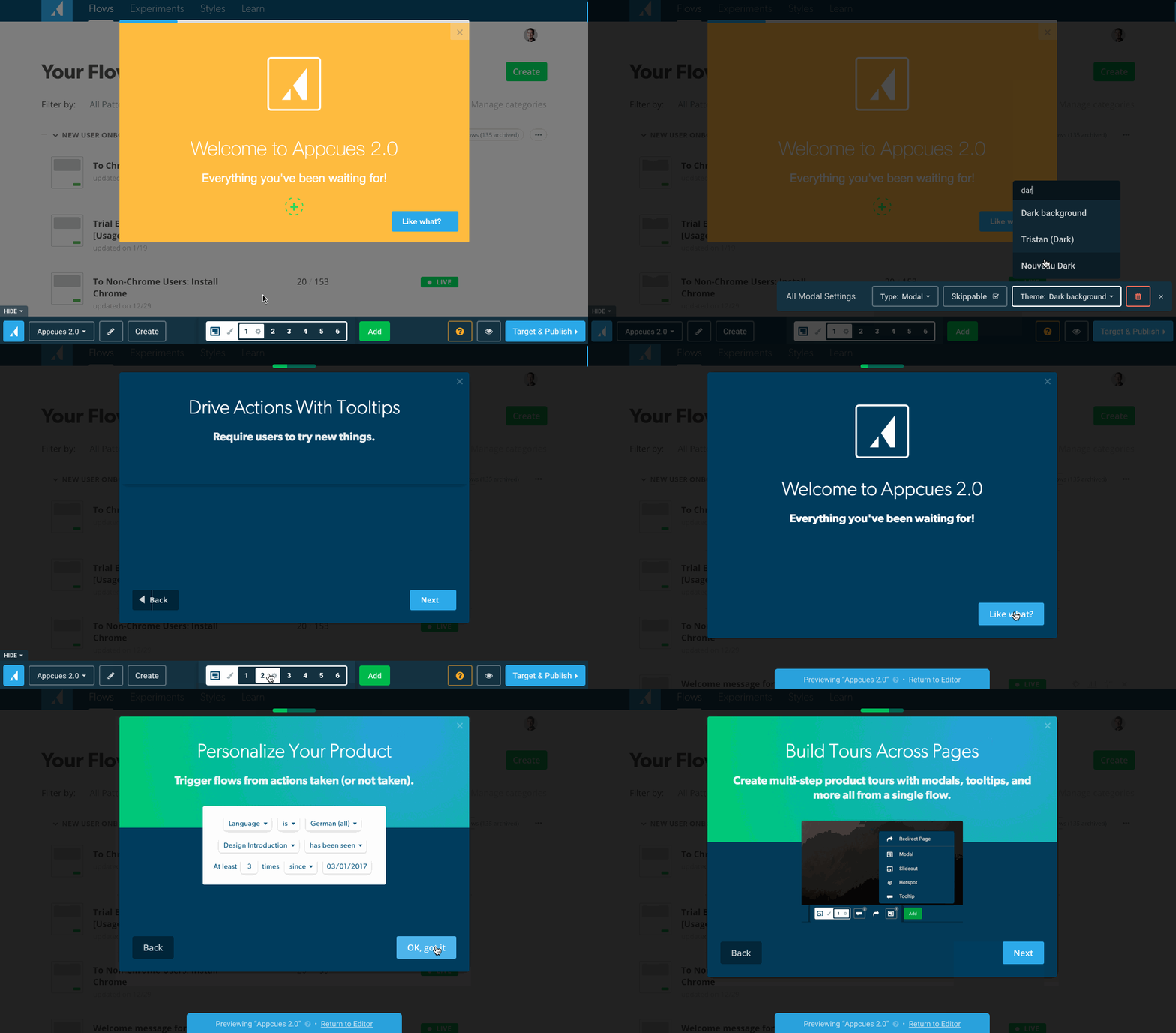
Point-and-click editor powered by a Chrome extension

Context is important. It’s hard to build onboarding experiences for your app—without your app. That’s why we built our new Chrome extension editor: it lets you build Appcues flows right where users will see them, surrounded by the context you need to make good design decisions. Put the right message in the right place, make sure it works from the start, and have fun doing it.
Action-driven tours

action-driven-tristan.gif


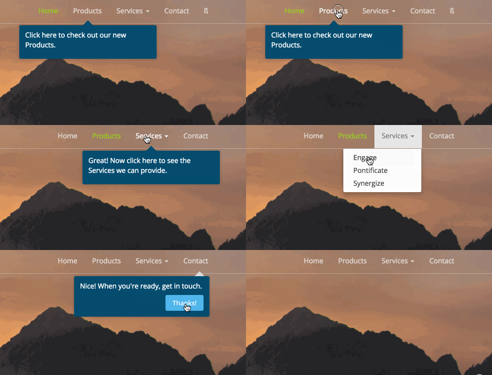
Require users to click on an element

Users learn best by doing, and to help you take advantage of that, we’ve added action-driven tooltips, which wait for the user to take an action before continuing. Users complete your onboarding “on rails,” and retain more knowledge as a result.

Personal and behavioral targeting

targeting-with-appcues.png


Personalize your product messages

Every user is different, and the most meaningful experiences are specific to who they are, what they’ve done, and what they’ve learned already. You can now target users based on any combination of characteristics, actions they’ve done in the past, or Appcues flows they’ve seen. You can get as specific as you like, even down to the day or time something happened. Our customers continually impress us with how they use targeting, so we’re excited to open up more possibilities for meaningful communication.
Backdrop

highlight-feature.png


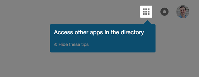
Focus users' attention more with backdrops

A big part of effective learning is focus, so we’ve added two visual effects to help you do just that: Highlight and Focus. Highlight isolates the target completely, while Focus is a more subtle soft-edged backdrop. They have different advantages, but the same result: more effectively holding onto your users’ attention.
Analytics

analytics page for product hunt launch.png


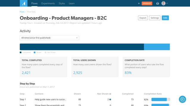
Measure flow success with our analytics

Knowing what’s going on with your content is key to improving it—and making sure your users get the right experience. With our new reporting, you can see all the details, like how many people saw your flow, how many completed it, and how each step performed. This is in addition to our comprehensive analytics integrations and full export. No more guessing.
Multiple patterns, multiple pages, one UI

multi-pattern-tours.png
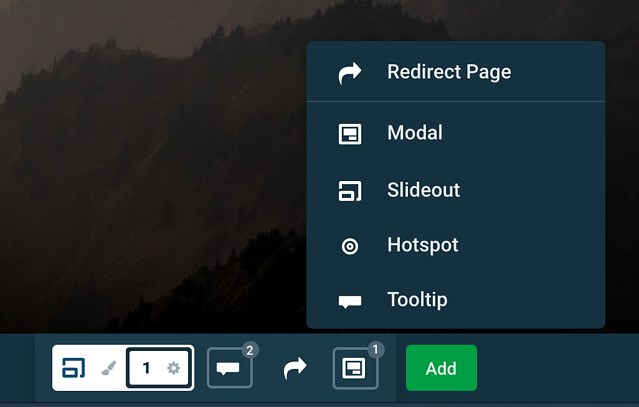
Create longer product tours from a single flow

This one’s big. Experiences that flow smoothly from page to page using several UI patterns and teaching methods really work. We’ve seen how effective this UX continuity can be, and today we’re proud to update our editor to make it as easy as creating a single modal or tooltip. The cohesive, connected experiences you can build are the next best thing to sitting next to your user the first time they use your product.
Fresh design

appcues-dashboard-navigation.png
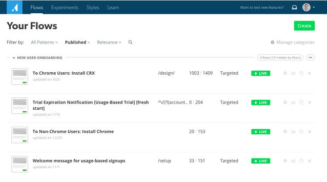
Our recently designed dashboard

What major release is complete without a redesign? Getting around Appcues is easier than ever. Browse flows, update styles, and find inspiration in our library of resources. Bounce back and forth between editing in our Chrome extension and seeing Analytics reporting. We’ve rethought the UI and made it more consistent and easy to use, and we hope you enjoy.

Why it matters

With everything we’ve learned over the last year, we’ve almost collected enough to write a book on onboarding and activation (and we've got a good start). We began to see what great onboarding experiences feel like, and what tools you need in order to build them easily. A big part of that was all the great feedback and knowledge our customers shared with us—thank you to each one of you who helped (you know who you are). We worked backward from what we learned, making it easy for everyone to reach the same results.

With Appcues 2.0, you can achieve some of your dream onboarding and activation flows—combining UI patterns, responding directly to behavior, and making a personal connection that engages and delights people. The goal is clear: happier, more successful users and a better outcome for everyone. We’ve even put together a whole list of inspiring new ideas you can now build easily using Appcues 2.0.

Each product and user has different needs, but with the new Appcues, we’re confident you can make the right flow—without development time—and iterate rapidly as your product grows and changes. Check it out, or get in touch and we’ll help you on board.

Tristan Harward
Head of Product Design at Appcues
Skip to section:

Skip to section:

Today we’re proud to launch Appcues 2.0, the complete platform for better user onboarding. If you’re looking to teach new users your software and existing users your new features without building all those modals and tooltips yourself, Appcues 2.0 can help.

Over the past year, we’ve learned a boatload about how our customers onboard and communicate with their users. They’re doing amazing things with Appcues:

  • Delivering users from sign up to their ‘aha!’ moments with slick experiences
  • Personalizing messages with action-based targeting that pull users into the fold
  • Using analytics to optimize their flows

We wanted to make these easy for every one of our customers to help them be just as successful. So, we did. We’ve focused all our energy on helping you build and optimize the right onboarding and activation experience as easily as possible. Here’s what’s changed:

The Chrome extension editor

appcues-2-editor.gif


Point-and-click editor powered by a Chrome extension

Context is important. It’s hard to build onboarding experiences for your app—without your app. That’s why we built our new Chrome extension editor: it lets you build Appcues flows right where users will see them, surrounded by the context you need to make good design decisions. Put the right message in the right place, make sure it works from the start, and have fun doing it.

Action-driven tours

action-driven-tristan.gif


Require users to click on an element

Users learn best by doing, and to help you take advantage of that, we’ve added action-driven tooltips, which wait for the user to take an action before continuing. Users complete your onboarding “on rails,” and retain more knowledge as a result.

Personal and behavioral targeting

targeting-with-appcues.png


Personalize your product messages

Every user is different, and the most meaningful experiences are specific to who they are, what they’ve done, and what they’ve learned already. You can now target users based on any combination of characteristics, actions they’ve done in the past, or Appcues flows they’ve seen. You can get as specific as you like, even down to the day or time something happened. Our customers continually impress us with how they use targeting, so we’re excited to open up more possibilities for meaningful communication.

Backdrop

highlight-feature.png


Focus users' attention more with backdrops

A big part of effective learning is focus, so we’ve added two visual effects to help you do just that: Highlight and Focus. Highlight isolates the target completely, while Focus is a more subtle soft-edged backdrop. They have different advantages, but the same result: more effectively holding onto your users’ attention.

Analytics

analytics page for product hunt launch.png


Measure flow success with our analytics

Knowing what’s going on with your content is key to improving it—and making sure your users get the right experience. With our new reporting, you can see all the details, like how many people saw your flow, how many completed it, and how each step performed. This is in addition to our comprehensive analytics integrations and full export. No more guessing.

Multiple patterns, multiple pages, one UI

multi-pattern-tours.png
Create longer product tours from a single flow

This one’s big. Experiences that flow smoothly from page to page using several UI patterns and teaching methods really work. We’ve seen how effective this UX continuity can be, and today we’re proud to update our editor to make it as easy as creating a single modal or tooltip. The cohesive, connected experiences you can build are the next best thing to sitting next to your user the first time they use your product.

Fresh design

appcues-dashboard-navigation.png
Our recently designed dashboard

What major release is complete without a redesign? Getting around Appcues is easier than ever. Browse flows, update styles, and find inspiration in our library of resources. Bounce back and forth between editing in our Chrome extension and seeing Analytics reporting. We’ve rethought the UI and made it more consistent and easy to use, and we hope you enjoy.

Why it matters

With everything we’ve learned over the last year, we’ve almost collected enough to write a book on onboarding and activation (and we've got a good start). We began to see what great onboarding experiences feel like, and what tools you need in order to build them easily. A big part of that was all the great feedback and knowledge our customers shared with us—thank you to each one of you who helped (you know who you are). We worked backward from what we learned, making it easy for everyone to reach the same results.

With Appcues 2.0, you can achieve some of your dream onboarding and activation flows—combining UI patterns, responding directly to behavior, and making a personal connection that engages and delights people. The goal is clear: happier, more successful users and a better outcome for everyone. We’ve even put together a whole list of inspiring new ideas you can now build easily using Appcues 2.0.

Each product and user has different needs, but with the new Appcues, we’re confident you can make the right flow—without development time—and iterate rapidly as your product grows and changes. Check it out, or get in touch and we’ll help you on board.

Tristan Harward
Head of Product Design at Appcues
You might also like...