← Visit Appcues.com
×
×

Tomorrow is too late: Why user onboarding should be a top priority for your SaaS company

High churn rates, low free-to-paid conversion, a large volume of support tickets—all are symptoms of bad onboarding. Why wait to fix yours?
Skip to section:

Skip to section:

User onboarding is the most important part of the user journey. 

No, really. We’re not just saying that because it’s a use case we solve for. We truly believe that all software deserves an exceptional onboarding experience—after all, your team has taken the time to design, develop, market, and sell your product. Why bungle the first impression and risk losing users at the word go?

The fact is, user onboarding should a top priority for any growth-minded SaaS company, whether the experience is built in-house or with Appcues. Or heck, even another third-party tool if it suits your needs better—if, for instance, you don’t care about having your flows look native to your product or you’re looking for a complete, self-contained business solution rather than a best-in-class platform that integrates with your current tech stack.

We won’t try to convince you to choose Appcues (you can make that decision for yourself by signing up for a free trial or talking to a product specialist). But we will tell you that you need to take a serious look at your user onboarding experience—and that you need to do so ASAP. 

It’s time to take it off the back burner, round up the troops, and make optimizing your onboarding UX a top priority.

Here’s why:

1. Better user onboarding helps you get ahead of the competition 

We’ve started hearing it more often: “We’re trying to keep up with the competition."

That’s what people tell us when we ask why they’re considering Appcues. Or, more broadly, why they’re looking for a third-party tool to help them build and iterate on their onboarding. 

And while in-app engagement should continue long after users are onboarded, the early stages of the user journey are especially high-stakes—for both the user and your company. Think about a time when you signed up for a free trial or a product, didn’t see the immediate value— and then quickly churned without ever looking back. 

Without effective user onboarding, your users could be experiencing similar frustrations. And a frustrating experience with your product is a boon for your competitors. 

High drop-off rates after signup, low free-to-paid conversion, a large volume of support tickets—all of these can be caused by a poorly designed onboarding experience (or a complete lack thereof). And yes, even great UX needs user onboarding.
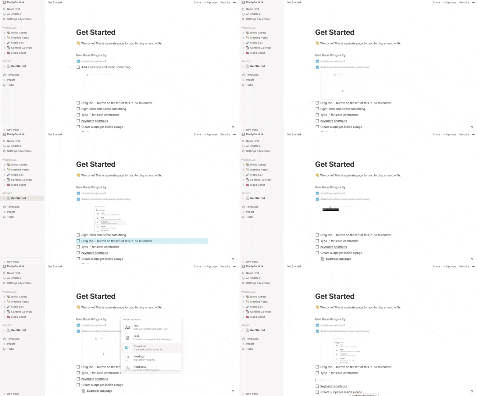
notion user onboarding experience get started document
Notion's great UX is made even better with effective onboarding.

Given the problem, the solution is pretty obvious: improve user onboarding now

But of course, there are a multitude of reasons why companies struggle to do this. One of those reasons—limited internal resources and long dev cycles—can be solved relatively easily through the use of a third-party tool, which we’ll explore more below.

Another common reason why companies fail to deliver the onboarding their users deserve is that they just don’t know where to start. This can be especially true for large enterprises and legacy software that wasn’t designed with a product-led experience in mind.
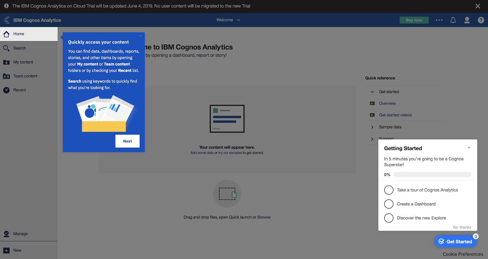
ibm cognos analytics user onboarding example made with appcues. an example of consumerized enterprise software
IBM’s Cognos Analytics is an enterprise experience that feels consumer-grade.

How to design better user onboarding in 3 steps

It just so happens that we have a lot of experience helping companies improve their user onboarding and activation rates (it’s sort of our thing). At the risk of oversimplifying, here are the 3 steps to designing an exceptional user onboarding experience:

1. Identify your product’s activation metric

Activation occurs when a user realizes the value of product first-hand—and your product’s activation event is the switch that turns the proverbial lightbulb on for your users. 

But in order to optimize for activation, you need to identify the moment when it occurs. To do this, you first need to map out the user journey. The key is to map backwards: Look at users who are already getting value from your product to find out what sets your retained users (aka your activated users) apart from the folks who churned. 
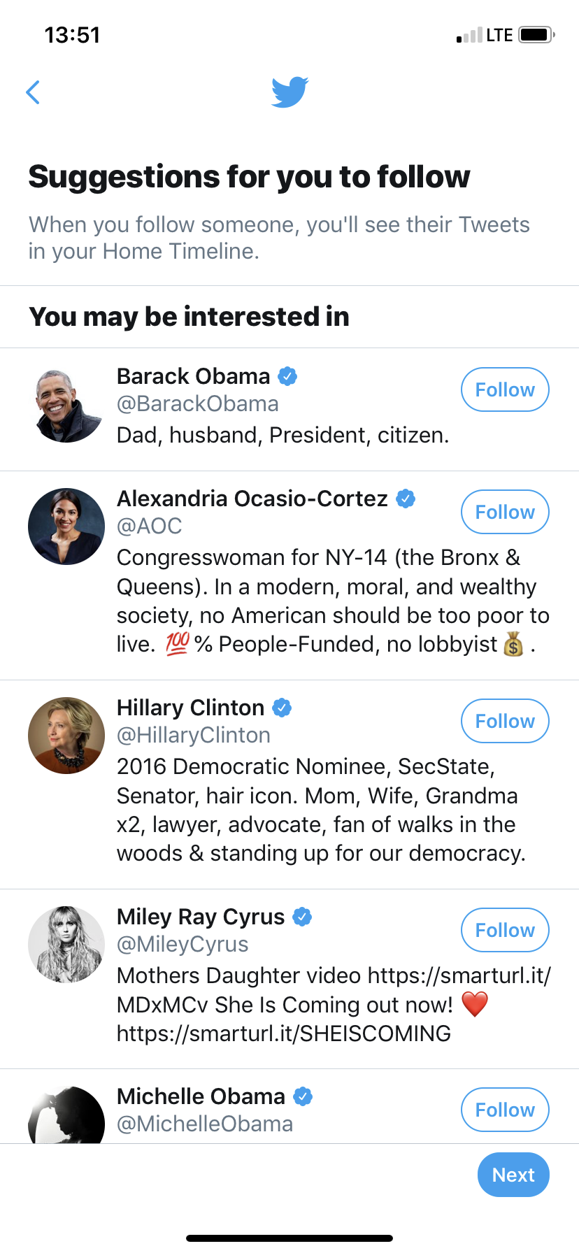
twitter user onboarding activation event 10 followers
Twitter defines an activated user as someone who follows 10 people

Use cohort analysis and product analytics and take note of the patterns in your behavioral data to identify the early, critical actions that retained users take within your product. Then, figure out how strongly these actions correlate with long-term customer retention.

Validate your hypothesis about which actions matter by talking to your users, observing their behavior with an analytics tools (like Heap, Mixpanel, or Amplitude), and leveraging the insights of your customer-facing team members. 

For a deep dive on identifying your activation metric, check out this guide.

2. Design onboarding around the aha moment

The aha moment is the moment when a user first realizes your product’s value for themselves—essentially, it’s how the activation event from the user’s side of the looking glass. Your goal should be to get users to that moment as quickly as possible. 

To do this, you should focus your onboarding on value, not features. In other words, show users how to do the thing that’s going to set the lightbulb off and make them realize how your product solves their most pressing problem. Don’t drag them through a tour of every single product feature, most of which they won’t need until several sessions down the line.

Also, declared data—whether that’s related to their job title, preferences, or goals—can and should be used to personalize the UX for each user. Personalization, especially when done through segmentation and targeting, allows you to deliver more relevant experiences, which resonate more deeply and speed up users’ time to aha.
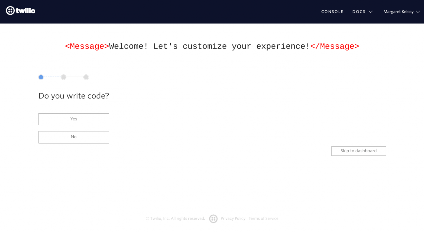
user onboarding personalization question example from twilio onboarding flow
Twilio uses information gathered during signup to deliver a more relevant user experience.

You can read all about getting users to their aha moment in this guide.

3. Experiment, analyze, and iterate to shorten time to value and reduce friction 

The thing about product design that nobody likes to admit? It’s never done. That product launch you celebrated? It may be the end of one project, but it’s the beginning of dozens of smaller ones. That’s because good UX is a product of frequent experimentation, analysis, and iteration.

In-app experiences aren’t set-it-and-forget-it affairs. Their impact needs to be monitored, measured, and adjusted to provide a user experience that can keep up as user needs and expectations evolve.

You should have a plan in place for how you are going to track and analyze your onboarding—as well as a process for making quick and frequent iterations to smooth out points of friction and continuously reduce time to value.

2. Good user onboarding reduces churn

Any company with a subscription-based model knows that with good retention rates, revenue compounds over time. The ugly flip side to that fact is that churn compounds over time, too. And the longer you wait to get your churn rates down, the harder it will be to recover.
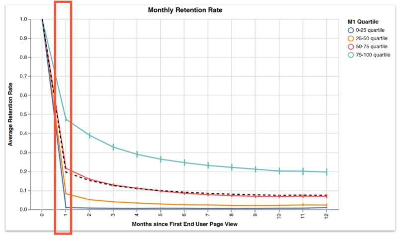
graph showing monthly retention rate for saas apps
In this study, we found that the top quartile of Appcues customers had retention rates 2X the industry average.

We’ve spoken to so many customer success managers who know that a bad customer experience destroys the chance of a renewal, while a positive early experience can set the tone for the entire customer relationship. These CSMs also understand that better onboarding speeds up product adoption, which in turn fuels ongoing user engagement and customer loyalty. The trouble is, the people closest to the customers have no control over changes to the product roadmap. 

The importance of cross-functional teams 

If you want to increase retention in the long-term (and of course you do), it’s not enough to perform triage when your support channels are flooded and important logos are dropping off your customer list. You need a solid strategy for churn prevention—starting from the very first interaction a user has with your product.

First and foremost, this involves establishing channels for cross-departmental communication and collaboration. 

That could mean moving some of your CSMs to the product pod to be a voice of the customer, creating cross-functional “squads” that meet regularly, or letting customer-facing team members have a direct role in creating and deploying in-app flows. There are myriad ways you can approach this, and there’s no one right way to break down silos in your company. The important thing is that you do it, one way or another.

Ongoing in-app engagement

Churn prevention also involves realizing that onboarding doesn’t (or shouldn’t) end after the first session, especially if you have a complex product. Learning is a process, and your user journey map should take into account how your regulars interact with different features or perform different tasks over time. 

Initial onboarding is for getting the basics down—it’s about that first aha moment. Once you’ve tackled that experience, it’s time to ask yourself: How can we keep our users learning? How do we continue to deliver new value once they’re in a routine?

The answer will look different for every product. Some ways to engage users, provide fresh value, and minimize churn are to:
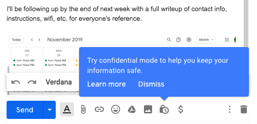
  1. Avoid information overload by introducing more advanced features or functionalities over time, as users explore the product on their own.
gmail tooltip introducing a new feature with behavioral targeting
Gmail introduces users to additional features as a need for them arises. This tooltip, for instance, appears when I user includes the word “password” in an email—and not before.
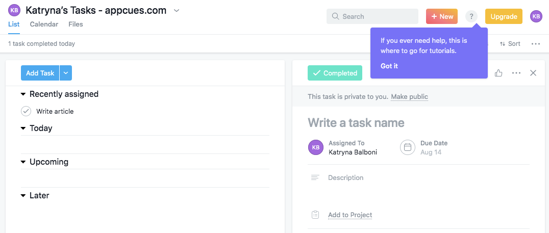
  1. Reduce support volume by using a tooltip or hotspot to call out self-serve help options and in-product guides.
asana self service help button in-app, which is pointed out by a purple tooltip
Asana concludes their onboarding tour by letting users know where they can go for help in the future.
  1. Reinforce your product’s value by utilizing data collected during onboarding to personalize communications and remind users about how your product is helping them reach their stated goals.
profitwell welcome modal that reinforces the core value propostion by reminding users of their goals
ProfitWell doesn’t beat around the bush—they tell users straight up that their growth goals selections during signup are being used to personalize their experience.
  1. Cure feature blindness and improve adoption by leveraging behavioral targeting and segmentation to nudge users toward an underused feature.
litmus made with appcus tooltip pointing out a new feature, with spotlighting
Litmus improved feature adoption by 22X by adding a simple tooltip.
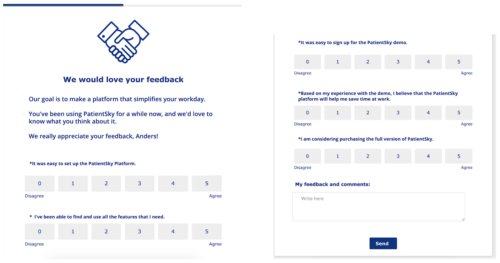
  1. Create a stronger feedback loop by incorporating user feedback forms and surveys into your product.
healthcare app in-product user survey csat ces score
PatientSky embedded a feedback form into a modal window to gather feedback from their regular users.

Yes, you can use email for most of those things (and should, when your emails are part of a considered omnichannel experience). But by sending the right message to the right person while they’re actually in your product provides an experience that even your strongest competitors can’t interrupt. 

Take advantage of your user’s undivided attention to provide instant value, introduce relevant functionality, or gather feedback. 

3. Code-less tools let your developers focus on your core UI

Your developers are busy. In the best case scenario, they’re juggling priorities and hustling to get the next exciting feature built. More likely, they’re also working on fixing something that broke in the last exciting feature. 

The point is, it can be hard to fit user onboarding into the roadmap. In fact, dev constraints are one of the most common justifications we hear for why companies are slow to move on onboarding. These constraints don’t lessen over time—as your product grows, so do the demands on engineers and developers.

The reason Appcues was built for nontechnical users was to remove this critical bottleneck and make it easy for marketing, customer success, support, and design to create and edit in-app experiences—without taking technical attention away from the core product. 

Note that we said edit: Onboarding and other in-app communications aren’t static parts of your product experience. They should change as your product changes, as company goals shift, and as user needs evolve over time. Using a third-party tool gives your nontechnical teams the autonomy to make updates quickly, without relying on a sprint cycle or unpredictable engineering timeframe.

For many companies, that kind of flexibility is a no-brainer. What’s more, it’s often far more cost-effective than building in-house. (Don’t take our word for it—you can use the User Onboarding Cost Calculator to do your own math.) 

Peter Reinhardt of Segment explains why companies should buy software whenever possible:

You should only be building your own tool if you've tried lots of others on the market and find that none of them will solve your problem. Only build if you’re left without a choice. And still take care: I’d estimate that 50% of the startups that I see build tools can’t maintain them.

Investing in product-led growth

Now, does all of this require some extra effort and collaboration across your teams? Sure it does. Does that effort pay dividends? Absolutely.

In our 2023 survey of 350 SaaS professionals, we learned that 97% are investing in delivering more product-led experiences. But that's not all, a whopping 88% of respondents believed delivering a product-led experience was crucial to competing and differentiating in the market.

Chart from Appcues 2023 Product-Led Experience Report showing off how important product-led experiences are to competing and differentiating

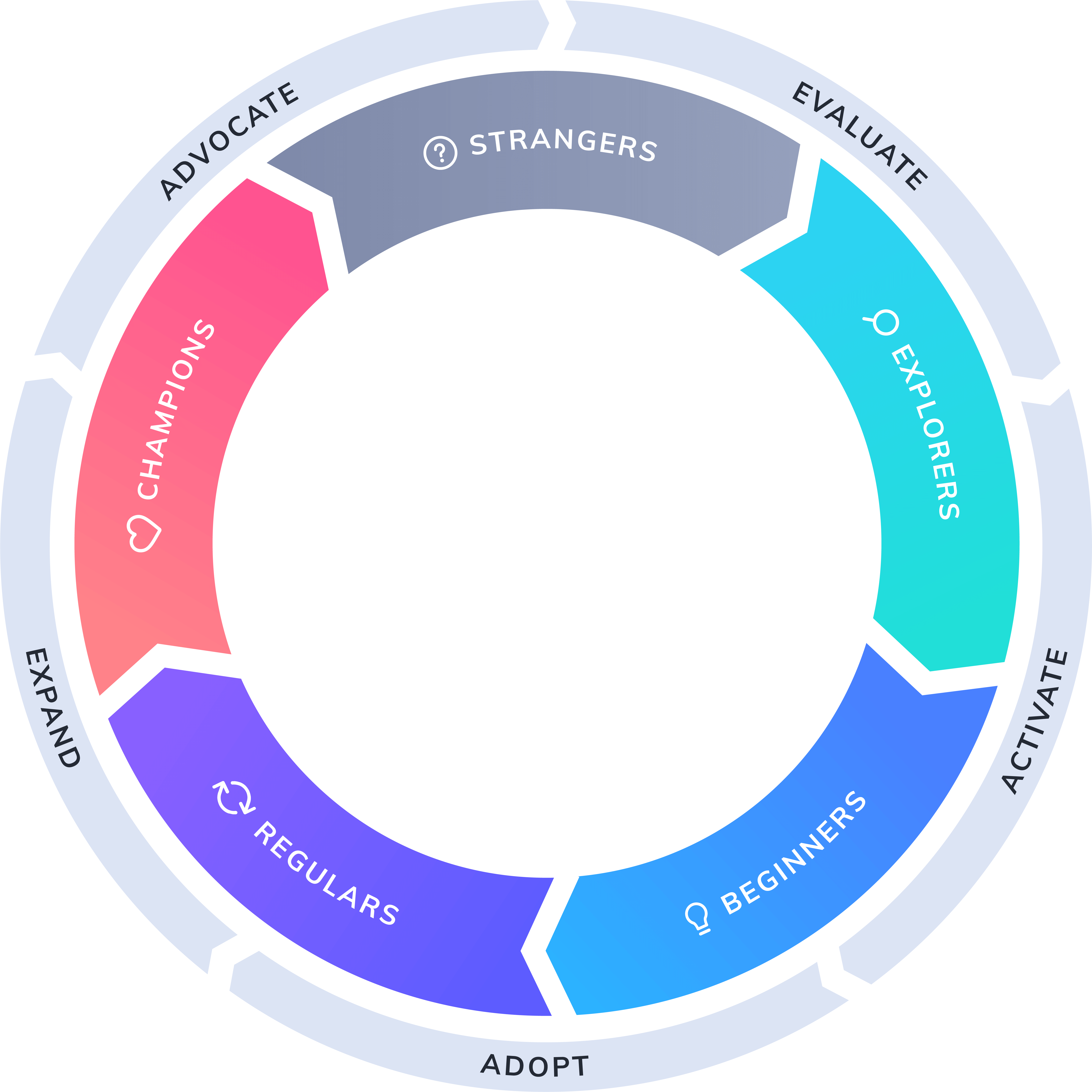
That’s because optimizing the first-time user experience has a long-lasting impact on the entire user journey. Better onboarding results in higher activation rates, which translates to more product adoption, improved retention, and increased advocacy from your loyal customers—all of which compounds over time for exponential growth. 

This cycle of UX-fed business growth is depicted in the Product-Led Growth Flywheel, a framework for growing your business by investing in a product-led user experience

product-led growth flywheel
(Hint: If you’re looking for a way to sell stakeholders on the importance of user onboarding, this framework is a great place to start!)

The fact is, many companies put off onboarding because it can seem like a big project with a long runway that takes ages to yield any results. But actually, you can reap huge gains from some surprisingly quick fixes. If you put onboarding off because it seems like an overwhelming project, you miss out on low-hanging fruit you could fix today. 

Ready to get started? Give Appcues a try (for free) or talk to a product specialist to find out if it’s right for your needs. 

Go to the ultimate guide to user onboarding. Discover user onboarding definitions, examples, best practices, and resources.


Frida Ottosson
Sales Manager at Appcues
Frida is the Sales Manager at Appcues. Originally from Sweden, she left Stockholm for Boston 4 years ago. When she’s not busy managing the sales team, you’ll find her fostering rescue dogs and road-tripping across the US.
Skip to section:

Skip to section:

User onboarding is the most important part of the user journey. 

No, really. We’re not just saying that because it’s a use case we solve for. We truly believe that all software deserves an exceptional onboarding experience—after all, your team has taken the time to design, develop, market, and sell your product. Why bungle the first impression and risk losing users at the word go?

The fact is, user onboarding should a top priority for any growth-minded SaaS company, whether the experience is built in-house or with Appcues. Or heck, even another third-party tool if it suits your needs better—if, for instance, you don’t care about having your flows look native to your product or you’re looking for a complete, self-contained business solution rather than a best-in-class platform that integrates with your current tech stack.

We won’t try to convince you to choose Appcues (you can make that decision for yourself by signing up for a free trial or talking to a product specialist). But we will tell you that you need to take a serious look at your user onboarding experience—and that you need to do so ASAP. 

It’s time to take it off the back burner, round up the troops, and make optimizing your onboarding UX a top priority.

Here’s why:

1. Better user onboarding helps you get ahead of the competition 

We’ve started hearing it more often: “We’re trying to keep up with the competition."

That’s what people tell us when we ask why they’re considering Appcues. Or, more broadly, why they’re looking for a third-party tool to help them build and iterate on their onboarding. 

And while in-app engagement should continue long after users are onboarded, the early stages of the user journey are especially high-stakes—for both the user and your company. Think about a time when you signed up for a free trial or a product, didn’t see the immediate value— and then quickly churned without ever looking back. 

Without effective user onboarding, your users could be experiencing similar frustrations. And a frustrating experience with your product is a boon for your competitors. 

High drop-off rates after signup, low free-to-paid conversion, a large volume of support tickets—all of these can be caused by a poorly designed onboarding experience (or a complete lack thereof). And yes, even great UX needs user onboarding.

notion user onboarding experience get started document
Notion's great UX is made even better with effective onboarding.

Given the problem, the solution is pretty obvious: improve user onboarding now

But of course, there are a multitude of reasons why companies struggle to do this. One of those reasons—limited internal resources and long dev cycles—can be solved relatively easily through the use of a third-party tool, which we’ll explore more below.

Another common reason why companies fail to deliver the onboarding their users deserve is that they just don’t know where to start. This can be especially true for large enterprises and legacy software that wasn’t designed with a product-led experience in mind.

ibm cognos analytics user onboarding example made with appcues. an example of consumerized enterprise software
IBM’s Cognos Analytics is an enterprise experience that feels consumer-grade.

How to design better user onboarding in 3 steps

It just so happens that we have a lot of experience helping companies improve their user onboarding and activation rates (it’s sort of our thing). At the risk of oversimplifying, here are the 3 steps to designing an exceptional user onboarding experience:

1. Identify your product’s activation metric

Activation occurs when a user realizes the value of product first-hand—and your product’s activation event is the switch that turns the proverbial lightbulb on for your users. 

But in order to optimize for activation, you need to identify the moment when it occurs. To do this, you first need to map out the user journey. The key is to map backwards: Look at users who are already getting value from your product to find out what sets your retained users (aka your activated users) apart from the folks who churned. 

twitter user onboarding activation event 10 followers
Twitter defines an activated user as someone who follows 10 people

Use cohort analysis and product analytics and take note of the patterns in your behavioral data to identify the early, critical actions that retained users take within your product. Then, figure out how strongly these actions correlate with long-term customer retention.

Validate your hypothesis about which actions matter by talking to your users, observing their behavior with an analytics tools (like Heap, Mixpanel, or Amplitude), and leveraging the insights of your customer-facing team members. 

For a deep dive on identifying your activation metric, check out this guide.

2. Design onboarding around the aha moment

The aha moment is the moment when a user first realizes your product’s value for themselves—essentially, it’s how the activation event from the user’s side of the looking glass. Your goal should be to get users to that moment as quickly as possible. 

To do this, you should focus your onboarding on value, not features. In other words, show users how to do the thing that’s going to set the lightbulb off and make them realize how your product solves their most pressing problem. Don’t drag them through a tour of every single product feature, most of which they won’t need until several sessions down the line.

Also, declared data—whether that’s related to their job title, preferences, or goals—can and should be used to personalize the UX for each user. Personalization, especially when done through segmentation and targeting, allows you to deliver more relevant experiences, which resonate more deeply and speed up users’ time to aha.

user onboarding personalization question example from twilio onboarding flow
Twilio uses information gathered during signup to deliver a more relevant user experience.

You can read all about getting users to their aha moment in this guide.

3. Experiment, analyze, and iterate to shorten time to value and reduce friction 

The thing about product design that nobody likes to admit? It’s never done. That product launch you celebrated? It may be the end of one project, but it’s the beginning of dozens of smaller ones. That’s because good UX is a product of frequent experimentation, analysis, and iteration.

In-app experiences aren’t set-it-and-forget-it affairs. Their impact needs to be monitored, measured, and adjusted to provide a user experience that can keep up as user needs and expectations evolve.

You should have a plan in place for how you are going to track and analyze your onboarding—as well as a process for making quick and frequent iterations to smooth out points of friction and continuously reduce time to value.

2. Good user onboarding reduces churn

Any company with a subscription-based model knows that with good retention rates, revenue compounds over time. The ugly flip side to that fact is that churn compounds over time, too. And the longer you wait to get your churn rates down, the harder it will be to recover.

graph showing monthly retention rate for saas apps
In this study, we found that the top quartile of Appcues customers had retention rates 2X the industry average.

We’ve spoken to so many customer success managers who know that a bad customer experience destroys the chance of a renewal, while a positive early experience can set the tone for the entire customer relationship. These CSMs also understand that better onboarding speeds up product adoption, which in turn fuels ongoing user engagement and customer loyalty. The trouble is, the people closest to the customers have no control over changes to the product roadmap. 

The importance of cross-functional teams 

If you want to increase retention in the long-term (and of course you do), it’s not enough to perform triage when your support channels are flooded and important logos are dropping off your customer list. You need a solid strategy for churn prevention—starting from the very first interaction a user has with your product.

First and foremost, this involves establishing channels for cross-departmental communication and collaboration. 

That could mean moving some of your CSMs to the product pod to be a voice of the customer, creating cross-functional “squads” that meet regularly, or letting customer-facing team members have a direct role in creating and deploying in-app flows. There are myriad ways you can approach this, and there’s no one right way to break down silos in your company. The important thing is that you do it, one way or another.

Ongoing in-app engagement

Churn prevention also involves realizing that onboarding doesn’t (or shouldn’t) end after the first session, especially if you have a complex product. Learning is a process, and your user journey map should take into account how your regulars interact with different features or perform different tasks over time. 

Initial onboarding is for getting the basics down—it’s about that first aha moment. Once you’ve tackled that experience, it’s time to ask yourself: How can we keep our users learning? How do we continue to deliver new value once they’re in a routine?

The answer will look different for every product. Some ways to engage users, provide fresh value, and minimize churn are to:
  1. Avoid information overload by introducing more advanced features or functionalities over time, as users explore the product on their own.
gmail tooltip introducing a new feature with behavioral targeting
Gmail introduces users to additional features as a need for them arises. This tooltip, for instance, appears when I user includes the word “password” in an email—and not before.
  1. Reduce support volume by using a tooltip or hotspot to call out self-serve help options and in-product guides.
asana self service help button in-app, which is pointed out by a purple tooltip
Asana concludes their onboarding tour by letting users know where they can go for help in the future.
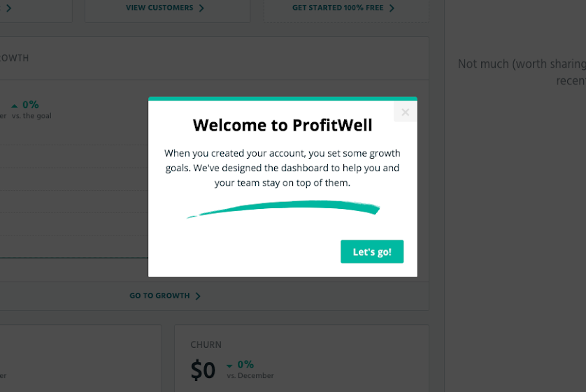
  1. Reinforce your product’s value by utilizing data collected during onboarding to personalize communications and remind users about how your product is helping them reach their stated goals.
profitwell welcome modal that reinforces the core value propostion by reminding users of their goals
ProfitWell doesn’t beat around the bush—they tell users straight up that their growth goals selections during signup are being used to personalize their experience.
  1. Cure feature blindness and improve adoption by leveraging behavioral targeting and segmentation to nudge users toward an underused feature.
litmus made with appcus tooltip pointing out a new feature, with spotlighting
Litmus improved feature adoption by 22X by adding a simple tooltip.
  1. Create a stronger feedback loop by incorporating user feedback forms and surveys into your product.
healthcare app in-product user survey csat ces score
PatientSky embedded a feedback form into a modal window to gather feedback from their regular users.

Yes, you can use email for most of those things (and should, when your emails are part of a considered omnichannel experience). But by sending the right message to the right person while they’re actually in your product provides an experience that even your strongest competitors can’t interrupt. 

Take advantage of your user’s undivided attention to provide instant value, introduce relevant functionality, or gather feedback. 

3. Code-less tools let your developers focus on your core UI

Your developers are busy. In the best case scenario, they’re juggling priorities and hustling to get the next exciting feature built. More likely, they’re also working on fixing something that broke in the last exciting feature. 

The point is, it can be hard to fit user onboarding into the roadmap. In fact, dev constraints are one of the most common justifications we hear for why companies are slow to move on onboarding. These constraints don’t lessen over time—as your product grows, so do the demands on engineers and developers.

The reason Appcues was built for nontechnical users was to remove this critical bottleneck and make it easy for marketing, customer success, support, and design to create and edit in-app experiences—without taking technical attention away from the core product. 

Note that we said edit: Onboarding and other in-app communications aren’t static parts of your product experience. They should change as your product changes, as company goals shift, and as user needs evolve over time. Using a third-party tool gives your nontechnical teams the autonomy to make updates quickly, without relying on a sprint cycle or unpredictable engineering timeframe.

For many companies, that kind of flexibility is a no-brainer. What’s more, it’s often far more cost-effective than building in-house. (Don’t take our word for it—you can use the User Onboarding Cost Calculator to do your own math.) 

Peter Reinhardt of Segment explains why companies should buy software whenever possible:

You should only be building your own tool if you've tried lots of others on the market and find that none of them will solve your problem. Only build if you’re left without a choice. And still take care: I’d estimate that 50% of the startups that I see build tools can’t maintain them.

Investing in product-led growth

Now, does all of this require some extra effort and collaboration across your teams? Sure it does. Does that effort pay dividends? Absolutely.

In our 2023 survey of 350 SaaS professionals, we learned that 97% are investing in delivering more product-led experiences. But that's not all, a whopping 88% of respondents believed delivering a product-led experience was crucial to competing and differentiating in the market.
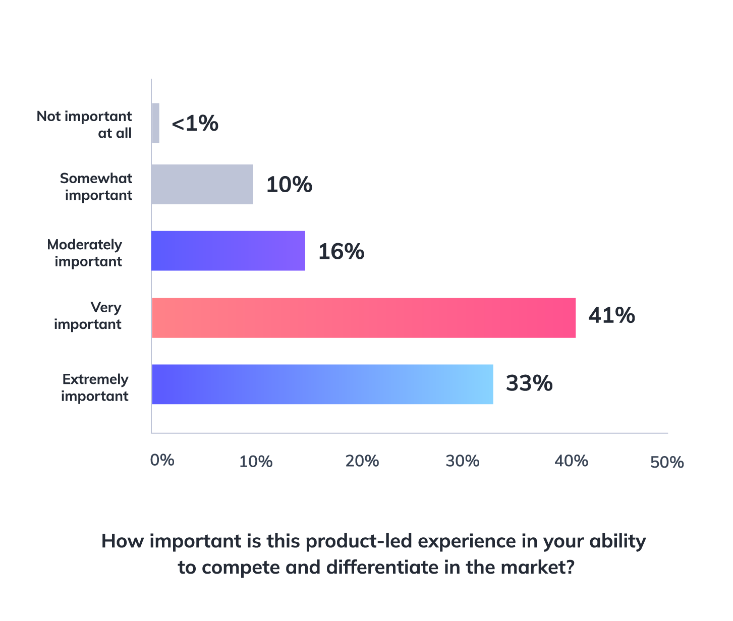
Chart from Appcues 2023 Product-Led Experience Report showing off how important product-led experiences are to competing and differentiating

That’s because optimizing the first-time user experience has a long-lasting impact on the entire user journey. Better onboarding results in higher activation rates, which translates to more product adoption, improved retention, and increased advocacy from your loyal customers—all of which compounds over time for exponential growth. 

This cycle of UX-fed business growth is depicted in the Product-Led Growth Flywheel, a framework for growing your business by investing in a product-led user experience

product-led growth flywheel
(Hint: If you’re looking for a way to sell stakeholders on the importance of user onboarding, this framework is a great place to start!)

The fact is, many companies put off onboarding because it can seem like a big project with a long runway that takes ages to yield any results. But actually, you can reap huge gains from some surprisingly quick fixes. If you put onboarding off because it seems like an overwhelming project, you miss out on low-hanging fruit you could fix today. 

Ready to get started? Give Appcues a try (for free) or talk to a product specialist to find out if it’s right for your needs. 
Go to the ultimate guide to user onboarding. Discover user onboarding definitions, examples, best practices, and resources.


Frida Ottosson
Sales Manager at Appcues
Frida is the Sales Manager at Appcues. Originally from Sweden, she left Stockholm for Boston 4 years ago. When she’s not busy managing the sales team, you’ll find her fostering rescue dogs and road-tripping across the US.
You might also like...