Don't onboard users like they're customers

.png)

.png)
The value of products no longer gets locked behind iron-clad paywalls.
SaaS is a buyers' market in which users expect to be able to try before they buy. More and more companies have had to lead their sales process with a free trial to demonstrate the worth of their service and tempt users to buy.
But users are fickle, and why wouldn't they be? They can hire and fire products without a second thought—the next product is only one browser tab away.
It's hyper-competitive, fast-paced, and ruthless.
To survive, businesses must figure out how to produce engaged customers and sustainable acquisition rates from their “free trials.” They understand the only way to do this is with a well-thought-out onboarding flow because it is the most crucial part of the customer journey.
Still, many businesses are making the same onboarding blunder.
They're treating their users as their customers. And there is a distinct difference.
Users are not customers. Yet.
They differ in approach, ownership, and the way you should onboard them.
Everyone automatically categorizes and generalizes all the time—it's a necessity for us to function. Our brains simply cannot process the natural variability of the world.
But automatic categorization is dangerous. It makes us mistakenly group things together, like users and customers, that are truly different. It distorts the way we view the people who use our products and consequently our thoughts, actions, and the way we onboard them.
Yes, we counteract our auto-categorization instinct with carefully designed segments, cohorts, and persona, but the dilemma we're discussing goes back to the basics.
The problem is the terms: users and customers get used interchangeably when in fact they are distinctly different. No, this is not pedantic. It is essential to the success of your product.
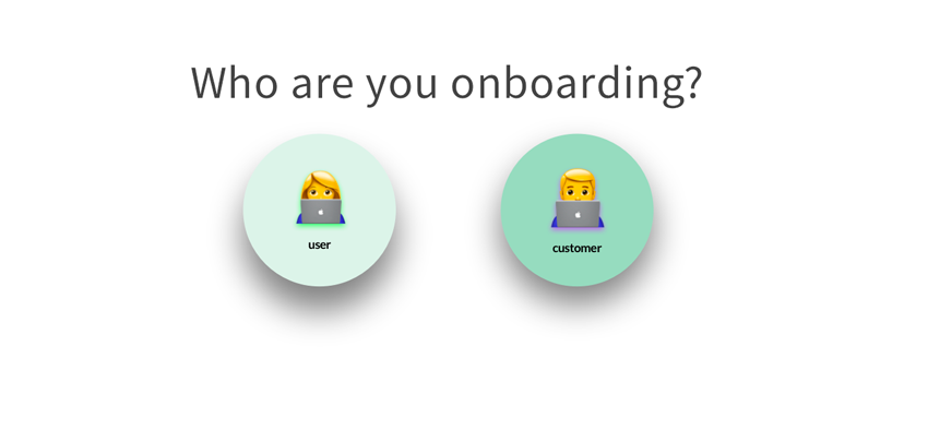
Think about it. The situations of the user and customer are entirely different. Their motivations are different. Their abilities are different. When you look at it, they're on the opposite ends of the scale.
Users don't have the time and patience to consume everything about your product. They'll cozy up with the first tool that shows them progress, outcome, and value with ease.
But customers need more. Left unsupervised, they will stagnate and churn. You need to keep them moving forward with your product or they'll start to look elsewhere for their next aha moment.
Thus, onboarding users like customers, and vice versa, is not a smart thing to do.
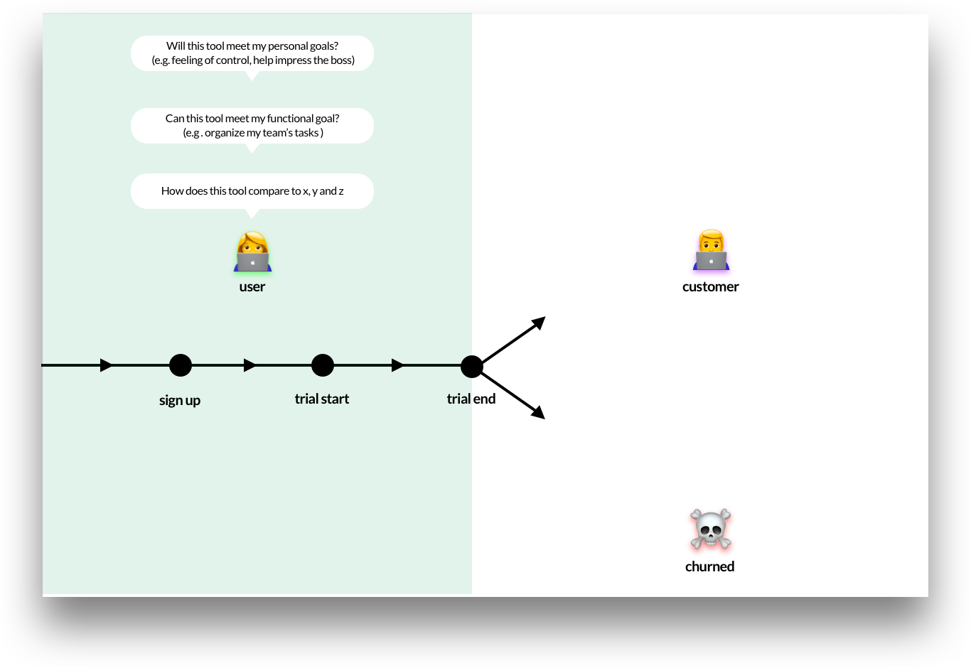
A user is a person using a product at no charge. Think of SaaS free trials, freemium services—where more advanced features must be paid for—and the likes of social media, webmail, and search.
To focus on SaaS: users discover your product and come to your website for a variety of reasons. It might be because of a budget change, a change in management, or they want to consolidate multiple tools into a single one. It's difficult to plan for all of these scenarios, but the one thing they will share is the jobs they need to get done (JTBD).
This is important to understand because users simply want to progress towards their goals. And, the reality is, they don't want your tool. What they want is the outcome it delivers.
The JTBD concept forces you to think about the higher purpose of your product—beyond the UI, functions, and features.
This higher purpose is all that matters to users, so you need to onboard them in a way that lets them see this outcome for themselves.
But remember, your product is not experienced in a vacuum. It's experienced alongside every other tool, service, and idea fighting for your user's attention.
For that reason, you need to coax users to your product's outcome at a brisk tempo, with value baked in at every step. The onboarding flows that win, and convert a user into a customer, are the ones that race towards the all-important “aha” or “wow” moment.
This moment is the point in the trial when your user suddenly sees the benefit of your product's outcomes, and they say to themselves “This is great!” This is the point where your product makes the conversion.
The product team owns the user because they know the product inside-out. Product teams spend hours with users, understanding their emotions and needs to get to the bottom of their users' Jobs to Be Done. From here, they're in the best place to design the most direct onboarding route to value and outcome.
For any SaaS company to grow, they first need to do one thing: increase the number of new users. They need to fill the top of the funnel with people who can use the product, so they're available to be converted to a customer further down the line. The product team has a big responsibility measured by adoption and product engagement.
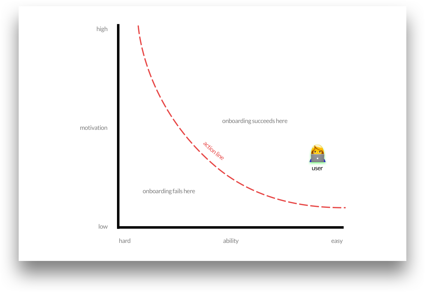
To design for the user, you need to understand their situation, motivation, and abilities.
One way to help you do this is by taking the Fogg Behavior Model (FBM) and applying it to onboarding because when you boil it down, onboarding is mostly about changing the user's behavior: the user is frustrated with their current way of working and is hoping your way is better. You need to show them a path to success.
Onboarding strives to make this behavioral transfer a successful one for as many users as possible.
The FBM shows that three elements must converge at the same time for a behavior to occur: motivation, ability, and the onboarding trigger. This means to get users to adopt your tool, your user onboarding needs to do three things:
When onboarding users, you want to give them a sense of what progress, outcome, and success look like with your tool as soon as you can.
Duolingo, a language-learning platform, is a perfect example of how this can be done. The context is likely to differ from your product, but the point still remains. Their onboarding flow gives the user confidence, value, and makes them feel smart.
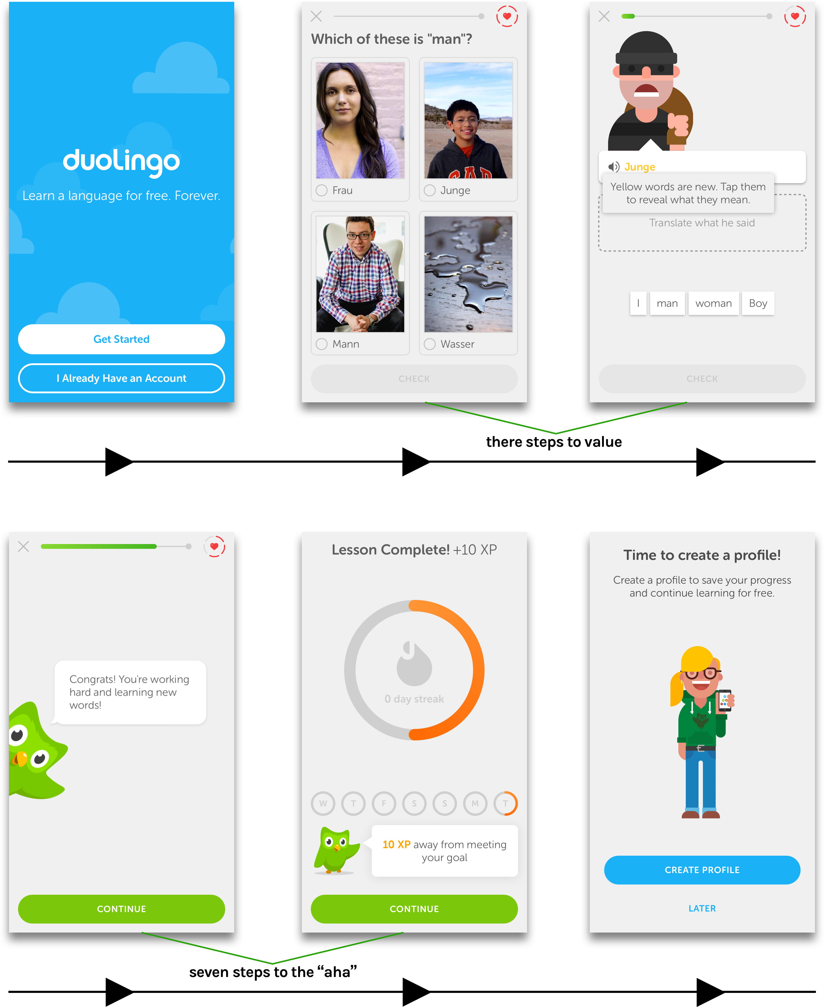
Duolingo postpones all of the typical tedious steps: name, email, password, “sign up for our newsletter.” Their goal is to nurture whatever motivation the user has and amplify it by getting to the outcome as soon as possible.
In three steps, the user is already learning by doing. Contextual coach marks eliminate any sticking points to let the user progress at speed. And positive reinforcement—linked to the JTBD—is delivered at regular intervals.
In less than three minutes the user has learned something new, they feel empowered, and they understand the value that Duolingo can deliver.
Your onboarding flow, like Duolingo, should only incorporate the vital few elements essential to delivering the value of your product. Each additional step, requirement, and bit of information that's not tightly linked to the user's JTBD will increase the risk of user abandonment.
Your onboarding needs to capitalize on the time, motivation, and ability the user has available to give you. The front-loading of information that often comes with customer onboarding should be reserved for just that. This granularity and depth of how to make the most of the tool should come later.

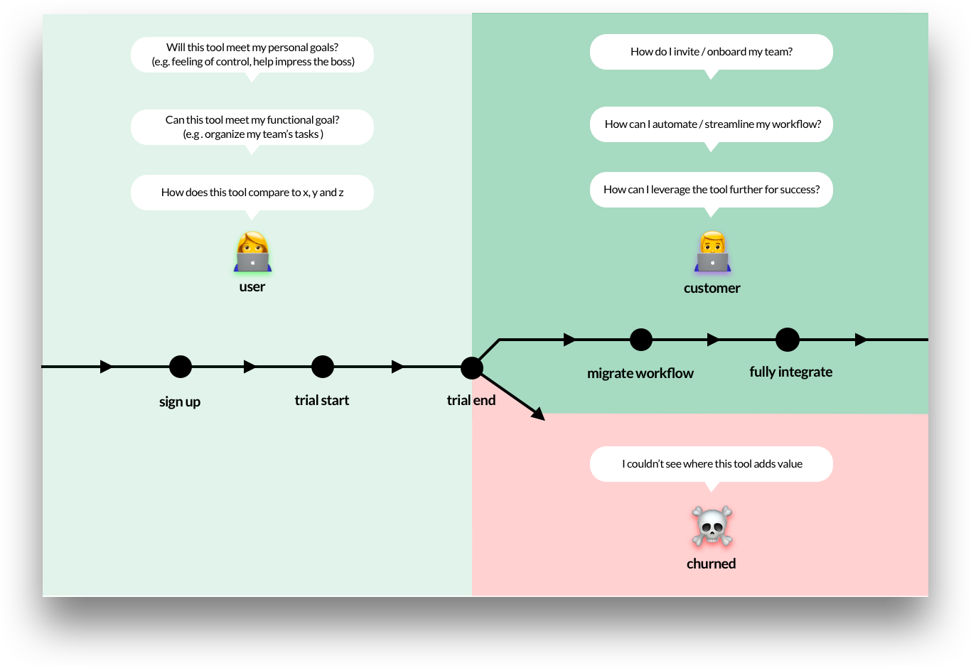
A customer, by definition, is a person who pays to use your tool. They've become your customer because you've onboarded them successfully—they saw and understood the value of what your product can deliver. And now they want more.
When products require payment up front, the prospect bypasses the user phase and immediately becomes a customer. Value and outcome get realized through product demos and walkthroughs. Customers recoup the experience lost in a free trial with early customer support and training.
Regardless of the B2B or B2C route, they have both paid and are raring to go. They are now customers.
The act of payment is a signal of trust. It's at this point the customer wants to give you more of their time and attention. In return, they want more of the value they've previously experienced. They're now committed to providing this relationship a try.
Consequently, a customer's motivation is considerably higher than that of a user's, and this means you can turn the complexity of your onboarding up. Now is the time to unleash the full capabilities of your tool to improve retention and create lasting relationships.
But don't forget. With financial expenses comes higher expectations. If you don't help your customers reach their successful outcomes consistently, and build upon the value of your product, customers are likely to churn.
Customer complacency is a common mistake—you can't leave a customer to their own devices. You need to design your onboarding for the long haul.
Once a user crosses the conversion bridge to customer territory, the responsibility baton is handed to, most commonly, customer success and account management teams, and success is evaluated on customer or revenue churn.
The overall goal is to make the customer as successful as possible, which, in turn, improves the customer lifetime value.
But in order to have the best onboarding experience, your teams need to work closely to ensure the user has a seamless transition. User onboarding and customer onboarding need to be designed on a singular, continuous path to ensure the momentum keeps going.
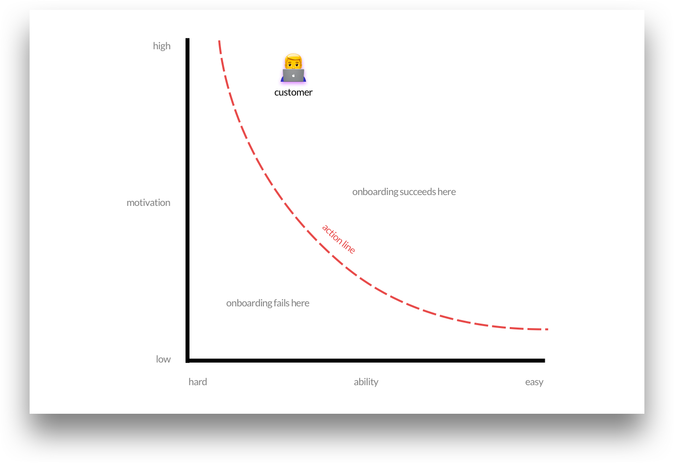
Plotting the customer on the Fogg Behavior Model puts them in a very different position than the user, which warrants a very different onboarding design.
And the goal posts move too. You want to increase the intensity or duration of their behavior with your products. Because when you get a customer deeply engaged, there's minimal risk of churn.
To increase customer engagement with your tool, your customer onboarding needs to do three things.
Sketch is a UI design tool that is very popular with designers and has been for a very long time now. It provides some solid inspiration for long-term customer onboarding.
Because Sketch is inherently more complicated than Duolingo, for example, the customer onboarding has to be on point to cultivate the long-lasting relationships that have been critical to its success to date.
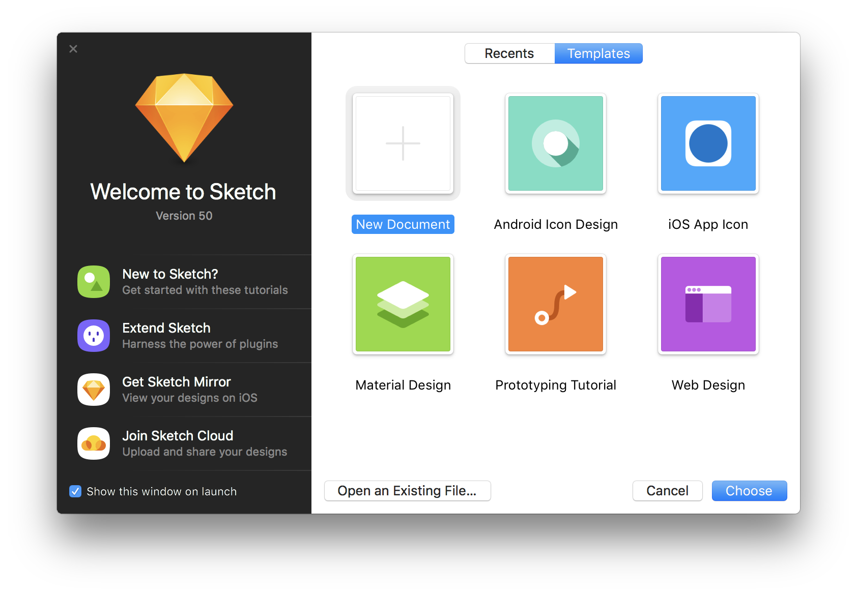
Every time you open Sketch, you're greeted with the same welcome modal. And this is the epicenter of their long-term onboarding. It's unobtrusive, but it's packed full of value. The content here acts as the portal to the “scaffolding” content for further customer development and is frequently updated with tutorials on new features.
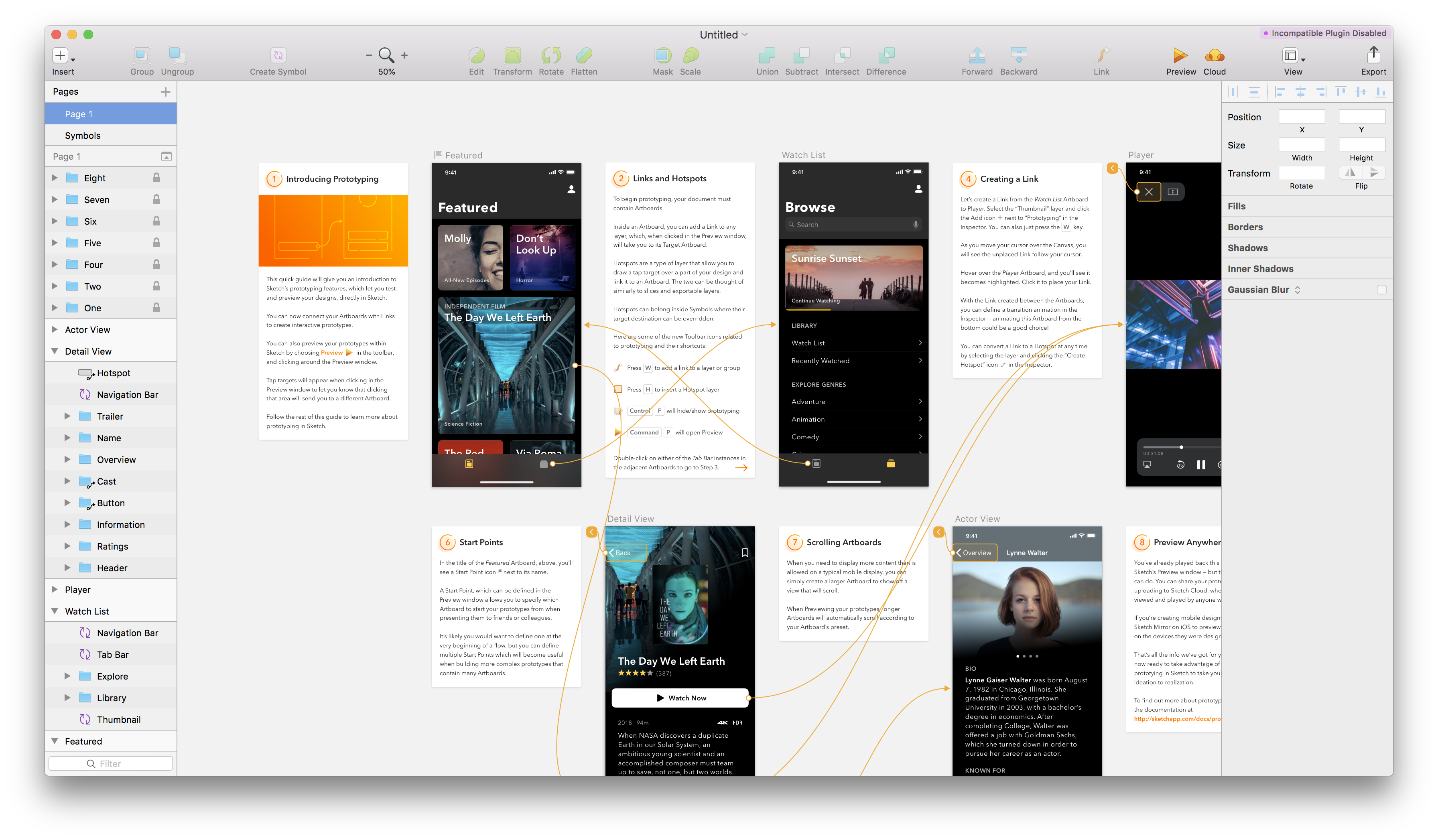
When Sketch launches a new feature, the onboarding starts with the outcome and then works backward. The “wow” moment leads to boost motivation, and then because customers already have an underlying mental model of how Sketch works, they can decipher the new feature themselves in their preferred way. Customers get hands-on immediately so they can learn much quicker by doing.
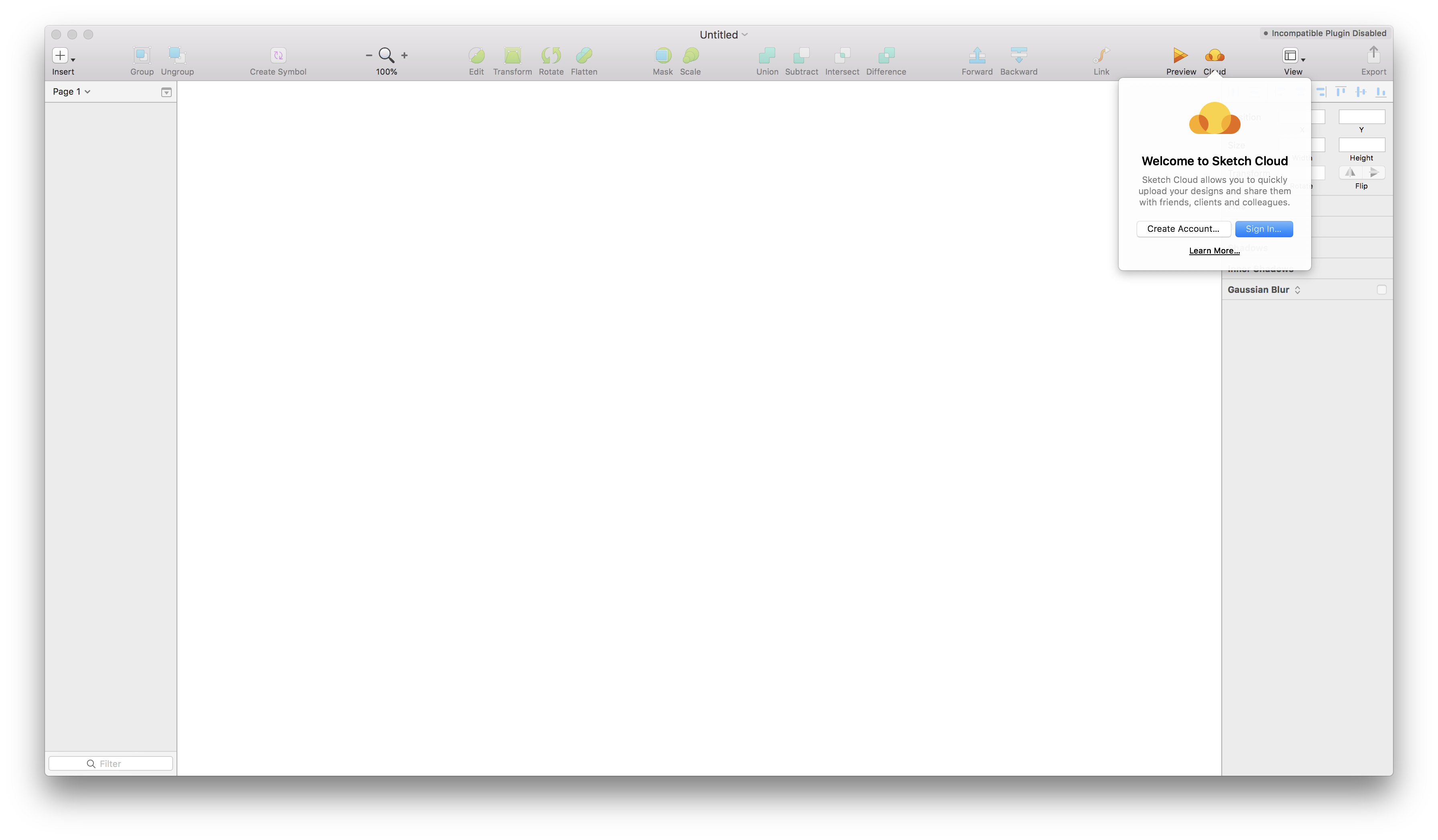
To reach the less pro-active users, Sketch reaches out with subtle tooltips to highlight new tools and features in the interface so that customers can pick them up at their leisure. The example above does just enough to grab the customer's attention and explain the new feature's value.
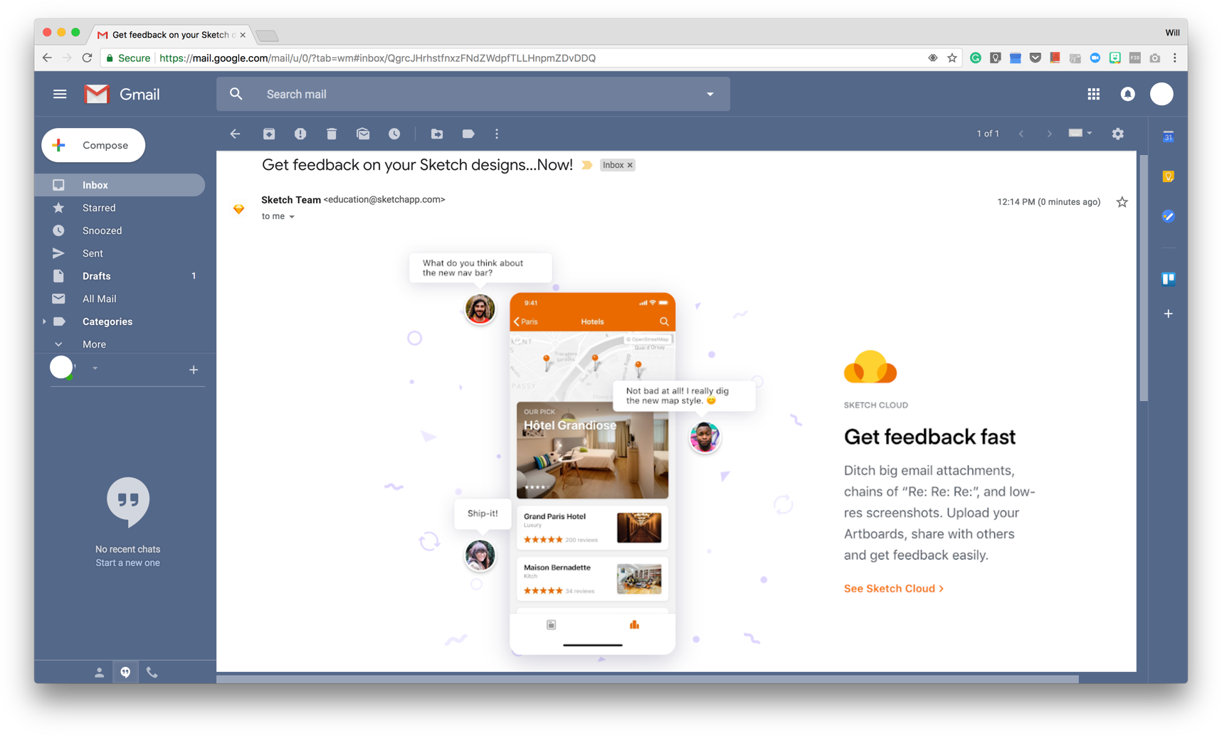
Every month the Sketch newsletter touches base with news, tips, and ideas to ensure customers are always progressing. These friendly check-ins ensure all customers, including ones who've been inactive, are kept in the loop. The one-per-month newsletter cadence keeps Sketch front of mind for all of their customers, while not cluttering their inbox. It does just enough, at the right time.
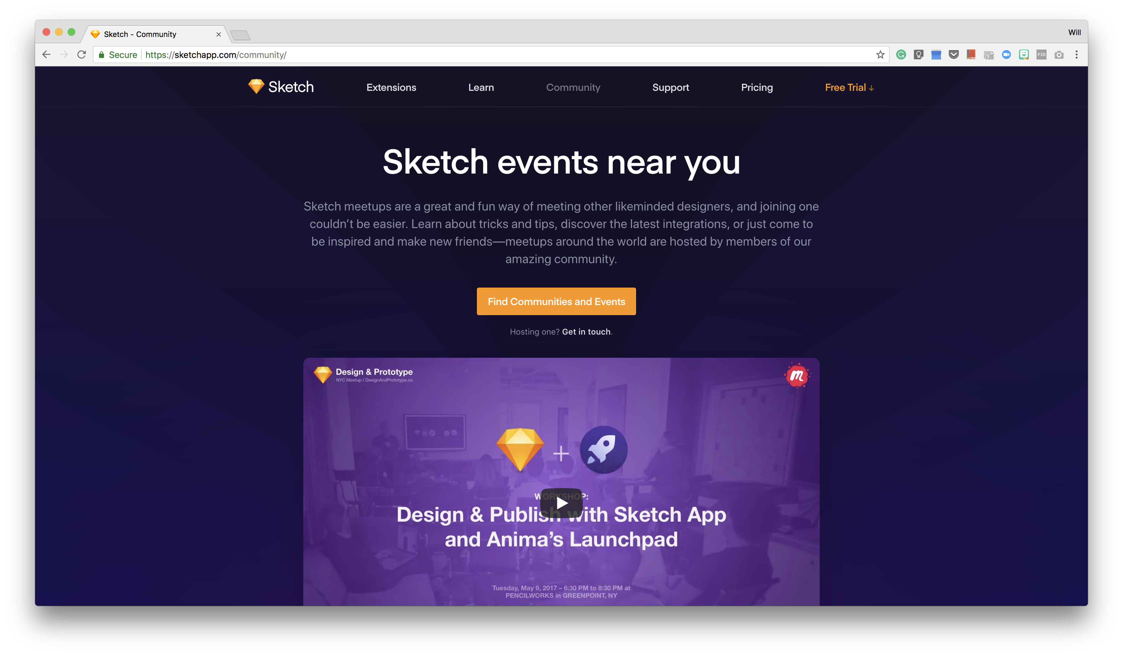
On their website, customers can find all design documentation, extensions, and community events. The content is deep and broad and offers the resources needed for customers to personalize their long-term onboarding for their specific needs.
Sketch shows customer onboarding is multifaceted, and it will differ depending on context. It's a lot more robust than user onboarding, which has to be lightweight to succeed.
But, as it's roughly five times more expensive to get a new user through the door than to keep an existing one, it is essential you build longevity like this into your customer onboarding.
User and customer onboarding are a lot like managing real-life relationships: you don't talk to strangers like they're a long-term friend.
People make connections easier when their first impressions are on point. They hit it off when they are on the same page; it's how instant connections are made. Relationships don't blossom when people are “difficult to read” and “over the top” on the first encounter.
But over time, people's best friends are the ones who consistently check in and continually provide value without them having to ask.
You first need to evaluate your users and customers to understand their differences. From here, design for them individually and bridge the user-to-customer conversion gap seamlessly.
This way, you will turn many more users into customers, and you will be able to retain those customers for the long run.
