← Visit Appcues.com
×
×

5 compelling user referral campaign examples

Jumpstart your user referral engine with these 5 approaches to referral campaigns from popular apps.
Skip to section:

Skip to section:

Think about the purchases you’ve made within the past year. How many were influenced by a recommendation? Research shows consumers are 4x more likely to make a purchase from a company recommended by a friend. This shouldn’t surprise anyone, as it’s human nature to trust the judgement of people we know far beyond even the cleverest of advertisements. 

For these reasons, customer referrals are arguably the most valuable form of marketing. They provide brands with high-quality leads already primed for conversion at a fraction of the cost of traditional marketing. A recent study conducted by Nielsen highlights even more compelling reasons to focus efforts on referral marketing:

  • 28% of millennials say they won't try a product if their friends don't approve of it.
  • Word of mouth is the primary factor behind 20-50% of purchasing decisions.
  • Customers acquired through referrals have a 37% higher retention rate and 81% of consumers are more likely to engage with brands that have reward programs.

Let’s explore exactly what you need to do to turn your customer referral program into a powerful conversion engine.

How to create a successful user referral program

A successful referral program requires 2 things:

  1. A product worthy of referring
  2. An uncomplicated referral process

Let’s assume you’ve already spent time iterating and optimizing your product and have strived for a first-class user experience. (If you need help in that department, check out ReallyGoodUX for tips and inspiration). 

That leaves us focused on the uncomplicated referral process

You want to make it as easy as possible for users to refer your product to friends and family.  To do this, you need to:

  • Target power users: People who have already extracted value from your product are most likely to refer it to friends. Don’t confuse and annoy new users with referral requests. Instead, focus your strategy on turning power users into influencers for your brand. 
  • Incentivize: Users are far more likely to oblige if there’s something in it for them. Attach an offer to your referral request to boost its success rate by upwards of 50%.
  • Use strategic placement: Since referrals are so important, you want to keep them top of mind without overshadowing your UX. Spend time considering the right placement of referral requests throughout your marketing materials to ensure you strike the right balance.

5 in-app user referral campaign examples

Now that you have the strategy down, let’s learn from the best by taking a look at real-life examples of some flawless referral requests:

1. Airbnb’s cross-channel invite campaign 

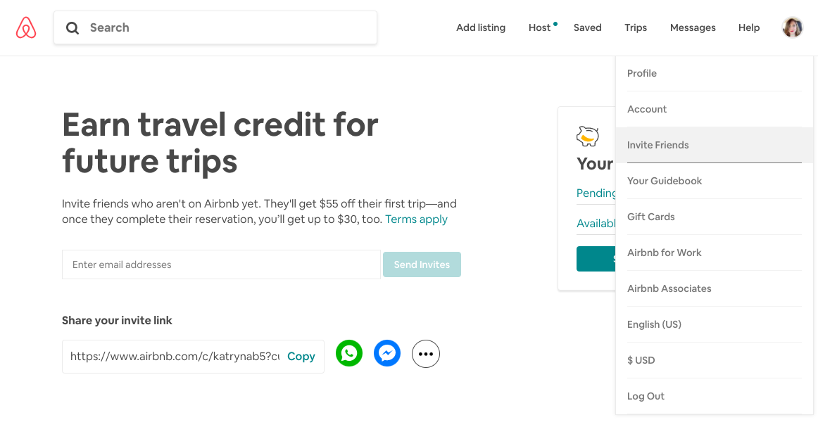
Airbnb recognizes the importance of referrals, which is why they strategized a cross-channel campaign to target their power users. 
airbnb user referral campaign invite friend

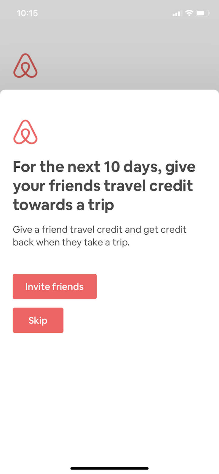
On desktop, the referral request in the dropdown is subtle; users are left to discover that opportunity on their own. On mobile, however, Airbnb used a fullscreen modal to create a sense of urgency, and even putting a 10-day timestamp on the deal.
airbnb mobile app invite user referral campaign

Airbnb’s strategy highlights the importance of having a cross-channel referral program strategy that takes into consideration how the message needs to adapt for each platform. 

2. Acorns straightforward referral prompt

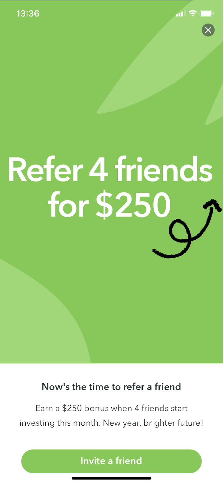
Fintech app Acorns' referral request is simple yet effective. The full-screen mobile modal grabs the user’s attention with its straightforward appeal—refer 4 friends and get $250. Who doesn’t want $250?
acorns user referral marketing campaign example


Acorn combines the compelling offer with a time limit (“this month”) so users know to get a jump on it. Finally, the CTA makes it exceedingly easy to complete the referral process and collect their prize.       

3. 12min’s free subscription offer

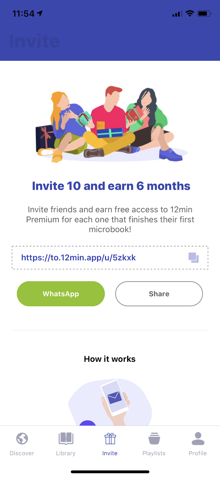
12min chose to make referral a standard feature of their app experience. The “invite” section is at the center of their navigation bar and there’s a whole page highlighting the benefits users get for referring their friends. 
12min integrated user referral campaign

By including an easy-to-copy referral link and combining it with multiple share CTAs breaks down all barriers to spreading the word.

3. Ritual’s email offer

Ritual (the multivitamin company you've seen all over Instagram) does a clever job at working their referral offer right into their email template. This is effective because it gives customers ample opportunities to capitalize on the offer. Perhaps they weren’t ready the first time they saw it, but the subtle reminders over time are sure to have a positive impact.
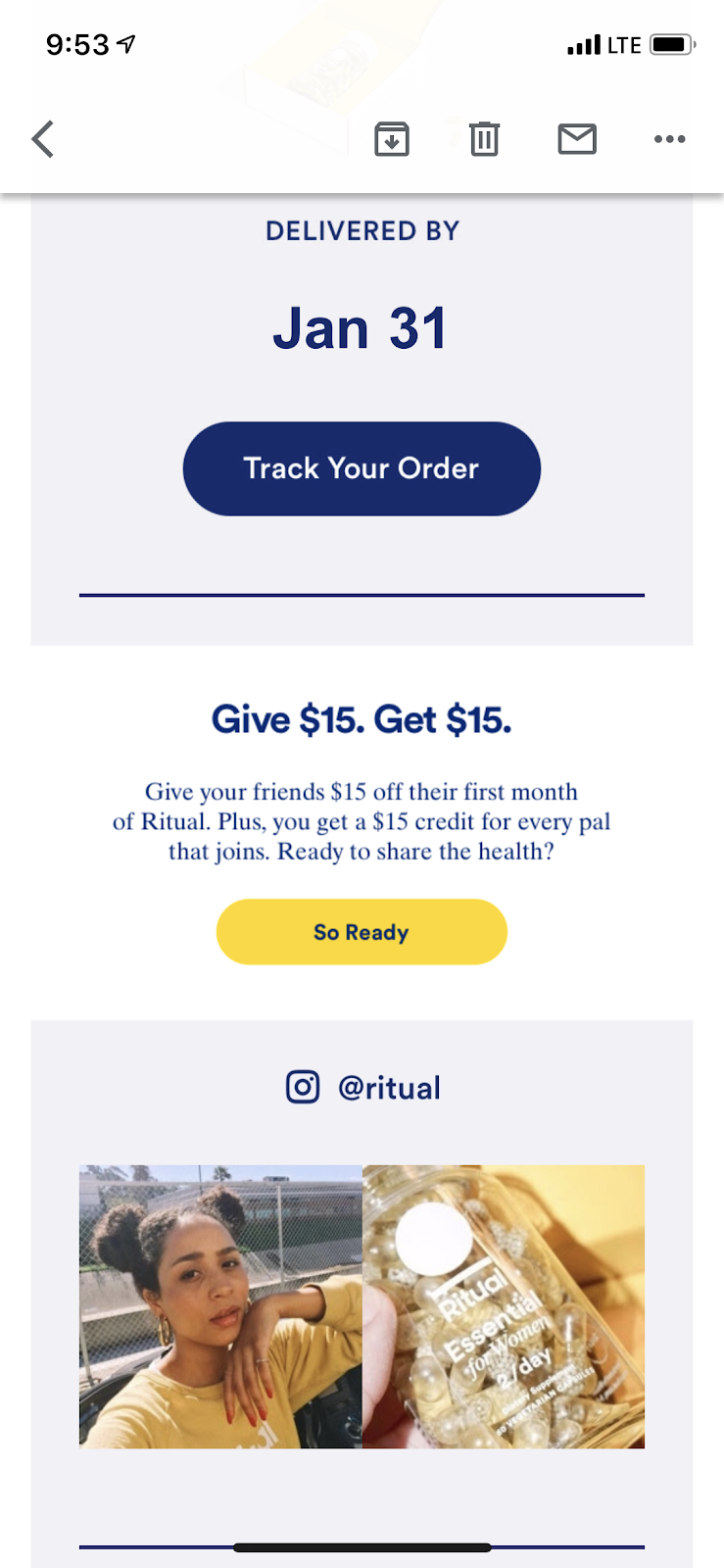
ritual vitamin customer referral program email example for viral growth

When taking this approach, it’s important to keep the offer as straightforward as possible so it catches the user’s attention as they move down the email. Short and sweet copy combined with a CTA will do the trick.

4. Duolingo’s easy CTAs

Duolingo offers power users a free week of the paid version of their app. Not only is this a persuasive offer, but it also is a clever way to introduce their premium app to a wealth of potential new customers. 
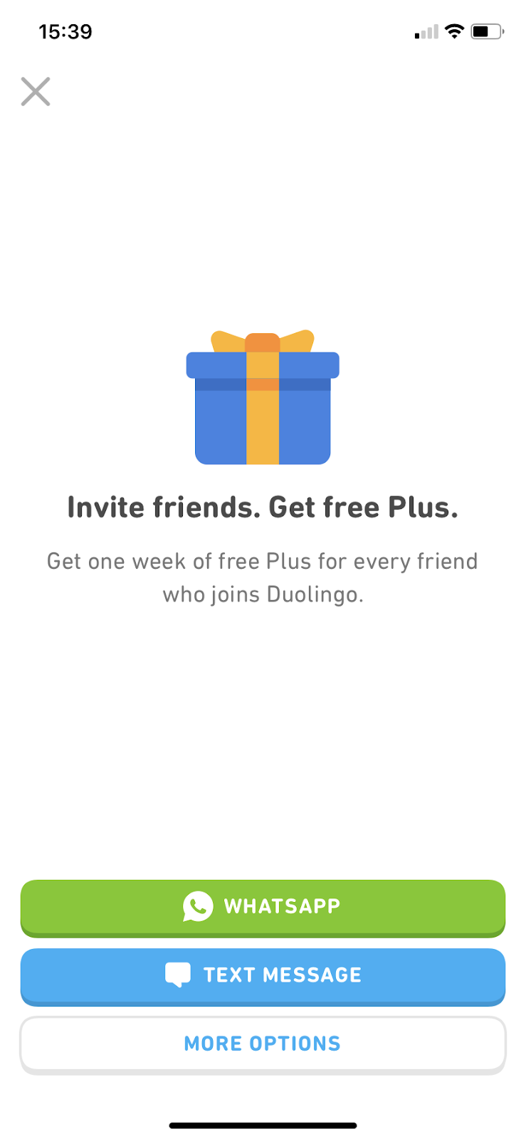
duolingo invite a friend campaign deep linking ctas

As far as the message itself, the full-screen takeover is an effective way to grab a user’s attention. Duolingo keeps the copy straightforward and really nails it with deep-linking CTAs that take users directly to WhatsApp or text.

5. Albert’s tiered user referral system

Fintech app Albert takes a very unique approach to referral requests with a tiered system. The more referrals that join the app, the more money a user can make—all the way up to $1000. 
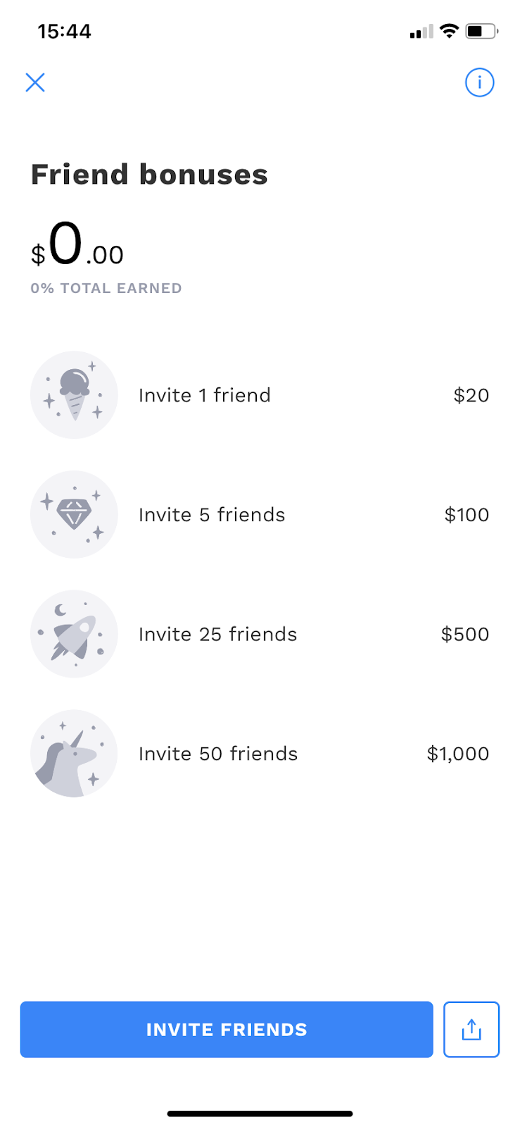
albert fintech user referral tiered rewards system

Seeing what you can earn by simply referring a friend is enticing. From Albert’s perspective, they understand how valuable referrals are so don’t mind shelling out the cash in exchange for high-quality leads.

The power of persuasion

Creating and maintaining a healthy customer referral engine is an existential challenge many marketers face. But it’s even more difficult for app marketers who may not have any personal relationship with the end user—one of the side effects of a low-touch approach. 

That’s why it’s imperative that you let your app do the talking by offering an exceptional experience. At the end of the day, whether in-app or in-person, an exceptional experience is what really drives people to spread the word. 

The referral request is a way to incentivize users to take the next step, but they’ll only be willing to do so once you’ve proven your product’s worth.

Jared DeLuca
Director of Operations
Jared leads the Operations team for Appcues and is a full-stack digital marketer. When he's not marketing software, he's probably cooking up a new recipe, playing music with friends, or going to a concert somewhere.
Skip to section:

Skip to section:

Think about the purchases you’ve made within the past year. How many were influenced by a recommendation? Research shows consumers are 4x more likely to make a purchase from a company recommended by a friend. This shouldn’t surprise anyone, as it’s human nature to trust the judgement of people we know far beyond even the cleverest of advertisements. 

For these reasons, customer referrals are arguably the most valuable form of marketing. They provide brands with high-quality leads already primed for conversion at a fraction of the cost of traditional marketing. A recent study conducted by Nielsen highlights even more compelling reasons to focus efforts on referral marketing:

  • 28% of millennials say they won't try a product if their friends don't approve of it.
  • Word of mouth is the primary factor behind 20-50% of purchasing decisions.
  • Customers acquired through referrals have a 37% higher retention rate and 81% of consumers are more likely to engage with brands that have reward programs.

Let’s explore exactly what you need to do to turn your customer referral program into a powerful conversion engine.

How to create a successful user referral program

A successful referral program requires 2 things:

  1. A product worthy of referring
  2. An uncomplicated referral process

Let’s assume you’ve already spent time iterating and optimizing your product and have strived for a first-class user experience. (If you need help in that department, check out ReallyGoodUX for tips and inspiration). 

That leaves us focused on the uncomplicated referral process

You want to make it as easy as possible for users to refer your product to friends and family.  To do this, you need to:

  • Target power users: People who have already extracted value from your product are most likely to refer it to friends. Don’t confuse and annoy new users with referral requests. Instead, focus your strategy on turning power users into influencers for your brand. 
  • Incentivize: Users are far more likely to oblige if there’s something in it for them. Attach an offer to your referral request to boost its success rate by upwards of 50%.
  • Use strategic placement: Since referrals are so important, you want to keep them top of mind without overshadowing your UX. Spend time considering the right placement of referral requests throughout your marketing materials to ensure you strike the right balance.

5 in-app user referral campaign examples

Now that you have the strategy down, let’s learn from the best by taking a look at real-life examples of some flawless referral requests:

1. Airbnb’s cross-channel invite campaign 

Airbnb recognizes the importance of referrals, which is why they strategized a cross-channel campaign to target their power users. 

airbnb user referral campaign invite friend

On desktop, the referral request in the dropdown is subtle; users are left to discover that opportunity on their own. On mobile, however, Airbnb used a fullscreen modal to create a sense of urgency, and even putting a 10-day timestamp on the deal.

airbnb mobile app invite user referral campaign

Airbnb’s strategy highlights the importance of having a cross-channel referral program strategy that takes into consideration how the message needs to adapt for each platform. 

2. Acorns straightforward referral prompt

Fintech app Acorns' referral request is simple yet effective. The full-screen mobile modal grabs the user’s attention with its straightforward appeal—refer 4 friends and get $250. Who doesn’t want $250?

acorns user referral marketing campaign example


Acorn combines the compelling offer with a time limit (“this month”) so users know to get a jump on it. Finally, the CTA makes it exceedingly easy to complete the referral process and collect their prize.       

3. 12min’s free subscription offer

12min chose to make referral a standard feature of their app experience. The “invite” section is at the center of their navigation bar and there’s a whole page highlighting the benefits users get for referring their friends. 

12min integrated user referral campaign

By including an easy-to-copy referral link and combining it with multiple share CTAs breaks down all barriers to spreading the word.

3. Ritual’s email offer

Ritual (the multivitamin company you've seen all over Instagram) does a clever job at working their referral offer right into their email template. This is effective because it gives customers ample opportunities to capitalize on the offer. Perhaps they weren’t ready the first time they saw it, but the subtle reminders over time are sure to have a positive impact.

ritual vitamin customer referral program email example for viral growth

When taking this approach, it’s important to keep the offer as straightforward as possible so it catches the user’s attention as they move down the email. Short and sweet copy combined with a CTA will do the trick.

4. Duolingo’s easy CTAs

Duolingo offers power users a free week of the paid version of their app. Not only is this a persuasive offer, but it also is a clever way to introduce their premium app to a wealth of potential new customers. 

duolingo invite a friend campaign deep linking ctas

As far as the message itself, the full-screen takeover is an effective way to grab a user’s attention. Duolingo keeps the copy straightforward and really nails it with deep-linking CTAs that take users directly to WhatsApp or text.

5. Albert’s tiered user referral system

Fintech app Albert takes a very unique approach to referral requests with a tiered system. The more referrals that join the app, the more money a user can make—all the way up to $1000. 

albert fintech user referral tiered rewards system

Seeing what you can earn by simply referring a friend is enticing. From Albert’s perspective, they understand how valuable referrals are so don’t mind shelling out the cash in exchange for high-quality leads.

The power of persuasion

Creating and maintaining a healthy customer referral engine is an existential challenge many marketers face. But it’s even more difficult for app marketers who may not have any personal relationship with the end user—one of the side effects of a low-touch approach. 

That’s why it’s imperative that you let your app do the talking by offering an exceptional experience. At the end of the day, whether in-app or in-person, an exceptional experience is what really drives people to spread the word. 

The referral request is a way to incentivize users to take the next step, but they’ll only be willing to do so once you’ve proven your product’s worth.

Jared DeLuca
Director of Operations
Jared leads the Operations team for Appcues and is a full-stack digital marketer. When he's not marketing software, he's probably cooking up a new recipe, playing music with friends, or going to a concert somewhere.
You might also like...