← Visit Appcues.com
×
×

Improve user and customer retention with these 9 quick wins

Give your retention rates a boost with a few quick wins. Here are 9 ways to improve user retention and reduce churn with in-app messaging.
Skip to section:

Skip to section:

Your retention rate is a reflection of the health of your entire business. From the features your product offers to the way your sales team describes them to prospects to how effectively CS and support solve customer problems—every team member plays a part in creating and maintaining an active user base.

Although robust customer retention programs can take years to develop, there are some basic measures you can take inside your app today to jumpstart your retention and grow your active user base. 

But before you jump right in to quick fixes, it's worth taking the time to make sure your team agrees on a framework for thinking about retention:

Break customer retention into stages

User journeys are complicated. Although you might envision a straight path from new user to power user, the reality is far more nuanced. 

One way to understand your users is to break their journey into 5 stages:

  1. Strangers: Are in search of a solution to their problem
  2. Explorers: Want to discover your product's value as it relates to their problem
  3. Beginners: Sees the value, wants to solve for a single use case
  4. Regulars: Proficient users who are looking to solve multiple use cases
  5. Champions: Power users who are invested brand advocates who influence a product’s use cases 

Visualizing each of these stages on a flywheel helps you pinpoint when and where you should connect with users: 
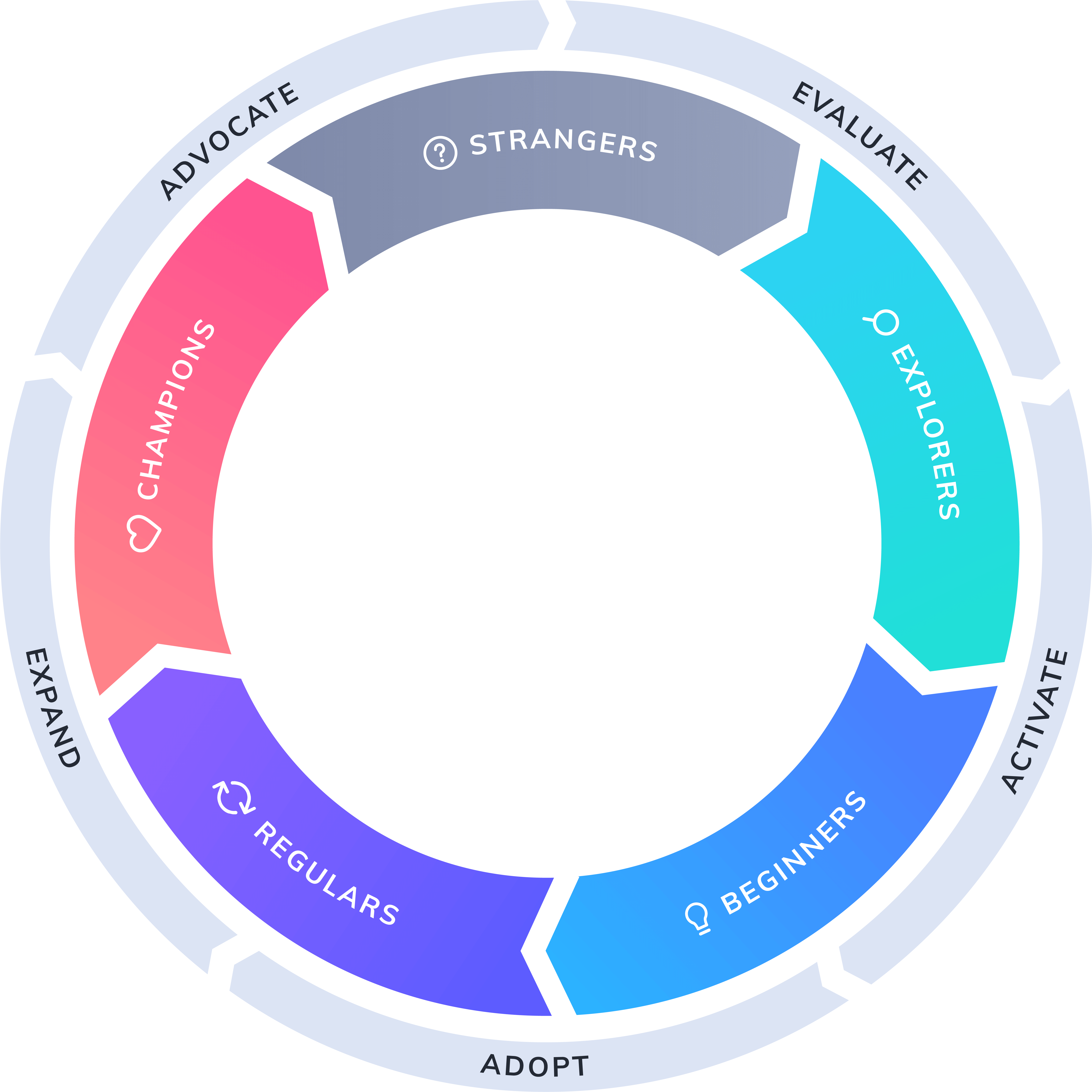
product-led growth flywheel

As you can imagine, there are many places a user can lose interest along the way. Your job is to provide experiences tailored to the unique needs of users as they move through each stage of the flywheel. 

  • Strangers: Understand that they have a problem and are motivated to find a solution to solve it.
  • Explorers: Need to see the value you can provide them, and feel motivated to start using your product.
  • Beginners: Need to be onboarded, engaged, and developing proficiency with your basic use cases without too much hand-holding.
  • Regulars: Should feel confident and inspired to dive deeper into your product and explore additional use cases and functionality. 
  • Champions: Must be empowered to act as brand advocates and be given opportunities to provide feedback for continual product improvements. 

Breaking it out into stages helps you to clearly identify and address user pain-points throughout the user journey, making it easier for you to drastically improve customer retention.

How to effectively measure retention

Before you can start implementing campaigns to drive up retention, it’s important to know which retention metrics you plan to track—and to have the right analytics tools in place in order to measure the impact of each change. 

You’ll also want to set up some KPIs that your teams can align around.  At a minimum, you should be tracking the following to understand how engaged your users are:

  • Daily Active Users/Monthly Active Users: DAU or MAU (whichever time frame is more relevant to your business) is a fairly straightforward measure of how many users are currently active with your product.  While a great starting point for understanding retention, the major caveat of the DAU/MAUs don’t take churn into account, which means this metric provides an incomplete picture on its own. doesn’t take into account churn.  
  • Churn: Also called negative retention, this is the metric every PM and app owner knows and fears. Your churn rate tells you how many users (or dollars, if you’re measuring revenue retention) are leaving your product on a daily, weekly, and monthly basis.
  • Stickiness: Provides a more holistic view of engagement by taking the ratio of DAU to MAU (DAU/MAU). This reveals how often users return to your product in a given month. The higher the ratio is, the sticker your product. 
  • Session intervals: The amount of time between user sessions. A measurement of how frequently users return to your product, session intervals is another indicator of stickiness.
  • App rating: Your rating in the App Store, Google Play, G2 Crowd, etc. is a clear and public indicator of user satisfaction and engagement. 

The metrics above are a great starting point for understanding engagement. From here, you can start to brainstorm how to reduce friction and provide personalized experiences that turn regular users into brand champions. 

Let’s take a look at some ways you can accomplish this quickly with strategic in-app messaging.

🤓 See also: The real impact of in-app messaging on end-user retention—learning from our customers' success

9 strategies to improve user retention

Your user onboarding experience is critical to long-term engagement and retention. The best onboarding experiences get users to that aha moment—the moment in which they first experience value from your product—as quickly and seamlessly as possible. Helping users find that value quickly leaves a lasting first impression that will motivate them and set them up to become more active users down the line. 

1. Learn about new users with a personalized signup flow

A great onboarding experience includes a well-designed and thought-out signup flow that captures the user data essential to providing a personalized and relevant product experience. Many mobile apps combine this step with a series of welcome screens that reiterate their core value propositions and highlight features and functionality. 

Mobile app 12min curates and condenses the best business and personal development books into digestible snippets so that their users can expand their personal development without worrying about time constraints. Their welcome screens do a great job of clearly articulating their value proposition before asking users to self-segment by language, interests, etc.
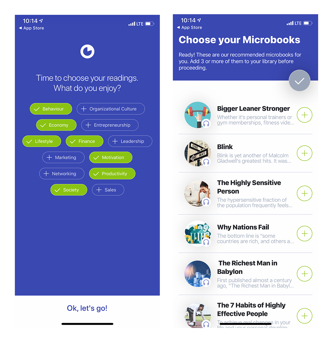
mobile app onboarding welcome screens signup flow with personalizing questions

2. Greet new users with a warm welcome message

A welcome message is typically the first thing a user sees after signing up and logging into your product for the first time. Welcome messages can help reduce the anxiety a new user can feel as they transition from your landing page experience into your product experience by restating your product’s promise of value in the form of a mission.
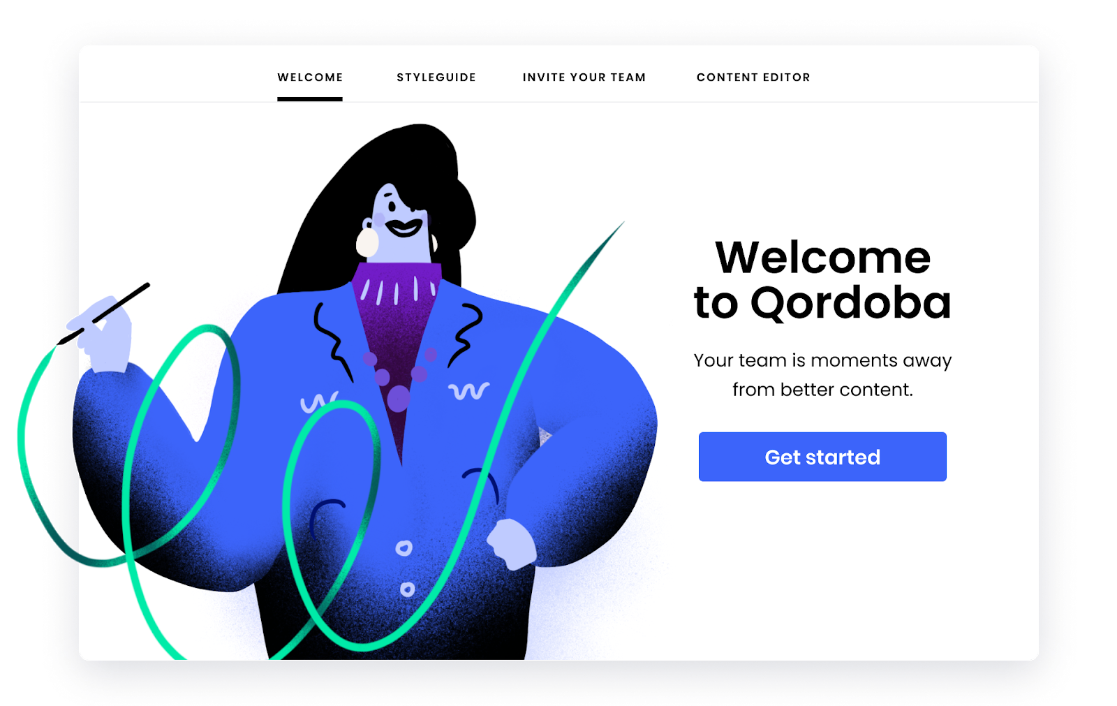
qordoba user onboarding custom modal idea made with appcues
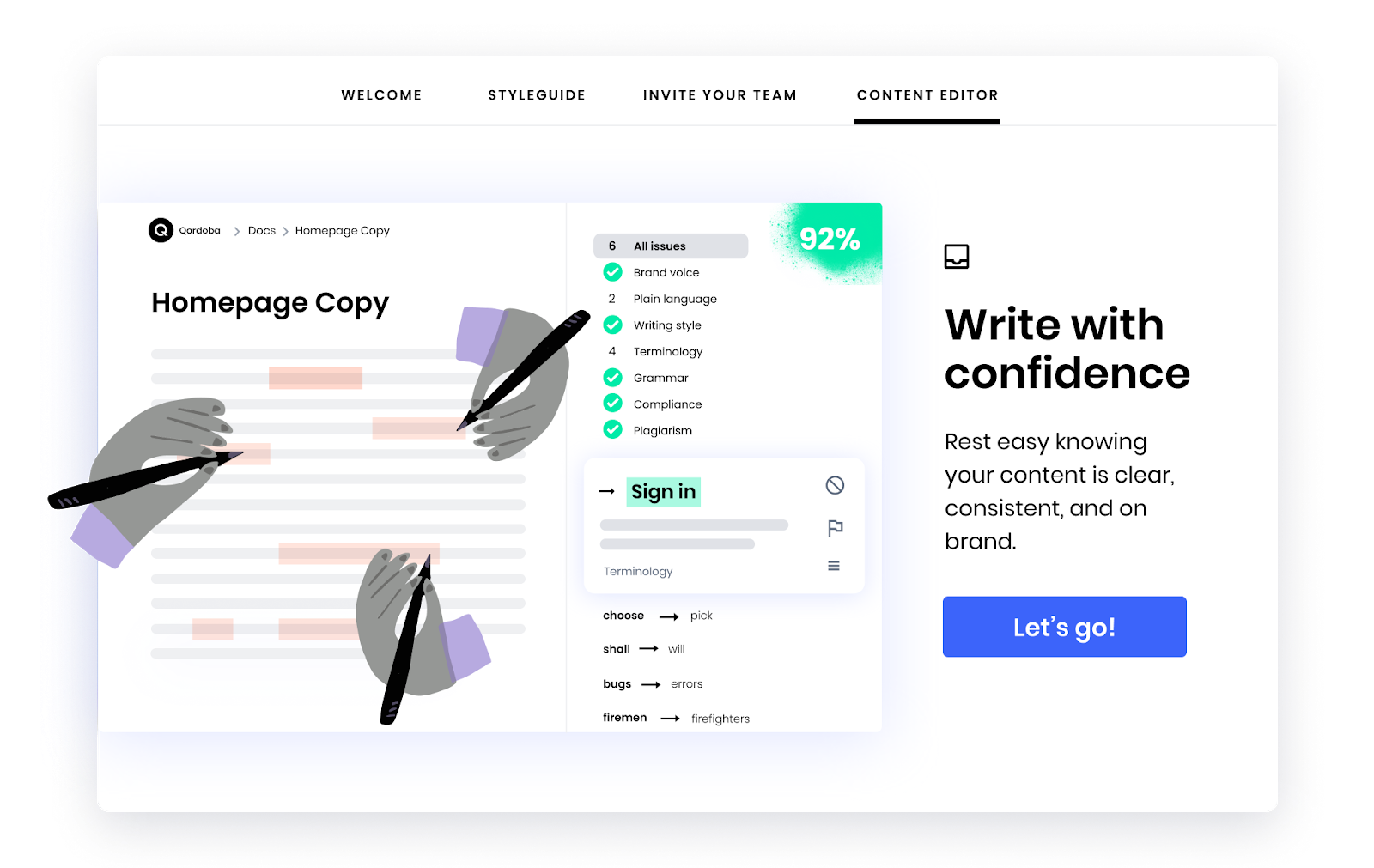
best user onboarding flow made with appcues top menu bar modal

Qordoba used Appcues to create the beautiful onboarding modal flow above. Qordoba’s unique graphic style adds a delightful touch to the onboarding experience. Their welcome message does a great job of highlighting their product’s value (while also driving users toward a key step—inviting their team).

An informative welcome message like Qordoba’s will buy you time and patience from your new users, and keep their initial motivation up longer.

3. Craft considerate product tours and walkthroughs

Product tours get a bit of a bad rep for being overbearing, but when done right, they’re effective at introducing new users to your product’s user interface and steering them towards their aha moment.

Here is a great example of an onboarding walkthrough from Asana:
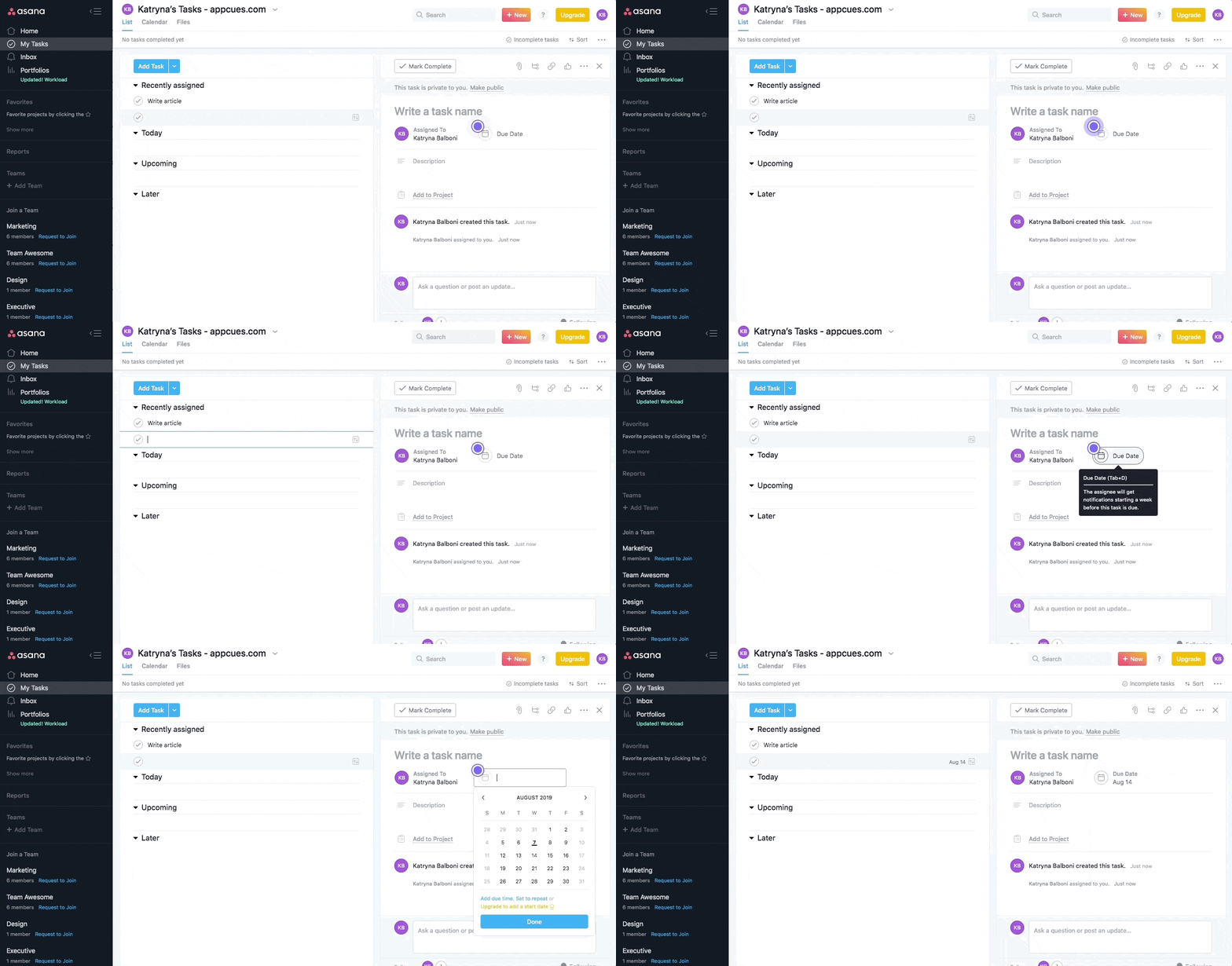
asana onboarding product tour walkthrought example with step by step instructions

Asana’s product tour inspires user engagement through participation—users must click on each element the page points to in order to continue. This action-oriented approach to product tours helps get users to their aha moment faster and start actively using the tool.

Think of good product tours like a set of training wheels. They’re great to help your users get up and running, but in order to convey the maximum impact of your product, you’ll need to let them experience the aha moment on their own.

4. Implement mindful permission requests 

Mobile product owners know how important it is to have users opt-in to key engagement tools like push notifications and location-based services. In fact, push notifications have been known to boost app engagement by 88%.

This is why it’s so critical to have effective permission requests—the standard iOS or Android message won’t cut it. YouTube TV’s permission request exemplifies all the qualities of an effective ask, positioning it as a must-have feature that is beneficial to the users and easy to opt-out of at any time:
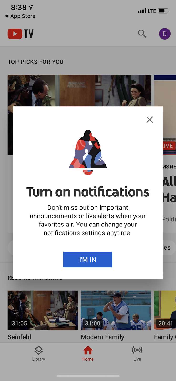
youtube tv mobile app permission request

Encourage deeper product adoption

Once you’ve enhanced your onboarding and feel it’s positively impacting your retention rate, it’s time to turn your attention towards building powerful relationships with users through meaningful lifecycle engagement. 

The best way to retain regular users  is to deliver ongoing product value. These tactics can help make  your product stickier and keeps your users around longer:

5. Reinforce value with successive aha moments

The more value you can provide a user, the stickier your product becomes. Feature discoverability is essential to promoting further engagement and driving up app stickiness in the process. Tried-and-true onboarding patterns like tooltips or hotspots are a perfect way to guide users into more meaningful engagement with your product.

Airtable uses a mix of UI patterns and design elements like tooltips, slideouts, and hotspots to introduce active users to helpful features and encourage  further exploration.
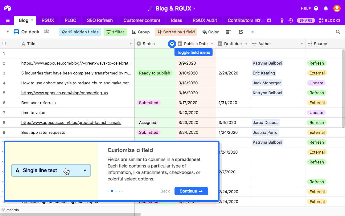
new airtable onboarding from 2020 with feature prompts

Make sure you don’t bombard users all at once—focus on gradual exposure by creating a regular cadence of prompts and pauses until users have maximized their usage. By driving users to additional aha moments one at a time, you’ll continue to encourage engagement and boost user sessions well after initial onboarding. 

6. Showcase the value of new features

Each time you launch a new feature, you’re providing additional value to your existing users. Of course, you know that. The tricky part is relaying that value to your users and getting them to adopt the new feature into their regular workflow. 

While blog posts and emails are useful for getting the word out to subscribers and prospects, relaying the message to active users should be done within your application itself. In-app feature announcements allow you to catch users when they’re actively engaged and positioned to take action. We’ve seen that features launched this way can help increase feature adoption by up to 400%

GoToWebinar used Appcues to introduce a new transcription feature. With a simple animated slideout, GoToWebinar effectively captures users’ attention on login.
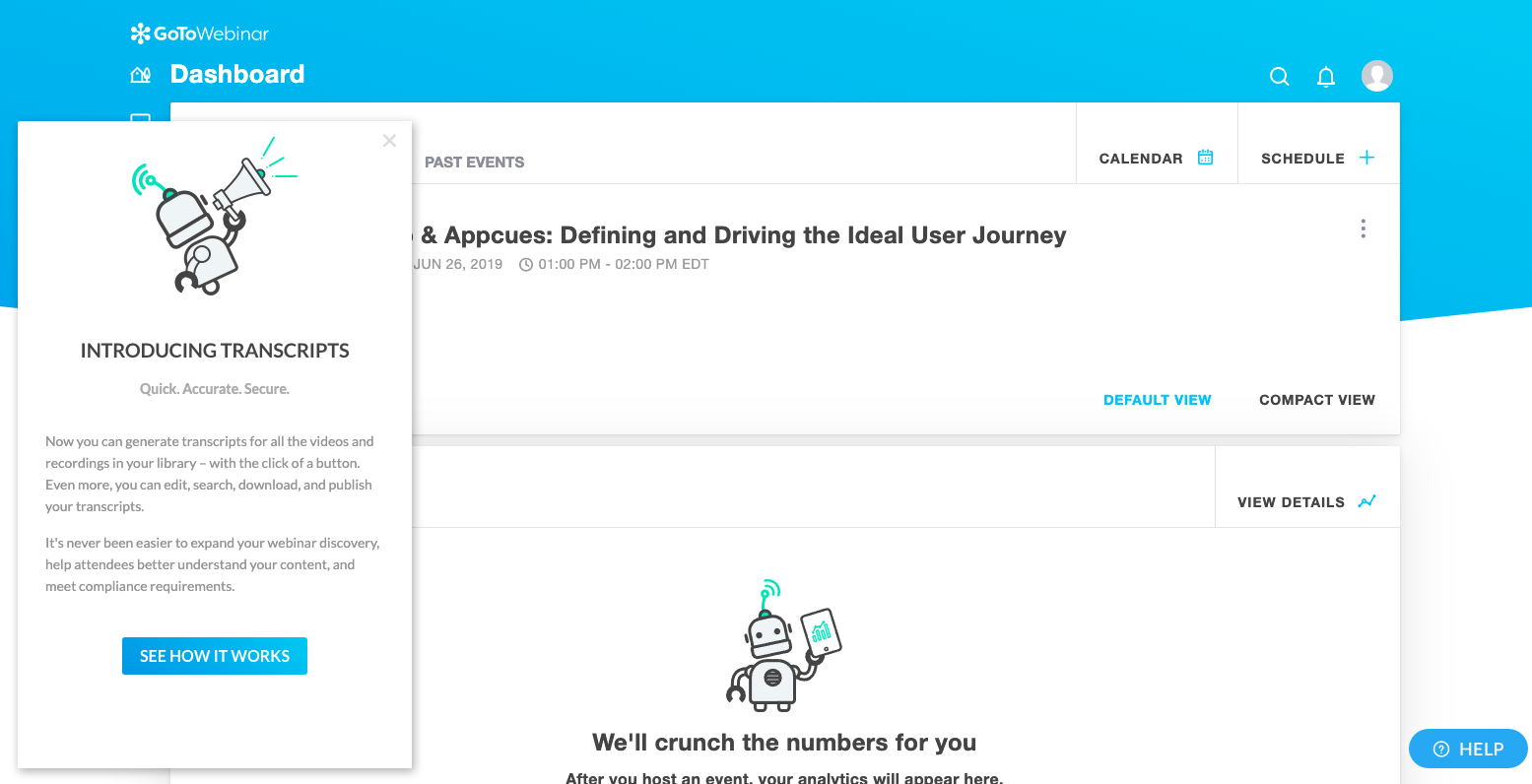
gotowebinar appcues slideout new feature announcement example

New feature announcements are just as important on mobile apps. When LinkedIn launched LinkedIn reactions, they used a simple tooltip to highlight the feature:
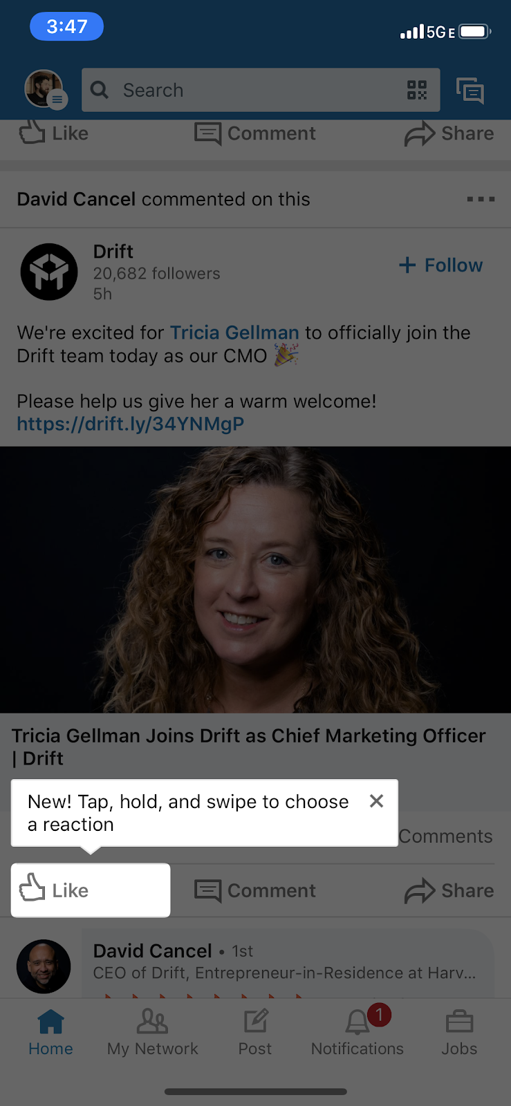
new feature tooltip example on linkedin mobile app

7. Create self-service support options 

Enhance the user experience and alleviate support team constraints through utilizing your in-app messaging to answer common questions.

Start by looking at your most viewed help docs and consider how you might be able to help users solve their problems up front. Implement tooltips or hotspots that address commonly asked how-to questions and measure if the views to that help doc drop over time.
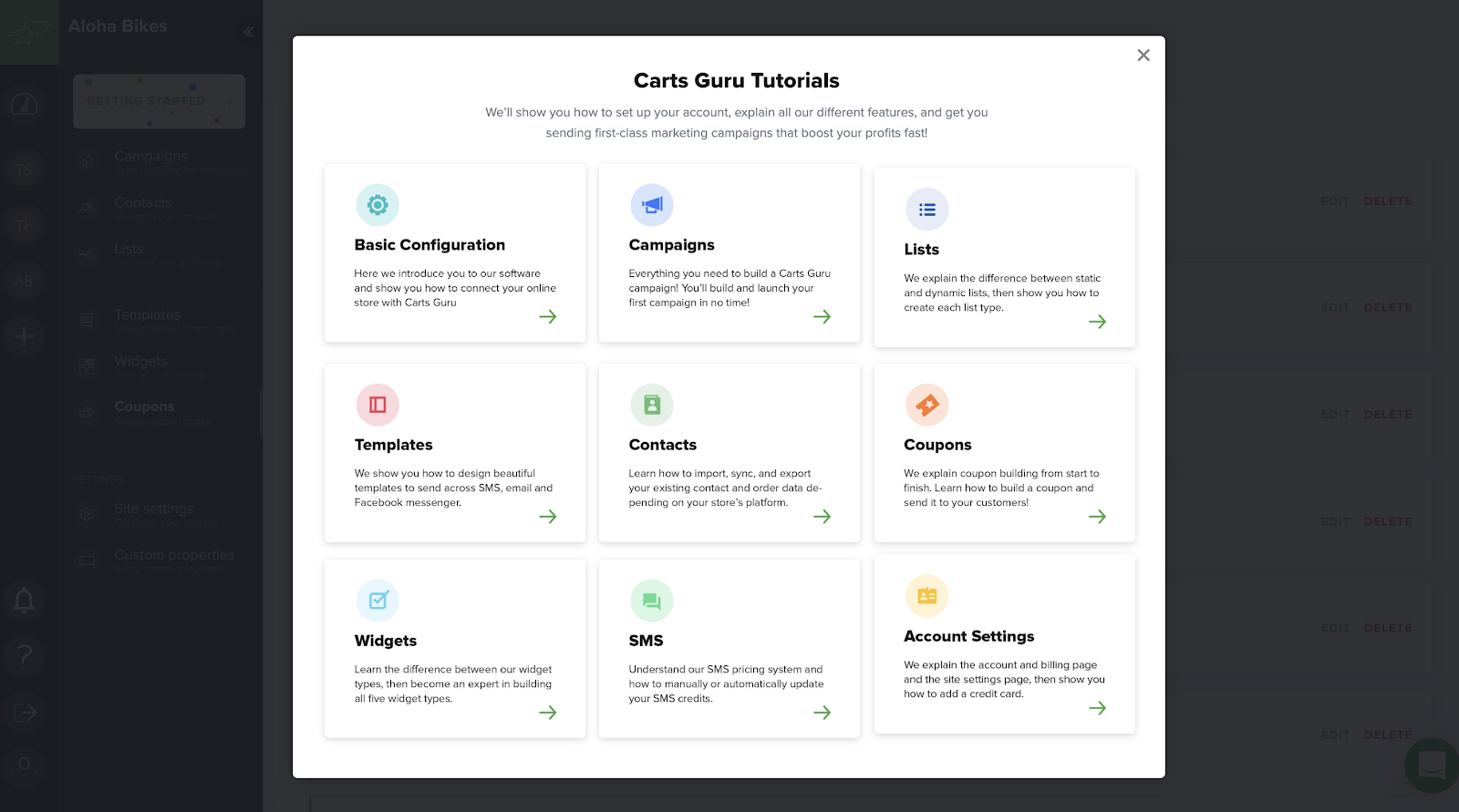
tutorial directory modal for in-app tours. example from carts guru
Carts Guru’s self-service tutorial menu made with Appcues

By giving your users better help inside of your product, user sessions will last longer, and they’ll be able to reach their goal faster. This in turn will improve your cohort of seasoned users.

Empower customers to drive future growth

Once you’ve developed a large cohort of power users, you can begin to focus on driving advocacy and extracting the passion and value your users have received in order to continue attracting new users. Done correctly, it can also make power users feel emotionally connected to your brand and its growth.

Here are a few ways to extract that value and make it easy for users to champion your product.

8. Gather product feedback

Solicit feedback from your power users in any way you can. Hop on the phone, send email surveys, and prompt them with in-product feedback forms. It isn’t always easy to get your customers to provide feedback—collecting it at scale requires a passionate user base and a little creative thinking.

Zova shows us the persuasive power of a clever rating request:
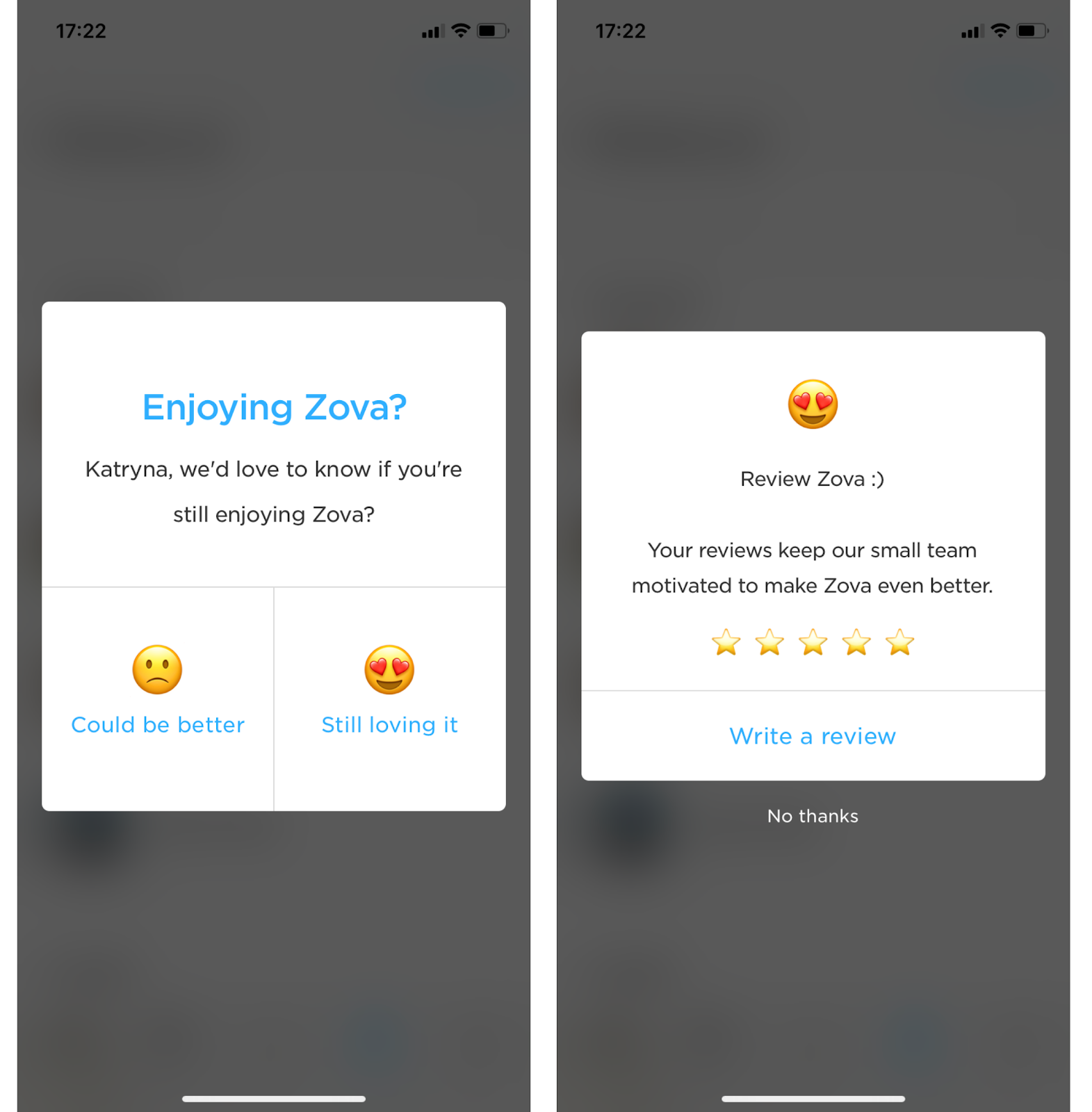
zova app rating user feedback request

When gathering feedback, try to identify a few themes. Make those themes a priority in both product development and customer success. For more on this subject—because it is awfully big—check out Steven Blank’s Four Steps to Epiphany.

Users will love you all the more if they feel they have a hand in your product development. Be sure to ask the right kinds of questions to really incorporate the users’ voice in your product.

9. Run a referral campaign

Customer referrals are incredibly powerful for user acquisition. The key is to make the offer both easy and compelling. Caviar’s offer is simple—give $10, get $10. The referral message is integrated into their header slideshow so users can’t miss it:

caviar user referral campaign give 10 get 10

But since we know many users find these messages disruptive, Caviar even lets you minimize their slideshow and just have this subtle reminder about the offer at the top of the user’s homepage:

caviar invite a user referral campaign banner

Retention begins at onboarding

Poor retention isn’t something you can bandaid over at late stages in the user journey. A solid onboarding experience lays the groundwork for a successful user experience down the line. How well you onboard users has a direct impact on how well you retain them. In fact, you could even argue that retention begins before a user ever signs up—it can depend on whether your marketing attracts good-fit leads and trialers, for instance. 

The point is, retention shouldn’t be something you worry about only when it goes wrong. When your retention rate slips into churn territory, it’s often too late to save many of the customers with one foot out the door. 

Many of the changes outlined above can be made relatively quickly—especially with tools like Appcues, which allow non-technical teams to publish user experiences without writing code. But that doesn’t mean you should think of retention strategies as quick fixes. They should be baked into your product experience from start to finish.

📚Learn more about proactive strategies for reducing customer churn.

Katryna Balboni
Content and Community Director at User Interviews
Katryna is the Content and Community Director at User Interviews. Before User Interviews, she made magic happen with all things content at Appcues. Her non-work time is spent traveling to new places, befriending street cats, and baking elaborate pies.
Skip to section:

Skip to section:

Your retention rate is a reflection of the health of your entire business. From the features your product offers to the way your sales team describes them to prospects to how effectively CS and support solve customer problems—every team member plays a part in creating and maintaining an active user base.

Although robust customer retention programs can take years to develop, there are some basic measures you can take inside your app today to jumpstart your retention and grow your active user base. 

But before you jump right in to quick fixes, it's worth taking the time to make sure your team agrees on a framework for thinking about retention:

Break customer retention into stages

User journeys are complicated. Although you might envision a straight path from new user to power user, the reality is far more nuanced. 

One way to understand your users is to break their journey into 5 stages:

  1. Strangers: Are in search of a solution to their problem
  2. Explorers: Want to discover your product's value as it relates to their problem
  3. Beginners: Sees the value, wants to solve for a single use case
  4. Regulars: Proficient users who are looking to solve multiple use cases
  5. Champions: Power users who are invested brand advocates who influence a product’s use cases 

Visualizing each of these stages on a flywheel helps you pinpoint when and where you should connect with users: 

product-led growth flywheel

As you can imagine, there are many places a user can lose interest along the way. Your job is to provide experiences tailored to the unique needs of users as they move through each stage of the flywheel. 

  • Strangers: Understand that they have a problem and are motivated to find a solution to solve it.
  • Explorers: Need to see the value you can provide them, and feel motivated to start using your product.
  • Beginners: Need to be onboarded, engaged, and developing proficiency with your basic use cases without too much hand-holding.
  • Regulars: Should feel confident and inspired to dive deeper into your product and explore additional use cases and functionality. 
  • Champions: Must be empowered to act as brand advocates and be given opportunities to provide feedback for continual product improvements. 

Breaking it out into stages helps you to clearly identify and address user pain-points throughout the user journey, making it easier for you to drastically improve customer retention.

How to effectively measure retention

Before you can start implementing campaigns to drive up retention, it’s important to know which retention metrics you plan to track—and to have the right analytics tools in place in order to measure the impact of each change. 

You’ll also want to set up some KPIs that your teams can align around.  At a minimum, you should be tracking the following to understand how engaged your users are:

  • Daily Active Users/Monthly Active Users: DAU or MAU (whichever time frame is more relevant to your business) is a fairly straightforward measure of how many users are currently active with your product.  While a great starting point for understanding retention, the major caveat of the DAU/MAUs don’t take churn into account, which means this metric provides an incomplete picture on its own. doesn’t take into account churn.  
  • Churn: Also called negative retention, this is the metric every PM and app owner knows and fears. Your churn rate tells you how many users (or dollars, if you’re measuring revenue retention) are leaving your product on a daily, weekly, and monthly basis.
  • Stickiness: Provides a more holistic view of engagement by taking the ratio of DAU to MAU (DAU/MAU). This reveals how often users return to your product in a given month. The higher the ratio is, the sticker your product. 
  • Session intervals: The amount of time between user sessions. A measurement of how frequently users return to your product, session intervals is another indicator of stickiness.
  • App rating: Your rating in the App Store, Google Play, G2 Crowd, etc. is a clear and public indicator of user satisfaction and engagement. 

The metrics above are a great starting point for understanding engagement. From here, you can start to brainstorm how to reduce friction and provide personalized experiences that turn regular users into brand champions. 

Let’s take a look at some ways you can accomplish this quickly with strategic in-app messaging.

🤓 See also: The real impact of in-app messaging on end-user retention—learning from our customers' success

9 strategies to improve user retention

Your user onboarding experience is critical to long-term engagement and retention. The best onboarding experiences get users to that aha moment—the moment in which they first experience value from your product—as quickly and seamlessly as possible. Helping users find that value quickly leaves a lasting first impression that will motivate them and set them up to become more active users down the line. 

1. Learn about new users with a personalized signup flow

A great onboarding experience includes a well-designed and thought-out signup flow that captures the user data essential to providing a personalized and relevant product experience. Many mobile apps combine this step with a series of welcome screens that reiterate their core value propositions and highlight features and functionality. 

Mobile app 12min curates and condenses the best business and personal development books into digestible snippets so that their users can expand their personal development without worrying about time constraints. Their welcome screens do a great job of clearly articulating their value proposition before asking users to self-segment by language, interests, etc.

mobile app onboarding welcome screens signup flow with personalizing questions

2. Greet new users with a warm welcome message

A welcome message is typically the first thing a user sees after signing up and logging into your product for the first time. Welcome messages can help reduce the anxiety a new user can feel as they transition from your landing page experience into your product experience by restating your product’s promise of value in the form of a mission.

qordoba user onboarding custom modal idea made with appcues
best user onboarding flow made with appcues top menu bar modal

Qordoba used Appcues to create the beautiful onboarding modal flow above. Qordoba’s unique graphic style adds a delightful touch to the onboarding experience. Their welcome message does a great job of highlighting their product’s value (while also driving users toward a key step—inviting their team).

An informative welcome message like Qordoba’s will buy you time and patience from your new users, and keep their initial motivation up longer.

3. Craft considerate product tours and walkthroughs

Product tours get a bit of a bad rep for being overbearing, but when done right, they’re effective at introducing new users to your product’s user interface and steering them towards their aha moment.

Here is a great example of an onboarding walkthrough from Asana:

asana onboarding product tour walkthrought example with step by step instructions

Asana’s product tour inspires user engagement through participation—users must click on each element the page points to in order to continue. This action-oriented approach to product tours helps get users to their aha moment faster and start actively using the tool.

Think of good product tours like a set of training wheels. They’re great to help your users get up and running, but in order to convey the maximum impact of your product, you’ll need to let them experience the aha moment on their own.

4. Implement mindful permission requests 

Mobile product owners know how important it is to have users opt-in to key engagement tools like push notifications and location-based services. In fact, push notifications have been known to boost app engagement by 88%.

This is why it’s so critical to have effective permission requests—the standard iOS or Android message won’t cut it. YouTube TV’s permission request exemplifies all the qualities of an effective ask, positioning it as a must-have feature that is beneficial to the users and easy to opt-out of at any time:

youtube tv mobile app permission request

Encourage deeper product adoption

Once you’ve enhanced your onboarding and feel it’s positively impacting your retention rate, it’s time to turn your attention towards building powerful relationships with users through meaningful lifecycle engagement. 

The best way to retain regular users  is to deliver ongoing product value. These tactics can help make  your product stickier and keeps your users around longer:

5. Reinforce value with successive aha moments

The more value you can provide a user, the stickier your product becomes. Feature discoverability is essential to promoting further engagement and driving up app stickiness in the process. Tried-and-true onboarding patterns like tooltips or hotspots are a perfect way to guide users into more meaningful engagement with your product.

Airtable uses a mix of UI patterns and design elements like tooltips, slideouts, and hotspots to introduce active users to helpful features and encourage  further exploration.

new airtable onboarding from 2020 with feature prompts

Make sure you don’t bombard users all at once—focus on gradual exposure by creating a regular cadence of prompts and pauses until users have maximized their usage. By driving users to additional aha moments one at a time, you’ll continue to encourage engagement and boost user sessions well after initial onboarding. 

6. Showcase the value of new features

Each time you launch a new feature, you’re providing additional value to your existing users. Of course, you know that. The tricky part is relaying that value to your users and getting them to adopt the new feature into their regular workflow. 

While blog posts and emails are useful for getting the word out to subscribers and prospects, relaying the message to active users should be done within your application itself. In-app feature announcements allow you to catch users when they’re actively engaged and positioned to take action. We’ve seen that features launched this way can help increase feature adoption by up to 400%

GoToWebinar used Appcues to introduce a new transcription feature. With a simple animated slideout, GoToWebinar effectively captures users’ attention on login.

gotowebinar appcues slideout new feature announcement example

New feature announcements are just as important on mobile apps. When LinkedIn launched LinkedIn reactions, they used a simple tooltip to highlight the feature:

new feature tooltip example on linkedin mobile app

7. Create self-service support options 

Enhance the user experience and alleviate support team constraints through utilizing your in-app messaging to answer common questions.

Start by looking at your most viewed help docs and consider how you might be able to help users solve their problems up front. Implement tooltips or hotspots that address commonly asked how-to questions and measure if the views to that help doc drop over time.

tutorial directory modal for in-app tours. example from carts guru
Carts Guru’s self-service tutorial menu made with Appcues

By giving your users better help inside of your product, user sessions will last longer, and they’ll be able to reach their goal faster. This in turn will improve your cohort of seasoned users.

Empower customers to drive future growth

Once you’ve developed a large cohort of power users, you can begin to focus on driving advocacy and extracting the passion and value your users have received in order to continue attracting new users. Done correctly, it can also make power users feel emotionally connected to your brand and its growth.

Here are a few ways to extract that value and make it easy for users to champion your product.

8. Gather product feedback

Solicit feedback from your power users in any way you can. Hop on the phone, send email surveys, and prompt them with in-product feedback forms. It isn’t always easy to get your customers to provide feedback—collecting it at scale requires a passionate user base and a little creative thinking.

Zova shows us the persuasive power of a clever rating request:

zova app rating user feedback request

When gathering feedback, try to identify a few themes. Make those themes a priority in both product development and customer success. For more on this subject—because it is awfully big—check out Steven Blank’s Four Steps to Epiphany.

Users will love you all the more if they feel they have a hand in your product development. Be sure to ask the right kinds of questions to really incorporate the users’ voice in your product.

9. Run a referral campaign

Customer referrals are incredibly powerful for user acquisition. The key is to make the offer both easy and compelling. Caviar’s offer is simple—give $10, get $10. The referral message is integrated into their header slideshow so users can’t miss it:

caviar user referral campaign give 10 get 10

But since we know many users find these messages disruptive, Caviar even lets you minimize their slideshow and just have this subtle reminder about the offer at the top of the user’s homepage:

caviar invite a user referral campaign banner

Retention begins at onboarding

Poor retention isn’t something you can bandaid over at late stages in the user journey. A solid onboarding experience lays the groundwork for a successful user experience down the line. How well you onboard users has a direct impact on how well you retain them. In fact, you could even argue that retention begins before a user ever signs up—it can depend on whether your marketing attracts good-fit leads and trialers, for instance. 

The point is, retention shouldn’t be something you worry about only when it goes wrong. When your retention rate slips into churn territory, it’s often too late to save many of the customers with one foot out the door. 

Many of the changes outlined above can be made relatively quickly—especially with tools like Appcues, which allow non-technical teams to publish user experiences without writing code. But that doesn’t mean you should think of retention strategies as quick fixes. They should be baked into your product experience from start to finish.

📚Learn more about proactive strategies for reducing customer churn.

Katryna Balboni
Content and Community Director at User Interviews
Katryna is the Content and Community Director at User Interviews. Before User Interviews, she made magic happen with all things content at Appcues. Her non-work time is spent traveling to new places, befriending street cats, and baking elaborate pies.
You might also like...