Upselling prompts: 8 excellent examples from B2C, B2B, and SaaS companies
.png)

.png)
When it comes to upselling, it's all about the 'how' rather than the 'what.' Like that one friend who knows just when to offer a piece of advice (or a slice of cake), the key to successful upselling lies in the timing and approach.
Upselling is a bit like asking users to take that extra step – upgrade a plan, explore a new feature, maybe even stretch their comfort zone a bit. It's an art, really, turning these moments into opportunities that feel less like chores and more like exciting discoveries.
But how do we do it without overwhelming our users? How do we make upselling as natural and engaging as those first few interactions with a favorite app? It's all about crafting those little moments that inform, entice, and ultimately, delight—from the initial encounter to the hundredth time they log in.
We're diving into some stand-out examples of upselling, showcasing how B2B SaaS, B2C, and other companies are making it as effortless as updating your favorite app.
Let’s get started.
Upselling in SaaS is all about enhancing your users' journey with additional product options or advanced features, transforming their experience from great to exceptional.
Here's how it works: picture yourself at a digital buffet, plate in hand, filled with the essentials from your basic SaaS package. But then, you spot the dessert section. That's where upselling comes in. It's about gently guiding your users over to the cheesecake and macarons they didn’t know were included in the feast.
In SaaS, upselling isn’t just about selling more stuff. It’s about offering value-packed features or plan upgrades that make your user's experience richer—kind of like offering an espresso shot in their regular latte. It's showing them what they can gain without making it feel like a hard sell.
Upselling a SaaS product is kind of like being a great host at a party. You're there to offer the perfect feature-snack to your guests—whether they’re long-time users or new customers just checking out what you have to offer.
Start by getting to know these users as if they're your good friends. What do they prefer? High-tech, avant-garde features or simple, user-friendly options?
And just like in relationships, timing in upselling is absolutely crucial. You wouldn't hand out hot chocolate on a sunny beach day, right? Present your upgrades and product recommendations when they make the most sense to your users—maybe when they’ve just achieved a milestone in your app or are showing signs of needing more advanced tools. This is where automated in-app messages come into play, popping up with the right suggestion at the right time (like a subtle reminder to put on sunscreen.)
When talking about value, clarity is your best friend. This isn’t the time for tech riddles or acronym gymnastics. Imagine you’re explaining why a special edition of a board game is the upgrade they didn't know they needed — it's not just another box, it's an experience enhancer, complete with those cool 3D pieces.
Above all, keep it real and human. Upselling shouldn’t feel like a sales pitch—it should be like offering a piece of advice over a friendly cup of coffee. Give your users the sense that they're being helped, not pushed. It's about suggesting, not demanding, and providing thoughtful upsell strategies and options that cater to their needs. That's how you create a warm, inviting atmosphere, encouraging users to explore more without feeling the pressure.
Ready to revamp your sales strategy for existing customers? Dive into these 8 upselling examples that are all about enhancing relationships and boosting value, not just making the sale. Let's explore how a little creativity can lead to big wins in customer retention and overall satisfaction.
Unless your current customers are actively thinking about upgrading (and how often does that happen?), they’re unlikely to visit your pricing page to learn about higher tier features. Rather than expecting them to hunt down this information themselves, make your customers aware of premium features by positioning reminders within the user interface itself.
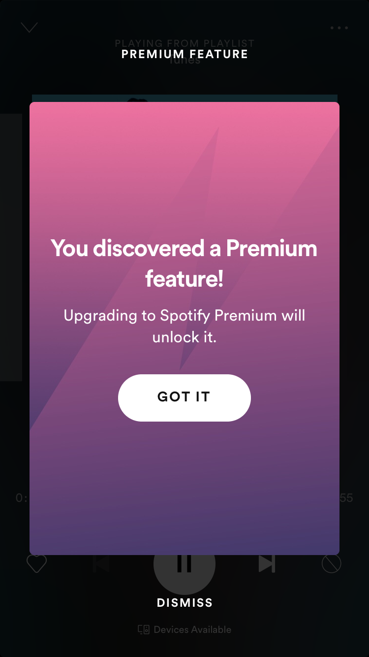
Take Spotify, for example. You're listening and enjoying (Spotify users with free accounts are allowed to skip 6 songs per hour), and then, boom, you hit your skip limit. But instead of a roadblock, Spotify presents this as a moment of discovery. A simple prompt suggests, "Hey, there’s more if you go Premium." It’s not a demand—it’s an invitation to explore what’s behind the Premium curtain.
The premium feature is integrated into the user experience, which allows users to see it in context and understand how it would benefit them.
What’s more, Spotify cleverly positions this upsell prompt as a moment of discovery. “You discovered a Premium feature” feels a lot more positive than “you’re not allowed to do that until you pay us.”
In-app messaging is one of the best, most contextual ways to communicate with your users—but by their nature, in-app messaging is only effective when users are in your app. Take advantage of the touch points you have with your users beyond your product.
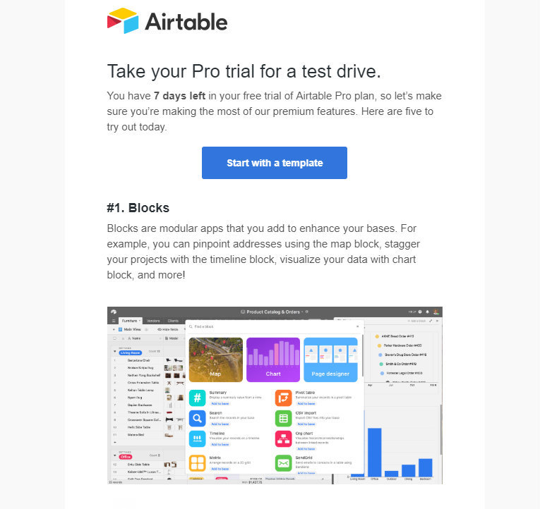
Pairing your in-product upgrade prompts with an enticing engagement email is a great way to reach users when they’re outside your product. Use your newsletter to give users the chance to window-shop features without flooding their inbox with an extra email send.
Airtable newsletters do an incredibly thorough job of this. Airtable knows that the conversation doesn't end when you close the app. Much more than a simple cash grab, they extend their relationship with users through upgrade emails that feel more like a friendly chat about what's new and fun in their tool.
Integrations expand the life of your product. While a user may not be interested in leveling up in your app right now, they may be interested in using your product alongside another in their tech stack. And the more a user invests in your product and makes it part of their daily lives, the more likely they are to continue using it long-term—and to eventually upgrade. Integrating with other products in their tech stack will not only make your app more helpful and useful to the work they do, it will also make it indispensable.
So use your integrations as upselling opportunities—reserve some for higher tier plans and show other users just what they're missing out on.
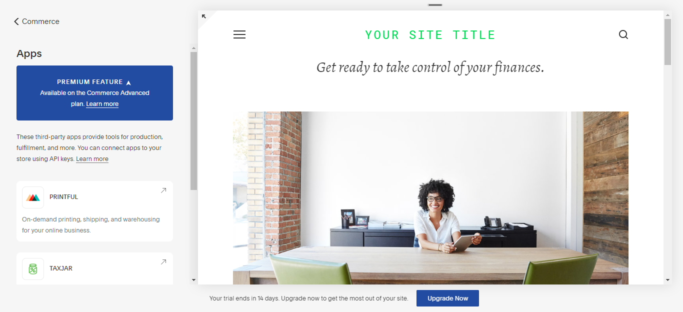
Squarespace’s commerce integrations, for example, are only available as premium features in the Commerce Advanced plan. Instead of prompting you directly to upgrade, it takes a softer approach to upselling and invites you to learn more about why you might need one of these plans. It’s like saying, "Hey, these cool features could work wonders with what you’re already doing."
Your integrations can inspire users to create bigger and better things with your product—ration and celebrate those features to turn them into upsell opportunities.
Push an upgrade CTA too forcefully when users have just arrived in your app—or are trying to use their current plan's features—and you risk annoying them rather than engaging them. Instead, you should tie your upgrade prompts to specific user actions to help users realize their own need for your premium features.
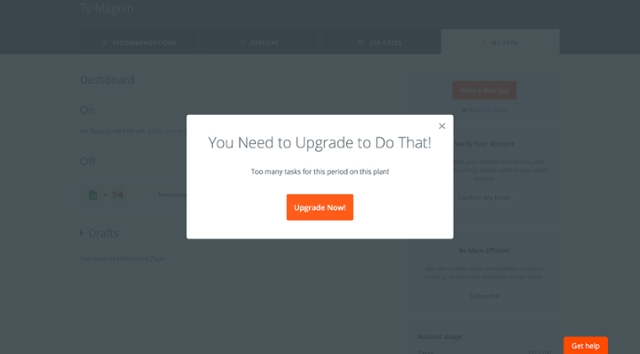
Zapier’s got a knack for timing. They introduce upgrade prompts exactly when users try to access a feature that’s just a tier above their current plan. It triggers a modal window when users click on a higher tier feature, and gives them a single button to upgrade.
There’s zero ambiguity here, and the directness is effective in this case because the prompt occurs while users are already motivated to complete the task at hand. Piggy-backing on active engagement is a good way to contextualize your upgrade prompt while taking advantage of user-driven momentum.
Instead of waiting until users click on a feature to tell them that it’s premium, you can also position premium features alongside commonly-used free features to catch the user’s eye and make them want to find out more.
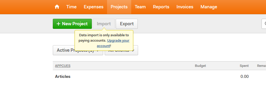
Time tracking software Harvest disables its premium features—in this case, the “import” feature, which is grayed out—but keeps the CTA prominently positioned between 2 free-to-use buttons. Hovering over the import feature displays a tooltip with an inline upgrade link.
You don't have to wait until users have exhausted all the features in their existing plan to prompt them to upgrade.
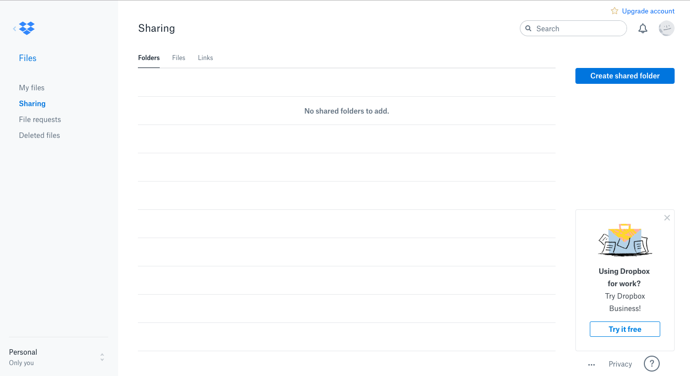
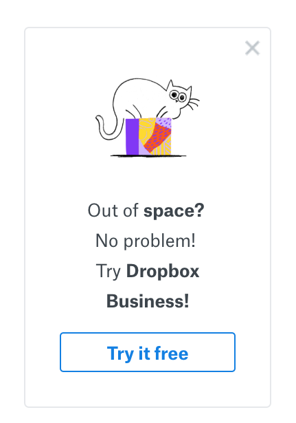
Dropbox uses persistent upsell prompts to remind users of the restrictions that come with a free plan, and offer them regular opportunities to upgrade. Because these prompts are ever-present (but dismissible), Dropbox mixes up the messaging, which subtly draws attention from users who may have otherwise tuned out the repeated prompt.
Companies often focus their upselling efforts on users who are on a free or freemium plan, but revenue expansion should also focus on moving paying customers to more premium pricing plans.
To convince power users who already pay for your product to upgrade, you must first identify the features that would provide the most additional benefit to each cohort. It’s important to understand how your users’ needs will change as they move to higher tiers—what sets individuals or small businesses apart from enterprise users, for instance.
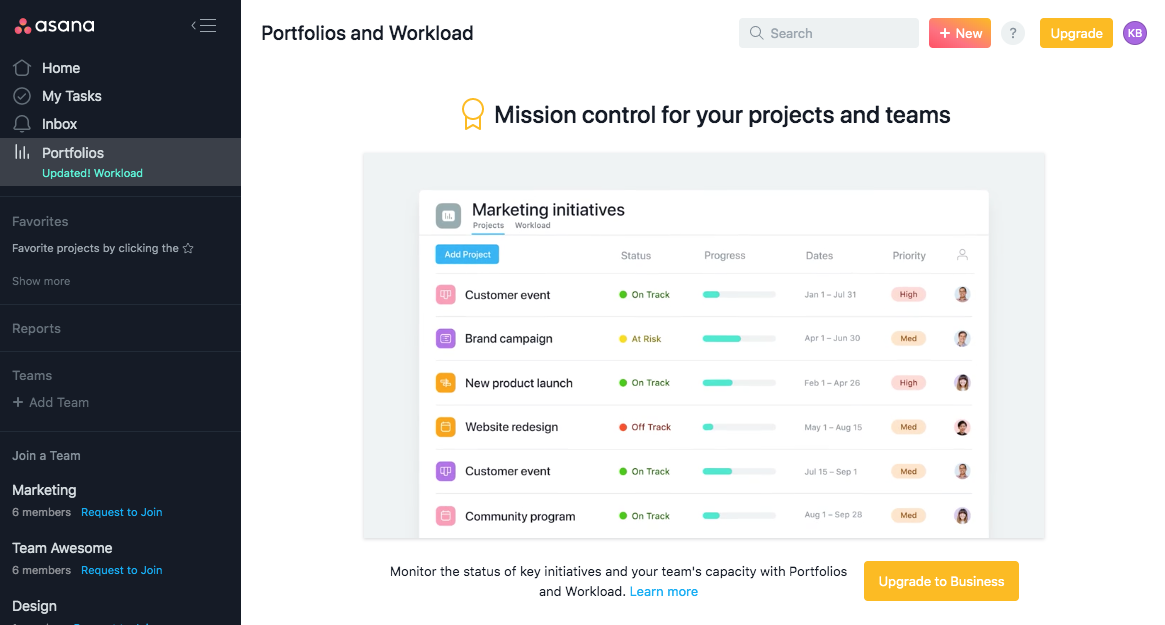
Project management tool Asana, for example, gates their Portfolios and Workload feature—the value of which may not be relevant to new users, but which becomes increasingly appealing as you ramp up your use of the platform.
When free or mid-tier users click on the feature, a video that explains how Portfolios and Workload works and an upgrade CTA appear in place of the dashboard. By identifying features that cater to the evolving needs of these users, Asana makes the upsell relevant and enticing.
Convincing users to upgrade is easier when your pricing is organized around the most relevant value metric.
Take Slack, for example. They've got this technique down to a fine art. In their approach, organizations using the free plan are capped at 10,000 archived messages. Want more? That’s where their upgrade to a paid plan comes into play.

Instead of putting up a hard paywall, Slack hints that users could be getting more value from the service. It's like a gentle nudge to show you the whole buffet when you’ve only been sampling the appetizers.
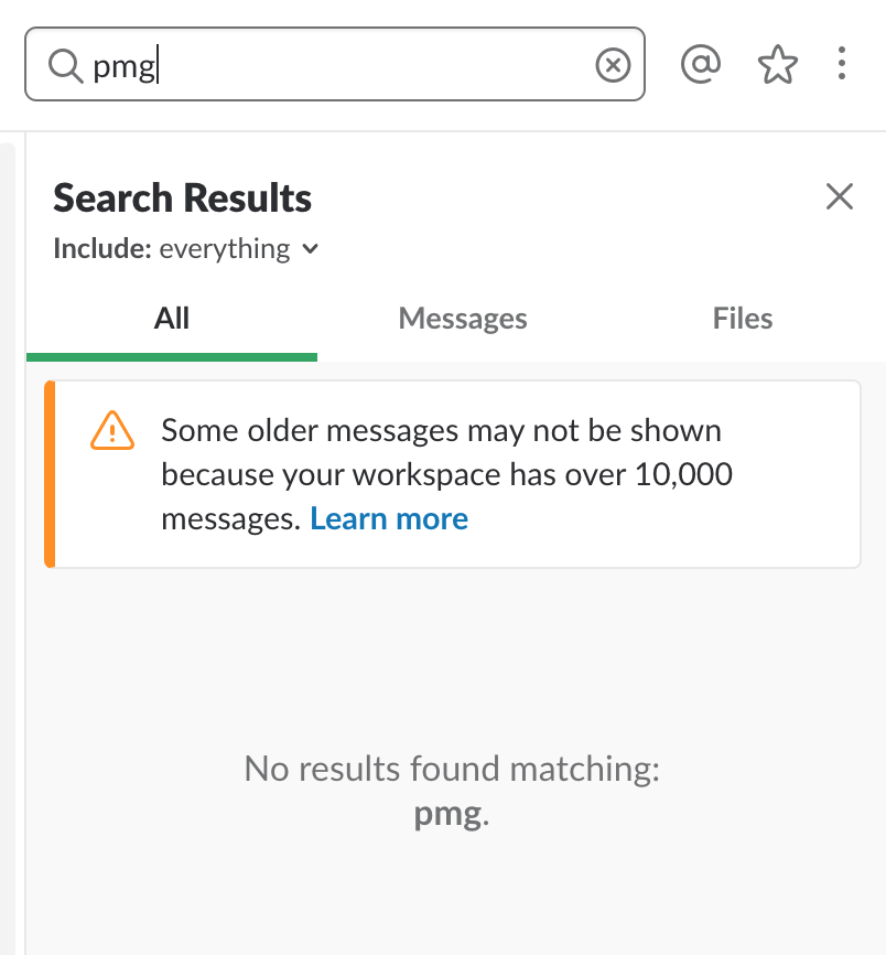
It’s a smart, understated way to introduce a freemium upgrade prompt, targeted at users who find themselves needing just a bit more than what the free plan offers. Slack shows us how understanding your users’ needs and linking them to the right value can turn an upgrade from a maybe to a must-have.
Upselling isn't about playing a game of cat and mouse with your users. If you start playing tricks or pressuring them into upgrades and add-ons, you might just find yourself waving goodbye as they head for the exit. The secret? Let your users lead the dance. When they step forward, showing interest in an upgrade, it's a clear sign they're into your app and ready for more.
The eight companies we've spotlighted? They've got their ears to the ground, listening to their users' needs before making their move with an upsell. And guess what? It’s working like a charm.
Encourage your users to explore beyond the basics, to dive deeper into what your product has to offer. Upselling should never be about squeezing out a few extra dollars. It's about opening doors for your users to more features, more value – enriching their experience with your product. Think of it as helping them to unlock new levels in a game they already love. That’s how you build a relationship that goes the distance, turning a simple transaction into a journey of shared growth and discovery.
Good examples of upselling are like when Spotify gently nudges you towards a Premium subscription after you've hit your song-skip limit, or when a project management tool offers a more advanced version as you start juggling more projects. It's those moments when a company offers you the 'cherry on top' that perfectly complements what you’re already enjoying.
Persuading customers to embrace an upsell offer or explore cross-selling options is like recommending a must-read book to a friend. The secret lies in tapping into their needs and desires, then presenting the upsell or cross-sell in a way that highlights its direct benefits to them. Create a sense of urgency, not through pressure, but by making them realize how this upgrade or additional product could be the missing piece that enhances their experience or solves a problem they're facing. It's about guiding, not pushing, leading them to the 'aha' moment where they see the value for themselves.
An upsell popup might appear when you’re using an app, say, a note-taking app, and you’ve just hit the limit of notes you can create. A friendly popup then appears, suggesting an upgrade that offers unlimited notes — it’s timely, relevant, and oh-so-tempting.
The four stages of upselling are like the steps in brewing a perfect cup of coffee:
The rule of three in upselling is like giving your customers a menu with three options: what they have, what they could have, and the ultimate dream option. It’s about providing a good, better, and best option, making sure there’s a choice that suits everyone’s appetite.
Upselling techniques are the strategies used to encourage customers to upgrade. It’s like knowing when to offer a free sample at a bakery — you’ve got to understand the customer’s taste, present it at the right moment, and show how it complements what they already like. Key techniques include understanding customer needs, timing the offer well, personalizing the message, and ensuring the upsell adds real value to the customer’s experience.