UI mockups: Tips and tools to bring your next idea to life

.png)

.png)
There’s a reason puzzles aren’t designed one piece at a time. Without an overall plan laid out before you, your beautiful summer scene could quickly become a Salvador Dali-esque nightmare.
The same is true of UI mockups. You can’t just skip to prototyping if you want to create a top-tier product. By taking the time to design a UI mockup, you’ll create a product with less clutter, better UX, and fewer melting clocks. 🫠
With these tips and tools, you’ll be ready to make your dream a reality before you know it.
A UI mockup is essentially a wireframe in its Sunday best. Wireframes are little more than sketches that aim to lay out your product's basic functionality and vision.
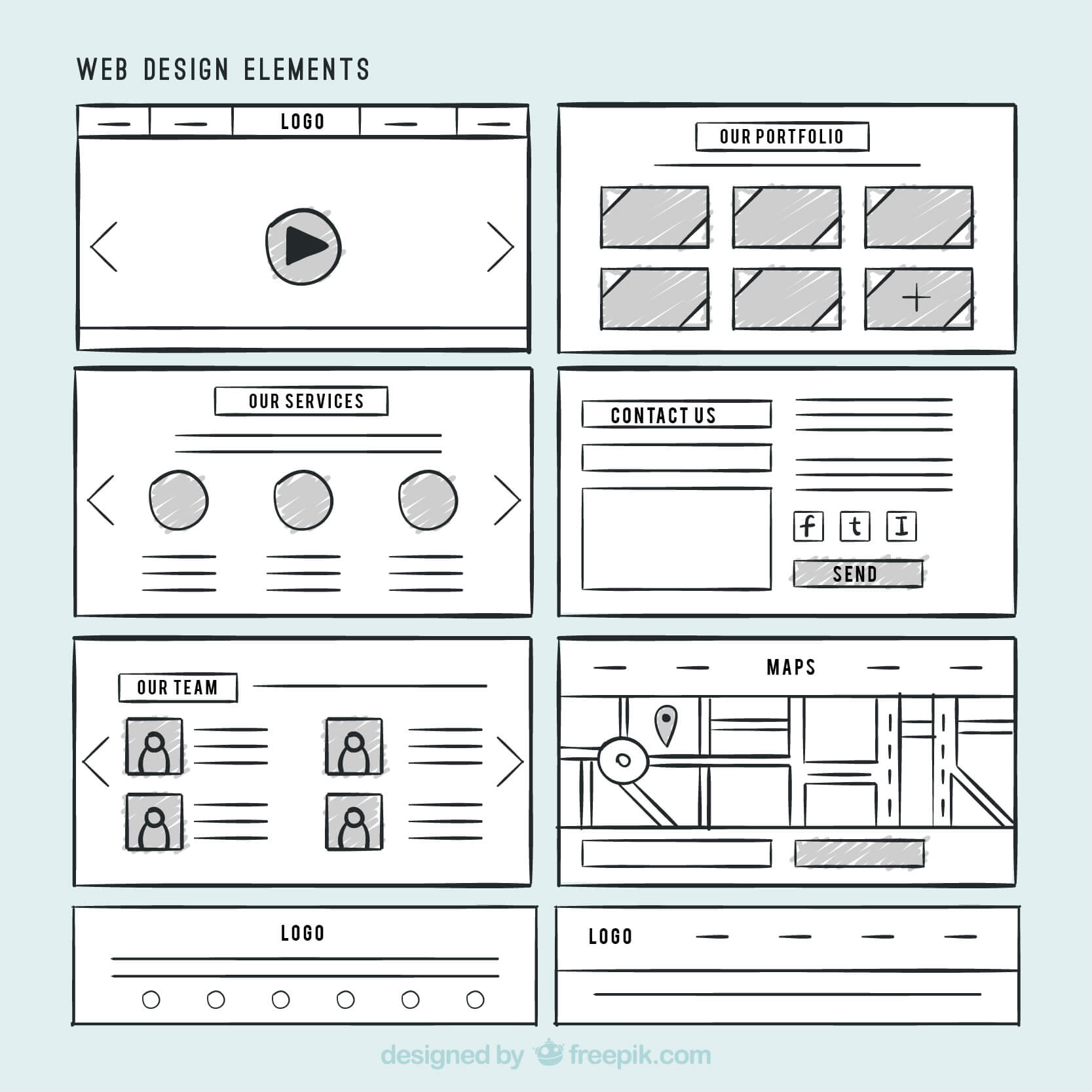
Mockups take those bare bones and add in visuals, fonts, and logos to represent what your final product should actually look like. So instead of looking like a blank page with arrows, boxes, and scribbled explanations, a mockup looks like a fully working product. You can add functionality in the next stage of product development—prototyping—once your mockup is reviewed and perfected.
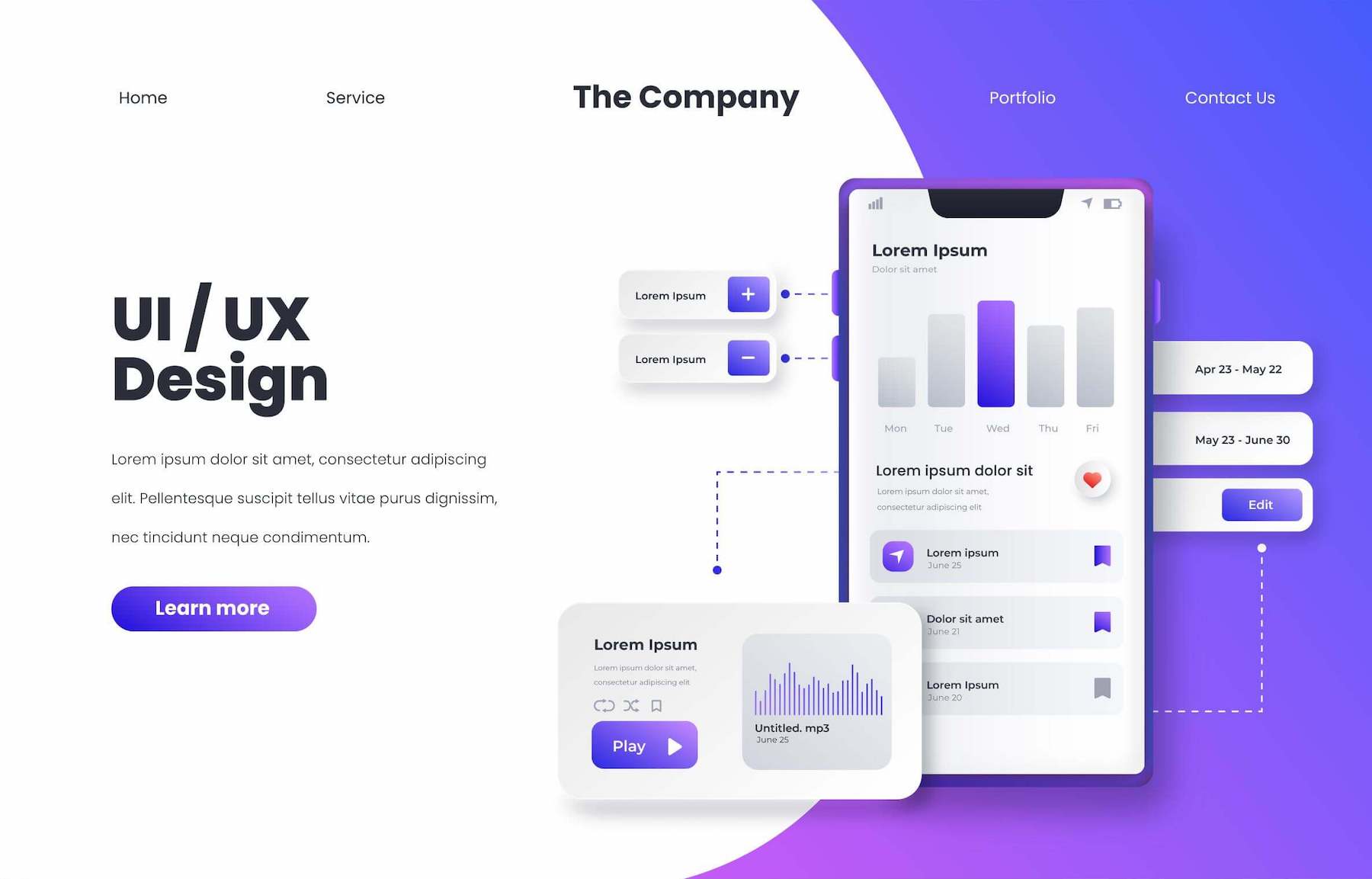
UI mockups do more than just prove how good you are at graphic design and UX. They’re the integral midway point in your development that’ll springboard you from a great idea to a successful SaaS product.
Use your mockup to:
Luckily, getting these benefits has only become easier as new tools and resources make creating high-quality mockups easier than ever before. By following best practices and using the right tools, you’ll get there in no time.
Great UI mockups come in all shapes and sizes, depending on their goals. However, there are some key best practices you should follow to make life easier for yourself, regardless of what you’re building.
Designing each of your mockup’s visual elements from scratch will take up more of your team’s time and energy when they could be directed to more constructive things. Free UI kits on the internet offer you premade elements and visual features you can use to build your mockup quickly (while still looking good). Some elements unique to your project may still require custom work, but there’s no need to redesign basic menu and button icons that are common across projects.
There are tons of free UI kits out there. The trick is finding the one that’s best for your unique needs. For that, we've got an article stuffed to the gills with the best free UI kits on the web.
The best user interfaces are instantly familiar. People don’t want a UI design they’ve never seen before because they won’t know how to use it. Instead, you want to pull from common UI patterns so that users focus on what your product does and not how to make it work.
The best user interfaces are instantly familiar.
For instance, most users are familiar with the three-line hamburger menu and will instantly know how to interact with it. However, remove just one or two lines from that icon, and you’ll leave most users confused and frustrated. Avoid this issue by studying our list of common UI patterns before you start your mockup. This way, you’ll know which patterns you should pull from when you're in the design process.
When designing the multitude of screens for your product, you’ll end up reusing a lot of elements out of convenience and design continuity. You don’t want to waste time searching through poorly labeled elements looking for just the right one.
Use a common naming scheme and series of folders to keep everything where it needs to be. It may add some extra time initially, but you’ll thank yourself later. (Trust us on this one!)
If you’re more of an idea person and less of a UX/UI expert, designing your mockup layout can be intimidating. But don’t fret—there’s no need to reinvent the wheel. Look at other successful apps and products, identify common design elements, and see how they can be incorporated into your plans.
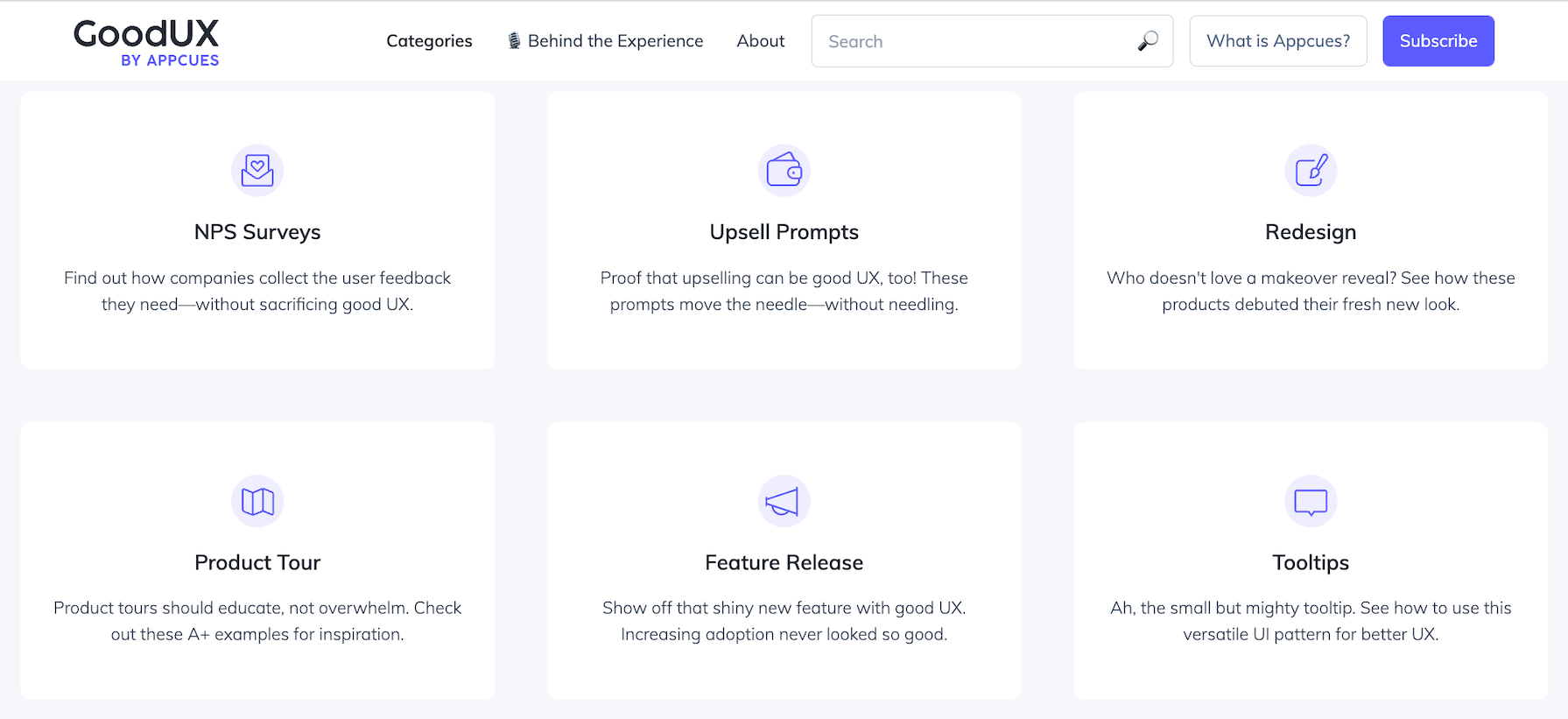
Check out GoodUX for a ton of great examples of design done right. Or, if you’re working on your user onboarding, take a look at the best user onboarding experiences. You may find yourself fully motivated and ready to take on your project or brainstorming session with even more gusto.
There are plenty of mockup tools out there, and most of them are really good at helping UI designers make the most out of their projects. However, you want the one that’s going to be just right for you and your project. Here’s what you should evaluate to find your diamond in the rough.
Most tools base their prices on the number of active users/collaborators/editors you want working on your projects. If you’re a large team, choosing a tool that charges a flat fee like Adobe XD can be advantageous.
Teams with smaller budgets and scope should consider products with free versions. There’s no need to shell out for a major program if you only need to do a couple of basic mockup designs.
No tool is perfect for every team. Each one has slightly different features and benefits to help it stand out from the competition. You need to find the one that's most convenient and compatible for your team.
Here are the major factors you should consider:
Many of the larger tools require some experience with design and technical know-how. If your team doesn’t have this, you’ll need a lot of time and energy to get the most out of one of these more complicated programs. Weighing the benefits of the extra features against the extra time adjusting to the learning curve is something you should consider when choosing the right tool for you.
Mockups are just one stage of a journey that starts with an idea and ends with a fully functional product. Ideally, you’ll want a design tool that takes you all the way from wireframing to a working prototype. That way, you won’t need to import and export designs multiple times throughout the process.
Most of the design tools listed below will take you across these product development stages (Miro being the exception). However, if you choose something else, make sure to take this into consideration.
One of the most important decisions you’ll make is which UI mockup tool to use for your projects. Here are some of the top tools laid out with all the details you’ll need to make a decision on what’s best for you.
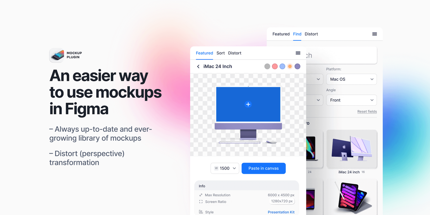
Figma is one of the most popular options for UI mockups because of its flexibility. It works on all major platforms, and it allows for greater collaboration than many of the competitors. For instance, Figma lets multiple team members edit and comment on a mockup in real time for faster design sessions.
The other advantage of Figma is its free version, which is perfect for teams that are just starting out. Figma allows you to create three Figma projects with unlimited collaborators at no cost. This is great value and a good chance for you to see whether this is the right tool for you when it comes to creating wireframes, mockups, or even interactive prototypes.
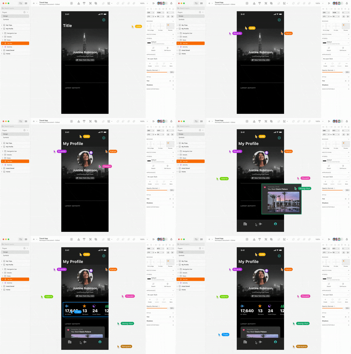
Sketch is undoubtedly the best design tool out there if you and your team are in the Mac ecosystem and plan to create for Apple products. The best part about Sketch is its smooth interface and Ul. Sketch’s UI is well-thought-out and runs like a dream on MacOS.
One of the biggest advantages of Sketch is that you can work offline. Sketch is a top choice if you’re somewhere with poor internet or just feel like working on a sunny beach.
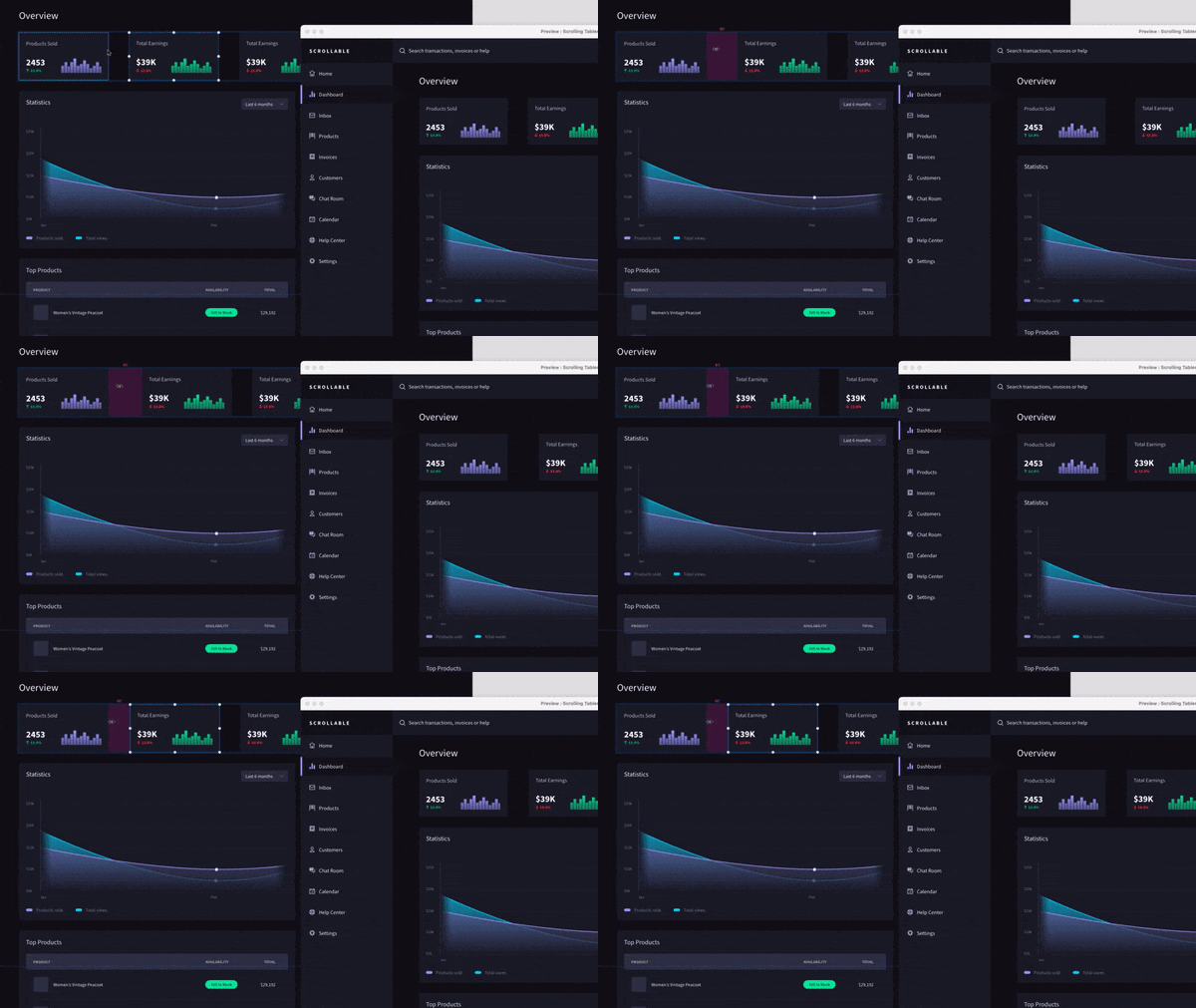
Adobe XD is quickly becoming one of the best UI mockup and prototyping programs on the web. Previously, XD felt a bit behind its competitors, but with Adobe putting out major updates multiple times a year, it quickly caught up to the pack. So if you had given XD a pass a couple of years ago, it might be worth coming back for a second look.
The biggest advantage of XD is that it’s a natural extension of Photoshop. If you’re already familiar with Photoshop, it’ll be far easier to jump into XD. It also supports multiple languages, including French, Spanish, and Japanese. So if you have an international team, this will be the right choice for you.
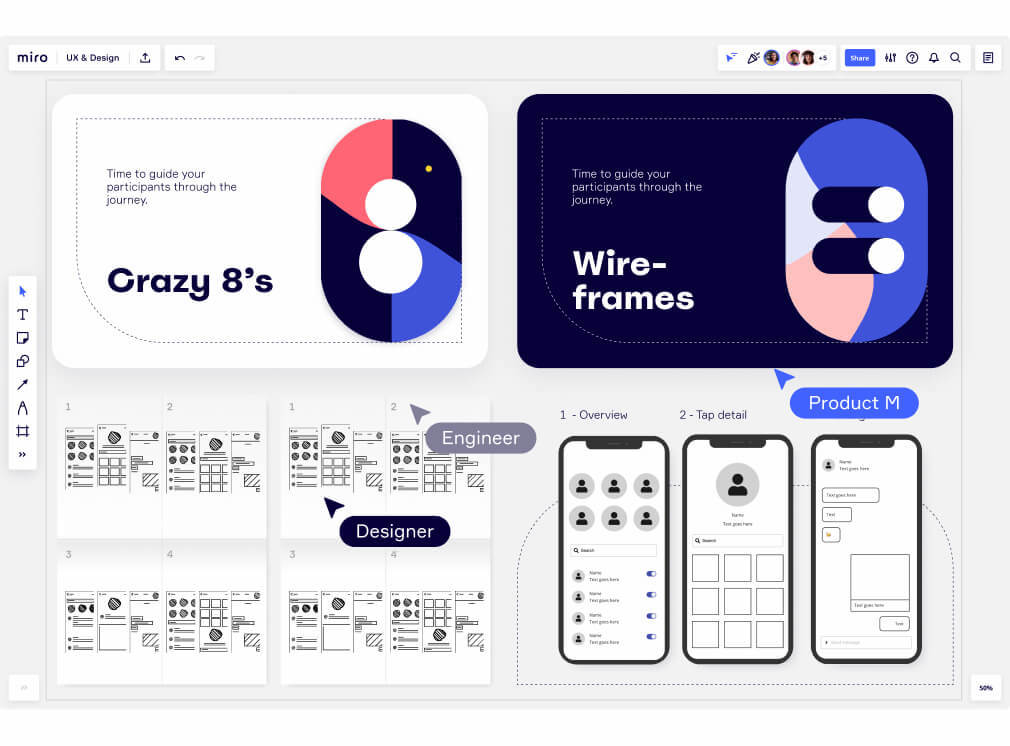
Miro is a whiteboard app that product managers can use to easily create mockup designs, wireframes, and low-fidelity prototypes. It’s a refreshingly lightweight, limited-scope option for mockups, to-do lists, or whatever you need it for. Whereas Figma or XD can do it all, Miro focuses on just one basic thing and does it very well.
Miro is ideal for small teams with limited technical abilities who don’t want to learn to use one of the bigger systems. It makes creating mockups simple by giving you access to templates, free-form drawings, and drag-and-drop shapes. Anyone can create a mockup here, which makes it ideal if you don't see yourself creating mockups very often.
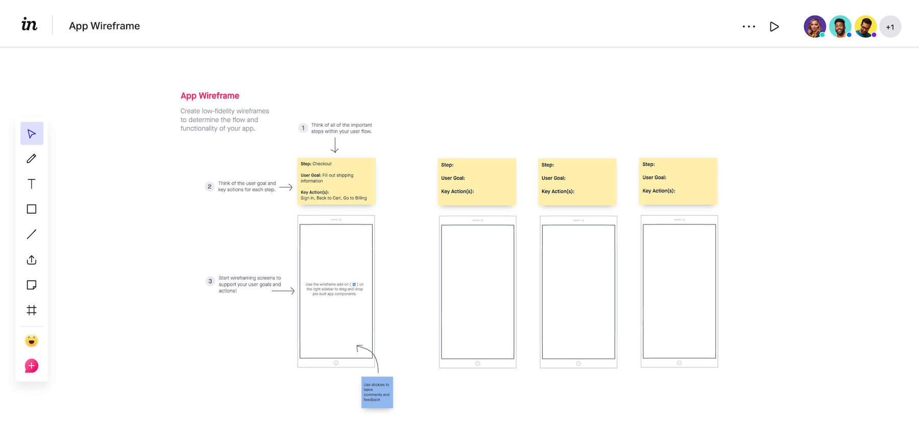
InVision is one of the OGs for creating wireframes, mockups, and interactive prototypes online. Recently, it lost some of its luster, but that doesn’t mean it’s not worth checking out.
InVision boasts all of the major design tools and editing features you’d get from competitors like Sketch or Figma. One area InVision does well is collaboration—users can request feedback from others by simply mentioning a co-worker and leaving them a short message.
Creating great mockups requires an understanding of what a good user experience looks like. If this is your first project, you may not know the basics of smart design and how it can help provide a better experience for your users.
The best way to get yourself up to speed is by reading the Product Experience Playbook. This book runs you through the basics of great product design, so you can avoid common pitfalls and provide an unparalleled UX on your first try.