.png)
25% of users abandon an app after just one use if they don't immediately understand its value?
Harsh to think about it but... onboarding screens are a make-or-break moment for user retention and engagement. These screens serve as your product's first impression, guiding users toward understanding its benefits while reducing friction in their initial experience.
With SaaS products user satisfaction inevitably hinges on seamless onboarding. So investing in tailored onboarding flows will gradually lead to considerable improvement in retention rates.
This article explores why effective onboarding flows are essential for SaaS platforms, offering examples, core principles, and actionable design tips specifically tailored for SaaS and web apps.
By the end, you’ll understand how to transform your onboarding experience into a strategic advantage that fosters long-term user engagement and growth.
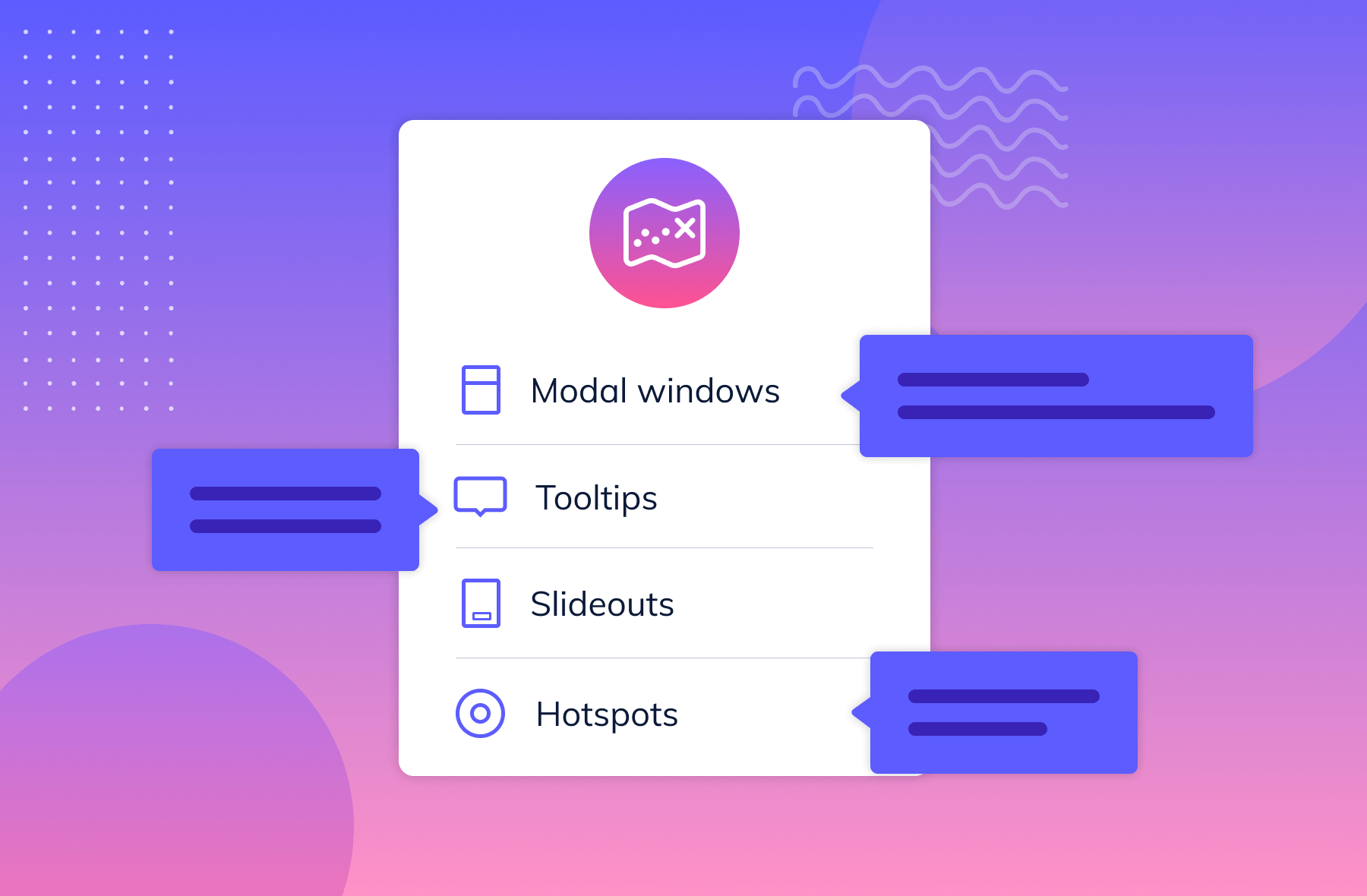
Onboarding screens are the first interactions a user has with your app.These screens introduce features, guide setup, and communicate product value—ensuring new users understand how to get started and why it matters.
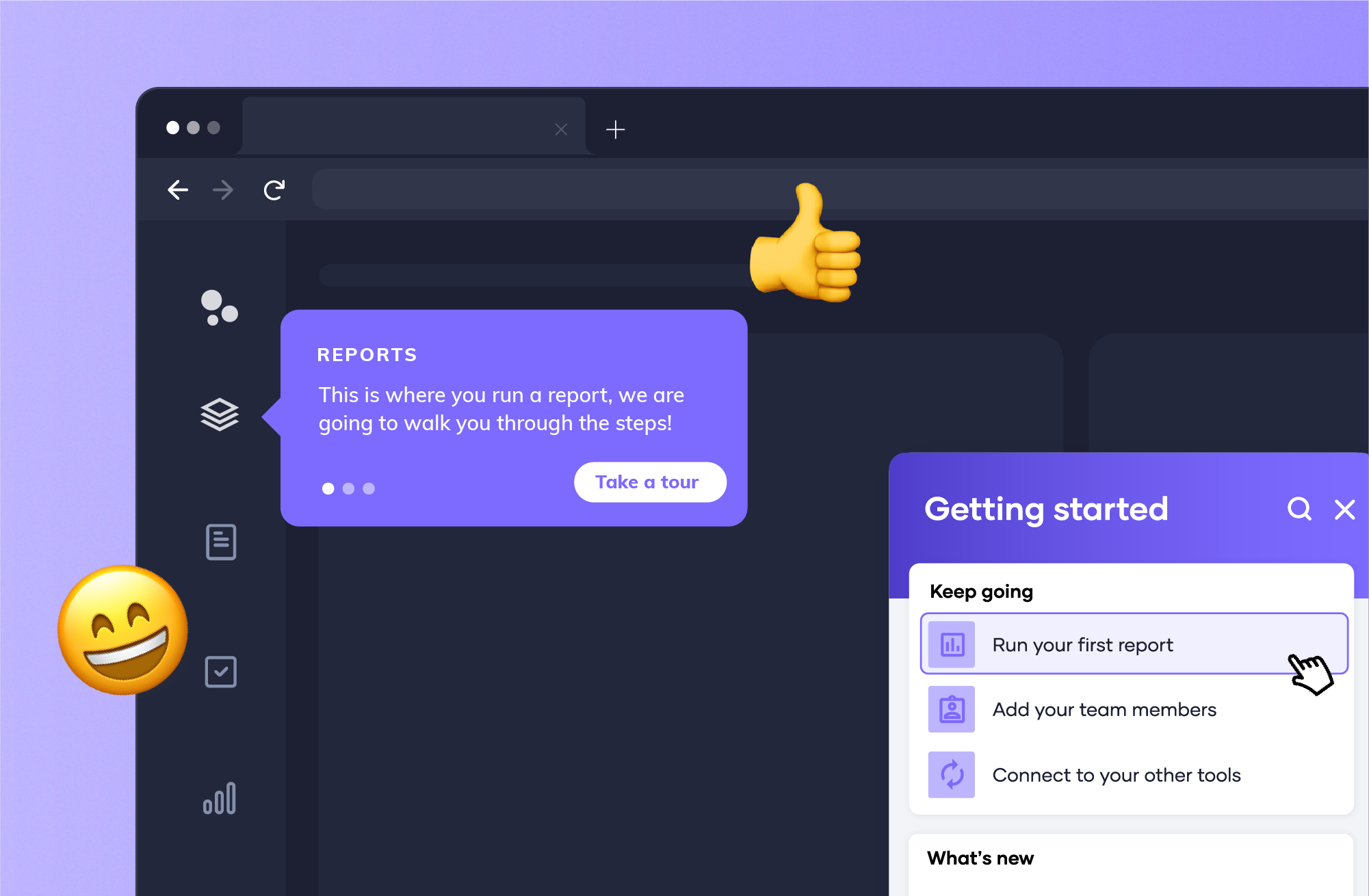
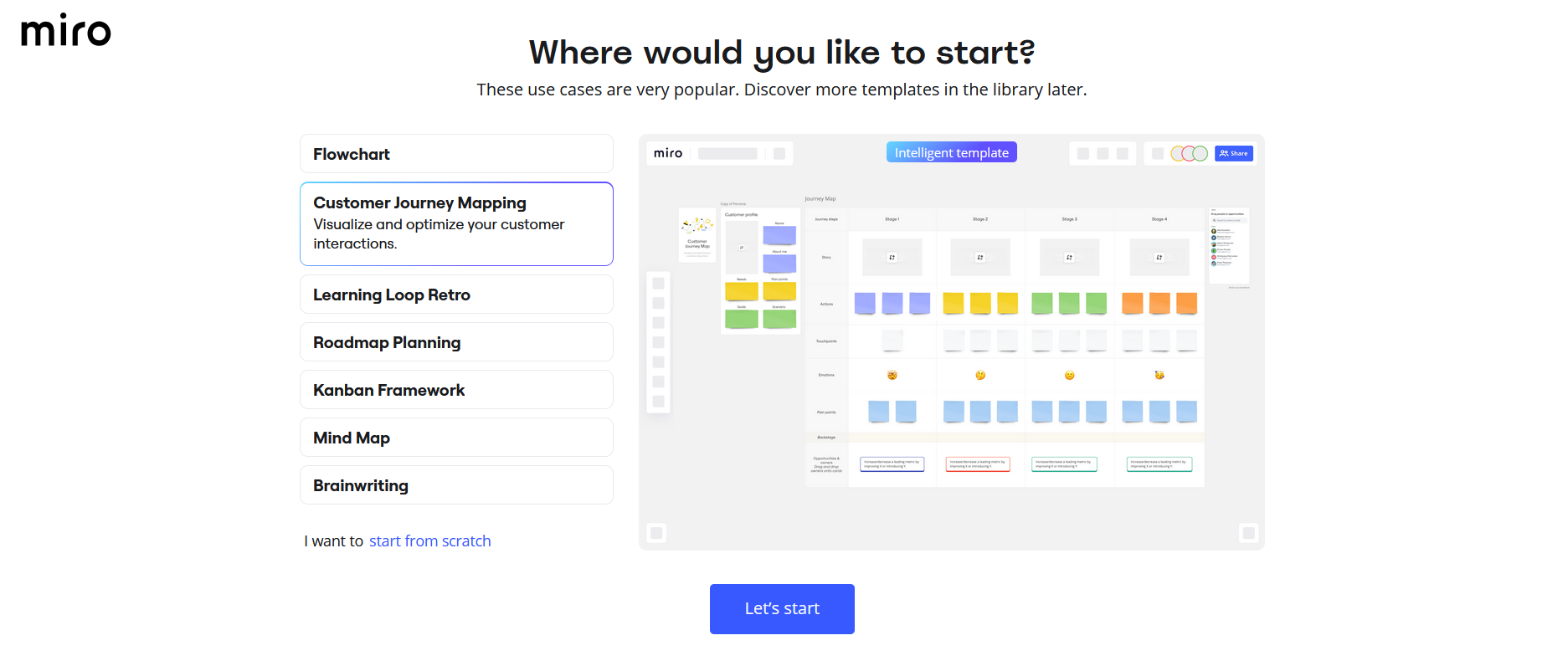
Greeting modals are simple. They are oftenn full-screen or pop-up interfaces that welcome users and provide an overview of the product or the onboarding process. Miro, for example, uses greeting modals to introduce users to templates, tools, and tips for getting started.
Why use them:
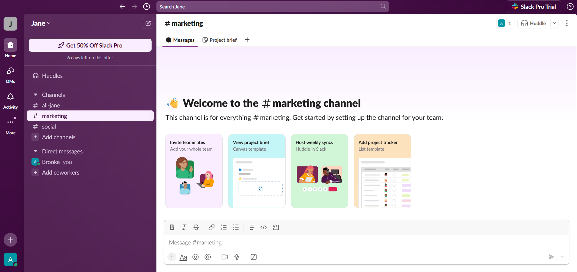
Interactive guides are step-by-step walkthroughs where users perform tasks while being guided. For example, Slack introduces new users to its workspace by demonstrating how to send messages, join channels, and customize settings.
Why use them:
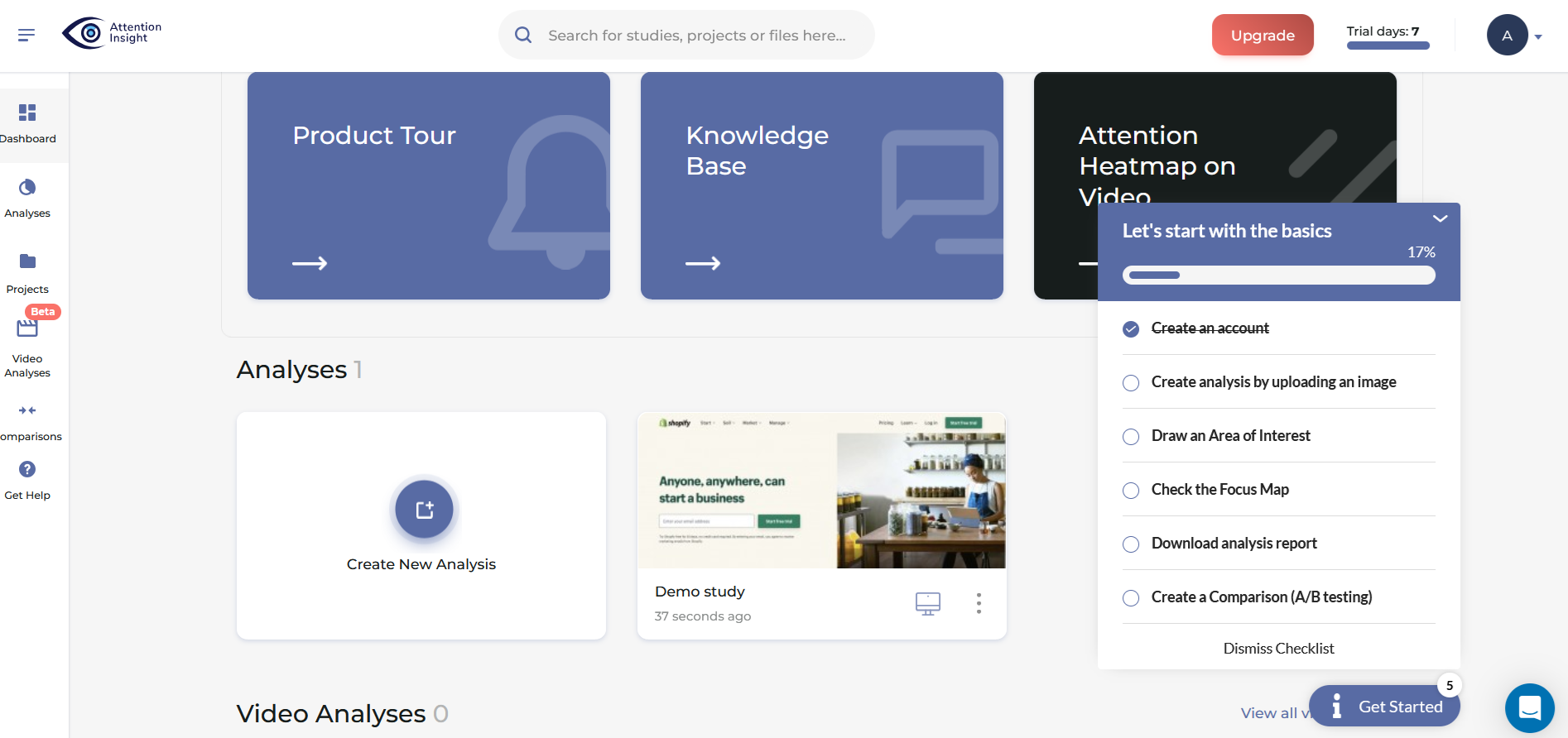
Checklists display a list of tasks users need to complete, often with progress tracking or status indicators. Attention Insight, for instance, uses checklists to encourage users to upload content, configure settings, and explore features.
Why use them:
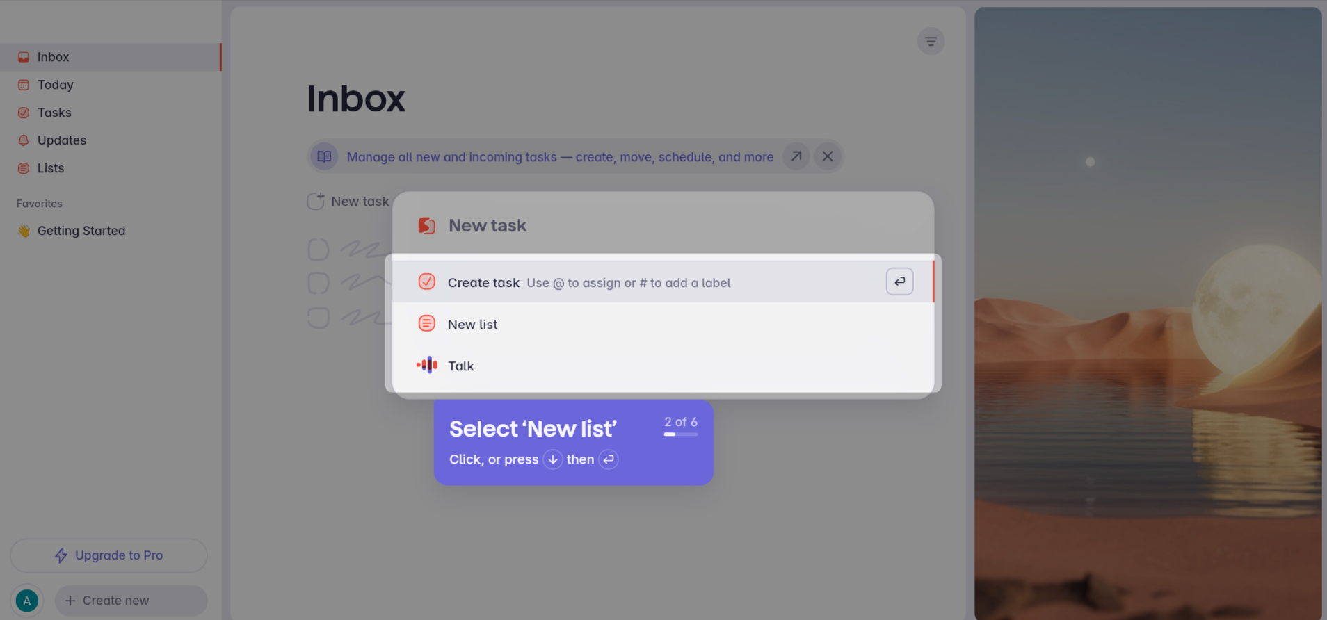
Progress bars, like in the Superlist example below, are visual indicators showing users how far they are in the onboarding process. Empty states are placeholders with instructional content that appear when a feature lacks data, such as a new user’s dashboard.
Why use them:
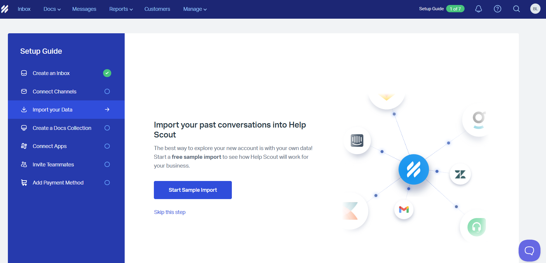
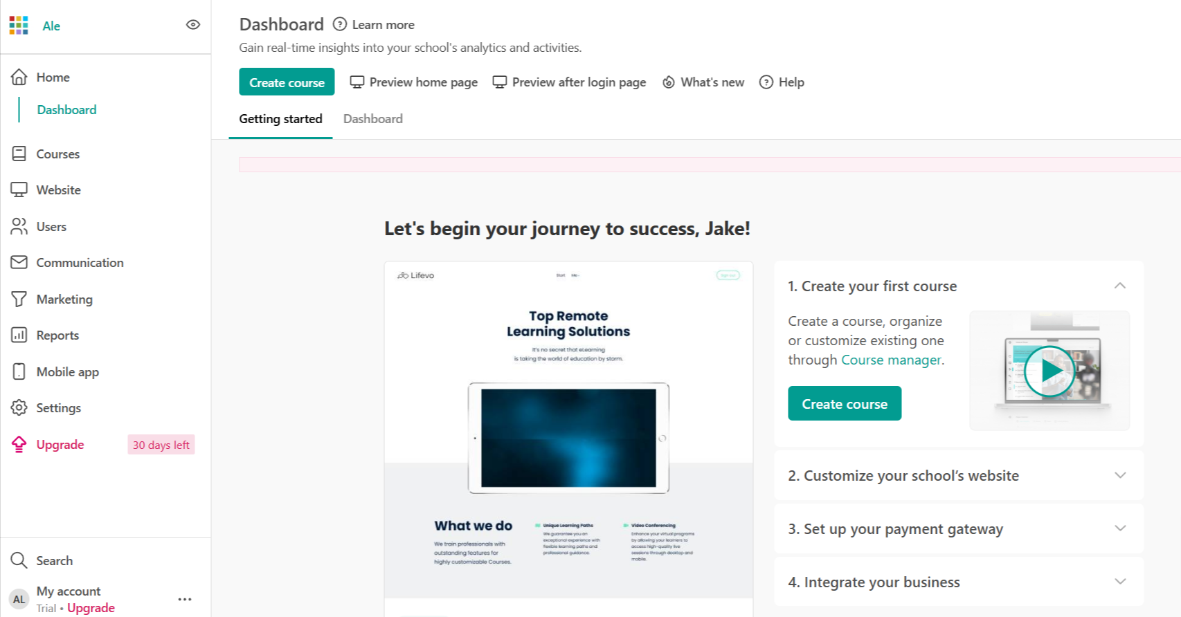
Help Scout’s onboarding is, quite frankly, everything a growing support team needs to hit the ground running. The initial setup guide provides clearly labeled steps so users can map out their customer support workflow on day one.
With clean visuals and action-oriented prompts, users should instinctively know how to proceed, whether it’s starting a sample import or connecting their existing tools.
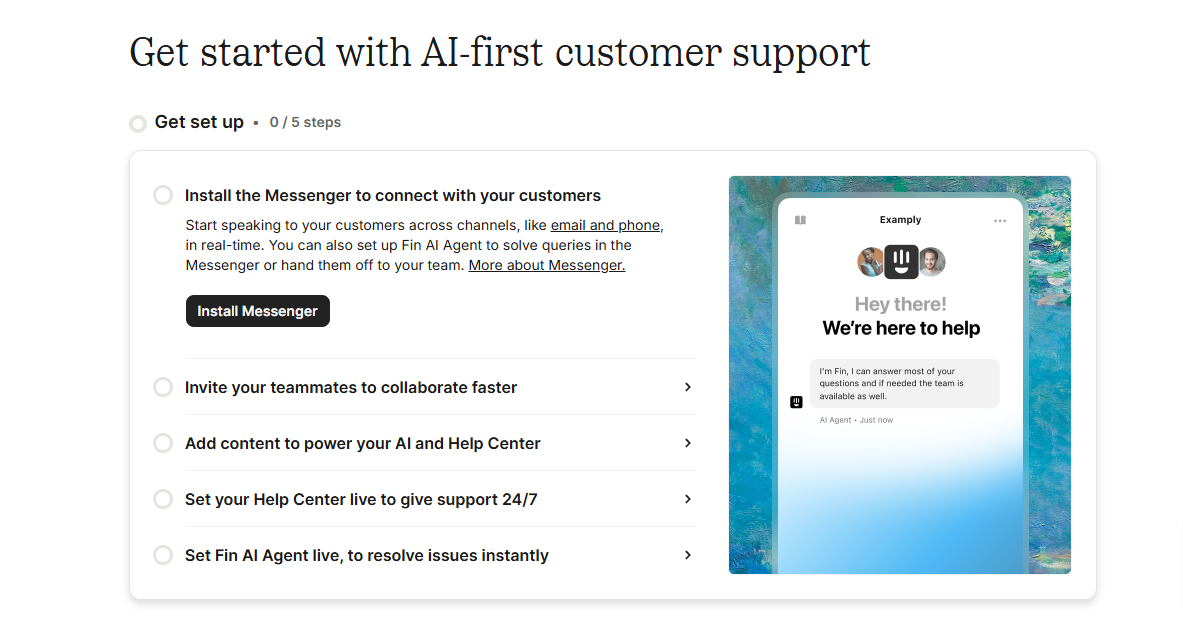
Intercom’s onboarding is a mix of modern customer support essentials and actionable AI-driven insights. The progress tracker and a focus on quick wins, like launching Messenger, make it effortless for users to immediately unlock value.
By highlighting the AI assistant as an essential feature, Intercom sets the tone for a forward-thinking experience. This level of guidance and focus ensures users can integrate tools quickly, keeping up with the fast-paced demands of customer service.
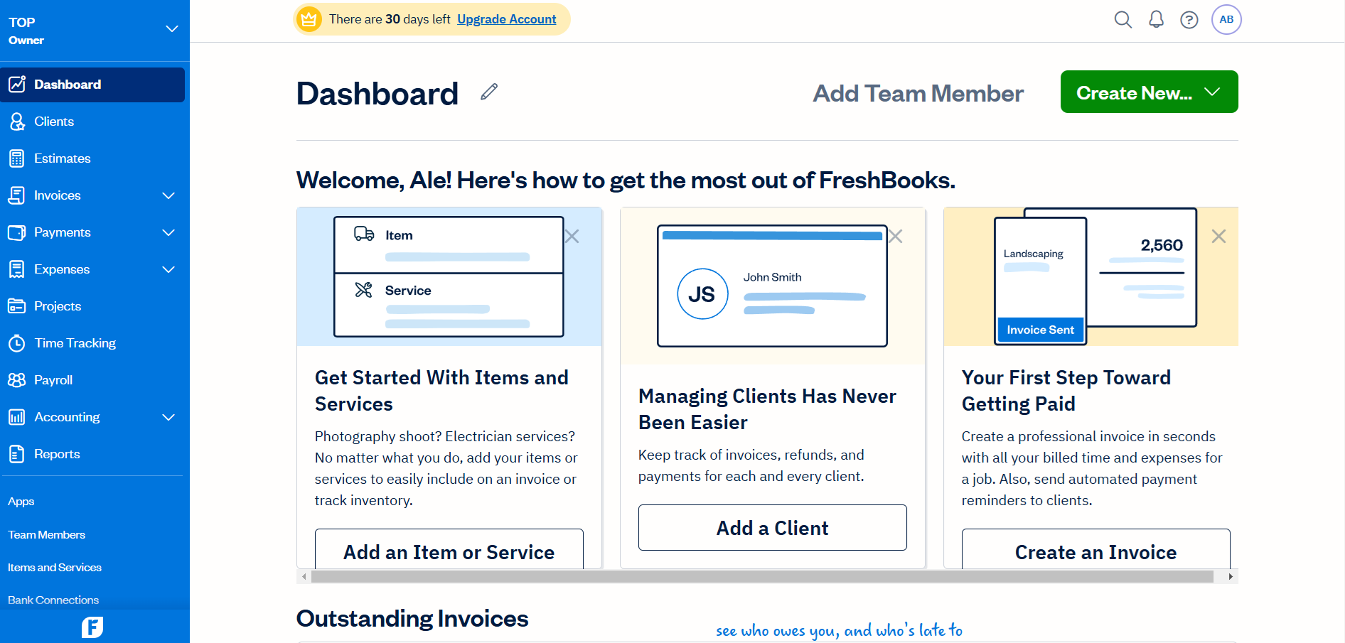
FreshBooks’ onboarding is a mix of everything a small business owner will need to manage their finances. The initial dashboard provides step-by-step guidance with labeled sections to help users add items, clients, and invoices.
With visual prompts and a focus on immediate value, users simply "get" how to quickly set up their workflow for billing and tracking. This level of clarity and speed is especially needed given the fact this might be an urgent task for them.
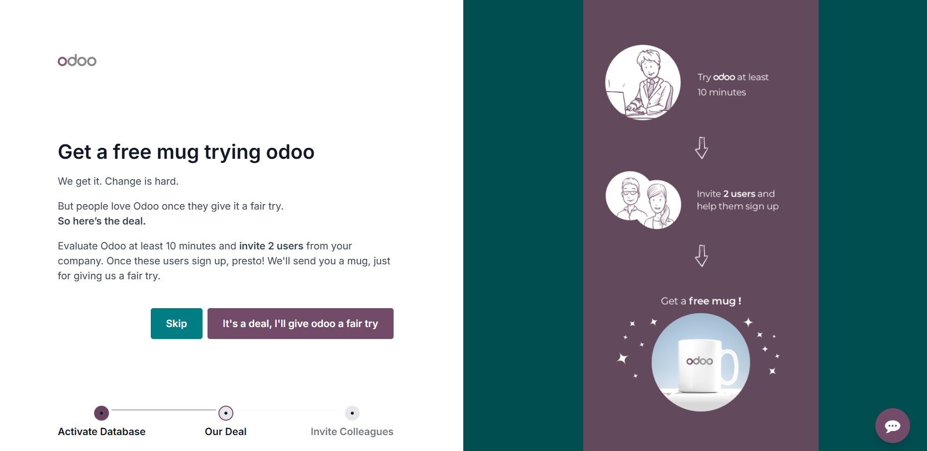
Odoo does things a little differently with an onboarding that blends utility and engagement. At the very beginning though, the promise of a free mug adds a playful incentive for users to complete their profiles.
The conversational tone and whimsical design choices make what could be a complex process feel approachable.
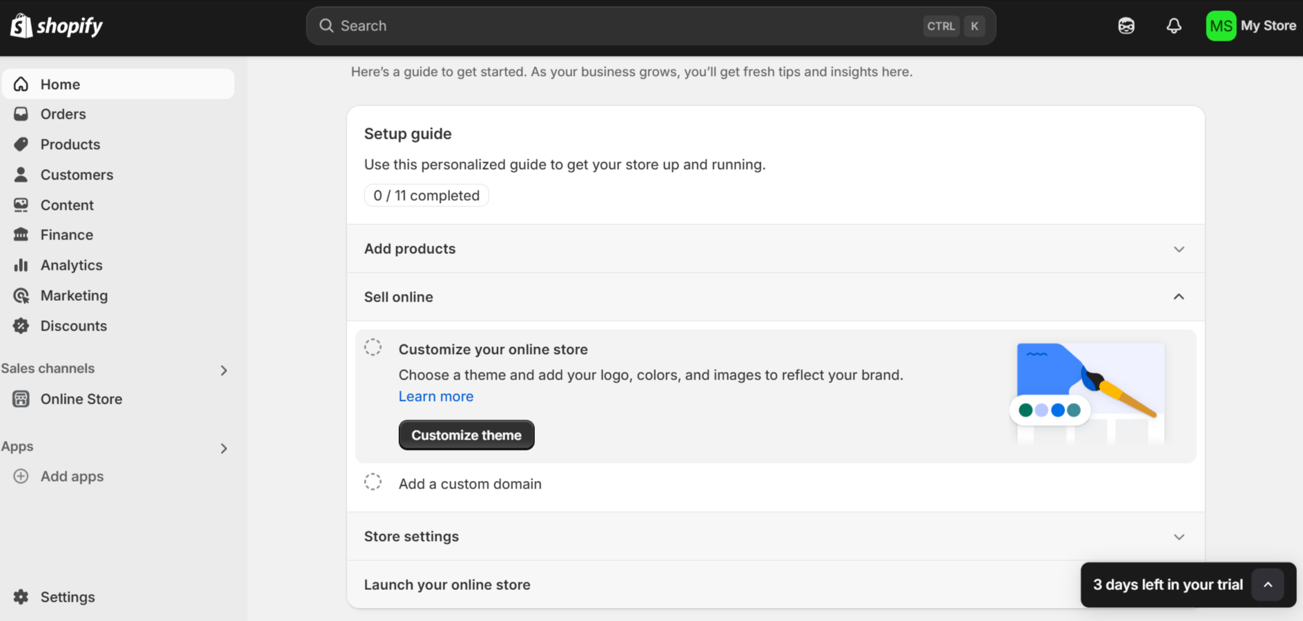
Shopify’s onboarding combines utility and practicality in a way that feels tailored to busy entrepreneurs. The personalized setup guide breaks the process into manageable steps, while a progress tracker provides clarity and motivation.
Although Shopify leans heavily into utility, subtle touches like a trial countdown add just enough charm to keep users engaged.
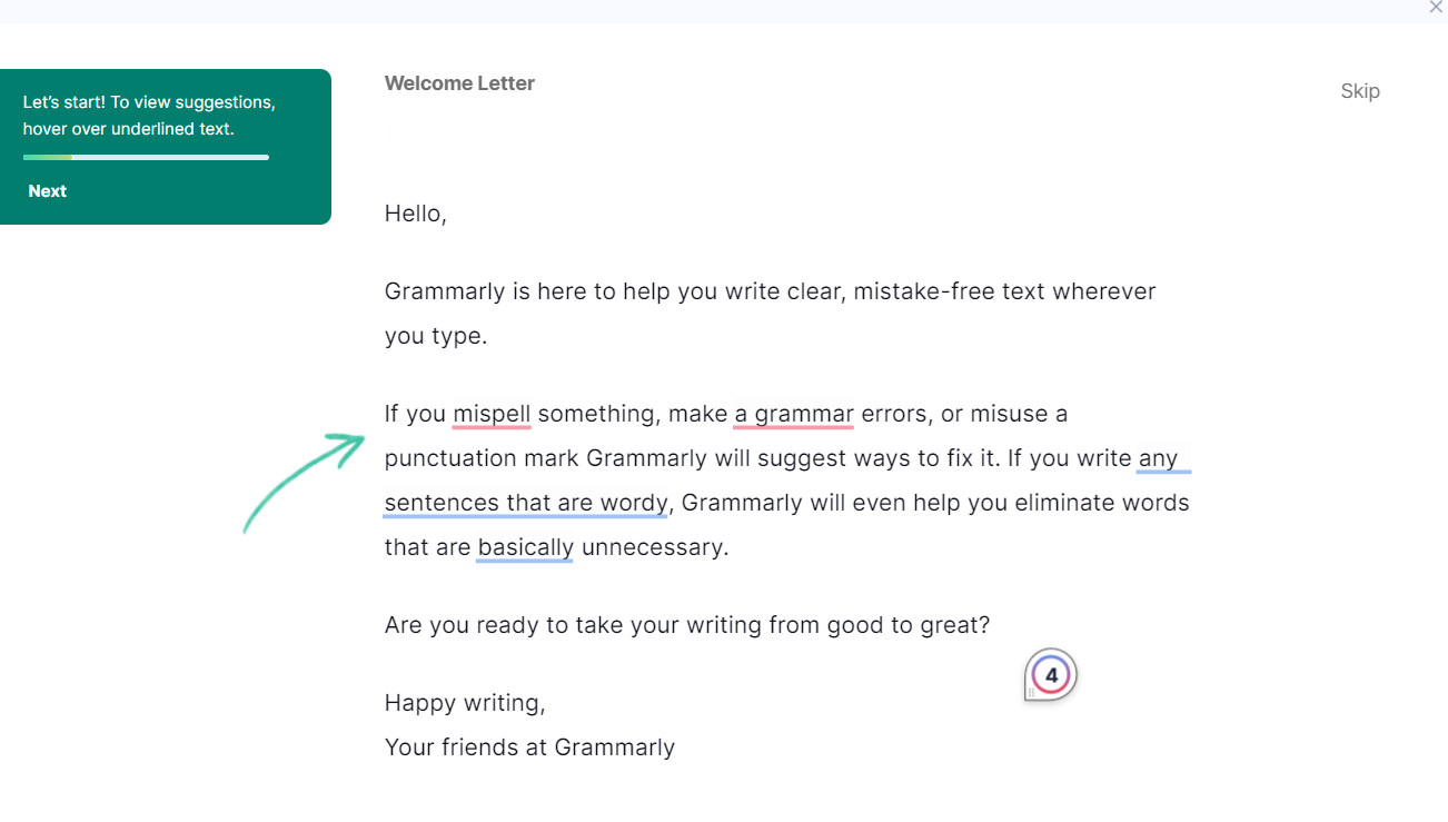
Grammarly’s onboarding shows new users exactly what using the app/extension is like. The highlighted suggestions instantly demonstrate the platform’s value, showcasing how it catches errors and streamlines writing.
By using a conversational tone and interactive elements, they remove any intimidation users might feel about improving their writing.
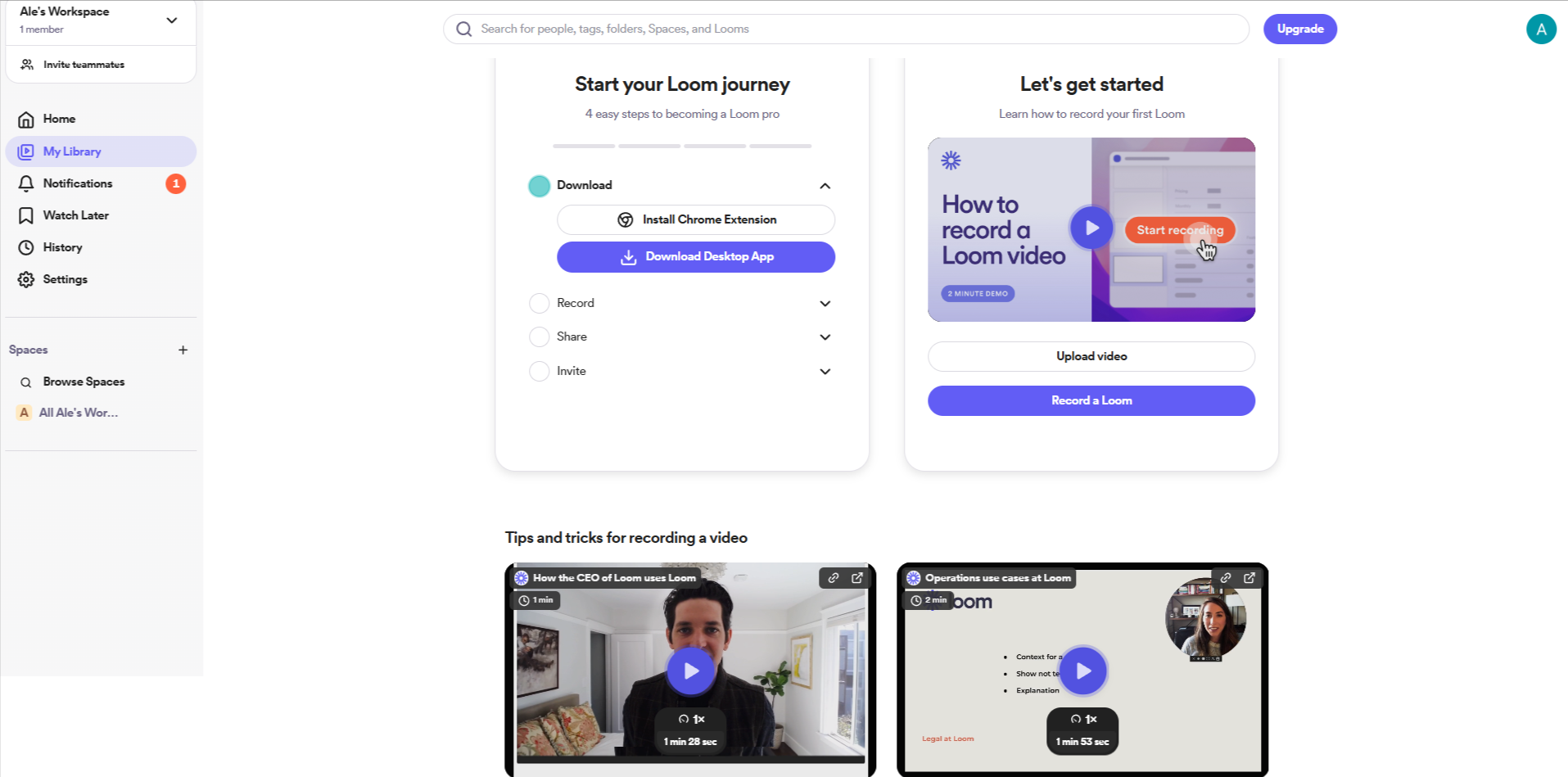
Loom’s onboarding strikes a balance between utility and engagement, with a clear step-by-step journey that feels intuitive rather than overwhelming. The promise of easily recording videos in a few clicks mirrors Odoo’s “10-minute” setup, keeping things simple and time-conscious. The inclusion of demo videos adds a touch of whimsy, making the experience visually engaging and approachable.
For professionals looking to save time, this combination of brevity, clarity, and charm ensures they feel confident getting started. Adding a playful incentive—like earning badges for completing steps—could take the engagement even further.
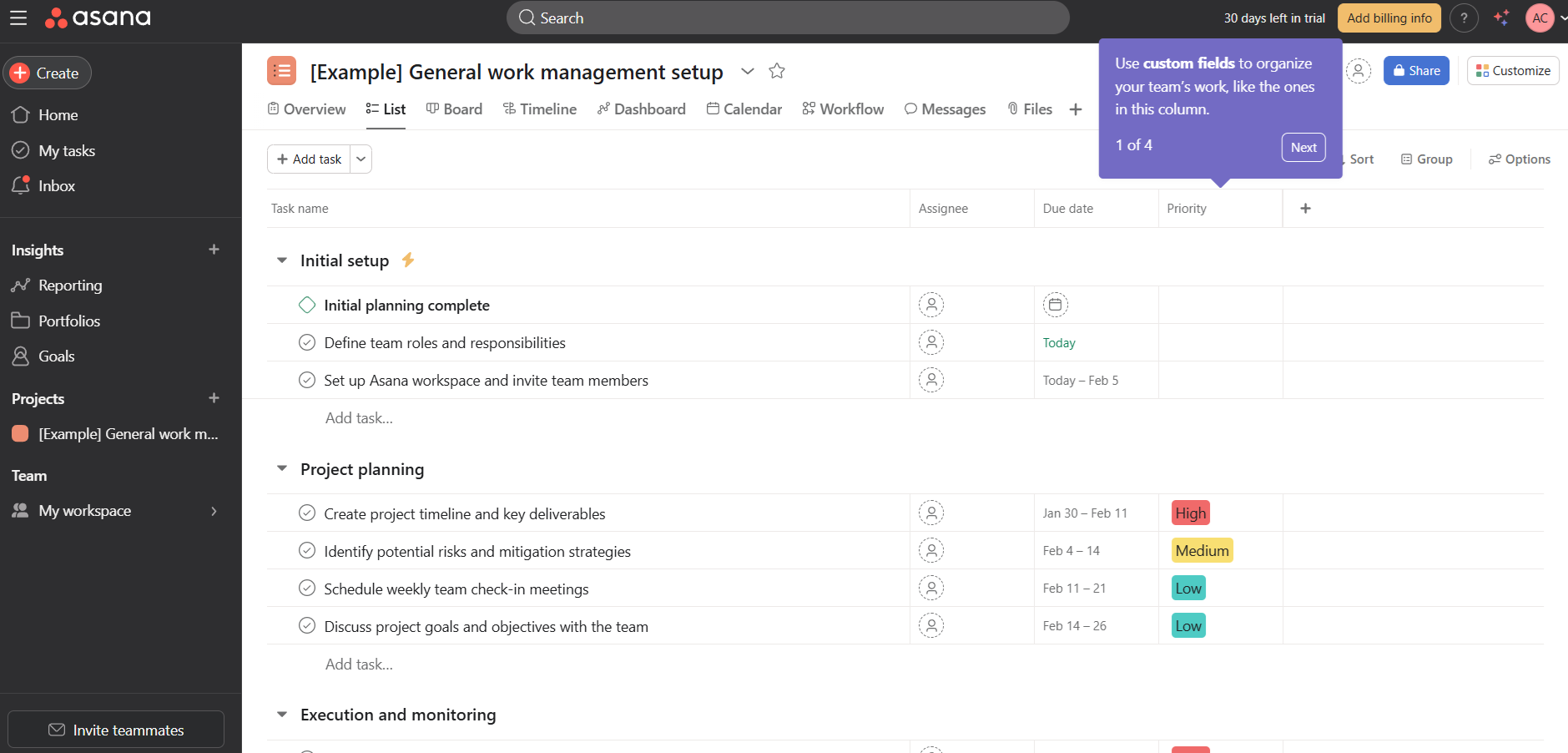
Asana's onboarding prioritizes getting new users with common in-product tasks such as managing tasks within projects. The app goes one step further to explain organizational features like custom fields and get users familiar with navigating common app workflows.
There's a lot to do within this screen alone but the user onboarding experience is smoother thanks to the clarity of the interactive tooltips.
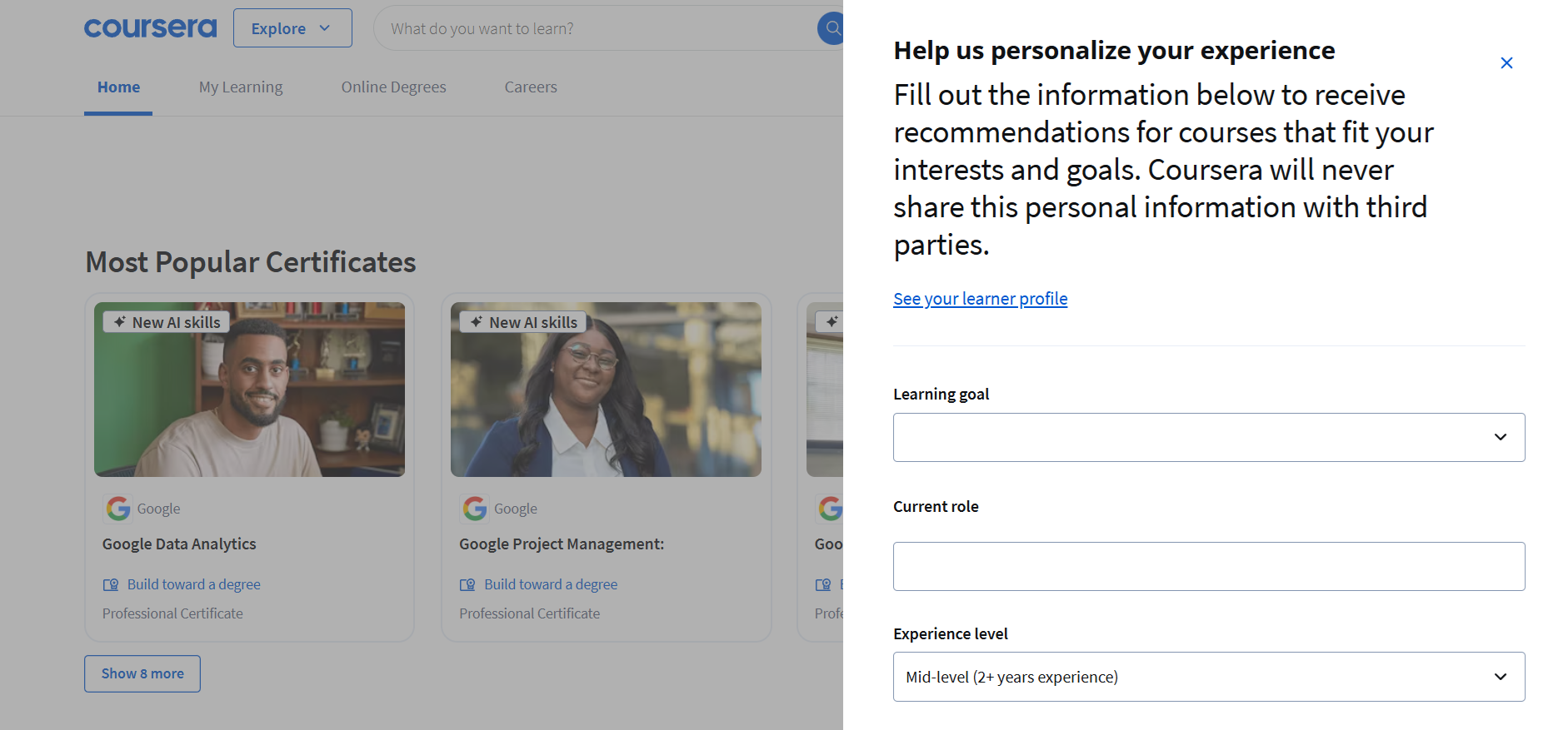
Coursera’s onboarding focuses on personalizing the user’s learning journey. It collects key information such as learning goals, current role, and experience level to tailor course recommendations.
The simplicity of the input fields and the emphasis on personalization make it easy for users to get started and rest assured they'll get relevant courses. Meanwhile, their instant focus on popular certifications adds an immediate sense of the value they'll get out of using the platform.
The LearnWorlds onboarding screens follow a typical user onboarding checklist format. A welcome page precedes multiple screens that take the target audience through a step-by-step user onboarding flow.
Beyond the welcome message, what matters the most is that this screen highlights key actions first time users should complete.
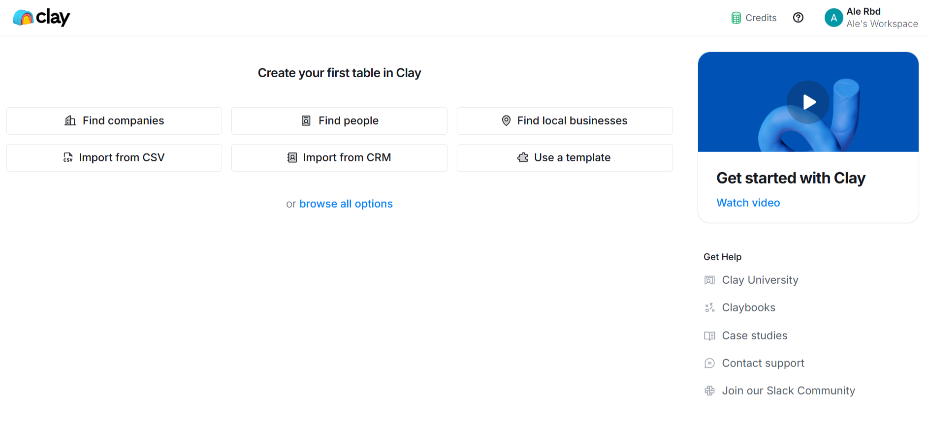
Clay’s onboarding screens are simple as they don't really push users toward a specific action item. With multiple clear entry points, it's entirely up to the user to decide what they want to do next.
A concise video tutorial is prominently displayed to guide users visually, while links to Clay University and other resources are accessible for deeper learning. This modular approach, paired with action-oriented buttons, ensures new users can easily find and organize data in a way that feels tailored to their needs.
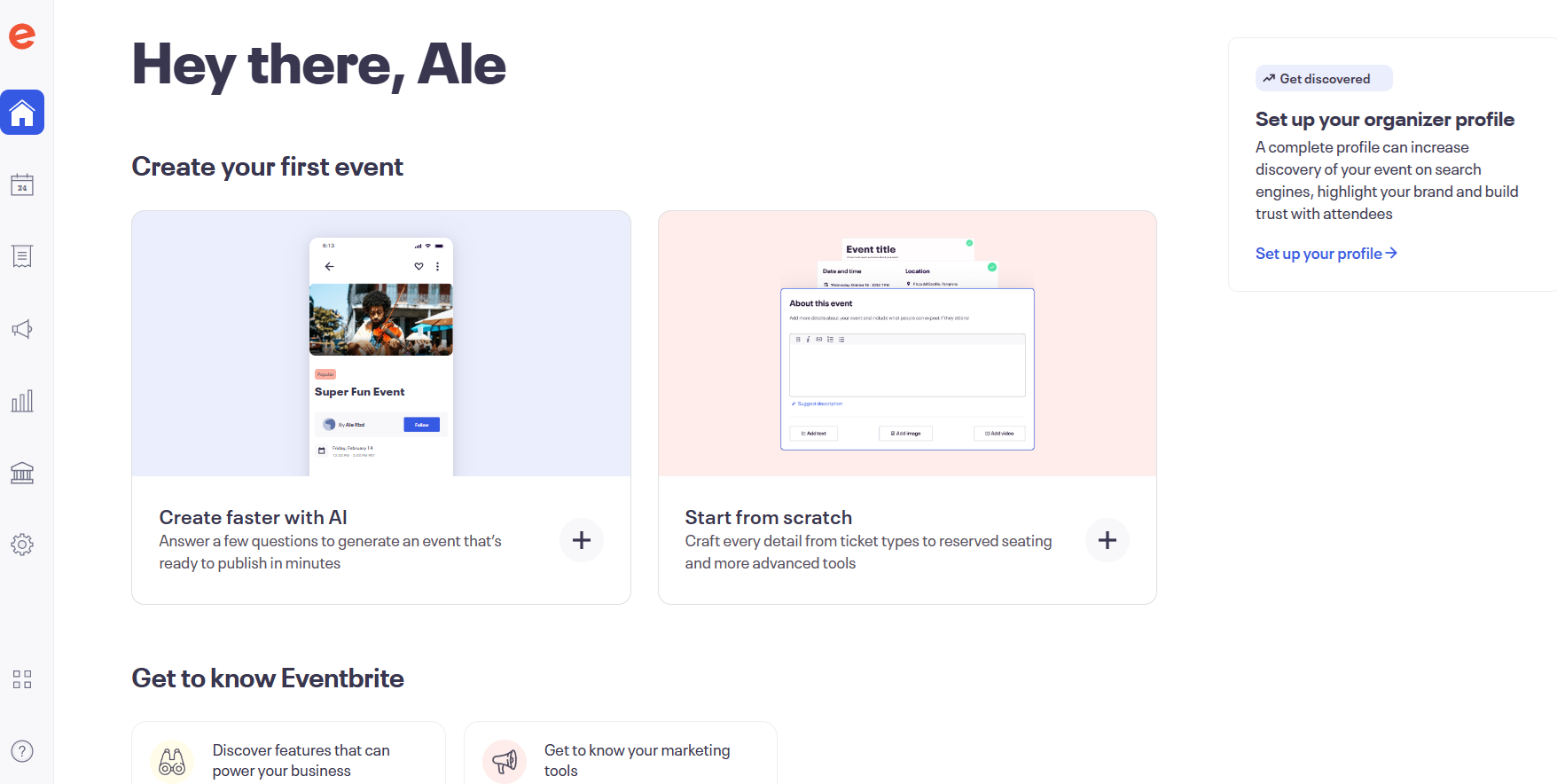
Eventbrite’s onboarding greets you with options to create events either through AI-generated setups or start these from scratch. Notice how the two largest highlights all focus on the app's main purpose: creating events.
Additionally, the platform emphasizes its marketing and discovery features, encouraging users to complete their organizer profiles to boost event visibility. This, however, only comes second to their main objective, allowing users to explore features at their own pace.
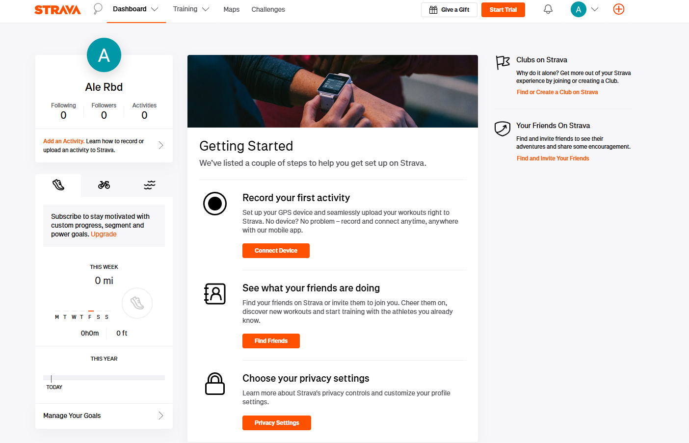
With Strava's onboarding screens, you get an initial look at what stats for users will look like once they use the app (on the left side of the screen).
Then, you get a list of steps you need to set up your account and get accustomed to using it. This is a key retention correlated action that ensures most users will know how to use the app, making it more likely for them to turn using the app into a habit. This goal is important for Strava's use cases but, ultimately, your onboarding screens will depend on what your ideal outcomes are.
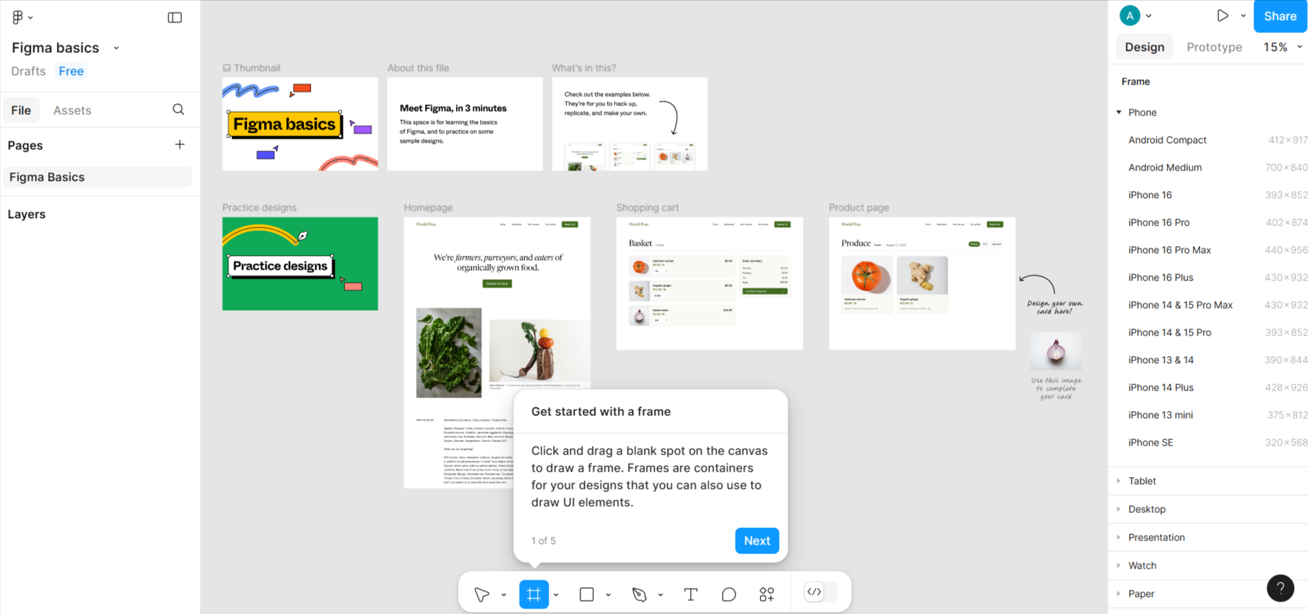
Figma’s user onboarding flow is built to help users dive straight into designing. It introduces core features like frames, layers, and templates through an interactive workspace, with tooltips providing step-by-step guidance.
The design-centric experience is both visual and hands-on, ensuring new users quickly grasp the platform’s functionality. The tooltips and example projects make the onboarding process approachable, even for beginners.
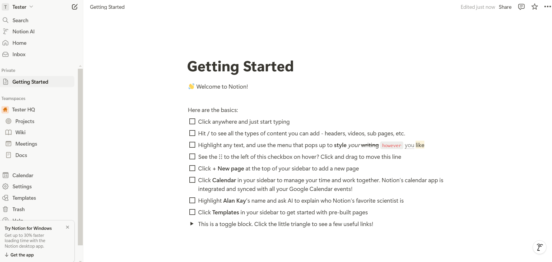
Notion sticks with an apparently simple checklist for their onboarding. In reality, this checklist already introduces one of its own features, getting users ready to start doing basic actions.
Each step is meant to add an extra in-app skill, getting users confident with the next action items.
Here are five best practices, each with a creative angle to how you can apply them:
Customize onboarding screens through welcome surveys that give you the exact insights you need into your customers.
For instance, Spotify asks users about their favorite artists and genres to curate a personalized playlist from the start. Similarly, an e-learning app like Duolingo tailors lessons based on the user’s language proficiency.
Introducing features gradually helps prevent cognitive overload. Instead of showing users every feature from the start, highlight essential actions like creating channels and sending messages.
This method mirrors a new relationship: you reveal your best qualities over time. Use interactive tooltips that appear only when users hover over specific areas, creating a self-guided exploration.
People care about what a product can do for them. For example, instead of saying “Enable two-factor authentication,” apps like Google use the onboarding stage to emphasize, “Add an extra layer of security to your account.”
Infuse empathy into microcopy—use conversational language and emojis to add personality to onboarding screens without sacrificing clarity.
Animations, clean layouts, and progress bars create an intuitive and visually pleasing flow. Notion’s onboarding uses soothing animations and empty states to encourage users to explore.
Incorporate storytelling with sequential illustrations or animations that progress as users complete steps, turning the onboarding into a mini journey.
No-code platforms allow teams to create, test, and deploy onboarding flows without writing code:
Design tools support you with creating custom onboarding designs and prototypes:
Analytics software lets you track and improve onboarding performance:
Start with onboarding UI kits for Figma and Sketch App Sources for Sketch templates, including progress bars, checklists, and interactive guides. You can also find downloadable Figma templates to visually indicate user progress through onboarding steps or checklist UI components for task-oriented checklists that keep users engaged and on track.
But we're not done yet. App onboarding goes well beyond the signup process, welcome screen, onboarding survey, or onboarding checklist.
Behavioral triggers help deliver guidance at the right time, enhancing the user's experience.
For example, you could show a tooltip when a user hovers over or interacts with a new feature. Alternatively, opt for contextual pop-ups to tackle situations like users who might appear stuck, such as idling on a page for too long. Use them sparingly though to avoid overwhelming users or disrupting their flow.
Use the onboarding journey (and beyond) to reinforce your product messaging across different channels. The message you use for onboarding can be part of welcome emails or push notifications to nudge users to return and complete their setup.
You should personalize these messages as much as possible based on specific user actions like unfinished tasks or milestones achieved. This will require extra tech setups and some development work to make sure you're recording users' actions correctly (and in real time) so you'll avoid sending them the wrong messages.
Experiment to identify the most effective onboarding elements. Variations you can test include copy, visuals, number of onboarding steps, cues, and formats. You can rely on popular tools you're already using for product analytics like Appcues, Mixpanel, or Optimizely to run A/B tests and analyze user behavior.
Track where users abandon the onboarding process to identify friction. Pay attention to common drop-off points like having forms that are too long, technical issues that might slow down the onboarding pages, and confusing instructions.
Don't forget to pair the results with qualitative feedback you can get from in-app surveys to dig deeper into the real reasons behind user behavior.
Effective onboarding screens are key to driving user adoption and retention. When done right, they guide users with clarity, reduce friction, and make a strong first impression.
Here’s what great onboarding delivers:
To build onboarding that truly works:
Next step:
Take a free Appcues tour to see how you can easily build and optimize onboarding flows that deliver real value from day one.