The Treasure Hunt Framework: How to turn more of your users into paying customers

.png)

.png)
“Free-to-paid” is the name of the game for most SaaS companies. Your free trial or freemium plans are like free samples at the grocery store: this product’s so good, just a little taste will convince you to buy it and take it home.
A SaaS product, however, isn’t a slice of capicola. Deli meat proves its value the moment you put it in your mouth because it tastes delicious. SaaS products need to prove their value over time and through repeated use. This problematic delay in gratification results in historically low conversion rates: 5-20% of users convert from free trials, while only 2-5% of freemium users end up upgrading.
But the delayed-gratification problem is also the inspiration behind Appcues’ Treasure Hunt Framework for converting free users into paying subscribers. The framework reimagines your product’s most valuable feature as buried treasure and your customers as treasure hunters with limited patience. It focuses on minimizing your time-to-value (TTV) to delight users and increase your conversion rate.
The success of your product depends on getting your users to strike gold before they lose interest. Help your users uncover the product’s true value—and boost your conversion rates—using the Treasure Hunt Framework’s 3 simple steps.
The Treasure Hunt Framework equates your product’s true value to buried gold. Somewhere inside your app lies a feature with the power to draw prospects in and convince them to convert to paying users. Unfortunately, many free trial and freemium users get lost looking for this treasure and never find the reason to plunk down money for your product.
Before you can identify the best way to lead users to this treasure feature, you must identify what it is. Your app might contain dozens of helpful features, but they’re not all equally valuable to new users. A review of your behavioral analytics will reveal your product’s most heavily used features. It’ll also show you which features are integral to user retention.
Right at the intersection of high use and best retention lies your product’s treasure.
But it isn’t enough to know which feature your users value most: You need to know why users treasure the feature. Development teams and product marketers too often atomize a product into its bells and whistles. The real value of your feature is in what it does—and converting your freemium and free trial subscribers into paying users requires you to show them that value ASAP.
To go a step further: you need to understand how users arrived at their pain points in the first place. Sure, users come to your recruitment software to solve their hiring woes, but you need to know why and how.
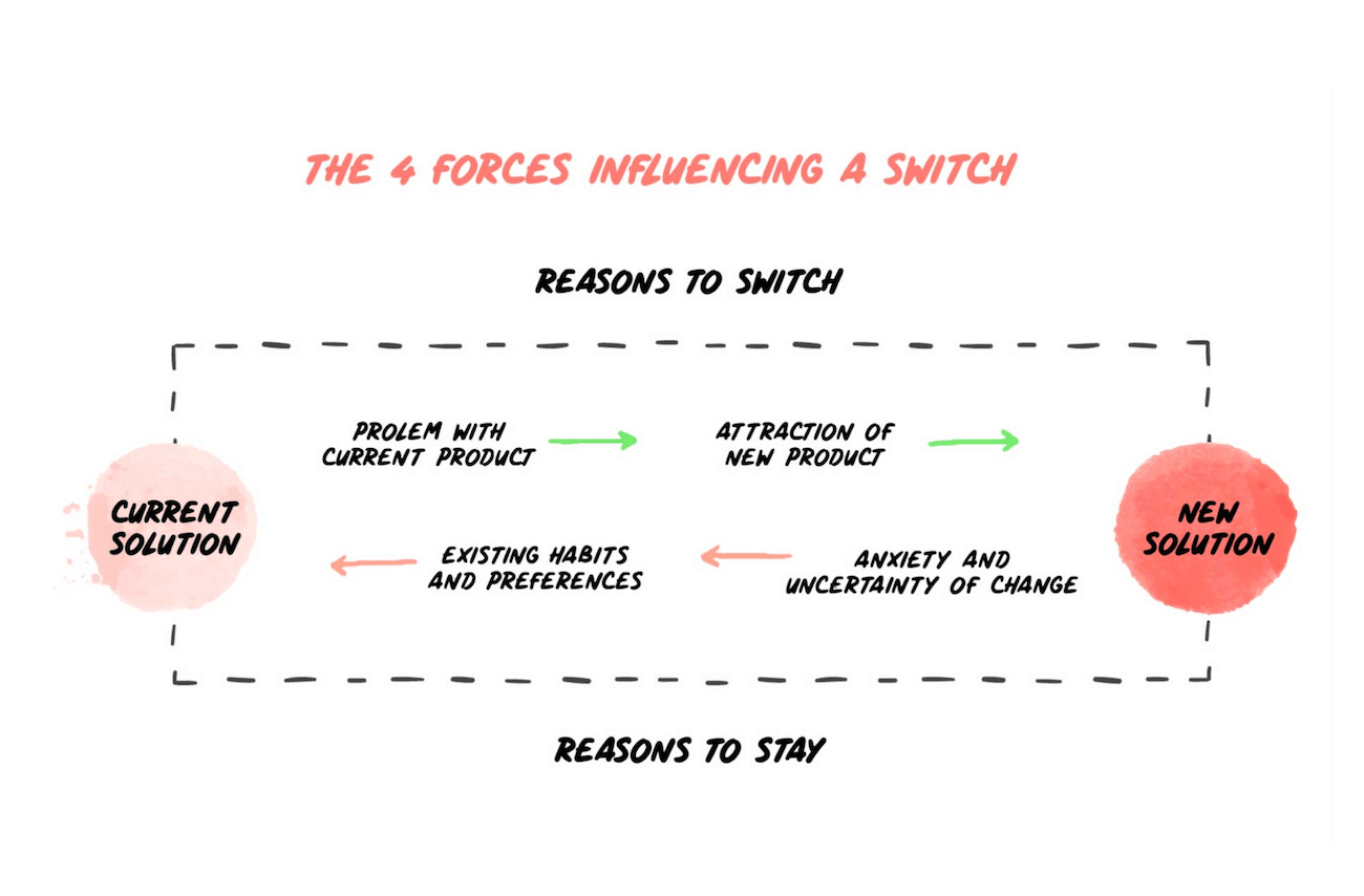
Ultimately, your treasure feature must compel users to do the one thing they despise the most: change. Companies often stick with products that produce mediocre results because changing to a new tool is difficult, full of uncertainty, and potentially expensive.
There are 4 progress-making forces that influence users to either stick with what’s not working or take a chance on something new:

You need to identify these qualms and curiosities before you ever stand a chance of enticing users with your product and its treasure. There’s no better way to do this than asking your target audience head-on. Your product data will give you insights into how users behave, but user research allows you to ask them directly about their pain points and motivations. Additionally, what you think your users value and what they actually value may not be the same thing, and user research will help bridge that gap.
Discover more about your users through:
Read more: User research: How to tap your users for better UX
Sometimes, this research reveals your product actually has different treasure features for different audience segments. Think about a product like Trello. You can use Trello to keep your own projects organized, which means you may value its ease of use above all else. However, if you’re using Trello in a large team setting, you may find that the product’s collaborative tools are its most important features. Discoveries like these suggest that your product may potentially require different paths to different treasures as you work to shorten your TTV.
Once you identify your treasure feature, you need to figure out how to get your free trial and freemium users there quickly. But you can’t just catapult them straight to a feature without giving them context.
Imagine booting up a computer for the first time ever and then being asked to build a spreadsheet in Excel. You might burn out trying to move the mouse properly before ever figuring out how to even launch the app.
A “happy path” is one that gets users to their moment of value without sacrificing essential context. These paths are viewed as the best possible outcome for a user as they achieve a short TTV without omitting the necessary information. The Treasure Hunt Framework outlines 3 steps to building a happy path that does just that:
Your app is chock-full of features, but only a handful of them are required to get users to your treasure. Your happy path must get users acquainted with these necessary features as quickly as possible while ignoring the “important, but not until later” ones for the time being.
Your users will never upgrade to a paid account if you never ask them to. No, you shouldn’t halt momentum down the happy path to make a sales pitch. However, an unobtrusive in-app message after a task is completed will quickly paint a picture of how upgrading would improve the experience as it’s happening.
Read more: The dos and don’ts of in-app notifications
Once you have your essential features and upgrade opportunities listed, it’s time to flesh out your happy path. Teams often visualize their treasure’s happy path with post-its, but digital tools like Trello and Notion achieve the same effect and are better when working with remote teams.
Before building out your product’s happy path, send your plan to every team involved with product development. Other teams may have insights you missed or steps you can cut to further decrease TTV.
Pirates left maps for people to discover their treasures. You need to include a map of your own to ensure users stay on course—that course being the path to the shortest TTV, of course. (Woo—that’s a lot of courses!)
You need to figure out where users get stuck or lost in your onboarding process before you build your treasure map. Usability testing will give you an in-person view of users’ struggles in real time. Meanwhile, your product data comes to the rescue again as a valuable means of identifying users’ frustrations as they bounce around your app.
Your list of friction points will inform you where you need signposts and guard rails along your product’s happy path. In-app messages are the best way to provide help within your product without bogging your users down. For example:

The best way to guide users seamlessly to the treasure is with a product tour. Product tours use in-app messages to provide a brief tutorial of the app’s interface and essential features to drive users straight to the most valuable features. The most successful product tours manage to do so within 3–5 steps, though highly complex apps may require a longer tour.
A product tour prioritizes only the most essential functions of an app to ensure lightning-fast TTV. Products will need to devise separate tours that lead to separate treasures if they appeal to more than one audience. A simple prompt at sign-up asking how each user expects to use the product will funnel the right segments into the right onboarding flows.
The free-to-paid conversion rate is the bread and butter of most SaaS businesses, so it literally pays to laser-focus your growth efforts on improving your user onboarding flows. The Treasure Hunt Framework keeps your onboarding optimizations on what matters most: the way your product improves the lives of those using it.
User onboarding is something of a specialty at Appcues. Our vast collection of no-code in-app messages serves as perfect guideposts for your own onboarding treasure maps. And our passion for onboarding extends beyond UI/UX tools. We’ve recently published an in-depth free-to-paid conversion rate course at our Product Adoption Academy to give you the pointers you need to transform freebies into revenue. We promise it’s more fun than advanced trigonometry, and it will help give your onboarding process a kick in the pants.
Hone your free-to-paid conversion skills at Appcues’ Product Adoption Academy