How to grow insanely engaging products with success messages

.png)

.png)
Product managers and marketers often fall into the trap of “carrot and the horse” thinking. They dangle carrots in front of users, in the form of email blasts with discount codes and unending streams of notifications.
These strategies can be effective—but only when they tap into real user motivations.
This is a fundamental principle of human psychology first uncovered by Ivan Pavlov over a 100 years ago. Pavlov noticed that if you place a chunk of raw beef in front of a dog, the dog will start to salivate.
That's not extraordinary on it's own. What Pavlov figured out was how to get dogs to drool without any raw beef at all—by simply ringing a bell.
In a series of experiments, Pavlov discovered that by ringing a bell each time he gave a dog food, the external stimulus of the bell and the anticipated reward become cognitively linked. Eventually, the stimulus of a bell ringing was powerful enough to trigger the response of a dog drooling.
It sounds simple—but Pavlov's theory provided a foundation for how to understand the mechanics of the human brain.
As applied to building addictive and engaging products: understand where your users are coming from and what they want to achieve. Once you do that, you can build a feedback loop of positive reinforcement that will drive users more deeply inside your app.
Acknowledging achievements through success messages and small nudges is an easy way to remind users of long term value. Here's how 5 different products apply Pavlov's principles in-app to celebrate users' progress and keep them coming back for more.
The most simple application of Pavlovian psychology principles is to reward users for good behavior, while steering them away from bad behavior. This works especially well when your in-app experience can be clearly defined into a series of steps. Codecademy, the online platform for learning code, is a perfect example.
Learning how to code is tough and can take years of practice. Codecademy helps users achieve this big goal by breaking it down into a series of micro-steps, leading users through a constant flow of small wins. Each course in Codecademy—from learning SQL, to basic HTML & CSS—is broken down into a series of smaller lessons. In each lesson, users complete exercises in a live code editor.
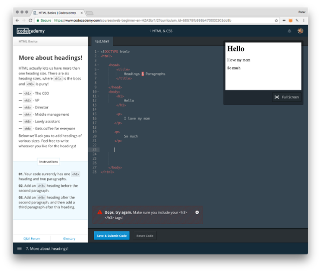
When a user makes a mistake, they're shown a small red “error” check mark. They're prompted to try again with a hint that helps them get to the right answer:
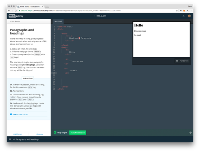
When users correctly complete an exercise, they're rewarded with a green check-mark and an encouraging “Way to go!” message:
By helping users achieve these small milestones through positive reinforcement, Codecademy uses small wins to achieve their bigger goals. It's an extremely effective way of building lasting motivation through the entire customer lifecycle.
Honey is a Chrome extension that allows you to apply coupons from around the web to your favorite shopping sites. Simply install the Chrome extension, and each time you checkout on J. Crew or Macy's web stores, Honey automatically applies any available coupons to your order.
Everyone feels good when they save money. Honey's product is built around this feeling, and getting users back there again and again throughout the customer lifecycle.
The problem is that for a new user, there might be a significant time lapse between when they sign up for Honey and the next time they actually make a purchase online. Honey has an extremely elegant solution to this problem.
Once users have installed the chrome extension, they're taken to this landing page:
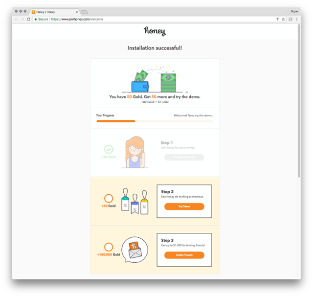
That leads to a call-to-action that encourages users to try a demo of Honey. Instead of waiting around for new users to purchase something on their own, this demo simulates Honey in action:
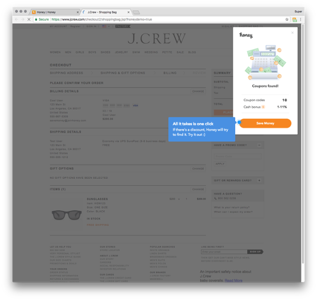
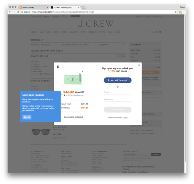
New users are taken to a real J. Crew checkout page, where they can immediately see how much they'd save using Honey—in this case. $46.32. That's what activates new users and builds a positive loop of activation.
Identifying and nurturing actions during user onboarding is one of the most effect levers of driving long-term retention. As the expression goes, “Give a man a fish and you feed him for a day; teach a man to fish and you feed him for a lifetime.”
Dropbox's Paper product, a collaborative document editor for teams, does just that through its beautifully designed onboarding process.
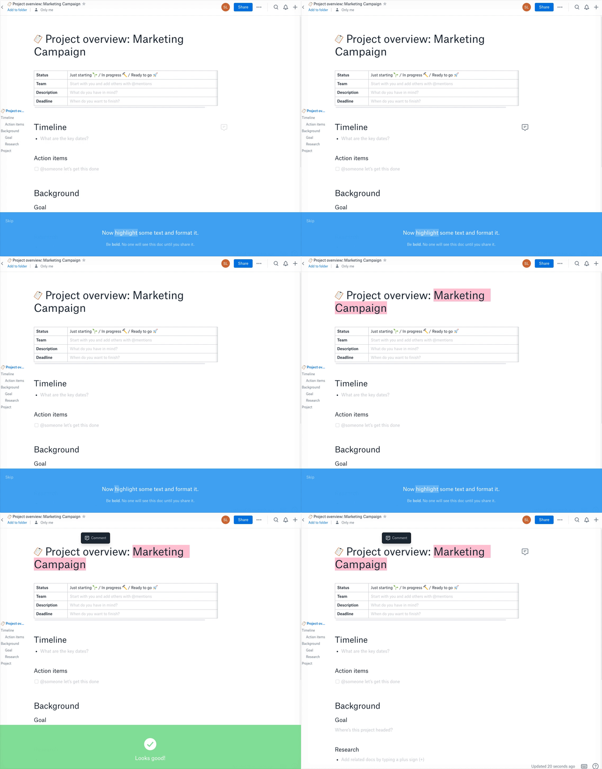
On the bottom of the screen, a large colored bar explains various features through a series of animated instructions. These instructions show new users how to change titles, insert images and tables, and change text formatting within Dropbox Paper.
If you're building a product geared toward individual users, you can activate users by aligning external triggers with a user's internal motivation. For a team-oriented product, this gets a bit trickier.
FullStory, a customer experience tool, does a great job of this through its “share” feature. FullStory's product allows you to watch how users interact with your website by recording each session as a video that you can watch. The “share” feature goes a step further and helps you navigate user experience as a team.
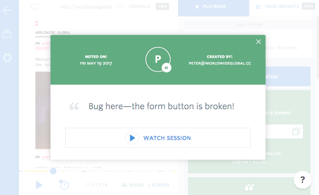
“Share” allows you to leave notes within specific user sessions, and quickly send them to your team.
When you add a note to a user session through FullStory's share feature, a call-to-action at the bottom of the note nudges you to “create a share link.” Click that CTA, and a link to that note is copied to your clipboard for easy sharing.
Each time you create a shared link, you're greeted by a green smiling face. It's a subtle but effective way of encouraging you to share more.
Helping users build habits and behaviors around your product is how you get them to stick around for the long-haul. The problem is that over time, users will often settle into routines and “feature blindness” to new ways of using your product. How do you encourage new behaviors in an existing product?
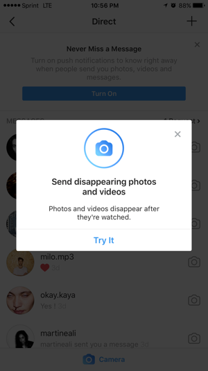
By starting from the ground up, and re-onboarding your users. That's how Instagram's new Stories product hit 200 million active users within seven months of launching. Instagram didn't just launch “Stories” with a simple in-app announcement. It did so across all levels of the user experience.
Let's take a deeper look at all the different ways Instagram reinforces new behavior in its app.


According to Kevin Systrom, one of Instagram's co-founders, “The primary reason [Instagram] scaled more quickly in the last 100 million is that we’ve figured out that as we’ve scaled, we’ve had to unbreak ourselves.”
While Pavlov's theory provides a useful framework for identifying the signals and external triggers you can use to drive engagement, they only work with a deep understanding of what people are actually trying to do in your app.
User onboarding expert Samuel Hulick has an elegant take on this:
Every single time someone uses software, they’re aiming to be transported from the situation they’re currently in (and don’t want to be in anymore) to a situation that they’d rather be in.
A solid foundation of user engagement and activation comes when you align where users are coming from with where you want to go.