10 brilliant retention emails that activate customers in limbo
.png)

.png)
You want users to stick around and use your product. Users want to stick around and use your product to accomplish their goals. What could go wrong?
Apparently, a lot. Products hemorrhage users within their first month, with the average mobile app losing 90% of its daily active users within 30 days of download. This is especially troubling for SaaS products that rely on free trials and freemium subscriptions to entice users into paid conversion.
Luckily, sometimes all it takes to re-engage your users is a quick hello in the form of a customer retention email. Product managers serious about reducing churn should embrace these emails as an effective way to reach out to your users and remind them of the value of your app.
If you looked closely at your overflowing email inbox, you’d probably find many different types of retention emails from apps you (whoops!) haven’t used in a minute. There are many varieties of retention emails. Each plays a unique role in re-engaging your users.
Welcome emails attack attrition straight away. You may think of retention as a “down the line” kind of issue, but the risk of churn starts as soon as users subscribe. A recent survey found that an eye-popping 25% of the mobile apps people download are only ever used a single time. This suggests some users churn within minutes of sign-up.
LinkedIn sends users a welcome email immediately after signing up. It declares its value straight away, reminding users that it pays to network on the world’s largest social media platform aimed at professionals.
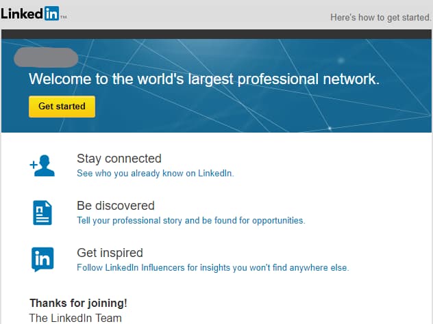
Unlike many other welcome emails, LinkedIn relies on a single CTA to bring users back to the site. It includes a broad CTA above the fold plus several others covering the app’s chief value propositions: bolstering existing connections, fostering new ones, and promoting professional growth.
Read more: Write a welcome email that grabs readers (with tips from Campaign Monitor)
Abandoned task emails are the most commonly sent retention emails, with the “abandoned cart” format ranking as perhaps the most famous example. An alarming 69% of online shoppers leave their carts before clicking the “purchase” button. This isn’t a problem for ecommerce companies alone. Even in B2B, there are several actions customers don’t complete, including uploading files, adding teammates, or updating profiles.
Good news: cart abandonment emails go a long way in saving the day. About 1 in 5 would-be shoppers open these emails, and half of the opened emails lead to a purchase.
Chubbies relies on its unique style and imagery to re-engage wayward users. The image reminds users of the items they left behind, and the copy evokes a sense of helpfulness. You aren’t being taken back to your cart—you’re being “teleported” to it. The repeated use of the phrase “shopping cart” might irk users in less capable hands, but Chubbies uses the repetition to humorous effect as they try to bring users back into the fold.
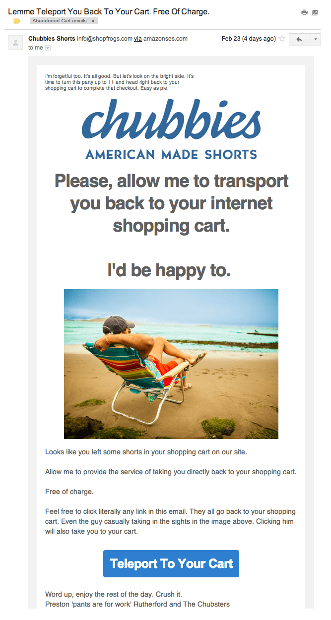
This repetition isn’t just for giggles, either. The email includes three links back to the shopping cart instead of a single CTA to boost the chances that users take the leap.
Your secondary features deserve some love, too. Yes, every app has core features that make the product valuable. For example, your onboarding process drives users to these features quickly to develop immediate and long-lasting usage habits. But your product also includes peripheral features that empower users to do more with your product. The more app features customers use, the less likely they are to migrate to another service.
So how do you ensure customers discover these less-obvious features of your app? This is where “later customer education” steps in. Samuel Hulick, UX consultant and founder of UserOnboard.com, shares:
“Later customer education is focused less around ‘how to use your product’ and instead more around ‘how to better accomplish the bigger, cooler thing our product helps you do.’"
This email from Mailchimp is a perfect example of “later customer education.” Mailchimp’s core feature makes bulk emailing easy, but its automation could be a lifesaver for customers—and make the app irresistible.
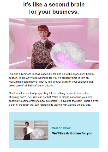
Mailchimp includes a video in the email instead of simply linking to the feature. Videos are great for showing users how to do something that’s too complex for simple text to convey. Mailchimp users can also watch a pro guide them through the process—increasing the likelihood of feature adoption.
Despite the many forms Quora takes, its core offering remains content. Content draws users to the platform and, in turn, encourages creators and advertisers to spend time and money on it. Content digests are hardly a revolutionary idea, but the fact that Quora curates its daily digest email specifically for the user sets it apart.
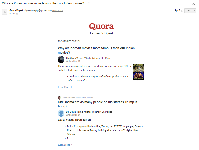
Like all social media platforms, Quora looks to form a regular product habit in its users. Its daily digest emails are the first step or the “trigger” in this process, as Nir Eyal, author of “Hooked,” calls it.
Quora harnesses every scrap of user information it has to make its trigger exciting: people they follow, topics they follow, and answers they upvote. This layer of personalization separates its content digest from countless other newsletters and roundups.
When done right, promotional emails help you rack up paid memberships. When done wrong? They wind up marked as spam—and users start associating your brand with annoying emails instead of a terrific product.
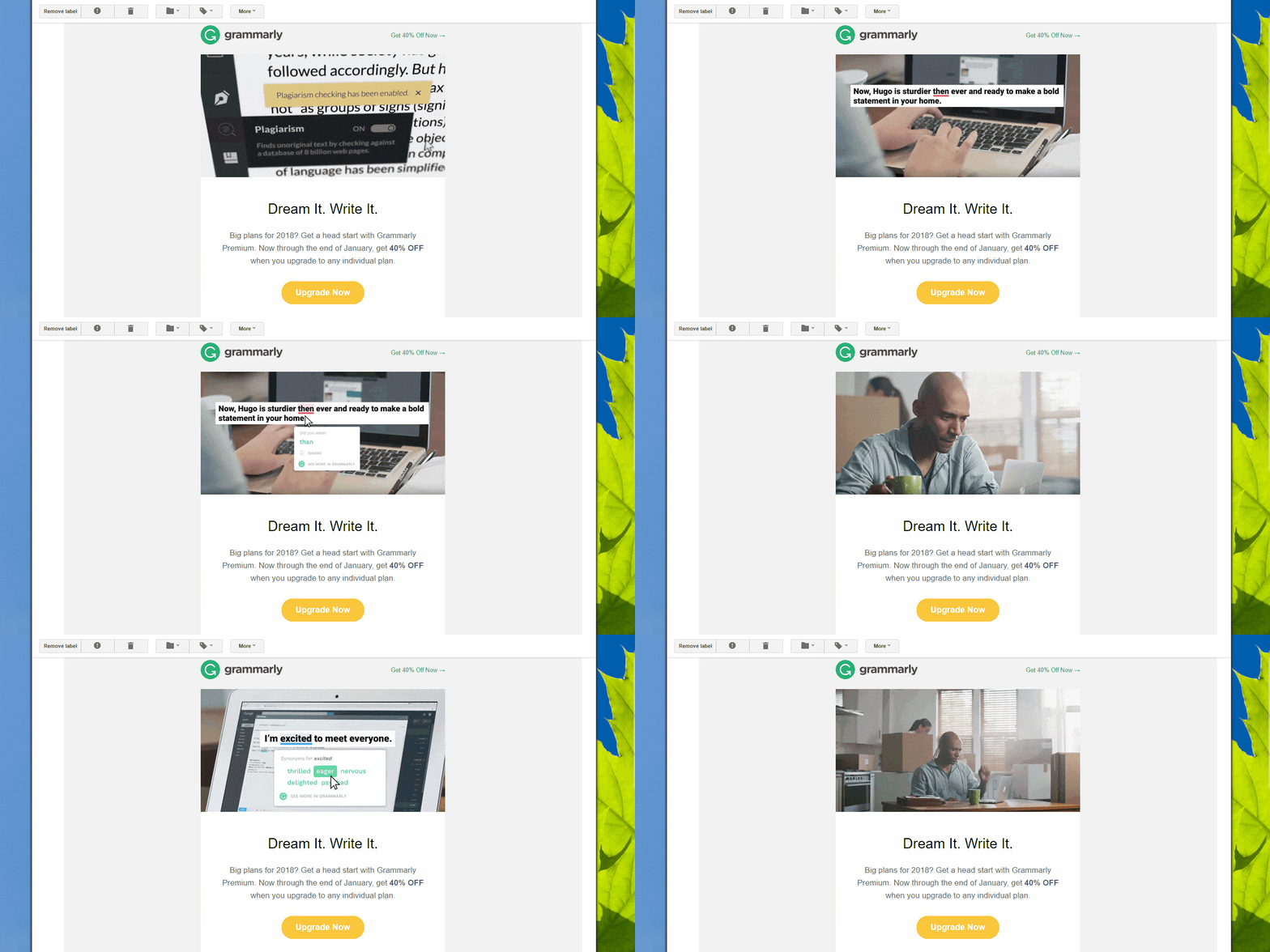
Grammarly crafts the perfect promotional offer. While the email copy is crisp and lets the call-to-action grab the spotlight, it’s the GIF that truly elevates the message. The image explains all that Grammarly helps you do in a matter of seconds, like a supercharged instructional video. Visuals often convey just as much (if not more) information as walls of text, so consider letting an image do much of the talking in your next retention email.
Not all of your free trial or freemium users will end up converting, but the ones that do are worth chasing down as you build your user base.
Shopify’s retention email acknowledges that many users who sign up for a free trial never actually try the product out. You can’t extend trials forever, but giving your users a mulligan is better than losing any chance of converting them into paying customers.
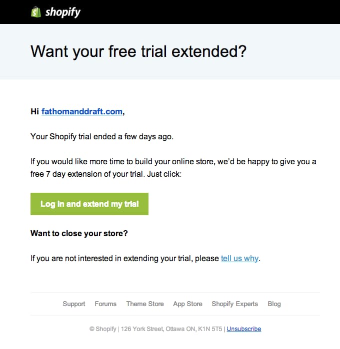
Note that the copy doesn’t waste time reminding the user about all the features they’ll lose access to once the trial ends. Instead, it focuses on the core value of the product (building an online store) and provides a CTA to enable the extension. Shopify also provides a means for gaining feedback from those who actually used their trial but decided not to subscribe to hopefully boost conversions in the future.
The progress email serves as one of the best types of retention emails. It doesn’t come across as spam, reminds the user that you exist, and coaxes them to come back.
Buffer’s former growth product manager Maxime Berthelot shares the 2 major ways the company brings users back: emailing them when their queue becomes empty and emailing them with their latest post analytics. “The first nudges them to come back to fill their queue,” Berthelot says, “while the second encourages them to schedule more posts.”
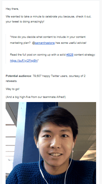
The subject line “Lookit! Your tweet is taking off” promises good things to come. This progress email doesn’t launch into stats immediately. Instead, it celebrates the performance of a particular tweet, boosting the user’s sense of achievement. The stats at the end just further pique the user’s interest.
Open any spam folder, and you’re sure to find one specific type of email: offers. These emails wind up here mostly because they are too generic and too frequent for their target readers.
Amazon sidesteps this issue with personalized offers. Imagine stepping into a store and being handed a lucrative discount on the very items you’ve come to buy. Amazon accomplishes this in email format through the use of big data. The company meticulously tracks every action you take on the website/app, like on-site behavior, browsing history, past orders, and location. It then uses this data to send a series of related product emails, upcoming deals, product bundles, and event-specific deals—all unique to your preferences and browsing history.
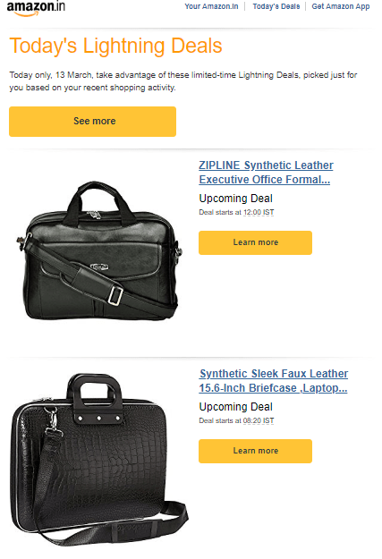
Notice how the buttons don’t ask the user to “Buy now.” It simply asks them to “Learn more,” which feels less aggressive. The email also focuses on just two upcoming deals related to products the user wants instead of overloading them with options.
Your developers work hard to ship new features—so it’s exciting to share the fruit of their labors with customers. However, you’d be hard-pressed to find users who share your level of enthusiasm. So, how do you make them not only care about product updates but also try them out?
Helpdesk software Groove came up with a solution after several false starts. The team’s first step was to make a note of all feedback that customers gave. Alex Turnbull, CEO of Groove, shares their process:
“Every time a request came in for a feature that others had already requested, we’d add a link to that customer support ticket directly into the feature’s Trello card. This simple system let us track all of our feature requests in one place, and gave us a list of every customer who had ever requested a particular feature, at our fingertips.”

Groove then announced a new feature through in-app messages and an update on their blog. The company also made it a point to email every customer who had ever requested the feature with a personal follow-up.
The results were astounding. Groove saw a 68% response rate and some of the emails even brought back churned customers. Compare this to the measly 10% open rates their emails previously got. This is the magic of personal follow-up.
Read more: How to plan out your feature release to drive product adoption
Most retention emails target users who struggle to adopt a product or fell off in usage after a brief period of extensive use. Milestone emails instead target users who have used your app consistently and deserve to be celebrated for it. They also serve as an excellent method for reminding ambivalent users about your product’s value.
Spotify’s entire retention model depends upon consistent streaming. Users who play thousands of songs a year are getting exactly what was promised from the app. It’s what makes its Spotify Wrapped concept so brilliant. The company goes out of its way to remind users how much music they consumed throughout the year—and how Spotify facilitated their constant jamming.
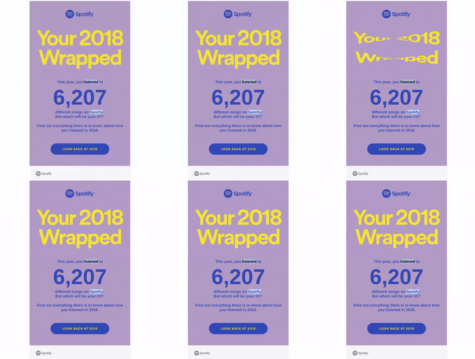
Spotify’s milestone email highlights the sheer volume of streams from the top, but it also plays a game with users: You listened to a lot of music this year—but who did you listen to the most? Casual listeners and audiophiles alike can’t help but feel curious about who their go-to artist was over the past year. The single CTA at the bottom of the email brings users straight back to the app to review their streams.
This email is particularly effective for 2 reasons. First, it brings users back to the product with a bit of gamification. Secondly, and just as importantly, it reveals exactly how much time users have spent within the app. It’s hard to argue that a subscription to a particular product isn’t worth it when you’ve spent hundreds of hours in it perfecting your INXS playlist.
You’ve probably noticed a few similarities in the designs of these 10 types of customer retention emails. Even though each example implements a different method for re-engaging users, an email is an email. Certain features will always appeal to readers no matter what type of email you send, so always stick to these four principles:
Read more: The ultimate guide to aligning your lifecycle emails and in-app messaging
Different customers stop using your product for different reasons, which means sending a single type of retention email with a single message at all times is woefully ineffective. Imagine sending a welcome email to a customer who used your app consistently for two years before falling off. It’s not exactly the best way to show a customer you care.
Instead, build an arsenal of retention emails to deploy to various user segments depending on where they are in their lifecycle. Your product data is your friend when it comes to identifying why a group of users isn’t as active as they were, so don’t hesitate to jump into your analytics and dig around. No, you shouldn’t blast out 14 emails a day to the poor soul who didn’t use your app on a solitary Saturday. However, don’t hesitate to check in on your more hum-drum users every few weeks with personalized emails designed to transform them into power users.
Users stay with a product when they are shown value early and often. Products that see users churn within days of sign-up likely need to improve their onboarding process to bring users to the aha moment ASAP. Even products with terrific adoption rates need to find ways to engage consistent users through the release of new features and constant improvements to the user experience.
Read more: How to improve user onboarding with powerful UX copy
Got questions about user onboarding? Our Ultimate guide's got you covered.
Retention emails are a genre of marketing emails that aim to reduce churn. Although many varieties of retention emails exist, all of them attempt to communicate the value of the product and bring users back to the app through the compelling use of such tactics as copy, offers, images, and CTAs.
Read more: 9 emails you can—and should—use to improve your customer retention
Absolutely. No, you won’t re-engage every flagging customer with your timely GIFs and witty subject lines, but email has proven an effective marketing channel time and time again. Emails maintain a 21.33% open rate across all industries and formats. Email reminders are a cost-friendly way to reach a wide audience, and they’re a great method for reminding users of the value of your app after they’ve spent some time away.
Engage users from the start with a sleek, satisfying product tour by Appcues