.png)

If you want real examples to study: This article breaks down 13 release notes from SaaS companies worth paying attention to, annotated for what works and why.
If you need a starting point: There's a copy-paste release notes template you can adapt for major releases, minor updates, and bug fixes.
If you want to get better at writing them: Seven practical steps walk you through how to write release notes that users actually read, with before-and-after examples.
But it's not your imagination that they've been changing shape these past few years. In fact, release notes have been slowly bifurcating, splitting based on what kind of attention a platform or an app asks for.
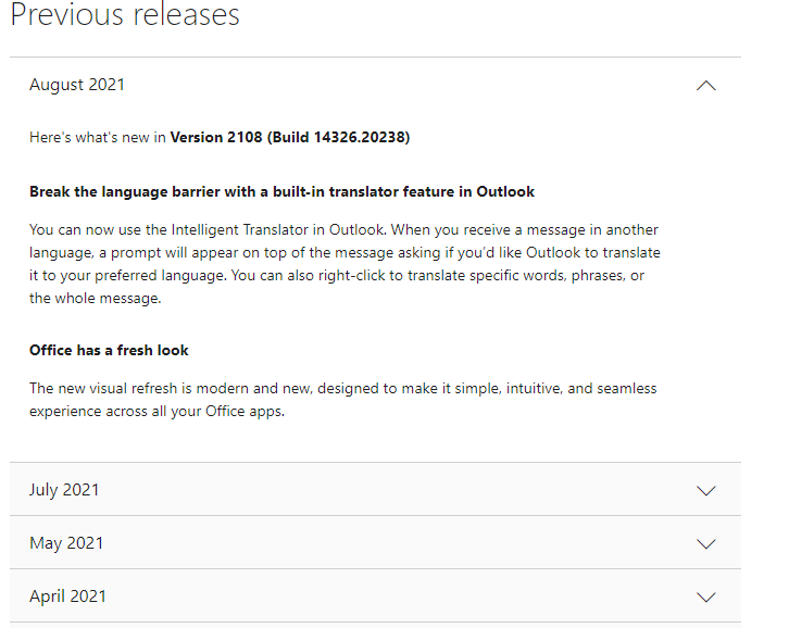
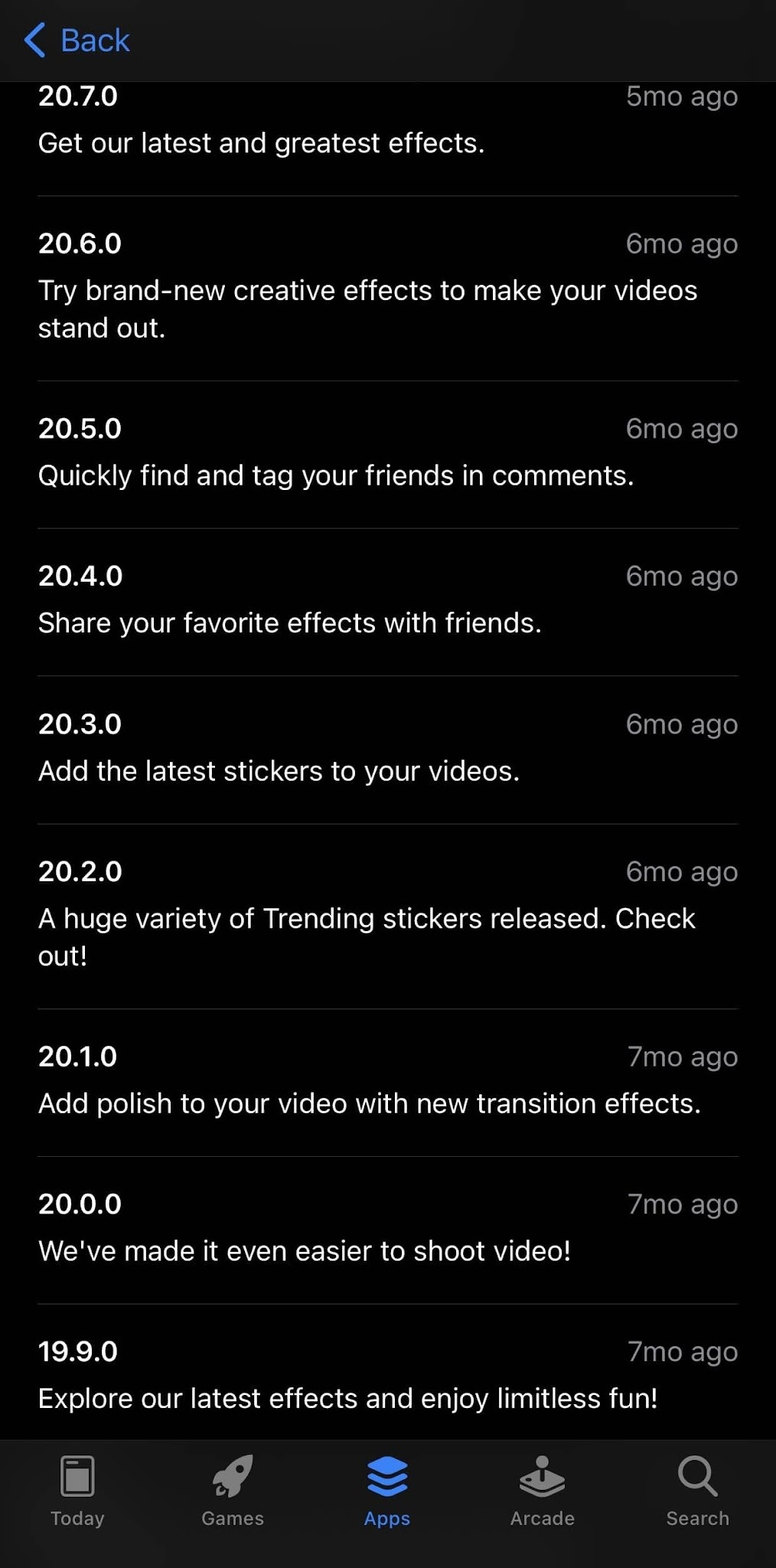
Consumer mobile, for example, have learned that meaningful release notes will go unread. Their goals, to have a user return to buy, aren't served by lengthy release notes. They've dwindled to boilerplate and an update in the app store when a bug gets fixed or there are meaningful performance improvements.
However, B2B SaaS and developer-tool companies have taken a different road. Release notes (and subsequent changelogs) have become a first-class marketing surface.
A release note is a brief, user-facing report published alongside new or updated software. It explains what changed, why it matters, and who it affects. For new releases, release notes give users a summary of what the product does. For updates to existing products, the notes explain what's new, what's improved, and what's been fixed since the last version.
Release notes vs. changelog: Release notes explain a single release in user terms that are curated, benefit-framed, and written for the people who actually use your product. A changelog is the running, chronological record of every change, often more technical and exhaustive. In practice the terms blur, since the changelog is usually where release notes live, but the distinction matters when you're deciding what to write and who it's for.
Momentum and trust signaling: Shipping velocity is itself a marketing tactic. Updates and changes show how responsive your team is and how invested you are in your customer’s success. However, as PostHog warns, “product velocity only compounds when adoption keeps up”. Shipping fast at inattentive users is a trap, so the way you communicate matters.
Feature adoption and retention: Targeting release note messages by whether a user has already explored a feature is the difference between announcing a release and actually driving adoption.
Support deflection: One release-note tooling vendor estimates that well-done release notes can reduce support tickets by up to 40% (Supportbench).
Closing the feedback loop: Release notes and changelogs are part of a necessary chain that builds advocacy. When you ask for feedback, then add a missing feature to your roadmap, having an announcement and notifying requesters directly helps create momentum in your customer engagement.
SEO and AEO: Changelogs and release notes are fresh, crawlable content that AI answer engines increasingly source for information.
Sales enablement: Buyers often scan changelogs and release notes to judge whether a product is alive. Now with AI, their assistants will often scan on their behalf.
Transparency and accountability: Vague notes dodge accountability, but detailed framing are coordination artifacts that show the trajectory of your business.
Not every update deserves the same treatment. The format and depth of your release notes should match the scope of the change:
Think of this as the anatomy of a release note. Every solid release note covers these elements, though the depth varies depending on whether you're announcing a major feature or a routine bug fix:
This question doesn't have a clear answer, since it's often contested and usually a combination of people. Product managers are the most common authors in B2B SaaS, product marketing managers where the notes are treated as marketing. Technical writers take over in larger orgs.
The best practice consensus is that engineering supplies the raw material (ship logs, commit messages, and technical specs), while a product marketer or PM translates them into customer-facing language. There is often one named owner because diffused ownership tends to mean release notes that never get published (Featurebase, 2026).
Ownership often defaults to PMs. The State of Product Marketing Report 2025 found that 44.3% of PMM teams are still one to two people, so their bandwidth is limited.
In 2020, an IEEE study analyzed 32,425 release notes across 1,000 GitHub projects plus a survey of 314 practitioners. Both producers and users reported that well-formed notes positively impact their work. However, there's a significant mismatch between what producers write and what readers want.
So what kind of people read release notes?
Power users and technical users over-index, but readership is wider than most teams assume. Prospects use changelogs as liveness checks when they're evaluating their options. Support and sales teams read them to stay informed for their customers. Feature requesters read entries that close their loop.
Karri Saarinen, co-founder and CEO at Linear, has two audiences many teams miss in candidates and investors. And now, the newest reader is non-human: AI coding assistants and customer facing agents now fetch changelogs at scale, with early directional estimates putting non-human reads at 10-30% of changelog traffic (ReleasePad, May 2026).
Knowing how to write release notes is foundational. However, writing what your specific customers want to read is a separate practice.
Knowing what to include is the foundation. How you write it determines whether anyone actually reads it. These are the steps are ordered for flow: start with what to say, then how to say it, then how to present it.
%20(1)%20(1).png)
Every change was built to solve a problem or unlock a capability. Lead with why, not the what of your team’s build.
Before: "Implemented batch processing for data exports with configurable chunk sizes."
After: "You can now export large datasets without the process timing out. Exports that used to fail after 10,000 rows now handle up to 500,000."
A reliable test: finish the sentence “here’s what you can do now that you couldn’t before”. If you can’t complete it for a given change, that change may not belong in user-facing notes at all. (You’ll see Notion apply exactly this test in the examples later.)
Remember the mismatch from the IEEE study: producers consistently write what they want to say, not what readers want to know. Readers scan for two things: what changed and whether it touches them. Front-load both.
Bold the feature name, use typed labels (New / Improved / Fixed), and hold each entry to two or three sentences of plain language.
A good test: read the entry aloud to someone outside the team. If they get it, your users will.
Before: "Bug fixed and updates applied."
After: "Fixed: switching between apps no longer causes crashes. App switching is now stable on all supported devices."
If an entry needs three paragraphs, it probably needs a fifteen-second GIF instead. Match the medium to the change: UI changes get annotated screenshots, new workflows get short recordings, data features get a picture of the output.
The written entry then only has to add context, not carry the whole explanation. Amplitude, Loom, and Figma all run this play.
The foundation makes release notes readable. This layer is what turns them into the advocacy engine the seven goals described and it’s where most teams stop short.
When a shipped feature started life as a feature request, say so in the entry and notify the people who asked.
Modern feedback tools automate this: link the changelog entry to the feedback post it resolves, and every voter gets told the moment it ships. This is the highest-leverage sentence you can write in a release note.
The customer who asked, got, and was personally told has a story they'll retell to colleagues.
Announcing a release and driving adoption are different jobs, and one message can't do both. Where it matters, write two variants: one for users already working in the affected area ("the thing you use every day just got faster") and one for users who've never touched it ("here's what you've been missing"). Then let behavioral targeting decide who sees which. A redundant notification teaches users to dismiss you; a well-timed one teaches them to keep reading.
With non-human reads estimated at 10-30% of changelog traffic, your newest reader is an AI agent fetching your changelog to answer someone else's question, often a prospect's.
Agents truncate: a long entry gets reduced to its first sentence or two. The habits that serve human scanners serve machines as well like a crisp one-sentence summary per entry, typed categories, stable URLs, consistent structure. If your changelog is also available as structured data (markdown, RSS, or JSON), answer engines will quote you accurately instead of paraphrasing you loosely.
Predictability beats frequency. Weekly Friday updates produce Friday readers; sporadic updates produce no readers. A consistent template compounds the effect so users learn where to look, and your team stops re-deciding structure every release. Keep the voice recognizably yours, but hold the 80/20 line: 80% genuinely useful information, at most 20% brand personality.
The template in the next section bakes the foundation into a reusable structure. The advocacy layer is a workflow decision but the writing habits above are what make it land.
Here's a free, copy-paste release notes template in three sizes (major releases, minor updates, and bug fixes) so you can adjust the depth based on what you're shipping.
It covers the essentials for most updates. Adjust the depth based on the scope of your release: major releases get more detail per feature, minor releases can compress sections, and bug-fix-only releases can skip the "What's new" block entirely.
[What the user can now do — not the internal feature name]
[New] · [Date] · Available on: [plans / platforms] · [Product area]
Summary: [One sentence: what changed and who it affects. This is
what scanners read and what AI agents quote — make it standalone.]
What you can do now
[2–3 sentences on the capability in user terms: the problem it
solves, when to reach for it. Link to docs, not a wall of text.]
[Visual: 15-second GIF or annotated screenshot for anything UI]
You asked, we built: [Link to the feedback post this resolves.
Requesters get notified — say thanks here.]
Works well with: [1–2 existing features that complement this one,
linked — turn the announcement into a discovery moment]
Get started: [The first click — deep link into the product]
Known limitations: [What’s not covered yet — workaround or timeline]
Questions? [Help docs / support / community]
[Date] — [Product name] updates
Summary: [One sentence covering the theme of this batch]
- Improved: [What changed] — [how it affects you]
- Improved: [What changed] — [how it affects you]
- Fixed: [What you saw before] → [what happens now]
- New: [Small capability] ([docs link])
Fixed: [What the user experienced] → [what happens now].
[Affected platforms or versions, if relevant]
Scale the treatment to the change: a major release gets the full block with a visual; a batch of small improvements compresses into the digest; a bug-fix release leads with the fixes and drops everything else.
Two fields are non-negotiable at every size: the typed label and the one-sentence summary — they're what make your notes scannable by humans and quotable by machines. And keep the structure identical release to release: consistency is what teaches readers where to look, and it's what lets the 10-30% of your readers who aren't human parse you reliably. If you can also publish the same entries as a feed (RSS, markdown, or JSON), do it. It's the same content for a second audience with zero extra writing.
The examples below are grouped by the goal each company's release notes are built to serve, matching the goals covered earlier in this article. For every example, you'll find what the company does, what their release notes get right, and a specific, transferable lesson you can apply to your own.
These companies use the changelog itself as proof of life, a visible heartbeat that tells users, prospects, candidates, and investors the product is moving.
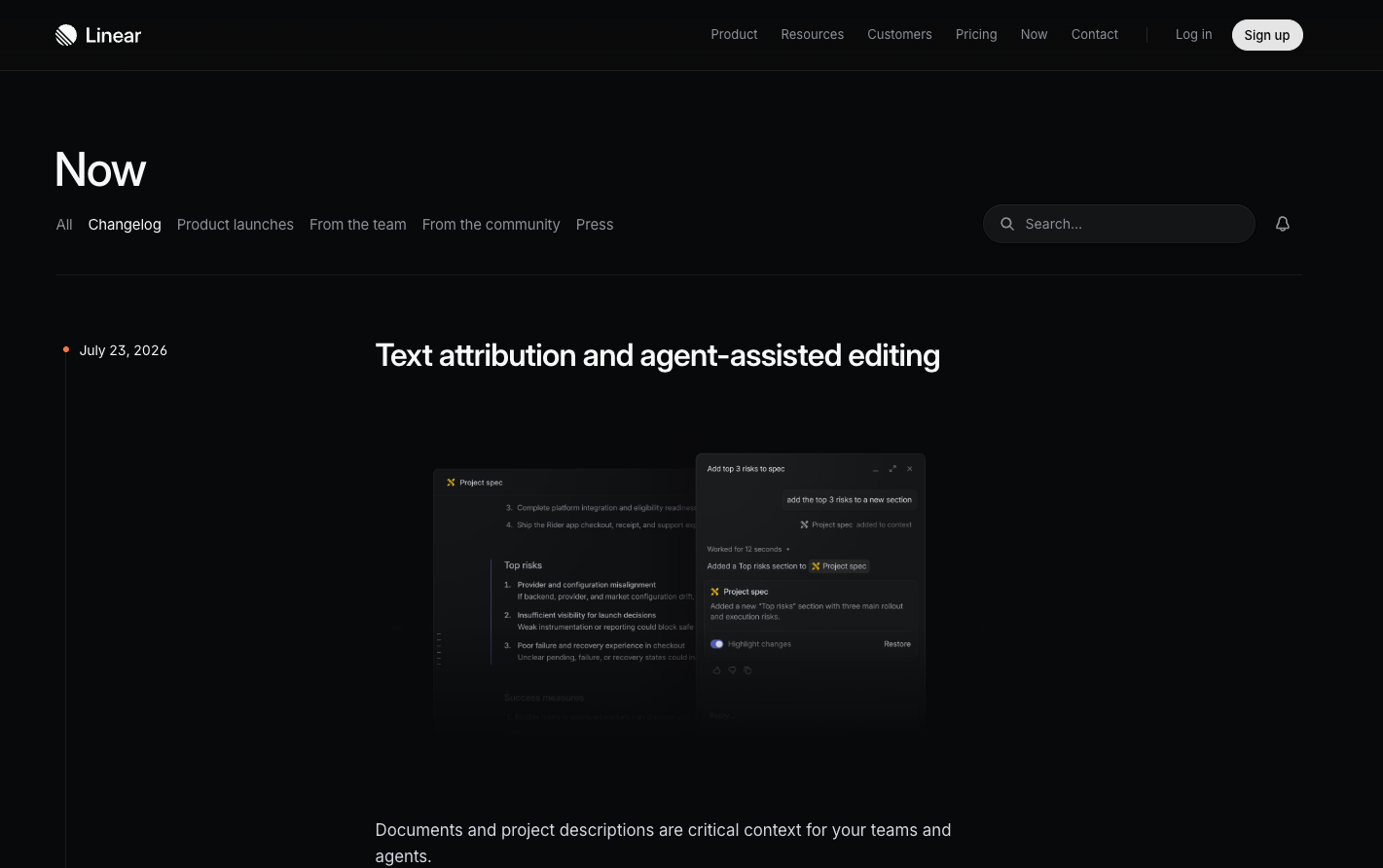
What they do: Linear is a project management and issue tracking tool built for software teams.
What their release notes do well: Linear's weekly, image-rich changelog is a primary link in its marketing-site nav — and it started before the company had a significant user base, as both an internal shipping ritual and an external momentum signal. Entries are tight and plain-language, one to three features plus a small-fixes section, and each one gets repackaged into the subscriber newsletter and social posts with demo videos.
What to emulate: Publish before you think you're ready, and keep the cadence sacred. The rhythm is the message: a changelog that updates every week says more about your team than any brand campaign. If your heading says “New: Batch operations,” rewrite it to what the user can now do.
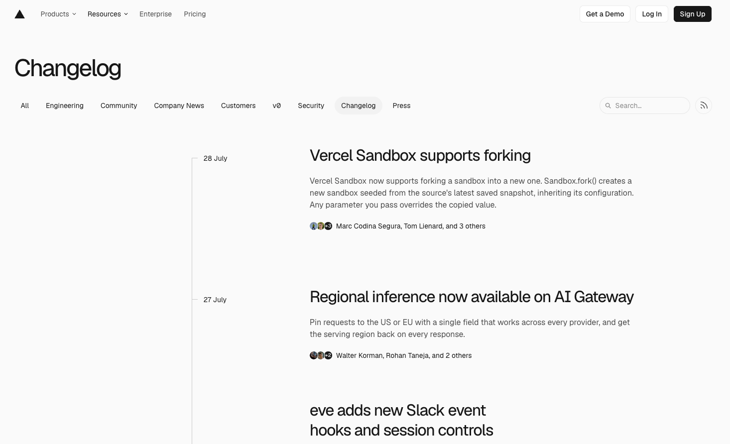
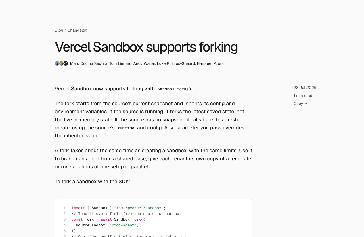
What they do: Vercel is a cloud platform for building and deploying web applications.
What their release notes do well: Weekly, sometimes daily, minimal entries with code blocks and before/after performance benchmarks. Their publishing is treated as a routine part of shipping rather than a special event. Vercel then pairs this steady drumbeat with big-bang moments (its “Ship” conference keynotes), so routine updates and headline launches each have their own channel.
What to emulate: Run a two-tier system: a low-ceremony drumbeat for everything you ship, and reserved big-bang moments for what deserves a stage. Benchmarks beat adjectives — “40% faster” earns trust that “blazing fast” never will.
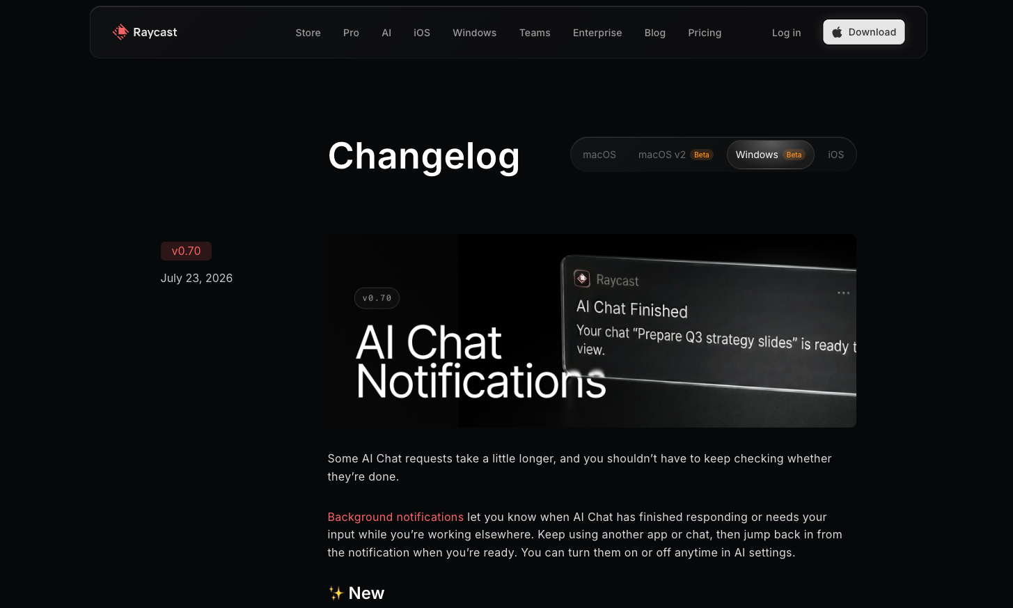
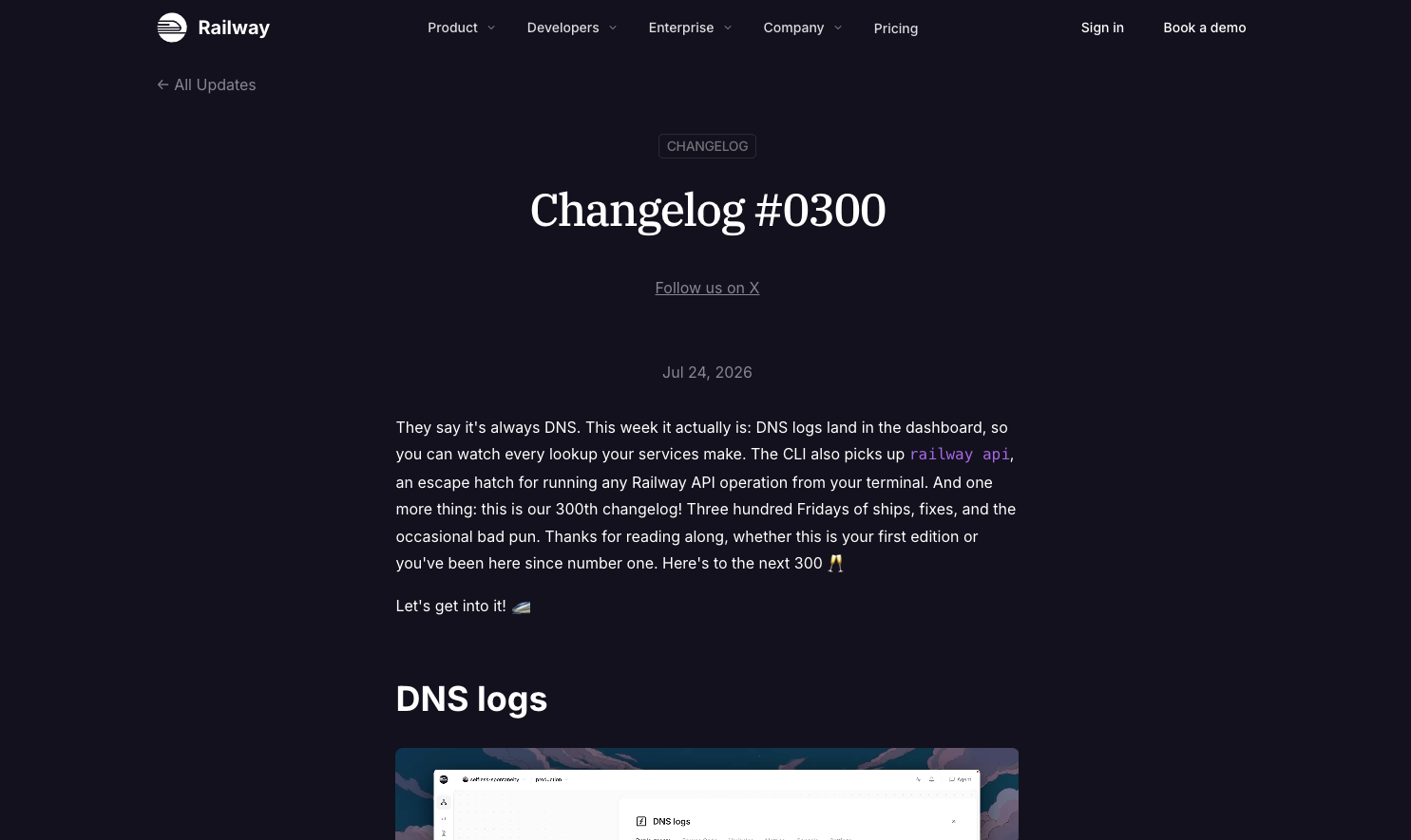
What they do: Raycast is a productivity launcher for macOS; Railway is a cloud infrastructure platform. Both are dev tools with strong communities.
What their release notes do well: Both write benefit-first, personality-heavy changelog entries and then amplify each one on X, treating the changelog as community glue rather than a compliance document. The entries read like a person telling you what got better, and the social amplification turns each release into a small conversation with the community.
What to emulate: Don't let entries die on the changelog page. Every release note is a social post, a community thread, and a reply-magnet waiting to happen, the amplification is where the momentum compounds.
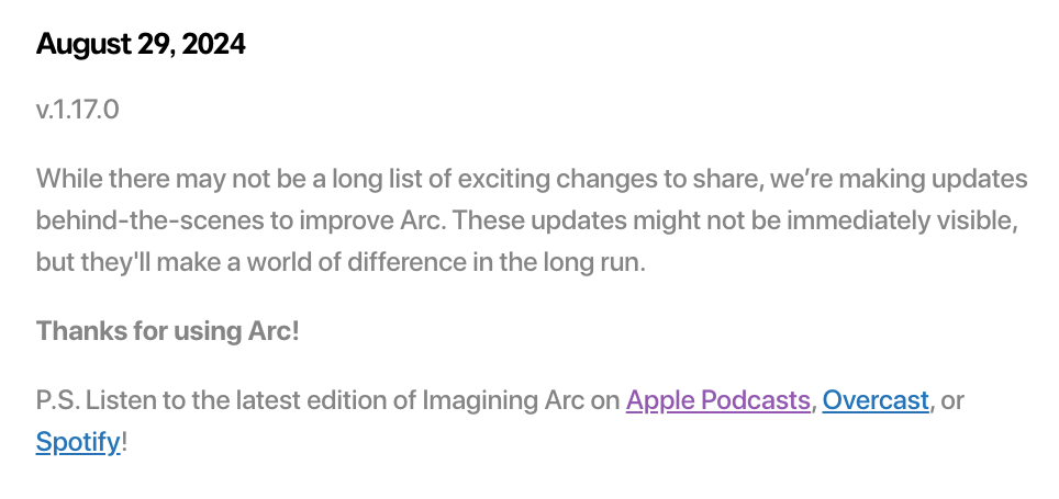
What they do: Arc was a reimagined web browser known for design-forward product culture.
What their release notes do well: CEO Josh Miller turned release notes into episodic media: casual, founder-hosted video updates that users genuinely anticipated. It remains the most-loved format experiment in release comms, with the caveat that Arc was frozen in May 2025 as the company pivoted to its AI browser, Dia. The format worked; cite it as a creative benchmark, not a current practice.
What to emulate: A face and a voice create connection a text entry can't. You don't need production value, a founder or PM talking over a screen recording for two minutes makes users feel like insiders. Just don't let the format outrun the product story it's carrying.
These companies engineer their release notes to move readers from “I saw it” to “I used it.”
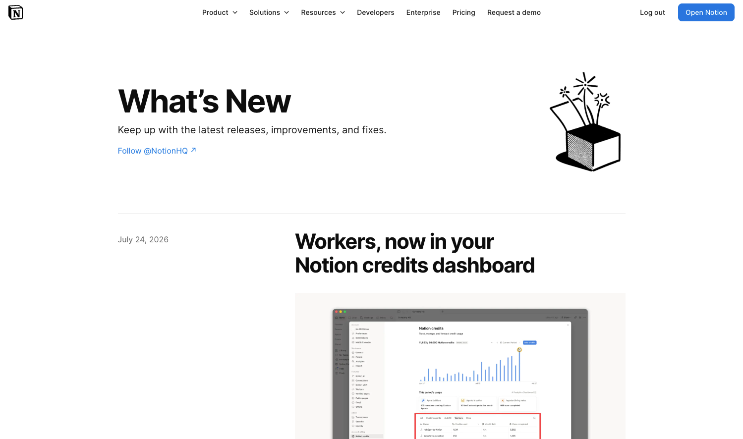
What they do: Notion is a connected workspace for notes, docs, project management, and wikis.
What their release notes do well: Notion's “What's New” page pairs extremely brief, capability-framed entries with strong visuals, and every entry links out to help docs: the announcement flows straight into learning the feature. Bigger batches get named releases (like “Notion 3.1”), which gives scattered improvements a single memorable identity.
What to emulate: Use “here's what you can do now that you couldn't before” as your framing device, and never let an entry dead-end — every announcement should link to the doc, template, or deep link that starts usage. Name your bigger releases so users (and your own team) can refer to them.
What they do: Figma is a collaborative interface design and prototyping tool.
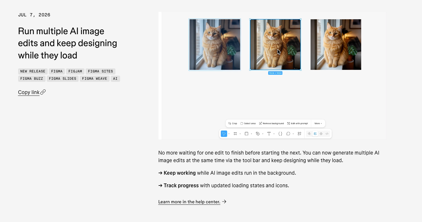
What their release notes do well: Figma deliberately splits its release comms in two: a visual “What's New” showcase (feature blocks, annotated screenshots, animated demos) for scanners, and a traditional granular release notes record for power users. Neither audience wades through the other's format, and the annotations call out exactly what's different and where to find it.
What to emulate: Serve the scanner and the completionist separately instead of compromising on one middle format. And for any UI change, showing beats telling: a screenshot with arrows and callouts directs the eye to the exact change.
What they do: GitHub is the world's largest software development platform.
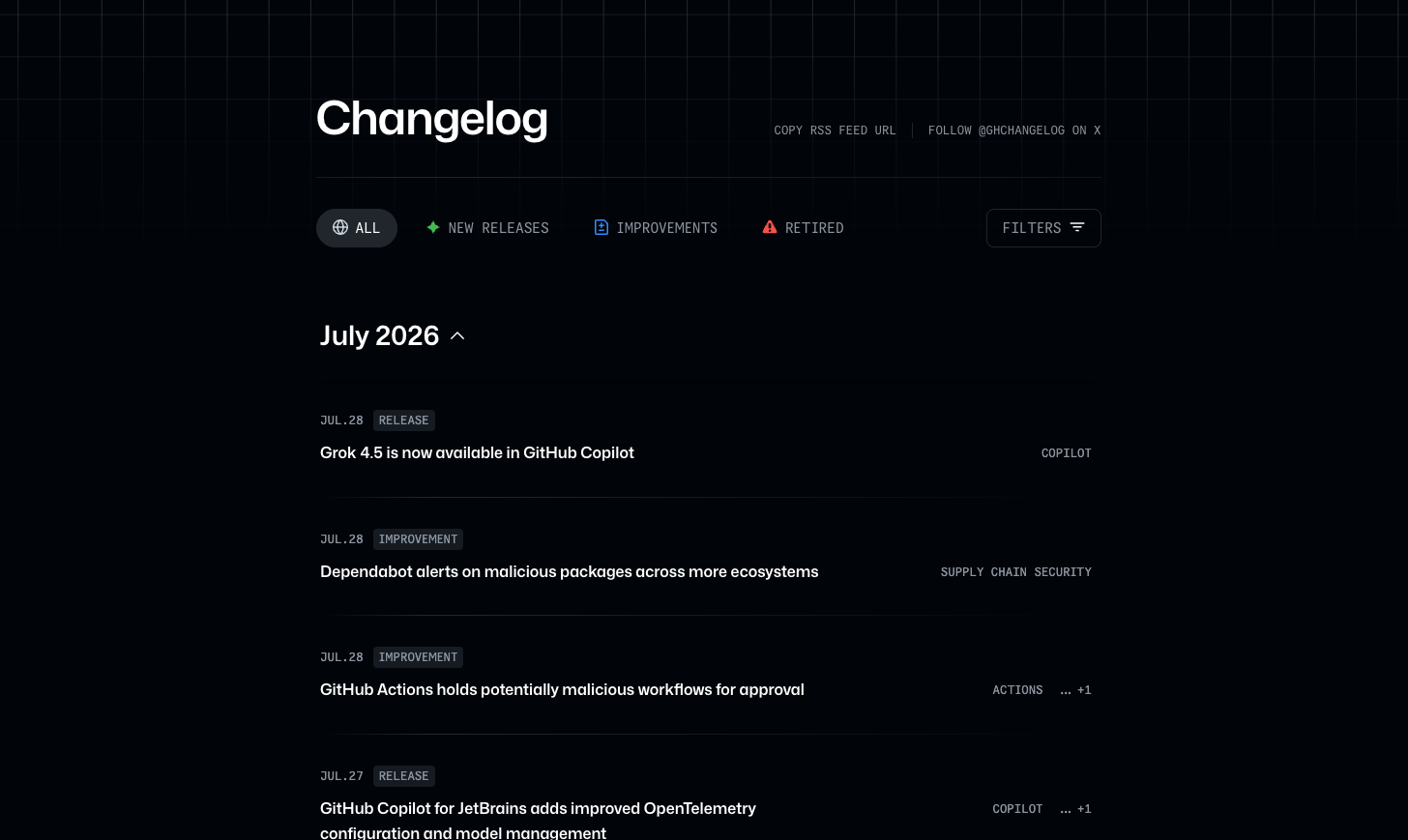
What their release notes do well: GitHub ships near-daily changelog posts tagged New Release / Improvement / Retired, filterable by label, with RSS and a dedicated @ghchangelog X account. It's how you communicate an enormous surface area (Copilot, Actions, and everything else) without burying users: nobody reads all of it, and nobody has to. Users subscribe to the slice that affects them and find their answer before it becomes a support ticket.
What to emulate: At high shipping volume, findability is the feature. Typed labels, filters, and feeds let each audience self-serve—which is also quiet support deflection: the admin who can find exactly what changed doesn't open a ticket.
Prospects (and increasingly their AI assistants) read changelogs to judge whether a product is alive and well-maintained. These companies answer with structure and spectacle respectively.
What they do: Stripe is a payments and financial infrastructure platform for the internet.
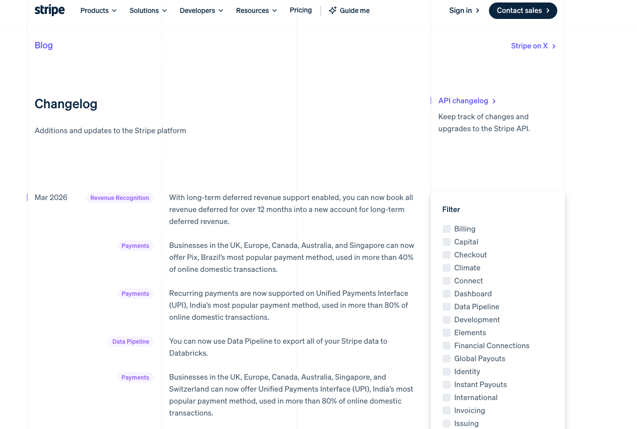
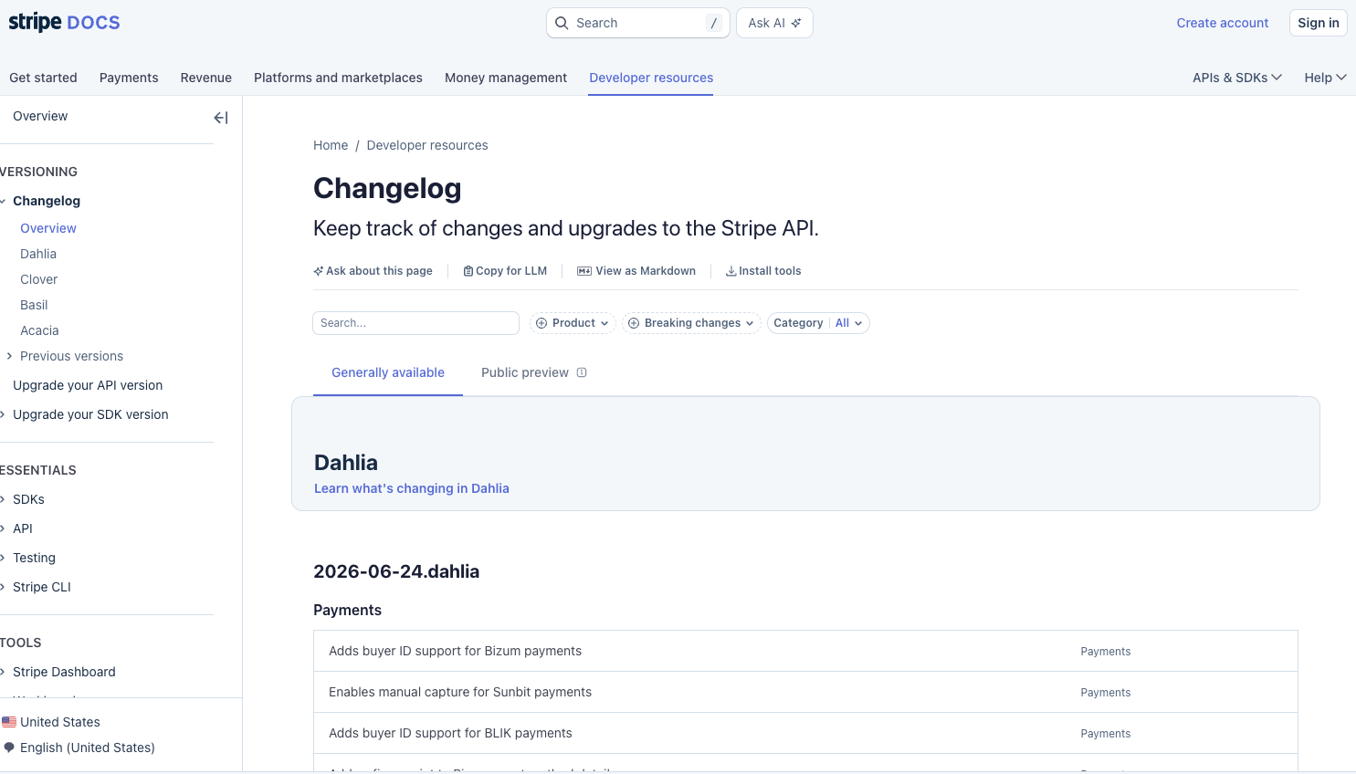
What their release notes do well: Stripe runs a two-layer system: a programmatically generated API changelog tied to named API versions (Acacia, Basil, Clover, Dahlia) for developers who need precision, plus a curated blog changelog for readers who want the narrative. The structured layer (consistent format, stable URLs, versioned entries) is exactly what both human evaluators and AI agents parse reliably, which is why Stripe gets quoted accurately while competitors get paraphrased loosely.
What to emulate: Layer your changelog for different readers, and make the structured layer machine-readable. Versioning as a first-class concept signals infrastructure-grade seriousness, and does double duty as your SEO/AEO play.
What they do: Intercom is an AI-powered customer service platform.
What their release notes do well: Intercom's “Built for You” franchise started as a monthly blog roundup of what shipped and evolved into a produced, seasonal live broadcast (like “Built For You Spring '25”) — releases batched into an event with demos, narrative, and a host. Release notes as programming, not paperwork, and a ready-made asset for sales and success teams to send prospects and customers.
What to emulate: When you ship enough volume, batch it into a moment. A quarterly “what we built for you” event, even a 15-minute video, reaches the majority who will never visit your changelog page, and gives revenue teams something to share.

The advocacy engine: telling the exact people who asked for something that you built it.
What they do: Canny is a feedback management and changelog tool for product teams.
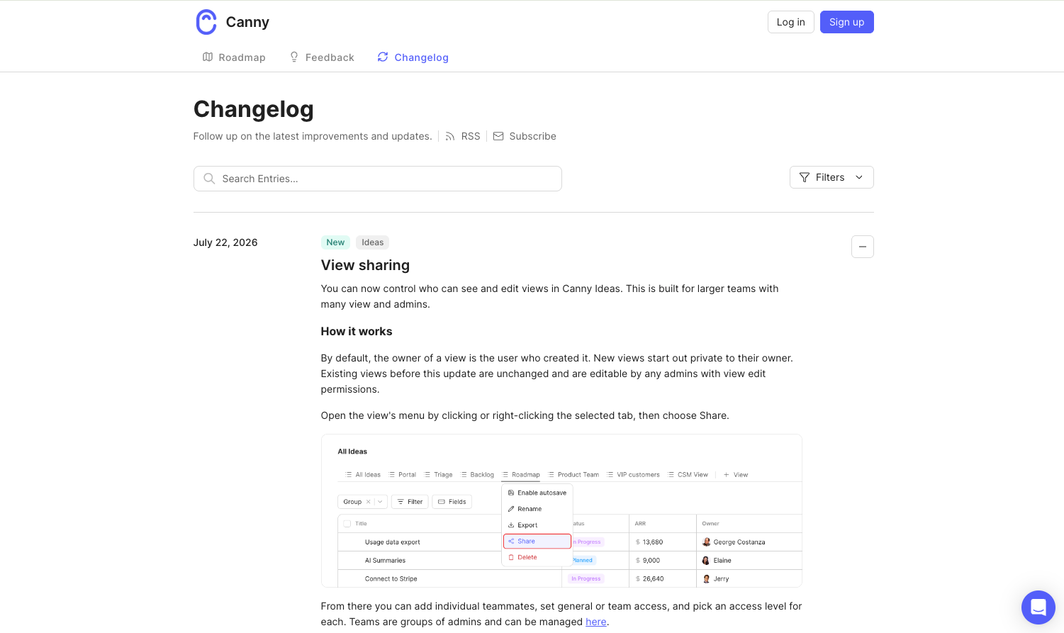
What their release notes do well: Because Canny's changelog is wired to its feedback boards, every entry completes a loop: when a feature ships, the entry connects back to the original request and every user who voted for it gets notified directly. The changelog becomes the final step of feedback → roadmap → announcement — the “you asked, we built it” moment delivered personally, at scale.
What to emulate: Link entries to the requests they resolve and notify the requesters. It's the highest-leverage sentence in release comms: the customer who asked, got, and was personally told has a story they'll retell — that's advocacy you didn't have to buy.
When users can find their own answer in the release notes, the ticket never gets opened.
What they do: UiPath is an enterprise automation and AI platform.
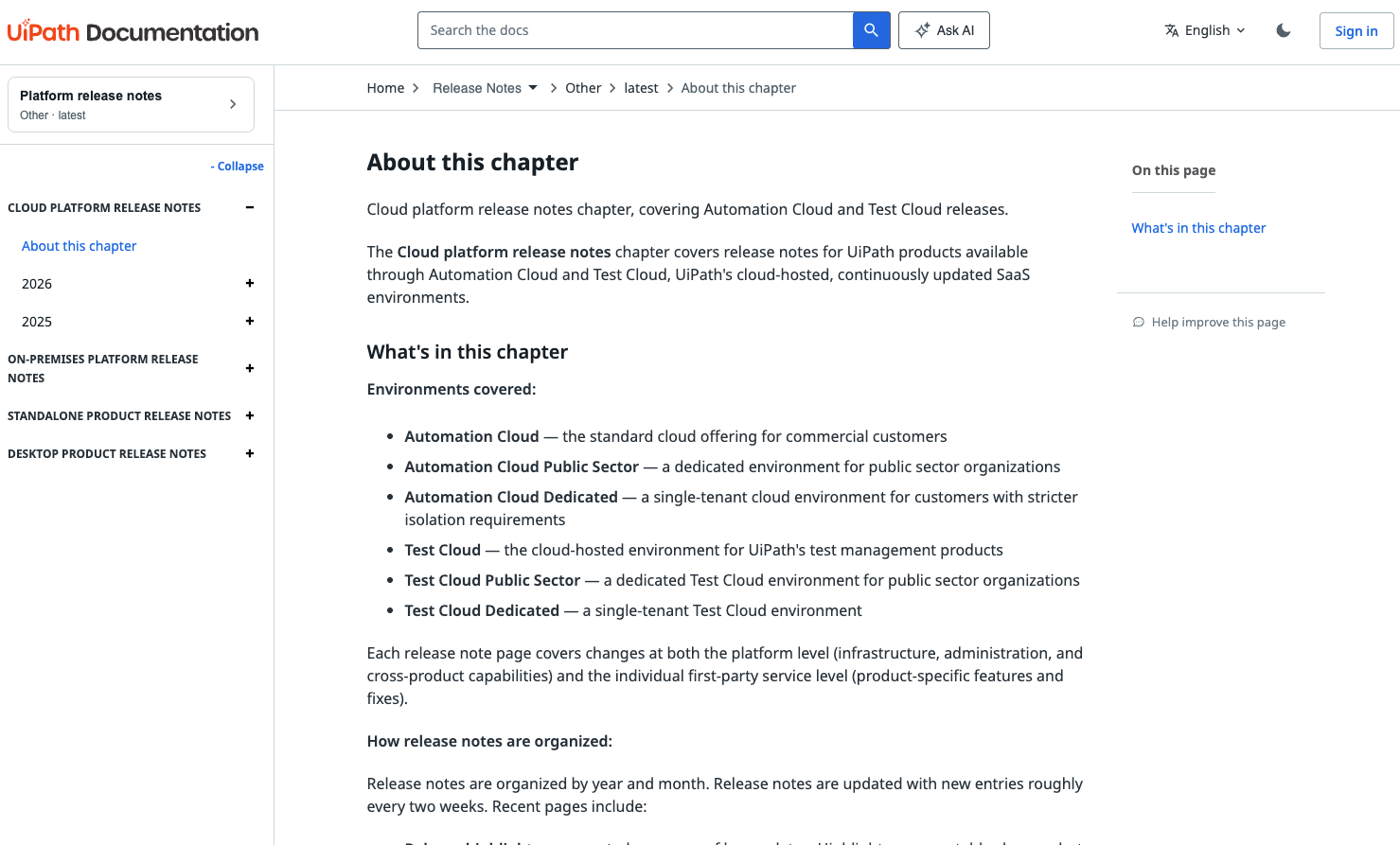
What their release notes do well: UiPath's release notes are long and technical by necessity; enterprise automation has a lot of moving parts, with separate tracks for cloud, on-premises, standalone, and desktop products. A table of contents organized by product, environment, year, and month lets users jump directly to the component that affects their workflow. Recent pages add a second layer: curated “Release highlights” for scanners plus a complete “Release notes catalog” for admins who need every change, refreshed roughly every two weeks. The admin who finds exactly what changed in their module doesn't open a ticket.
What to emulate: If your release notes are long, give users a map. A table of contents is especially valuable for enterprise products or platforms with multiple modules. The goal isn't to make users read everything — it's to help them find the one thing that matters to them as fast as possible.
Personality isn't one of the seven goals; but it's how these two companies make the retention and trust goals land in channels everyone else has abandoned.
What they do: Slack is a workplace messaging and collaboration platform.
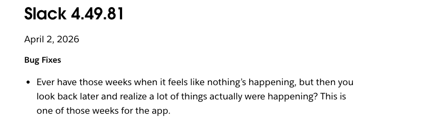
What their release notes do well: Slack's 2014–2019 release notes turned bug fixes into a minor literary genre. “It's like a duck swimming on a pond... This week, Slack is the duck.” The era proved that even maintenance updates can build brand affinity. The peak has passed, but the wit persists, and the lesson stands: users screenshotted and shared release notes, voluntarily, for years.
What to emulate: Voice turns an obligation into an asset. You need to sound like a person. If a user would screenshot your release note and share it, you've made retention marketing out of a bug fix
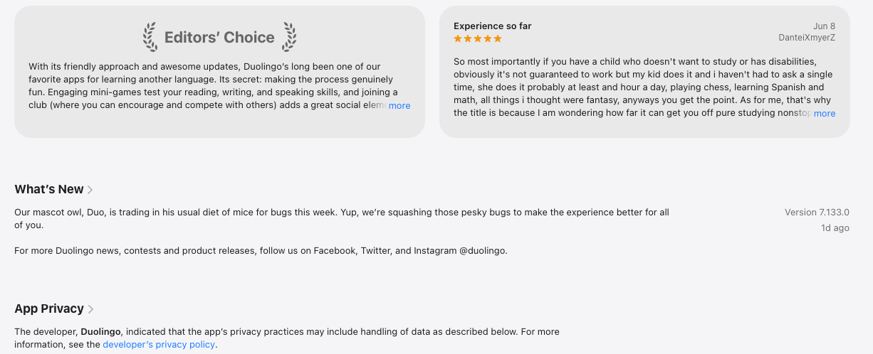
What they do: Duolingo is a language-learning app — and proof that personality survives even in the App Store's “What's New” box.
What their release notes do well: While most consumer apps have surrendered to “bug fixes and performance improvements,” Duolingo treats App Store notes as brand real estate, localized into 38+ languages and voiced by its mascot: “Our mascot owl, Duo, is trading in his usual diet of mice for bugs this week. Yup, we're squashing those pesky bugs.” A wasted channel for everyone else becomes a retention touchpoint.
What to emulate: No channel is too small for voice. If your competitors have abandoned a surface, App Store notes, update modals, even error messages with consistent personality is cheap differentiation.
Writing great release notes is half the job. The other half is making sure the right users actually see them. Not everyone checks your changelog page, and not every update warrants an email blast. The distribution channel should match the importance and context of the change.
Here's where each channel works best:
The closer the message is to the moment of change, the more effective it is. When a user receives an email about a new feature, they're reading about it in one context and experiencing it later in another. In-app messaging closes that gap. This is where a tool like Appcues helps. Rather than building custom in-app announcement infrastructure, you can trigger release note messages based on user behavior, such as which features someone has or hasn't explored yet.
After studying 13 examples across the seven goals, a few patterns emerge consistently:
If you're looking to go beyond writing better release notes and want to make sure the right users see them at the right time, that's the delivery side of the equation. Appcues helps teams trigger in-app messages based on user behavior, so your release notes reach users in the context where the change actually matters.
And if you're planning a larger launch, not just a routine update, our Ultimate Guide to Product Launches covers the full release playbook.
You've got the examples. You've got the template. The last piece is making sure the right users see your release notes in the right context. With Appcues, you can trigger release note messages based on which features a user has, or hasn't, explored yet. That's the difference between announcing a release and actually driving adoption. Book a demo.
Product Development
Roadmap & Release Communication
AI
Product Discovery & User Research
TL;DR
If you want real examples to study: This article breaks down 13 release notes from SaaS companies worth paying attention to, annotated for what works and why.
If you need a starting point: There's a copy-paste release notes template you can adapt for major releases, minor updates, and bug fixes.
If you want to get better at writing them: Seven practical steps walk you through how to write release notes that users actually read, with before-and-after examples.
But it's not your imagination that they've been changing shape these past few years. In fact, release notes have been slowly bifurcating, splitting based on what kind of attention a platform or an app asks for.
Consumer mobile, for example, have learned that meaningful release notes will go unread. Their goals, to have a user return to buy, aren't served by lengthy release notes. They've dwindled to boilerplate and an update in the app store when a bug gets fixed or there are meaningful performance improvements.
However, B2B SaaS and developer-tool companies have taken a different road. Release notes (and subsequent changelogs) have become a first-class marketing surface.
A release note is a brief, user-facing report published alongside new or updated software. It explains what changed, why it matters, and who it affects. For new releases, release notes give users a summary of what the product does. For updates to existing products, the notes explain what's new, what's improved, and what's been fixed since the last version.
Release notes vs. changelog: Release notes explain a single release in user terms that are curated, benefit-framed, and written for the people who actually use your product. A changelog is the running, chronological record of every change, often more technical and exhaustive. In practice the terms blur, since the changelog is usually where release notes live, but the distinction matters when you're deciding what to write and who it's for.
Momentum and trust signaling: Shipping velocity is itself a marketing tactic. Updates and changes show how responsive your team is and how invested you are in your customer’s success. However, as PostHog warns, “product velocity only compounds when adoption keeps up”. Shipping fast at inattentive users is a trap, so the way you communicate matters.
Feature adoption and retention: Targeting release note messages by whether a user has already explored a feature is the difference between announcing a release and actually driving adoption.
Support deflection: One release-note tooling vendor estimates that well-done release notes can reduce support tickets by up to 40% (Supportbench).
Closing the feedback loop: Release notes and changelogs are part of a necessary chain that builds advocacy. When you ask for feedback, then add a missing feature to your roadmap, having an announcement and notifying requesters directly helps create momentum in your customer engagement.
SEO and AEO: Changelogs and release notes are fresh, crawlable content that AI answer engines increasingly source for information.
Sales enablement: Buyers often scan changelogs and release notes to judge whether a product is alive. Now with AI, their assistants will often scan on their behalf.
Transparency and accountability: Vague notes dodge accountability, but detailed framing are coordination artifacts that show the trajectory of your business.
Not every update deserves the same treatment. The format and depth of your release notes should match the scope of the change:
Think of this as the anatomy of a release note. Every solid release note covers these elements, though the depth varies depending on whether you're announcing a major feature or a routine bug fix:
This question doesn't have a clear answer, since it's often contested and usually a combination of people. Product managers are the most common authors in B2B SaaS, product marketing managers where the notes are treated as marketing. Technical writers take over in larger orgs.
The best practice consensus is that engineering supplies the raw material (ship logs, commit messages, and technical specs), while a product marketer or PM translates them into customer-facing language. There is often one named owner because diffused ownership tends to mean release notes that never get published (Featurebase, 2026).
Ownership often defaults to PMs. The State of Product Marketing Report 2025 found that 44.3% of PMM teams are still one to two people, so their bandwidth is limited.
In 2020, an IEEE study analyzed 32,425 release notes across 1,000 GitHub projects plus a survey of 314 practitioners. Both producers and users reported that well-formed notes positively impact their work. However, there's a significant mismatch between what producers write and what readers want.
So what kind of people read release notes?
Power users and technical users over-index, but readership is wider than most teams assume. Prospects use changelogs as liveness checks when they're evaluating their options. Support and sales teams read them to stay informed for their customers. Feature requesters read entries that close their loop.
Karri Saarinen, co-founder and CEO at Linear, has two audiences many teams miss in candidates and investors. And now, the newest reader is non-human: AI coding assistants and customer facing agents now fetch changelogs at scale, with early directional estimates putting non-human reads at 10-30% of changelog traffic (ReleasePad, May 2026).
Knowing how to write release notes is foundational. However, writing what your specific customers want to read is a separate practice.
Knowing what to include is the foundation. How you write it determines whether anyone actually reads it. These are the steps are ordered for flow: start with what to say, then how to say it, then how to present it.
Every change was built to solve a problem or unlock a capability. Lead with why, not the what of your team’s build.
Before: "Implemented batch processing for data exports with configurable chunk sizes."
After: "You can now export large datasets without the process timing out. Exports that used to fail after 10,000 rows now handle up to 500,000."
A reliable test: finish the sentence “here’s what you can do now that you couldn’t before”. If you can’t complete it for a given change, that change may not belong in user-facing notes at all. (You’ll see Notion apply exactly this test in the examples later.)
Remember the mismatch from the IEEE study: producers consistently write what they want to say, not what readers want to know. Readers scan for two things: what changed and whether it touches them. Front-load both.
Bold the feature name, use typed labels (New / Improved / Fixed), and hold each entry to two or three sentences of plain language.
A good test: read the entry aloud to someone outside the team. If they get it, your users will.
Before: "Bug fixed and updates applied."
After: "Fixed: switching between apps no longer causes crashes. App switching is now stable on all supported devices."
If an entry needs three paragraphs, it probably needs a fifteen-second GIF instead. Match the medium to the change: UI changes get annotated screenshots, new workflows get short recordings, data features get a picture of the output.
The written entry then only has to add context, not carry the whole explanation. Amplitude, Loom, and Figma all run this play.
The foundation makes release notes readable. This layer is what turns them into the advocacy engine the seven goals described and it’s where most teams stop short.
When a shipped feature started life as a feature request, say so in the entry and notify the people who asked.
Modern feedback tools automate this: link the changelog entry to the feedback post it resolves, and every voter gets told the moment it ships. This is the highest-leverage sentence you can write in a release note.
The customer who asked, got, and was personally told has a story they'll retell to colleagues.
Announcing a release and driving adoption are different jobs, and one message can't do both. Where it matters, write two variants: one for users already working in the affected area ("the thing you use every day just got faster") and one for users who've never touched it ("here's what you've been missing"). Then let behavioral targeting decide who sees which. A redundant notification teaches users to dismiss you; a well-timed one teaches them to keep reading.
With non-human reads estimated at 10-30% of changelog traffic, your newest reader is an AI agent fetching your changelog to answer someone else's question, often a prospect's.
Agents truncate: a long entry gets reduced to its first sentence or two. The habits that serve human scanners serve machines as well like a crisp one-sentence summary per entry, typed categories, stable URLs, consistent structure. If your changelog is also available as structured data (markdown, RSS, or JSON), answer engines will quote you accurately instead of paraphrasing you loosely.
Predictability beats frequency. Weekly Friday updates produce Friday readers; sporadic updates produce no readers. A consistent template compounds the effect so users learn where to look, and your team stops re-deciding structure every release. Keep the voice recognizably yours, but hold the 80/20 line: 80% genuinely useful information, at most 20% brand personality.
The template in the next section bakes the foundation into a reusable structure. The advocacy layer is a workflow decision but the writing habits above are what make it land.
Here's a free, copy-paste release notes template in three sizes (major releases, minor updates, and bug fixes) so you can adjust the depth based on what you're shipping.
It covers the essentials for most updates. Adjust the depth based on the scope of your release: major releases get more detail per feature, minor releases can compress sections, and bug-fix-only releases can skip the "What's new" block entirely.
[What the user can now do — not the internal feature name]
[New] · [Date] · Available on: [plans / platforms] · [Product area]
Summary: [One sentence: what changed and who it affects. This is
what scanners read and what AI agents quote — make it standalone.]
What you can do now
[2–3 sentences on the capability in user terms: the problem it
solves, when to reach for it. Link to docs, not a wall of text.]
[Visual: 15-second GIF or annotated screenshot for anything UI]
You asked, we built: [Link to the feedback post this resolves.
Requesters get notified — say thanks here.]
Works well with: [1–2 existing features that complement this one,
linked — turn the announcement into a discovery moment]
Get started: [The first click — deep link into the product]
Known limitations: [What’s not covered yet — workaround or timeline]
Questions? [Help docs / support / community]
[Date] — [Product name] updates
Summary: [One sentence covering the theme of this batch]
- Improved: [What changed] — [how it affects you]
- Improved: [What changed] — [how it affects you]
- Fixed: [What you saw before] → [what happens now]
- New: [Small capability] ([docs link])
Fixed: [What the user experienced] → [what happens now].
[Affected platforms or versions, if relevant]
Scale the treatment to the change: a major release gets the full block with a visual; a batch of small improvements compresses into the digest; a bug-fix release leads with the fixes and drops everything else.
Two fields are non-negotiable at every size: the typed label and the one-sentence summary — they're what make your notes scannable by humans and quotable by machines. And keep the structure identical release to release: consistency is what teaches readers where to look, and it's what lets the 10-30% of your readers who aren't human parse you reliably. If you can also publish the same entries as a feed (RSS, markdown, or JSON), do it. It's the same content for a second audience with zero extra writing.
The examples below are grouped by the goal each company's release notes are built to serve, matching the goals covered earlier in this article. For every example, you'll find what the company does, what their release notes get right, and a specific, transferable lesson you can apply to your own.
These companies use the changelog itself as proof of life, a visible heartbeat that tells users, prospects, candidates, and investors the product is moving.
What they do: Linear is a project management and issue tracking tool built for software teams.
What their release notes do well: Linear's weekly, image-rich changelog is a primary link in its marketing-site nav — and it started before the company had a significant user base, as both an internal shipping ritual and an external momentum signal. Entries are tight and plain-language, one to three features plus a small-fixes section, and each one gets repackaged into the subscriber newsletter and social posts with demo videos.
What to emulate: Publish before you think you're ready, and keep the cadence sacred. The rhythm is the message: a changelog that updates every week says more about your team than any brand campaign. If your heading says “New: Batch operations,” rewrite it to what the user can now do.
What they do: Vercel is a cloud platform for building and deploying web applications.
What their release notes do well: Weekly, sometimes daily, minimal entries with code blocks and before/after performance benchmarks. Their publishing is treated as a routine part of shipping rather than a special event. Vercel then pairs this steady drumbeat with big-bang moments (its “Ship” conference keynotes), so routine updates and headline launches each have their own channel.
What to emulate: Run a two-tier system: a low-ceremony drumbeat for everything you ship, and reserved big-bang moments for what deserves a stage. Benchmarks beat adjectives — “40% faster” earns trust that “blazing fast” never will.
What they do: Raycast is a productivity launcher for macOS; Railway is a cloud infrastructure platform. Both are dev tools with strong communities.
What their release notes do well: Both write benefit-first, personality-heavy changelog entries and then amplify each one on X, treating the changelog as community glue rather than a compliance document. The entries read like a person telling you what got better, and the social amplification turns each release into a small conversation with the community.
What to emulate: Don't let entries die on the changelog page. Every release note is a social post, a community thread, and a reply-magnet waiting to happen, the amplification is where the momentum compounds.
What they do: Arc was a reimagined web browser known for design-forward product culture.
What their release notes do well: CEO Josh Miller turned release notes into episodic media: casual, founder-hosted video updates that users genuinely anticipated. It remains the most-loved format experiment in release comms, with the caveat that Arc was frozen in May 2025 as the company pivoted to its AI browser, Dia. The format worked; cite it as a creative benchmark, not a current practice.
What to emulate: A face and a voice create connection a text entry can't. You don't need production value, a founder or PM talking over a screen recording for two minutes makes users feel like insiders. Just don't let the format outrun the product story it's carrying.
These companies engineer their release notes to move readers from “I saw it” to “I used it.”
What they do: Notion is a connected workspace for notes, docs, project management, and wikis.
What their release notes do well: Notion's “What's New” page pairs extremely brief, capability-framed entries with strong visuals, and every entry links out to help docs: the announcement flows straight into learning the feature. Bigger batches get named releases (like “Notion 3.1”), which gives scattered improvements a single memorable identity.
What to emulate: Use “here's what you can do now that you couldn't before” as your framing device, and never let an entry dead-end — every announcement should link to the doc, template, or deep link that starts usage. Name your bigger releases so users (and your own team) can refer to them.
What they do: Figma is a collaborative interface design and prototyping tool.
What their release notes do well: Figma deliberately splits its release comms in two: a visual “What's New” showcase (feature blocks, annotated screenshots, animated demos) for scanners, and a traditional granular release notes record for power users. Neither audience wades through the other's format, and the annotations call out exactly what's different and where to find it.
What to emulate: Serve the scanner and the completionist separately instead of compromising on one middle format. And for any UI change, showing beats telling: a screenshot with arrows and callouts directs the eye to the exact change.
What they do: GitHub is the world's largest software development platform.
What their release notes do well: GitHub ships near-daily changelog posts tagged New Release / Improvement / Retired, filterable by label, with RSS and a dedicated @ghchangelog X account. It's how you communicate an enormous surface area (Copilot, Actions, and everything else) without burying users: nobody reads all of it, and nobody has to. Users subscribe to the slice that affects them and find their answer before it becomes a support ticket.
What to emulate: At high shipping volume, findability is the feature. Typed labels, filters, and feeds let each audience self-serve—which is also quiet support deflection: the admin who can find exactly what changed doesn't open a ticket.
Prospects (and increasingly their AI assistants) read changelogs to judge whether a product is alive and well-maintained. These companies answer with structure and spectacle respectively.
What they do: Stripe is a payments and financial infrastructure platform for the internet.
What their release notes do well: Stripe runs a two-layer system: a programmatically generated API changelog tied to named API versions (Acacia, Basil, Clover, Dahlia) for developers who need precision, plus a curated blog changelog for readers who want the narrative. The structured layer (consistent format, stable URLs, versioned entries) is exactly what both human evaluators and AI agents parse reliably, which is why Stripe gets quoted accurately while competitors get paraphrased loosely.
What to emulate: Layer your changelog for different readers, and make the structured layer machine-readable. Versioning as a first-class concept signals infrastructure-grade seriousness, and does double duty as your SEO/AEO play.
What they do: Intercom is an AI-powered customer service platform.
What their release notes do well: Intercom's “Built for You” franchise started as a monthly blog roundup of what shipped and evolved into a produced, seasonal live broadcast (like “Built For You Spring '25”) — releases batched into an event with demos, narrative, and a host. Release notes as programming, not paperwork, and a ready-made asset for sales and success teams to send prospects and customers.
What to emulate: When you ship enough volume, batch it into a moment. A quarterly “what we built for you” event, even a 15-minute video, reaches the majority who will never visit your changelog page, and gives revenue teams something to share.
The advocacy engine: telling the exact people who asked for something that you built it.
What they do: Canny is a feedback management and changelog tool for product teams.
What their release notes do well: Because Canny's changelog is wired to its feedback boards, every entry completes a loop: when a feature ships, the entry connects back to the original request and every user who voted for it gets notified directly. The changelog becomes the final step of feedback → roadmap → announcement — the “you asked, we built it” moment delivered personally, at scale.
What to emulate: Link entries to the requests they resolve and notify the requesters. It's the highest-leverage sentence in release comms: the customer who asked, got, and was personally told has a story they'll retell — that's advocacy you didn't have to buy.
When users can find their own answer in the release notes, the ticket never gets opened.
What they do: UiPath is an enterprise automation and AI platform.
What their release notes do well: UiPath's release notes are long and technical by necessity; enterprise automation has a lot of moving parts, with separate tracks for cloud, on-premises, standalone, and desktop products. A table of contents organized by product, environment, year, and month lets users jump directly to the component that affects their workflow. Recent pages add a second layer: curated “Release highlights” for scanners plus a complete “Release notes catalog” for admins who need every change, refreshed roughly every two weeks. The admin who finds exactly what changed in their module doesn't open a ticket.
What to emulate: If your release notes are long, give users a map. A table of contents is especially valuable for enterprise products or platforms with multiple modules. The goal isn't to make users read everything — it's to help them find the one thing that matters to them as fast as possible.
Personality isn't one of the seven goals; but it's how these two companies make the retention and trust goals land in channels everyone else has abandoned.
What they do: Slack is a workplace messaging and collaboration platform.
What their release notes do well: Slack's 2014–2019 release notes turned bug fixes into a minor literary genre. “It's like a duck swimming on a pond... This week, Slack is the duck.” The era proved that even maintenance updates can build brand affinity. The peak has passed, but the wit persists, and the lesson stands: users screenshotted and shared release notes, voluntarily, for years.
What to emulate: Voice turns an obligation into an asset. You need to sound like a person. If a user would screenshot your release note and share it, you've made retention marketing out of a bug fix
What they do: Duolingo is a language-learning app — and proof that personality survives even in the App Store's “What's New” box.
What their release notes do well: While most consumer apps have surrendered to “bug fixes and performance improvements,” Duolingo treats App Store notes as brand real estate, localized into 38+ languages and voiced by its mascot: “Our mascot owl, Duo, is trading in his usual diet of mice for bugs this week. Yup, we're squashing those pesky bugs.” A wasted channel for everyone else becomes a retention touchpoint.
What to emulate: No channel is too small for voice. If your competitors have abandoned a surface, App Store notes, update modals, even error messages with consistent personality is cheap differentiation.
Writing great release notes is half the job. The other half is making sure the right users actually see them. Not everyone checks your changelog page, and not every update warrants an email blast. The distribution channel should match the importance and context of the change.
Here's where each channel works best:
The closer the message is to the moment of change, the more effective it is. When a user receives an email about a new feature, they're reading about it in one context and experiencing it later in another. In-app messaging closes that gap. This is where a tool like Appcues helps. Rather than building custom in-app announcement infrastructure, you can trigger release note messages based on user behavior, such as which features someone has or hasn't explored yet.
After studying 13 examples across the seven goals, a few patterns emerge consistently:
If you're looking to go beyond writing better release notes and want to make sure the right users see them at the right time, that's the delivery side of the equation. Appcues helps teams trigger in-app messages based on user behavior, so your release notes reach users in the context where the change actually matters.
And if you're planning a larger launch, not just a routine update, our Ultimate Guide to Product Launches covers the full release playbook.
You've got the examples. You've got the template. The last piece is making sure the right users see your release notes in the right context. With Appcues, you can trigger release note messages based on which features a user has, or hasn't, explored yet. That's the difference between announcing a release and actually driving adoption. Book a demo.

Sign up for Quickcues and get our monthly updates!
.svg)