← Visit Appcues.com
×
×

3 ways product managers should let users lead development
Throughout development, you'll either need inspiration, clarity, or validation from your users. Here's how to get them all.
Skip to section:

Skip to section:

The best product managers assume nothing and question everything. Why? To quote the words of W. Edwards Deming—a physicist/statistician—without data, you're just another person with an opinion

But wait. Opinions—in the form of ideas and hypotheses—are essential. 

The point is, for opinions to develop into something substantial, they need to be backed by answers. You need to unearth the facts from your users. 

Throughout development, the types of user questions you need to ask and the answers you seek will vary. Depending on the status of your product, you'll either need inspiration, clarity, or validation. With a variety of questions, you need a variety of user research methods. You need more than simple surveys, focus groups, or quantitative analytics in your tool bag to get accurate answers. 

Luckily, there are many tried and tested research techniques specifically designed to help you ask the questions you want and find the right answers. 

an image of an arrow. First, along the arrow is the section "ideate" with the question "what do your users need?". Next, the middle section is "strategize" with the question "do you users want your product?". The final section is "success" with the question, "what's best for your users?"

Here we take three key user questions and show how you can answer them with three different research methods. Let's dive in.

What do your users need?

Product design starts with identifying users' needs. Because if you don't know what the needs are, you won't build the right thing. 

You may think you understand what users need, and that's fine. But to avoid risking your reputation, time, and effort it's advisable to assume you know nothing. When preconceived ideas take a back seat, your user research can lead you to hidden gems

With a method called experience sampling, you can explore the broader world of your users' experiences. It will bolster your overall understanding of who you are designing for, and it will highlight genuine needs in a real-life context.

Experience Sampling Method

The Experience Sampling Method (ESM) is a strategic user research technique that explores people's current behavior, without your product, to evaluate whether or not they indicate a need that matches the value you can provide. 

It consists of asking users to send systematic self-reports at random occasions during the working hours of a typical week. 

This way, the data is less likely to be skewed from recall bias or unnatural environments like labs. The insights are gathered from the real world, as close to the event as possible.

an image of an ESM test on a cell phone

Say your company creates productivity products. This is what your ESM would look like:

  1. Define the question that speaks to a participant's behavior: For example, “What was the reason you recently used a piece of paper to write something down?"
  2. Find appropriate research participants: Use a screening survey to select at least 25 participants who match your target demographic.
  3. Set the data point requirement: For a comprehensive data set, you should aim for 500 responses. If you have 25 participants and you're asking the question two times per day, you will have a good data set to analyze in two working weeks.
  4. Set your collection method: SMS, WhatsApp, and email are all good options with a link to a simple Google form. But a tool like LifeData can save a lot of the legwork.
  5. Analyze data: To manage the volume, you and your team need to classify the responses into concise categories. From here, you can see how the responses are distributed, which will help you identify the most important themes and patterns.

Experience sampling can be used for all scenarios. Everything from the needs of young women in the context of mental health to how people go about streaming media

From here, you can generate evidence-based feature and product ideas to explore further. It sets you off on the right track.

Do users want your product?

Where the "need" is the end goal, the "want" is how the user wishes they could get there. For example, a user needs to check their banking, but they want to do it on the go with the highest level of security. 

Answering this question is vital in making you more aware of the current pain points of your audience. It lets you validate your crucial product and user assumptions. 

But ideally, you should get under the skin of the “want” before you start to build anything. 

The problem is: to let your users lead at this stage, they need to be exposed to your product in one way or another—relying on their imagination is unreliable. But without building a product, what can you do? 

You can create a Concierge MVP or a fake-door experiment.

The concierge MVP

A Minimum Viable Product (MVP) is the bare minimum needed for you to get feedback on your product. This often takes the shape of a prototype that requires some back-end work to get it going. 

But the effort of an MVP can be even more minimal if you replace computer processing with human processing. This is what's called a Concierge MVP. 
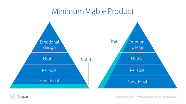
An image of two triangles that shows a MVP has slices of a working product (functional, reliable, usable, and with emotional design)
source‍[

Eric Ries's “The Lean Startup” illustrates how Food on the Table, a meal planner app that hunts down the best deals on ingredients, used the Concierge MVP first to understand users' wants. 

To begin with, a few new users told the team their food and store preferences via email, and then the team manually created the recipes and shopping lists with no algorithms in sight. The team then delivered the service, listened, and adapted based on what they learned. 

Without writing a single line of code, Food on the Table was able to find out if users wanted the service, and—more importantly—how they wanted the service to work. 

It's the quick and dirty way to validate your product idea.

Fake-door testing

Fake-door testing allows you to validate (or trash) your ideas in a very short space of time, with minimal development effort. 

Here's how it works:

  1. Create a landing page that clearly and compellingly explains the purpose of your product, as you would if you were about to launch it and ask users to sign up for early access to the product. Preferably, the user should not know the product does not exist yet.
  2. Advertise the landing page on social, search, and email to get your target audience's eyes on your concept.
  3. Respond to registered users sensitively. Something along the lines of: “Sorry, the product/feature is not available yet. But you will be the first to know once it is launched.”

It is simple: if enough people click on the advertisement and sign up, you will know your idea is something users will want. 

Topshop, a British fashion retailer, used a fake-door experiment to see if there was a want for a shopping wish list. To get the answer, Topshop simply added a wish list button, displayed it to 20% of their traffic and counted the clicks to see if the demand was worthy of the development effort. 

a screenshot of Topshop's wish list fake-door

Admittedly, this is not a technique you would want to use and abuse, so reserve fake-door testing for quality ideas backed by your research. But overall, it is a solid method to get a reliable lead on what users want.

What's best for your users?

Even with years of experience in SaaS and the tech industry, you can never be sure of what's best for your users. And the truth is, there will always be a difference between what a user says and what they actually do. 

You need a way to validate your user-led designs with confidence. 

With A/B testing you can let users—unknowingly—lead you to the answer with 95% statistical confidence. This way you can turn your qualitative user insight into a quantitative one to help you funnel your resource toward the most optimal solution. 
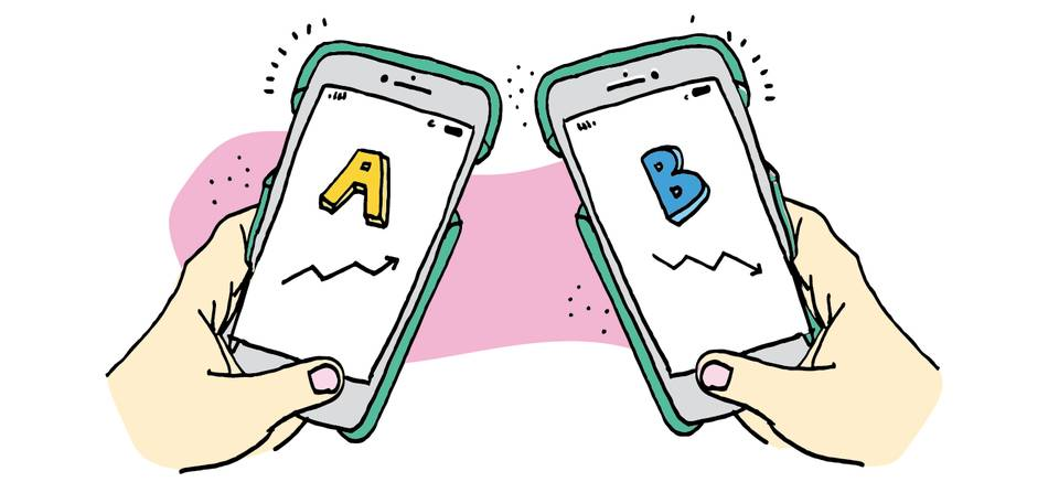
An illustration of two hands holding cell phones, one with the letter "A" and the other, the letter "B"—for A/B test.
]source‍[

A/B testing

A/B testing is the practice of comparing two or more variations of your product, feature, or page to see which one performs better with your user base. Here's how it works:

  1. Develop a hypothesis: The best ideas for tests are the ones backed by your user research and insight rather than your gut feeling or the latest trend. An evidence-based hypothesis increases your chances of finding solutions that will have a positive impact on your product.
  2. Design the test: Most testing platforms offer a drag-and-drop solution for simple alterations to your website. But for more complex changes, you will need a developer to create a variation to test against your control. Remember to make one change per test, or you won't know which change made a difference.
  3. Select KPI: The Key Performance Indicator you choose to evaluate your test must be closely linked to your hypothesis. The most common top-level KPIs include click-through-rate, conversion rate, and revenue per visitor. But they can be much more granular like the interaction rate on a specific feature if need be.
  4. Launch, test, and analyze the results: The time it takes for a test to run will depend on your traffic volume, the differences in variation performance, and your selected confidence threshold. Most testing tools run the stats for you and will let you know once your test has reached statistical significance.

Wistia, a video hosting business, has run and learned from over 150 tests in the last three years. By letting their users lead them to accurate answers, they have been able to make precise decisions on how to improve their product. 

The great thing about A/B testing is you can get feedback from all of your users in one go. It gives you the volume of participants you need to get highly accurate answers, and it can act as the final sense check for all your opinions and ideas that have been funneled through your user research. 

It's hard to quibble at the cold hard stats that A/B testing delivers.

Conclusion

Here we've addressed three big product development questions and how you can let users lead you to the answers. But there are many other big and small questions you will also want to ask your users. 

You may want to understand first impressions, in which five-second tests can give you the answer. Or you may want to find the optimal solution to your information architecture, which card-sorting can help with. 

The point is, you shouldn't be afraid to question everything, because there is always a method to help you get the answer quickly and easily. When you ask for user input in the right way and at the right time, there's no reason why users cannot help you lead at every stage of development.

Ty Magnin
Skip to section:

Skip to section:

The best product managers assume nothing and question everything. Why? To quote the words of W. Edwards Deming—a physicist/statistician—without data, you're just another person with an opinion

But wait. Opinions—in the form of ideas and hypotheses—are essential. 

The point is, for opinions to develop into something substantial, they need to be backed by answers. You need to unearth the facts from your users. 

Throughout development, the types of user questions you need to ask and the answers you seek will vary. Depending on the status of your product, you'll either need inspiration, clarity, or validation. With a variety of questions, you need a variety of user research methods. You need more than simple surveys, focus groups, or quantitative analytics in your tool bag to get accurate answers. 

Luckily, there are many tried and tested research techniques specifically designed to help you ask the questions you want and find the right answers. 

an image of an arrow. First, along the arrow is the section "ideate" with the question "what do your users need?". Next, the middle section is "strategize" with the question "do you users want your product?". The final section is "success" with the question, "what's best for your users?"

Here we take three key user questions and show how you can answer them with three different research methods. Let's dive in.

What do your users need?

Product design starts with identifying users' needs. Because if you don't know what the needs are, you won't build the right thing. 

You may think you understand what users need, and that's fine. But to avoid risking your reputation, time, and effort it's advisable to assume you know nothing. When preconceived ideas take a back seat, your user research can lead you to hidden gems

With a method called experience sampling, you can explore the broader world of your users' experiences. It will bolster your overall understanding of who you are designing for, and it will highlight genuine needs in a real-life context.

Experience Sampling Method

The Experience Sampling Method (ESM) is a strategic user research technique that explores people's current behavior, without your product, to evaluate whether or not they indicate a need that matches the value you can provide. 

It consists of asking users to send systematic self-reports at random occasions during the working hours of a typical week. 

This way, the data is less likely to be skewed from recall bias or unnatural environments like labs. The insights are gathered from the real world, as close to the event as possible.

an image of an ESM test on a cell phone

Say your company creates productivity products. This is what your ESM would look like:

  1. Define the question that speaks to a participant's behavior: For example, “What was the reason you recently used a piece of paper to write something down?"
  2. Find appropriate research participants: Use a screening survey to select at least 25 participants who match your target demographic.
  3. Set the data point requirement: For a comprehensive data set, you should aim for 500 responses. If you have 25 participants and you're asking the question two times per day, you will have a good data set to analyze in two working weeks.
  4. Set your collection method: SMS, WhatsApp, and email are all good options with a link to a simple Google form. But a tool like LifeData can save a lot of the legwork.
  5. Analyze data: To manage the volume, you and your team need to classify the responses into concise categories. From here, you can see how the responses are distributed, which will help you identify the most important themes and patterns.

Experience sampling can be used for all scenarios. Everything from the needs of young women in the context of mental health to how people go about streaming media

From here, you can generate evidence-based feature and product ideas to explore further. It sets you off on the right track.

Do users want your product?

Where the "need" is the end goal, the "want" is how the user wishes they could get there. For example, a user needs to check their banking, but they want to do it on the go with the highest level of security. 

Answering this question is vital in making you more aware of the current pain points of your audience. It lets you validate your crucial product and user assumptions. 

But ideally, you should get under the skin of the “want” before you start to build anything. 

The problem is: to let your users lead at this stage, they need to be exposed to your product in one way or another—relying on their imagination is unreliable. But without building a product, what can you do? 

You can create a Concierge MVP or a fake-door experiment.

The concierge MVP

A Minimum Viable Product (MVP) is the bare minimum needed for you to get feedback on your product. This often takes the shape of a prototype that requires some back-end work to get it going. 

But the effort of an MVP can be even more minimal if you replace computer processing with human processing. This is what's called a Concierge MVP. 

An image of two triangles that shows a MVP has slices of a working product (functional, reliable, usable, and with emotional design)
source‍[

Eric Ries's “The Lean Startup” illustrates how Food on the Table, a meal planner app that hunts down the best deals on ingredients, used the Concierge MVP first to understand users' wants. 

To begin with, a few new users told the team their food and store preferences via email, and then the team manually created the recipes and shopping lists with no algorithms in sight. The team then delivered the service, listened, and adapted based on what they learned. 

Without writing a single line of code, Food on the Table was able to find out if users wanted the service, and—more importantly—how they wanted the service to work. 

It's the quick and dirty way to validate your product idea.

Fake-door testing

Fake-door testing allows you to validate (or trash) your ideas in a very short space of time, with minimal development effort. 

Here's how it works:

  1. Create a landing page that clearly and compellingly explains the purpose of your product, as you would if you were about to launch it and ask users to sign up for early access to the product. Preferably, the user should not know the product does not exist yet.
  2. Advertise the landing page on social, search, and email to get your target audience's eyes on your concept.
  3. Respond to registered users sensitively. Something along the lines of: “Sorry, the product/feature is not available yet. But you will be the first to know once it is launched.”

It is simple: if enough people click on the advertisement and sign up, you will know your idea is something users will want. 

Topshop, a British fashion retailer, used a fake-door experiment to see if there was a want for a shopping wish list. To get the answer, Topshop simply added a wish list button, displayed it to 20% of their traffic and counted the clicks to see if the demand was worthy of the development effort. 

a screenshot of Topshop's wish list fake-door

Admittedly, this is not a technique you would want to use and abuse, so reserve fake-door testing for quality ideas backed by your research. But overall, it is a solid method to get a reliable lead on what users want.

What's best for your users?

Even with years of experience in SaaS and the tech industry, you can never be sure of what's best for your users. And the truth is, there will always be a difference between what a user says and what they actually do. 

You need a way to validate your user-led designs with confidence. 

With A/B testing you can let users—unknowingly—lead you to the answer with 95% statistical confidence. This way you can turn your qualitative user insight into a quantitative one to help you funnel your resource toward the most optimal solution. 

An illustration of two hands holding cell phones, one with the letter "A" and the other, the letter "B"—for A/B test.
]source‍[

A/B testing

A/B testing is the practice of comparing two or more variations of your product, feature, or page to see which one performs better with your user base. Here's how it works:

  1. Develop a hypothesis: The best ideas for tests are the ones backed by your user research and insight rather than your gut feeling or the latest trend. An evidence-based hypothesis increases your chances of finding solutions that will have a positive impact on your product.
  2. Design the test: Most testing platforms offer a drag-and-drop solution for simple alterations to your website. But for more complex changes, you will need a developer to create a variation to test against your control. Remember to make one change per test, or you won't know which change made a difference.
  3. Select KPI: The Key Performance Indicator you choose to evaluate your test must be closely linked to your hypothesis. The most common top-level KPIs include click-through-rate, conversion rate, and revenue per visitor. But they can be much more granular like the interaction rate on a specific feature if need be.
  4. Launch, test, and analyze the results: The time it takes for a test to run will depend on your traffic volume, the differences in variation performance, and your selected confidence threshold. Most testing tools run the stats for you and will let you know once your test has reached statistical significance.

Wistia, a video hosting business, has run and learned from over 150 tests in the last three years. By letting their users lead them to accurate answers, they have been able to make precise decisions on how to improve their product. 

The great thing about A/B testing is you can get feedback from all of your users in one go. It gives you the volume of participants you need to get highly accurate answers, and it can act as the final sense check for all your opinions and ideas that have been funneled through your user research. 

It's hard to quibble at the cold hard stats that A/B testing delivers.

Conclusion

Here we've addressed three big product development questions and how you can let users lead you to the answers. But there are many other big and small questions you will also want to ask your users. 

You may want to understand first impressions, in which five-second tests can give you the answer. Or you may want to find the optimal solution to your information architecture, which card-sorting can help with. 

The point is, you shouldn't be afraid to question everything, because there is always a method to help you get the answer quickly and easily. When you ask for user input in the right way and at the right time, there's no reason why users cannot help you lead at every stage of development.

Ty Magnin
You might also like...