← Visit Appcues.com
×
×

Onboarding (Tool)tip: Use inclusive language so you don’t alienate new users

Anyone who spends time making their product design more accessible should think about how words can do the same.
Skip to section:

Skip to section:

“Brevity is the soul of wit.” “Simplify, simplify, simplify.” “Less is more.” 

In human communications, simple is best. Your products’ users are human. (We imagine, at least, as it’s still early days for the doggie software industry.) That means the best way to teach users about your product is the simplest way—even if you sell something complicated like software. 

The jargon we commonly use in the SaaS industry is no exception. Of course, it can be difficult to talk about B2B SaaS simply—but entrenched insiders risk leaving new users in the dust with their use of industry-specific terms. 

So, how can you get to an ideal midpoint of communicating with your customers (without going too far)?

Simplifying language for a better user onboarding experience

Making things easy to understand isn’t the same as dumbing them down. 

If you’re working to improve product onboarding, your goal is to keep users engaged until they discover the real value behind your product. When it comes to language, keeping things light and breezy is a great way to get and keep them aboard as they learn. The best ways to do that?

  1. Avoiding language your users don’t understand
  2. Doing research to make sure your customer-facing copy sounds like how customers actually talk about their problems. 

To simplify things, you first need to speak your users’ language. This can look like adding questions to your customer research process to discover: 

  • How are users interacting with your product? 
  • How much product knowledge do users have prior to onboarding?
  • How familiar are users with your industry?

Here’s a home-grown example: in Appcue's external messaging, we generally avoid using the internal term “Studio” when talking to users. Appcues Studio is the main interface within Appcues for managing flows and events. 

“Internally, we refer to Studio and Builder. But when I was an Appcues customer, I never once called it Appcues Studio or Builder,” Lyla Rozelle, Director of Customer Enablement at Appcues, says. “So it wouldn't make sense for me to put that in the checklist like, ‘Take a tour of the Studio.’ The studio is just Appcues.’”

The information you receive from your sales personalization efforts or user data is another opportunity to simplify your messaging. With better knowledge about your users, you can create more customized onboarding flows. Are your users sales experts? You might be able to get away with more jargon. Small business owners? Less insider language might be called for.

A few ideas for speaking your users’ language

It’s one thing to want to modify your language to match your customers—but another thing entirely to put that into practice. So, here are some easy ways to make the messaging in your onboarding process more comprehensible.

Break large lists into smaller, bite-sized chunks

We’ve said it before and we’ll say it again:

Users just don’t care about your features as much as you do


That long list of features that you think will benefit every user that comes across your product might be the thing that drives them away. (We’re looking at you, Clippy.)
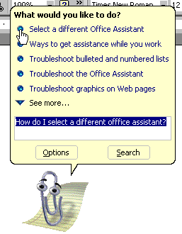
Microsoft Clippy with a full feature list
Image source: GCF Global

What you need in those precious first seconds is retention. You can make this easier by breaking down that long, convoluted checklist you show when users first enter your app into smaller, digestible, and easy-to-understand chunks. 

Even better, consider using a user journey map to craft a customized experience that only shows users what will get them to the goal they signed up to achieve.

Personalize language with data

Knowing more about your users comes in handy when designing your onboarding. For example, pairing job titles or other identifying information to common use cases in your product can help these new users arrive at value faster. 

At the language level, you can also personalize the user onboarding experience by collecting data at sign-up.

One example of this are welcome pages that greet users by name. But other demographic data you pull at the beginning can be used to give your onboarding experience depending on demographic factors like: 

  • Company size
  • Job title
  • Industry
  • Country (for language localization) 

Pinterest gives us a great IRL example to learn from. They ask users about their interests during sign-up—and then they blend that with your browser's location data to create a personalized recommendation feed.
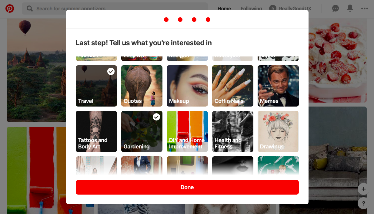
Pinterest personalized sign up
Image source: Pinterest

Avoid insider jargon when possible 

CAC? LTV? ARR? If you’re responsible for reporting on these metrics related to sales and retention, then you probably know what they are. But that doesn’t mean your users always will.  

Jessica Andrews, Senior Product Marketing Manager at Copper, argues using terms that are too “inside baseball,” i.e., too technical or industry-specific, can lead to some confused users when they haven’t adopted that language themselves. 

Take the case of customer relationship management (CRM) software, for example. Assuming your users understand the nuances of sales-specific terms like “opportunity” or “lead”  could lead to confusion, frustration, or even churn. The workaround? Make defining key terms—or better yet, understanding exactly how prospects talk about certain topics—a part of your onboarding design process.

The bottom line

Language is a part of UX. Anyone who spends time making their product design more accessible should also be thinking about how words can do the same. 

There’s a lot of software out there, after all. If your users need a dictionary to understand you, odds are good they’ll look for a different solution—one that speaks their language. 

Looking to level up your onboarding knowledge? Learn to remove as much friction as possible—complete our User Onboarding 101 course and get certified today.

Ramli John
Director of Content at Appcues
Ramli John is the Director of Content at Appcues and author of the bestselling book Product-Led Onboarding. He’s also a PLG Coach at ProductLed, where he’s worked with Mixpanel, Microsoft, and more to accelerate their growth.
Skip to section:

Skip to section:

“Brevity is the soul of wit.” “Simplify, simplify, simplify.” “Less is more.” 

In human communications, simple is best. Your products’ users are human. (We imagine, at least, as it’s still early days for the doggie software industry.) That means the best way to teach users about your product is the simplest way—even if you sell something complicated like software. 

The jargon we commonly use in the SaaS industry is no exception. Of course, it can be difficult to talk about B2B SaaS simply—but entrenched insiders risk leaving new users in the dust with their use of industry-specific terms. 

So, how can you get to an ideal midpoint of communicating with your customers (without going too far)?

Simplifying language for a better user onboarding experience

Making things easy to understand isn’t the same as dumbing them down. 

If you’re working to improve product onboarding, your goal is to keep users engaged until they discover the real value behind your product. When it comes to language, keeping things light and breezy is a great way to get and keep them aboard as they learn. The best ways to do that?

  1. Avoiding language your users don’t understand
  2. Doing research to make sure your customer-facing copy sounds like how customers actually talk about their problems. 

To simplify things, you first need to speak your users’ language. This can look like adding questions to your customer research process to discover: 

  • How are users interacting with your product? 
  • How much product knowledge do users have prior to onboarding?
  • How familiar are users with your industry?

Here’s a home-grown example: in Appcue's external messaging, we generally avoid using the internal term “Studio” when talking to users. Appcues Studio is the main interface within Appcues for managing flows and events. 

“Internally, we refer to Studio and Builder. But when I was an Appcues customer, I never once called it Appcues Studio or Builder,” Lyla Rozelle, Director of Customer Enablement at Appcues, says. “So it wouldn't make sense for me to put that in the checklist like, ‘Take a tour of the Studio.’ The studio is just Appcues.’”

The information you receive from your sales personalization efforts or user data is another opportunity to simplify your messaging. With better knowledge about your users, you can create more customized onboarding flows. Are your users sales experts? You might be able to get away with more jargon. Small business owners? Less insider language might be called for.

A few ideas for speaking your users’ language

It’s one thing to want to modify your language to match your customers—but another thing entirely to put that into practice. So, here are some easy ways to make the messaging in your onboarding process more comprehensible.

Break large lists into smaller, bite-sized chunks

We’ve said it before and we’ll say it again:

Users just don’t care about your features as much as you do


That long list of features that you think will benefit every user that comes across your product might be the thing that drives them away. (We’re looking at you, Clippy.)

Microsoft Clippy with a full feature list
Image source: GCF Global

What you need in those precious first seconds is retention. You can make this easier by breaking down that long, convoluted checklist you show when users first enter your app into smaller, digestible, and easy-to-understand chunks. 

Even better, consider using a user journey map to craft a customized experience that only shows users what will get them to the goal they signed up to achieve.

Personalize language with data

Knowing more about your users comes in handy when designing your onboarding. For example, pairing job titles or other identifying information to common use cases in your product can help these new users arrive at value faster. 

At the language level, you can also personalize the user onboarding experience by collecting data at sign-up.

One example of this are welcome pages that greet users by name. But other demographic data you pull at the beginning can be used to give your onboarding experience depending on demographic factors like: 

  • Company size
  • Job title
  • Industry
  • Country (for language localization) 

Pinterest gives us a great IRL example to learn from. They ask users about their interests during sign-up—and then they blend that with your browser's location data to create a personalized recommendation feed.

Pinterest personalized sign up
Image source: Pinterest

Avoid insider jargon when possible 

CAC? LTV? ARR? If you’re responsible for reporting on these metrics related to sales and retention, then you probably know what they are. But that doesn’t mean your users always will.  

Jessica Andrews, Senior Product Marketing Manager at Copper, argues using terms that are too “inside baseball,” i.e., too technical or industry-specific, can lead to some confused users when they haven’t adopted that language themselves. 

Take the case of customer relationship management (CRM) software, for example. Assuming your users understand the nuances of sales-specific terms like “opportunity” or “lead”  could lead to confusion, frustration, or even churn. The workaround? Make defining key terms—or better yet, understanding exactly how prospects talk about certain topics—a part of your onboarding design process.

The bottom line

Language is a part of UX. Anyone who spends time making their product design more accessible should also be thinking about how words can do the same. 

There’s a lot of software out there, after all. If your users need a dictionary to understand you, odds are good they’ll look for a different solution—one that speaks their language. 

Looking to level up your onboarding knowledge? Learn to remove as much friction as possible—complete our User Onboarding 101 course and get certified today.

Ramli John
Director of Content at Appcues
Ramli John is the Director of Content at Appcues and author of the bestselling book Product-Led Onboarding. He’s also a PLG Coach at ProductLed, where he’s worked with Mixpanel, Microsoft, and more to accelerate their growth.
You might also like...