← Visit Appcues.com
×
×

How to motivate users through the activation funnel and beyond
Discover 6 strategies for keeping users motivated on their path to activation and beyond.
Skip to section:

Skip to section:

Editor's note: This article was first published in 2016 and has been updated in May 2020 with fresh content and insights. Enjoy!

Every summer, many people find themselves wondering how much better off they’d be if only they’d stuck to all the resolutions they made at the beginning of the year. They’d be eating healthier, in better shape, maybe they’d even speak a new language.

But no matter how well we plan out our resolutions, many inevitably end up in the graveyard of wishful thinking. 

That’s because we take motivation for granted when setting goals. Since it's a feeling, we don't really know how to factor it into tactical plans—we just hope that the initial excitement will power us through.

In reality, motivation needs to be carefully cultivated and planned. 

This is also true in software. When users aren't motivated beyond sign-up, activation rates drop off.

Given the outsized impact of activation on your bottom line, getting users to complete your product’s activation event—through which they achieve real value and experience an aha moment—is one of the most important things growth teams can do. Improving and maintaining user motivation is crucial to this process.

Below, we’ll explore 6 strategies for keeping users motivated through the activation stage of their user journey.

What is activation and why is it important?

Before we continue, a quick refresher on what exactly product people mean when we talk about activation.

Activation occurs when users first achieve the value you promised. It happens when new users reach their first aha moment and the lightbulb goes off—after this, they become activated users.

Activation rate is expressed as the percent of activated users out of total acquired users.

How to define activated users is something each team needs to figure out for themselves, by analyzing the user journey and mapping backward to figure out the early events that set successful, retained users apart from those that fizzle out. We’ve published a guide to finding your product’s activation event, which we recommend checking out. You may also want to read up on how to find your aha moment, which is another side of the same coin.

6 ways to motivate users and boost activation

Once you have an understanding of what activation looks like in your product, you can set about designing a user experience that is optimized for it. As promised, here are 6 ways to improve your activation rate by increasing user motivation.

1. Build excitement with better user onboarding

Activation starts with signup and user onboarding. These first experiences are the rare moments where you might have the user’s full attention, so it’s crucial for your user onboarding experience to convey excitement and provide a warm welcome.

Take a look at how Tumblr greets new users and showcases its range of content during signup:

tumblr user onboarding signup welcome page with user content
tumblr user onboarding personalization

When reiterating your value, keep the statements short and sweet so that users are able to get into your product faster. And as much as possible, use language that makes users feel the experience is about them. Tumblr’s “tell us what you like” copy is a good example of this.

Another motivation-building tactic is goal-setting. Getting users to commit to a goal during signup can help you maintain momentum through onboarding and beyond. 

headspace mobile app goal setting user onboarding example

2. Reduce effort by breaking up difficult tasks

Keeping motivation high is especially crucial if your key activation event or aha moment takes a bit of work to reach. 

It’s much easier to ask people to complete one small thing at a time than to make one giant commitment. Plus, once people agree to a small task, they’re more likely to take on larger tasks

Think about the difference between filing your taxes yourself and filing them with a tool like TurboTax. Part of what makes filing with TurboTax feel easier is that the process is broken down into logical, manageable steps. Those steps are further punctuated by checkpoints, which give users a sense of accomplishment along the way.

turbotax user experience broken down into small steps example
turbotax UX milestone checkpoint to make a long process feel easier

Breaking up steps can also help measure the effectiveness of your onboarding experience. With smaller units to measure, you can better pinpoint why something is or isn’t working. As Quick Sprout product designer Ian Main said,

“The single most important thing we've done to improve user onboarding is to split our onboarding up into more bite-sized smaller steps. This has enabled us to measure our user onboarding funnel more granularly and has made it easier to move the steps around when we are trying to optimize the funnel.”

3) Remove barriers to the aha moment

Minimizing the amount of forms a user has to fill out upfront is a surefire way to get users into your product faster. To ensure that this approach doesn’t just bloat your acquisition numbers with users who won’t actually continue using your product, you can delay the account creation until after the user experiences true value. 

Duolingo uses deferred account creation to shorten the path to activation. Their onboarding flow guides visitors through a quick language learning lesson, showing how quick and easy it is to learn a new language with the app—before asking users to commit to the product with a signup.

For an even shorter path to activation, take a look at minimalist publishing tool,Telegraph, created by the team behind messaging app Telegram. This simple tool gives users immediate value. All users have to do (indeed, all they can do) is input a title, author, some content, and hit the publish button. It’s one of the quickest, most no-frills ways to publish something online. 

simplest online publishing tool telegraph has an immediate time to value

Telegraph’s stark simplicity takes inspiration from the ease-of-use of other platforms and takes it to a whole new level.  

4. Encourage users with visible progress

Progress bars are a simple way to let users know how much progress they’ve completed, and how much more they have to go. They both celebrate what the user has already done and maintain momentum as users get closer to the finish line. 

Quora's onboarding flow uses a progress bar to keep users engaged enough to finish setting up their account.

quora user onboarding progress bar example

By starting users off with a progress bar that’s partially completed, Quora also hits on the goal gradient effect, which states that motivation tends to increase the closer we are to completing our goals. 

Checklists work the same way, and have the added benefit of providing clear insight into the next steps ahead. Checklists can be used in tandem with progress bars to help users stay on track as they complete more complex onboarding with multiple steps. This user onboarding checklist from Asana is a good example:

asana user onboarding checklist to improve activation

5) Reward users with delightful success messages

People want to be rewarded after completing a task. Yet far too often, products spend all their effort on getting users to do something, but quickly forget about the user experience after the desired action is completed. 

Doing so is a missed opportunity for 1) confirming task success and 2) delighting users with added personality. 

Success messages can occur immediately inside the app after a user completes a task, like when users choose the correct answer during a language learning lesson, as in this example from Hello Chinese:

hello chinese mobile language learning app success message

Or they can be tied to important milestones and take the form of an email:

youtube 500 subscribers email milestone celebration for user engagement
Source

Milestones create an opportunity to offer users something special in recognition of their continued engagement. 

6) Use feedback to refine the path to activation

User feedback can be a powerful tool for refining your product’s value and smoothing out the path to activation.  

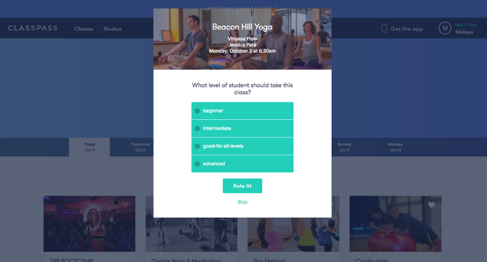
ClassPass uses a modal window series to solicit feedback. These modals appear the first time a user logs onto ClassPass after they've taken a scheduled class. Timing this kind of feedback correctly increases the likelihood of users remembering the class and leaving an accurate rating.

ClassPass further incentives users to leave a review by reminding users that it will help “inform others in the ClassPass community.” 

classpass class rating user review prompt
classpass in-app user feedback request modal popup

This information probably helps ClassPass decide what classes to offer and how to drive users to the best class for them, which speeds up the path to activation. 

Motivation helps deliver long-term value

Users don’t start receiving value from your product until they reach activation, so motivating users along the path to activation is really just a part of your promise to deliver value. 

And any improvements that you make to activation will have ripple effects throughout the user journey. With the right guidance and support, activated users go on to adopt your product. Those who have successfully adopted your software will become regular users who eventually spread the word to others in their network.

The more motivated users are in the beginning, the more likely they are to engage with your product further down the user journey—meaning a lift in activation impacts everything from long-term retention to word-of-mouth promotion.

That’s why growth teams simply can't afford to skimp on motivation. It's crucial to inspiring action, delivering value, and keeping your customers successful and satisfied.

Katryna Balboni
Content and Community Director at User Interviews
Katryna is the Content and Community Director at User Interviews. Before User Interviews, she made magic happen with all things content at Appcues. Her non-work time is spent traveling to new places, befriending street cats, and baking elaborate pies.
Skip to section:

Skip to section:

Editor's note: This article was first published in 2016 and has been updated in May 2020 with fresh content and insights. Enjoy!

Every summer, many people find themselves wondering how much better off they’d be if only they’d stuck to all the resolutions they made at the beginning of the year. They’d be eating healthier, in better shape, maybe they’d even speak a new language.

But no matter how well we plan out our resolutions, many inevitably end up in the graveyard of wishful thinking. 

That’s because we take motivation for granted when setting goals. Since it's a feeling, we don't really know how to factor it into tactical plans—we just hope that the initial excitement will power us through.

In reality, motivation needs to be carefully cultivated and planned. 

This is also true in software. When users aren't motivated beyond sign-up, activation rates drop off.

Given the outsized impact of activation on your bottom line, getting users to complete your product’s activation event—through which they achieve real value and experience an aha moment—is one of the most important things growth teams can do. Improving and maintaining user motivation is crucial to this process.

Below, we’ll explore 6 strategies for keeping users motivated through the activation stage of their user journey.

What is activation and why is it important?

Before we continue, a quick refresher on what exactly product people mean when we talk about activation.

Activation occurs when users first achieve the value you promised. It happens when new users reach their first aha moment and the lightbulb goes off—after this, they become activated users.

Activation rate is expressed as the percent of activated users out of total acquired users.

How to define activated users is something each team needs to figure out for themselves, by analyzing the user journey and mapping backward to figure out the early events that set successful, retained users apart from those that fizzle out. We’ve published a guide to finding your product’s activation event, which we recommend checking out. You may also want to read up on how to find your aha moment, which is another side of the same coin.

6 ways to motivate users and boost activation

Once you have an understanding of what activation looks like in your product, you can set about designing a user experience that is optimized for it. As promised, here are 6 ways to improve your activation rate by increasing user motivation.

1. Build excitement with better user onboarding

Activation starts with signup and user onboarding. These first experiences are the rare moments where you might have the user’s full attention, so it’s crucial for your user onboarding experience to convey excitement and provide a warm welcome.

Take a look at how Tumblr greets new users and showcases its range of content during signup:
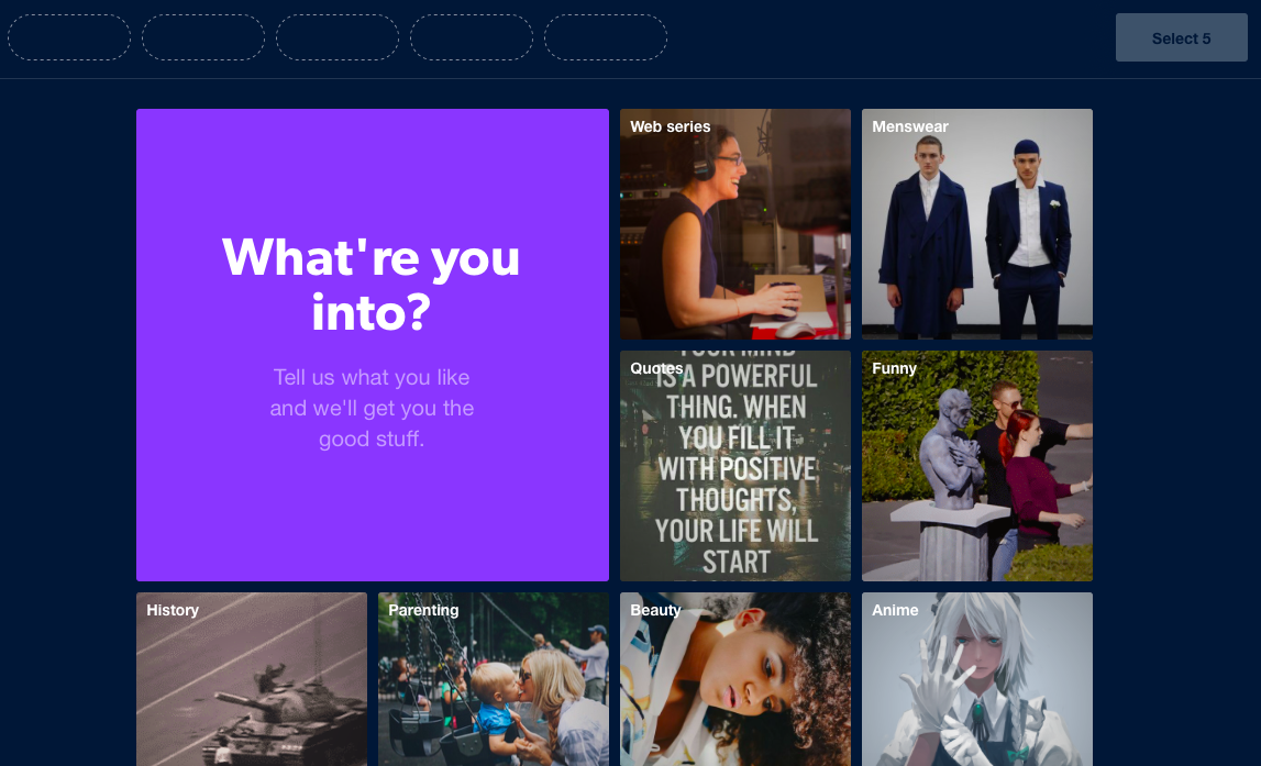
tumblr user onboarding signup welcome page with user content
tumblr user onboarding personalization

When reiterating your value, keep the statements short and sweet so that users are able to get into your product faster. And as much as possible, use language that makes users feel the experience is about them. Tumblr’s “tell us what you like” copy is a good example of this.

Another motivation-building tactic is goal-setting. Getting users to commit to a goal during signup can help you maintain momentum through onboarding and beyond. 
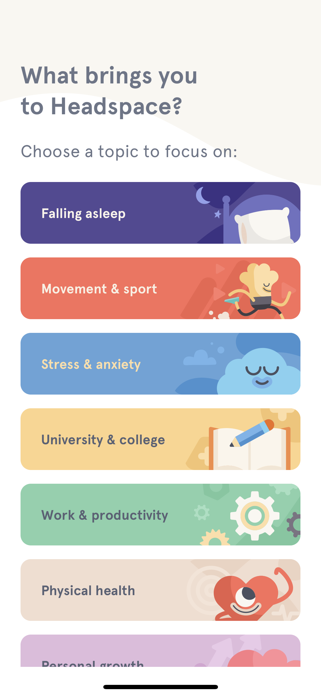
headspace mobile app goal setting user onboarding example

2. Reduce effort by breaking up difficult tasks

Keeping motivation high is especially crucial if your key activation event or aha moment takes a bit of work to reach. 

It’s much easier to ask people to complete one small thing at a time than to make one giant commitment. Plus, once people agree to a small task, they’re more likely to take on larger tasks

Think about the difference between filing your taxes yourself and filing them with a tool like TurboTax. Part of what makes filing with TurboTax feel easier is that the process is broken down into logical, manageable steps. Those steps are further punctuated by checkpoints, which give users a sense of accomplishment along the way.
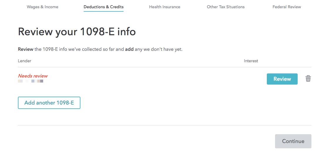
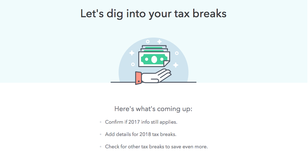
turbotax user experience broken down into small steps example
turbotax UX milestone checkpoint to make a long process feel easier

Breaking up steps can also help measure the effectiveness of your onboarding experience. With smaller units to measure, you can better pinpoint why something is or isn’t working. As Quick Sprout product designer Ian Main said,

“The single most important thing we've done to improve user onboarding is to split our onboarding up into more bite-sized smaller steps. This has enabled us to measure our user onboarding funnel more granularly and has made it easier to move the steps around when we are trying to optimize the funnel.”

3) Remove barriers to the aha moment

Minimizing the amount of forms a user has to fill out upfront is a surefire way to get users into your product faster. To ensure that this approach doesn’t just bloat your acquisition numbers with users who won’t actually continue using your product, you can delay the account creation until after the user experiences true value. 

Duolingo uses deferred account creation to shorten the path to activation. Their onboarding flow guides visitors through a quick language learning lesson, showing how quick and easy it is to learn a new language with the app—before asking users to commit to the product with a signup.

For an even shorter path to activation, take a look at minimalist publishing tool,Telegraph, created by the team behind messaging app Telegram. This simple tool gives users immediate value. All users have to do (indeed, all they can do) is input a title, author, some content, and hit the publish button. It’s one of the quickest, most no-frills ways to publish something online. 
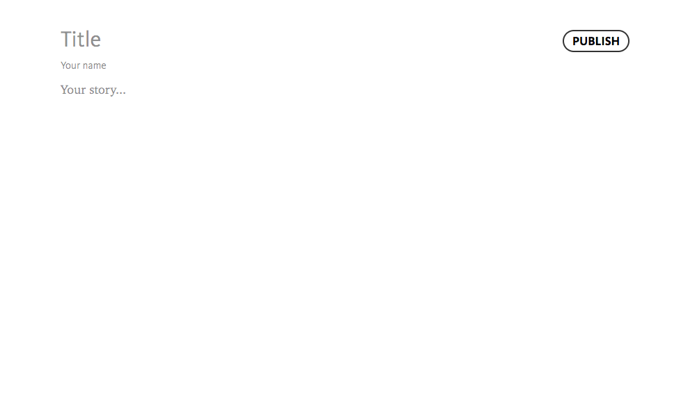
simplest online publishing tool telegraph has an immediate time to value

Telegraph’s stark simplicity takes inspiration from the ease-of-use of other platforms and takes it to a whole new level.  

4. Encourage users with visible progress

Progress bars are a simple way to let users know how much progress they’ve completed, and how much more they have to go. They both celebrate what the user has already done and maintain momentum as users get closer to the finish line. 

Quora's onboarding flow uses a progress bar to keep users engaged enough to finish setting up their account.
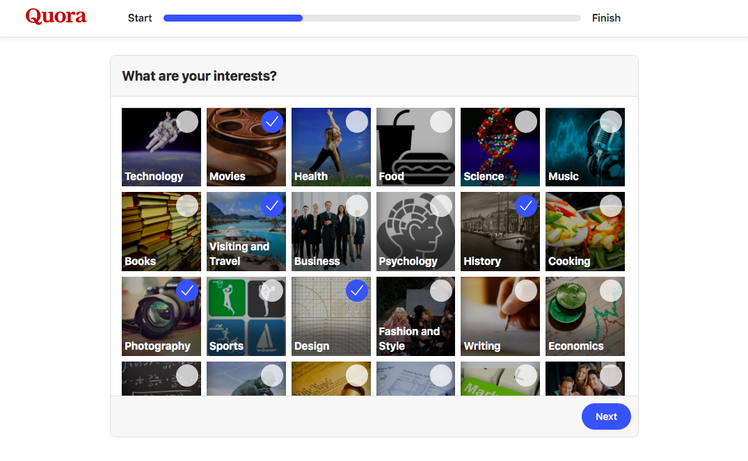
quora user onboarding progress bar example

By starting users off with a progress bar that’s partially completed, Quora also hits on the goal gradient effect, which states that motivation tends to increase the closer we are to completing our goals. 

Checklists work the same way, and have the added benefit of providing clear insight into the next steps ahead. Checklists can be used in tandem with progress bars to help users stay on track as they complete more complex onboarding with multiple steps. This user onboarding checklist from Asana is a good example:
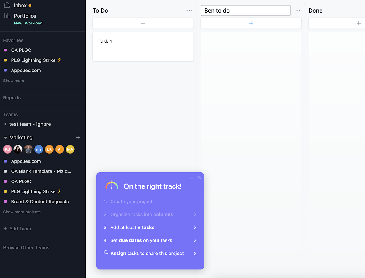
asana user onboarding checklist to improve activation

5) Reward users with delightful success messages

People want to be rewarded after completing a task. Yet far too often, products spend all their effort on getting users to do something, but quickly forget about the user experience after the desired action is completed. 

Doing so is a missed opportunity for 1) confirming task success and 2) delighting users with added personality. 

Success messages can occur immediately inside the app after a user completes a task, like when users choose the correct answer during a language learning lesson, as in this example from Hello Chinese:

hello chinese mobile language learning app success message

Or they can be tied to important milestones and take the form of an email:
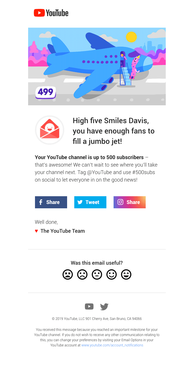
youtube 500 subscribers email milestone celebration for user engagement
Source

Milestones create an opportunity to offer users something special in recognition of their continued engagement. 

6) Use feedback to refine the path to activation

User feedback can be a powerful tool for refining your product’s value and smoothing out the path to activation.  

ClassPass uses a modal window series to solicit feedback. These modals appear the first time a user logs onto ClassPass after they've taken a scheduled class. Timing this kind of feedback correctly increases the likelihood of users remembering the class and leaving an accurate rating.

ClassPass further incentives users to leave a review by reminding users that it will help “inform others in the ClassPass community.” 
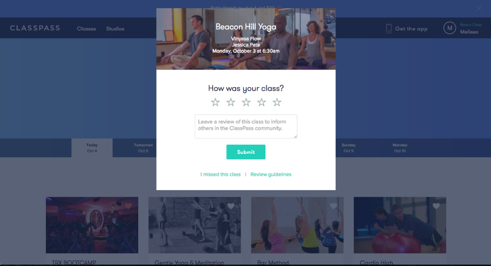
classpass class rating user review prompt
classpass in-app user feedback request modal popup

This information probably helps ClassPass decide what classes to offer and how to drive users to the best class for them, which speeds up the path to activation. 

Motivation helps deliver long-term value

Users don’t start receiving value from your product until they reach activation, so motivating users along the path to activation is really just a part of your promise to deliver value. 

And any improvements that you make to activation will have ripple effects throughout the user journey. With the right guidance and support, activated users go on to adopt your product. Those who have successfully adopted your software will become regular users who eventually spread the word to others in their network.

The more motivated users are in the beginning, the more likely they are to engage with your product further down the user journey—meaning a lift in activation impacts everything from long-term retention to word-of-mouth promotion.

That’s why growth teams simply can't afford to skimp on motivation. It's crucial to inspiring action, delivering value, and keeping your customers successful and satisfied.

Katryna Balboni
Content and Community Director at User Interviews
Katryna is the Content and Community Director at User Interviews. Before User Interviews, she made magic happen with all things content at Appcues. Her non-work time is spent traveling to new places, befriending street cats, and baking elaborate pies.
You might also like...