← Visit Appcues.com
×
×

Why do bad user retention rates happen to good mobile apps?
Here are some not-so-fun stats about mobile app abandonment—plus, what you can do to improve your app's retention rates.
Skip to section:

Skip to section:

Not-so-fun facts about mobile app user retention: Not only do a mere 24.9% of users revisit an app the day after download, but that number drops to 9.4% after 2 weeks. Yes, that's right—the 2-week retention rate for mobile apps is less than 10%. And by the 90-day mark, a whopping 71% of app users will have churned completely.
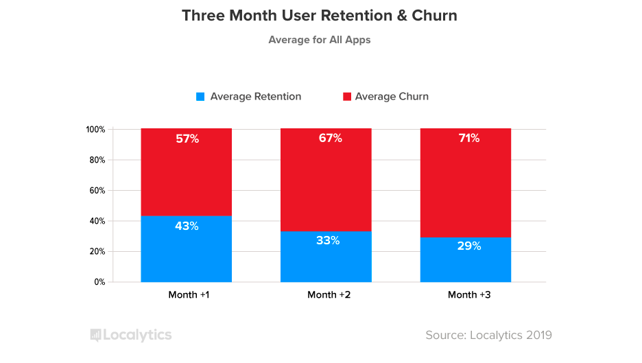
This is a bar graphing showing average user retention and user churn rates for mobile apps in 2018. Churn is shown in red, retention in blue.
Source: Localytics

A 2019 followup to that report found that after improving in recent years, mobile app abandonment has actually increased. As it stands, 25% of users open an app once and then abandon it completely.
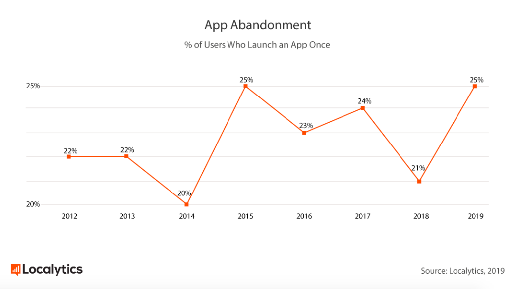
This is a graph showing mobile app abandonment, which is a percent of users who launch an app only once. It is a line graph showing rates from 2012 to 2019.
Source: Localytics

Compounding those statistics is the fact that the majority of mobile users actually access fewer than 20 apps per month, but spend half of their time using a single app. On most mobile devices, that first place prize goes to Facebook, Youtube, Google, Snapchat, or Pandora. 

Pretty scary stuff.

We wanted to understand why this level of abandonment occurs after a single use—and how the most popular apps are managing to do better. (Hint: they’re tackling the problem by creating better user onboarding experiences that shorten time to value and fast-track product adoption.)

So, we downloaded the top 100 iOS apps, went through their onboarding as if we were first-time users, and recorded the experiences from start to finish. 
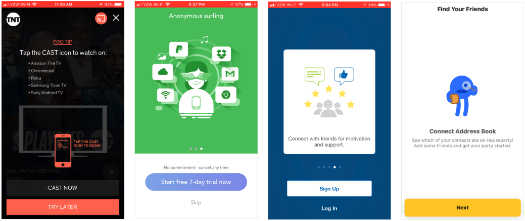
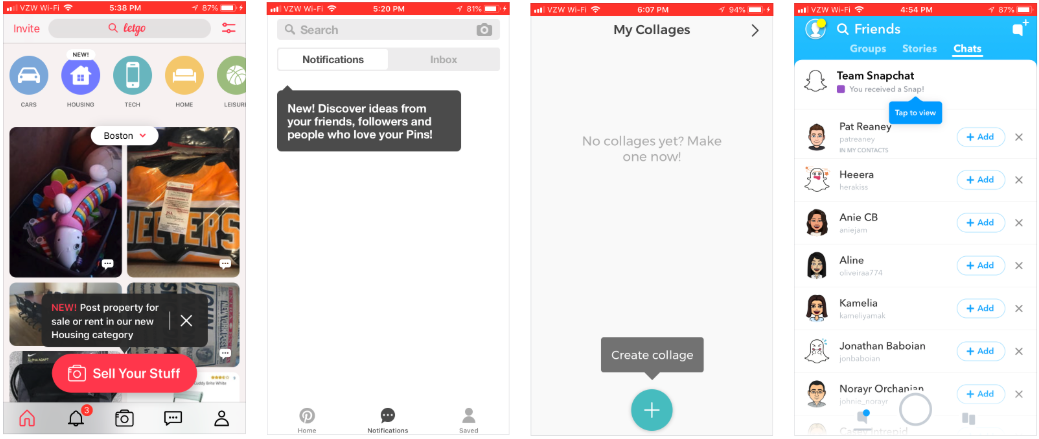
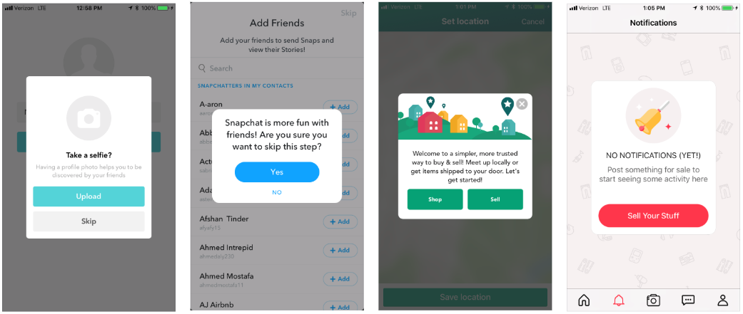
Examples of compelling fullscreen modals
Explaining swiping directions helps users learn your app more quickly
We love a good tooltip around here
Ditto for modals

In this article, we’ll take a look at what we discovered—and talk about how you can improve your own app’s onboarding patterns to create a positive first-time user experience.

Why is mobile so hard?

Before we dive into solutions for your mobile app woes, let’s first take a look at some of the big, overarching issues within mobile today.

First things first: Mobile isn’t merely an extension of web. The App Store is a cutthroat world, and the strategies that brought you success on web don’t always translate to an app.

This is a horizontal bar graph showing the 10 top mobile apps in 2017. Facebook and Google own 8/10 of the top apps.
Source: Comscore

There’s simply a lot more friction involved in mobile adoption. Think about the process of downloading an app for the first time: First, you’ve got to know about the app—what it’s called, what it does, why it’s worth your time and money—then seek it out in your phone’s app store, then grant approval for the app to take up precious real estate on your phone, and then finally download it to your device.  

That’s a whole lot of hoops to jump through before you even open an app for the first time.

You might think that that level of effort would translate to more intentional users, but more often than not, what it really creates is more impatient users. They’ve already made an effort, now they want their reward. This is why getting your users onboarded and into your app quickly is essential. 

1. Mobile users are impatient

The fact that people’s attention spans have gotten shorter is old news, but that doesn’t mean it’s always accounted for in mobile app development. Part of the reason so many users abandon an app after their first use is simple, good old-fashioned impatience.

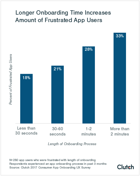
Clutch found that if an onboarding experience takes longer than 2 minutes, many people just give up altogether. In other words, you have 120 seconds to onboard your mobile users, or lose them forever.

This is a bar graph showing that longer onboarding time increases amount of frustrated app users. It shows user frustration on the y axis and length of onboarding process on the x axis, with more user frustration shown the longer an onboarding process takes.
Source: Clutch

Apps like Instagram and Youtube have a huge advantage when it comes to onboarding time, thanks to single sign-on through their parent companies—Facebook and Google, respectively. Single sign-on allows apps to import essential user data and create and account in under 10 seconds, freeing up precious time for onboarding and value realization.

The lesson here is that, whenever possible, you should let your users sign up with one of their existing accounts like Google, Facebook, or Twitter.

2. Mobile users are suspicious

The Cambridge Analytica scandal was a watershed moment for user privacy. Making your users feels safe is more important than ever—how and when you ask for personal information and phone access can make or break your user onboarding experience.

Being asked to hand over sensitive data or access to your smartphone can be jarring:

Why does LinkedIn want access to my Bluetooth? Why is Bitmoji asking for my location? Why would this rideshare app need access to my camera?

Your reasons for requiring certain information may seem obvious to you, but if you don’t explain them to your users, they won’t feel safe. And if users don’t trust your app, they’re much more likely to abandon or delete it before they’ve even finished onboarding.

This is where permission priming comes in. The vast majority of users—over 82%—report that they want apps to give them a clear reason for requesting personal information.

This actually isn’t a hard fix: Often a simple line of copy is enough to explain why your app needs access and make users feel comfortable.

This is a screenshot of the uber eats app asking for permission to use the mobile phone's location services to locate the user to determine where to deliver food to. It is an example of simple permission priming.

Making permissions optional—asking, rather than demanding—can also go a long way toward putting users at ease. So, too, can contextualizing permissions requests by asking for access when a feature is being used for the first time, instead of during the initial onboarding process.

this is a screenshot of Twitter's permission priming for their mobile app. There is a button to allow notifications and an option to skip for now.

Getting permission priming right can have an enormous impact on your retention rates: 46% of users will actually use an app 11 or more times if they've opt into push notifications:

This is a bar graph showing mobile app retention by number of sessions (1-11+) according to whether or not users opted in to push nortications.
Source: Localytics

3. Mobile data and storage are limited

Even if you shelled out for the extra MBs, the storage on your phone is a finite resource. Chances are, you’re picky about how you use that space.

The real estate on your users’ phone is equally valuable—so valuable in fact, that nearly 20% of users say they’ve deleted an app because they thought the icon was too ugly for their home screen.

This is a graph showing mobile smartphone users' reasons for deleting an app by age segment. There are 4 reasons shown for deleting a mobile app, including storage space.
Source: Comscore

In other words, if you don’t deliver on your app’s value proposition quickly and efficiently, your users are unlikely to stick around. Getting them onboarded swiftly and confidently is essential to preventing abandonment and retaining your mobile users beyond that first use. (Designing an attractive icon can’t hurt, either.)

There’s hope!

As depressing as the stats can be, there is hope: 64% of millennial users (and 30% of users aged 35 to 54) say they are downloading more apps now than they did a year ago. That means people are willing to try new mobile experiences, and that there is real opportunity to be found in the market.

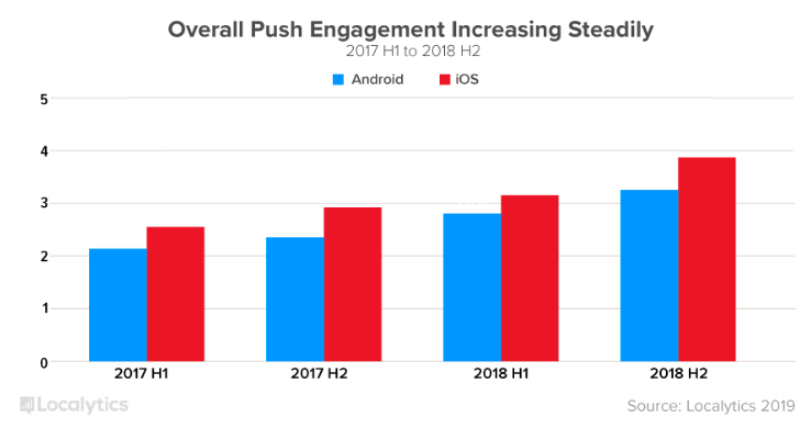
And long-term retention (3+ months) has actually been improving, thanks in part to more effective and personalized targeting in mobile push and in-app notifications. Push notification engagement increased 38% year over year for Android apps and 32% year over year for iOS.

Source: Localytics

What this tells us is that people aren’t starved for options, but they are hungry for truly exceptional user experiences. And they’ll stick with apps that can deliver that.

To be successful in the mobile space—that is, to deliver engaging experiences and thereby improve your product adoption and user retention rates—you need demonstrate the value of your product, show your users how to use your app, and make them feel safe and secure. And you need to do it all as swiftly and delightfully as possible.

Jonathan Kim
Co-Founder at Appcues
Skip to section:

Skip to section:

Not-so-fun facts about mobile app user retention: Not only do a mere 24.9% of users revisit an app the day after download, but that number drops to 9.4% after 2 weeks. Yes, that's right—the 2-week retention rate for mobile apps is less than 10%. And by the 90-day mark, a whopping 71% of app users will have churned completely.

This is a bar graphing showing average user retention and user churn rates for mobile apps in 2018. Churn is shown in red, retention in blue.
Source: Localytics

A 2019 followup to that report found that after improving in recent years, mobile app abandonment has actually increased. As it stands, 25% of users open an app once and then abandon it completely.

This is a graph showing mobile app abandonment, which is a percent of users who launch an app only once. It is a line graph showing rates from 2012 to 2019.
Source: Localytics

Compounding those statistics is the fact that the majority of mobile users actually access fewer than 20 apps per month, but spend half of their time using a single app. On most mobile devices, that first place prize goes to Facebook, Youtube, Google, Snapchat, or Pandora. 

Pretty scary stuff.

We wanted to understand why this level of abandonment occurs after a single use—and how the most popular apps are managing to do better. (Hint: they’re tackling the problem by creating better user onboarding experiences that shorten time to value and fast-track product adoption.)

So, we downloaded the top 100 iOS apps, went through their onboarding as if we were first-time users, and recorded the experiences from start to finish. 

Examples of compelling fullscreen modals
Explaining swiping directions helps users learn your app more quickly
We love a good tooltip around here
Ditto for modals

In this article, we’ll take a look at what we discovered—and talk about how you can improve your own app’s onboarding patterns to create a positive first-time user experience.

Why is mobile so hard?

Before we dive into solutions for your mobile app woes, let’s first take a look at some of the big, overarching issues within mobile today.

First things first: Mobile isn’t merely an extension of web. The App Store is a cutthroat world, and the strategies that brought you success on web don’t always translate to an app.

This is a horizontal bar graph showing the 10 top mobile apps in 2017. Facebook and Google own 8/10 of the top apps.
Source: Comscore

There’s simply a lot more friction involved in mobile adoption. Think about the process of downloading an app for the first time: First, you’ve got to know about the app—what it’s called, what it does, why it’s worth your time and money—then seek it out in your phone’s app store, then grant approval for the app to take up precious real estate on your phone, and then finally download it to your device.  

That’s a whole lot of hoops to jump through before you even open an app for the first time.

You might think that that level of effort would translate to more intentional users, but more often than not, what it really creates is more impatient users. They’ve already made an effort, now they want their reward. This is why getting your users onboarded and into your app quickly is essential. 

1. Mobile users are impatient

The fact that people’s attention spans have gotten shorter is old news, but that doesn’t mean it’s always accounted for in mobile app development. Part of the reason so many users abandon an app after their first use is simple, good old-fashioned impatience.

Clutch found that if an onboarding experience takes longer than 2 minutes, many people just give up altogether. In other words, you have 120 seconds to onboard your mobile users, or lose them forever.
This is a bar graph showing that longer onboarding time increases amount of frustrated app users. It shows user frustration on the y axis and length of onboarding process on the x axis, with more user frustration shown the longer an onboarding process takes.
Source: Clutch

Apps like Instagram and Youtube have a huge advantage when it comes to onboarding time, thanks to single sign-on through their parent companies—Facebook and Google, respectively. Single sign-on allows apps to import essential user data and create and account in under 10 seconds, freeing up precious time for onboarding and value realization.

The lesson here is that, whenever possible, you should let your users sign up with one of their existing accounts like Google, Facebook, or Twitter.

2. Mobile users are suspicious

The Cambridge Analytica scandal was a watershed moment for user privacy. Making your users feels safe is more important than ever—how and when you ask for personal information and phone access can make or break your user onboarding experience.

Being asked to hand over sensitive data or access to your smartphone can be jarring:

Why does LinkedIn want access to my Bluetooth? Why is Bitmoji asking for my location? Why would this rideshare app need access to my camera?

Your reasons for requiring certain information may seem obvious to you, but if you don’t explain them to your users, they won’t feel safe. And if users don’t trust your app, they’re much more likely to abandon or delete it before they’ve even finished onboarding.

This is where permission priming comes in. The vast majority of users—over 82%—report that they want apps to give them a clear reason for requesting personal information.

This actually isn’t a hard fix: Often a simple line of copy is enough to explain why your app needs access and make users feel comfortable.
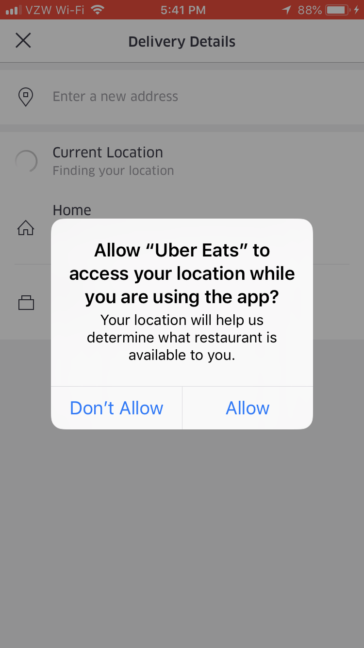
This is a screenshot of the uber eats app asking for permission to use the mobile phone's location services to locate the user to determine where to deliver food to. It is an example of simple permission priming.

Making permissions optional—asking, rather than demanding—can also go a long way toward putting users at ease. So, too, can contextualizing permissions requests by asking for access when a feature is being used for the first time, instead of during the initial onboarding process.
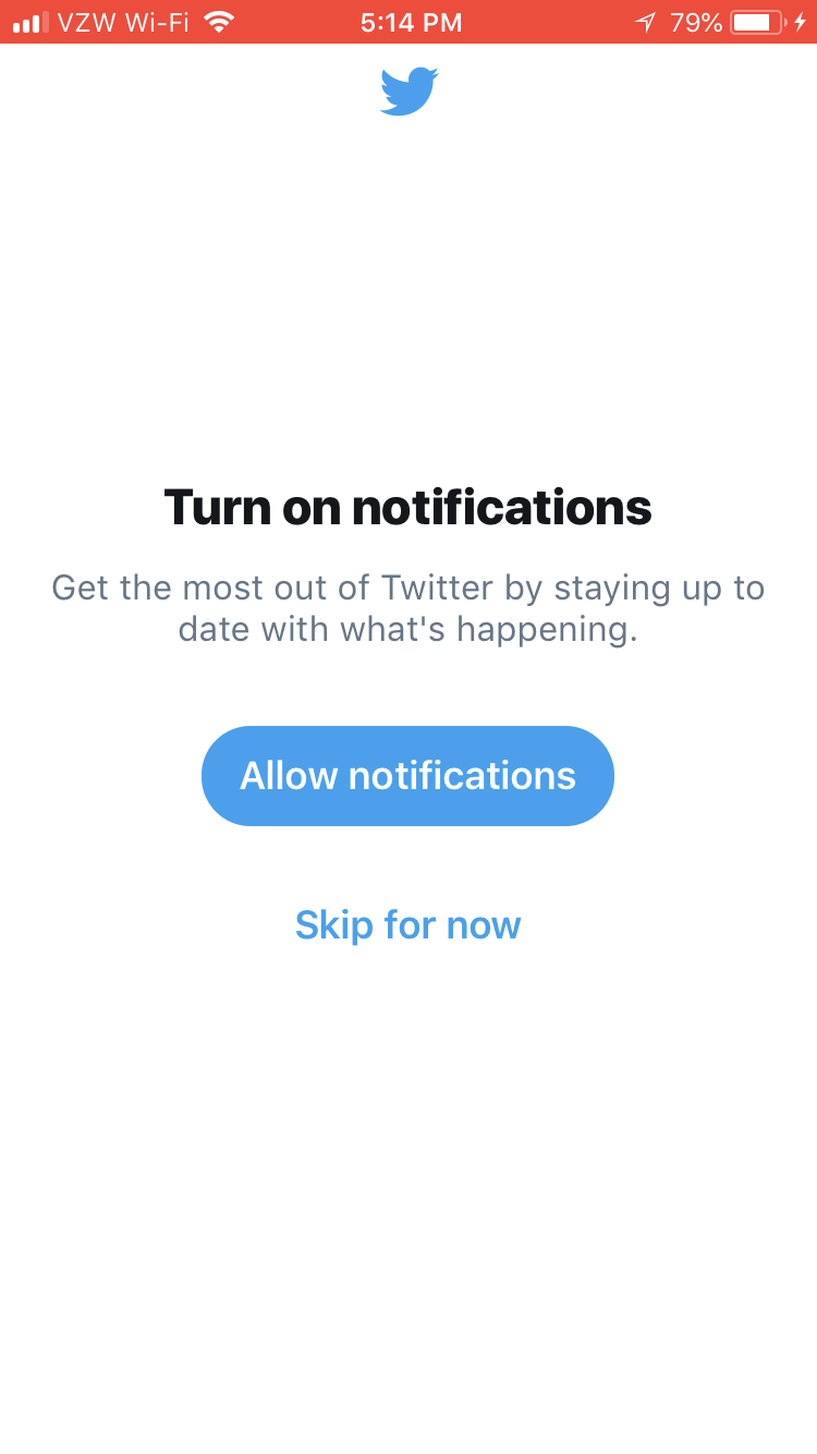
this is a screenshot of Twitter's permission priming for their mobile app. There is a button to allow notifications and an option to skip for now.

Getting permission priming right can have an enormous impact on your retention rates: 46% of users will actually use an app 11 or more times if they've opt into push notifications:
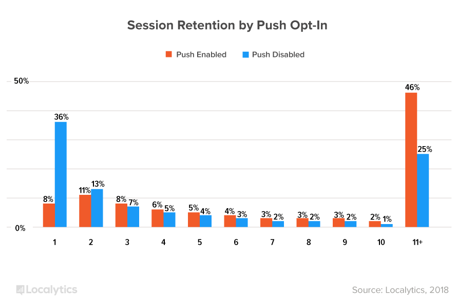
This is a bar graph showing mobile app retention by number of sessions (1-11+) according to whether or not users opted in to push nortications.
Source: Localytics

3. Mobile data and storage are limited

Even if you shelled out for the extra MBs, the storage on your phone is a finite resource. Chances are, you’re picky about how you use that space.

The real estate on your users’ phone is equally valuable—so valuable in fact, that nearly 20% of users say they’ve deleted an app because they thought the icon was too ugly for their home screen.
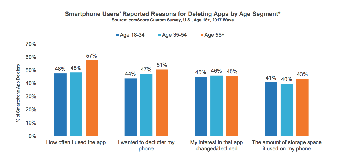
This is a graph showing mobile smartphone users' reasons for deleting an app by age segment. There are 4 reasons shown for deleting a mobile app, including storage space.
Source: Comscore

In other words, if you don’t deliver on your app’s value proposition quickly and efficiently, your users are unlikely to stick around. Getting them onboarded swiftly and confidently is essential to preventing abandonment and retaining your mobile users beyond that first use. (Designing an attractive icon can’t hurt, either.)

There’s hope!

As depressing as the stats can be, there is hope: 64% of millennial users (and 30% of users aged 35 to 54) say they are downloading more apps now than they did a year ago. That means people are willing to try new mobile experiences, and that there is real opportunity to be found in the market.

And long-term retention (3+ months) has actually been improving, thanks in part to more effective and personalized targeting in mobile push and in-app notifications. Push notification engagement increased 38% year over year for Android apps and 32% year over year for iOS.
Source: Localytics

What this tells us is that people aren’t starved for options, but they are hungry for truly exceptional user experiences. And they’ll stick with apps that can deliver that.

To be successful in the mobile space—that is, to deliver engaging experiences and thereby improve your product adoption and user retention rates—you need demonstrate the value of your product, show your users how to use your app, and make them feel safe and secure. And you need to do it all as swiftly and delightfully as possible.

Jonathan Kim
Co-Founder at Appcues
You might also like...