← Visit Appcues.com
×
×

It's not over 'til it's over: 6 ways to get your users back

Inactive users aren't always gone for good. Here are 6 proven strategies to re-engage lapsed customers and improve long-term retention.
Skip to section:

Skip to section:

Editor's note: This article was originally published in 2016 and has been updated in May 2020 with fresh content and insights.

Customer retention is the unconquerable beast of SaaS. It’s never “done”.

And although you can never retain every single customer, you should always aim to improve your customer retention strategy. It's the easiest—and the cheapest—way to lift your MRR and help your business scale. In fact, a SaaS Capital study found that reducing your churn by just 1% can increase your company's valuation by 12% in 5 years.

Having a holistic strategy for re-engaging users is paramount. To realistically prevent user inactivity, you have to take a deep dive into why customers are losing interest and address those issues. You'll prevent churn in the short-term, and you'll have the data to improve your overall customer retention strategy in the long-term.

Here are 6 sure-fire ways to re-engage those inactive users and improve your retention rates.

1. Extend user onboarding beyond the first session

You already know how essential a solid onboarding strategy is to your product’s success. But did you know the best onboarding strategies continue to nurture users far beyond their first session? The goal of your onboarding experience is to get users to value as quickly as possible. But understanding your core value doesn’t mean new users can automatically navigate the nuances of your product. 

Continue to provide learning aids to users as they familiarize themselves with use cases and more advanced functionality. Use patterns like tooltips and modals to guide users through a workflow. The same rules that should guide your initial onboarding flow apply here, too:

  1. ‍Keep it simple 
  2. Focus on core product value
  3. Create momentum

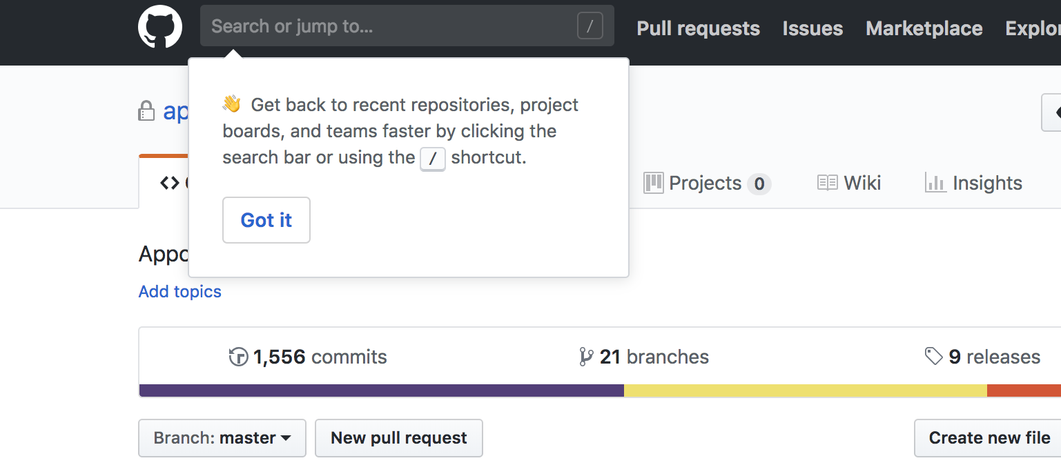
Github, for example, uses a tooltip to highlight a shortcut for new or inexperienced users: 
github tooltip onboarding tip example

Github’s tooltip is effective because it provides valuable insight into how a user can streamline their in-app experience and accomplish tasks faster. Their use of emojis provides a touch of flair that will hopefully grab the user’s attention and their “Got It” CTA provides an easy out for users who are already aware of the shortcut. 

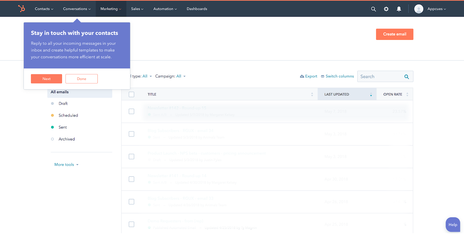
Hubspot also does an exceptional job at extending the onboarding experience with a tooltip. This tooltip grabs the user’s attention and clearly depicts the benefit of the feature (make your conversations more efficient at scale): 
hubspot tooltip feature suggestion in-app message example from a saas app

By focusing on the benefit to the user, Hubspot re-emphasizes its value and promotes customer retention in the process.

And of course, you don't have to wait around for your user to come back to your app themselves. You can send a friendly email (or push notification, if you have a mobile app) reminding users about your product’s unique solution to their needs or announcing a feature. If you’re smart about it, re-engagement emails can be great levers for driving lapsed users back to your product, where you can then rekindle that spark they felt when they first subscribed.

2. Survey users to find problem areas

There are many reasons a user may stop engaging with your product. Perhaps they found your onboarding experience laborious, encountered bugs in your software, or just decided to go a different route with their needs. 

According to a Harvard Business Review study, the biggest reason that customers stop engaging is because the workflow isn't easy enough. If using your app is too complicated, users will give up.

Take a look at your user data and identify points where they’re dropping off. Analyze these parts of your product to understand what users experience and what’s causing them to churn. From there, you can start A/B testing to see if changing the flow improves retention. 

Customers are your best resource

There's no better way to learn about customers' experiences with your app than hearing it straight from the horses' mouth. Send around surveys to learn how you can re-engage each type of customer. Customers—especially churned customers—can provide invaluable real-world feedback.. Lean into it!

When done effectively, email surveys are a great way to solicit feedback so that you can pinpoint what didn't work in the customer experience, and whether their issue with your product is something you can address expediently and directly.

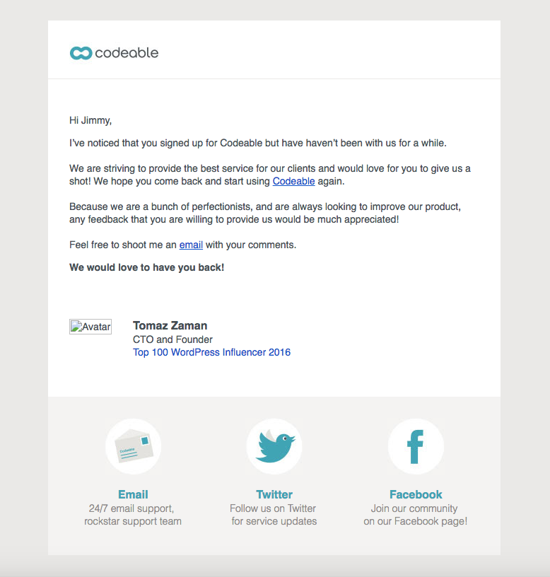
But an email survey that only makes an ask will come off as too self-serving. In your email, you want to make the customers recognize why taking this survey will benefit them (not you). Take a look at how the WordPress outsourcing service Codeable accomplishes this:
codeable saas email customer survey request example

The opening sentence recognizes that Jimmy hasn’t been using Codeable lately, and then launches into a compelling pitch for open feedback. Codeable’s email successfully asks for feedback while making them come across as super customer-centric. 

3. Make it personal with a targeted new feature campaign

One of the best ways to inspire re-engagement is by continually improving your product. ‍New features have a way of reinvigorating customers, even those who have been fairly inactive. 

For active users, in-app announcements are one of the most effective ways to increase engagement with a new feature. But of course, you need to get folks into your product first! A multichannel social and email campaign around your feature updates is a great way to reach lapsed users. Below are a few real-world examples of compelling email announcements for inspiration:

The big debut invite

When Litmus made some serious product updates, they took the opportunity to relaunch the product and get lapsed (as well as active) users excited to explore the changes. They position their email as an invitation to use the new and improved Litmus platform, creating a sense of exclusivity:

litmus new feature product update example from really good emails
Source

Litmus highlights all the new features of their product while assuring their core users that the product they know and love still exists—even giving users the option to switch back and forth between new and old. This strategy works because they’re appealing to lapsed users searching for a different experience without abandoning their loyal fanbase.

Regular feature updates newsletter

User research app Dovetail takes a bit of a different approach to feature announcements by providing them regularly in the form of a monthly newsletter:

dovetail product updates newsletter example
Source

This is especially effective for young companies with a new product—it lets users know you are truly invested and making updates on the regular.  Inactive users who receive this email can see that the product is being optimized and all the kinks are being worked out on the regular. Dovetail’s newsletter instills confidence in their product and gives lapsed users that extra push needed to re-engage. 

Plus, we love the friendly, straightforward copy that succinctly explains each update.

“You’re missing out” messaging

Dropbox directly targets lapsed users with their email entitled, “21 reasons to give Dropbox Paper another try”:

dropbox email example here's what you're missing
Source

The idea is simple—give lapse users a picture into your product’s value by informing them of features they probably didn’t even know existed. The hope is that they give you another shot and try out some features they hadn’t before.

4. Use proactive customer support

A Lee Resources International study revealed that for every customer who issues a complaint, there are 26 unhappy who don’t—many of whom go on to unsubscribe immediately. So if your customer support team only engages with customers once they've put in a ticket, they're missing 96% of your customers' problems.

Address this issue and re-engage your customers by asking your support team to provide proactive customer support. That means reaching out to inactive customers and reminding them that the team is ready and willing to help them with any issue.

Leverage your customer support and success teams

Have your customer-facing teams reach out with helpful reminders. These can be instructions on how to start using your product, FAQs, or advice on different use cases. Equipping users with selected pieces of manageable guidance will make the product more accessible and relevant.

Take this example from RescueTime, a productivity app that tracks how you spend your work time:

rescuetime customer support email example from a saas productivity app

This example may be several years old, but there’s still a lot to learn from here. For one thing, RescueTime did their research: They found the 3 most common reasons for inactivity and then sent tangible solutions for each. They also provided a link to a customer support page so that users can let the company know their own reasons for being inactive.

Another way to go about this is to have a support team member send a personal message. It can be something simple like:

Hi Yume,

Hope all is well! Just checking in to see if there’s anything I could do to help you get more out of [our product]. Don’t hesitate to reach out with questions or frustrations. I’ll be happy to help!
Best,

Marcus

An informal personal message like this can help your team seem more accessible. It also frees the user from the process of having to go through a ticketing platform to submit a complaint.

5. Market to users again

Sometimes, when a user and product meet, it’s just bad timing. Maybe the user ended up switching companies or was just too distracted to give your product a fair shake. This is where re-engagement marketing campaigns come in handy. 

There are many ways to approach re-engagement campaigns. There is the simple awareness approach, in which you invest in ads to keep your product top-of-mind.  For a more targeted approach, think about what it is your prospects are trying to accomplish and adapt your strategy to address their needs.

For instance, many users give up on the product because they didn't spend long enough getting to know how it works. By enticing them with an extended free trial or a discounted upgrade, you'll give yourself more time to win them over.

Of course this strategy won't work if there are deeper issues—such as UI preferences, bugs, compatibility issues, etc. But it can work wonders for the users who just need a little bit more time getting to know your product in the first place.

Targeted promotions

The key is to offer users promotions that encourage users to actually use your product more. This type of promo can come in several forms, including:

  1. ‍Free re-trial (one month free)
  2. Free or discounted upgrade
  3. Limited-time-only discount

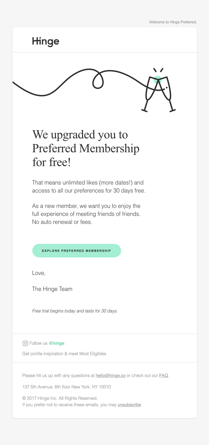
These strategies work best for users that have had some experience with your service already. Since you can't give away free stuff to all your inactive users, target those who have interacted with the stickiest features of your app. Take a look at how dating app Hinge accomplishes this:
hinge email re engagement email free trial
Source

Hinge positions their free upgrade as an opportunity to give users more time exploring their product—in premium style. This not only encourages lapsed users to re-engage, but also to explore the best features Hinge has to offer. It’s a great strategy for turning users who are halfway out the door into long-term, paying customers. 

6. Say a warm goodbye

While it might seem counter-intuitive to think of a goodbye message as a customer retention strategy, not all customers are sure about their decision to leave. A good user offboarding experience won’t save every account, but for some customers, it can provide just the right amount of positive friction to keep them from churning. Others who still leave, might eventually decide to come back if you make their last moments with your brand pleasant.

Optimize your user offboarding

Put some thought into the options you give users on their way out the door. Create an offboarding flow that addresses common reasons for churn with options like:

  1. ‍One-click access to a support team
  2. Option to downgrade
  3. Prompt for feedback
  4. Cancellation confirmation

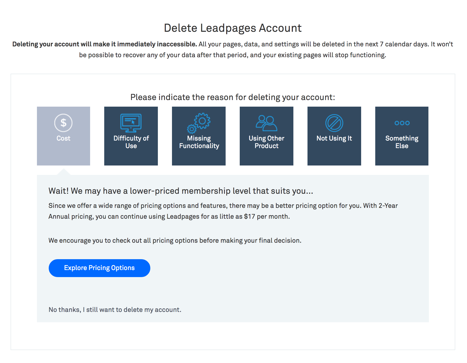
Check out this example from Leadpages:
offboarding account cancellation flow example

Leadpages asks users to indicate their reason for deleting their account, and provides 6 options to choose from. Based on their reason for canceling, Leadpages offers targeted responses within their offboarding flow. They try to address every possible reason why a customer might leave—cost, difficulty, missing functionality, etc. If none of that convinces them, they still have the option to leave.

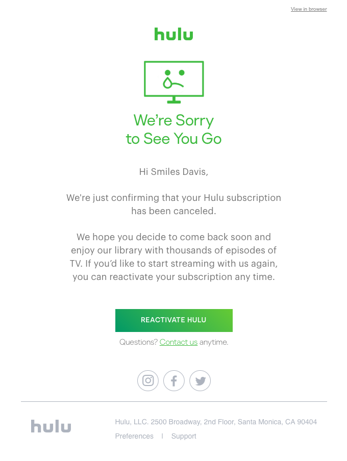
Hulu takes the cancellation confirmation approach and keeps their goodbye email short and sweet:
hulu account cancellation confirmation email example
Source

Hulu’s email provides a gentle reminder that users can become subscribers again at any time—they even provide a reactivate CTA, in case users change their mind immediately. What’s important here is that the cancellation message keeps the door open for future opportunities to re-engage, instead of treating churned users like they’re lost forever.

Forget the last-ditch efforts

Re-engaging customers is too important to take lightly. You need a fool-proof re-engagement strategy, not a few last ditch effort emails.

Reconnect with your customers—whether it's through in-product messaging, emails, or even direct mail—and dig deep to find out why they disengaged in the first place. Only then will you be able to prevent your active users from becoming inactive users and improve your overall customer retention strategy.

Author's picture
Jared DeLuca
Demand Generation Manager
Jared leads demand generation for Appcues and is a full-stack digital marketer. When he's not marketing software, he's probably cooking up a new recipe, playing music with friends, or going to a concert somewhere.
Skip to section:

Skip to section:

Editor's note: This article was originally published in 2016 and has been updated in May 2020 with fresh content and insights.

Customer retention is the unconquerable beast of SaaS. It’s never “done”.

And although you can never retain every single customer, you should always aim to improve your customer retention strategy. It's the easiest—and the cheapest—way to lift your MRR and help your business scale. In fact, a SaaS Capital study found that reducing your churn by just 1% can increase your company's valuation by 12% in 5 years.

Having a holistic strategy for re-engaging users is paramount. To realistically prevent user inactivity, you have to take a deep dive into why customers are losing interest and address those issues. You'll prevent churn in the short-term, and you'll have the data to improve your overall customer retention strategy in the long-term.

Here are 6 sure-fire ways to re-engage those inactive users and improve your retention rates.

1. Extend user onboarding beyond the first session

You already know how essential a solid onboarding strategy is to your product’s success. But did you know the best onboarding strategies continue to nurture users far beyond their first session? The goal of your onboarding experience is to get users to value as quickly as possible. But understanding your core value doesn’t mean new users can automatically navigate the nuances of your product. 

Continue to provide learning aids to users as they familiarize themselves with use cases and more advanced functionality. Use patterns like tooltips and modals to guide users through a workflow. The same rules that should guide your initial onboarding flow apply here, too:

  1. ‍Keep it simple 
  2. Focus on core product value
  3. Create momentum

Github, for example, uses a tooltip to highlight a shortcut for new or inexperienced users: 

github tooltip onboarding tip example

Github’s tooltip is effective because it provides valuable insight into how a user can streamline their in-app experience and accomplish tasks faster. Their use of emojis provides a touch of flair that will hopefully grab the user’s attention and their “Got It” CTA provides an easy out for users who are already aware of the shortcut. 

Hubspot also does an exceptional job at extending the onboarding experience with a tooltip. This tooltip grabs the user’s attention and clearly depicts the benefit of the feature (make your conversations more efficient at scale): 

hubspot tooltip feature suggestion in-app message example from a saas app

By focusing on the benefit to the user, Hubspot re-emphasizes its value and promotes customer retention in the process.

And of course, you don't have to wait around for your user to come back to your app themselves. You can send a friendly email (or push notification, if you have a mobile app) reminding users about your product’s unique solution to their needs or announcing a feature. If you’re smart about it, re-engagement emails can be great levers for driving lapsed users back to your product, where you can then rekindle that spark they felt when they first subscribed.

2. Survey users to find problem areas

There are many reasons a user may stop engaging with your product. Perhaps they found your onboarding experience laborious, encountered bugs in your software, or just decided to go a different route with their needs. 

According to a Harvard Business Review study, the biggest reason that customers stop engaging is because the workflow isn't easy enough. If using your app is too complicated, users will give up.

Take a look at your user data and identify points where they’re dropping off. Analyze these parts of your product to understand what users experience and what’s causing them to churn. From there, you can start A/B testing to see if changing the flow improves retention. 

Customers are your best resource

There's no better way to learn about customers' experiences with your app than hearing it straight from the horses' mouth. Send around surveys to learn how you can re-engage each type of customer. Customers—especially churned customers—can provide invaluable real-world feedback.. Lean into it!

When done effectively, email surveys are a great way to solicit feedback so that you can pinpoint what didn't work in the customer experience, and whether their issue with your product is something you can address expediently and directly.

But an email survey that only makes an ask will come off as too self-serving. In your email, you want to make the customers recognize why taking this survey will benefit them (not you). Take a look at how the WordPress outsourcing service Codeable accomplishes this:

codeable saas email customer survey request example

The opening sentence recognizes that Jimmy hasn’t been using Codeable lately, and then launches into a compelling pitch for open feedback. Codeable’s email successfully asks for feedback while making them come across as super customer-centric. 

3. Make it personal with a targeted new feature campaign

One of the best ways to inspire re-engagement is by continually improving your product. ‍New features have a way of reinvigorating customers, even those who have been fairly inactive. 

For active users, in-app announcements are one of the most effective ways to increase engagement with a new feature. But of course, you need to get folks into your product first! A multichannel social and email campaign around your feature updates is a great way to reach lapsed users. Below are a few real-world examples of compelling email announcements for inspiration:

The big debut invite

When Litmus made some serious product updates, they took the opportunity to relaunch the product and get lapsed (as well as active) users excited to explore the changes. They position their email as an invitation to use the new and improved Litmus platform, creating a sense of exclusivity:

litmus new feature product update example from really good emails
Source

Litmus highlights all the new features of their product while assuring their core users that the product they know and love still exists—even giving users the option to switch back and forth between new and old. This strategy works because they’re appealing to lapsed users searching for a different experience without abandoning their loyal fanbase.

Regular feature updates newsletter

User research app Dovetail takes a bit of a different approach to feature announcements by providing them regularly in the form of a monthly newsletter:

dovetail product updates newsletter example
Source

This is especially effective for young companies with a new product—it lets users know you are truly invested and making updates on the regular.  Inactive users who receive this email can see that the product is being optimized and all the kinks are being worked out on the regular. Dovetail’s newsletter instills confidence in their product and gives lapsed users that extra push needed to re-engage. 

Plus, we love the friendly, straightforward copy that succinctly explains each update.

“You’re missing out” messaging

Dropbox directly targets lapsed users with their email entitled, “21 reasons to give Dropbox Paper another try”:

dropbox email example here's what you're missing
Source

The idea is simple—give lapse users a picture into your product’s value by informing them of features they probably didn’t even know existed. The hope is that they give you another shot and try out some features they hadn’t before.

4. Use proactive customer support

A Lee Resources International study revealed that for every customer who issues a complaint, there are 26 unhappy who don’t—many of whom go on to unsubscribe immediately. So if your customer support team only engages with customers once they've put in a ticket, they're missing 96% of your customers' problems.

Address this issue and re-engage your customers by asking your support team to provide proactive customer support. That means reaching out to inactive customers and reminding them that the team is ready and willing to help them with any issue.

Leverage your customer support and success teams

Have your customer-facing teams reach out with helpful reminders. These can be instructions on how to start using your product, FAQs, or advice on different use cases. Equipping users with selected pieces of manageable guidance will make the product more accessible and relevant.

Take this example from RescueTime, a productivity app that tracks how you spend your work time:

rescuetime customer support email example from a saas productivity app

This example may be several years old, but there’s still a lot to learn from here. For one thing, RescueTime did their research: They found the 3 most common reasons for inactivity and then sent tangible solutions for each. They also provided a link to a customer support page so that users can let the company know their own reasons for being inactive.

Another way to go about this is to have a support team member send a personal message. It can be something simple like:

Hi Yume,

Hope all is well! Just checking in to see if there’s anything I could do to help you get more out of [our product]. Don’t hesitate to reach out with questions or frustrations. I’ll be happy to help!
Best,

Marcus

An informal personal message like this can help your team seem more accessible. It also frees the user from the process of having to go through a ticketing platform to submit a complaint.

5. Market to users again

Sometimes, when a user and product meet, it’s just bad timing. Maybe the user ended up switching companies or was just too distracted to give your product a fair shake. This is where re-engagement marketing campaigns come in handy. 

There are many ways to approach re-engagement campaigns. There is the simple awareness approach, in which you invest in ads to keep your product top-of-mind.  For a more targeted approach, think about what it is your prospects are trying to accomplish and adapt your strategy to address their needs.

For instance, many users give up on the product because they didn't spend long enough getting to know how it works. By enticing them with an extended free trial or a discounted upgrade, you'll give yourself more time to win them over.

Of course this strategy won't work if there are deeper issues—such as UI preferences, bugs, compatibility issues, etc. But it can work wonders for the users who just need a little bit more time getting to know your product in the first place.

Targeted promotions

The key is to offer users promotions that encourage users to actually use your product more. This type of promo can come in several forms, including:

  1. ‍Free re-trial (one month free)
  2. Free or discounted upgrade
  3. Limited-time-only discount

These strategies work best for users that have had some experience with your service already. Since you can't give away free stuff to all your inactive users, target those who have interacted with the stickiest features of your app. Take a look at how dating app Hinge accomplishes this:

hinge email re engagement email free trial
Source

Hinge positions their free upgrade as an opportunity to give users more time exploring their product—in premium style. This not only encourages lapsed users to re-engage, but also to explore the best features Hinge has to offer. It’s a great strategy for turning users who are halfway out the door into long-term, paying customers. 

6. Say a warm goodbye

While it might seem counter-intuitive to think of a goodbye message as a customer retention strategy, not all customers are sure about their decision to leave. A good user offboarding experience won’t save every account, but for some customers, it can provide just the right amount of positive friction to keep them from churning. Others who still leave, might eventually decide to come back if you make their last moments with your brand pleasant.

Optimize your user offboarding

Put some thought into the options you give users on their way out the door. Create an offboarding flow that addresses common reasons for churn with options like:

  1. ‍One-click access to a support team
  2. Option to downgrade
  3. Prompt for feedback
  4. Cancellation confirmation

Check out this example from Leadpages:

offboarding account cancellation flow example

Leadpages asks users to indicate their reason for deleting their account, and provides 6 options to choose from. Based on their reason for canceling, Leadpages offers targeted responses within their offboarding flow. They try to address every possible reason why a customer might leave—cost, difficulty, missing functionality, etc. If none of that convinces them, they still have the option to leave.

Hulu takes the cancellation confirmation approach and keeps their goodbye email short and sweet:

hulu account cancellation confirmation email example
Source

Hulu’s email provides a gentle reminder that users can become subscribers again at any time—they even provide a reactivate CTA, in case users change their mind immediately. What’s important here is that the cancellation message keeps the door open for future opportunities to re-engage, instead of treating churned users like they’re lost forever.

Forget the last-ditch efforts

Re-engaging customers is too important to take lightly. You need a fool-proof re-engagement strategy, not a few last ditch effort emails.

Reconnect with your customers—whether it's through in-product messaging, emails, or even direct mail—and dig deep to find out why they disengaged in the first place. Only then will you be able to prevent your active users from becoming inactive users and improve your overall customer retention strategy.

Author's picture
Jared DeLuca
Demand Generation Manager
Jared leads demand generation for Appcues and is a full-stack digital marketer. When he's not marketing software, he's probably cooking up a new recipe, playing music with friends, or going to a concert somewhere.
You might also like...