.png)
In the face of insurmountable challenges, some of our most iconic heroes have used maps and guides to navigate their journeys.
Harry Potter and Co. leveraged the Marauder's Map to navigate Hogwarts after dark and track rivals. For Princess Leia and the underdog rebellion of Star Wars: A New Hope fame, the hopes of an entire movement hinged on stolen death star plans.
For your users, a similar guiding hand can be invaluable — whether their experience mirrors a hero's journey or not.
A contextual in-app resource center is one of the best ways to support your users. These interactive hubs consolidate help content where it’s needed most — within the product itself.
In this article, we’ll explore how in-app resource centers can enhance user experience and how leading SaaS brands are successfully implementing them. Let’s dive in.
An in-app resource center — also known as an embedded resource center or in-app knowledge base — is a repository for helpful, contextual information for your product's users.
Unlike resources on your marketing website or help center, in-app resource centers populate alongside end-user tools or workflows inside your product.
In-app resource centers typically contain any or all of the following elements:
The goal of any in-app resource center? Meeting users where they are.
By surfacing helpful information in the time and place where users need it, you can turn a disjointed product experience — one punctuated by visits away from your app to a knowledge base, support center, or elsewhere — into a unified one. Improving the user experience, and encouraging users to spend more time in your product, where user value is created and experienced.
In-app resource centers are a significant upgrade from traditional help centers. They enable teams to:
The best way to achieve this? A no-code in-app resource center that’s easy to implement and maintain without relying on your engineering team.
“Some of the customers who used to call our support for information are now self-served via Appcues,” Iselin Johnsen, Product Manager at PatientSky, says. “This means that our support department today can spend more time on customers who need wider technical help.”
We’ve all had the experience of browsing a traditional knowledge base or resource center. (For better or worse). For comparison’s sake, let’s break down some of the reasons you might prefer one over the other.
The content you include in an in-app resource center—and where in your product you choose to deploy it—depends on your users' unique needs.
That said, you can use plenty of help content to empower users to navigate your product headache-free. Some of the tried-and-true examples include:
When it comes to showing off some of the best-in-class uses of an in-app resource center, a screenshot’s worth a thousand words.
Let’s take a look at some of the ways companies use in-app resource centers and why they’re effective.
By now, the Slack brand is so prominent in the corporate messaging landscape that most companies (at least anecdotally) fall on one of two sides when it comes to internal comms stack: the Microsoft Teams ecosystem for file sharing and messaging, or Google and Slack.
Slack, which has been owned by Salesforce since 2020, deploys a freemium model set up to onboard users quickly by allowing them to experience the full value of the platform.
True to form, Slack features an in-app resource center that stands out for its discrete presence and sleek interface.
.png)
Slack's take on an in-app resource center features keyboard shortcuts, release notes in the upper-right corner, an easily accessed search bar, and links to explore help topics below.
Slack’s in-app resource hub is tucked away behind the question mark in the top-right corner of the main messaging screen. This less-invasive UI makes sense for a pretty intuitive messaging product. Help is there when you need it, but never in the way when you don’t.
This no-frills philosophy extends to the resource center itself. Front and center is a search bar that invites users to get answers to their questions quickly. Below, links to useful features — reply later, list creation, and more — address some of the most common workflow questions for new users.
Finally, the bottom of the screen features a simple “Contact Us” button for users needing assistance from a human support team.
Overall, we love this in-app resource center for its simple, cool effectiveness.
Asana is a mainstay in the productivity space, where it offers a comprehensive workforce management solution that helps teams manage projects, delegate and share details with stakeholders, and communicate contextually.
Regarding its collection of in-app resources, Asana is arguably the best example of the ones we reviewed.
.png)
Similar to Slack, Asana's in-app resource center is accessible via a menu tucked into the corner of the app's main product screen.
Clicking on the “Help with Asana” button opens a packed help menu from the left side of the screen. From there, a search function goes top and center, offering users quick access to a library of help content.
Below, a video tutorials section stands out in a nod to visual learners. Notably, clicking on these videos opens a module with the content in the center of the screen, meaning you don't have to leave the app environment to interact with helpful video content.
Finally, a "Popular Topics" section below directs users to links in Asana knowledge base for options including integrations, recommended use cases, live training, and the Asana Academy.
The resource center also includes options to contact support and sales and a breakdown of keyboard shortcuts.
Overall, the mix of help content—videos, guides, and knowledge base articles—makes this one of the most complete in-app resource centers we've seen.
Another popular option in the project management/productivity space, Trello, is well-known for its Kanban-style lists and boards. It has existed since 2014 and was acquired by Atlassian in 2017.
Compared to the previous two entries in this list, Trello takes a more pared-down approach. Clicking the "Help" option under "Account" in the upper right-hand corner takes users directly to Atlassian's more extensive support and knowledge base site. But tooltips for new users and a smaller "Information" hub help users navigate the web app's unique features.
.png)
Part of Trello's appeal is its simple UI—newcomers to the product benefit from the feeling that they can roll up their sleeves and immediately start creating boards. The information hub offers users the option to learn about more advanced features to take their projects to the next level.
Clicking "Information" in the upper right-hand corner introduces a small module with tips on demand. One allows users to "Make boards more powerful with Trello Power-Ups." At the same time, another teases playbooks to help teams optimize their boards with techniques, integrations, and other goodies specific to functional roles (engineering, marketing, etc.) Clicking "Get a new tip" brings up a link to another resource.
Overall, Trello's approach to in-app resources delights and helps users acclimate without overwhelming them.
Figma is a web app for designers that has exploded in popularity in recent years. Its emphasis on collaboration and easy-to-learn interface, preferred by professional and dabbling designers alike, has made it a popular choice.
Figma takes a different approach to its help center than some of the other tools on this list, electing to maintain some quick start information in the web app, while leaving options for more advanced support in the external help center.
.png)
Figma’s Fig Jam tool offers a variety of pre-built templates for new users looking to get started collaborating with teammates. Clicking into the question mark in the right-hand corner opens a menu of options, some of which aim to simplify the user experience and provide quick support without booting you out of the web app.
.png)
Perhaps the top feature of this list is a bottom-aligned banner packaging the full list of keyboard shortcuts for quick reference.
This approach keeps some of the most useful information for users in the app while keeping links to the help center handy — a split we can definitely support.
Zendesk is a cloud-based SaaS tool for all things customer support, sales, and customer communications. It’s a major established player in the contact center space, boasting 13% of market share in the category according to 6Sense.
Companies ranging from Groupon and Box to Zappos leverage Zendesk to enhance customer support team productivity, lower costs, and drive customer satisfaction.
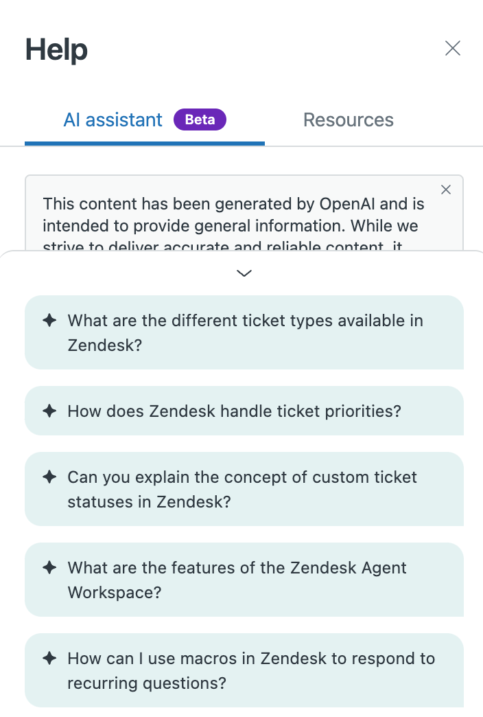
Like many others in the customer support space, Zendesk has been developing and expanding AI-powered experiences and capabilities in-product — something that’s clear when interacting with its in-app resource offering.
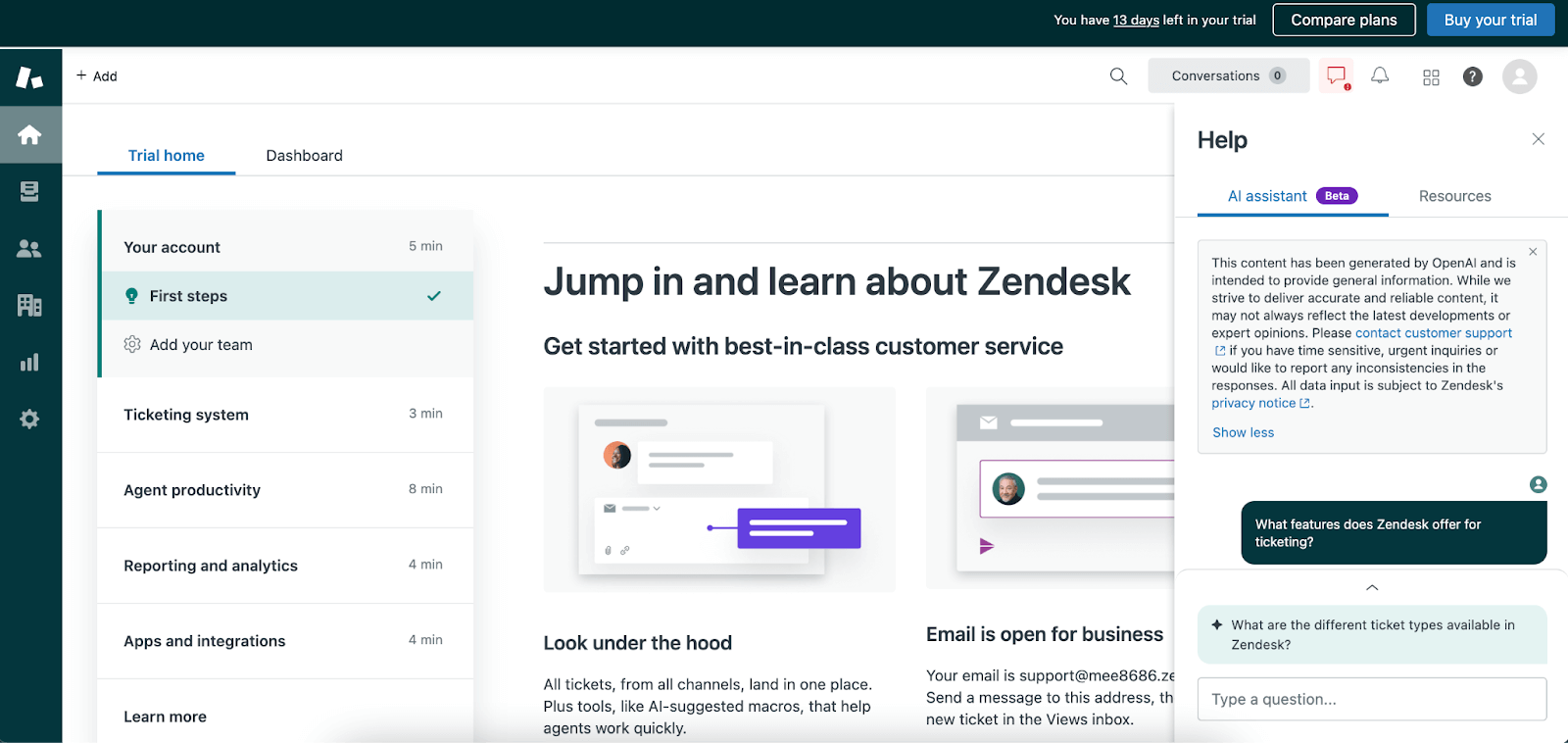
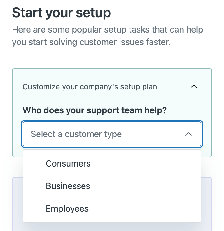
Clicking the profile image in the upper righthand corner of the web app pulls up a menu with a link to its full support content resource center on the marketing website. But clicking on the question mark to the left brings up an in-app resource center topped by two main sections — an AI chatbot assistant with pre-loaded questions based on common customer queries, and a resource tab with an onboarding checklist and links to resources like videos and popular help topics.
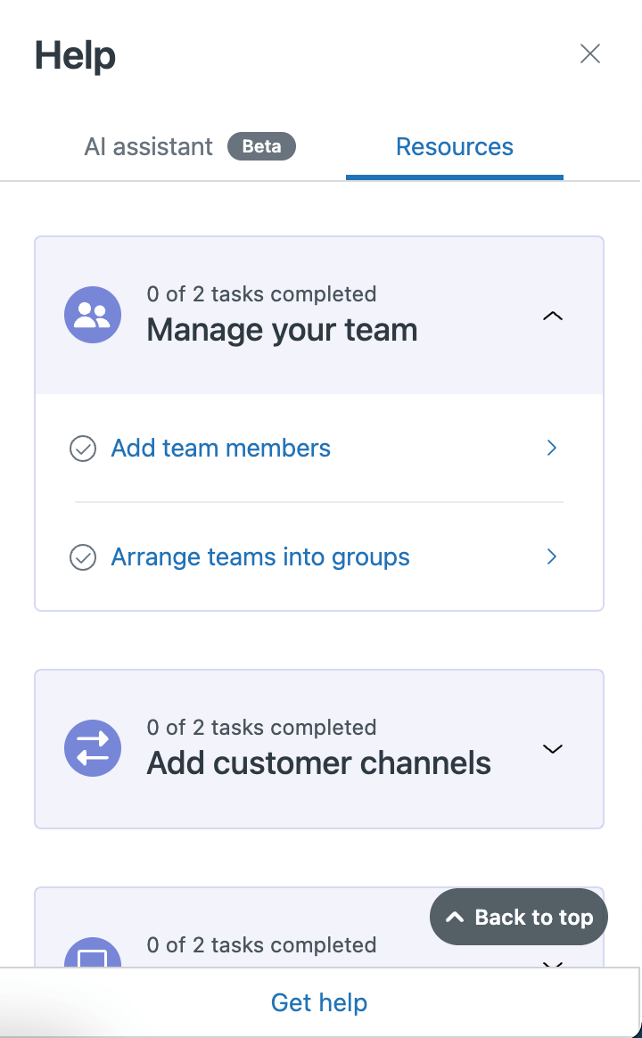
Zendesk offers an array of tools for customer service, so getting set up can be challenging for the unacquainted. That’s why we like Zendesk’s in-app resource collection — it offers a diverse set of helpful options that allow new users to choose their own adventure.
The AI assistant chatbot comes pre-populated with common questions, making it easy to figure out questions to answer you maybe didn’t even know you had — like the different types of ticket types available.
The resource center also allows users to customize their setup with various onboarding tasks suited to the type of customers they interact with.
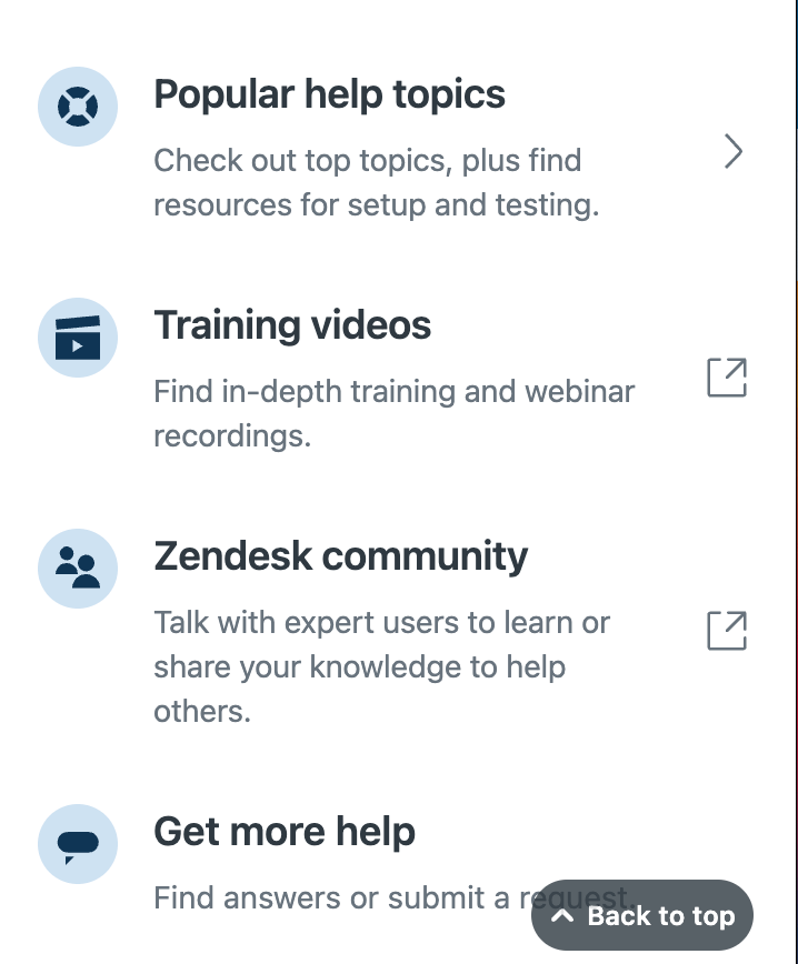
Finally, the embedded links offer information that speaks to different kinds of users, such as those that prefer reading support articles, watching training videos, or even connecting with experienced users in the Zendesk community to learn and share knowledge.
Overall, Zendesks’ take on the in-app resource center is optimal for connecting users with the support content they need at critical moments throughout the user journey, like onboarding into the product.
Remember: What's good for your users is good for growth. Looking at how some of the world's top SaaS firms deploy help resources in-app, it's clear that providing contextualized tips and resources to users is a winning tactic for promoting a streamlined user journey.
If you're looking for a best-in-class option for building your own in-app resource center, look no further than Launchpads — Appcues' no-code in-app resource center. Launchpads integrates seamlessly with your product to reduce user headaches, defray support tickets for your team, and boost retention.
With Launchpads, you can build a striking, on-brand, in-app experience for users in minutes — not entire dev sprints. Segment flows to multiple audiences at crucial points in their user journey, report on impact with simple analytics, and link effortlessly to your entire library of support docs.
Solve more problems for your users, right in the product. Create a free account or request a demo to get started today, or visit our blog, course library, or other resources to learn more.


