← Visit Appcues.com
×
×

How Canva's growth team improves activation +10%
Canva's growth team has created a process from which they improve their activation rate by 10% regularly, resulting in tens of thousands...
Skip to section:

Skip to section:

Canva's growth team has created a process from which they improve their activation rate by 10% regularly, resulting in tens of thousands of new active users every month. Here's how.

When you step into Canva’s office—just upstairs from one of Sydney’s hippest neighborhoods—you feel like you’ve entered an art studio. Natural light pours through the gaping windows, and the office mimics the vibrancy of different neighborhoods in a city’s more artsy districts.

Canva's Sydney office

Canva is Australia’s fastest growing tech company. They’ve attracted 8 million users in two short years and raised nearly $50M in VC by empowering anyone to create beautiful graphic design, and their office reflects both their mission and their success.

With hundreds of thousands of new users trying the product every month, Canva built a growth team focused on improving their product's activation rate—or the percentage of new users who successfully create a design.

Xingyi Ho, a growth manager with a penchant towards clarity, has mastered Canva’s growth playbook.

Xingyi Ho - Canva's growth team

By running Canva’s growth process, Xingyi has improved the activation rate of several features by over 10%. And 10% is a big lift for a company that's been around for 5 years and already put substantial effort into their user onboarding experience. 

Xingyi's improvements have translated to tens of thousands of additional users achieving value with the product every month. Further, this generates hundreds of thousands more dollars for the business.

The growth playbook that Xingyi runs goes like this:
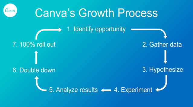
Canva's Growth Process

The following is a detailed recount of how Xingyi has improved activation on Canva’s poster feature using the growth process.

1. Identify opportunities

Tasked with improving overall product activation, Xingyi needed a way to identify the highest impact opportunities to maximize his efforts.

“If an acquisition channel only contributes to about 5% of our signups, we probably won't pay too much attention to it,” said Xingyi, “but if a channel contributes to 20%-30% of signups…” There might be a big opportunity there.

So Xingyi looked at which high-volume channels were activating worse than others. Those with high volume and low activation rates were the ripest opportunities for improvement.

After looking at the numbers in Canva's product analytics tool, Xingyi identified Canva's poster feature as a good candidate for improvement, so he decided to drill in.
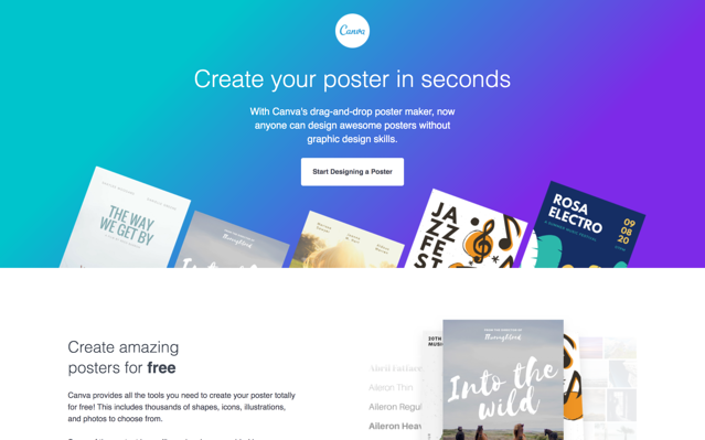
Canva poster landing page

2. Gather data

Excited by the opportunity, Xingyi sprung into research mode to get a better understanding of why new users weren’t converting. 

“When you’re trying to improve activation, you first have to understand each segment of users. What is their ultimate goal, and how can we help get what they want to get done, done.” 

Knowing that a deep understanding of what users want and how the product can best help them, Xingyi followed a 3-step process to gather user insights:
  1. He ran a user test to try and understand what new users engaged with. The user test often uncovers anything confusing or misaligned within the user onboarding experience.
  2. Then Xingyi emailed a survey to churned users to better understand why they churned. 
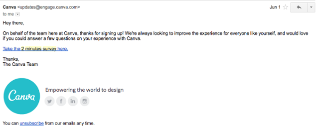
  3. Lastly, Xingyi sent another survey to new users almost immediately after signup. This survey aimed to quantify users’ ultimate goals. As Xingyi explained, “we wanted to know what type of poster new users are looking for.” 
Canva user survey email

Xingyi analyzed the survey data and looked for patterns. Patterns bring Xingyi from grasping the broad opportunity to having an accurate diagnosis as to where exactly the opportunity lives.

The poster surveys helped Xingyi realize that the goals of new users were vastly different. Some users were coming to create something for their church, while others were doing it for a rock concert. The clipart, stock photos, and tools these users needed may not overlap, and users were churning because of this.

3. Hypothesize

Now well informed, Xingyi was able to make a hypothesis as to how he could improve activation for new users trying to create a poster.

“From the surveys, we essentially understand two things: we understand who our users are, and we understand why they signed up for Canva. 

Based on that, we can infer a set of hypotheses, and then the next step would be to test it out.”

Looking at the survey results from the poster feature, Xingyi thought, “how can we make it as easy as possible for users to reach their goal in this scenario?”

Xingyi had a hypothesis: a personalized in-app onboarding experience that branched users to various paths could help them get to where they want to go faster. Personalization can help users identify with a product quicker, and an in-app message would appeal to user motivation at its highest point.

"When users want to create a design, they usually create the design on the first day. Anytime after the first day, the impact of whatever we do will have a comparatively lower impact."

4. Experiment

Having identified a strong hypothesis, Xingyi moved forward to implement it as an experiment. Xingyi tested the experiment against a control (nothing new) by targeting 5% of new users.

Many of the personalized onboarding experiments are conducted inside of the Canva product. And without an engineering background, Xingyi uses Appcues, a user onboarding tool, to create and publish them there.

“Appcues enables our growth team to test multiple hypotheses within a short period of time.” 

Using Appcues, Xingyi created a welcome message with options for a variety of posters.
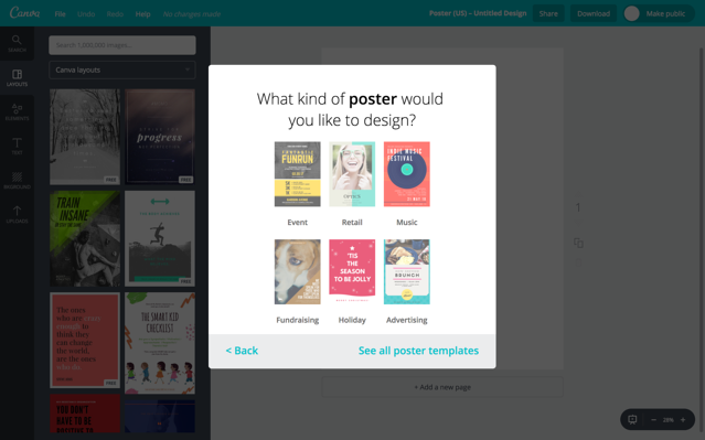
Canva's onboarding built with Appcues

To create the onboarding experience, Xingyi took the most popular posters that survey respondants reported looking for and created a mock-up, which he sent to his boss, Canva's Head of Growth. 

Once approved, Xingyi passed the mock-up to their design team to refine the styling of the message. He then tested the functionality of message to make sure it appeared at the right time and directed users to where they wanted to go. Finally, he published it. 

As Xingyi reported, "the whole process took 2-3 weeks, but is significantly faster than experimenting by using development."

Before Canva started using Appcues, their growth experiments were built by their development team. This process took 4-6 weeks and included several more steps. Each experiment was prioritized into development sprint cycles, coded by front-end and back-end developmers, QA'ed by another team, reviewed by a peer, then reviewed by another peer, before being deployed into their product.

Although the processs was thorough, it was too slow. Slowness was costing Canva tens of thousands of newly activated users, which meant leaving hundreds of thousands of dollars on the table each month. Further, Canva's developers had other projects to focus on, and the team didn't want to take away from those.

When Appcues was installed, it was readily embraced by the team. Xingyi explained, "it helps us test faster and learn faster, so naturally we were pretty quick to roll with it."

5. Analyze results

Xingyi measured results from his activation experiment in Amplitude. After 2 to 3 weeks he reached statistically significant results, and was able to quantify the improvement the experiment made. 

Xingyi’s hypothesis about personalized onboarding proved to be correct. Directing users towards specific types of posters and continuing to personalize the experience based on their choices resulted in a 10% increase in activation for the posters product. 

But before Xingyi rolled out the onboarding experience to all of Canva's users—remember, only 5% of new users saw the experiment—he ran a few additional tests to optimize the in-app message further.

6. Double down

When a hypothesis like personalized onboarding proves correct, Xingyi and the growth team doubles down on their win.

They experiment further with things like copy and design to find an even greater lift.

“We try to find very small opportunities for optimization. That could be testing different types of thumbnails in our Appcues message, the copy, or the design.”

After Xingyi launched the poster onboarding, he realized some posters in the message were getting significantly fewer clicks than others. Xingyi decided to test different poster images for those seeing less engagement, and was pleased to see an improvement. The posters got more clicks, and overall activation received a small lift.

This doubling down on an experiment can help bring an activation growth rate of 10% all the way up to 12%, a significant win for a product with a massive volume of users.

7. 100% roll out

Having found significant impact from his experiment, Xingyi published the personalized onboarding flow to everyone, and created that massive lift in activated users and new revenue he had been working for. 

When he shared with his team that more than ten thousand additional new users a month will now get value from Canva, leading to hundreds of thousands more dollars in revenue for the business, his teammates wanted to do more.

So starting from the top of the growth process again, Xingyi and his teammates began to implement personalized onboarding for other features and products.

Canva's growth playbook

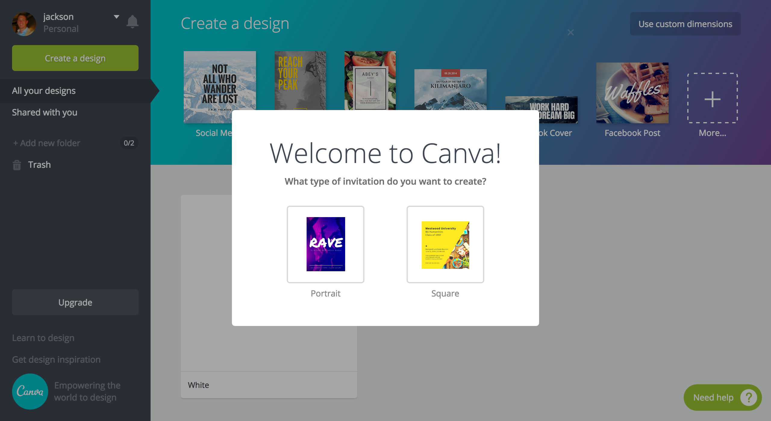
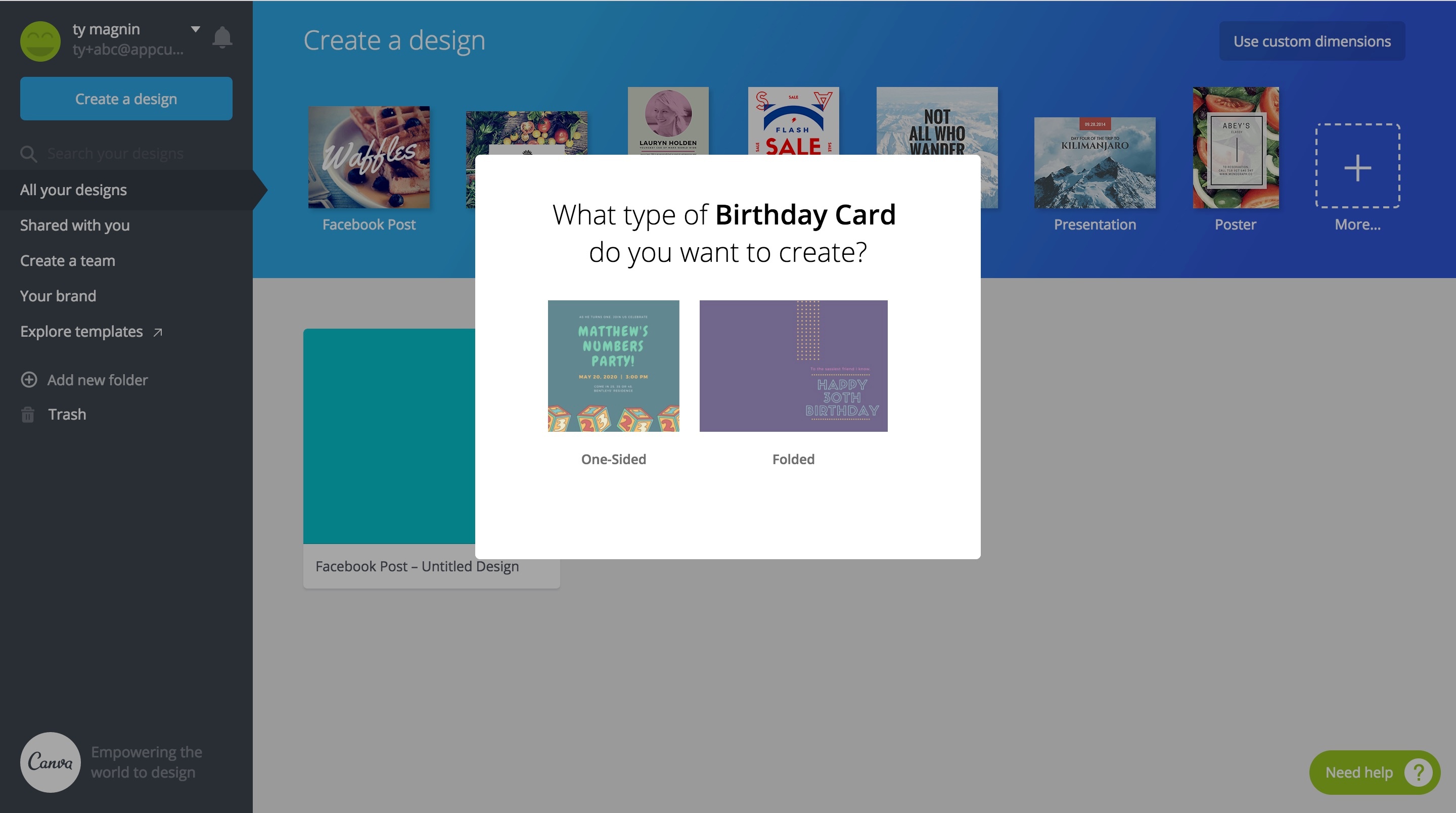
They created personalized onboarding for their B2B product, Canva for Work. They implemented it for several other features like the posters feature, and they even personalized the onboarding from Canva's homepage (their most popular acquisition funnel). Here are some example:
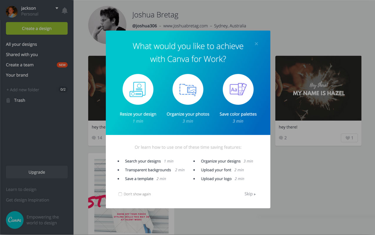
Canva for work message
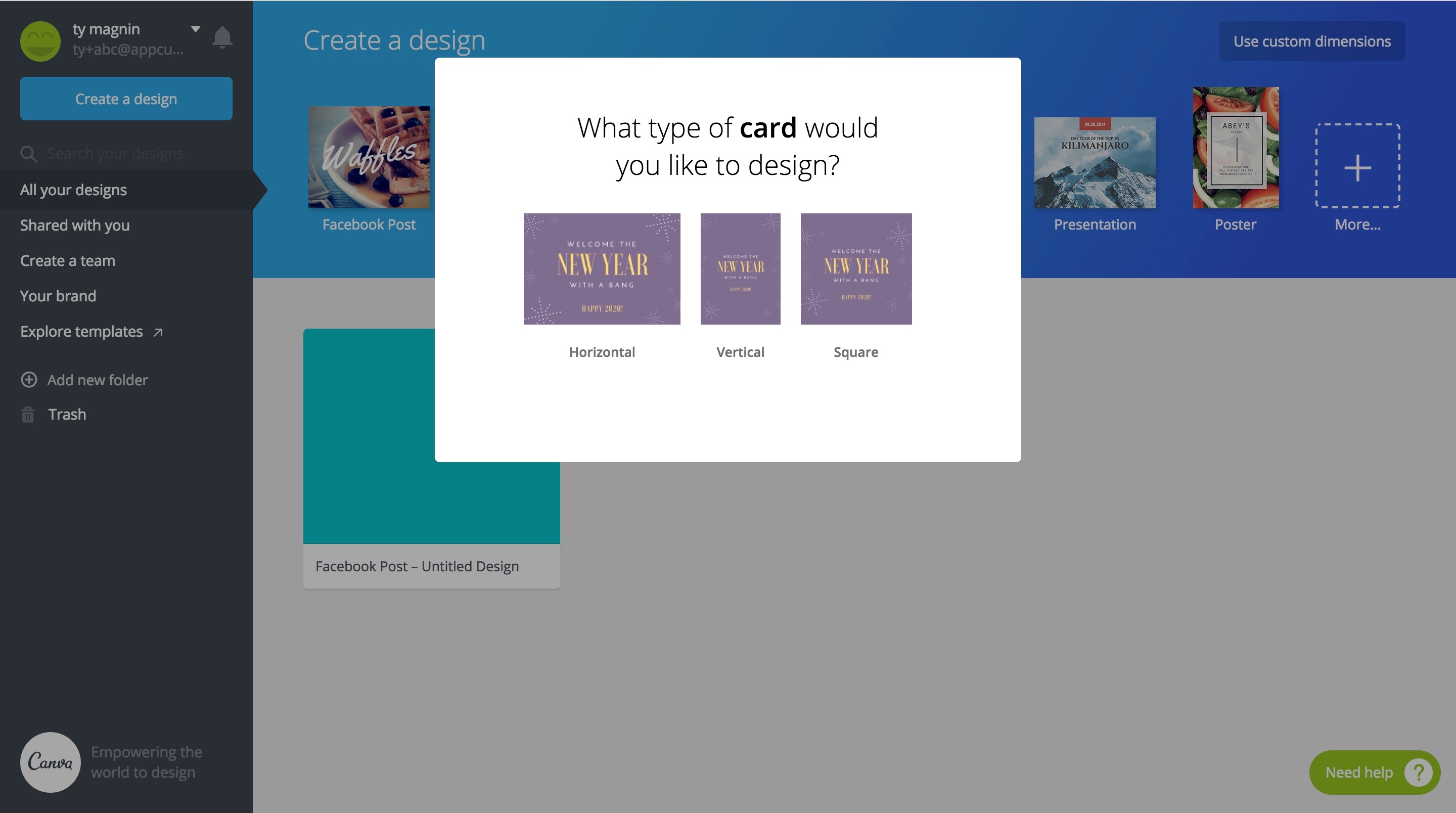
Birthday card modal
Canva card onboarding
Canva card orientation
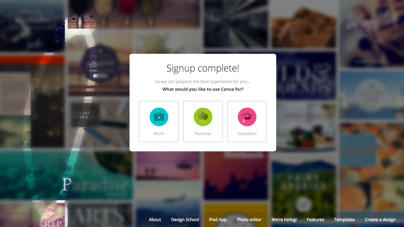
Canva choose your work
Canva choices modal
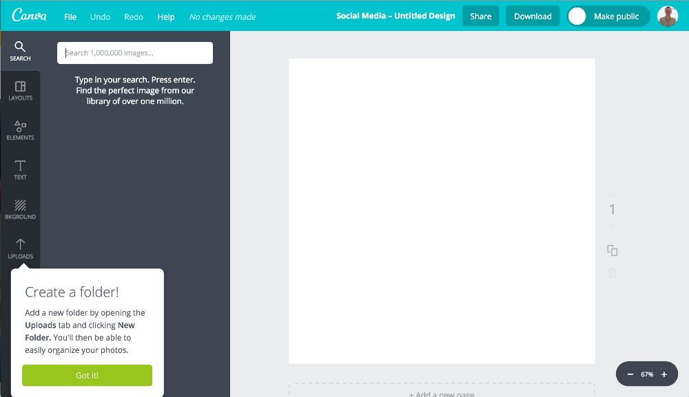
Canva tooltip

Thankfully, the 10% lift in activation that Xingyi saw from the poster experiment is in line with subsequent growth experiments that Canva has run with Appcues.

“If successful, an experiment with Appcues typically improves activation by around 10%”

And within a year since first launch, Canva’s growth team has conducted 30-50 experiments with Appcues. Quickly running their growth process to learn about their users and drive significant improvements to key metrics like activation.

Ty Magnin
Skip to section:

Skip to section:

Canva's growth team has created a process from which they improve their activation rate by 10% regularly, resulting in tens of thousands of new active users every month. Here's how.

When you step into Canva’s office—just upstairs from one of Sydney’s hippest neighborhoods—you feel like you’ve entered an art studio. Natural light pours through the gaping windows, and the office mimics the vibrancy of different neighborhoods in a city’s more artsy districts.

Canva's Sydney office

Canva is Australia’s fastest growing tech company. They’ve attracted 8 million users in two short years and raised nearly $50M in VC by empowering anyone to create beautiful graphic design, and their office reflects both their mission and their success.

With hundreds of thousands of new users trying the product every month, Canva built a growth team focused on improving their product's activation rate—or the percentage of new users who successfully create a design.

Xingyi Ho, a growth manager with a penchant towards clarity, has mastered Canva’s growth playbook.

Xingyi Ho - Canva's growth team

By running Canva’s growth process, Xingyi has improved the activation rate of several features by over 10%. And 10% is a big lift for a company that's been around for 5 years and already put substantial effort into their user onboarding experience. 

Xingyi's improvements have translated to tens of thousands of additional users achieving value with the product every month. Further, this generates hundreds of thousands more dollars for the business.

The growth playbook that Xingyi runs goes like this:

Canva's Growth Process

The following is a detailed recount of how Xingyi has improved activation on Canva’s poster feature using the growth process.

1. Identify opportunities

Tasked with improving overall product activation, Xingyi needed a way to identify the highest impact opportunities to maximize his efforts.

“If an acquisition channel only contributes to about 5% of our signups, we probably won't pay too much attention to it,” said Xingyi, “but if a channel contributes to 20%-30% of signups…” There might be a big opportunity there.

So Xingyi looked at which high-volume channels were activating worse than others. Those with high volume and low activation rates were the ripest opportunities for improvement.

After looking at the numbers in Canva's product analytics tool, Xingyi identified Canva's poster feature as a good candidate for improvement, so he decided to drill in.

Canva poster landing page

2. Gather data

Excited by the opportunity, Xingyi sprung into research mode to get a better understanding of why new users weren’t converting. 

“When you’re trying to improve activation, you first have to understand each segment of users. What is their ultimate goal, and how can we help get what they want to get done, done.” 

Knowing that a deep understanding of what users want and how the product can best help them, Xingyi followed a 3-step process to gather user insights:

  1. He ran a user test to try and understand what new users engaged with. The user test often uncovers anything confusing or misaligned within the user onboarding experience.
  2. Then Xingyi emailed a survey to churned users to better understand why they churned. 
  3. Lastly, Xingyi sent another survey to new users almost immediately after signup. This survey aimed to quantify users’ ultimate goals. As Xingyi explained, “we wanted to know what type of poster new users are looking for.” 
Canva user survey email

Xingyi analyzed the survey data and looked for patterns. Patterns bring Xingyi from grasping the broad opportunity to having an accurate diagnosis as to where exactly the opportunity lives.

The poster surveys helped Xingyi realize that the goals of new users were vastly different. Some users were coming to create something for their church, while others were doing it for a rock concert. The clipart, stock photos, and tools these users needed may not overlap, and users were churning because of this.

3. Hypothesize

Now well informed, Xingyi was able to make a hypothesis as to how he could improve activation for new users trying to create a poster.

“From the surveys, we essentially understand two things: we understand who our users are, and we understand why they signed up for Canva. 

Based on that, we can infer a set of hypotheses, and then the next step would be to test it out.”

Looking at the survey results from the poster feature, Xingyi thought, “how can we make it as easy as possible for users to reach their goal in this scenario?”

Xingyi had a hypothesis: a personalized in-app onboarding experience that branched users to various paths could help them get to where they want to go faster. Personalization can help users identify with a product quicker, and an in-app message would appeal to user motivation at its highest point.

"When users want to create a design, they usually create the design on the first day. Anytime after the first day, the impact of whatever we do will have a comparatively lower impact."

4. Experiment

Having identified a strong hypothesis, Xingyi moved forward to implement it as an experiment. Xingyi tested the experiment against a control (nothing new) by targeting 5% of new users.

Many of the personalized onboarding experiments are conducted inside of the Canva product. And without an engineering background, Xingyi uses Appcues, a user onboarding tool, to create and publish them there.

“Appcues enables our growth team to test multiple hypotheses within a short period of time.” 

Using Appcues, Xingyi created a welcome message with options for a variety of posters.

Canva's onboarding built with Appcues

To create the onboarding experience, Xingyi took the most popular posters that survey respondants reported looking for and created a mock-up, which he sent to his boss, Canva's Head of Growth. 

Once approved, Xingyi passed the mock-up to their design team to refine the styling of the message. He then tested the functionality of message to make sure it appeared at the right time and directed users to where they wanted to go. Finally, he published it. 

As Xingyi reported, "the whole process took 2-3 weeks, but is significantly faster than experimenting by using development."

Before Canva started using Appcues, their growth experiments were built by their development team. This process took 4-6 weeks and included several more steps. Each experiment was prioritized into development sprint cycles, coded by front-end and back-end developmers, QA'ed by another team, reviewed by a peer, then reviewed by another peer, before being deployed into their product.

Although the processs was thorough, it was too slow. Slowness was costing Canva tens of thousands of newly activated users, which meant leaving hundreds of thousands of dollars on the table each month. Further, Canva's developers had other projects to focus on, and the team didn't want to take away from those.

When Appcues was installed, it was readily embraced by the team. Xingyi explained, "it helps us test faster and learn faster, so naturally we were pretty quick to roll with it."

5. Analyze results

Xingyi measured results from his activation experiment in Amplitude. After 2 to 3 weeks he reached statistically significant results, and was able to quantify the improvement the experiment made. 

Xingyi’s hypothesis about personalized onboarding proved to be correct. Directing users towards specific types of posters and continuing to personalize the experience based on their choices resulted in a 10% increase in activation for the posters product. 

But before Xingyi rolled out the onboarding experience to all of Canva's users—remember, only 5% of new users saw the experiment—he ran a few additional tests to optimize the in-app message further.

6. Double down

When a hypothesis like personalized onboarding proves correct, Xingyi and the growth team doubles down on their win.

They experiment further with things like copy and design to find an even greater lift.

“We try to find very small opportunities for optimization. That could be testing different types of thumbnails in our Appcues message, the copy, or the design.”

After Xingyi launched the poster onboarding, he realized some posters in the message were getting significantly fewer clicks than others. Xingyi decided to test different poster images for those seeing less engagement, and was pleased to see an improvement. The posters got more clicks, and overall activation received a small lift.

This doubling down on an experiment can help bring an activation growth rate of 10% all the way up to 12%, a significant win for a product with a massive volume of users.

7. 100% roll out

Having found significant impact from his experiment, Xingyi published the personalized onboarding flow to everyone, and created that massive lift in activated users and new revenue he had been working for. 

When he shared with his team that more than ten thousand additional new users a month will now get value from Canva, leading to hundreds of thousands more dollars in revenue for the business, his teammates wanted to do more.

So starting from the top of the growth process again, Xingyi and his teammates began to implement personalized onboarding for other features and products.

Canva's growth playbook

They created personalized onboarding for their B2B product, Canva for Work. They implemented it for several other features like the posters feature, and they even personalized the onboarding from Canva's homepage (their most popular acquisition funnel). Here are some example:
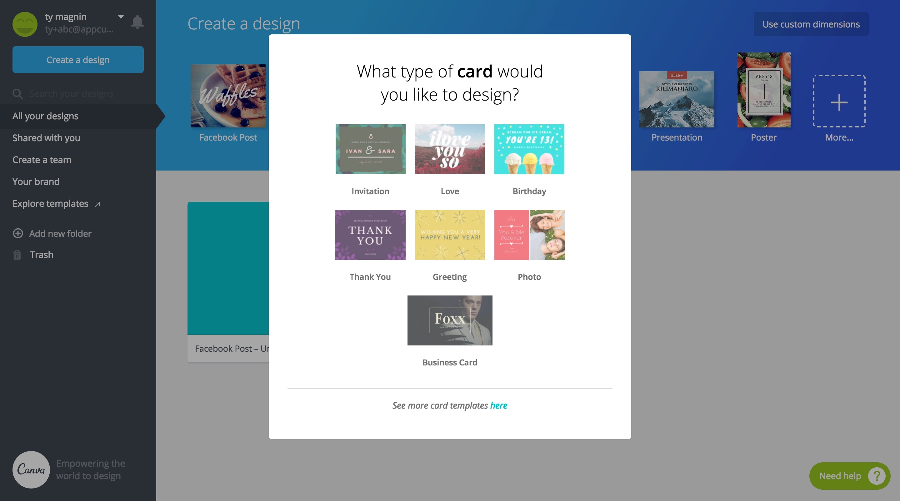
Canva for work message
Birthday card modal
Canva card onboarding
Canva card orientation
Canva choose your work
Canva choices modal
Canva tooltip

Thankfully, the 10% lift in activation that Xingyi saw from the poster experiment is in line with subsequent growth experiments that Canva has run with Appcues.

“If successful, an experiment with Appcues typically improves activation by around 10%”

And within a year since first launch, Canva’s growth team has conducted 30-50 experiments with Appcues. Quickly running their growth process to learn about their users and drive significant improvements to key metrics like activation.

Ty Magnin
You might also like...