← Visit Appcues.com
×
×

4 aha moment examples that remove friction from user onboarding

Getting new users to see your product’s value begins with friction-free onboarding.
Skip to section:

Skip to section:

You may have heard about the “seven friends in 10 days” moment that set Facebook on the path to 1 billion users. The concept is quite simple. If a new user connects with seven friends within their first 10 days on Facebook, they’re likely to stick around with the product. Why? Because once they’ve connected to friends, they can appreciate Facebook’s core product value.

Users won’t wait forever to experience the “aha moment”with your product. If you don’t prove your product’s value during onboarding, users may lose interest and move on to a competitor.

The key is getting first-time users to their aha moment as quickly as possible.

What is an example of an aha moment?

Aha moments happen when new users discover how your product works and realize why it’s a must-have solution. That moment of sudden realization—also known by its more formal name, activation—is the start of a long-lasting relationship between your brand-new customers and your product.
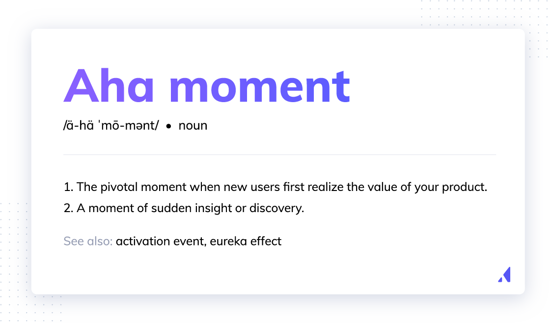
Definition of aha moment
Aha moment aka activation event or the eureka effect

But to turn new customers into regular users of your product, you’ve got to help them discover the value you promised—fast. The opportunity to reduce time to value for customers exists during our favorite part of the customer journey: user onboarding. (Pro Tip: if you haven't spent time creating a user journey map, we suggest getting a handle on that first before optimizing flows for specific aha moments.)

Why are aha moments essential to user onboarding?

The sooner you get new users to the aha moment during onboarding, the more likely they are to stay with your product. Retained customers drive growth by bringing in more new users and helping a company’s bottom line.

Users who appreciate a product’s value are likely to spread the word about it throughout their networks. Word-of-mouth referrals can result in big wins for businesses because they often lower the need for paid user acquisition. And saving on acquisition is a pretty big deal, considering it costs more than retention.

Retained customers also play a major role in bringing in revenue. Existing customers are more likely to buy from a company repeatedly and spend more money during subsequent purchases.

Increasing revenue and winning new customers are both exciting goals. But to achieve these benefits, companies must create a friction-free onboarding experience that gets folks to their aha moment.
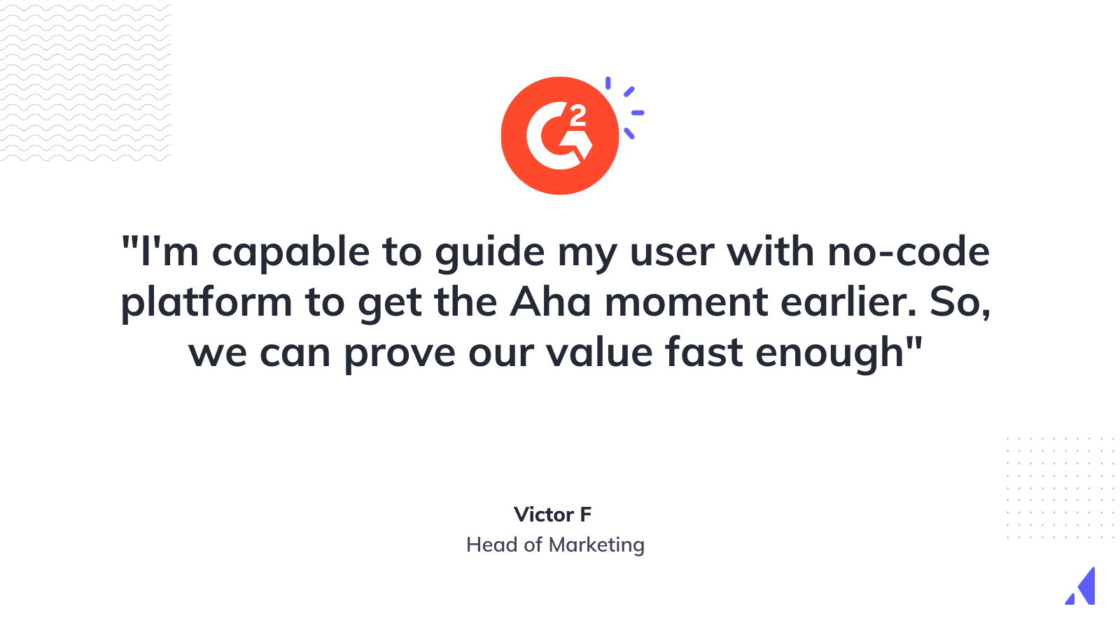
Appcues G2 review about Aha moments
With Appcues, finding your Aha moments has never been easier | G2 Source

4 user onboarding aha moment examples

Now that we've covered the basics, it's time to find inspiration for your own onboarding processes. Let's have some fun, shall we? Take a look at these stand-out, real-life aha moment examples that remove the friction from onboarding and quickly show first-time users a product’s value.

1. Canva

Aha moment: Canva helps first-time users quickly reach their aha moment with a frictionless onboarding process that quickly shows users how anyone can create and share professional designs. New users don’t have to sign up for the product until they’re ready to save their design.  First-time users see how Canva supports their need for an easy-to-use design tool without offering up any of their information.
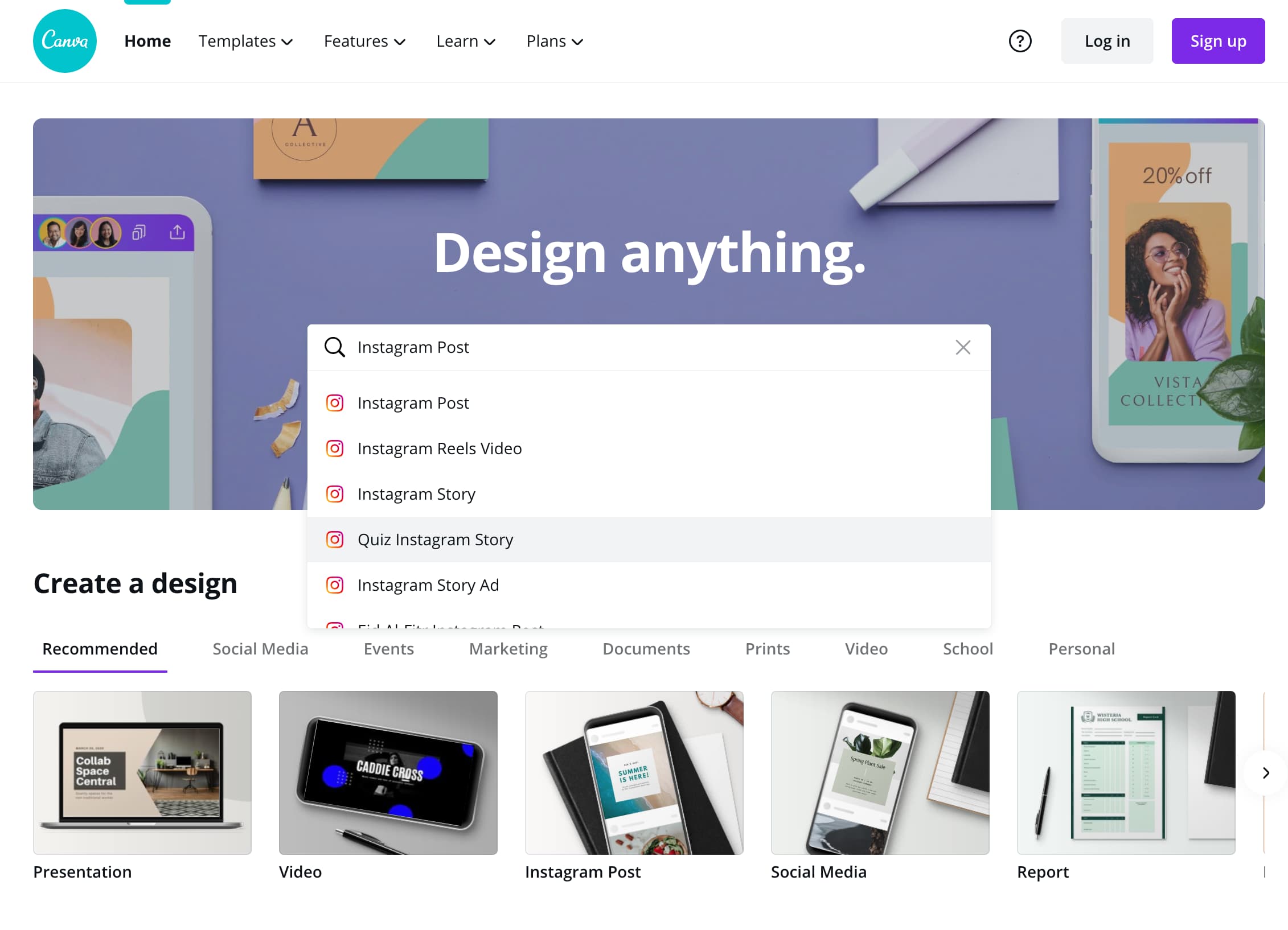
aha moment example featuring Canva

Canva’s user onboarding sequence is straightforward. On the homepage, the “Design anything” copy above the search bar signals to users that they can do just that: design anything they want. Users fill in the search bar with the type of design they wish to create, and a new tab opens displaying ready-to-go templates.

Canva guides first-time users through a four-step design flow that gets them to their first creation.

Screenshot of Canva's design flow for first-time users

In the first step, Canva prompts users to select from ready-to-go templates to get started.
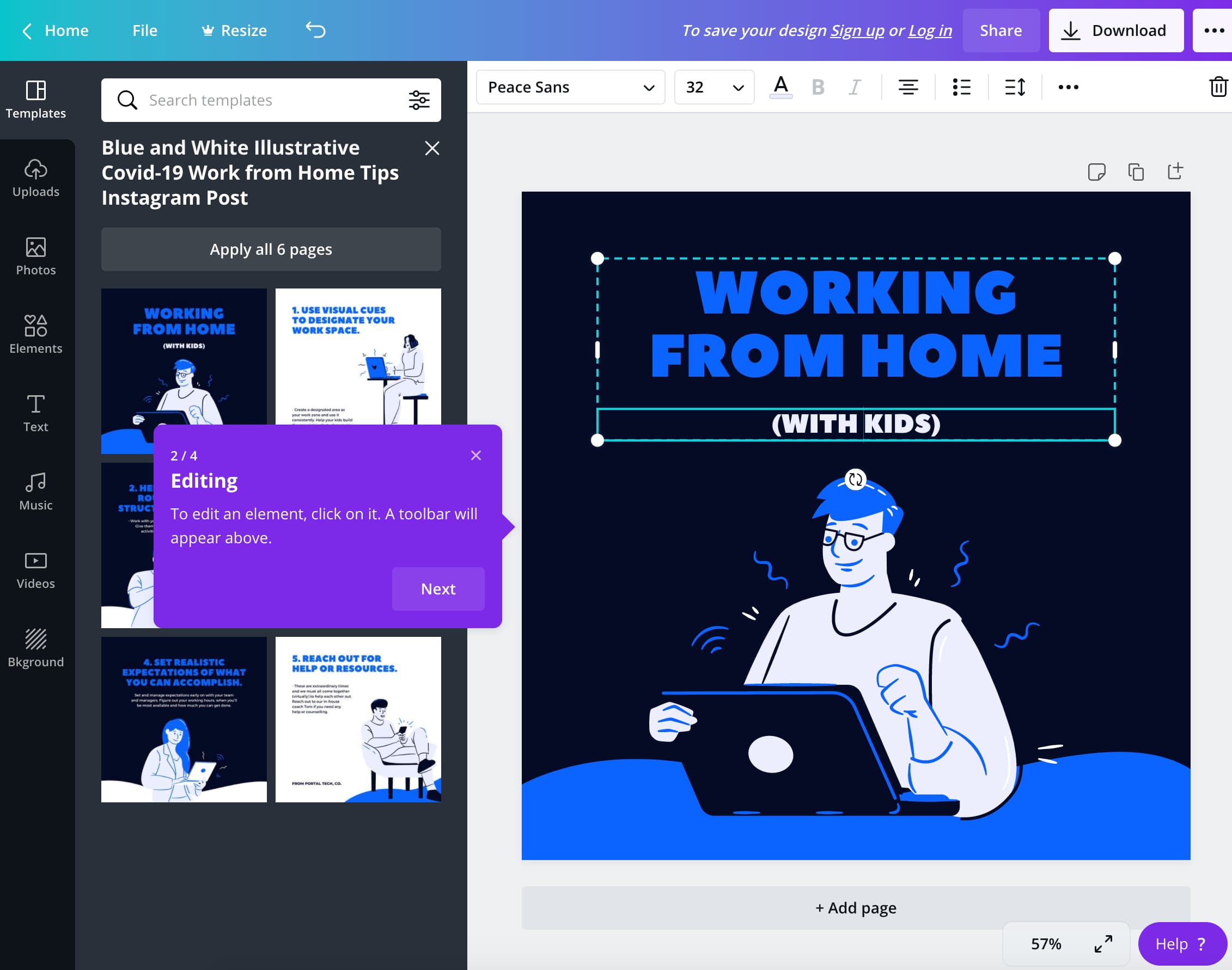
Screenshot of Canva templates

Next, Canva walks users through editing their selected design.
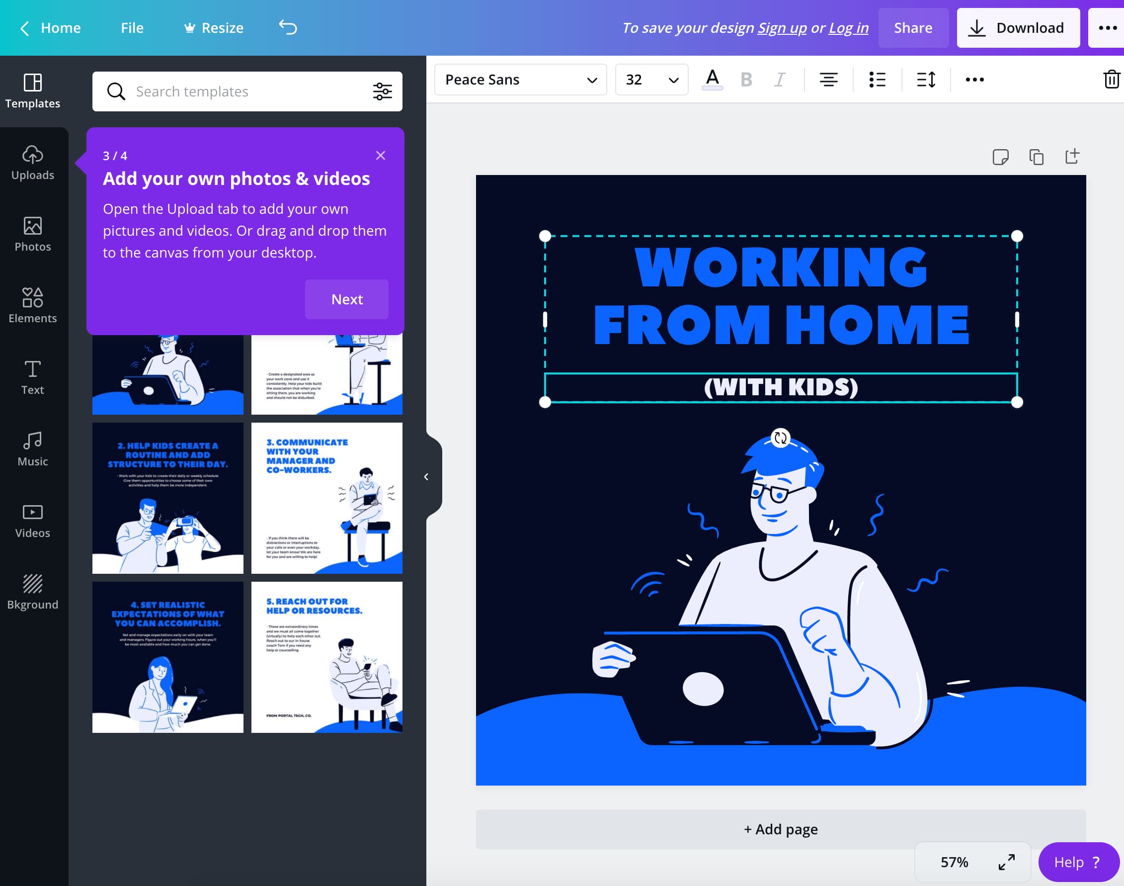
Canva walkthrough editing select designs

In the third step, users learn how to upload their own media into their Canva designs.
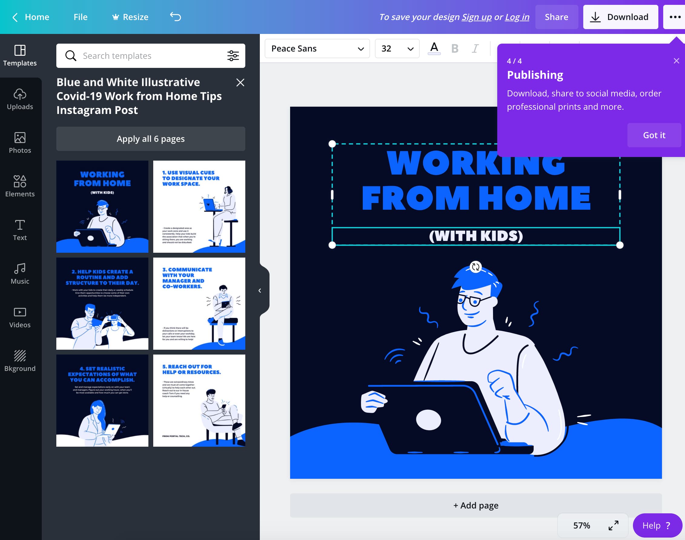
Canva aha moment to generate user-generated designs

Once new users get to step four of the product’s onboarding tutorial, Canva shows them exactly where to go to begin sharing their design with the world!

Canva even removes obstacles for users who just want to see how it works and aren’t ready to design anything just yet. First-time users aren’t directed to create anything of their own, but they’re shown how with simple instructions.  The straightforward onboarding approach helps new users get ramped up on the product quickly.

2. Grubhub

Aha moment: After a new user enters their address on the homepage, Grubhub presents them with a page full of restaurants to choose from. This particular aha moment is backed by user research. Grubhub’s first marketing lead, Casey Winters, and his team discovered that the conversion rate doubles for Grubhub users in Boston who get 55 or more results after searching their address on the platform.

Like other food delivery apps, Grubhub promises to help users discover and order food online from nearby restaurants for pickup or delivery.  
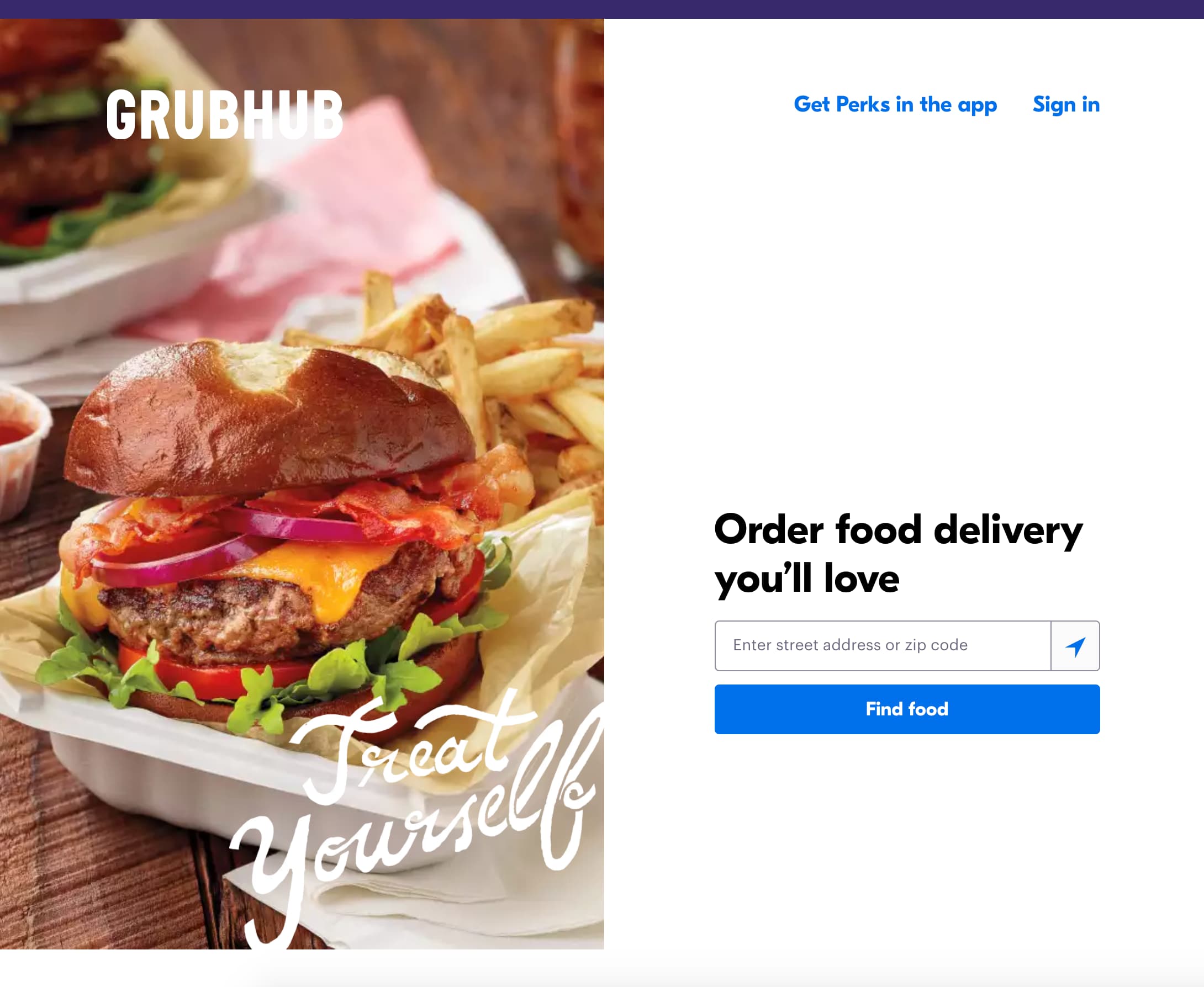
Grubhub example of aha moment
Grubhub's homepage
Grubhub homepage example of aha moment by narrowing choices


Like Canva, Grubhub keeps its onboarding process frictionless. New users don’t have to sign up for the product to complete a search.

Grubhub’s onboarding couldn’t be simpler. All they ask for is the user’s street address, which people expect to submit since the service is for food delivery. Once Grubhub gets that info, new users see the product’s value immediately.

Get started

We'll help users discover your product's aha moment faster

  • Increase user engagement
  • Help users get more out of your product
Aha moment user onboarding


3. Headspace

Aha moment: Users reach the aha moment at the end of Headspace’s onboarding routine once they’ve completed a survey. Normally, an aha moment at the end of onboarding is a no-no. But in the case of Headspace, the aha moment has to happen at the end of onboarding to provide the new user a personalized experience.

The new user onboarding is a completely personalized experience for those who sign up for Headspace’s free trial—plus, it only takes a couple of minutes to complete.

Headspace aha moment example

After signing up, Headspace takes users through a series of questions to create individualized plans for each user.

Headspace onboarding flows to drive a personalized experience

Headspace asks users about their previous meditation experience and recommends a length of time for their first sessions.

Headspace questions to drive a better onboarding

In the next step, users choose from six different options that express their motivation for trying the Headspace app.  

Headspace user onboarding flows
Headspace aha moment example

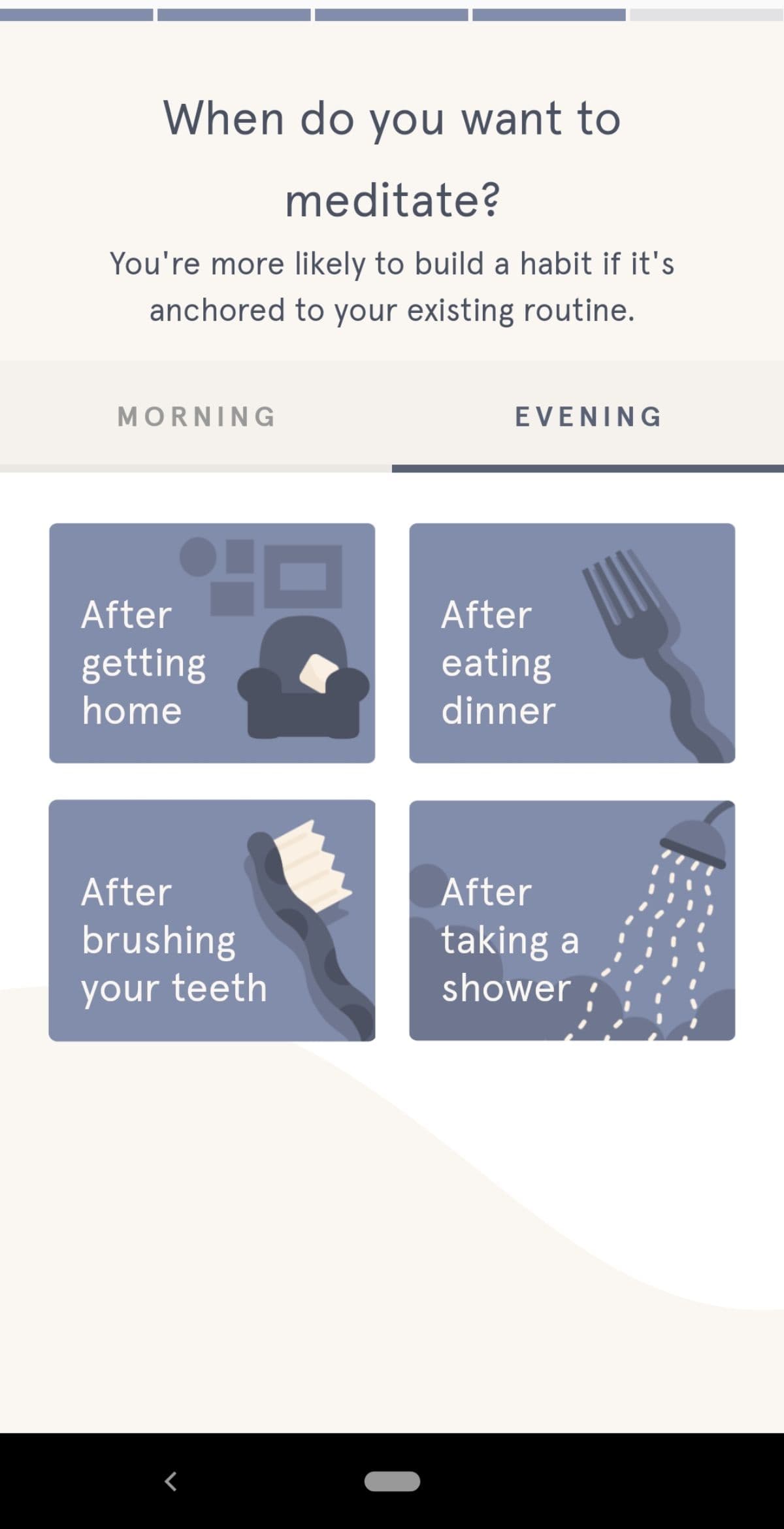
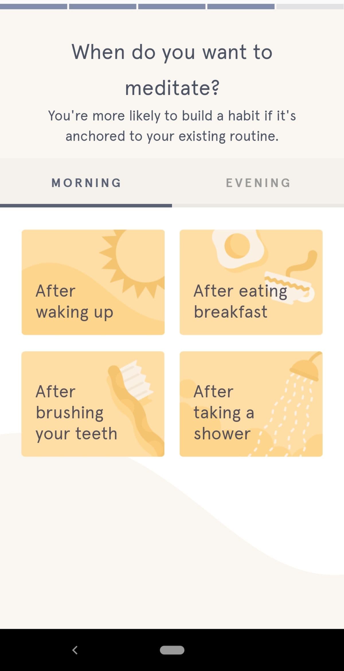
The last two questions focus on the user’s preferred meditation schedule. The user’s options include common activities people perform during their morning or evening routines.

Headspace recap questions in user onboarding flows

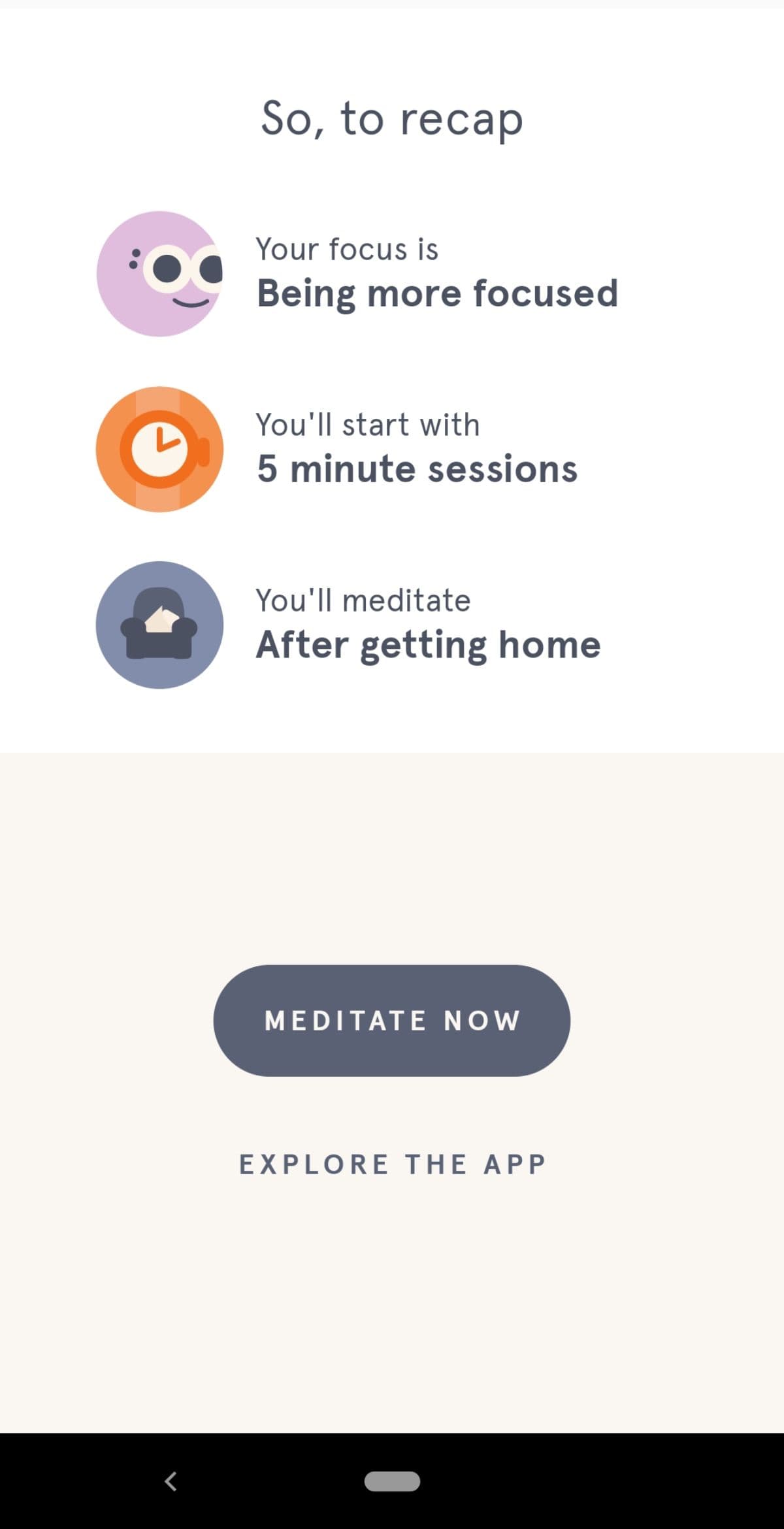
After answering the onboarding questions, Headspace users reach the aha moment; users get a personalized recap of their guided meditation plan and can get started with their new meditation right away.

This personalization is critical since meditation is a deeply personal practice. If the product’s promised value is that it offers guided meditations to help people achieve their wellness goals, then Headspace must take the time to understand users’ unique needs.

4. Sprout Social

Aha moment: New Sprout Social users immediately find their aha moment through a product demo tour. During the onboarding process, users are able to quickly see the value Sprout Social brings to their social media management toolkit using their company's data to make it even more impactful.

In the tool’s onboarding process, new users attach their social accounts and share details about their social media experience and goals.

Sprout Social removes friction here by saving users the extra step of inputting or importing their own data. Users get to play around and check out the product’s  features using a fake data set. This frictionless onboarding flattens the learning curve and gets new users to the aha moment quickly.

Sprout social aha moment explained
Sprout social user onboarding questions for personalization

From there, Sprout Social takes users to a demo report.

Sprout social demo report aha moment example


Sprout Social removes friction here by saving users the extra step of inputting or importing their own data. Users get to play around and check out the product’s  features using a fake data set. This frictionless onboarding flattens the learning curve and gets new users to the aha moment quickly.

Aha moments at work

Aha moments vary from product to product. Grubhub’s aha moment meant giving users a wide range of choices, while Headspace narrowed down options based on a user’s individual needs. Finding your product’s aha moment takes a bit of effort—but when done right, it’s worth it.

You know your product so well that you can wax rhapsodic about its value forever. But your new customers don’t want to hear about how great your product is; they want to experience it for themselves.

As you work toward discovering your product’s aha moment, remember to zero in on the activation event you want users to complete. This key event is the foundation for your aha moment because it sets the stage for future long-term user engagement. You should also speak to both your churned and existing users to gain valuable insights into if and when they reached the aha moment. This customer feedback will also help you personalize onboarding and get users to that eureka moment faster.

Strengthen your onboarding with your own aha moment examples


If you’re ready to get deep into the nitty-gritty of finding aha moments during user onboarding, you can learn more in The aha moment guide: How to find, optimize, and design for your product’s aha moment.

An aha moment for your user is a tada! moment for your business, opening the door for a long-lasting relationship between your user base and your brand.

Author's picture
Ramli John
Director of Content at Appcues
Ramli John is the Director of Content at Appcues and author of the bestselling book Product-Led Onboarding. He’s also a PLG Coach at ProductLed, where he’s worked with Mixpanel, Microsoft, and more to accelerate their growth.
Skip to section:

Skip to section:

You may have heard about the “seven friends in 10 days” moment that set Facebook on the path to 1 billion users. The concept is quite simple. If a new user connects with seven friends within their first 10 days on Facebook, they’re likely to stick around with the product. Why? Because once they’ve connected to friends, they can appreciate Facebook’s core product value.

Users won’t wait forever to experience the “aha moment”with your product. If you don’t prove your product’s value during onboarding, users may lose interest and move on to a competitor.

The key is getting first-time users to their aha moment as quickly as possible.

What is an example of an aha moment?

Aha moments happen when new users discover how your product works and realize why it’s a must-have solution. That moment of sudden realization—also known by its more formal name, activation—is the start of a long-lasting relationship between your brand-new customers and your product.

Definition of aha moment
Aha moment aka activation event or the eureka effect

But to turn new customers into regular users of your product, you’ve got to help them discover the value you promised—fast. The opportunity to reduce time to value for customers exists during our favorite part of the customer journey: user onboarding. (Pro Tip: if you haven't spent time creating a user journey map, we suggest getting a handle on that first before optimizing flows for specific aha moments.)

Why are aha moments essential to user onboarding?

The sooner you get new users to the aha moment during onboarding, the more likely they are to stay with your product. Retained customers drive growth by bringing in more new users and helping a company’s bottom line.

Users who appreciate a product’s value are likely to spread the word about it throughout their networks. Word-of-mouth referrals can result in big wins for businesses because they often lower the need for paid user acquisition. And saving on acquisition is a pretty big deal, considering it costs more than retention.

Retained customers also play a major role in bringing in revenue. Existing customers are more likely to buy from a company repeatedly and spend more money during subsequent purchases.

Increasing revenue and winning new customers are both exciting goals. But to achieve these benefits, companies must create a friction-free onboarding experience that gets folks to their aha moment.

Appcues G2 review about Aha moments
With Appcues, finding your Aha moments has never been easier | G2 Source

4 user onboarding aha moment examples

Now that we've covered the basics, it's time to find inspiration for your own onboarding processes. Let's have some fun, shall we? Take a look at these stand-out, real-life aha moment examples that remove the friction from onboarding and quickly show first-time users a product’s value.

1. Canva

Aha moment: Canva helps first-time users quickly reach their aha moment with a frictionless onboarding process that quickly shows users how anyone can create and share professional designs. New users don’t have to sign up for the product until they’re ready to save their design.  First-time users see how Canva supports their need for an easy-to-use design tool without offering up any of their information.

aha moment example featuring Canva

Canva’s user onboarding sequence is straightforward. On the homepage, the “Design anything” copy above the search bar signals to users that they can do just that: design anything they want. Users fill in the search bar with the type of design they wish to create, and a new tab opens displaying ready-to-go templates.

Canva guides first-time users through a four-step design flow that gets them to their first creation.

Screenshot of Canva's design flow for first-time users

In the first step, Canva prompts users to select from ready-to-go templates to get started.

Screenshot of Canva templates

Next, Canva walks users through editing their selected design.

Canva walkthrough editing select designs

In the third step, users learn how to upload their own media into their Canva designs.

Canva aha moment to generate user-generated designs

Once new users get to step four of the product’s onboarding tutorial, Canva shows them exactly where to go to begin sharing their design with the world!

Canva even removes obstacles for users who just want to see how it works and aren’t ready to design anything just yet. First-time users aren’t directed to create anything of their own, but they’re shown how with simple instructions.  The straightforward onboarding approach helps new users get ramped up on the product quickly.

2. Grubhub

Aha moment: After a new user enters their address on the homepage, Grubhub presents them with a page full of restaurants to choose from. This particular aha moment is backed by user research. Grubhub’s first marketing lead, Casey Winters, and his team discovered that the conversion rate doubles for Grubhub users in Boston who get 55 or more results after searching their address on the platform.

Like other food delivery apps, Grubhub promises to help users discover and order food online from nearby restaurants for pickup or delivery.  
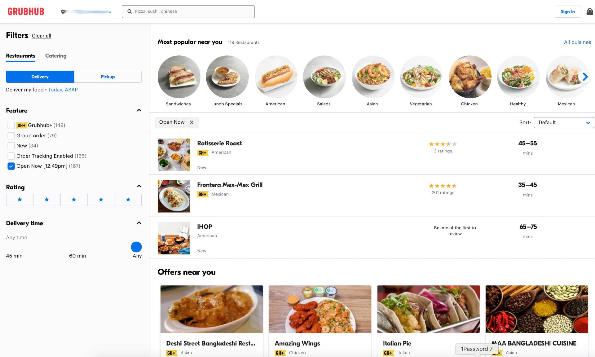
Grubhub example of aha moment
Grubhub's homepage
Grubhub homepage example of aha moment by narrowing choices


Like Canva, Grubhub keeps its onboarding process frictionless. New users don’t have to sign up for the product to complete a search.

Grubhub’s onboarding couldn’t be simpler. All they ask for is the user’s street address, which people expect to submit since the service is for food delivery. Once Grubhub gets that info, new users see the product’s value immediately.

Get started

We'll help users discover your product's aha moment faster

  • Increase user engagement
  • Help users get more out of your product
Aha moment user onboarding


3. Headspace

Aha moment: Users reach the aha moment at the end of Headspace’s onboarding routine once they’ve completed a survey. Normally, an aha moment at the end of onboarding is a no-no. But in the case of Headspace, the aha moment has to happen at the end of onboarding to provide the new user a personalized experience.

The new user onboarding is a completely personalized experience for those who sign up for Headspace’s free trial—plus, it only takes a couple of minutes to complete.
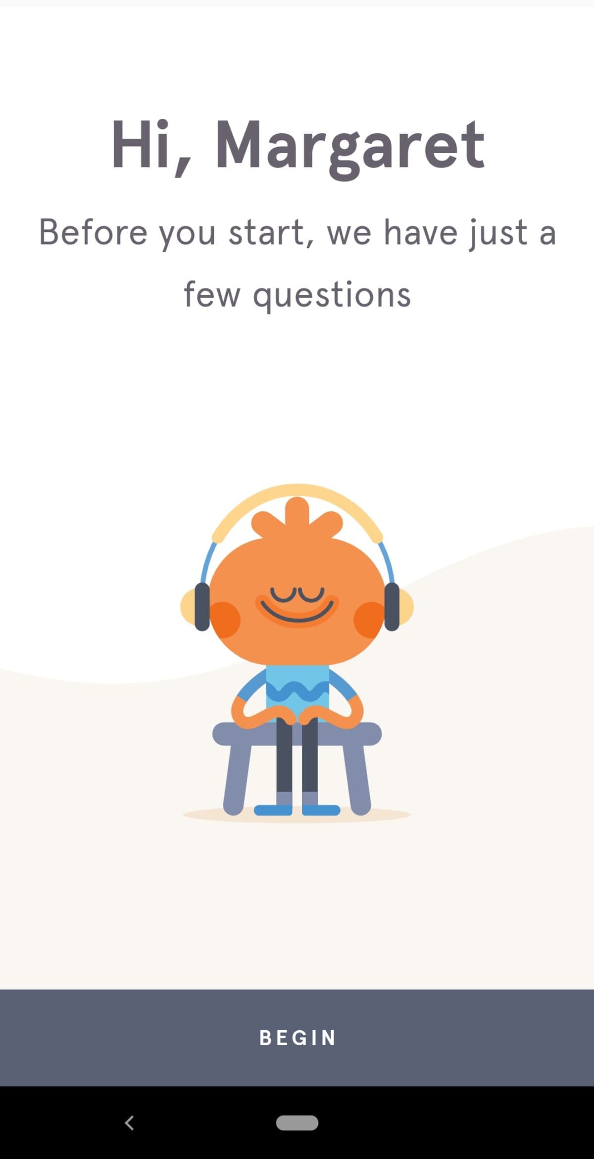
Headspace aha moment example

After signing up, Headspace takes users through a series of questions to create individualized plans for each user.
Headspace onboarding flows to drive a personalized experience

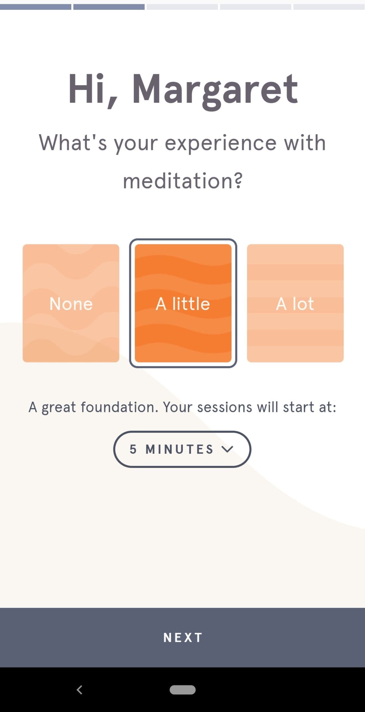
Headspace asks users about their previous meditation experience and recommends a length of time for their first sessions.
Headspace questions to drive a better onboarding

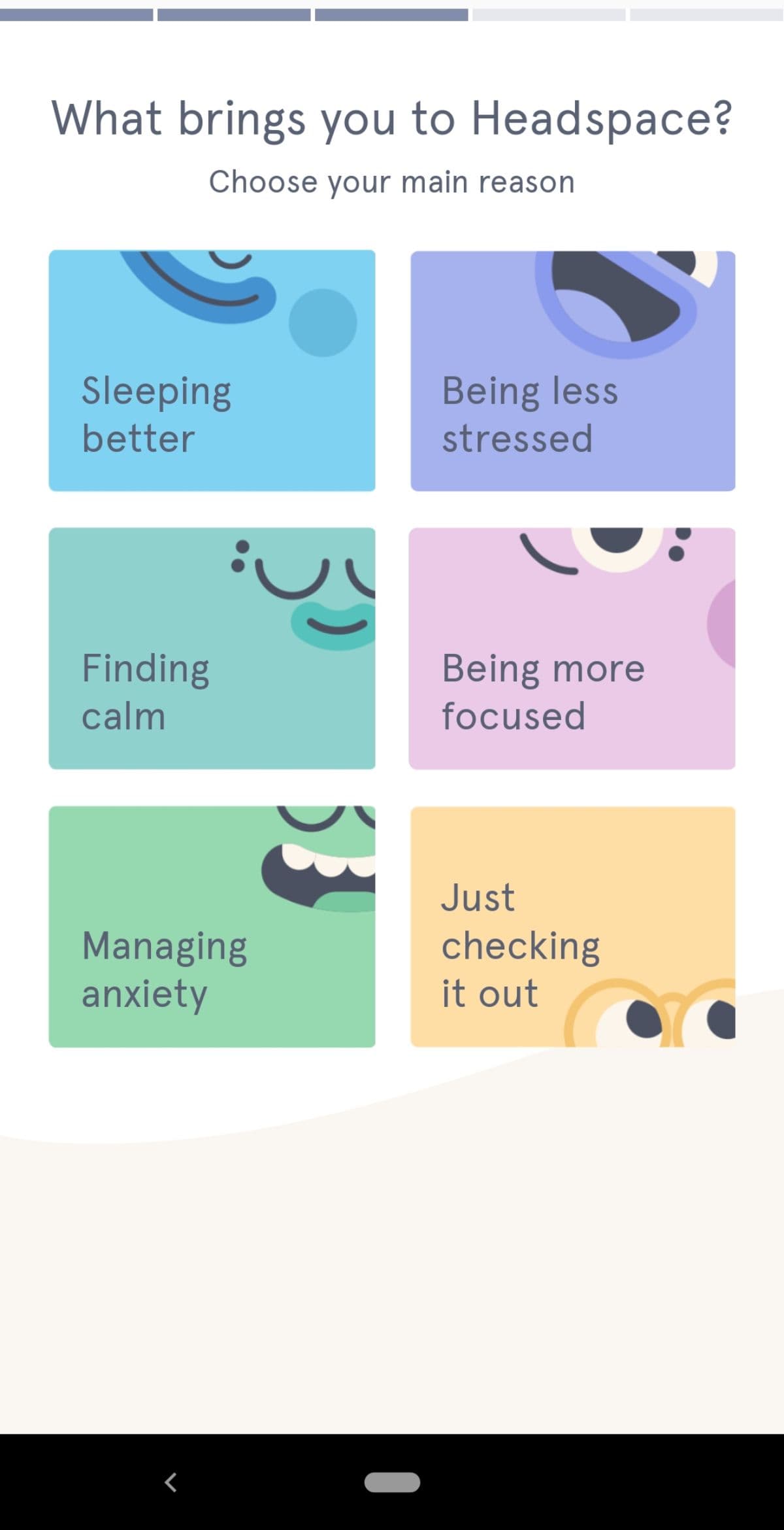
In the next step, users choose from six different options that express their motivation for trying the Headspace app.  
Headspace user onboarding flows
Headspace aha moment example

The last two questions focus on the user’s preferred meditation schedule. The user’s options include common activities people perform during their morning or evening routines.
Headspace recap questions in user onboarding flows

After answering the onboarding questions, Headspace users reach the aha moment; users get a personalized recap of their guided meditation plan and can get started with their new meditation right away.

This personalization is critical since meditation is a deeply personal practice. If the product’s promised value is that it offers guided meditations to help people achieve their wellness goals, then Headspace must take the time to understand users’ unique needs.

4. Sprout Social

Aha moment: New Sprout Social users immediately find their aha moment through a product demo tour. During the onboarding process, users are able to quickly see the value Sprout Social brings to their social media management toolkit using their company's data to make it even more impactful.

In the tool’s onboarding process, new users attach their social accounts and share details about their social media experience and goals.

Sprout Social removes friction here by saving users the extra step of inputting or importing their own data. Users get to play around and check out the product’s  features using a fake data set. This frictionless onboarding flattens the learning curve and gets new users to the aha moment quickly.

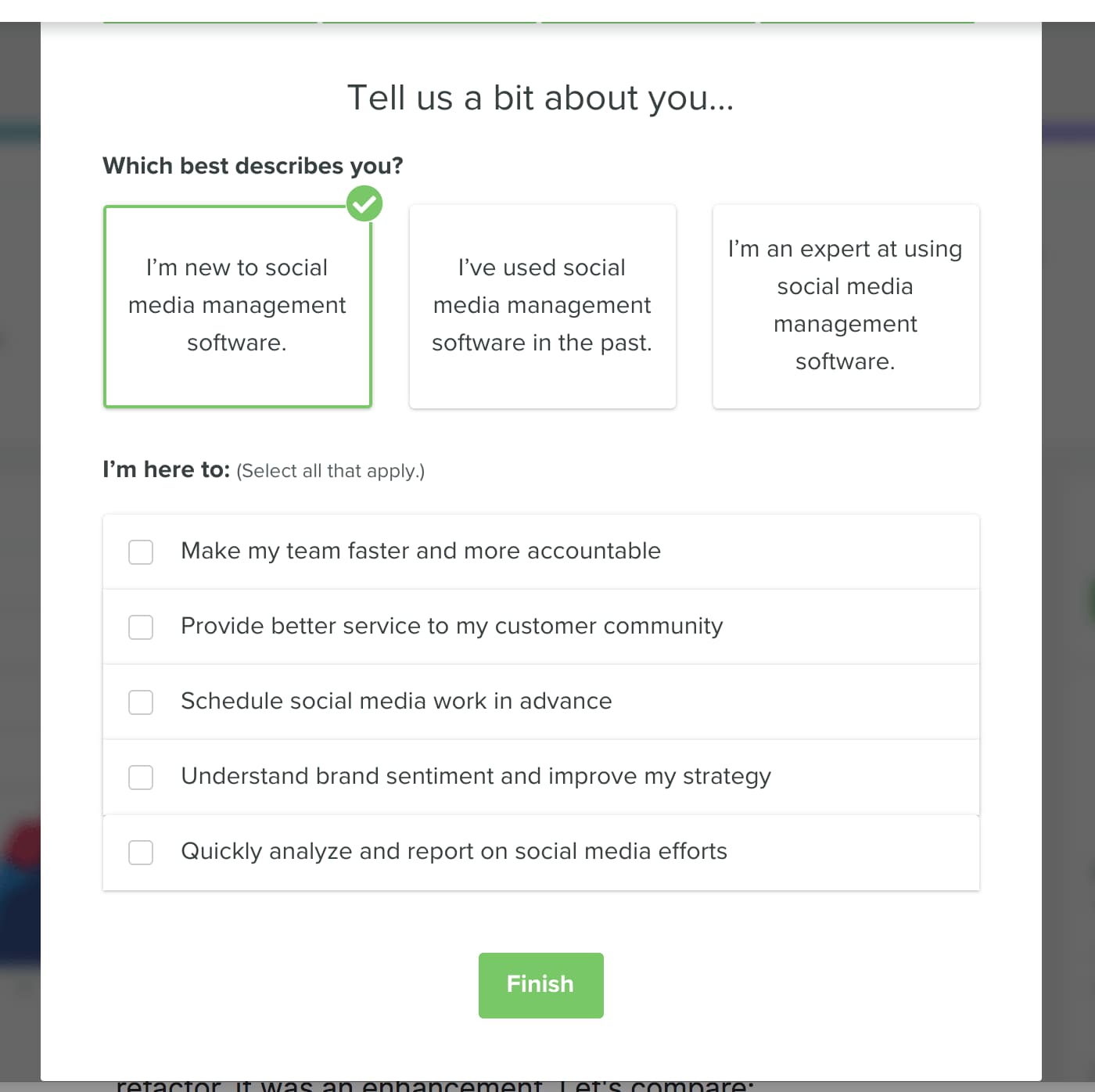
Sprout social aha moment explained
Sprout social user onboarding questions for personalization

From there, Sprout Social takes users to a demo report.

Sprout social demo report aha moment example


Sprout Social removes friction here by saving users the extra step of inputting or importing their own data. Users get to play around and check out the product’s  features using a fake data set. This frictionless onboarding flattens the learning curve and gets new users to the aha moment quickly.

Aha moments at work

Aha moments vary from product to product. Grubhub’s aha moment meant giving users a wide range of choices, while Headspace narrowed down options based on a user’s individual needs. Finding your product’s aha moment takes a bit of effort—but when done right, it’s worth it.

You know your product so well that you can wax rhapsodic about its value forever. But your new customers don’t want to hear about how great your product is; they want to experience it for themselves.

As you work toward discovering your product’s aha moment, remember to zero in on the activation event you want users to complete. This key event is the foundation for your aha moment because it sets the stage for future long-term user engagement. You should also speak to both your churned and existing users to gain valuable insights into if and when they reached the aha moment. This customer feedback will also help you personalize onboarding and get users to that eureka moment faster.

Strengthen your onboarding with your own aha moment examples


If you’re ready to get deep into the nitty-gritty of finding aha moments during user onboarding, you can learn more in The aha moment guide: How to find, optimize, and design for your product’s aha moment.

An aha moment for your user is a tada! moment for your business, opening the door for a long-lasting relationship between your user base and your brand.

Author's picture
Ramli John
Director of Content at Appcues
Ramli John is the Director of Content at Appcues and author of the bestselling book Product-Led Onboarding. He’s also a PLG Coach at ProductLed, where he’s worked with Mixpanel, Microsoft, and more to accelerate their growth.
You might also like...