← Visit Appcues.com
×
×

8 mission-critical user onboarding lessons from 8 top product people

One of the best ways to design your user onboarding flow is to look at what successful companies are doing. The problem with this...
Skip to section:

Skip to section:

One of the best ways to design your user onboarding flow is to look at what successful companies are doing. The problem with this strategy is that while it’s easy to see what they’ve done, it’s much more difficult to put a finger on how they got there. 

To get a behind-the-scenes look at how some of the user onboarding best practices actually came into being, we reached out directly to the people responsible for them. We asked them a simple question: “What’s the one single most important change you’ve made to user onboarding?”

Here’s what they said. 
1. Break Down the Steps

quick-sprout.jpeg

When it comes to user onboarding, there’s a lot of different steps that users have to walk through, and each one is an opportunity to either surprise and engage them, or to let them fall by the wayside and get lost in the dark. Onboarding presents an excellent opportunity to find out more about your users, either through email capture, or social media sign-on—but each of these points adds a layer of friction to the onboarding process that may ultimately drive users away. 

As Ian Main, product designer at Quick Sprout says, 

Ian_Main.jpeg

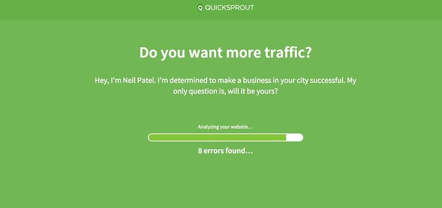
   “The single most important thing we've done to improve user onboarding is to split our onboarding up into more bite-sized smaller steps. There are very few, if not just a single option for people to fill out or enter in information at each step. This has enabled us to measure our user onboarding funnel more granularly and has made it easier to move the steps around when we are trying to optimize the funnel.”

Main notes that it’s very hard to actually get people to give out personal information, such as email addresses and social profiles—especially when they’re getting to know you during onboarding. Quick Sprout’s onboarding genius lies in that instead of paring down on onboarding, it added more steps. It provides a variety of different touch points where new users can engage with the product and provide personal information—and it fundamentally ties this back to the core value of the product.

By entering in your URL, on the landing page, for example, Quick Sprout asks you to login through Google to manage the specific blog you’re trying to optimize. Users who are wary of this, however, have a different option: they can click the “Start Here” call-to-action on the landing page, which scans a website for errors—before being directed to a page that asks for their name, email address and marketing budget. 

Discover more product design insights from Ian's Twitter feed. 
2. Become Your New User’s Best Friend

idonethis.jpeg

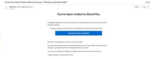
As a productivity management tool, iDoneThis relies on getting users to adopt the app into their existing habits and workflows, and this fundamentally begins with onboarding. 

As Teri Wilson, CEO at iDoneThis points out:

0f18231.jpg

   “When it comes to onboarding, we’ve found that the most important thing is to always be available. Might sound like we're trying to be your significant other but we want to be your life partner at work. We want to make sure our users know not just our tool but that we can help them implement best practices within their team. That comes through calls, demos and hyper-support.

It’s not just that iDoneThis  helps customers work better—in order to fully receive value from the app, the entire team has to get on board and commit to making their processes and workflows more efficient and effective. iDoneThis achieves this through a high-touch customer engagement model throughout onboarding and beyond, that focuses on unfurling the higher-level benefits of productivity—and iDoneThis— in the workplace. 

Get weekly productivity tips and process insights from the iDoneThis blog.
3. Show Value Immediately

close.io-sales-crm-onboarding.png

Reducing friction during user onboarding is one of the most important things you can do. Make it easy for users to figure out how to use your app, and they’ll associate the great experience with how they use your app at-large. Often times, however, it’s the small things that can create the most friction and throw up roadblocks against user engagement.

For Phil Freo, Engineering and Product lead at Close.io, this was an essential part of improving user onboarding:

Phil_Freo.jpeg

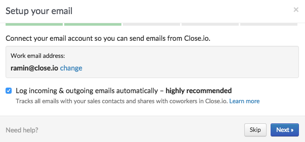
   “The single most important thing we've done for onboarding in our product is to try to eliminate making users do hard work, so they can start to see value from the product with minimal effort. One example of this is setting up Close.io's two-way email sync, which used to require visiting an email settings page and entering email server credentials (IMAP and SMTP host, ports, username, password), which almost nobody knows. 

We redesigned this so upon signup we automatically detect their email server based on their address, and for Google users it's just a one click authorization to setup the sync. We also made it really easy to import your existing CRM data into Close.io. So now a user can signup, get some leads in the system right away, and immediately see value from Close.io since we will instantly pull in old email communication for each lead.

Close.io is a sales CRM that focuses on reducing manual data-entry, to allow salespeople to do what their best at—closing sales. When it comes to the onboarding flow, getting new users to import contact and CSV files into the CRM is a key measure of activation—without leads, the value of the product is neutered. By automating how users can important their email addresses and contact lists, Close.io gets new users to the aha! moment of activation that much faster.

Get in touch with Phil on Twitter or LinkedIn

4. ‘Design for the Novice, Configure for the Pro'

status-page-io.jpeg

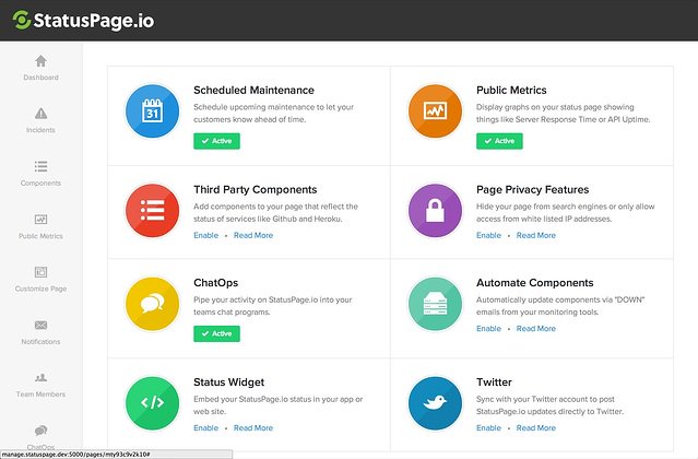
StatusPage.io provides a status page for companies that reports downtime and other metrics, like server response time, to their customers in real time. The tool allows companies to communicate to customers both problems, and how they’re being resolved—on the site, through email, and over text message.

StatusPage has a complex product that could potentially be very difficult to onboard—it fills a variety of needs and services, with a variety of public metrics, custom CSS, and Status API. But it’s a universal truth that not all customers need to use every feature, and seeing a mass of features the first time a user logins can be overwhelming. 

Steve Klein, co-founder of StatusPage, highlights his creative solution to this problem:

cf2f2201c7575405244ef88e500e9c5b_400x400.jpeg

   “Rather than bundle all of our features into the onboarding process, we created an ‘add-on store’ that users could visit later to enhance or turn on features that aren't part of the core experience of the product. These are valuable features, but throwing them all at users who haven’t even started using the core product yet was really muddying up the onboarding flow. By putting these features in a different space altogether, we really sped up our onboarding process and got new users seeing positive value from the product in a quicker, simpler way. 

I have to give credit to Mark Suster, as his ‘design for the novice, configure for the pro’  philosophy really inspired this decision for us. We want newbies to be able to dive into the product right away, and we want more advanced users to configure the extra bells and whistles all they want.”

With this “add-on” store, StatusPage doesn’t strip away from the functionality of it’s product for expert users, but at the same time stops feature creep in its tracks. Through this “add-on” store, the onboarding process is simplified to the bare-bones essentials, while new users are able to cherry pick the range of features they need to be successful.  

Keep up to date with Steve on Twitter.
5. Dig into Your Activation Metric

wistia.jpeg

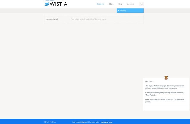
When it comes to user onboarding best practices, it’s absolutely crucial that you double down on user behaviors and patterns that correspond to long-term retention. A small lift to week 1 retention cascades across your entire rentention curve. This is a fundamental truth that Wistia, a video-hosting for businesses product, grasps in its approach to user onboarding.

As Andrew Capland, Wistia Growth Team Lead, notes:

andrew-capland.jpeg

   “The most important thing we've done to improve our user onboarding was to define our activation metric and get serious about tracking the inputs to that metric. Agreeing on what a successfully "activated" account looked like, and understanding all the individual actions to get there, allowed us to take our new user onboarding to the next level. We formed a cross-functional team dedicated to increasing that metric. 

The team is able to clearly prioritize ideas and projects since we all agree what success looks like. That activation metric is paying huge dividends to our users and our company.

Capland makes the crucial point that if you don’t know what it takes for a user to be successful, you’re lost in the ocean. When you’re dealing with a whole crowd of users, and large amounts of data, there’s a lot of noise to get lost in. To successfully streamline your onboarding procedure, you need to be able to figure out how to make customers successful—and then your whole team can focus on getting them there.

Follow Andrew on Twitter.
6. Send Highly-Targed Messages

process-street.jpeg

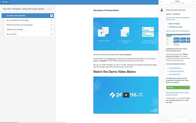
Process Street, a checklist and workflow management tool, uses a variety of different strategies to onboard new users, from implementing onboarding videos, to tutorials, to in-app messaging

As Vinay Patankar, CEO and co-founder of Process Street says,

vinnay-patankar.jpeg

   “I want to highlight a couple things that have worked particularly effectively for Process Street. First, Intercom or any similar tool allows you to send in-app targeted messages on specific pages, based on specific actions that users take. For example, when people go to Process Street’s scheduled checklist page, we have a message that pops-up and basically explains how scheduled checklists work. If we see that people have run a checklist without naming it, another message explains how checklists work and how naming them work.

What’s crucial is getting those really targeted messages in, and not trying to each everyone every feature in a welcome tour—but actually show them how as they’re going through the product and using those features. We also use messages that allow new users to reply to directly to us and engage with support.”

A carefully thought-out messaging strategy is crucial to getting users swiftly onboarded and into the core functionality of your product. Patankar points out that different users prefer to learn about an app in different ways, and that during your user onboarding flow, you have to be able to cover the entire spectrum.

 What’s key to the success of Process Street’s onboarding flow, however, is making sure that users get the information they need at the right time—when they’re about to use a specific feature or tool. 

Find Vinay on Twitter.
7. Watch and Learn 

scribble-post.jpeg

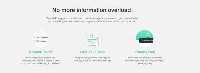
When it comes to user onboarding, product people are often too close to the subject to give it the objective eye it needs—while it’s the actual users of an app who have the insight necessary to craft a successful user onboarding strategy. It’s something that ScribblePost, a soon-to-be-launched productivity network and platform, is particularly attuned to, and they’ve been paying particular attention to optimizing user onboarding pre-launch. 

Alon Novy, CEO of ScribblePost breaks down their onboarding design methodology:

alon-novy.jpg

   “The most important user onboarding strategy we applied at ScribblePost was to undergo an extended period in which we conducted observed trials. In the observed trials, our entire team would closely observe prospective users explore the software without any explanation as to what the purpose of the software was, and without any instructions on how to operate the software. Afterwards, our subjects were asked to explain the purpose and benefit of the software as well as to explain how to use the software.

After a series of such trials we would identify the biggest difficulties faced by our subjects, and then we would iterate the software to make it more inherently intuitive, specifically in an effort to overcome the identified difficulties. Then we would repeat the observed trials with a new cohort of people, taking note of which difficulties had disappeared as a result of the last set of changes.

Then—and only then —did we set about building a formal onboarding system. This allowed us to build a compact and fast onboarding experience, despite the fact that ScribblePost is highly sophisticated and feature-rich.

By conducting bare-bones user testing, ScribblePost is able to get to how users organically experience and dive into an app, without any user onboarding whatsoever. Through rigorously testing various cohorts of “trial subjects” with a blank slate the product team at ScribblePost was able to get behind users intuitively explore the app, and build an onboarding flow around these behaviors.

Reach Alon on Twitter.

8. Look to the Long Game

appcues-screenshot.jpeg

Product people need to be able to isolate the stickiest features of an app, and then quickly drive users towards them during the user onboarding. But what we often forget is that real user engagement isn’t just about metrics—it comes from the actual users behind those metrics. 

Jackson Noel, Co-Founder here at Appcues says:

jackson-noel.jpg

   “The single most important thing we've done for onboarding is planning past the first session. Let's say you have a SaaS application and know that new users who take actions X, Y, and Z end up being really successful.

It's tempting to build a linear new user flow that encourages them to take these 3 actions then call it a day. But that's just not how humans evaluate software - most of them will hardly complete one of the three actions in their first session. So what happens when they come back 5 days later and they have completed Y but not X or Z? 

Planning past the first session matches your funnel to your buyer's decision making process. It means aligning your in-product experiences, email campaigns and sales/customer success outreach to reinforce the user's success path.

There’s far more to implementing user onboarding best practices than just driving users through a series of predetermined key actions, and it’s something we’ve learned well at Appcues. All your various business goals need to align and culminate during user onboarding.  

Hit Jackson up on Twitter, and sign up for the Appcues Blog’s mailing list to get fresh, weekly insights on user onboarding. 

There’s No Silver Bullet to User Onboarding

Conducting user onboarding is always challenging. The stakes are high, and it’s easy to slip up. The real secret to an airtight user onboarding flow is that there’s no secret. There’s no one-size-fits-all solution, no silver bullet that will pave the way for long-term retention and customer success. 

What the most successful product managers realize is that user onboarding is a continually ongoing process, that needs to be constantly measured, tweaked, and iterated upon. Understanding that will allow you to implement these critical learnings into your own user onboarding procedure, and turn new users into paying customers who will actually stick around. 

Ty Magnin
Skip to section:

Skip to section:

One of the best ways to design your user onboarding flow is to look at what successful companies are doing. The problem with this strategy is that while it’s easy to see what they’ve done, it’s much more difficult to put a finger on how they got there. 

To get a behind-the-scenes look at how some of the user onboarding best practices actually came into being, we reached out directly to the people responsible for them. We asked them a simple question: “What’s the one single most important change you’ve made to user onboarding?”

Here’s what they said. 

1. Break Down the Steps

quick-sprout.jpeg

When it comes to user onboarding, there’s a lot of different steps that users have to walk through, and each one is an opportunity to either surprise and engage them, or to let them fall by the wayside and get lost in the dark. Onboarding presents an excellent opportunity to find out more about your users, either through email capture, or social media sign-on—but each of these points adds a layer of friction to the onboarding process that may ultimately drive users away. 

As Ian Main, product designer at Quick Sprout says, 

Ian_Main.jpeg

   “The single most important thing we've done to improve user onboarding is to split our onboarding up into more bite-sized smaller steps. There are very few, if not just a single option for people to fill out or enter in information at each step. This has enabled us to measure our user onboarding funnel more granularly and has made it easier to move the steps around when we are trying to optimize the funnel.”

Main notes that it’s very hard to actually get people to give out personal information, such as email addresses and social profiles—especially when they’re getting to know you during onboarding. Quick Sprout’s onboarding genius lies in that instead of paring down on onboarding, it added more steps. It provides a variety of different touch points where new users can engage with the product and provide personal information—and it fundamentally ties this back to the core value of the product.

By entering in your URL, on the landing page, for example, Quick Sprout asks you to login through Google to manage the specific blog you’re trying to optimize. Users who are wary of this, however, have a different option: they can click the “Start Here” call-to-action on the landing page, which scans a website for errors—before being directed to a page that asks for their name, email address and marketing budget. 

Discover more product design insights from Ian's Twitter feed. 

2. Become Your New User’s Best Friend

idonethis.jpeg

As a productivity management tool, iDoneThis relies on getting users to adopt the app into their existing habits and workflows, and this fundamentally begins with onboarding. 

As Teri Wilson, CEO at iDoneThis points out:

0f18231.jpg

   “When it comes to onboarding, we’ve found that the most important thing is to always be available. Might sound like we're trying to be your significant other but we want to be your life partner at work. We want to make sure our users know not just our tool but that we can help them implement best practices within their team. That comes through calls, demos and hyper-support.

It’s not just that iDoneThis  helps customers work better—in order to fully receive value from the app, the entire team has to get on board and commit to making their processes and workflows more efficient and effective. iDoneThis achieves this through a high-touch customer engagement model throughout onboarding and beyond, that focuses on unfurling the higher-level benefits of productivity—and iDoneThis— in the workplace. 

Get weekly productivity tips and process insights from the iDoneThis blog.

3. Show Value Immediately

close.io-sales-crm-onboarding.png

Reducing friction during user onboarding is one of the most important things you can do. Make it easy for users to figure out how to use your app, and they’ll associate the great experience with how they use your app at-large. Often times, however, it’s the small things that can create the most friction and throw up roadblocks against user engagement.

For Phil Freo, Engineering and Product lead at Close.io, this was an essential part of improving user onboarding:

Phil_Freo.jpeg

   “The single most important thing we've done for onboarding in our product is to try to eliminate making users do hard work, so they can start to see value from the product with minimal effort. One example of this is setting up Close.io's two-way email sync, which used to require visiting an email settings page and entering email server credentials (IMAP and SMTP host, ports, username, password), which almost nobody knows. 

We redesigned this so upon signup we automatically detect their email server based on their address, and for Google users it's just a one click authorization to setup the sync. We also made it really easy to import your existing CRM data into Close.io. So now a user can signup, get some leads in the system right away, and immediately see value from Close.io since we will instantly pull in old email communication for each lead.

Close.io is a sales CRM that focuses on reducing manual data-entry, to allow salespeople to do what their best at—closing sales. When it comes to the onboarding flow, getting new users to import contact and CSV files into the CRM is a key measure of activation—without leads, the value of the product is neutered. By automating how users can important their email addresses and contact lists, Close.io gets new users to the aha! moment of activation that much faster.

Get in touch with Phil on Twitter or LinkedIn

4. ‘Design for the Novice, Configure for the Pro'

status-page-io.jpeg

StatusPage.io provides a status page for companies that reports downtime and other metrics, like server response time, to their customers in real time. The tool allows companies to communicate to customers both problems, and how they’re being resolved—on the site, through email, and over text message.

StatusPage has a complex product that could potentially be very difficult to onboard—it fills a variety of needs and services, with a variety of public metrics, custom CSS, and Status API. But it’s a universal truth that not all customers need to use every feature, and seeing a mass of features the first time a user logins can be overwhelming. 

Steve Klein, co-founder of StatusPage, highlights his creative solution to this problem:

cf2f2201c7575405244ef88e500e9c5b_400x400.jpeg

   “Rather than bundle all of our features into the onboarding process, we created an ‘add-on store’ that users could visit later to enhance or turn on features that aren't part of the core experience of the product. These are valuable features, but throwing them all at users who haven’t even started using the core product yet was really muddying up the onboarding flow. By putting these features in a different space altogether, we really sped up our onboarding process and got new users seeing positive value from the product in a quicker, simpler way. 

I have to give credit to Mark Suster, as his ‘design for the novice, configure for the pro’  philosophy really inspired this decision for us. We want newbies to be able to dive into the product right away, and we want more advanced users to configure the extra bells and whistles all they want.”

With this “add-on” store, StatusPage doesn’t strip away from the functionality of it’s product for expert users, but at the same time stops feature creep in its tracks. Through this “add-on” store, the onboarding process is simplified to the bare-bones essentials, while new users are able to cherry pick the range of features they need to be successful.  

Keep up to date with Steve on Twitter.

5. Dig into Your Activation Metric

wistia.jpeg

When it comes to user onboarding best practices, it’s absolutely crucial that you double down on user behaviors and patterns that correspond to long-term retention. A small lift to week 1 retention cascades across your entire rentention curve. This is a fundamental truth that Wistia, a video-hosting for businesses product, grasps in its approach to user onboarding.

As Andrew Capland, Wistia Growth Team Lead, notes:

andrew-capland.jpeg

   “The most important thing we've done to improve our user onboarding was to define our activation metric and get serious about tracking the inputs to that metric. Agreeing on what a successfully "activated" account looked like, and understanding all the individual actions to get there, allowed us to take our new user onboarding to the next level. We formed a cross-functional team dedicated to increasing that metric. 

The team is able to clearly prioritize ideas and projects since we all agree what success looks like. That activation metric is paying huge dividends to our users and our company.

Capland makes the crucial point that if you don’t know what it takes for a user to be successful, you’re lost in the ocean. When you’re dealing with a whole crowd of users, and large amounts of data, there’s a lot of noise to get lost in. To successfully streamline your onboarding procedure, you need to be able to figure out how to make customers successful—and then your whole team can focus on getting them there.

Follow Andrew on Twitter.

6. Send Highly-Targed Messages

process-street.jpeg

Process Street, a checklist and workflow management tool, uses a variety of different strategies to onboard new users, from implementing onboarding videos, to tutorials, to in-app messaging

As Vinay Patankar, CEO and co-founder of Process Street says,

vinnay-patankar.jpeg

   “I want to highlight a couple things that have worked particularly effectively for Process Street. First, Intercom or any similar tool allows you to send in-app targeted messages on specific pages, based on specific actions that users take. For example, when people go to Process Street’s scheduled checklist page, we have a message that pops-up and basically explains how scheduled checklists work. If we see that people have run a checklist without naming it, another message explains how checklists work and how naming them work.

What’s crucial is getting those really targeted messages in, and not trying to each everyone every feature in a welcome tour—but actually show them how as they’re going through the product and using those features. We also use messages that allow new users to reply to directly to us and engage with support.”

A carefully thought-out messaging strategy is crucial to getting users swiftly onboarded and into the core functionality of your product. Patankar points out that different users prefer to learn about an app in different ways, and that during your user onboarding flow, you have to be able to cover the entire spectrum.

 What’s key to the success of Process Street’s onboarding flow, however, is making sure that users get the information they need at the right time—when they’re about to use a specific feature or tool. 

Find Vinay on Twitter.

7. Watch and Learn 

scribble-post.jpeg

When it comes to user onboarding, product people are often too close to the subject to give it the objective eye it needs—while it’s the actual users of an app who have the insight necessary to craft a successful user onboarding strategy. It’s something that ScribblePost, a soon-to-be-launched productivity network and platform, is particularly attuned to, and they’ve been paying particular attention to optimizing user onboarding pre-launch. 

Alon Novy, CEO of ScribblePost breaks down their onboarding design methodology:

alon-novy.jpg

   “The most important user onboarding strategy we applied at ScribblePost was to undergo an extended period in which we conducted observed trials. In the observed trials, our entire team would closely observe prospective users explore the software without any explanation as to what the purpose of the software was, and without any instructions on how to operate the software. Afterwards, our subjects were asked to explain the purpose and benefit of the software as well as to explain how to use the software.

After a series of such trials we would identify the biggest difficulties faced by our subjects, and then we would iterate the software to make it more inherently intuitive, specifically in an effort to overcome the identified difficulties. Then we would repeat the observed trials with a new cohort of people, taking note of which difficulties had disappeared as a result of the last set of changes.

Then—and only then —did we set about building a formal onboarding system. This allowed us to build a compact and fast onboarding experience, despite the fact that ScribblePost is highly sophisticated and feature-rich.

By conducting bare-bones user testing, ScribblePost is able to get to how users organically experience and dive into an app, without any user onboarding whatsoever. Through rigorously testing various cohorts of “trial subjects” with a blank slate the product team at ScribblePost was able to get behind users intuitively explore the app, and build an onboarding flow around these behaviors.

Reach Alon on Twitter.

8. Look to the Long Game

appcues-screenshot.jpeg

Product people need to be able to isolate the stickiest features of an app, and then quickly drive users towards them during the user onboarding. But what we often forget is that real user engagement isn’t just about metrics—it comes from the actual users behind those metrics. 

Jackson Noel, Co-Founder here at Appcues says:

jackson-noel.jpg

   “The single most important thing we've done for onboarding is planning past the first session. Let's say you have a SaaS application and know that new users who take actions X, Y, and Z end up being really successful.

It's tempting to build a linear new user flow that encourages them to take these 3 actions then call it a day. But that's just not how humans evaluate software - most of them will hardly complete one of the three actions in their first session. So what happens when they come back 5 days later and they have completed Y but not X or Z? 

Planning past the first session matches your funnel to your buyer's decision making process. It means aligning your in-product experiences, email campaigns and sales/customer success outreach to reinforce the user's success path.

There’s far more to implementing user onboarding best practices than just driving users through a series of predetermined key actions, and it’s something we’ve learned well at Appcues. All your various business goals need to align and culminate during user onboarding.  

Hit Jackson up on Twitter, and sign up for the Appcues Blog’s mailing list to get fresh, weekly insights on user onboarding. 

There’s No Silver Bullet to User Onboarding

Conducting user onboarding is always challenging. The stakes are high, and it’s easy to slip up. The real secret to an airtight user onboarding flow is that there’s no secret. There’s no one-size-fits-all solution, no silver bullet that will pave the way for long-term retention and customer success. 

What the most successful product managers realize is that user onboarding is a continually ongoing process, that needs to be constantly measured, tweaked, and iterated upon. Understanding that will allow you to implement these critical learnings into your own user onboarding procedure, and turn new users into paying customers who will actually stick around. 

Ty Magnin
You might also like...