How to write awesome product launch emails (+14 examples)
.png)

.png)
You’ve poured your blood, sweat, and tears into a new product. You release the product into the world and send out an email announcement... only to get a lukewarm reception, which may leave you wondering: what went wrong?
Too many great products have flopped because of a lousy release. After doing so much work to get to launch day, companies sometimes make the mistake of treating a product launch email as an afterthought. You know the value of your new product inside and out, so you assume that customers will instantly see its value, too, and be thrilled to try it out.
The reality is that email inboxes are flooded. To get your message across, you need product launch emails—yes, plural—that pique the interest of your audience and get them excited about what you’re offering.
A product launch email is an email a company sends to its customers or subscribers announcing either a new product or a feature and offering adequate details about the launch. The idea is to provide insight into how the new product update can benefit current and potential customers.
A good product launch email reveals just enough to boost awareness and pique curiosity.
That said, there are actually different types of product launch emails that each have a distinct purpose.
The purpose of a product launch email may seem straightforward. You’re making an announcement about something new. But there are actually different types of product launch emails that each have a distinct purpose.
Each of these emails has a slightly different spin, but they’re all working toward the same goal of educating your customers about your new product and when it will be available.
Your product launch emails should catch your audience’s attention so that they want to learn more about your upcoming release. Making one aspect of your launch email compelling isn’t enough. You need to look at the entire campaign and make it engaging for a variety of users—from those who are eagerly waiting to those who barely know your brand.
Your product launch announcement should not occur in a single email, but rather a series of emails. If you send a single email, you risk your message being lost or not being memorable. The success of these emails has to do with both the timing and the messaging.
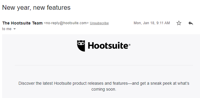
Take a look at this example from Hootsuite, one that is part of launch day and announces upcoming features. The company is grabbing its audience at the right moment by timing the release with a new year when people are typically thinking about trying new things.
Your email needs to stand out amidst hundreds of other emails in your readers’ inboxes. You want to create enough intrigue so that your audience wants to learn more.
Try writing at least 10 different subject lines. Or 25! The more you write, the greater your chances of creating a compelling subject line.
Use A/B testing to see if different subject lines generate different open rates. This will help you know what subject lines work best for future announcements.
Don’t forget about the preview text of your email body that follows your subject line. It’s often ignored, but this language needs to be compelling—just like subject lines—to captivate customers when they’re skimming their inboxes.
Take this subject line from Amplitude announcing a new product.
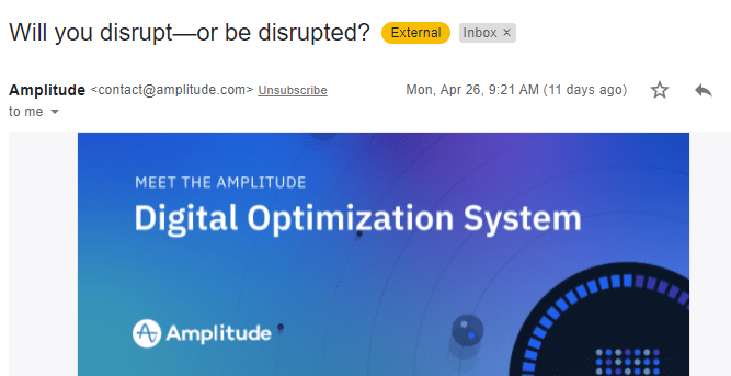
The subject line grabs the reader’s attention by forcing the reader to think about a choice: disrupt or be disrupted. The preview text provides more context about the announcement with the line “Introducing Amplitude Digital Optimization System.”
It may be tempting to stuff a bunch of details into your product launch emails, such as all of the new cool features your product has. But you’ll want to keep it brief so you don’t lose your audience’s attention. Your emails should be a concise reflection of your brand and your audience.
Project management software Asana chose to announce several new features in a single email.
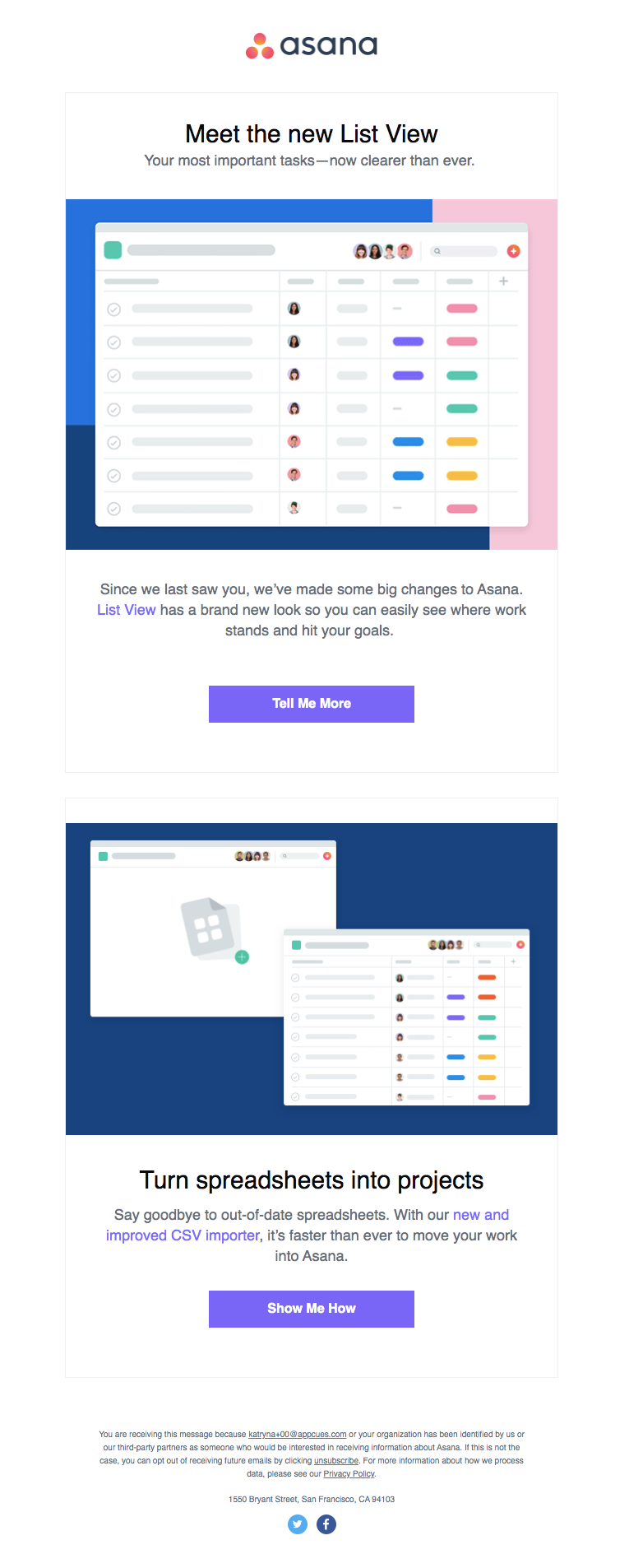
This product launch email has all of the right elements: a brief intro, a visual, a link to another resource, and a CTA button.
Naturally, your email strategy will depend on your product and your relationship with your customers. Even though your own product launch emails should be a reflection of your brand, here are 14 examples that have elements to inspire you.
Apple has product launches down to a science. The promotional email for the release of AirPods Pro does a great job of highlighting each new feature.

What makes this a great product launch email:
Mailchimp offers marketing tools for small businesses, from email campaigns to landing pages and digital ads. The brand is defined by a conversational tone and a warm, friendly illustration style.
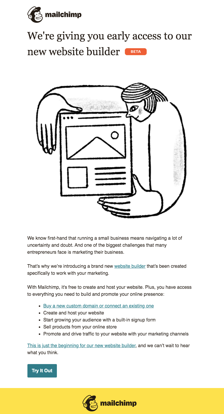
What makes this a great product launch email:
Grammarly is a popular writing and grammar-checking tool that ensures all of your correspondences are grammatically correct.

What makes this a great product launch email:
Everlane is an ecommerce company that prides itself on designing ethically made modern basics for everyday life.

What makes this a great product launch email:
Comrad designs compression socks for travel, work, and everyday wear. The key to the company’s success is that, unlike most compression socks on the market, Comrad’s products look like regular sporty socks to the unassuming observer.
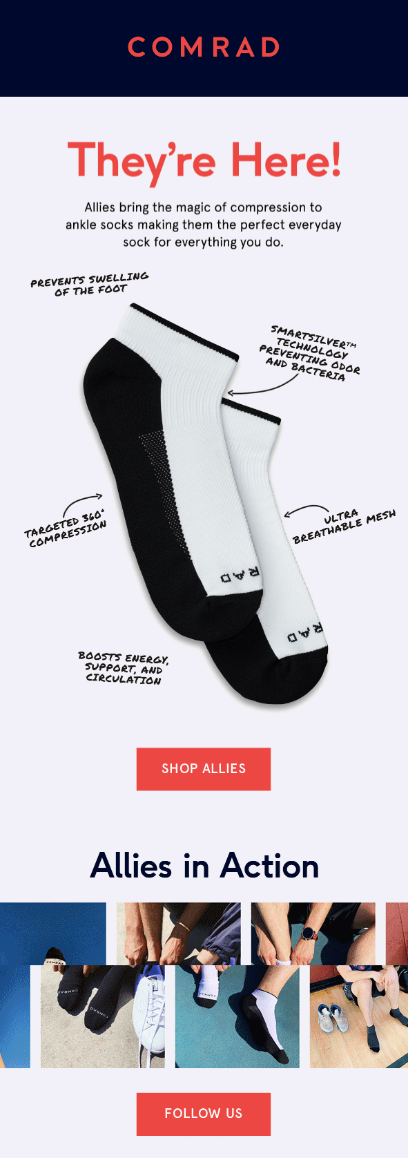
What makes this a great product launch email:
Venmo is a cashless, peer-to-peer exchange app that has an impressive 40 million users, more than most banks. Venmo’s cross-promotion product launch with Mastercard calls upon Venmo lovers to bring their cashless, digital transactions to the real-world.
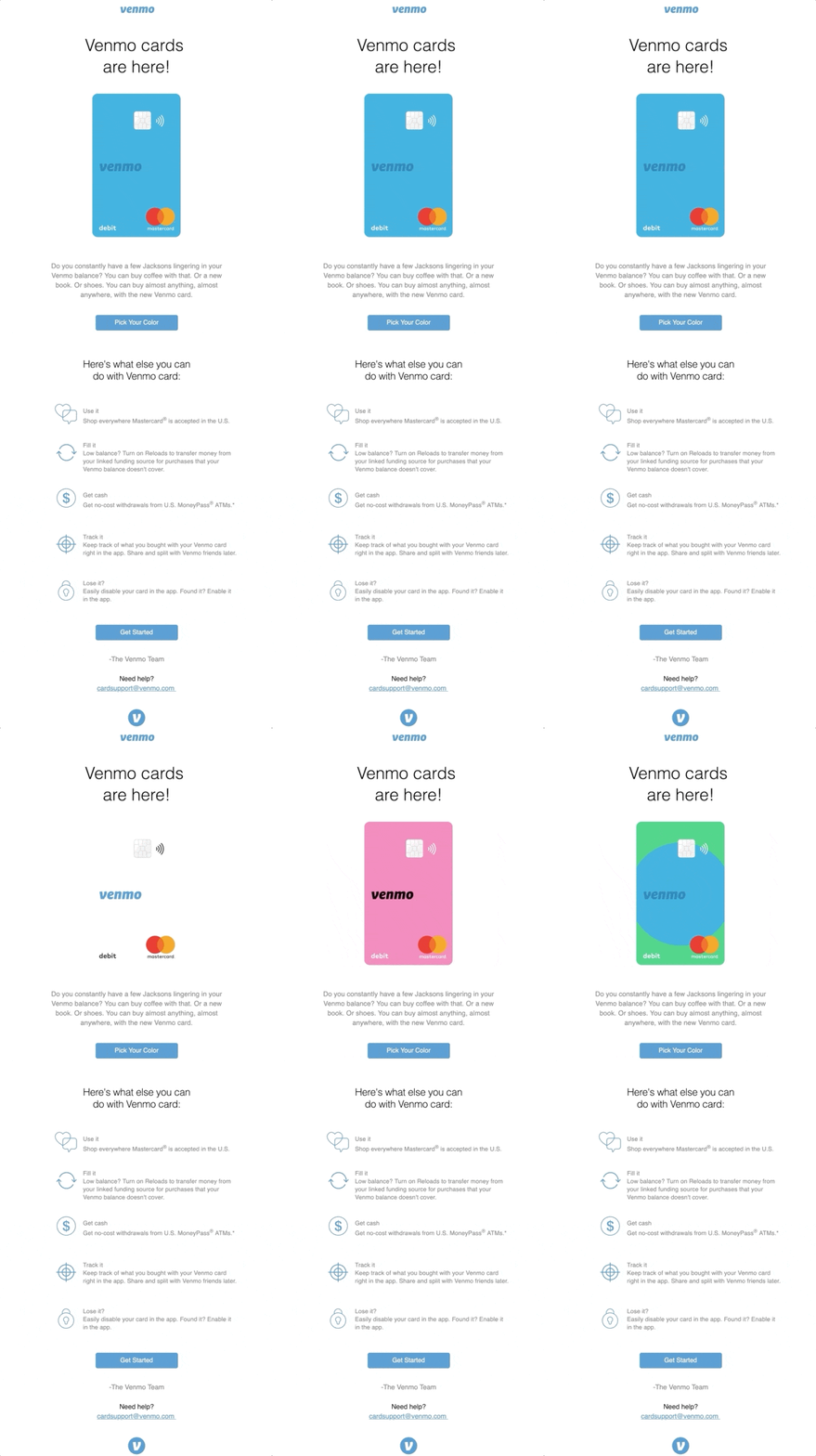
What makes this a great product launch email:
Blissfully allows companies to manage all of their technology assets and workflows in one comprehensive IT platform.
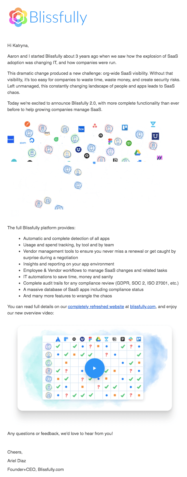
What makes this a great product launch email:
InVision gives designers the workspace they need to innovate, iterate and collaborate with team members.

What makes this a great product launch email:
Designmodo offers powerfully simple website and email design tools for businesses of any size.
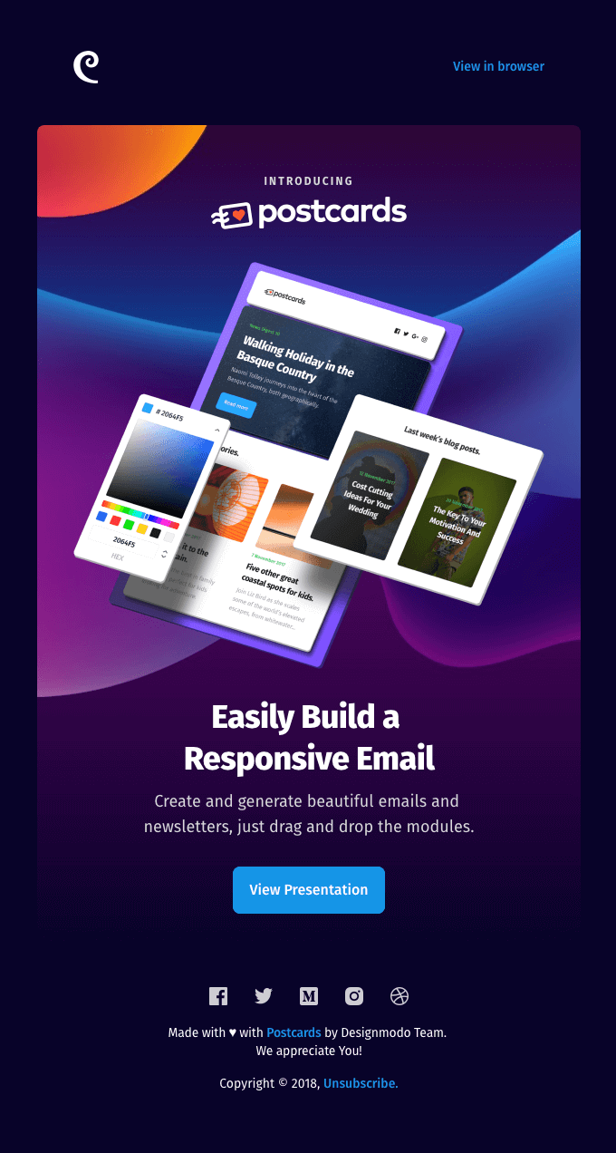
What makes this a great product launch email:
WeTransfer offers products that make it easy to share creative files. The product launch email for their mobile app, Collect, is one of our favorites on this list.
.png)
What makes this a great product launch email:
CraftCellr is a mobile app for beer lovers. CraftCellr users find local breweries and beer releases in their area, while connecting them to a community of fellow beer enthusiasts.

What makes this a great product launch email:
Billie is a subscription-based women’s razor company that promises high-quality, low-cost razor blades delivered straight to your door.

What makes this a great product launch email:
Airbnb started offering Adventures in 2019—fully planned overnight trips that include meals, activities, and (naturally) accommodations.

What makes this a great product launch email:
Of course, we have to include our own announcement as an example (😉). This email introduced our new Mobile feature.
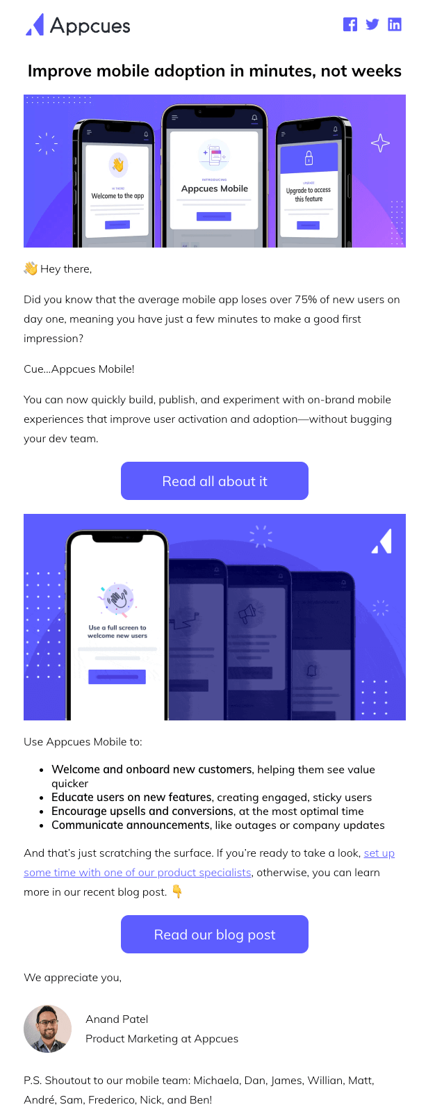
Why we're proud of this email:
These emails all have something essential in common. Hint: It's not the copy, or the tone, or even the call to action.
Every single one of these companies understands their users’ needs and is able to speak their language effectively. They focus on the value that each new product or feature provides. No matter which direction your own product launch emails take, make sure you’re connecting with your readers about what makes your product worthwhile.
The Appcues Product Launch Planner is an easy (and totally free!) way to get started. Answer 8 simple questions and we’ll give you a personalized and detailed timeline of everything you need to do to make sure that your next product launch is out of this world!
