← Visit Appcues.com
×
×

7 reasons even great UX needs user onboarding

A product designer explains why your great UX still needs onboarding, and how humble learning patterns can make your best UX even better.
Skip to section:

Skip to section:

There’s a myth among designers and product managers that sounds something like this: If you’re striving for a great user experience, you shouldn’t need onboarding.

We seem to have a stigma against learning support like tooltips, pop-ups, and guides, as though using them means we’ve somehow failed in our duties as custodians of a great UX and a simple product.

It’s high time that we not only let go of that myth, but flip it around and embrace the value of good learning patterns.

These patterns are your partners in creating a great user experience. The learning layer serves a unique role in your product—one that’s critical for new and loyal users alike.

Here are 7 reasons why thoughtful learning support makes even the best-designed user experience better.

1. Onboarding isn’t just about the UI

Designers tend to turn their noses up at onboarding patterns. And it makes sense: We're responsible for the quality of the UI, and adding a tooltip to a confusing button or having to explain how something works feels like a band-aid on a self-inflicted cut. Ouch.

But the funny thing about great initial experiences is that the best of them aren't about the UI at all. These experiences are often found in products that are already known for their intuitive and consistent interface.

All on their own, however, the products themselves don't always do the best job of introducing the user to their purpose and function. That's where user onboarding comes in.

You can have a spectacular UI, but if you aren't leading users to see the value your product delivers from the start, then they'll never use it.

Great onboarding experiences do just that: They lead users from the first stages of introduction—when they know very little about your product—through understanding the whats, whys, and hows of it all, to reaching their aha moment and forming an emotional connection.
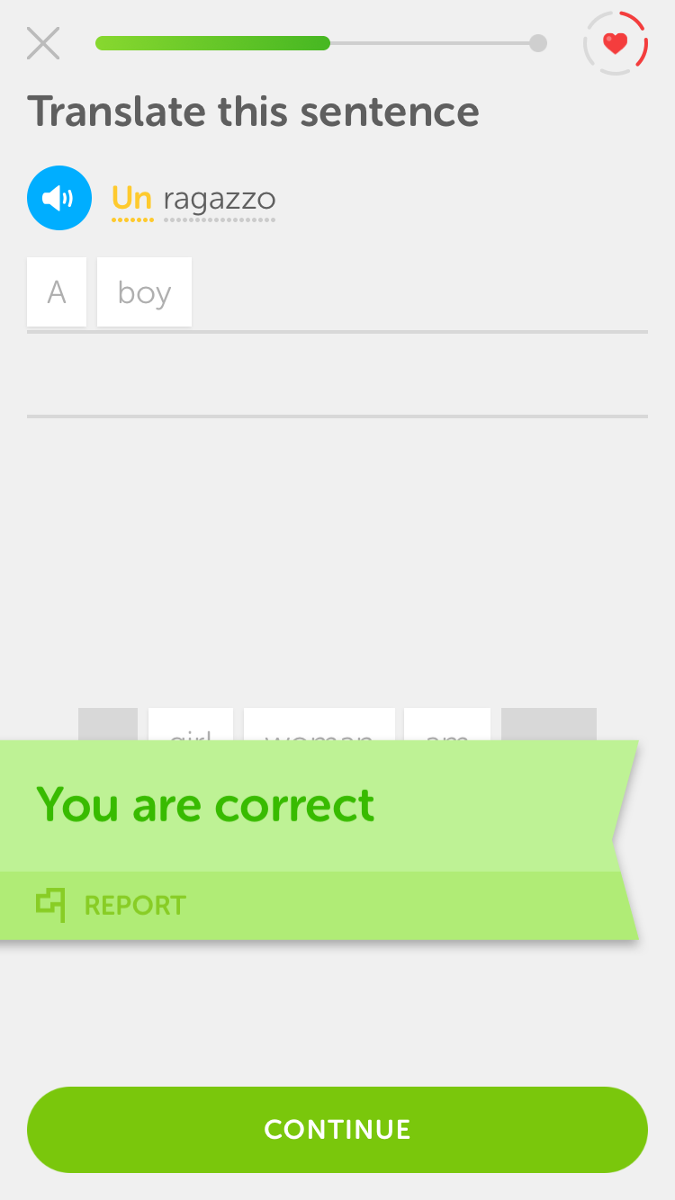
This is a screen capture of Duolingo's mobile app showing interactive onboarding. Users learn by doing and the product demonstrates its value through its UI. It is a screenshot of an Italian language lesson in which the user is asked to translate "un ragazzo", which means "the boy". There is a progress bar at the top and a badge that says "you are correct" at the bottom.
Duolingo does an exceptional job of onboarding new users seamlessly and effectively. Their learn-by-doing approach demonstrates the product's value and motivates users to continue using the app.

Great user onboarding experiences don't just teach the UI—they teach value through the UI. That's not a sign of failure, but an opportunity for designers and product managers alike.

2. Users have varying needs

Users’ learning needs vary significantly. Your users might have different roles, different levels of domain knowledge, different levels of technical experience, different backgrounds, and different goals.

No two users will think about your product in exactly the same way.
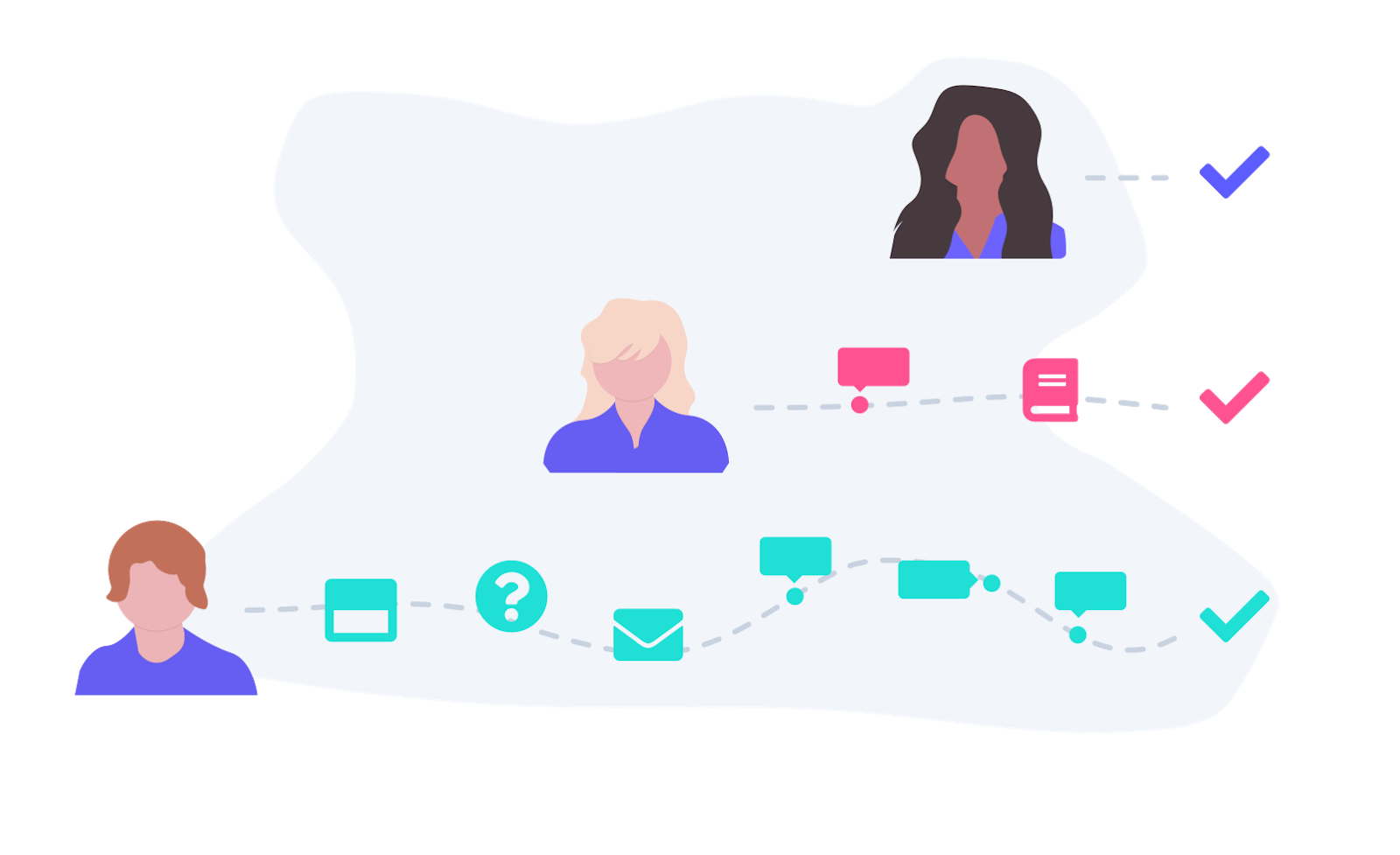
An illustration of 3 people with different learning needs. At the top is a woman who intuitively understands the product. Below is a woman who needs tooltips and reading blog articles and help docs to onboard. At the bottom is a man who needs a lot of customer service and learning aids to reach his goals within the product.

In other words, you can design the most intuitive user interface ever—and it still won’t be all things to all people. People with less general computer experience might need more help with the interactions themselves. Users with less domain experience might need help understanding the value. Secondary roles might need to be pushed through the process so they can help your primary user be successful.

There’s only one thing for it: personalization.

That's a loaded word these days, but when you get back to the root of it, personalization is about making the experience work for a person—that is, one specific human being. By researching who they are, where they're at, and what they need to be successful—then putting that knowledge to good use—you’ll almost certainly guarantee a higher rate of success.

Get started with a needs analysis. Do an inventory of the meaningful differences in the kinds of users you encounter. This doesn’t necessarily have to be defined by your personas. Instead, look for the variables that divide your users. The differences that emerge could be a mix of persona and technical experience level, or they might be tied to roles and domain knowledge.
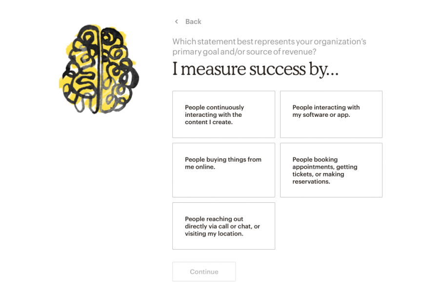
This is a screenshot of Mailchimp's onboarding flow showing personalization in onboarding. It shows an illustration of a brain colored in with yellow and the personalization prompt "I measure success by..." followed by 5 answers.
Mailchimp asks users questions about their needs and business goals to provide a more personalized experience and customized recommendations during onboarding.

For each of the different kinds of users you encounter, plot where they are in their work, compared to where they need to be. What do they need to learn? What do they need to do? Your job is to close that gap for each person.

That’s why having one fixed onboarding experience might not be enough. In the end, it comes down to your product and the person sitting across from it. Adapting to their specific needs will help both of you succeed.

3. Learning is a unique task

User experiences often follow the boundaries of a specific activity. A visual task like editing a photograph, for example, has completely different UI requirements from a data processing task, like calculating finances in a spreadsheet.
This is an illustration of three people pointing at different tooltips, which are a UI pattern common in onboarding. The tooltips are grey and purple.

The same is true of the task of learning software. The patterns that work well for guiding users through their first time in a new product are specialized, and for good reason.

The experience layer patternstooltips, modals, hotspots, checklists, slideouts, and other overlay guidance—are basically pathing interfaces. They’re ideal for taking users on a journey, drawing attention, providing persistent context, and bringing the user a level above the product to learn more about it.

Sometimes you can’t see things properly when you’re in the thick of them. That’s why the experience layer is powerful—it forces a context switch out of the mode of using, into the mode of learning, which helps users to bridge the gaps in their knowledge faster and more effectively.

Of course, you have to strike a balance between how your product works, how easy it is to understand without guidance, and how you teach it—but separating the tasks of using and doing can help your users better focus on each process.

4. You might not prioritize learnability all of the time

This is where we get a little philosophical. Developing a product is all about tradeoffs: Where do you focus your time? What's the highest priority? Which principles drive your product, and which don't?

If you create a product so simple it teaches itself, you inevitably make some tradeoffs. You may end up trading long-term value for short-term learnability.

Often, you'll need to favor one end of the spectrum over the other. Sometimes you'll favor a richer interface that brings tons of value by solving a very specific problem. Sometimes you'll choose to make something ultra-simple.

It’s important to remember that choosing to create something powerful doesn’t mean sacrificing learnability. User onboarding is a way to support users as they learn how to get value from your product, especially when that value requires a bit of work to achieve.

That can be a powerful combo play: When the product is designed to be used, and the support is designed to help learn how to use it, you can create an experience that's both easy to adopt and powerful for the lifetime of a user. And wouldn’t you know, that's often what users want and prefer!
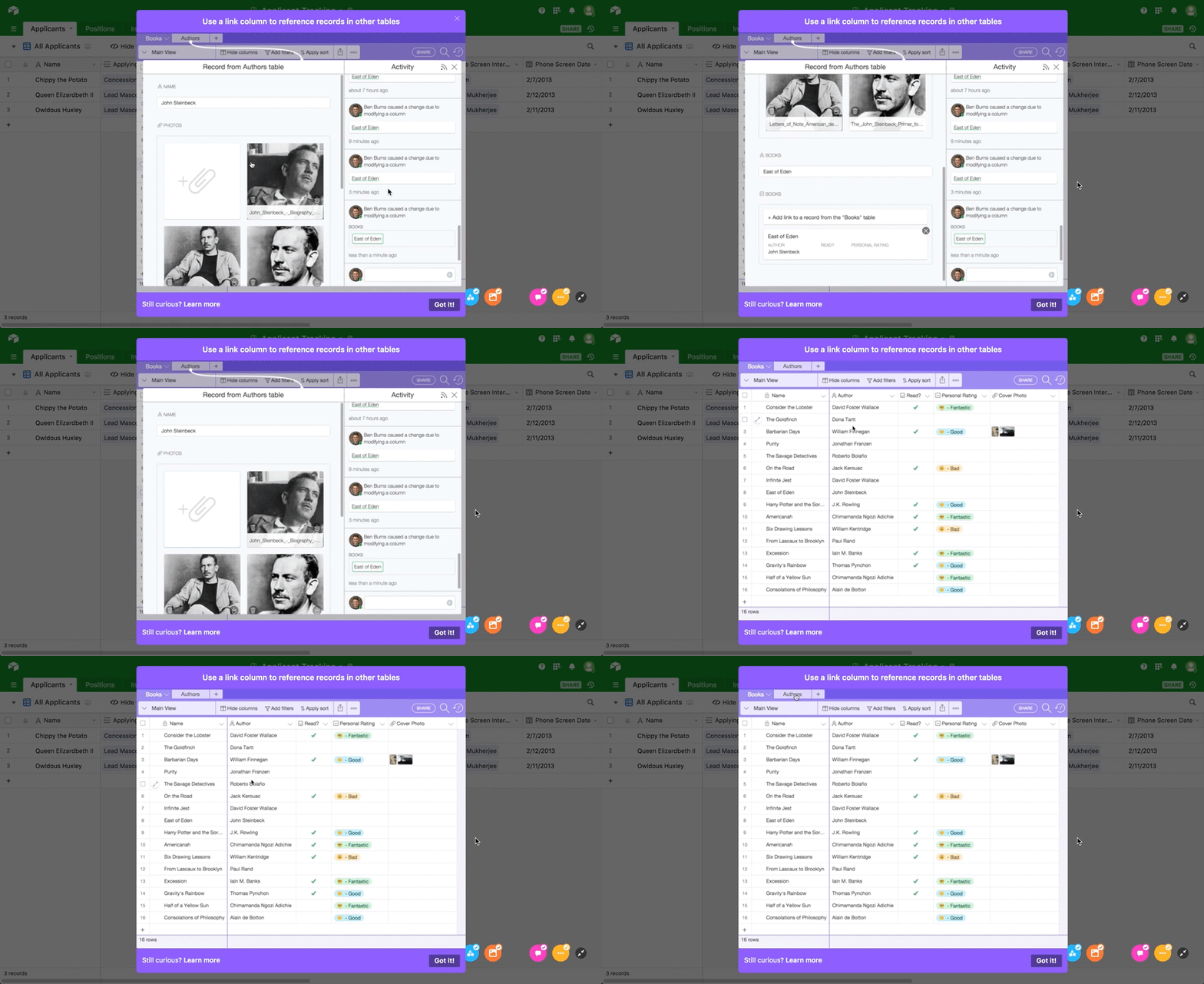
This is a gif of Airtable's onboarding sequence showing a tutorial of how to use the tool. It is an animated modal showing an example workflow of a spreadsheet that demonstrates features
is an incredibly powerful spreadsheet/database hybrid that could easily feel overwhelming to new users. Instead of trading in powerful functionality for easy learnability, Airtable used onboarding to teach users how to use their complex product and get value from it quickly.Airtable

5. Learning doesn't end after onboarding

When we think of a user onboarding experience, we tend to think of the modal that pops up the first time you sign up for a new product, or the three-page swipe welcome screens on a mobile app. But there are so many more opportunities for using the experience layer over the lifetime of a user—opportunities that, if acted upon, can increase everything from feature adoption to customer loyalty.
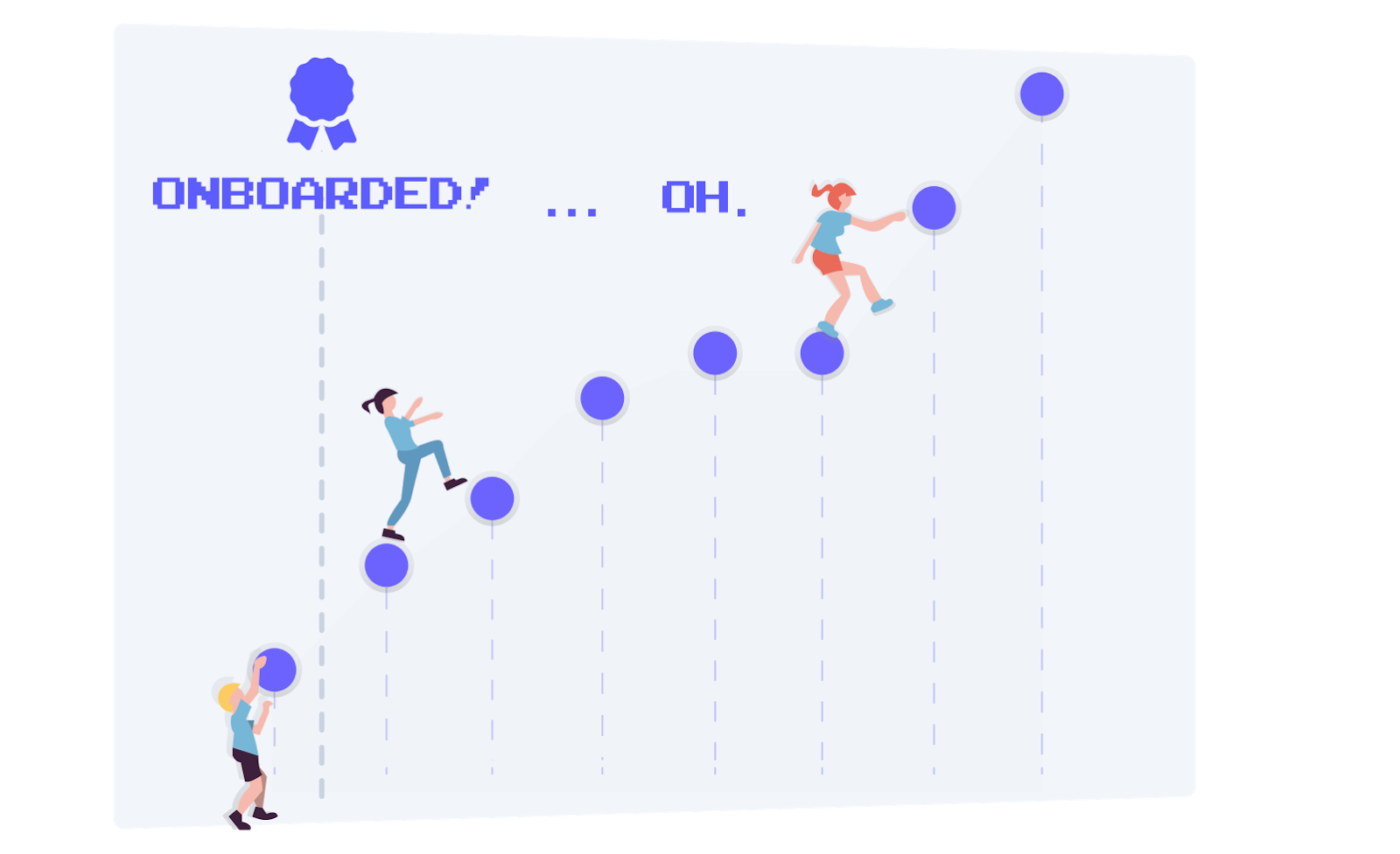
This is a simple illustration of a user's learning path showing people climbing upward. The moment of onboarding is followed by steep ascent, then there is a dip in user success as they run into roadblocks, represented by a woman missing the next step.

Consider, for example:

  • When the user leaves the product for a while and comes back
  • When someone new signs up on the same business account
  • When the user forgets how to use a piece of the product
  • When the user reaches value, but doesn't know what to do next
  • When billing time comes around, and users wonder what they're paying for
  • When you introduce a new feature or redesign your product in a way that alters users' workflow

There are hundreds of situations where on-demand or directed learning can make a long-term impact. If you limit your thinking about onboarding to just learning the UI initially, welcoming new users, or driving them to their initial aha moment, then you're missing out on a lot of potential value.

We don’t question the value of human support and customer success teams. Why not also provide some of that same support within the product, and let your human teams focus on even higher-value efforts that really benefit from a personal touch?

Next time you see a user struggling with your product long after onboarding, ask yourself: What learning support might have helped them help themselves?

6. The learning layer is an opportunity for personality

In the learning layer, as in other product and marketing experiences, the right voice and tone are crucial. Onboarding is an opportunity to establish and reinforce your brand and product personality.
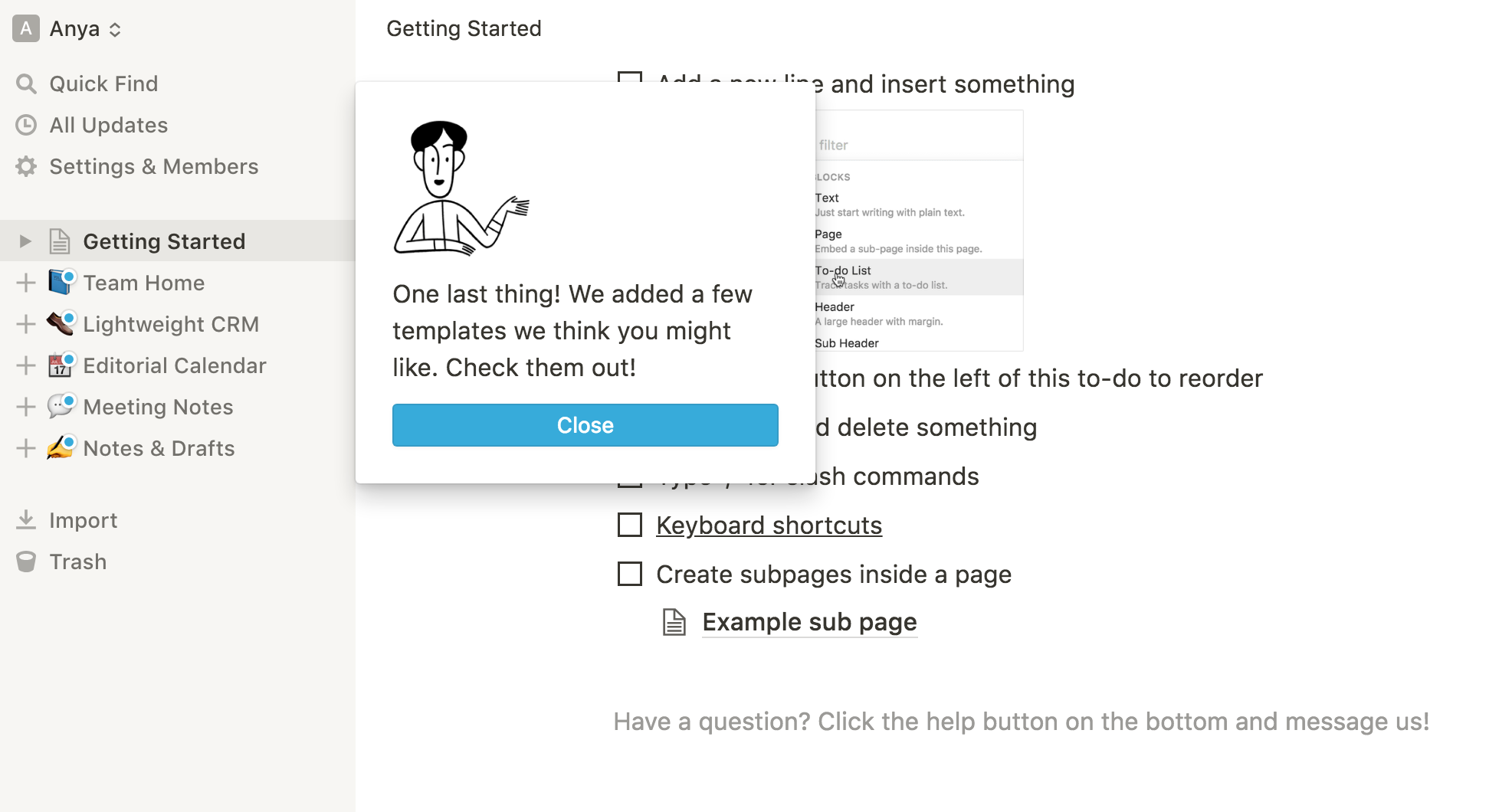
This is a screenshot of Notion's new feature announcement. It is a good example of brand voice and tone used in in-app product messaging. It shows an illustrated person speaking and a conversational message letting the user know that there are new templates available.
uses a casual, conversational tone to point users toward new features. In-app messaging offers an opportunity to let your brand voice shine through. Here, Notion

Learning is often specific and intermittent, and users benefit from learning support that is distinct within the UI. Just as giving all buttons of a certain function the same color helps users navigate your product more efficiently and confidently, a single, consistent way of learning within your product helps users quickly switch into learning mode.

Even more importantly, adopting a personal tone when designing learning experiences is an easy and effective way to differentiate the learning state and make users comfortable with the unfamiliar.

The fact that it sits on top of your product temporarily means that the learning experience can take on the role of friendly teacher or mentor, even if the product itself has to remain serious and focused.

And because these patterns are often separated from the code and powered by easy-to-use tools like Appcues, more roles within the organization can easily contribute, such as product marketing teams, UX designers, and UX writers. It can be incredibly effective for people close to a brand and its customers to work directly on these critical experiences.

Onboarding and learning are unmissable opportunities to make a more human connection with users from the start, and even ease the transition from marketing copy into the product itself, helping them adapt to that crucial shift in their journey.

7. Onboarding needs to adapt to frequent change

If you're an agile software company, you'll be iteratively pushing new value to customers every couple weeks. One of your goals as a company might even be to do that faster and more efficiently. But are you thinking about the impact each change has on your users?
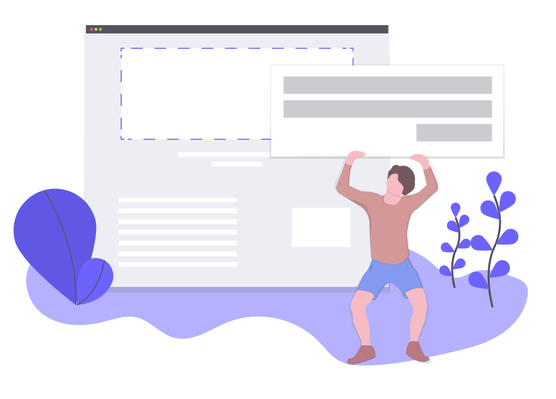
This is an illustration of a man holding up a giant UI element while a screen hovers in the background. There are purple plants in the foreground. This represents the changing nature of UI and UX patterns.

There are at least two major impacts to consider: First, change can disrupt long-term users' learned workflows (like rearranging the dishes on the table while someone is having their meal). And second, it impacts new users' onboarding (like giving a new visitor to your city an outdated map).

You need to plan for and solve for both cases. It's not just about being considerate—taking the impact of change into account will help you increase adoption of new features and reduce negative experiences.

This is where learning patterns really come into their own. All it takes is a single tooltip to turn a frustrating jolt into a delightful surprise.

One of the most rapidly changing products around is Amplitude. Not only do they release new features or small improvements on a continuous basis, but they also do an excellent job of pointing out those changes so they're not a surprise—and to users, any change feels like a big change when it comes without explanation. 

Every new thing that Amplitude releases—whether it's a small addition to a menu or a brand new product—has an appropriate callout that helps users both discover it and adapt their workflow. Top notch stuff.
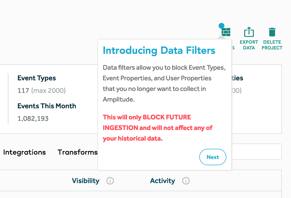
This is a screenshot of a good new feature release tooltip example from Amplitude. It shows a tooltip pointing to a new feature and the tooltip says "Introducing Data Filters." It then explains the new feature and, in red text, explains how it will and won't affect users. There is a round next button in the bottom right corner.

Finally, don't forget your onboarding as your product changes. I've done this more times than I can count. Onboarding is the kind of project that takes a long time to design, and a long time to build just right, and it's difficult to get continual investment. 

And that’s an important meta-point: Great learning support should help users adapt to change, but because great products are always evolving, it should be able to adapt well to change itself.

In other words, your supporting UI patterns need to be fast and easy to execute or they’ll never stay current, relevant, or effective.

In fact, that’s why products like Appcues exist—to make creating exceptional learning and onboarding experiences faster and easier. The problem demands that kind of adaptability.

But it's not just me who feels this way. Marketers, Designers, and even Engineers all share a similar sentiment on what why onboarding is important and what needs to be included.

When I chatted with Amrit Vyas, a Software Engineer over at Postman, he shared the four most important things he looks for when he trials a new product:

"During my tenure in the onboarding team, I've gleaned several key insights:

  1. The onboarding experience should be seamless and user-friendly.
  2. User interface design should prioritize simplicity and clarity, avoiding unnecessary complexity.
  3. An effective onboarding process should swiftly guide users to their intended feature or use case within the product. Redirecting users to unrelated features can result in a drop-off in engagement, thus personalized onboarding experiences are beneficial in mitigating this issue.
  4. Incorporating features such as a guided tour or checklist can enhance the onboarding experience for new users, fostering engagement and familiarity with the platform.

In conclusion...

The humble tooltip, the unsung modal, the up-and-coming checklist, the under-appreciated hotspot—as a product designer, I’m amazed at how much I've come to appreciate these lowly learning patterns.

By providing a little separation between learning support and your product's core design and function, you ease the process of creating a cohesive journey from the moment a user meets your product, through the changes and shifts, to a long and loyal relationship.

And maybe more importantly, you free your team to focus on what matters most: the core purpose and value of your product, and the best UI to deliver it over the long term.

Of course, you should still strive for a great UX, and simplifying and streamlining your core product to be easier to use and learn is rarely a bad thing. But even if you do succeed at simplifying the product and reducing the need for onboarding (congrats!), you'll still need to guide users through moments of change, and that guidance will itself change over time.

There's no better platform for that than the very onboarding patterns we used to shun.

Embrace the experience layer, and treat learning patterns as full-fledged members of your product family. You and your users will be happy you did.
The ultimate guide to user onboarding. Discover user onboarding definitions, examples, best practices, and resources.

Tristan Harward
Head of Product Design at Appcues
Skip to section:

Skip to section:

There’s a myth among designers and product managers that sounds something like this: If you’re striving for a great user experience, you shouldn’t need onboarding.

We seem to have a stigma against learning support like tooltips, pop-ups, and guides, as though using them means we’ve somehow failed in our duties as custodians of a great UX and a simple product.

It’s high time that we not only let go of that myth, but flip it around and embrace the value of good learning patterns.

These patterns are your partners in creating a great user experience. The learning layer serves a unique role in your product—one that’s critical for new and loyal users alike.

Here are 7 reasons why thoughtful learning support makes even the best-designed user experience better.

1. Onboarding isn’t just about the UI

Designers tend to turn their noses up at onboarding patterns. And it makes sense: We're responsible for the quality of the UI, and adding a tooltip to a confusing button or having to explain how something works feels like a band-aid on a self-inflicted cut. Ouch.

But the funny thing about great initial experiences is that the best of them aren't about the UI at all. These experiences are often found in products that are already known for their intuitive and consistent interface.

All on their own, however, the products themselves don't always do the best job of introducing the user to their purpose and function. That's where user onboarding comes in.

You can have a spectacular UI, but if you aren't leading users to see the value your product delivers from the start, then they'll never use it.

Great onboarding experiences do just that: They lead users from the first stages of introduction—when they know very little about your product—through understanding the whats, whys, and hows of it all, to reaching their aha moment and forming an emotional connection.

This is a screen capture of Duolingo's mobile app showing interactive onboarding. Users learn by doing and the product demonstrates its value through its UI. It is a screenshot of an Italian language lesson in which the user is asked to translate "un ragazzo", which means "the boy". There is a progress bar at the top and a badge that says "you are correct" at the bottom.
Duolingo does an exceptional job of onboarding new users seamlessly and effectively. Their learn-by-doing approach demonstrates the product's value and motivates users to continue using the app.

Great user onboarding experiences don't just teach the UI—they teach value through the UI. That's not a sign of failure, but an opportunity for designers and product managers alike.

2. Users have varying needs

Users’ learning needs vary significantly. Your users might have different roles, different levels of domain knowledge, different levels of technical experience, different backgrounds, and different goals.

No two users will think about your product in exactly the same way.

An illustration of 3 people with different learning needs. At the top is a woman who intuitively understands the product. Below is a woman who needs tooltips and reading blog articles and help docs to onboard. At the bottom is a man who needs a lot of customer service and learning aids to reach his goals within the product.

In other words, you can design the most intuitive user interface ever—and it still won’t be all things to all people. People with less general computer experience might need more help with the interactions themselves. Users with less domain experience might need help understanding the value. Secondary roles might need to be pushed through the process so they can help your primary user be successful.

There’s only one thing for it: personalization.

That's a loaded word these days, but when you get back to the root of it, personalization is about making the experience work for a person—that is, one specific human being. By researching who they are, where they're at, and what they need to be successful—then putting that knowledge to good use—you’ll almost certainly guarantee a higher rate of success.

Get started with a needs analysis. Do an inventory of the meaningful differences in the kinds of users you encounter. This doesn’t necessarily have to be defined by your personas. Instead, look for the variables that divide your users. The differences that emerge could be a mix of persona and technical experience level, or they might be tied to roles and domain knowledge.

This is a screenshot of Mailchimp's onboarding flow showing personalization in onboarding. It shows an illustration of a brain colored in with yellow and the personalization prompt "I measure success by..." followed by 5 answers.
Mailchimp asks users questions about their needs and business goals to provide a more personalized experience and customized recommendations during onboarding.

For each of the different kinds of users you encounter, plot where they are in their work, compared to where they need to be. What do they need to learn? What do they need to do? Your job is to close that gap for each person.

That’s why having one fixed onboarding experience might not be enough. In the end, it comes down to your product and the person sitting across from it. Adapting to their specific needs will help both of you succeed.

3. Learning is a unique task

User experiences often follow the boundaries of a specific activity. A visual task like editing a photograph, for example, has completely different UI requirements from a data processing task, like calculating finances in a spreadsheet.

This is an illustration of three people pointing at different tooltips, which are a UI pattern common in onboarding. The tooltips are grey and purple.

The same is true of the task of learning software. The patterns that work well for guiding users through their first time in a new product are specialized, and for good reason.

The experience layer patternstooltips, modals, hotspots, checklists, slideouts, and other overlay guidance—are basically pathing interfaces. They’re ideal for taking users on a journey, drawing attention, providing persistent context, and bringing the user a level above the product to learn more about it.

Sometimes you can’t see things properly when you’re in the thick of them. That’s why the experience layer is powerful—it forces a context switch out of the mode of using, into the mode of learning, which helps users to bridge the gaps in their knowledge faster and more effectively.

Of course, you have to strike a balance between how your product works, how easy it is to understand without guidance, and how you teach it—but separating the tasks of using and doing can help your users better focus on each process.

4. You might not prioritize learnability all of the time

This is where we get a little philosophical. Developing a product is all about tradeoffs: Where do you focus your time? What's the highest priority? Which principles drive your product, and which don't?

If you create a product so simple it teaches itself, you inevitably make some tradeoffs. You may end up trading long-term value for short-term learnability.

Often, you'll need to favor one end of the spectrum over the other. Sometimes you'll favor a richer interface that brings tons of value by solving a very specific problem. Sometimes you'll choose to make something ultra-simple.

It’s important to remember that choosing to create something powerful doesn’t mean sacrificing learnability. User onboarding is a way to support users as they learn how to get value from your product, especially when that value requires a bit of work to achieve.

That can be a powerful combo play: When the product is designed to be used, and the support is designed to help learn how to use it, you can create an experience that's both easy to adopt and powerful for the lifetime of a user. And wouldn’t you know, that's often what users want and prefer!

This is a gif of Airtable's onboarding sequence showing a tutorial of how to use the tool. It is an animated modal showing an example workflow of a spreadsheet that demonstrates features
is an incredibly powerful spreadsheet/database hybrid that could easily feel overwhelming to new users. Instead of trading in powerful functionality for easy learnability, Airtable used onboarding to teach users how to use their complex product and get value from it quickly.Airtable

5. Learning doesn't end after onboarding

When we think of a user onboarding experience, we tend to think of the modal that pops up the first time you sign up for a new product, or the three-page swipe welcome screens on a mobile app. But there are so many more opportunities for using the experience layer over the lifetime of a user—opportunities that, if acted upon, can increase everything from feature adoption to customer loyalty.

This is a simple illustration of a user's learning path showing people climbing upward. The moment of onboarding is followed by steep ascent, then there is a dip in user success as they run into roadblocks, represented by a woman missing the next step.

Consider, for example:

  • When the user leaves the product for a while and comes back
  • When someone new signs up on the same business account
  • When the user forgets how to use a piece of the product
  • When the user reaches value, but doesn't know what to do next
  • When billing time comes around, and users wonder what they're paying for
  • When you introduce a new feature or redesign your product in a way that alters users' workflow

There are hundreds of situations where on-demand or directed learning can make a long-term impact. If you limit your thinking about onboarding to just learning the UI initially, welcoming new users, or driving them to their initial aha moment, then you're missing out on a lot of potential value.

We don’t question the value of human support and customer success teams. Why not also provide some of that same support within the product, and let your human teams focus on even higher-value efforts that really benefit from a personal touch?

Next time you see a user struggling with your product long after onboarding, ask yourself: What learning support might have helped them help themselves?

6. The learning layer is an opportunity for personality

In the learning layer, as in other product and marketing experiences, the right voice and tone are crucial. Onboarding is an opportunity to establish and reinforce your brand and product personality.

This is a screenshot of Notion's new feature announcement. It is a good example of brand voice and tone used in in-app product messaging. It shows an illustrated person speaking and a conversational message letting the user know that there are new templates available.
uses a casual, conversational tone to point users toward new features. In-app messaging offers an opportunity to let your brand voice shine through. Here, Notion

Learning is often specific and intermittent, and users benefit from learning support that is distinct within the UI. Just as giving all buttons of a certain function the same color helps users navigate your product more efficiently and confidently, a single, consistent way of learning within your product helps users quickly switch into learning mode.

Even more importantly, adopting a personal tone when designing learning experiences is an easy and effective way to differentiate the learning state and make users comfortable with the unfamiliar.

The fact that it sits on top of your product temporarily means that the learning experience can take on the role of friendly teacher or mentor, even if the product itself has to remain serious and focused.

And because these patterns are often separated from the code and powered by easy-to-use tools like Appcues, more roles within the organization can easily contribute, such as product marketing teams, UX designers, and UX writers. It can be incredibly effective for people close to a brand and its customers to work directly on these critical experiences.

Onboarding and learning are unmissable opportunities to make a more human connection with users from the start, and even ease the transition from marketing copy into the product itself, helping them adapt to that crucial shift in their journey.

7. Onboarding needs to adapt to frequent change

If you're an agile software company, you'll be iteratively pushing new value to customers every couple weeks. One of your goals as a company might even be to do that faster and more efficiently. But are you thinking about the impact each change has on your users?

This is an illustration of a man holding up a giant UI element while a screen hovers in the background. There are purple plants in the foreground. This represents the changing nature of UI and UX patterns.

There are at least two major impacts to consider: First, change can disrupt long-term users' learned workflows (like rearranging the dishes on the table while someone is having their meal). And second, it impacts new users' onboarding (like giving a new visitor to your city an outdated map).

You need to plan for and solve for both cases. It's not just about being considerate—taking the impact of change into account will help you increase adoption of new features and reduce negative experiences.

This is where learning patterns really come into their own. All it takes is a single tooltip to turn a frustrating jolt into a delightful surprise.

One of the most rapidly changing products around is Amplitude. Not only do they release new features or small improvements on a continuous basis, but they also do an excellent job of pointing out those changes so they're not a surprise—and to users, any change feels like a big change when it comes without explanation. 

Every new thing that Amplitude releases—whether it's a small addition to a menu or a brand new product—has an appropriate callout that helps users both discover it and adapt their workflow. Top notch stuff.

This is a screenshot of a good new feature release tooltip example from Amplitude. It shows a tooltip pointing to a new feature and the tooltip says "Introducing Data Filters." It then explains the new feature and, in red text, explains how it will and won't affect users. There is a round next button in the bottom right corner.

Finally, don't forget your onboarding as your product changes. I've done this more times than I can count. Onboarding is the kind of project that takes a long time to design, and a long time to build just right, and it's difficult to get continual investment. 

And that’s an important meta-point: Great learning support should help users adapt to change, but because great products are always evolving, it should be able to adapt well to change itself.

In other words, your supporting UI patterns need to be fast and easy to execute or they’ll never stay current, relevant, or effective.

In fact, that’s why products like Appcues exist—to make creating exceptional learning and onboarding experiences faster and easier. The problem demands that kind of adaptability.

But it's not just me who feels this way. Marketers, Designers, and even Engineers all share a similar sentiment on what why onboarding is important and what needs to be included.

When I chatted with Amrit Vyas, a Software Engineer over at Postman, he shared the four most important things he looks for when he trials a new product:

"During my tenure in the onboarding team, I've gleaned several key insights:

  1. The onboarding experience should be seamless and user-friendly.
  2. User interface design should prioritize simplicity and clarity, avoiding unnecessary complexity.
  3. An effective onboarding process should swiftly guide users to their intended feature or use case within the product. Redirecting users to unrelated features can result in a drop-off in engagement, thus personalized onboarding experiences are beneficial in mitigating this issue.
  4. Incorporating features such as a guided tour or checklist can enhance the onboarding experience for new users, fostering engagement and familiarity with the platform.

In conclusion...

The humble tooltip, the unsung modal, the up-and-coming checklist, the under-appreciated hotspot—as a product designer, I’m amazed at how much I've come to appreciate these lowly learning patterns.

By providing a little separation between learning support and your product's core design and function, you ease the process of creating a cohesive journey from the moment a user meets your product, through the changes and shifts, to a long and loyal relationship.

And maybe more importantly, you free your team to focus on what matters most: the core purpose and value of your product, and the best UI to deliver it over the long term.

Of course, you should still strive for a great UX, and simplifying and streamlining your core product to be easier to use and learn is rarely a bad thing. But even if you do succeed at simplifying the product and reducing the need for onboarding (congrats!), you'll still need to guide users through moments of change, and that guidance will itself change over time.

There's no better platform for that than the very onboarding patterns we used to shun.

Embrace the experience layer, and treat learning patterns as full-fledged members of your product family. You and your users will be happy you did.

The ultimate guide to user onboarding. Discover user onboarding definitions, examples, best practices, and resources.

Tristan Harward
Head of Product Design at Appcues
You might also like...