← Visit Appcues.com
×
×

We watched users browse SaaS marketing sites for 1,800 minutes and here's what we learned

This article comes excerpted from Hiten Shah’s SaaS DNA Project: The Anatomy of a SaaS Marketing Site, a 30,000+ word research study on...
Skip to section:

Skip to section:

This article comes excerpted from Hiten Shah’s SaaS DNA Project: The Anatomy of a SaaS Marketing Site, a 30,000+ word research study on how users actually browse and experience SaaS marketing sites. 

Hiten Shah has built products on the web for over 10 years, including Crazy Egg, KISSmetrics, and now Quick Sprout. He breaks down everything he's learned about building companies in his weekly email newsletter here.

Long before new users sign up for your SaaS product and start your onboarding process, they hit your landing page and make split second judgments about your app based on how it feels to navigate your marketing site.

Your marketing site’s navigation is one of the most important aspects of your first-time user experience because it's how users interface with your site—and you—for the first time. 

If users struggle to get around your site, they'll lose confidence in your company and your product. They will assume that your product is similarly confusing, and they’ll bounce. 

Create an intuitive, seamless experience for users, and not only will they be able to find the information they need, but they’re far more likely to take action on it. And what they learn will not only get them to sign up, it will lead them successfully through your onboarding process.

In the most comprehensive look at SaaS homepages to date, we studied 30 different SaaS websites through 90 different user interactions by partnering with UserTesting.com, who donated credits for their product so we could analyze the videos and understand what makes for a successful visit to a homepage.

With guidance from the UserTesting team, we had participants share their thoughts out loud as they answered questions and completed tasks about their experience during the session. The user's experience on each site was recorded in its entirety to video in total amounting to over 1,800 minutes of user testing.

To test the overall navigation of the marketing site, we sent users to a SaaS company’s site and asked them to spend 2-4 minutes on the homepage. Users were then asked to think aloud as they searched for the product, service, or plan, that best suited their needs, and then rate how easy this task was on a scale of 1-5 [1 = Very Difficult, 5 = Very Easy]. 
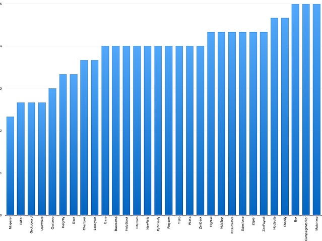
How Users Rated the Navigation of 30 SaaS Sites

How-Users-Rated-the-Navigation-of-30-SaaS-Sites.jpeg

Highly-Rated Example: MailChimp

MailChimp website

MailChimp’s sleek, intuitively-designed website made it easy for users to navigate and find everything they were looking for. On the homepage, an autoplaying and looping screencast of a customized email campaign quickly gave users a sense of MailChimp’s product.

The navigation toolbar created a seamless continuity  in users’ experience of the marketing site. They found it straightforward to navigate from the homepage, to the features page, to the pricing page.

MailChimp pricing plans page

On these pages, information is always organized logically. On the features page, for example, features are arranged by complexity. Users start with MailChimp’s design templates and functionality, before scrolling down to developer tools, like API documentation. 

MailChimp’s pricing page is prominently displayed as the second option on the navigation bar, rather than being buried somewhere inside or at the bottom of the site. Asked to find the product or plan for their needs, users were able to smoothly transition from browsing features to finding the best plan for them. 

Navigation is one of the ways users gained insight into product UX, and they strongly associated the layout of MailChimp’s site with what they imagined the product’s actual interface to look like. They described MailChimp’s product as “simple,” “easy,” and “useful”—without actually experiencing the product.

Users left the marketing site with an impressive overview of various benefits of using MailChimp, from Google Analytics integration, to automation capabilities, to customizable email design templates. The key to MailChimp’s marketing site is that it packs in a whole lot of information, but presents it in easily digestible packets that users were able to browse through seamlessly. 

Quotes from the responses:

  • It’s very easy to use and navigate. When you have so many things going on, it’s important that your email marketing or email campaign platform is very easy to use, and you don’t have to spend a lot of time trying to figure out where to find certain features. MailChimp makes it really easy, it’s not all over the place. Usually, platforms are all over the place and hard to navigate.
  • This was much more simple to find.You can see the pricing tab right from the beginning, and which category you fit into best.
  • I like the fact that when I’m looking for pricing or the different packages, it's actually not hidden somewhere on the website.
  • The user interface is pretty easy and simple to teach. The interface is simple, with different levels of knowledge for users.

Low-Rated Example: Buffer

Buffer homepage UX teardown


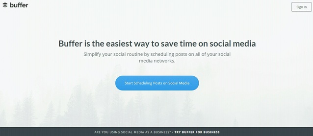
Buffer’s website posed an interesting problem for user navigation, because it didn’t actually have a navigation toolbar. Instead, users were greeted with the company’s tagline on the homepage, and a blue free trial call-to-action—one of the only navigation options immediately available.

Two users went ahead and signed up for the free trial, which gave them a detailed sense of Buffer’s product by running through basic onboarding—connecting to a social media account, and scheduling a post.

The issue was that when it came to learning more about the product, most of the users were left lost, unable to navigate outside of Buffer’s logged-in web app. They had a difficult time locating actual pricing and plan information, which on the marketing site was presented only through a small floating banner at the bottom of the site: “Are you using social media as a business? Try Buffer for business.” 

When asked to find more information about Buffer’s product or service, two of the users completely overlooked the banner, and struggled to find how they would pay for the product.

Once users reached the pricing page, Buffer’s product, features, and customer testimonials were all nicely spread out and easy to understand—the difficulty was getting there in the first place.

Buffer for business pricing page

The problem was one of continuity. Because Buffer’s marketing site eschews a navigation bar, users lacked a common frame of reference while jumping between the home page, web app, and pricing. While they appreciated Buffer’s product, they were frustrated and turned off by the site’s navigation options—or lack thereof. One user even repeatedly clicked on Buffer’s logo, mistaking it for a sandwich menu button. 

Buffer’s website tries to drive user activity into a linear flow—get them inside the product as quickly as possible, start user onboarding, and trigger an aha! moment. However, users wanted to be able to explore the site on their own, and were frustrated by their inability to do so. Unable to learn more about Buffer, users felt forced into signing up for the free trial. 

Quotes from the responses:

  • Okay so, let’s see, I'm going to try to see if there's a new thing else on the homepage I can click on besides this button and it doesn't look like it, except for the sign in but I don't have an account yet. So I'm going to click this blue button.
  • I think it was difficult because it was confusing how it works. 
  • I don’t see anywhere I can learn that information here on the page.
  • I think a video on the homepage would be helpful as far as just explain a little bit more of the service, to see it in action here before you start your free trial.

Key Takeaways

  • Simplicity is good, but not at the expense of functionality. Users like to explore for more information—even if only to browse over it briefly. Allow users to get to know you through your marketing site, not only through product features and plan details, but “About Us” or “Culture” pages as well. 
  • Continuity is the backbone of your marketing site. Make sure users don’t get lost. When evaluating your marketing site, you need to look closely and holistically at user experience, which needs to be unified across the homepage, pricing page, and free trial. Think about your marketing site as a funnel in and of itself, and carefully plot out user journeys. 
  • User onboarding starts with your marketing site. Even though app developers see a strong distinction between the logged-in app experience and the marketing site, users don’t see it that way. To them, it’s one continuous experience, and so if you want to prime your users for success during onboarding, give them the information that they need while they’re browsing the marketing site.

Conclusion

When users are on an unfamiliar site that’s difficult to navigate, you can hear it in their voice. “Guess” was the #1 word that users said when they got lost.

confusion-word-map.jpeg

It’s that uncertainty and confusion that kills engagement and retention in your app, whether the user is navigating your marketing site or going through your app’s onboarding flow. 

Keep your navigation easy to use and clean by implementing some user onboarding best practices. Remove unnecessary items. And win your customers over  by making your site and your app super simple to understand and use.

Hiten Shah has built products on the web for over 10 years, including Crazy Egg, KISSmetrics, and now Quick Sprout. He breaks down everything he's learned about building companies in his weekly email newsletter here.

Hiten Shah
Co-Founder at Quick Sprout, Crazy Egg, and FYI
Hiten Shah has been building products on the web for over a decade and is an advisor and investor in startups. He is the co-founder of including Crazy Egg, Quick Sprout, FYI, and (formerly) KISSmetrics .
Skip to section:

Skip to section:

This article comes excerpted from Hiten Shah’s SaaS DNA Project: The Anatomy of a SaaS Marketing Site, a 30,000+ word research study on how users actually browse and experience SaaS marketing sites. 

Hiten Shah has built products on the web for over 10 years, including Crazy Egg, KISSmetrics, and now Quick Sprout. He breaks down everything he's learned about building companies in his weekly email newsletter here.

Long before new users sign up for your SaaS product and start your onboarding process, they hit your landing page and make split second judgments about your app based on how it feels to navigate your marketing site.

Your marketing site’s navigation is one of the most important aspects of your first-time user experience because it's how users interface with your site—and you—for the first time. 

If users struggle to get around your site, they'll lose confidence in your company and your product. They will assume that your product is similarly confusing, and they’ll bounce. 

Create an intuitive, seamless experience for users, and not only will they be able to find the information they need, but they’re far more likely to take action on it. And what they learn will not only get them to sign up, it will lead them successfully through your onboarding process.

In the most comprehensive look at SaaS homepages to date, we studied 30 different SaaS websites through 90 different user interactions by partnering with UserTesting.com, who donated credits for their product so we could analyze the videos and understand what makes for a successful visit to a homepage.

With guidance from the UserTesting team, we had participants share their thoughts out loud as they answered questions and completed tasks about their experience during the session. The user's experience on each site was recorded in its entirety to video in total amounting to over 1,800 minutes of user testing.

To test the overall navigation of the marketing site, we sent users to a SaaS company’s site and asked them to spend 2-4 minutes on the homepage. Users were then asked to think aloud as they searched for the product, service, or plan, that best suited their needs, and then rate how easy this task was on a scale of 1-5 [1 = Very Difficult, 5 = Very Easy]. 

How Users Rated the Navigation of 30 SaaS Sites

How-Users-Rated-the-Navigation-of-30-SaaS-Sites.jpeg

Highly-Rated Example: MailChimp

MailChimp website

MailChimp’s sleek, intuitively-designed website made it easy for users to navigate and find everything they were looking for. On the homepage, an autoplaying and looping screencast of a customized email campaign quickly gave users a sense of MailChimp’s product.

The navigation toolbar created a seamless continuity  in users’ experience of the marketing site. They found it straightforward to navigate from the homepage, to the features page, to the pricing page.
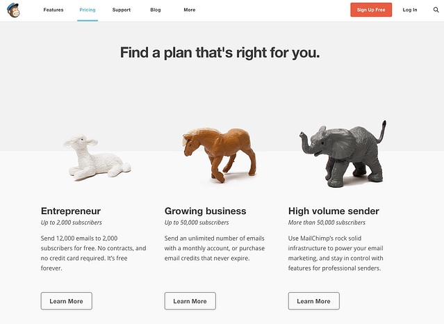
MailChimp pricing plans page

On these pages, information is always organized logically. On the features page, for example, features are arranged by complexity. Users start with MailChimp’s design templates and functionality, before scrolling down to developer tools, like API documentation. 

MailChimp’s pricing page is prominently displayed as the second option on the navigation bar, rather than being buried somewhere inside or at the bottom of the site. Asked to find the product or plan for their needs, users were able to smoothly transition from browsing features to finding the best plan for them. 

Navigation is one of the ways users gained insight into product UX, and they strongly associated the layout of MailChimp’s site with what they imagined the product’s actual interface to look like. They described MailChimp’s product as “simple,” “easy,” and “useful”—without actually experiencing the product.

Users left the marketing site with an impressive overview of various benefits of using MailChimp, from Google Analytics integration, to automation capabilities, to customizable email design templates. The key to MailChimp’s marketing site is that it packs in a whole lot of information, but presents it in easily digestible packets that users were able to browse through seamlessly. 

Quotes from the responses:
  • It’s very easy to use and navigate. When you have so many things going on, it’s important that your email marketing or email campaign platform is very easy to use, and you don’t have to spend a lot of time trying to figure out where to find certain features. MailChimp makes it really easy, it’s not all over the place. Usually, platforms are all over the place and hard to navigate.
  • This was much more simple to find.You can see the pricing tab right from the beginning, and which category you fit into best.
  • I like the fact that when I’m looking for pricing or the different packages, it's actually not hidden somewhere on the website.
  • The user interface is pretty easy and simple to teach. The interface is simple, with different levels of knowledge for users.

Low-Rated Example: Buffer

Buffer homepage UX teardown


Buffer’s website posed an interesting problem for user navigation, because it didn’t actually have a navigation toolbar. Instead, users were greeted with the company’s tagline on the homepage, and a blue free trial call-to-action—one of the only navigation options immediately available.

Two users went ahead and signed up for the free trial, which gave them a detailed sense of Buffer’s product by running through basic onboarding—connecting to a social media account, and scheduling a post.

The issue was that when it came to learning more about the product, most of the users were left lost, unable to navigate outside of Buffer’s logged-in web app. They had a difficult time locating actual pricing and plan information, which on the marketing site was presented only through a small floating banner at the bottom of the site: “Are you using social media as a business? Try Buffer for business.” 

When asked to find more information about Buffer’s product or service, two of the users completely overlooked the banner, and struggled to find how they would pay for the product.

Once users reached the pricing page, Buffer’s product, features, and customer testimonials were all nicely spread out and easy to understand—the difficulty was getting there in the first place.
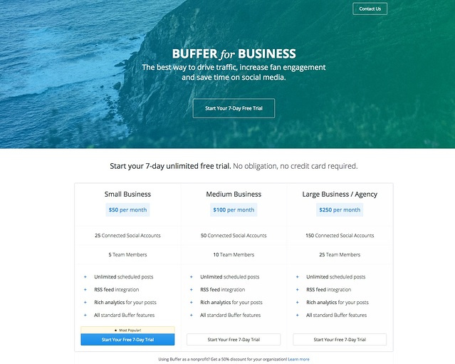
Buffer for business pricing page

The problem was one of continuity. Because Buffer’s marketing site eschews a navigation bar, users lacked a common frame of reference while jumping between the home page, web app, and pricing. While they appreciated Buffer’s product, they were frustrated and turned off by the site’s navigation options—or lack thereof. One user even repeatedly clicked on Buffer’s logo, mistaking it for a sandwich menu button. 

Buffer’s website tries to drive user activity into a linear flow—get them inside the product as quickly as possible, start user onboarding, and trigger an aha! moment. However, users wanted to be able to explore the site on their own, and were frustrated by their inability to do so. Unable to learn more about Buffer, users felt forced into signing up for the free trial. 

Quotes from the responses:

  • Okay so, let’s see, I'm going to try to see if there's a new thing else on the homepage I can click on besides this button and it doesn't look like it, except for the sign in but I don't have an account yet. So I'm going to click this blue button.
  • I think it was difficult because it was confusing how it works. 
  • I don’t see anywhere I can learn that information here on the page.
  • I think a video on the homepage would be helpful as far as just explain a little bit more of the service, to see it in action here before you start your free trial.

Key Takeaways

  • Simplicity is good, but not at the expense of functionality. Users like to explore for more information—even if only to browse over it briefly. Allow users to get to know you through your marketing site, not only through product features and plan details, but “About Us” or “Culture” pages as well. 
  • Continuity is the backbone of your marketing site. Make sure users don’t get lost. When evaluating your marketing site, you need to look closely and holistically at user experience, which needs to be unified across the homepage, pricing page, and free trial. Think about your marketing site as a funnel in and of itself, and carefully plot out user journeys. 
  • User onboarding starts with your marketing site. Even though app developers see a strong distinction between the logged-in app experience and the marketing site, users don’t see it that way. To them, it’s one continuous experience, and so if you want to prime your users for success during onboarding, give them the information that they need while they’re browsing the marketing site.

Conclusion

When users are on an unfamiliar site that’s difficult to navigate, you can hear it in their voice. “Guess” was the #1 word that users said when they got lost.
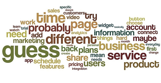
confusion-word-map.jpeg

It’s that uncertainty and confusion that kills engagement and retention in your app, whether the user is navigating your marketing site or going through your app’s onboarding flow. 

Keep your navigation easy to use and clean by implementing some user onboarding best practices. Remove unnecessary items. And win your customers over  by making your site and your app super simple to understand and use.

Hiten Shah has built products on the web for over 10 years, including Crazy Egg, KISSmetrics, and now Quick Sprout. He breaks down everything he's learned about building companies in his weekly email newsletter here.

Hiten Shah
Co-Founder at Quick Sprout, Crazy Egg, and FYI
Hiten Shah has been building products on the web for over a decade and is an advisor and investor in startups. He is the co-founder of including Crazy Egg, Quick Sprout, FYI, and (formerly) KISSmetrics .
You might also like...