.png)
Most people would be reluctant to explore a new city or country without some sort of guide. If you’ve traveled to a place like New York or Rome, you know tourists fall into 2 groups: big, double-decker-tour-bus people, or Google/Apple Maps, find-my-own-way types. Regardless of your preference, we can all agree traveling is a far less pleasant experience without a handy frame of reference.
New users signing up for your product are the same. They also need help navigating your website or app through in-app tutorials or guide posts. The absence of such guidance can be the difference between users continuing their journey or quitting before arriving at their destination. So, offer these tips the right way during user onboarding—or risk derailing your users’ journey before it even gets started.
User onboarding is the process of helping new users learn and understand your product or service with the hopes of turning them into long-term customers and advocates. It will convince new users that your product is easy to use and can help them achieve their goals. When done well, it shortens a user’s time to value. We refer to this moment of value as a user’s wow or aha moment—like, “Wow, this is awesome!” Or “Aha! Now I get it!”
Onboarding tools will help you build user onboarding UI/UX experiences into your product or incorporate common UI patterns that overlay or augment your app’s true UI with annotations. These annotations guide users to their aha moment faster than if they were simply dropped into your app after signing up. And by getting your new users to that aha moment faster, you are more likely to retain these new users beyond their first session.
Good user onboarding experiences boost user retention rates, minimize early churn, reduce support tickets, and lead to higher free-trial-to-paid conversion rates.
Tl;dr: User onboarding is essential (yes, even for products with otherwise great UX).
User onboarding UX is the in-app experience of new users when they sign up to test or use your product. It’s the way the product setup instructions and UI element signals make users feel when they begin using your product.
Many users will come to your app with little knowledge of your app and how to use it. It’s your responsibility to ensure that they can easily discover the features they need to justify using your app and that they enjoy the in-app learning process.
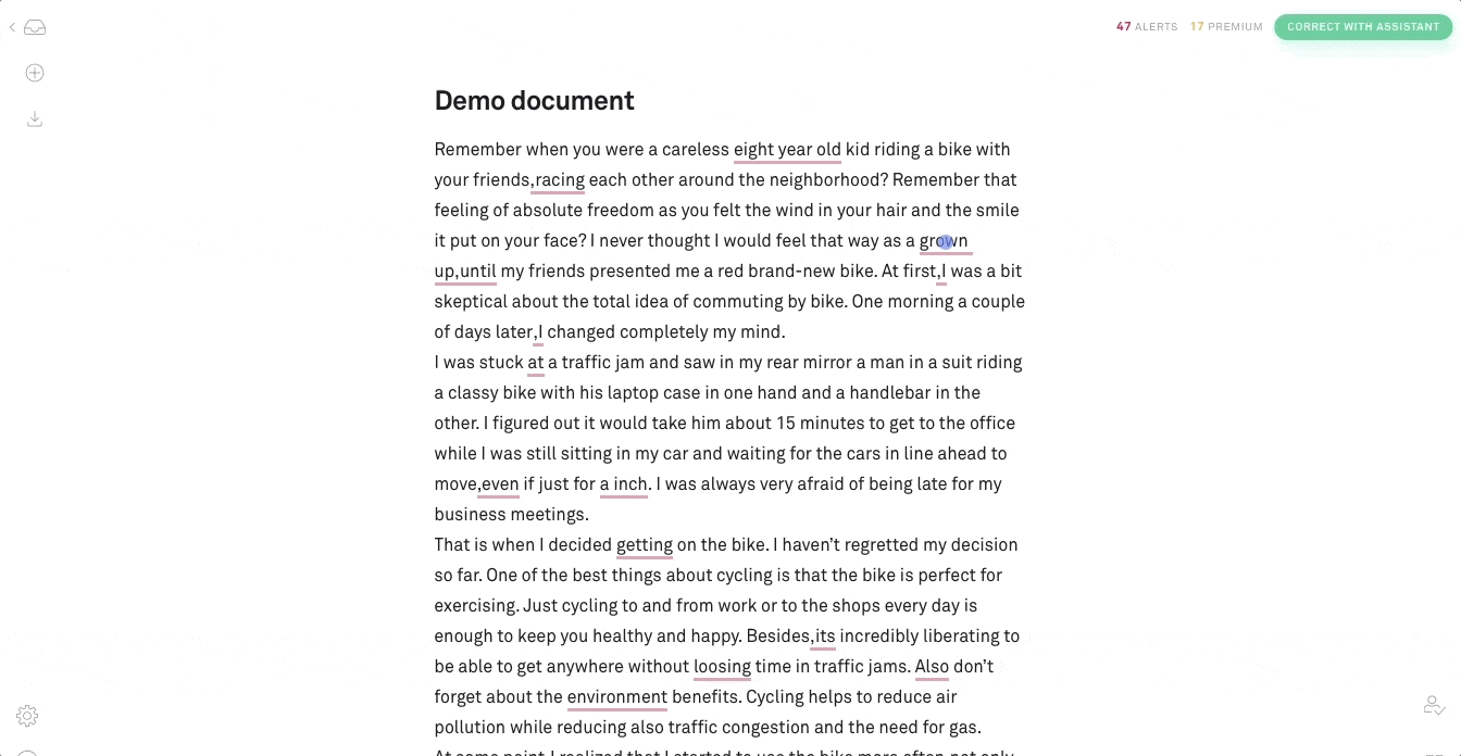
We’re big fans of user onboarding UX—so much so that we analyze every onboarding experience we come across. Over the last few years, we’ve analyzed over 500 onboarding UX methodologies and categorized them into 8 onboarding UX patterns to use as inspiration.
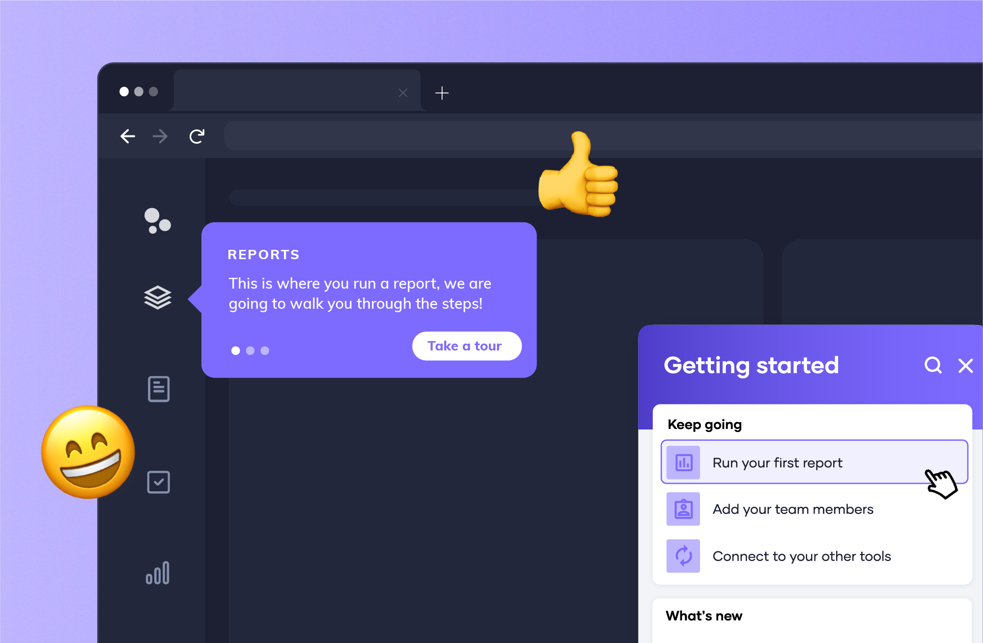
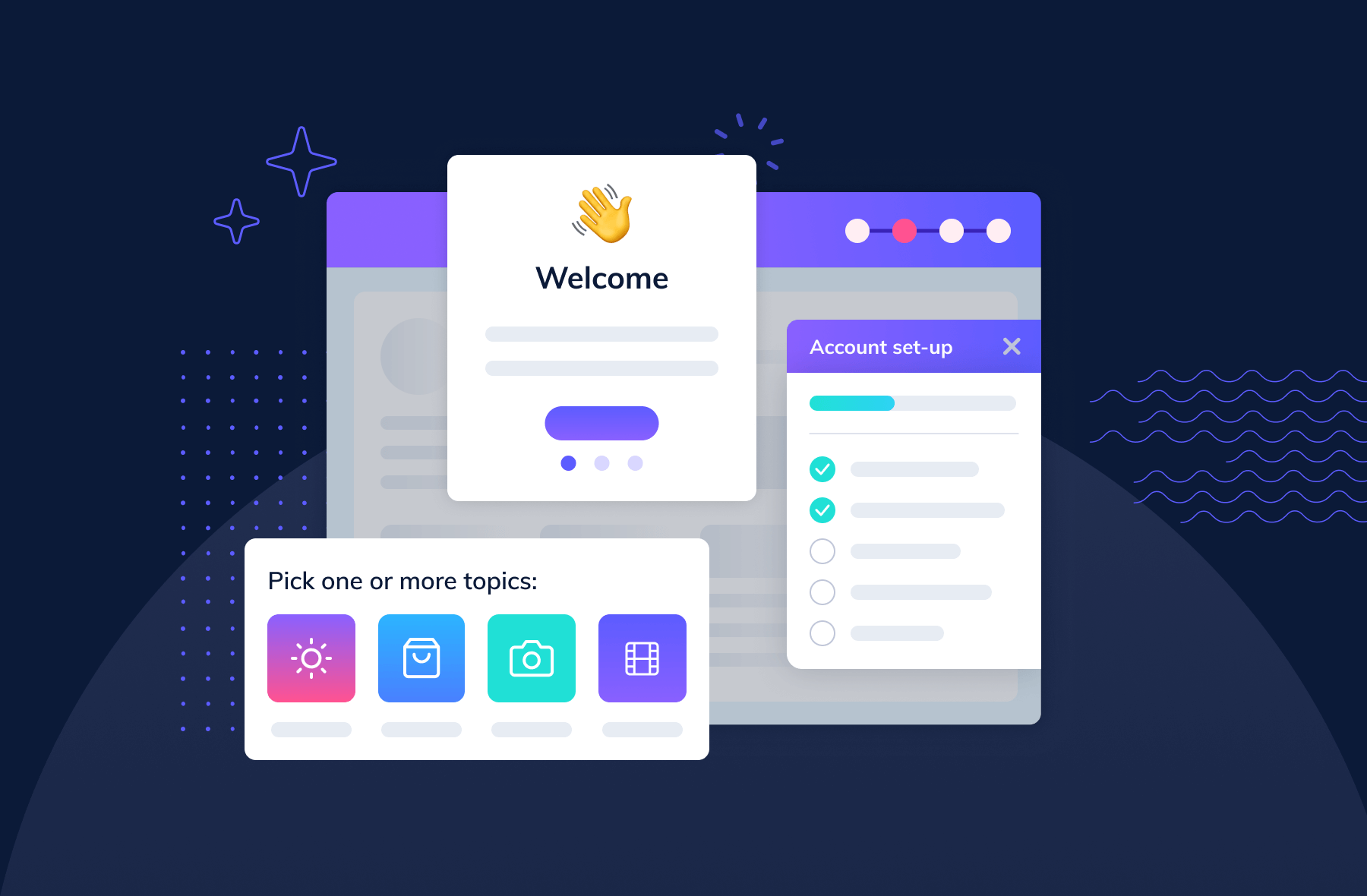
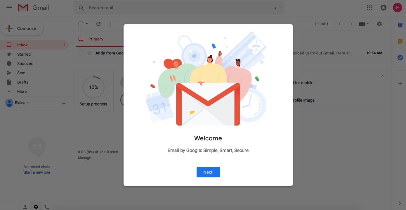
Welcome messages are any greeting that first-time users see when they log into an app for the first time, and these messages usually contain words like “Hello” or “Welcome.” The message often includes an opportunity for action—like a CTA to begin a brief product tour or walkthrough. Welcome messages help users feel more, well, welcome to your app and can help set expectations and tone.
.jpeg)
About 9 in 10 new user onboarding sequences begin with a welcome message. Welcome new users when they first log in to your app and give them direction on the next steps to take in their product journey.
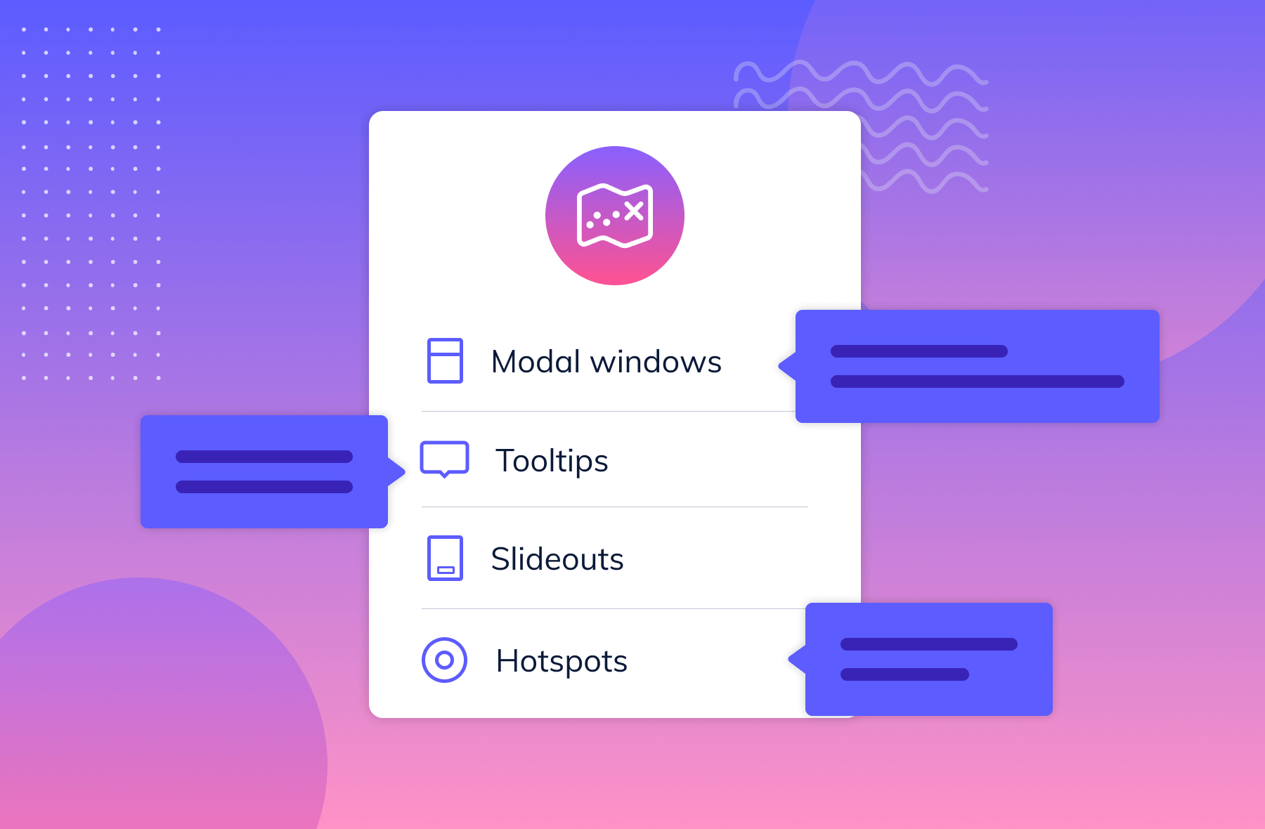
Welcome messages are often contained within a modal window—a large UI element that visually separates the user onboarding experience from the application’s interface itself. These messages often have a layer of transparency behind them to give users a peek into the main app. This design helps users keep an eye on their end goal and may motivate them to complete your user onboarding experience to start using your app.
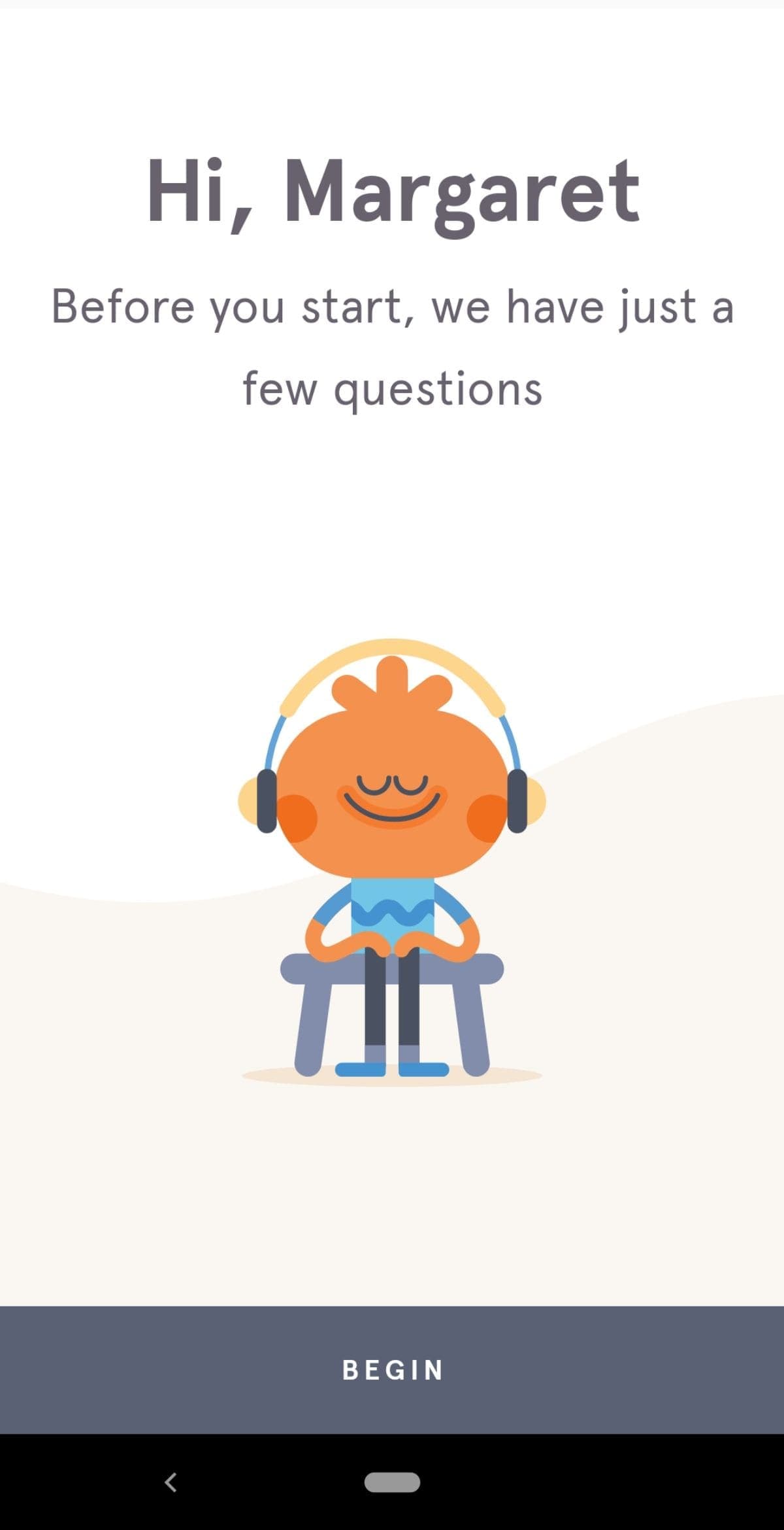
Alternatively, some welcome message modals take over a user’s entire screen, blocking visibility into your app and focusing a user entirely on the message and user onboarding experience in front of them. We refer to this pattern as a full-screen takeover. This pattern is highly disruptive and is best used sparingly or saved for when there are required inputs that a user must fulfill before using your product.
Here’s a good deep dive into in-app welcome messages.
You can build welcome messages with Appcues’ modal windows or with one of these open-source alternatives:
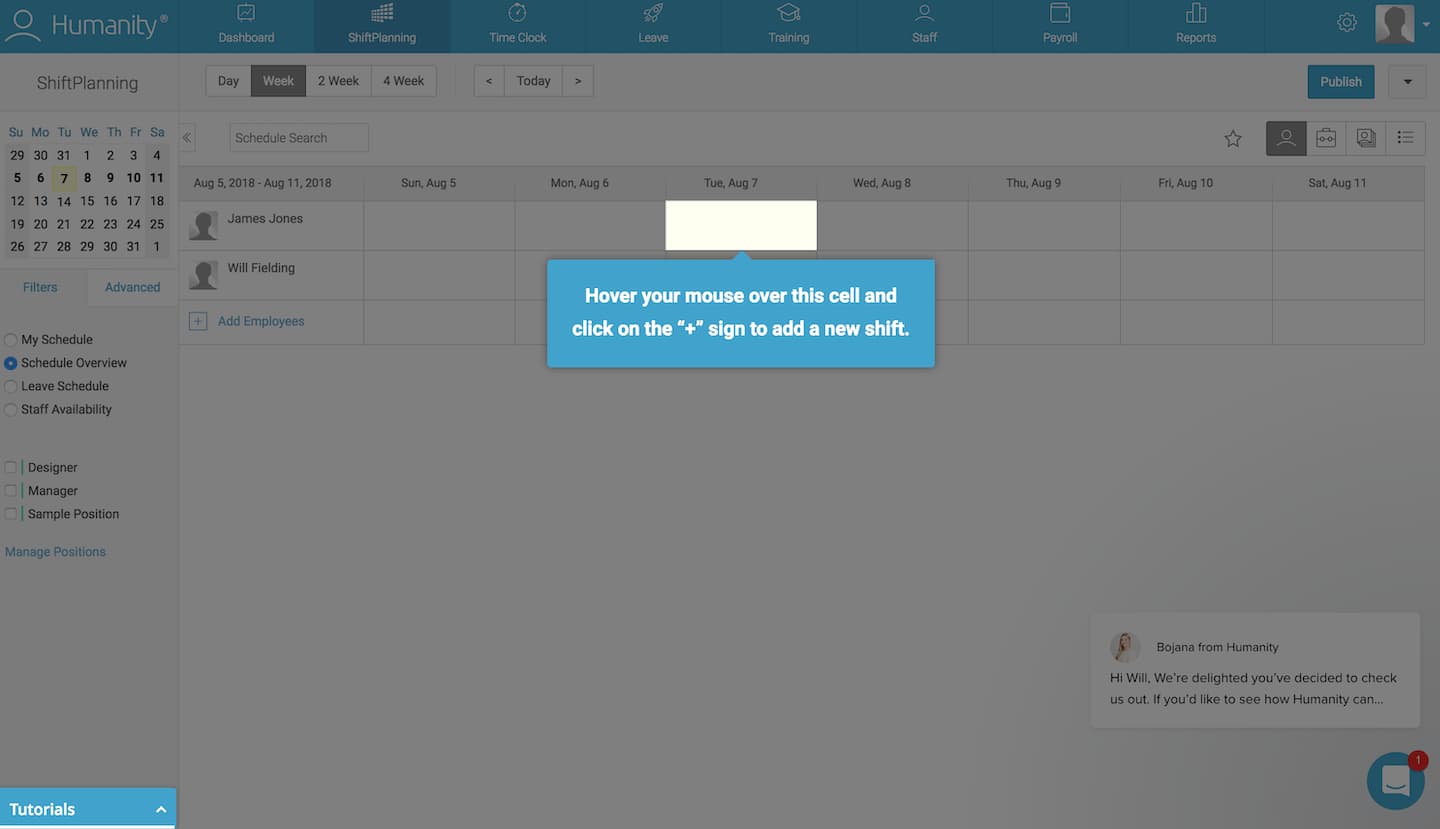
Product tours are in-app guides that walk new users through your app to familiarize them with your UI. These guides show new users key workflows or processes that make your product valuable and are useful for driving full product adoption. Product tours can take the form of various UI patterns and often include videos to show users your product in action.
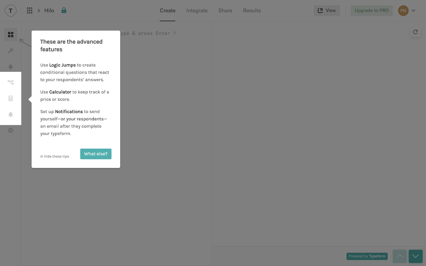
Use product tours when you want users to take specific action or complete certain processes in your app. The process can be simple or complicated—what’s difficult to the user might be simple for you, so always err on the side of creating a product walkthrough.
Product tours often come in the form of tooltips. Tooltips are boxes with pointers that call out and contextualize certain elements within a product. A few tips to optimize your product tour’s user onboarding UX:
You can build product tours with Appcues’ tooltips or with one of these open-source alternatives:
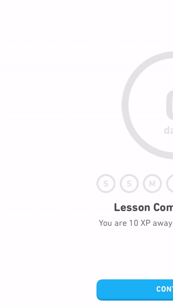
Progress bars are visual representations of a new user’s progress toward completing tasks in your app. They’re common with processes like downloads, installations, and file transfers. Progress bars say, “Hey, you’re on your way! Just a little more effort, and you’ll get there.”
Use progress bars (or similar progress indicators, like dots, dashes, and fractions) to motivate new users to complete their onboarding. You should also use progress bars to show how long a task featured in a product walkthrough will take to encourage completion.
Progress bars are most effective at motivating users when they show a substantial percentage of the bar filled out. Starting with a partially completed progress bar helps a user feel like they’ve already accomplished something instead of starting from scratch. This sense of progress increases a person’s desire to complete the task at hand.
You can add progress bars to your app onboarding with Appcues’ modal windows or build your own with one of these open-source alternatives:
A checklist is a visual depiction of tasks that informs people how many tasks they have and haven’t completed. Like progress bars, they play into powerful psychological principles, motivating new users to finish—and even enjoy—the crucial setup tasks required to get up and running within your product. Users will see a checkmark next to completed tasks while uncompleted ones are left unticked.
Checklists are used for complex tasks and multi-step processes during user onboarding. They also combine well with a progress bar to turbocharge motivation.
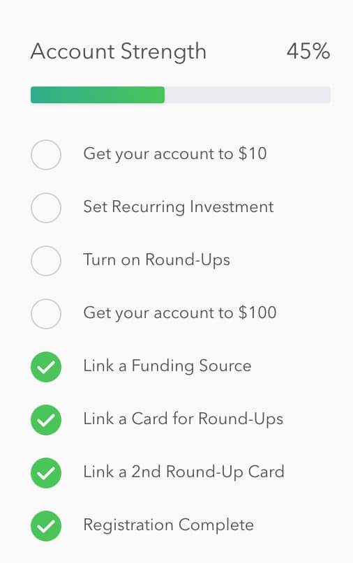
Checklists work best when they live alongside your product as a present reminder of the tasks that still need to be completed.
For more checklist design inspiration, check out 5 other examples of best-in-class checklists.
Yup, we offer checklists too! You can add progress bars to your user onboarding with Appcues’ Checklists or build your own with one of these open-source alternatives:
Hotspots are small dots that prompt people to focus on specific elements or features of your app’s UI. A cross between notification badges and tooltips, hotspots are a great alternative to tooltips since they can appear passively without a user’s active interaction with your product.
Hotspots are subtle and discreet. They’re best for calling out non-essential features without interrupting user workflow. They’re also useful for giving some contextual help to entice new users to activate certain elements or features in your app.
Beautify your hotspots with unique pulsating animations to catch the user’s eye. Adjust the intensity of your animation so that users can easily digest relevant information. You don’t want users to miss the point of the hotspot.
You can build hotspots with Appcues or create your own with one of these open-source alternatives:
Tooltips are in-app messages that pop up when someone hovers over, stops at, or clicks a specific element on your website or mobile app. Tooltips work best on elements like text links, buttons, and icons. They disappear when the user leaves the element.
Use tooltips when you want to isolate elements like form fields or buttons to guide a user through account setup. Once a user completes a step, they’re referred to the next one, and so on.
Highlight a given element in your app and darken the space around it to help users to follow a particular set of instructions and path through your product. However, you should be careful not to overdo tooltips—they can come off the wrong way to more independent-minded users.
Don’t place tooltips on information that is essential to the success of a new user’s task. Tooltips disappear, and users would need to memorize the information to complete the task.
You can build action-driven tooltips with Appcues’ tooltips or with one of these open-source alternatives:
Deferred account creation allows new users to experience the value of your product before asking them to sign up. New users can see the value of your product without the commitment of adding their email, creating a password, or inputting other details. Delaying account creation will help you avoid signups from users who aren’t a good match with your product.
Defer account creation when you want to ensure that new users have a certain level of commitment to your product before signing up. Some products delay account creation until after the initial landing page, while others go as far as delaying account creation entirely until after a user has reached their aha moment. This process is called gradual engagement.
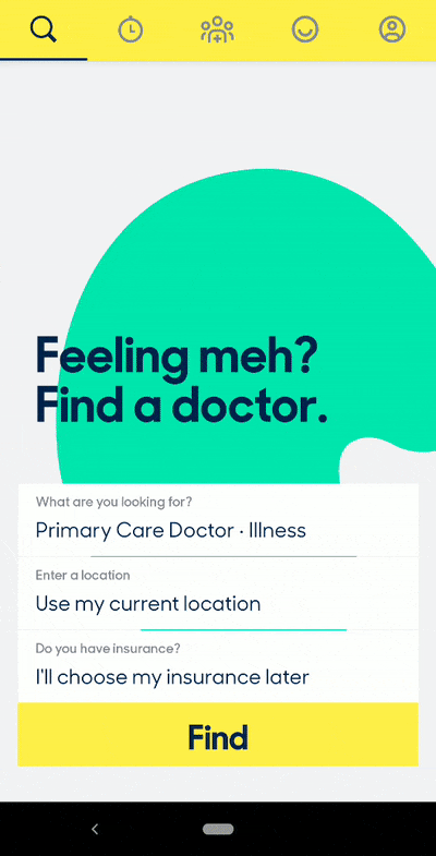
Move new users through your app slowly, helping them experience the value firsthand before requiring that they sign up for an account. You can also defer account creation by decreasing the number of form fields to fill out and the amount of personal information you require of users. This can be as simple as asking users to sign up with only their email address at first—it increases conversion rates on your signup page by lowering the barrier of entry.
The UI for delayed account creation needs to be hyper-focused once you actually get to the registration step. If a user doesn’t realize they need to save their account, you may lose them if they bounce—or perhaps even worse, they may lose their progress and feel so frustrated that they churn.
There isn’t any single UI pattern for deferred account creation. Depending on how you plan to communicate the need for registration, you may want to use tooltips to draw attention to a signup CTA or a modal window at an appropriate moment in the user journey. You can build either pattern with Appcues or the following open-source alternatives:
Persona-based user onboarding means designing new users’ onboarding experience based on their role or desired outcome while using your app. This user onboarding UX design prompts users to self-segment by selecting their own course of action, with each option leading to different first experiences. Segmenting can happen without the user knowing it—by using data collected on signup—or through a choose-your-own-adventure option.
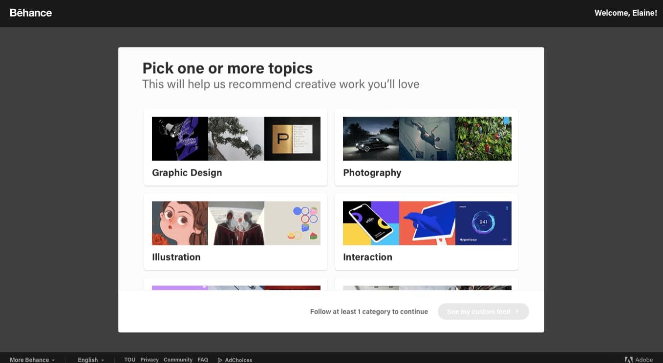
Use persona-based user onboarding during or after the signup process if your app has multiple products or offers serving different target audiences. It gives users personalized and relevant first experiences with higher engagement and lower time-to-value rates.
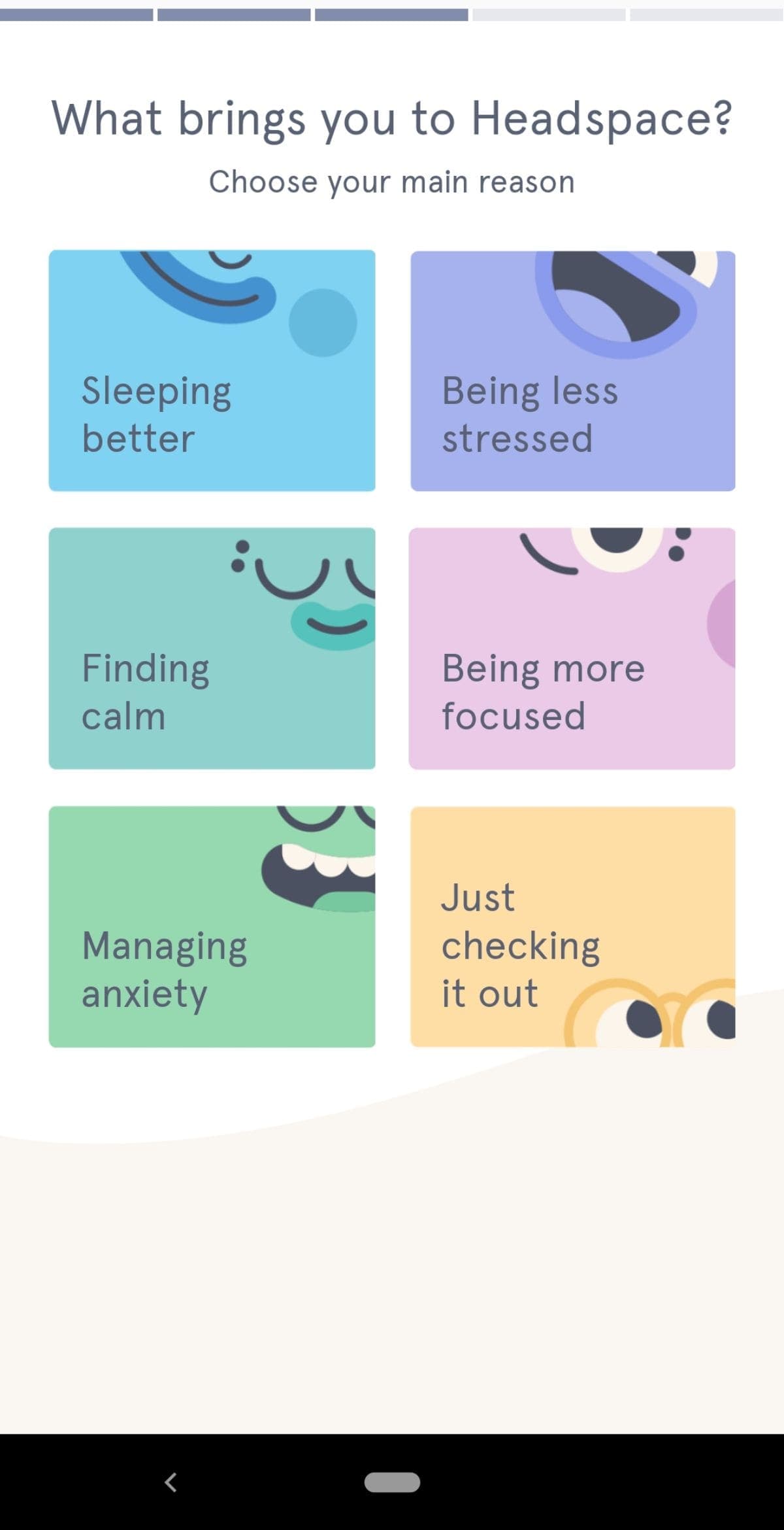
Personalized user onboarding often starts with an option after a user has filled out a signup form. The option may be a clear choice for the user based on their desired outcome, or it may be to select their job role.
It’s important not to overwhelm the user with too many choices. From what we’ve seen, 2–5 options seem to be the magic number.
You can create persona-based user onboarding with Appcues or by hard-coding the logic and data loops with an open-source alternative.
There are hundreds of fantastic user onboarding examples for every UX/UI pattern we’ve listed. Head over to ReallyGoodUX for some of the best examples for mobile and web—whether you’re actively building your user onboarding flow and need inspiration, or you’re just trying to stay on top of the trends.
Thoughtful onboarding experiences are the difference between converting free users to paying customers and experiencing drop-offs after signup. To help you avoid or combat these, here are the best tips for creating onboarding experiences.
Each customer is different, but they signed up for your product because they believed it could benefit them. Use your user onboarding experience to validate their belief about your product.
Look at your existing customers who have been around for more than 90 days. Find behavioral patterns and compare them with customers who didn’t stick around. Tools like Amplitude or Mixpanel allow you to segment customers into behavioral cohorts where you can analyze what’s driving user retention or possibly causing churn. A cohort like “users who bought a product add-on” can help you understand where your users need more guidance. Giving these users the necessary instructions can convince them that paying for your product or buying a higher plan is worthwhile.
Collect direct user feedback through conversations, emails, and in-app surveys if you don’t have enough data to use a product analytic tool. Look for patterns in their responses and apply anything you learn to improve your onboarding experience. Your product and customer behavior will change over time, so stay on top of any changes by actively collecting user feedback.
UX copy will be your users’ guide throughout their interactions with your product. Use these tips to help you write effective UX copy:
Check out this article for a more in-depth look at how to write exceptional UX copy.
Tests and experiments will give you data to make better decisions instead of relying on gut feelings. Sometimes your instincts are based on conscious or unconscious biases that blur the line between a good idea and a terrible one. Testing will help you ensure you’re making changes the user actually needs—not what you think they need.
Run tests and experiments to confirm or disprove any assumptions you have about creating onboarding experiences for your customers. If you think your free trial users are not converting to paid users because of a certain feature, test it. Withhold the feature from some users and leave it for others. Analyze your results and apply the insights you gain by removing or adding new features and running more tests.
A product analytic tool like Amplitude allows you to perform A/B tests that will enable you to improve your onboarding UI and onboarding patterns. Don’t stop at testing sticky app features that improve the user onboarding experience. Test your user onboarding UI and UX copy too. You’ll get a lot of data points to help you further optimize your user onboarding.
Each common UI pattern can be built with either open-source or SaaS solutions, and both have their advantages.Here’s how they compare:
Give your non-technical team the keys to engaging new users with a SaaS solution. Think about it: Who’s more familiar with the user journey and writing compelling copy—your marketers and CSMs or your engineers? However, if you’re bootstrapping and have an abundance of dev time, open-source solutions may make sense.
Read: 8 examples of effective SaaS onboarding experiences (plus tips)
User onboarding on a website is how the website helps you understand its product: what you can do with it, how to use it, and how using certain features benefits you. It involves product tours, flows to explain certain features, and in-app messages to encourage learning and app usage progress.
You can improve an onboarding process with UX in the following ways:
Design an onboarding experience in the following steps:
A couple of user onboarding examples for inspiration:
You can find other onboarding examples on ReallyGoodUX.
Companies are constantly launching multiple feature updates, and existing users need updated training to keep up. So, don’t stop onboarding after new users are acquainted with your product—make it a vital part of their ongoing product experience.
If you focus on giving users the best experience possible on your app, you’re already halfway to making excellent first impressions with your onboarding flow. The other part would involve creating onboarding patterns that fit with your users, their journey, and their desired outcome with your product. That’s how you’ll retain users, grow revenue, and, who knows, probably create an app people can’t live without.