User onboarding throwdown: Trello vs Asana
.png)

.png)
Do you work at a startup? If so, chances are you use Trello or Asana. According to Stacklist, the vast majority of startups are running on one or the other (or both!).
When you get down to it, both tools are designed to do the same thing: organize your projects. However, Trello and Asana take very different approaches to onboarding. Let’s see which one’s flow is more effective with some good, old-fashioned, head-to-head combat.
“Signing up is really fun,” said no one ever. That’s why the best sign-up processes are over almost instantly.
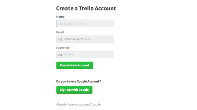
And that definitely applies to Trello’s process. Look at how fluid it is: Just enter your name, email, and password, and bam, you’re done. One second later, Trello presents you with your dashboard.
Nonetheless, there is one way it could be improved. The password rules don’t show up until you violate them, forcing you to use a trial-and-error strategy. It’s always frustrating to pick out a password and learn belatedly it didn’t fulfill some requirement, like “must contain at least one upper-case character.”

Asana’s sign-up process isn’t nearly as quick and effortless as Trello’s.
Things begin smoothly: I only have to fill out one box (for my email), rather than four boxes (email, enter email again, password, enter password again) that many onboarding flows include, so I can fill out the form with ease.
Unfortunately, it goes downhill from there. Before I can get into the app, I need to go to my inbox, wait for the confirmation message, and then click the verification link.
That’s an annoying detour to complete before I’ve gotten even the tiniest value from the product. And then, there’s a 41-second tutorial video! Really?!?
My experience peaks slightly at the end. Asana recognizes which email host you use and changes the button accordingly, so when I put in a Gmail address, the copy read “Open your Gmail inbox.” Nice touch.
Round 1 Winner: Trello
Undoubtedly, this portion of the onboarding process is the trickiest. Most products have way more features than time—or user attention—allows for, so honing in on the most useful and impressive is crucial. The process also needs to be uncomplicated and, well, fun!
After I’ve created my account, Trello brings me to my dashboard. There’s not a ton going on, so it’s easy to figure out I should click on the “Welcome” board.
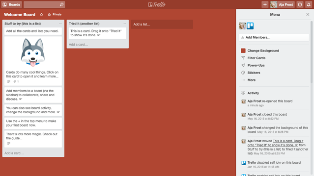
Woah—a completely fleshed-out board. Rather than having to read pop-ups or follow arrows, I can infer how the product works by using the product. User onboarding expert Samuel Hulick calls this revolutionary approach the “content is the tutorial” method.
It takes approximately two minutes to open all the cards, and I’ve already learned:
The “Aha!” moment actually took place in mini-lesson #1, when Trello tells me to drag a card from the “Stuff to try” column into the “Tried it” one. You can instantly see Trello’s value: create a task, do it, and move it.
It’s worth noting what Trello’s tutorial leaves out. When I tried out the previous onboarding process (January 2016), it also highlighted the keyboard shortcuts, mobile apps, labels, and archiving feature. Cutting these out of the flow was wise, as a new user needs to create cards and boards before she can label, archive, or change them.
Trello’s onboarding process is lacking in one regard. After I’ve opened all the cards, I’m not quite sure what to do next. Buried in the middle of the flow is the instruction to “make your first board,” but it would be way more effective to close with something like, “Now that you know how to use Trello, turn your first board into an overview of a current project!”
You know that “content is the tutorial” method? Well, Asana’s method is basically the opposite of that. After I click the verification link, I need to complete my profile (30 seconds, plus 15 more while I tried to find a nice picture) and add a couple teammates (45 seconds, since I had to open a new tab and find their emails). One minute and half later, I finally land in my dashboard and...
Nothing happened.
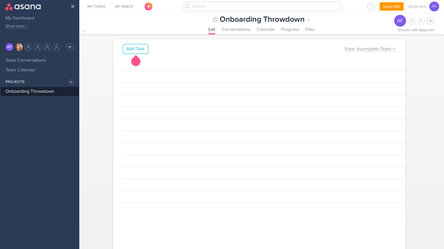
I experimentally jiggle the mouse, click a couple keys, and am on the verge of clicking “Add task,” when I notice a softly glowing icon at the top of the screen. A opened tooltip—or even a much bigger icon—would’ve helped me find what I was supposed to do much faster.
A tool-tip does pop up, however, when I hover the icon.

Next, I obediently follow the instructions to name my project, add a task, assign that task to a team member, add comments, tag my coworkers, set deadlines, and attach files.
The obvious quick win took place when I created a task. Yet, I’d argue the user really sees the benefit of the product for the first time when she mentions a teammate on a task. Most people use a task manager, and everyone uses email—Asana’s ability to combine those tools into one platform is its core value.
Even though Asana’s “Aha!” moment might be more impactful than Trello’s, Trello’s flow is more engaging, so it takes this round.
Round 2 Winner: Trello
Hulick has argued that customer lifecycle emails are the “most-ignored, highest-leverage part of the onboarding experience.” With that in mind, I was eager to see how Trello and Asana would each use this opportunity to show me features and get me back in the app with email.
(Check out top examples of user onboarding.)
The same day I sign up, Trello sends me a welcome email.

This message is extremely well-done. The copy is down-to-earth, natural, and friendly, perfectly matching Trello’s brand personality. The CTA is strong and extremely prominent. Plus, during the previous stage, Trello introduced me to Taco, the “husky mascot,” and said I’d see a lot of him; true to their word, this message came from “taco@trello.com.”
Two days after sign up, I get another email from Taco.
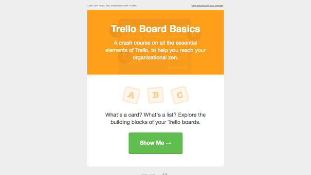
Again, Trello nailed it. By using words that connote simplicity (“zen,” “basics,” “essentials,” etc.) and keeping the design minimal, this email reminds the user on a subconscious level how easy Trello makes life.
Like Trello, Asana sends me a welcome email on Day One.
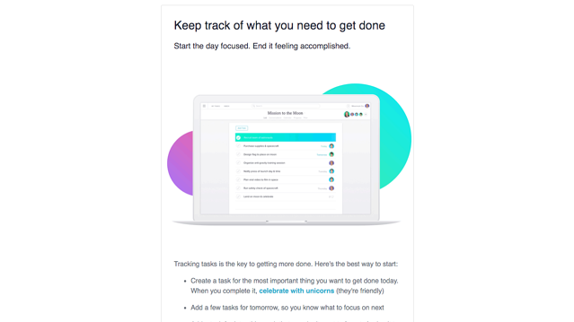
Unlike Trello, Asana doesn’t direct me to a lesson; instead, all the info is contained within the email itself, and the CTA lets me execute on that info by bringing me to a specific feature of the app.
While this strategy makes the email longer and more complex, I appreciate that it’s one step shorter. I also love the “bonus” tip at the end: it makes the user instantly feel more efficient.

The second email arrives on Day Three. This one followed the same format: mini-lesson, link to in-app feature, bonus tip.
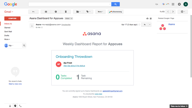
Asana’s email strategy deviates from Trello’s in one major way—every week, you get a report summarizing how many tasks you completed, how many you still have left, and the status of your projects.
Quantifying user activity was really smart, since many people will find it fun to compete with themselves and continually ramp up their productivity. It’s a great example of providing usefulness while encouraging the user to open your product.
Round 3 Winner: Asana
It’s not very close: Trello was triumphant two rounds out of three. Overall, I found Trello’s onboarding process engaging, whimsical, and most importantly, focused. The user doesn’t finish the tutorial knowing how to use all 48 of Trello’s features—and that’s a good thing. By concentrating on the core features, Trello makes its app seem like a basic but highly effective tool. Once you’re sold on the utility, the lifecycle emails can introduce you to more advanced options.
That’s not to say Trello’s flow was perfect: adding some guidance toward the end of the welcome board experience would encourage newbies to stay in the app longer.
Asana’s onboarding process could also be improved. The sign-up process is bewilderingly long (especially because the product itself is so easy to use.) Also, it’s lacking some of Trello’s whimsy—not that every app should have a cute mascot or use the “content is the tutorial” approach, but Asana could make its tone a little friendlier and insert some “winks” into the UX.
(Take a look at how Slack, Tumblr, Canva, and other apps have infused their onboarding process with personality.)