← Visit Appcues.com
×
×

How to design a successful user onboarding process

A successful user onboarding process creates long-term customers by driving them to a moment of value. Here's how to do it.
Skip to section:

Skip to section:

Aspiring musicians often pick up a guitar in the hopes of playing their favorite song. Most quickly discover the steep learning curve between figuring out how to tune a six-string and playing Van Halen’s “Eruption” note-for-note. According to world-renowned guitar manufacturer Fender, 90% of new players abandon their attempt to learn the guitar within a year. (As product people, we know it’s hard to invest in a product that doesn’t immediately reveal its value.)

Guitar instructors usually start new students with simple songs to get newbies playing actual music ASAP—to deter them from giving up too quickly. This approach engages new players and gets them excited to continue progressing toward their larger goals. (It also creates situations where 12-year-old guitarists only play “Smoke on the Water” for three months, driving their parents to the brink of madness.)

gif of small bird pretending to play electric guitar
(Source)

This “show me now” mentality also applies to digital products. New customers who can’t figure out how to use a product in a meaningful way within a short time frame are unlikely to adopt long-term usage habits. A reported 21% of customers quit using an app after a single try. Worse yet, 90% of a mobile app’s customers will be long gone within a single month.

User onboarding is the process of acquainting new customers with your product to increase the likelihood of product adoption. An ideal user onboarding process guides the user directly to the critical “aha moment” that shows them the value of your product. It’s arguably the most essential stage in a customer’s lifecycle to your product as a whole. (You can’t wow users who don’t stick around!)

All successful user onboarding processes prioritize the quick reveal of value to customers above all other considerations to ensure continued usage—and this is how they do it.

The formula for perfecting your user onboarding process

The single most important component of a good user onboarding process is minimizing your time to value. Time to value measures how long it takes customers to go from signing up for your product, to realizing its true potential. This means the best formula for perfecting your onboarding is the one that calculates your time to value. A simple version of this formula looks like this:

The fastest time to value = the right users + the right guidance + the right timing.

There’s no point in having a million users sign up for your app if none of them have any intention of using it—so you need to make sure you’re attracting the right users first. It’s better to commit to marketing a product to a defined set of users who would actually benefit from your offering.

Second, you need the right guidance. The more features your product has, the easier it is for users to get lost on the way to that value-revealing aha moment. Even relatively straightforward products stand to benefit from quick pointers that specifically call out the benefits of certain features in the form of product tours, tutorials, or walkthroughs.

Finally, you must deliver your guidance to these users at the right time. You don’t want to wax poetic about backend improvements in a product tour geared toward new users. Alternatively, you don’t want to wait to point out vital details about your app after your users have already become frustrated with it.


The 4 essential elements of a user onboarding process

There are countless approaches to teaching someone to play guitar, but even the most unique styles contain the same essential facets, like standard picking techniques and basic music theory. Likewise, while your product’s special features and user base will dictate a unique customer experience, there are several elements that should always be considered while attempting to minimize your product’s time to value.

1. Customer research

Before you fine-tune your actual onboarding process, you need to attract the right users to your product. Customers who download Tinder to order their food instead of Uber Eats aren’t going to stick around. Even the most customer-pleasing onboarding process can’t retain users whose pain points aren’t eased by a product’s offering.

Customer research enables companies to better target users with a higher likelihood of sticking around in the first place. There’s no sense in altering your onboarding process to appeal to customers who are unlikely to find the value of your product in the first place. The best way to find out what kinds of customers you’re building for and what their needs are is by asking them through:

Picking the brains of your existing customers will help single out the elements of your existing onboarding process that annoyed or resonated with your customers. Well-framed questions can also reveal what your prospective and existing customers found frustrating about your competitors’ onboarding processes. Methods for avoiding these criticisms and highlighting these triumphs can be baked into your eventual strategies for improving your product’s user onboarding.

2. A simple sign-up

Effective user onboarding emphasizes a brief and intentional sign-up process to keep the customer moving through your product’s experience. If you’re promising customers a smooth experience and then bogging them down with a 15 minute sign-up form, that’s not smooth! Instead, your sign-up process should be crystal clear and prioritize the minimum amount of information required to get them started. This will minimize the time it takes to bring them to that all-important aha moment and eliminate confusion.

We heard this same sentiment echoed by Picsart's Product Manager, Tamara Vanetsyan, when we asked her what she first looks for in an onboarding experience:

"The first thing I look for in an onboarding experience is clarity. I want to understand what the product or service does and how it can benefit me. When starting a free trial, I notice if the process is smooth and if the instructions are clear. If it's off, I might encounter confusing steps or unclear value propositions, which can be a red flag."
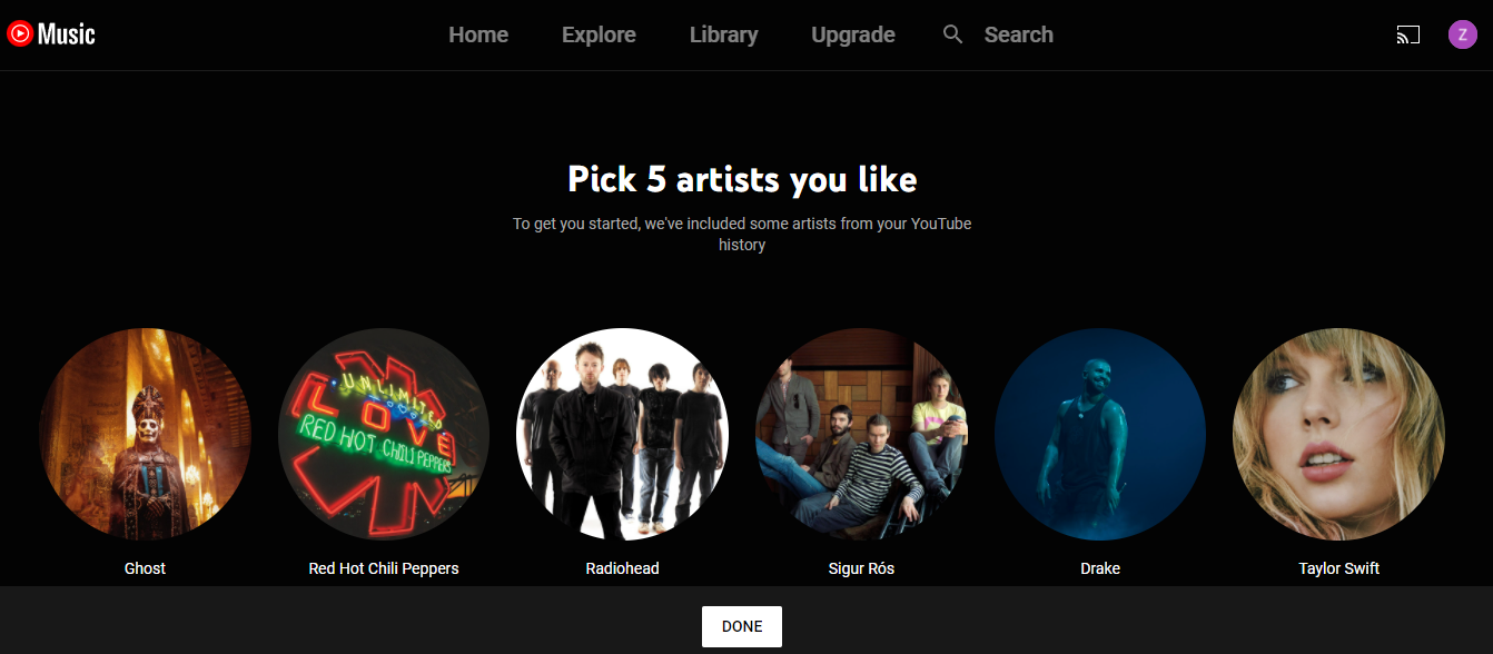
screen grab of youtube music onboarding screen
YouTube Music only asks users to select five bands to minimize setup time. (Source)

This doesn’t mean you shouldn’t track down other information later in the customer journey. Use demographic and psychographic information to customize product experiences or provide recommendations to users down the line. Prompts to get customers to complete their user profiles should be sent via in-app messaging or emails once consistent usage habits have been established to minimize friction.

3. The product tour

The product tour is the quintessential tool for showing customers how to use the features you’ve built for them. A product tour walks your users through the basic functionality of your app. The goal of a product tour is to minimize the confusion that can muck up a customer’s first critical interaction with a new product. Instead of letting a customer wander around your product aimlessly hoping they find value, a well-constructed product tour illustrates the most valuable features outright.

While no 2 product tours are the same, they often consist of any combination of the following types of in-app messaging patterns:
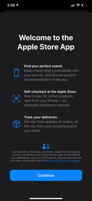
screen shot of apple store app welcome screen
The Apple Store app summarizes its most valuable features immediately upon first opening it. (Source)


The most effective product tours keep it short and sweet. Users get frustrated when they don’t know what to do in a new app, but they’re also turned off by intrusive tours, tutorials, and walkthroughs that never end. Your product tour should highlight the fastest way to use important features, and then promptly get out of the customer’s way.

4. The aha moment

You can’t drive users to the action that encourages retention if you don’t know what it is. A study of your product data shows what event in your customer’s journey activates your customer. Somewhere along the way, a customer completes an action that flips their experience from “trying to use this product” to “actively engaged with the product.” That particular critical retention event is what your entire onboarding process should be built around.

For instance, a music streaming platform’s aha moment could be when a user first downloads a song. Once the download has been completed, the customer begins to build their music library track by track. This increases the likelihood that they stay engaged with your product into the future.

3 crucial tips for optimizing your user onboarding process

The name of the onboarding game is ease of use. Limiting friction for your new users increases the likelihood that they engage with your product long enough to discover its true value. Several best practices for improving your user onboarding process include:

1. Segment your onboarding flows

Not all “new” users are created equal. For example, some customers have never used your product before and would benefit from in-app messaging guidance. Others might have used your product in the past and are returning after churning. (You wouldn’t want to force returning users to sit through a multi-step product tour highlighting features they already know how to use, right?)

User segmentation creates a more customized experience for users that feeds into their growing appetite for personalization. Users coming to your product from an advertisement highlighting certain features could be funneled to a specific onboarding flow whose product tour emphasizes those same features. Alternatively, different onboarding experiences should be built for new users who purchased a subscription to your product upfront versus customers using your product on a freemium basis.

2. Preserve user momentum

Segmenting your users will optimize your onboarding processes, but even users within the same segment will run through your app at their own pace. The best onboarding flows allow users to opt out of non-essential product tour messages at their convenience. This prevents impatient users from feeling stuck when they’re ready to use your product immediately.

You should also limit the activation of in-app messages pertaining to certain features to when the user actually engages with said feature. This prevents customers from being overwhelmed by instructions and hyper-focuses assistance to when the user is interested in what a feature can do.

The preservation of user momentum is also important when dealing with empty states, such as when a customer first clicks on their inbox and finds no messages. An empty inbox destroys a user’s momentum through the onboarding process. Avoid this issue by designing your onboarding empty states to guide users forward using CTA’s like, “Write your first message!” instead of letting users languish.

screen shot of linkedin empty inbox message
LinkedIn propels users to action when they have empty inboxes. (Source)

3. Engage your product data

Your greatest resource in the fight to effectively onboard new users is your own product data. Your users show you the greatest points of friction in your user onboarding process, whether they realize it or not. An analytics tool like Amplitude will help you take advantage of your product data by showing you an event-by-event breakdown of user engagement.

Imagine this hypothetical scenario: While scrutinizing your product data, you find that while 95% percent of users begin a product tour. However, an event-by-event analysis reveals only 50% of those users actually finish one. In this case, it’s worth evaluating length or number of steps currently included in your tour.

Analysis of your product data will also help you flag users who have dropped off completely. The best way to reach these users is through a tactful email reminding them of where they left off (or even incentivizing them to return). These emails should put your product’s value proposition at the core of its messaging and should include a CTA that links customers back to your product and back into action.

Harness your user onboarding process to reveal your product’s potential

It’s important to keep in mind that your aha moment doesn’t need to reveal the full value of your product to your customer all at once. A new guitarist doesn’t need to learn the entire Beatles catalog before they find a reason to stick to it. They just need to be patient enough to learn a single “Hello Goodbye” or “Yellow Submarine” to see the possibilities that open up with their continued practice.

Similarly, your product is chock-full of helpful features, but your onboarding process doesn’t need to hit every beat. Instead, build your onboarding process to drive your customer to that singular event that reveals the possibilities your product can provide for them.

Eric Keating
VP, Marketing at Appcues
Eric heads up Marketing at Appcues. When he isn't helping companies become more product-led, he’s likely to be found keeping up with his wife and two children, exploring the White Mountains, or fermenting things at home.
Skip to section:

Skip to section:

Aspiring musicians often pick up a guitar in the hopes of playing their favorite song. Most quickly discover the steep learning curve between figuring out how to tune a six-string and playing Van Halen’s “Eruption” note-for-note. According to world-renowned guitar manufacturer Fender, 90% of new players abandon their attempt to learn the guitar within a year. (As product people, we know it’s hard to invest in a product that doesn’t immediately reveal its value.)

Guitar instructors usually start new students with simple songs to get newbies playing actual music ASAP—to deter them from giving up too quickly. This approach engages new players and gets them excited to continue progressing toward their larger goals. (It also creates situations where 12-year-old guitarists only play “Smoke on the Water” for three months, driving their parents to the brink of madness.)

gif of small bird pretending to play electric guitar
(Source)

This “show me now” mentality also applies to digital products. New customers who can’t figure out how to use a product in a meaningful way within a short time frame are unlikely to adopt long-term usage habits. A reported 21% of customers quit using an app after a single try. Worse yet, 90% of a mobile app’s customers will be long gone within a single month.

User onboarding is the process of acquainting new customers with your product to increase the likelihood of product adoption. An ideal user onboarding process guides the user directly to the critical “aha moment” that shows them the value of your product. It’s arguably the most essential stage in a customer’s lifecycle to your product as a whole. (You can’t wow users who don’t stick around!)

All successful user onboarding processes prioritize the quick reveal of value to customers above all other considerations to ensure continued usage—and this is how they do it.

The formula for perfecting your user onboarding process

The single most important component of a good user onboarding process is minimizing your time to value. Time to value measures how long it takes customers to go from signing up for your product, to realizing its true potential. This means the best formula for perfecting your onboarding is the one that calculates your time to value. A simple version of this formula looks like this:

The fastest time to value = the right users + the right guidance + the right timing.

There’s no point in having a million users sign up for your app if none of them have any intention of using it—so you need to make sure you’re attracting the right users first. It’s better to commit to marketing a product to a defined set of users who would actually benefit from your offering.

Second, you need the right guidance. The more features your product has, the easier it is for users to get lost on the way to that value-revealing aha moment. Even relatively straightforward products stand to benefit from quick pointers that specifically call out the benefits of certain features in the form of product tours, tutorials, or walkthroughs.

Finally, you must deliver your guidance to these users at the right time. You don’t want to wax poetic about backend improvements in a product tour geared toward new users. Alternatively, you don’t want to wait to point out vital details about your app after your users have already become frustrated with it.


The 4 essential elements of a user onboarding process

There are countless approaches to teaching someone to play guitar, but even the most unique styles contain the same essential facets, like standard picking techniques and basic music theory. Likewise, while your product’s special features and user base will dictate a unique customer experience, there are several elements that should always be considered while attempting to minimize your product’s time to value.

1. Customer research

Before you fine-tune your actual onboarding process, you need to attract the right users to your product. Customers who download Tinder to order their food instead of Uber Eats aren’t going to stick around. Even the most customer-pleasing onboarding process can’t retain users whose pain points aren’t eased by a product’s offering.

Customer research enables companies to better target users with a higher likelihood of sticking around in the first place. There’s no sense in altering your onboarding process to appeal to customers who are unlikely to find the value of your product in the first place. The best way to find out what kinds of customers you’re building for and what their needs are is by asking them through:

Picking the brains of your existing customers will help single out the elements of your existing onboarding process that annoyed or resonated with your customers. Well-framed questions can also reveal what your prospective and existing customers found frustrating about your competitors’ onboarding processes. Methods for avoiding these criticisms and highlighting these triumphs can be baked into your eventual strategies for improving your product’s user onboarding.

2. A simple sign-up

Effective user onboarding emphasizes a brief and intentional sign-up process to keep the customer moving through your product’s experience. If you’re promising customers a smooth experience and then bogging them down with a 15 minute sign-up form, that’s not smooth! Instead, your sign-up process should be crystal clear and prioritize the minimum amount of information required to get them started. This will minimize the time it takes to bring them to that all-important aha moment and eliminate confusion.

We heard this same sentiment echoed by Picsart's Product Manager, Tamara Vanetsyan, when we asked her what she first looks for in an onboarding experience:

"The first thing I look for in an onboarding experience is clarity. I want to understand what the product or service does and how it can benefit me. When starting a free trial, I notice if the process is smooth and if the instructions are clear. If it's off, I might encounter confusing steps or unclear value propositions, which can be a red flag."
screen grab of youtube music onboarding screen
YouTube Music only asks users to select five bands to minimize setup time. (Source)

This doesn’t mean you shouldn’t track down other information later in the customer journey. Use demographic and psychographic information to customize product experiences or provide recommendations to users down the line. Prompts to get customers to complete their user profiles should be sent via in-app messaging or emails once consistent usage habits have been established to minimize friction.

3. The product tour

The product tour is the quintessential tool for showing customers how to use the features you’ve built for them. A product tour walks your users through the basic functionality of your app. The goal of a product tour is to minimize the confusion that can muck up a customer’s first critical interaction with a new product. Instead of letting a customer wander around your product aimlessly hoping they find value, a well-constructed product tour illustrates the most valuable features outright.

While no 2 product tours are the same, they often consist of any combination of the following types of in-app messaging patterns:

screen shot of apple store app welcome screen
The Apple Store app summarizes its most valuable features immediately upon first opening it. (Source)


The most effective product tours keep it short and sweet. Users get frustrated when they don’t know what to do in a new app, but they’re also turned off by intrusive tours, tutorials, and walkthroughs that never end. Your product tour should highlight the fastest way to use important features, and then promptly get out of the customer’s way.

4. The aha moment

You can’t drive users to the action that encourages retention if you don’t know what it is. A study of your product data shows what event in your customer’s journey activates your customer. Somewhere along the way, a customer completes an action that flips their experience from “trying to use this product” to “actively engaged with the product.” That particular critical retention event is what your entire onboarding process should be built around.

For instance, a music streaming platform’s aha moment could be when a user first downloads a song. Once the download has been completed, the customer begins to build their music library track by track. This increases the likelihood that they stay engaged with your product into the future.

3 crucial tips for optimizing your user onboarding process

The name of the onboarding game is ease of use. Limiting friction for your new users increases the likelihood that they engage with your product long enough to discover its true value. Several best practices for improving your user onboarding process include:

1. Segment your onboarding flows

Not all “new” users are created equal. For example, some customers have never used your product before and would benefit from in-app messaging guidance. Others might have used your product in the past and are returning after churning. (You wouldn’t want to force returning users to sit through a multi-step product tour highlighting features they already know how to use, right?)

User segmentation creates a more customized experience for users that feeds into their growing appetite for personalization. Users coming to your product from an advertisement highlighting certain features could be funneled to a specific onboarding flow whose product tour emphasizes those same features. Alternatively, different onboarding experiences should be built for new users who purchased a subscription to your product upfront versus customers using your product on a freemium basis.

2. Preserve user momentum

Segmenting your users will optimize your onboarding processes, but even users within the same segment will run through your app at their own pace. The best onboarding flows allow users to opt out of non-essential product tour messages at their convenience. This prevents impatient users from feeling stuck when they’re ready to use your product immediately.

You should also limit the activation of in-app messages pertaining to certain features to when the user actually engages with said feature. This prevents customers from being overwhelmed by instructions and hyper-focuses assistance to when the user is interested in what a feature can do.

The preservation of user momentum is also important when dealing with empty states, such as when a customer first clicks on their inbox and finds no messages. An empty inbox destroys a user’s momentum through the onboarding process. Avoid this issue by designing your onboarding empty states to guide users forward using CTA’s like, “Write your first message!” instead of letting users languish.

screen shot of linkedin empty inbox message
LinkedIn propels users to action when they have empty inboxes. (Source)

3. Engage your product data

Your greatest resource in the fight to effectively onboard new users is your own product data. Your users show you the greatest points of friction in your user onboarding process, whether they realize it or not. An analytics tool like Amplitude will help you take advantage of your product data by showing you an event-by-event breakdown of user engagement.

Imagine this hypothetical scenario: While scrutinizing your product data, you find that while 95% percent of users begin a product tour. However, an event-by-event analysis reveals only 50% of those users actually finish one. In this case, it’s worth evaluating length or number of steps currently included in your tour.

Analysis of your product data will also help you flag users who have dropped off completely. The best way to reach these users is through a tactful email reminding them of where they left off (or even incentivizing them to return). These emails should put your product’s value proposition at the core of its messaging and should include a CTA that links customers back to your product and back into action.

Harness your user onboarding process to reveal your product’s potential

It’s important to keep in mind that your aha moment doesn’t need to reveal the full value of your product to your customer all at once. A new guitarist doesn’t need to learn the entire Beatles catalog before they find a reason to stick to it. They just need to be patient enough to learn a single “Hello Goodbye” or “Yellow Submarine” to see the possibilities that open up with their continued practice.

Similarly, your product is chock-full of helpful features, but your onboarding process doesn’t need to hit every beat. Instead, build your onboarding process to drive your customer to that singular event that reveals the possibilities your product can provide for them.

Eric Keating
VP, Marketing at Appcues
Eric heads up Marketing at Appcues. When he isn't helping companies become more product-led, he’s likely to be found keeping up with his wife and two children, exploring the White Mountains, or fermenting things at home.
You might also like...