← Visit Appcues.com
×
×

Why you should optimize your user onboarding flow for motivation

Motivation needs to be at the core of how you design your user onboarding flows. Here are a couple of reasons why.
Skip to section:

Skip to section:

It’s natural to want to show new users every bell and whistle of your product. It’s also the most common mistake we make when designing new user onboarding experiences because it ignores what users actually need—motivation.

Lots of people think they know what's important for user onboarding flows, but they don't
(Source)

In other words, you may have shown them every feature of your product during onboarding, and yet they still don’t know where to start or why they should care. This is why simply targeting knowledge and skills gaps in user onboarding experiences is not enough.

Rather than showing users how to do every little thing, try something else: get them motivated.

1. Get your users to an aha moment sooner

According to Upland, 25% of users abandon apps after just one use because they aren’t finding value fast enough. However, when you understand and appeal to the user’s motivations, your onboarding experience will naturally lead to value. This realization of value is commonly called activation or the “aha moment.

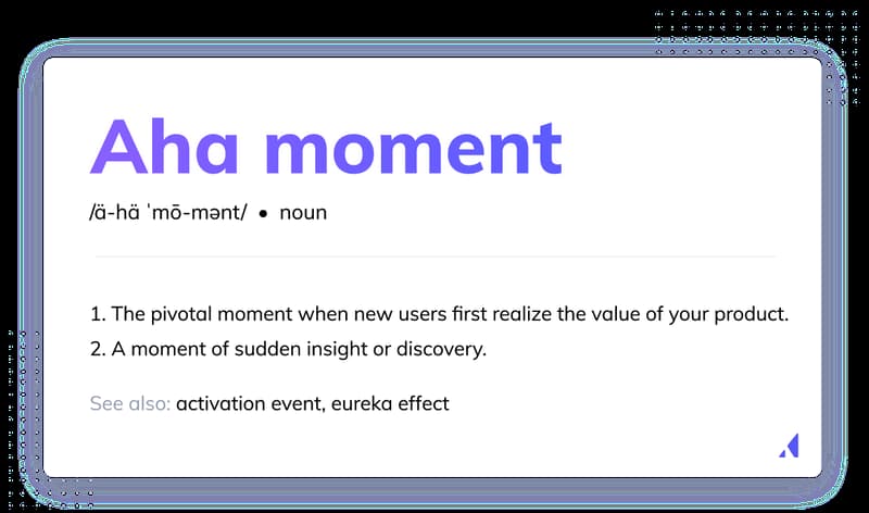
An 'aha moment" is the pivotal moment when new users first realize the value of your product


Targeting user motivation in the onboarding process means you’re showing the user the value of your product for their specific needs. You’re not just showing them every product feature that may or may not be relevant to them. When users immediately find what matters to them, they’re motivated to keep on using your product.

A great example of optimizing for the “aha” moment is the language app Duolingo that uses persona-based onboarding and custom milestones to motivate users throughout the signup process.

Duolingo starts the user journey by asking users about their language learning goals and the reasons behind them. Asking these questions ensures that product onboarding is aligned with those goals by tailoring the experience to each user.
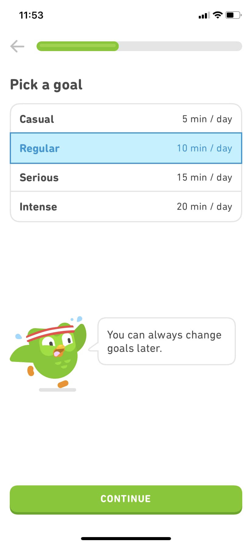
Duolingo's user onboarding flow asks you questions to learn about your needs
Image from the Duolingo App

he progress bar at the top of the screen also gives the user a clear idea of how far they are in the process and keeps them moving forward.

Once users are done answering these questions, Duolingo jumps right into personalized lessons where they canprovide immediate value for the user and lead them to their “aha” moment.

Duolingo's user onboarding flow customizes itself
Image from the Duolingo App

Duolingo demonstrates value before the user has even created their account, so by the time the user is finally prompted to register, they’re plenty motivated to do so. They’ve experienced the value firsthand, rather than guessing at what’s on the other side of the activation point, and have clear motivation to move forward.

2. Increase feature adoption

Optimizing for user motivation means highlighting the features that will make users realize the initial value of your product. Throwing features at your user faster than they can blink, just to show off every facet of your product, is a good way to make the user feel overwhelmed and forget half of the features anyway.

Instead, try revealing features when they are most immediately relevant to a user’s goals. Not only will this increase the likelihood of the user adopting those features, presenting new features in a timely way ensures they won't have to recall information they learned when they first started using your product.

Chorus, for example, only highlights the most essential tools everyone will need in their onboarding flow. Customers are then free to discover more advanced tools as they’re needed—a design format called progressive disclosure.

Chorus' user onboarding flow sticks to the basics
Image from Chorus

For example, instead of forcing the user to set up their calendar immediately upon account creation, they hold off until the user clicks on “my schedule.” Because the user is already seeking this functionality, they’re more likely to complete the setup process (instead of skipping through it just to complete the initial onboarding).

3. Build trust in the product

Users want what most people want in a relationship: consistency, honesty, and to have their needs met. Onboarding is not just an opportunity to showcase your product but to cultivate a relationship and build trust.

You cultivate this trust by reflecting back to users what they need, talking like a human, and being clear about how your product meets their needs. This process follows the classic psychological relationship-building practice of mirroring: your user tells you what they need, and you “repeat” it back to assure them they are heard and understood. This gives them the motivation to continue this relationship.

For example, Mint’s account setup process addresses the user’s need for security and builds trust by creating the context for each ask in clear language.

A welcome message clearly states why Mint needs user information for account creation and highlights the value in continuing.

Mint's user onboarding flow explains what it is doing to keep users motivated
Image from Intuit Mint

Mint also sets clear expectations for onboarding with a step-by-step process outlined next to the current task.

Mint's user onboarding flow has a checklist on the side of the screen to show you how much more there is to complete

Image from Intuit Mint

Another nice touch is that the loading screen doesn’t leave the user wondering what’s taking so long—it spells out exactly what’s happening while they wait.

Even Mint's loading screens tell you what they're doing
Image from Intuit Mint

All of these UX design choices inform the user about what is happening and why to increase trust. Later on down the line, this same trust can pay dividends in long-term retention, helping you convince them to try new features or upgrade their plans.

4. Increase user retention and revenue

If you’re a product manager, you probably talk about UX design goals on the regular. But your efforts will fall short if user motivation isn’t driving the onboarding experience. Don’t take our word for it, though—let’s look at the research. According to ProfitWell, users who had a positive perception during onboarding:

  • Had between a 12% and 21% higher willingness to pay than the median.
  • Experienced much less drop-off in the first 21 days of being a customer.
Great onboarding boosts overall retention
(Source)

The bottom line: if you optimize your user onboarding flow for motivation, you will see less churn and more revenue.

Nike’s Run Club app uses motivation to retain customers and increase revenue by helping the user set goals, celebrating their progress, and surveying customers in order to offer personalized product recommendations later in the customer journey.

Nike prompts its users to join and create challenges with set goals and time limits so they remain motivated to keep using the app.

Nike's app uses its club to keep people motivated
Image from the Nike Run Club App

Nike also awards “badges” for completing challenges and highlights which ones the user has yet to attain, incentivizing retention by celebrating the user’s progress.

Nike's app offers a personalized shopping experience
Image from the Nike Run Club App

Finally, personalized product recommendations are built into the customer journey based on each individual user’s behavior. For example, a recommendation to purchase new running shoes after a certain number of miles have been logged (and the ability to purchase in-app) feels helpful and easy, rather than salesy, increasing motivation and the likelihood of a purchase.

Reach your goals by optimizing for your user’s goals

Focusing on your users and what they need rather than your own goals is really the best thing you can do to achieve your own goals. When users continually have their needs met and experience value at every step of the user journey, they stay motivated and develop what marketing nerds like to call “brand affinity.” Brand affinity is when a user identifies with and believes in a product so much that they become loyal, often life-long, customers. But this loyalty goes beyond just retention—these customers will often bring others with them in the form of referrals, leaving positive reviews, sharing your message through promoting your content on social media, etc. And that is what targeting motivation does—it gets people excited to talk about your brand.

Are you wondering how to motivate your users in onboarding? You’re in luck—we wrote all about it here!

Lyla Rozelle
Sr. Customer and Lifecycle Marketing Manager at Appcues
Lyla is a marketer working on growth at Appcues. She works remotely from the hilltowns in Western Massachusetts where's she usually hiking with her hound dogs or researching antiques.
Skip to section:

Skip to section:

It’s natural to want to show new users every bell and whistle of your product. It’s also the most common mistake we make when designing new user onboarding experiences because it ignores what users actually need—motivation.

Lots of people think they know what's important for user onboarding flows, but they don't
(Source)

In other words, you may have shown them every feature of your product during onboarding, and yet they still don’t know where to start or why they should care. This is why simply targeting knowledge and skills gaps in user onboarding experiences is not enough.

Rather than showing users how to do every little thing, try something else: get them motivated.

1. Get your users to an aha moment sooner

According to Upland, 25% of users abandon apps after just one use because they aren’t finding value fast enough. However, when you understand and appeal to the user’s motivations, your onboarding experience will naturally lead to value. This realization of value is commonly called activation or the “aha moment.

An 'aha moment" is the pivotal moment when new users first realize the value of your product


Targeting user motivation in the onboarding process means you’re showing the user the value of your product for their specific needs. You’re not just showing them every product feature that may or may not be relevant to them. When users immediately find what matters to them, they’re motivated to keep on using your product.

A great example of optimizing for the “aha” moment is the language app Duolingo that uses persona-based onboarding and custom milestones to motivate users throughout the signup process.

Duolingo starts the user journey by asking users about their language learning goals and the reasons behind them. Asking these questions ensures that product onboarding is aligned with those goals by tailoring the experience to each user.

Duolingo's user onboarding flow asks you questions to learn about your needs
Image from the Duolingo App

he progress bar at the top of the screen also gives the user a clear idea of how far they are in the process and keeps them moving forward.

Once users are done answering these questions, Duolingo jumps right into personalized lessons where they canprovide immediate value for the user and lead them to their “aha” moment.

Duolingo's user onboarding flow customizes itself
Image from the Duolingo App

Duolingo demonstrates value before the user has even created their account, so by the time the user is finally prompted to register, they’re plenty motivated to do so. They’ve experienced the value firsthand, rather than guessing at what’s on the other side of the activation point, and have clear motivation to move forward.

2. Increase feature adoption

Optimizing for user motivation means highlighting the features that will make users realize the initial value of your product. Throwing features at your user faster than they can blink, just to show off every facet of your product, is a good way to make the user feel overwhelmed and forget half of the features anyway.

Instead, try revealing features when they are most immediately relevant to a user’s goals. Not only will this increase the likelihood of the user adopting those features, presenting new features in a timely way ensures they won't have to recall information they learned when they first started using your product.

Chorus, for example, only highlights the most essential tools everyone will need in their onboarding flow. Customers are then free to discover more advanced tools as they’re needed—a design format called progressive disclosure.

Chorus' user onboarding flow sticks to the basics
Image from Chorus

For example, instead of forcing the user to set up their calendar immediately upon account creation, they hold off until the user clicks on “my schedule.” Because the user is already seeking this functionality, they’re more likely to complete the setup process (instead of skipping through it just to complete the initial onboarding).

3. Build trust in the product

Users want what most people want in a relationship: consistency, honesty, and to have their needs met. Onboarding is not just an opportunity to showcase your product but to cultivate a relationship and build trust.

You cultivate this trust by reflecting back to users what they need, talking like a human, and being clear about how your product meets their needs. This process follows the classic psychological relationship-building practice of mirroring: your user tells you what they need, and you “repeat” it back to assure them they are heard and understood. This gives them the motivation to continue this relationship.

For example, Mint’s account setup process addresses the user’s need for security and builds trust by creating the context for each ask in clear language.

A welcome message clearly states why Mint needs user information for account creation and highlights the value in continuing.

Mint's user onboarding flow explains what it is doing to keep users motivated
Image from Intuit Mint

Mint also sets clear expectations for onboarding with a step-by-step process outlined next to the current task.

Mint's user onboarding flow has a checklist on the side of the screen to show you how much more there is to complete

Image from Intuit Mint

Another nice touch is that the loading screen doesn’t leave the user wondering what’s taking so long—it spells out exactly what’s happening while they wait.

Even Mint's loading screens tell you what they're doing
Image from Intuit Mint

All of these UX design choices inform the user about what is happening and why to increase trust. Later on down the line, this same trust can pay dividends in long-term retention, helping you convince them to try new features or upgrade their plans.

4. Increase user retention and revenue

If you’re a product manager, you probably talk about UX design goals on the regular. But your efforts will fall short if user motivation isn’t driving the onboarding experience. Don’t take our word for it, though—let’s look at the research. According to ProfitWell, users who had a positive perception during onboarding:

  • Had between a 12% and 21% higher willingness to pay than the median.
  • Experienced much less drop-off in the first 21 days of being a customer.
Great onboarding boosts overall retention
(Source)

The bottom line: if you optimize your user onboarding flow for motivation, you will see less churn and more revenue.

Nike’s Run Club app uses motivation to retain customers and increase revenue by helping the user set goals, celebrating their progress, and surveying customers in order to offer personalized product recommendations later in the customer journey.

Nike prompts its users to join and create challenges with set goals and time limits so they remain motivated to keep using the app.

Nike's app uses its club to keep people motivated
Image from the Nike Run Club App

Nike also awards “badges” for completing challenges and highlights which ones the user has yet to attain, incentivizing retention by celebrating the user’s progress.

Nike's app offers a personalized shopping experience
Image from the Nike Run Club App

Finally, personalized product recommendations are built into the customer journey based on each individual user’s behavior. For example, a recommendation to purchase new running shoes after a certain number of miles have been logged (and the ability to purchase in-app) feels helpful and easy, rather than salesy, increasing motivation and the likelihood of a purchase.

Reach your goals by optimizing for your user’s goals

Focusing on your users and what they need rather than your own goals is really the best thing you can do to achieve your own goals. When users continually have their needs met and experience value at every step of the user journey, they stay motivated and develop what marketing nerds like to call “brand affinity.” Brand affinity is when a user identifies with and believes in a product so much that they become loyal, often life-long, customers. But this loyalty goes beyond just retention—these customers will often bring others with them in the form of referrals, leaving positive reviews, sharing your message through promoting your content on social media, etc. And that is what targeting motivation does—it gets people excited to talk about your brand.

Are you wondering how to motivate your users in onboarding? You’re in luck—we wrote all about it here!

Lyla Rozelle
Sr. Customer and Lifecycle Marketing Manager at Appcues
Lyla is a marketer working on growth at Appcues. She works remotely from the hilltowns in Western Massachusetts where's she usually hiking with her hound dogs or researching antiques.
You might also like...