Minimum viable onboarding: The 3 essentials to great user onboarding

.png)

.png)
Whether you're the founder of a small startup with limited resources or the PM at a legacy B2B business trying to transition to a consumer-grade approach, optimizing your user onboarding experience can feel like a daunting task.
Product-led companies (like Slack, Mailchimp, or Dropbox, for example) have entire teams of talented folks dedicated to usability testing, journey mapping, and squeezing every bit of performance from their onboarding experience. But if you're new to user onboarding, it can be hard to know where to start.
User onboarding is your user’s initial experience with your brand, product, and people. It spans from the moment someone starts to sign up for your product, until the moment they realize how your product is going to improve their life—also known as their WOW or aha moment.
The goal of user onboarding is to help users find your product’s core value and benefit from it regularly.
User onboarding is essential for just about every product, but it is especially critical for product-led companies who use a freemium or free trial revenue model. The quicker users find and understand your product’s core value, the more likely they are to become enthusiastic and profitable customers.
Remember Clippy, the overly eager steward of the Microsoft Office realm? Clippy was proud of what his Microsoft teammates had built and took every opportunity possible to show off features one by one.

On the surface, Clippy sounds like a great idea. But too often, Clippy wanted to talk to users about features that they didn’t care about—features that weren’t going to improve their lives. And even worse, Clippy distracted users from finding and regularly benefitting from the core value of Microsoft Office products.
This is a HUGE trap that many products fall into: Talking too much. When we fall into this trap, a user onboarding flow can sound something like this:
Here, look at this, and you can also do this. Look over here at this thing as well.
Users just don’t care about your features as much as you do. They care about how your product is going to make their life better. Yes, users will gladly take the time and effort to learn your entire product—but only after they've experienced its value first-hand.
That's why the goal of user onboarding should be to demonstrate that value, not shine a spotlight on every single detail of your product.
Now that we understand what effective onboarding experiences should look like, let's talk about how to get there. We've put together a shortlist of user onboarding essentials. You can think of it as minimum viable user onboarding.
(Keep in mind that this article is focused on simple onboarding tactics. Product teams at mature companies might find our more advanced User Onboarding Academy more useful for learning about onboarding fundamentals, how to find your product’s aha moment, etc.)
Now, without further ado—the 3 essential strategies for effective user onboarding:
Even the best products need user onboarding. And no matter how intuitive you think your product may be, there is always a learning curve involved. For new users, familiarizing themselves with your UI and developing the skills needed to realize value from your product takes time. The role of onboarding is to ensure that the process doesn't take too much time. Because until users reach that aha moment, they're much more likely to give up and abandon your product.
Chris Savage, co-founder and CEO of Wistia, explains:
Learning to play the piano is hard. Most people never get past the valley of despair. That’s because to truly have fun playing the piano, you want to be able to improvise, make up your own songs, pick up a tune by ear, and entertain yourself with your creativity. Just imagine how much fun it would be to create great music at any moment.
Here’s the secret to getting better at it: you have to measure smaller successes that will generate joy for you along the way, so that you can forge right through the valley of despair.
SaaS products should never require the same level of skill and practice as learning to play the piano (can you imagine?!) but the user experience can benefit from being broken down into “smaller successes”. You can motivate users to forge through the valley of despair and reach their goals faster by breaking down the onboarding journey into smaller tasks, reminding users how far along they are in the process, and celebrating minor achievements,
One strategy that is relatively easy to implement in your user onboarding is motivating users with progress bars.
People are naturally biased to complete tasks when they feel like they've already made some progress. You can use this bias to motivate users to complete your onboarding—progress bars or indicators remind users you've given them a task that they've yet to finish.
These indicators can be as simple as a series of dots showing the number of onboarding tasks, like the ones marketing platform Mailchimp uses to maintain user motivation during their onboarding sequence:
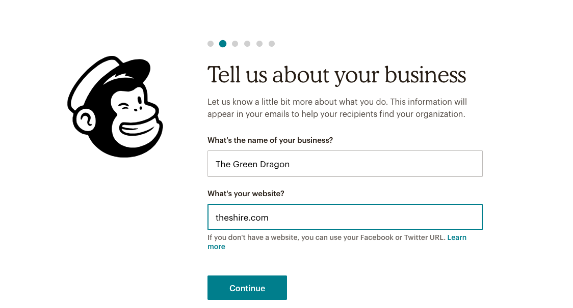
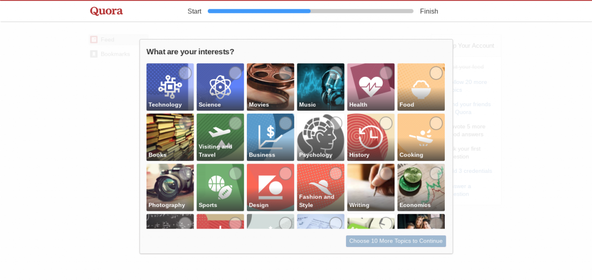
Progress bars tend to be most effective at motivating users when the bar is already partially filled. This simple trick helps users feel like they've already accomplished something, instead of feeling like they're starting from scratch. After signing up for an account on Quora, for example, new users see a progress bar that's already half completed—the sense of progress increases their motivation to complete the next tasks.
You can add progress bars to your user onboarding with Appcues’ modal windows or build your own open-source alternatives using tool kits like nanobar.js or ProgressBar.js.
When done correctly, gamification can help keep users engaged and make onboarding tasks more enjoyable. Gamification elements like rewards, badges, levels, or instructional scaffolding can help increase activation.
The trick to successful gamification is to balance users' needs and motivations with their desire to be entertained—it's very easy to go overboard. Never sacrifice your core value proposition for the sake of entertainment.
No matter how motivated your users are, they won't get far if they can't figure out how to use your product and how it helps them reach their goals.
I asked Paolo Ragone, a Marketing Manager at eXact Learning Solutions, what he looked for when he went through a new product's onboarding experience:
"Understanding the main functionalities of the product and the way to start doing things"
Pretty straightforward, but you'd be surprised how many onboarding experiences don't actually explain how their product can solve your use case.
The goal of any user onboarding experience should be helping users reach their aha moment—or the moment they understand how your product will improve their lives. While you may have a big-picture vision of your product's benefits to their workflow, your users can only go off of whatever screen they're currently viewing. They know the job they're trying to get done—whether that's getting more leads, improving their processes, prototyping, etc—but they may not understand how your product can help them reach that goal.
A simple way to demonstrate value is through a lightweight product tour.
Product tours can help orient new users within your product, nudge them closer to activation, and shorten their time to value (TTV). Your product tour should walk users through important workflows, highlight key features, and guide them toward your core value—it should not point out every single bell and whistle.
When building your own product tour, remember to focus on goals, not features—think about what it is new users need to accomplish in your product to be successful and design your walkthrough around guiding users through the relevant actions.
The best product tours are simple, often including only 3 to 5 tooltips. Take a look at InVision's pared down tour of its prototyping app, for example:
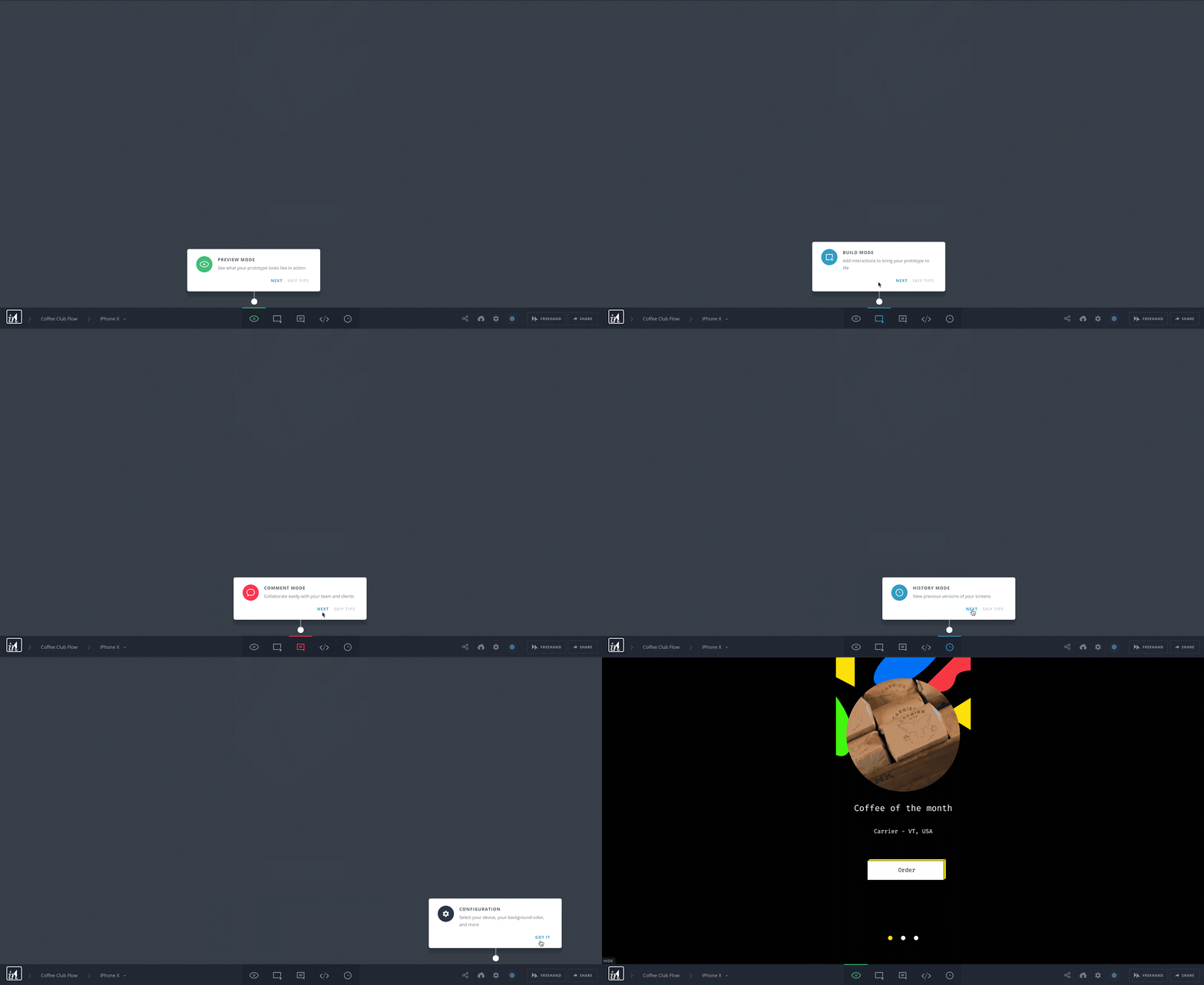
You can build product tours with Appcues’ tooltips or use open-source alternatives like Intro.js or Hopscotch.
Exploring new systems for themselves helps people gain a deeper understanding of how things work, rather than just memorizing tasks. When it comes to learning new things, oftentimes seeing is great but doing is better.
Learn-by-doing demos—like Grammarly's onboarding demo doc—offer a bit of both by letting users explore features and functionality in a controlled environment that allows new users actually to experience the product in use.
Progress bars, product tours, and other onboarding flows are a means to an end: guiding users to their aha moment and ultimately, an activation event. The activation event is the moment when new users first obtain real value from your product. The goal of user onboarding is to increase the number of users who reach activation, so defining what activation means for your product is a crucial first step.
To get users to experience this crucial moment, you need to encourage them to take key, meaningful action within your product.
This event will be different for every product, but will always bring users closer to your app's core value. To understand which actions are most meaningful for your own users, take a closer look at your user journey map and look for behaviors that correlate to conversion or activation rates. The activation event has a few characteristics:
Basecamp, for example, knows that the core value of their product becomes evident only after a user adds people to their team. After signing up, users are given a demo project that demonstrates the value that teams can get from the product, reiterating to new users that Basecamp is meant to be a shared experience. There are multiple prompts and CTAs throughout the onboarding process meant to guide users toward a key action—in this case, inviting teammates to the product.
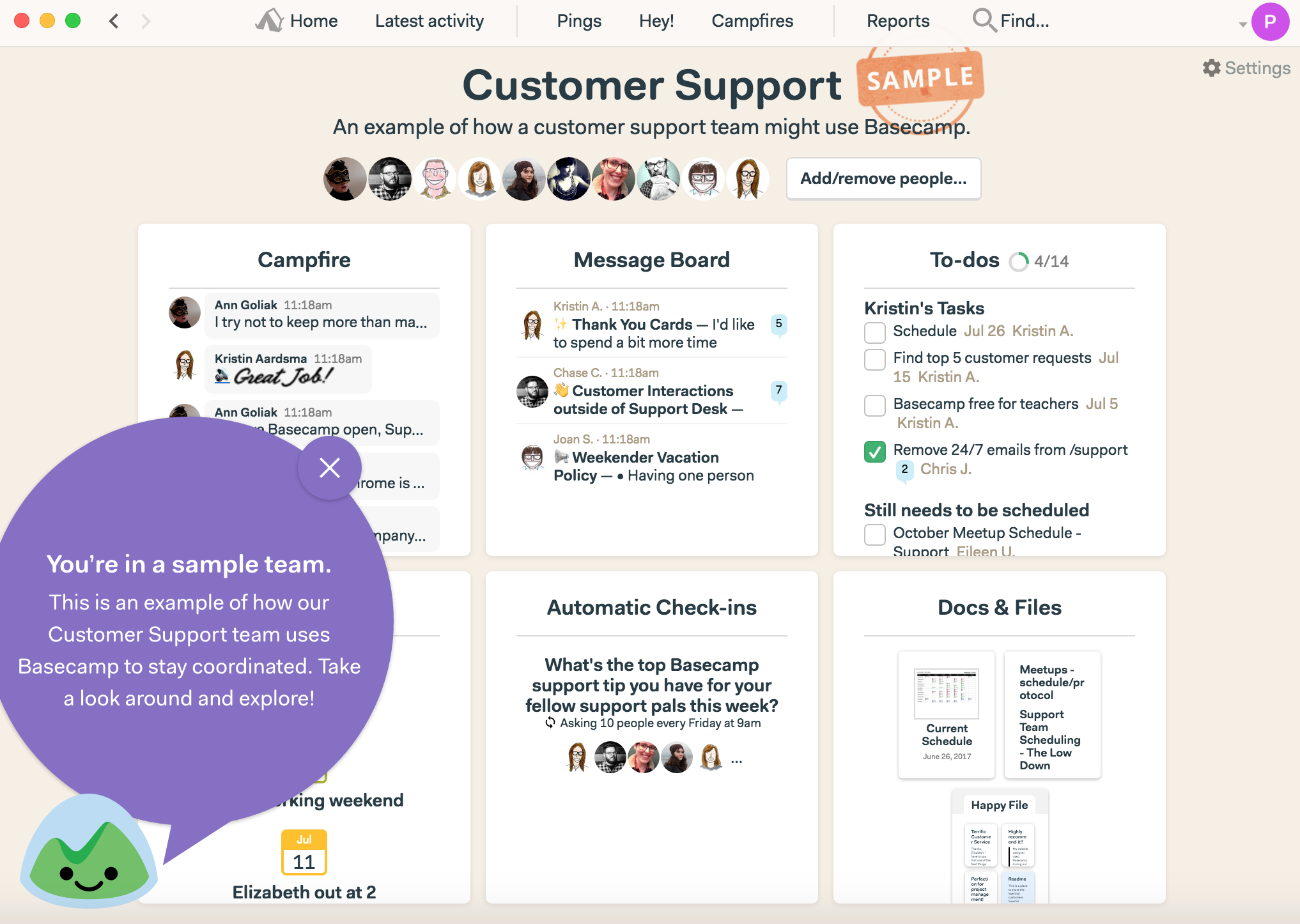

Helping users take meaningful action doesn't have to be complicated. Once you've identified your activation event, look for ways to get users to take the relevant actions as early as possible.
Gradual engagement involves moving users through your app in stages, allowing them to experience your app's value before signing up for an account. Duolingo is a prime example—users are allowed to use the app without creating an account, but are given registration prompts periodically. These prompts coincide with user progress (like reaching a new level) and end up feeling like a small step in a larger and more rewarding process, rather than an obstacle on the journey to value.
User onboarding experiences don't have to be complicated. In fact, many of the best are also the simplest. Don't try to turn new users into experts or power users in a single go. Instead, keep your focus on motivating, educating, and guiding your users to value.
User onboarding can and should be simple—for the users and the teams that create them. If you don't have the time or resources to build and iterate on these experiences in-house, consider a product like Appcues that lets your marketing, product, sales, and CS teams collaborate, create, and iterate onboarding flows more easily.
