The 11 best user onboarding examples to learn from
.png)
.png)
.png)
.png)
So, who has the best user onboarding experience?
After tearing down 100's of onboarding experiences—and writing the book on product-led onboarding—I get this question all the time.
And the answer is, well, complicated. 😂
User onboarding best practices are highly dependent on who the new user is, their motivations and pains, and a product’s ability to satisfy that new user’s desire.
Can I really say whether Netflix or Slack has a better user onboarding experience when they’re built for widely different audiences and purposes? Even within a product category, subtle differences in value propositions and user personas make attempting an apples-to-apples comparison a dangerous game.
Every product’s user onboarding experience is different. And it should be.
So while I can’t crown a single champion, some onboarding experiences stand out from the pack.
That's why I compiled 11 of the best user onboarding examples I could find—broken down by what makes each onboarding tactic so effective (and delightful 😊) for you to learn from.
A quick TL;DR:
But before we start the list, let’s take a quick look at what good onboarding actually is.
Onboarding is the process of acquainting a new user with a product. A great user onboarding experience shortens your new users’ time to value, guides them to their aha moment, and gets them to activate faster. (I explain it all in the video 👇.)
In the Product-Led Growth Flywheel framework, onboarding is one of the primary levers for turning your product’s Strangers into Explorers, Beginners, Regulars, and finally Champions.
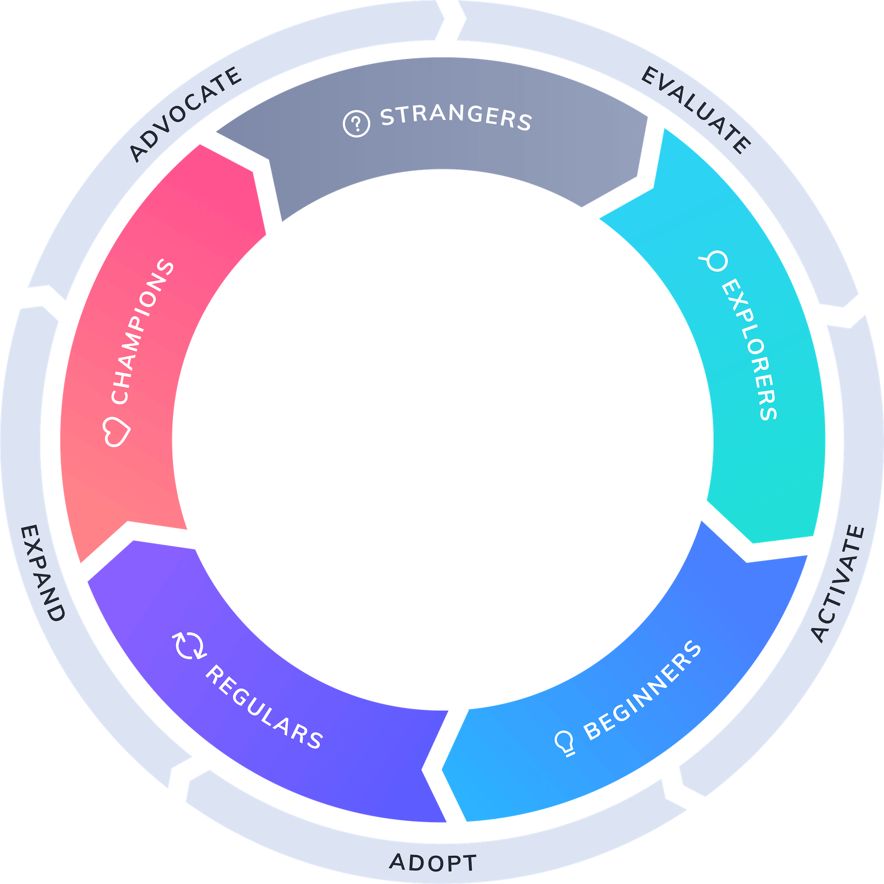
Onboarding convinces on-the-fence Evaluators that your product is worth trying out. Evaluators convinced by your onboarding now become Beginners who are taught how to use each of your product’s features. As they see how your product benefits them, they gradually become Regulars and, finally, Champions who love to share your solutions with the people they know.
At this point, your flywheel will really start to pick up speed—and you’ll see sustainable growth that continues to increase over time.
But it all starts with impeccable onboarding that convinces users to commit to your solution—showing them how to get to the value they were promised.
Throughout my extensive research into what makes an amazing onboarding, I've found that there are 8 onboarding UX and UI designs that commonly contribute to a better onboarding experience. These include:
These onboarding experiences are not mutually exclusive—many products will include 2 or 3 of these patterns depending on what their users need. Consider these a toolbox of sorts. When designing your onboarding, see how you can introduce these 8 UX and UI patterns to improve the user experience. If some of them don’t have a place in your onboarding flow—don’t sweat it.
If this all looks a little overwhelming, no worries, you don’t have to start from scratch. Appcues can help you design an onboarding flow that includes engaging experiences like hotspots and surveys. It can even help you add modals, tooltips, and slideouts, so you can guide your users every step of the way. This way, you can focus less on the technical challenges of adding these UX and UI patterns and more on the best way to onboard your new users.
Each of the 11 onboarding examples we’ll go through have their own unique style, but they all fundamentally follow the same progression to onboarding. These 4 steps of successful user onboarding are:
I asked our Director of Growth, Meg Gowell, about how she approaches testing the free trial onboarding experience here at Appcues:
The onboarding examples below each take a different approach, as they should, since all of these products offer different experiences and attract different users. But they have one important thing in common: all 11 products do an excellent job of guiding users to see their value.
These 11 user onboarding experiences are the cream of the crop, the top dogs, the head honchos—you get the point. So study at the feet of these masters, see what they do right, and take notes on how you can one day earn a spot on this list.
Slack, the ever-popular team-messaging app, does a great job of explaining itself to new users with well-designed empty states and a clever use of its own core functionality: messaging.
Slack starts off with a simple signup form and a fun welcome message—“Tada!” It then gently drop users into the channels and messaging UI, so they can get a feel for the place. Throughout the product tour, Slack uses empty states, Slackbot (Slack’s chatbot mascot), and tooltips to walk users through basic Slack functions.
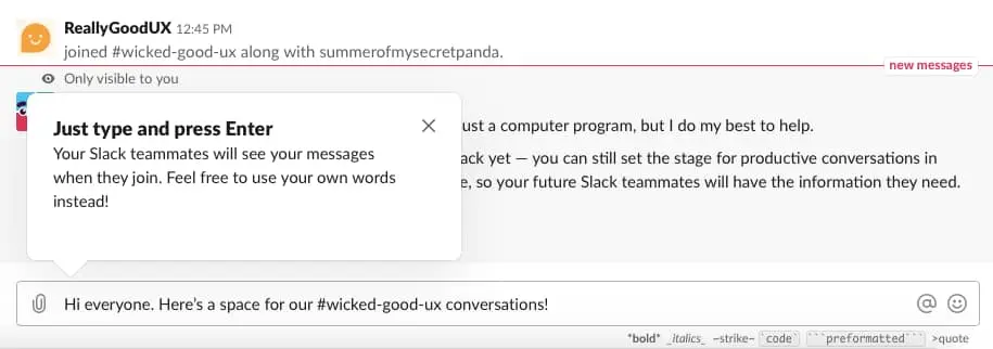
This isn’t Slack’s first onboarding experience—they’ve been iterating on their new user experience for years. Each iteration has been better than the last. The latest version is more pared down than ever—they’ve trimmed out a lot of the introductions and cut right to the chase. The result is a minimal, contextual onboarding experience that helps users familiarize themselves with the interface and get up to speed as swiftly as possible.
Unlike most apps, Duolingo has a user onboarding experience that begins with the product and ends with a signup form. It’s an excellent example of gradual engagement and deferred account creation.
Deferred account creation involves postponing registration for as long as possible—usually until the moment when users must register in order to progress further.
Duolingo does this perfectly. Its onboarding flow guides visitors through a quick translation exercise of their choosing (an example of persona-based onboarding and progress bars), showing how quick and easy it is to learn a new language—before asking users to commit to the product by signing up.
.webp)
Certain features remain off-limits to unregistered users. But these unregistered users can still access the app's core value proposition of daily language learning without creating an account (though they will receive periodic prompts as they complete lessons, an example of action-driven tooltips).
Gradual engagement isn’t an approach that will work for every product (a banking app, for example, requires the user to enter personal information in order to demonstrate value). But the core lesson—that you should let users interact with your product and understand its benefits before requiring them to make a commitment (like subscribing for your service)—is an important part of a product-led strategy.
Grammarly is a personal writing assistant tool. Users can check for spelling, grammar, word choice, and more through in-line suggestions. All of these features are communicated with an onboarding-specific demo document that contains hotspots users can explore on their own.
.gif)
We’re big fans of Grammarly’s UX in general—it does a great job with everything, from emails to upgrade prompts—and its onboarding experience is no exception. Its clever learn-by-doing demo doc does an excellent job of encouraging discovery and teaching users how to use the tool’s features within a controlled environment.
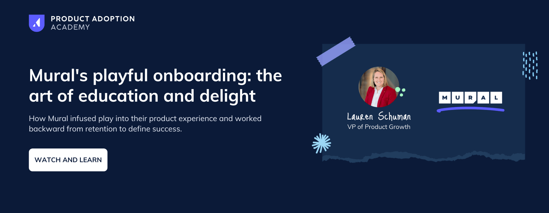
Mural, maker of the collaborative digital whiteboard, does a bang-up job infusing play-based experiences into their onboarding. (Makes sense, “play to wow” is actually one of their company values.)
I know because I had the chance to sit down with their former VP of Product Growth, Lauren Schuman, and she walked me through exactly how her team approached onboarding.
Tumblr’s user onboarding experience is bolstered by its creativity and personality. Using persona-based onboarding, Tumblr really shines with visual design and microcopy that are tailored to each unique user (featuring user-generated content!).
.webp)
From its use of personalization to its witty copy and a value-focused product tour, Tumblr’s user onboarding tactics are widely applicable to B2B software, especially tools that rely on curated content to deliver value.
IBM’s Cognos Analytics is an AI-driven business intelligence solution. To acquaint users with this complex tool, IBM uses modals and a choose-your-own-adventure style product tour.
.webp)
With complex enterprise products like Cognos, successful onboarding depends on the user’s ability to prioritize between a wealth of useful features. IBM avoids the urge to drag new users through every single feature one by one. Instead, it focuses its onboarding experience around a few essential features using a persona-based product tour and simple checklists.
Avast Antivirus is one of the biggest names in freemium computer protection. Its free antivirus software could just be a set-it-and-forget-it kind of product, but then it would ignore the biggest security threat of all—you. Most people don’t want to learn how to stay safe online; they just want the program to do it for them. To get around this issue, Avast’s Online Security and Privacy Onboarding gives people what they want (privacy controls) before offering them what they need (privacy education).
People these days are rightfully concerned about online privacy. So Avast starts its onboarding by configuring users’ online privacy settings.
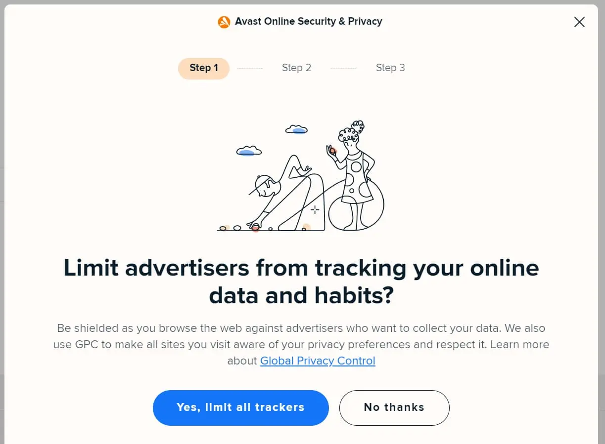
Its modal copy is extremely clear, as it’s obvious what Avast is offering (to block trackers) and what the “right” option should be (“Yes, limit all trackers”).
Avast gets to the education part of the onboarding after it finishes configuring your privacy settings.
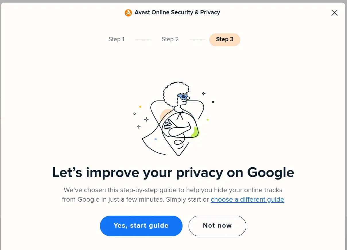
Users have seen that Avast is trying to help them stay safe online. If Avast had started with this guide, chances are more users would have clicked “Not now.” However, because Avast demonstrated value first, users are more likely to see what else Avast has to say.
A complete onboarding tour becomes unwieldy when you have as many tools and functions as time tracker Toggl does. Rather than plunging on anyway or cutting important info, Toggl divided its product tour into multiple tours with natural stopping points between each one. Its onboarding starts with Toggl’s most basic functions and then lets people choose to learn more advanced techniques and functions.
Toggle’s product tour starts with a rundown on how to begin your tracker, name your tracked activity, and stop your tracker—the essential functions of Toggl. Each step is clearly expressed through tooltips on its UI.
.webp)
When you’re done following this guide, Toggl congratulates you with a modal that lets you know there is so much more to learn.
.webp)
This modal is a perfect example of what you should do in onboarding. It congratulates users on their milestones. It clearly explains the next steps and what you can learn by clicking “Show me.” And it lets you know you can always pick this up later and how you can do so.
Since you're here: check out our modal windows guide to learn how to create even more captivating onboarding experiences with modals.
Account signup is an area where products lose a lot of new users. It's boring, and no one likes to do it. Avo, a product analytics tool, knows this and designs its signup process to be as painless as possible.
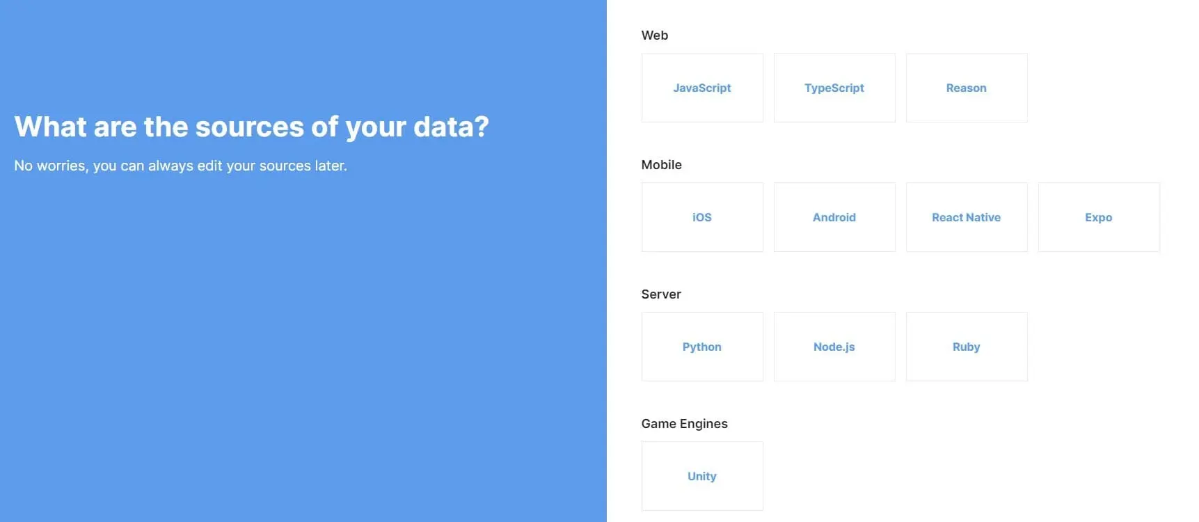
The onboarding process here is the epitome of clean. Each page is a single question that uses the entire page's real estate to spread out your options. But just because it looks simple doesn’t mean it is. Avo showcases its expertise by asking knowledgeable questions that get to the heart of what your product needs.
It also takes advantage of deferred account creation. First, users answer questions and get a feel for Avo. Then, after Avo has made an impression with onboarding, it asks users to sign up.
TikTok is the not-so-new social media giant that has become the #1 visited site on the internet. One way it achieved this is with smart onboarding that explicitly teaches new users how to improve the product experience with its in-app actions.
When users sign up on TikTok, they're simply told that the more they watch, the better their feed understands what content they like to watch.
.webp)
If you stay a long time on a single video, like it, or comment on it, TikTok’s algorithm will take note and give you more content like that. This is similar to how other social media companies operate. TikTok differs because it explicitly tells users how to work with the algorithm to create their own optimal user experience.
Reclaim is a calendar assistant that makes it easy for users to work efficiently and find time for the things that matter outside of work. Its onboarding teaches people how to use its calendars. However, it also teaches users how to reimagine what a smart calendar can do for their lives.
Most calendar apps make it easy for you to manage your calendar as it exists now: adding meetings, finding time slots, and blocking off time. Reclaim was built to change all of that. Sure, you can schedule appointments, but you can also make flexible time blocks for other things like exercise, reading, or just an afternoon nap.
Reclaim uses its onboarding to get users to think about how to include their hobbies into their daily and weekly schedules.
.webp)
Reclaim starts by asking users if they want to set aside time for lunch—a habit we all have (hopefully) that sometimes gets eaten up by crowded meeting schedules. It also explains that you don’t have to set a firm time for lunch. You can instead opt-in for lunch, and Reclaim will find you a time slot around your meeting schedule that day.
.gif)
Lunch breaks are the foot in the door that Reclaim needs to get users thinking about what else they could block time off for. Many users who signed up for Reclaim may have come solely for business purposes. But with this onboarding, they see how a smart assistant like Reclaim can help manage all aspects of their life—a value prop that’ll keep more people using Reclaim for longer.
If you have any more questions, here is some more general information about user onboarding.
User onboarding is the process of guiding new users to understand and effectively use a product or service
The onboarding process starts the first time someone tries your product and ends when they either churn or become a regular user. For some products, this means onboarding will be a matter of minutes, while others might require days to get people to a point where they can comfortably use the product as intended.
The primary goal of onboarding is to teach users about your product, personalize the product for their needs, and lead them to their aha moment—the first time they see the benefits your product can bring.
User onboarding is important because it helps ease users into a new product. It’s a chance for them to be shown how it works, so they don’t have to waste time figuring it out on their own.
User onboarding is also crucial for companies. A good introduction of your product improves the overall user experience as users are introduced to product features and how to use them. When the onboarding is successful, it directly impacts customer retention, one of the most important profit metrics. If you improve retention by only 15% in the first week, that could boost revenue by 40% as each succeeding week’s cohort staves off churn that much longer. Great onboarding is how you achieve this.
A good onboarding experience is created when:
If you do all 5 of these things well, then your onboarding is on the way to improving overall product adoption and reducing churn. If you’re serious about creating a world-class onboarding experience, check out how Appcues makes it easy to build, test, and improve your onboarding.
You can measure onboarding success through metrics like time-to-value (TTV), user activation rate, product adoption rate, and retention rate. Collecting user feedback is also essential for improving the process.
Common mistakes include overwhelming users with too much information, neglecting personalization, lacking clear guidance, and failing to highlight the product's core value early in the process.