How shopping sites use tooltips to close deals
.png)

.png)
Everyone might be trying to sell something, but not all approaches to selling are equal.
Every salesperson knows (or should know) that there is a fine line between being annoying, yet empathetic when trying to close a deal. When a sales rep can find the perfect marriage of the two, the buyer may not even realize they are being sold and their decision becomes a no-brainer.
The same is true of e-commerce sites. Even the biggest online retailers—like Amazon and Overstock—tread the line between aggressively trying to close sales and maintaining a beautiful and helpful customer experience.
That’s where subtle tooltips come in handy. With careful design and limited usage, they have the power to discreetly turn visitors into consumers.
Here’s a quick overview of popular use cases for tooltips on shopping sites.
While it’d be great if all conversions happened in one session, people love to shop around. Consumers may view dozens of pages on a site, and competitors’ sites, over a span of weeks or months before committing to a purchase
Instead of trying to get everyone to buy RIGHT NOW, offer consumers different ways to engage with products.
Many shopping sites have a love / save to favorites functionality. This is a great way to engage passive shoppers and get them to come back (through account creation and email).
Here’s how Overstock uses a tooltip to announce the love functionality:

Here’s how Wayfair’s look:
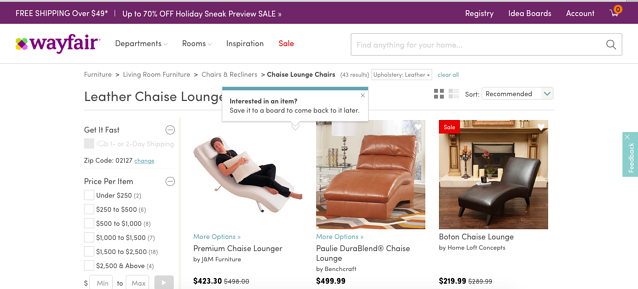
And a similar one, with Chairish: (This shows up on individual item pages as well as general catalog pages.)
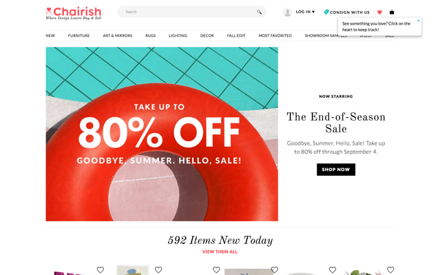
All of the examples are simple and to-the-point. Best of all, they get out of the way and let shoppers browse without distraction.
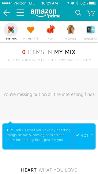
Amazon’s mobile app takes a different spin on the same concept. While the tooltip gets the message across just fine, it doesn’t provide an action that is right in front of the user, relying instead on empty space to propel user engagement.
Tooltips are a great way to convey tiny bits of information that can help the user. Since many consumers need an extra push before making a purchase, tooltips can offer special promotions, and even upsell opportunities. Unlike splashy modal windows, tooltips don’t put a barrier between the consumer and the item they’re browsing.
Amazon uses a tooltip pointing at the URL bar to let consumers know that they can visit another address to have Amazon donate to charities. This tooltip has a basic design that tells the essentials and sets expectations by letting consumers know that they’ll see the notification periodically.
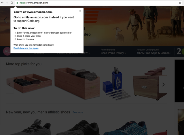
To improve the conversion of the tooltip, Amazon could have tried focusing more on the value of switching over to smile.amazon, instead of explaining the process. The text doesn’t explain the impact that smile.amazon has or that the donations won’t cost the consumer anything extra.
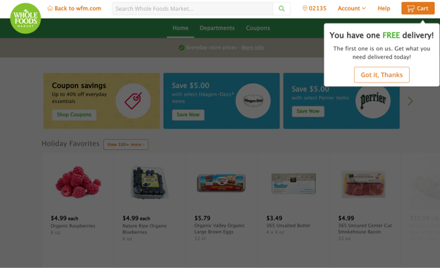
The online grocery delivery service Instacart offers a few promotions to new and existing consumers. To remind new users of a free delivery offer, Instacart uses a tooltip to reinforce the perk during the shopping experience.
Yelp is increasingly becoming more than just a site for consumer-driven reviews. Even frequent visitors can easily miss all that Yelp can do. Yelp often uses a single blue tooltip for feature discovery (these styles of tooltips are trending now among social media sites).
Here, Yelp draws attention to a feature that probably doesn’t get as much love:

Regardless of how long ago a feature was built, tooltips are an unobtrusive approach to combating feature blindness, as long as they’re targeted to the right audience.
Sometimes you just need to use a little extra persuasion to get users to buy. Tactics like scarcity and urgency work. Tooltips are pithy enough to nudge and get out of the way.
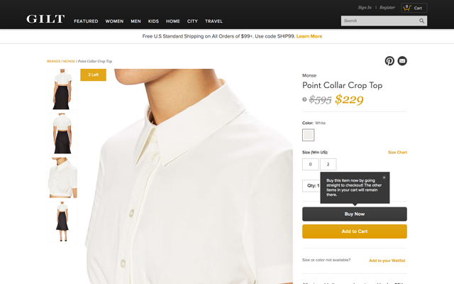
Gilt uses a tooltip to point out the difference between their two CTAs: “Buy Now” and “Add to Cart.” The copy does that sufficiently, but the tooltip teeters the line of being annoying, especially since it doesn’t disappear when consumers try to access the buttons behind it (instead, consumers have to explicitly exit out of it).
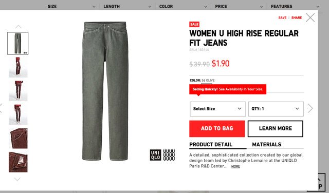
Uniqlo drives scarcity by alerting consumers when an item is selling out quickly. It’s a bold message for a tooltip, but may be appropriate for the frantic bargain shopper.
Sometimes you just won’t have what people are looking for. A tooltip can quickly display this information and help consumers move on to what you could offer them.
Grana is an online clothing store that emphasizes transparency. Their web experience reflects their style—essentials and basics—and their principles.
For sold out items, Grana displays a tooltip over the size selection buttons to let consumers know just want they need to know quickly. It’s pretty annoying when shopping sites don’t inform shoppers of the status of any item until after selections are made.
This approach also lets consumers know what “sold out” looks like for future browsing.

All of these use cases required just one tooltip. No elaborate guides, no multistep tours. The best tooltips are ones that say what they need to say without getting in the way. Single tooltips are perfect for this, and can be just the vehicle to nudge consumers one step closer to making a purchase.
As with any UI pattern, tooltips can be abused and damage the user experience. It’s easy to tact a tooltip onto any area that needs more engagement—the harder and more important part is making sure each tooltip conveys contextual value and is targeted to the right customer.
A customer who uses the same functionality day in and day out does not need any extra nudges. If a user doesn’t see value the first time they see a tooltip, they may be more apt to ignore other parts of the product experience. Make sure each tooltip has an objective, and factor them into the rest of your in-app strategy.
For more on designing tooltips for high impact (and less annoyance), check out this piece.