← Visit Appcues.com
×
×

8 examples of effective SaaS onboarding experiences (plus tips)

SaaS companies lose up to 75% of users in the first week. Great user onboarding can help you reduce the rate of attrition.
Skip to section:

Skip to section:

Onboarding. What is it good for? Absolutely everything.

For SaaS companies, specifically, user onboarding can take your product higher. (Did we just sneak another classic song into the intro of this article? Yup.) Onboarding can directly lead to more revenue. So helping new users stick around is crucial. Happy customers are also the best referral source for growing a community around your SaaS offering. These two reasons are exactly why those first few customer interactions have to count.

Rather than just telling you the best way to onboard someone, we thought it’d be better to show you. By learning from these eight examples of exceptional SaaS onboarding, you’ll see how top-level SaaS products are onboarding their users and what you can do to make your onboarding just as spectacular.

What is SaaS onboarding?

SaaS onboarding is the process where new users are introduced to your product in a way that encourages them to adopt it. During this time, your goal is to show users how to use the most important parts of your product and hammer home the benefits that come with using it regularly.

Successful SaaS onboarding provides the foundation for healthy and sustainable productivity growth. It does so in two ways:

  1. It improves your retention rate, so you’ll have more active users at the end of the month.
  2. It grooms product advocates who will bring in more qualified leads and prospective users.

Onboarding may not be a silver bullet for product growth, but it’s where you need to start if you want to reduce churn and improve your product adoption rates.  

How you achieve this will look different for every product, but the goal is the same: get users to the point of product activation. However, the final form of your onboarding will depend on your product's complexity and what activation looks like for your users. Most onboarding involves some type of product tour, tasks to accomplish, and education on using features. Some products need to stretch this over days or weeks, while others succinctly achieve this in minutes.

User onboarding is as much an art as a science. We can give you all the tools, tips, and examples in the world, but no one set template will necessarily work for your SaaS product. However, there are still lessons to keep in mind when planning your onboarding. Here are some we’ve learned from working with hundreds of SaaS products.

Tips to improve your SaaS user onboarding experience

You’ve got a user onboarding flow already built for your SaaS product, but it’s not bringing in the results you’d like. Churn is too high. Adoption rates are too low. And you’re just helplessly watching new users drift away. Don’t panic. Here are five tips anyone can use to get their onboarding flow back on the right track.

Infographic: 5 tips to level up your SaaS user onboarding experience
  1. Build with goals in mind: A good onboarding experience is not a laundry list of everything you can do with your product. It’s a flow that ends with a user taking a desired action that you believe will lead to them adopting your product. By building your onboarding this way, you keep it streamlined and focused on the most important things your new users need to know and do to be successful with your product. (And if you need some inspiration, we've got a whole list of aha moment examples that'll help you identify triggers to boost engagement.)
  2. Use UI patterns to guide users to their end goal: UI patterns like tooltips, hotspots, and modals all play a role in guiding users through onboarding. You can use these tools to draw users’ attention, show them how to do something, and familiarize them with your UI.  
  3. Personalize with segmentation: Different segments of your users may require a different flow, educational approach, or goals for your onboarding to be effective.  Use segmentation to collect data on your users and design onboarding flows that reduce churn rates for that specific segment.
  4. Continue to test and optimize: Every product goes through several iterations as you hone in on the best possible onboarding experience. The only way to do that successfully is to constantly collect data, run experiments, and optimize your flows based on what you learn. The UX and UI changes you make may be small, but they’ll add up to an A+ experience over time.
  5. Pick the right tools: Building your onboarding requires more than hard work and dedication. It requires the right tools, too. Tools like Appcues allow you to continuously build and test your onboarding flows to improve your onboarding experience. For a complete list of onboarding tools, check out our comprehensive guide.

Onboarding is far more complicated than these five simple tips. If you’d like to learn more about creating the best experience for your new users, check out our guide to user onboarding best practices.

8 examples of effective SaaS onboarding experiences
It helps to learn from the best. So pull out your notepad and get comfy because here are eight top-notch examples of SaaS onboarding experiences you can learn from today.  

1. Asana: Creates actionable guides to encourage team adoption and retention

Asana is well known for being a great project management software. But, like most project management SaaS products, it can be tricky to learn. That’s why Asana arms users with a self-serve guide that is ready to answer any questions they may have.

The Asana Guide is the brand's fully searchable, centralized content hub of best practices to help bring teams up to speed with their product. As a growing resource, it features a wide range of educational content to help teams with Asana onboarding.

SaaS onboarding example from Asana
Image from Asana

Asana’s dedicated Search page allows users to quickly identify themselves as “just getting started with Asana” or “helping my team learn Asana” to be served relevant, contextual help outside of the app.

User drop-off in the product-adoption phase is one of the most challenging aspects of retention. That’s why Asana provides checklists, templates, webinar links, and step-by-step instructions to address common reasons for user drop-off. The brand's thoughtful “Help your team adopt Asana” guide is a great example of how Asana helps their new users get through product adoption.

For anyone with teammates who learn by doing or by talking it out, Asana’s Guide can also connect colleagues to live Q&As with trainers or self-paced online courses that remove the intimidation from the implementation.

What you can learn from Asana’s SaaS onboarding

Asana knows that frictionless onboarding doesn’t always happen. Users may get distracted and leave their onboarding flow temporarily, or worse—permanently. Asana wants users to complete the onboarding flow, so they use simple prompts.

If users lose patience and navigate elsewhere on your product, a prompt (such as a team onboarding checklist embedded into an Asana adoption guide) can bring them back into the app as an active user.

Whether an Asana Tip leads a customer to design their first in-app collaborative workflow or their team gets up to speed in 15 minutes by watching an Asana Lessons series together, Asana guides users back to their workspaces loaded with new knowledge and renewed navigational confidence.

2. HubSpot: Personalizes SaaS user onboarding with surveys

If Rod Stewart wrote a song about HubSpot’s CRM, he might’ve sang that it was “forever free.” That’s because their CRM is free...forever. That presents a unique challenge because users have no “skin in the game.” They haven’t paid for anything, and they never have to. Product adoption is tough in these instances, so HubSpot has to have their user onboarding dialed in.

HubSpot onboards and retains users by personalizing the onboarding experience based on user survey responses. The SaaS tool sends new users a getting-to-know-you Q&A session with no more than four multiple-choice questions.

SaaS onboarding example from HubSpot
Image from HubSpot

HubSpot requests details about the user’s role and company and what they’ll be using the tool for. This information is then used to personalize the customer’s dashboard and online workspace. Product managers can personalize a user’s learning curve based on their job function when they better understand what motivates and pushes the user to action.

HubSpot’s CRM encourages customers to stay active on their dashboard by indicating what value they’ll gain in return for feedback or data. This could be learning a new skill that’s essential to their job, gaining insight into who is the most productive on the team and why, and setting quotas to visualize progress.

What you can learn from HubSpot’s SaaS onboarding

When users are new to your product, remind them every step of the way that taking action leads to progress (visualized in a checklist, progress bar, percentage value), progress leads to action, and a certain number of actions in a specified timeframe lead to accomplishment.

When customers feel productive in the digital workspaces that are set up for all their day-to-day tasks, they’ll be more likely to encourage other team members to come on board and join them.

3. Notion: Onboards users with an interactive, task-based product tour

Released in 2016 by Ivan Zhao, Notion is a collaborative workspace and productivity tool that helps you and your team write, plan, and get organized.

To onboard users, Notion offers a guided tour filled with tasks on the "Getting Started" page. This onboarding approach encourages users to learn the valuable core functions anyone will need to start collaborating and creating as soon as possible in the software.

SaaS onboarding example from Notion
Image from Notion

During the onboarding process, users can choose templates that help them build Notion pages—budgets, meeting agendas, and more. These templates encourage users to build collaborative content and systems based on the team’s purpose and business needs.

Notion encourages actively exploring and practicing on prebuilt pages to build confidence with the product. Their onboarding flow is designed as a to-do list on a private Notion page. Users can play, test, and learn by discovering interactive hover states with more detailed walk-throughs.

What you can learn from Notion’s SaaS onboarding

By making the onboarding flow a “Get Started” to-do list, the document serves two purposes for new customers: they learn how to click through and make progress on a basic use case (a to-do list that can benefit any team function), and Notion makes it clear what basics need mastering to gain value straightaway (for example, keyboard shortcuts).

During Notion’s onboarding survey, customers explain what their job function is and who they’ll use Notion with (either solo or with teams). Accordingly, Notion pre-populates a workspace with relevant templates and encourages users to check them out via friendly tooltip messaging.

Customize onboarding templates for different teams, cultures, and contexts as needed. Users can try them out as a jumping-off point for using your product for the first time in a way that’s relevant to their needs.

4. Webflow: Uses tooltips to show people how to get started

Tooltips may seem small, but they’re one of the most versatile and powerful tools at your disposal. They pull double duty by directing people’s eyes to specific parts of your UI and offer a dedicated place where you instruct and educate your users. They’re so versatile that the majority of Webflow’s onboarding process runs on tooltips.

Webflow’s onboarding is split into three sections, with each one focusing on different aspects of creating a website.

SaaS onboarding example from WebFlow
Image from Webflow

The copy on this tooltip sets expectations—telling users what they will learn and roughly how long it will take. It also provides an easy exit point where more advanced users can skip the onboarding altogether and get straight to the good stuff.

The tooltips within each section guide users through basic website building tasks.

SaaS onboarding example from WebFlow 2
Image from Webflow

The tooltip tells you exactly what to do and makes it clear where you need to go to adjust these settings. As you complete a task, another tooltip pops up with the next thing you can do to build your website. By the end of the three sections, you’ll have experience adding buttons, adjusting container sizes, and much more.

What you can learn from Webflow’s SaaS onboarding

Tooltips are a powerful way to educate users and get them familiar with your UI at the same time. Webflow knows that there are a lot of symbols and tools on their website builder interface. Their onboarding can’t just tell people that they can do certain things with the builder. It also has to show them where to access these options and how to use them.

When designing your onboarding flow, consider how to employ UI patterns to familiarize your users with your UI. Tooltips, modals, and hotspots can all play a role in ensuring that your users are prepared from day one to use your product like a pro.

5. Guru: Creates resources that’ll help users hit the ground running

Guru is a knowledge management software that makes it easy for your company to keep resources and best practices easily accessible to the entire company. Anyone who has worked with this kind of software knows that one of the hardest parts is just getting everything created. There are usually mountains and mountains of docs you need to get published. And until these documents are created, it’s hard for companies to see the value that Guru brings.

Guru helps solve this problem by doing a lot of the work for you. In their onboarding materials lives a treasure trove of templates you are free to use to get your database off the ground quickly.

Each template is organized by topic, and there are a ton to choose from.

SaaS onboarding example from Guru
Image from Guru

Click through to these templates, and you’ll find a quality resource that someone has put a lot of time and thought into (so you don’t have to).

SaaS onboarding example from Guru 2
Image from Guru

This template on “How to Use Slack” is over 500 words long and goes over some of the major points new employees should know about your Slack channel. Because it’s already formatted, it’s easy enough for new users to go in and adjust it to fit their company’s policies. Now a project that might’ve taken a couple of hours if you had to write this from scratch now takes about 10 or 20 minutes.

What you can learn from Guru’s SaaS onboarding

SaaS onboarding helps users get to value quicker. It could take months for a company to create their knowledge base, but that job will go much faster with templates. Users will see value from the knowledge base more quickly and be more likely to renew their contract when the time comes. Templates may not be suitable for your SaaS product, but don't be afraid to think outside the box in pursuit of helping users get more out of your product right out of the gate.

6. Sprout Social: Removes roadblocks proactively on the way to product activation

Sprout Social requires access to data from multiple social media accounts to be useful to their customers. They need that data to help users coordinate social posts and analyze their results, showing them the value of the product. However, getting that data isn’t always easy, especially when Sprout Social can’t control if users will say yes.

Instead of throwing their hands up and saying “oh well” when users say no, Sprout Social proactively addresses user concerns.

SaaS onboarding example from Sprout Social
Image from Sprout Social

They address user concerns through a well-written modal. The copy addresses how Sprout Social will use this data, tells users what happens if they say no, and offers them a chance to change their minds. If they do, Sprout Social has potentially saved a user because they pushed back when a user was at risk of going down a road that would ultimately lead to churn.

What you can learn from Sprout Social’s SaaS onboarding

Your main onboarding goal is to guide users to activation events that lead to long-term retention. Part of that process is identifying points where users stray off that path. By using a well-placed modal, Sprout Social has done what it can to shepherd users to a more successful outcome.

Use your data to find these negative user journeys and UI patterns to intervene where possible. Your churn rate will thank you.

7. Wealthfront: Displays the long-term rewards of sticking with them  

Wealthfront is an investment app that aims to bring the benefits of long-term financial practices to the masses. One clear challenge Wealthfront’s onboarding needed to face was showing users in their 20s the value of investing for their retirement.

The answer: interactive graphs!

SaaS onboarding example from Wealthfront
Image from Wealthfront

Wealthfront shows users how much they’ll have if they set aside a certain amount each month. It may not be a concrete benefit, but seeing that you’ll be a millionaire by 65 is enough value to get some people to commit until they start to see real results that’ll justify staying with Wealthfront.

What you can learn from Wealthfront’s SaaS onboarding

Value does not always need to be concrete. Concrete value is always better, but if you sell people a good story about the future value your product will bring, it’ll buy you time until that value arrives.

Invest time into visuals, data, and UX copy to sell these stories. Wealthfront’s graph works because it highlights how much money they’ll earn (“You’ll have $2.4M”) and because it's based on the basic math that users see when they manipulate the graph.

8. Deputy: Provides multiple ways to learn

Product marketers often refer to what users learn in onboarding and not how users learn when they discuss personalization. But by providing multiple ways to interact with the onboarding materials, you give people the chance to learn in the way they choose at the speed they prefer.

The scheduling and timesheet product Deputy includes both written and video instructions on how to use their features. They include a minute-long video for people who want a quick visual overview of how Deputy’s News Feed works.

SaaS onboarding example from Deputy
Image from Deputy

However, they also have a long-form article if that’s the style a user prefers

SaaS onboarding example from Deputy
Image from Deputy

The long-form article goes into more in-depth discussions on how the News Feed works, while the video is great for getting a quick introduction and learning on your own.

What you can learn from Deputy’s SaaS onboarding

Make your onboarding materials as easy to engage with as possible. One way to do this is to follow Deputy’s lead and publish your learning materials in multiple formats that might appeal to different kinds of users.

Not only is it convenient to be offered a choice of how to learn, but it also makes your product more accessible. People with visual or auditory impairments or second language learners might prefer one version over another. You want your onboarding to be effective for all of your users, and providing multiple formats for your learning materials is one of the easiest ways to do that.

Embrace the unknowns of what makes the “best” onboarding process

Customers don’t just hope for good onboarding—they expect to be blown away in those early interactions. SaaS companies like HubSpot, Notion, and Asana have leveraged how-to guides, personalized user flows, and template libraries to map out positive outcomes and productive solutions by rewarding customers for the right behavior early on.

But as Margaret Kelsey, OpenView's VP of marketing, said, "There's no definitive best user onboarding because users' experiences vary so much from product to product." Instead, product managers should focus on understanding what their customers believe is a great onboarding experience based on their unmet needs.

By learning to meet your customers where they’re at (even if they’re at risk of leaving), you’ll be able to take on the role of a thoughtful tour guide who can guide them back to finding value and making the most of your product.

Want to master the art of user onboarding? Complete our free User Onboarding 101 Certification course.

Ramli John
Director of Content at Appcues
Ramli John is the Director of Content at Appcues and author of the bestselling book Product-Led Onboarding. He’s also a PLG Coach at ProductLed, where he’s worked with Mixpanel, Microsoft, and more to accelerate their growth.
Skip to section:

Skip to section:

Onboarding. What is it good for? Absolutely everything.

For SaaS companies, specifically, user onboarding can take your product higher. (Did we just sneak another classic song into the intro of this article? Yup.) Onboarding can directly lead to more revenue. So helping new users stick around is crucial. Happy customers are also the best referral source for growing a community around your SaaS offering. These two reasons are exactly why those first few customer interactions have to count.

Rather than just telling you the best way to onboard someone, we thought it’d be better to show you. By learning from these eight examples of exceptional SaaS onboarding, you’ll see how top-level SaaS products are onboarding their users and what you can do to make your onboarding just as spectacular.

What is SaaS onboarding?

SaaS onboarding is the process where new users are introduced to your product in a way that encourages them to adopt it. During this time, your goal is to show users how to use the most important parts of your product and hammer home the benefits that come with using it regularly.

Successful SaaS onboarding provides the foundation for healthy and sustainable productivity growth. It does so in two ways:

  1. It improves your retention rate, so you’ll have more active users at the end of the month.
  2. It grooms product advocates who will bring in more qualified leads and prospective users.

Onboarding may not be a silver bullet for product growth, but it’s where you need to start if you want to reduce churn and improve your product adoption rates.  

How you achieve this will look different for every product, but the goal is the same: get users to the point of product activation. However, the final form of your onboarding will depend on your product's complexity and what activation looks like for your users. Most onboarding involves some type of product tour, tasks to accomplish, and education on using features. Some products need to stretch this over days or weeks, while others succinctly achieve this in minutes.

User onboarding is as much an art as a science. We can give you all the tools, tips, and examples in the world, but no one set template will necessarily work for your SaaS product. However, there are still lessons to keep in mind when planning your onboarding. Here are some we’ve learned from working with hundreds of SaaS products.

Tips to improve your SaaS user onboarding experience

You’ve got a user onboarding flow already built for your SaaS product, but it’s not bringing in the results you’d like. Churn is too high. Adoption rates are too low. And you’re just helplessly watching new users drift away. Don’t panic. Here are five tips anyone can use to get their onboarding flow back on the right track.
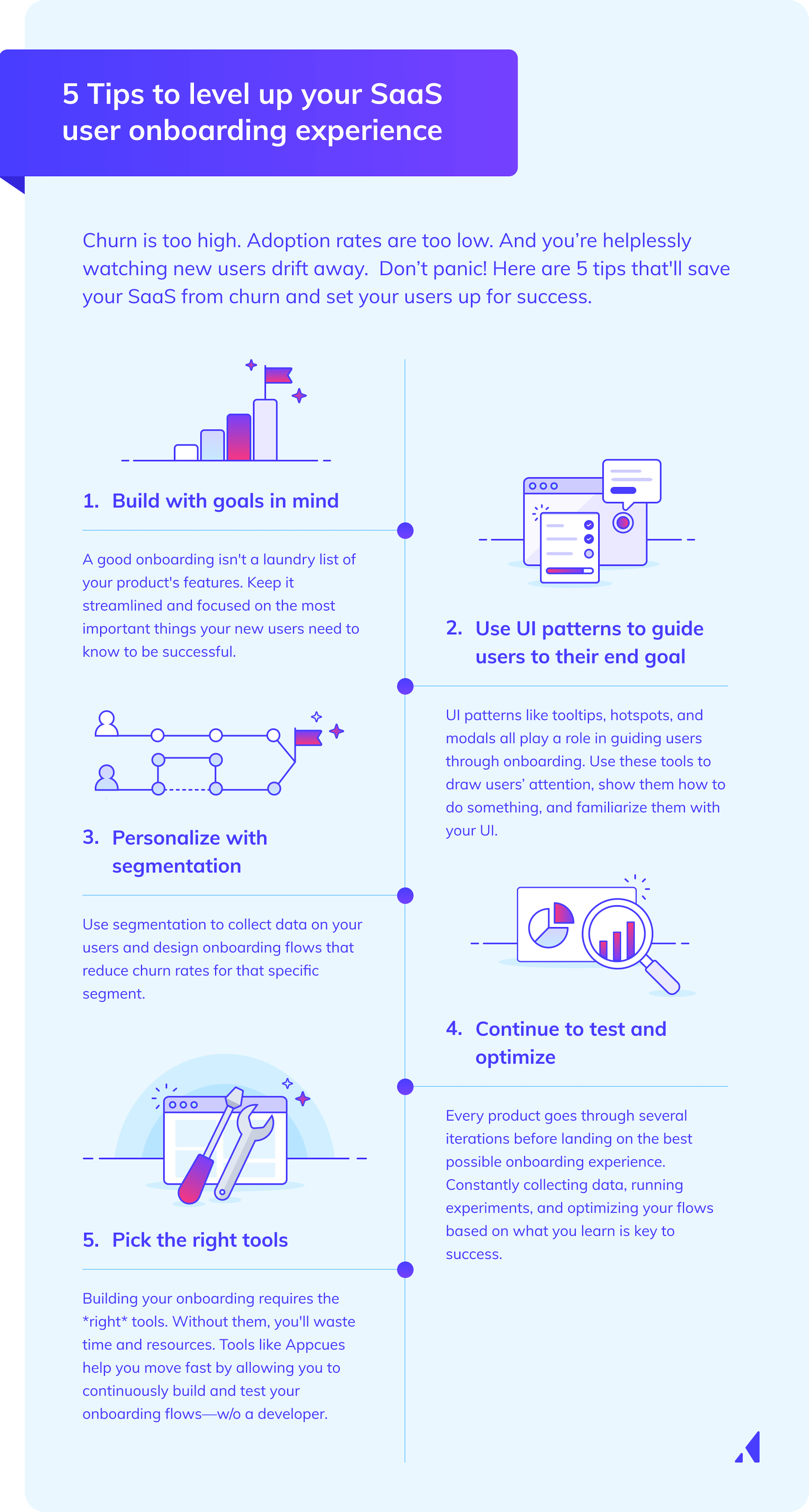
Infographic: 5 tips to level up your SaaS user onboarding experience
  1. Build with goals in mind: A good onboarding experience is not a laundry list of everything you can do with your product. It’s a flow that ends with a user taking a desired action that you believe will lead to them adopting your product. By building your onboarding this way, you keep it streamlined and focused on the most important things your new users need to know and do to be successful with your product. (And if you need some inspiration, we've got a whole list of aha moment examples that'll help you identify triggers to boost engagement.)
  2. Use UI patterns to guide users to their end goal: UI patterns like tooltips, hotspots, and modals all play a role in guiding users through onboarding. You can use these tools to draw users’ attention, show them how to do something, and familiarize them with your UI.  
  3. Personalize with segmentation: Different segments of your users may require a different flow, educational approach, or goals for your onboarding to be effective.  Use segmentation to collect data on your users and design onboarding flows that reduce churn rates for that specific segment.
  4. Continue to test and optimize: Every product goes through several iterations as you hone in on the best possible onboarding experience. The only way to do that successfully is to constantly collect data, run experiments, and optimize your flows based on what you learn. The UX and UI changes you make may be small, but they’ll add up to an A+ experience over time.
  5. Pick the right tools: Building your onboarding requires more than hard work and dedication. It requires the right tools, too. Tools like Appcues allow you to continuously build and test your onboarding flows to improve your onboarding experience. For a complete list of onboarding tools, check out our comprehensive guide.

Onboarding is far more complicated than these five simple tips. If you’d like to learn more about creating the best experience for your new users, check out our guide to user onboarding best practices.

8 examples of effective SaaS onboarding experiences

It helps to learn from the best. So pull out your notepad and get comfy because here are eight top-notch examples of SaaS onboarding experiences you can learn from today.  

1. Asana: Creates actionable guides to encourage team adoption and retention

Asana is well known for being a great project management software. But, like most project management SaaS products, it can be tricky to learn. That’s why Asana arms users with a self-serve guide that is ready to answer any questions they may have.

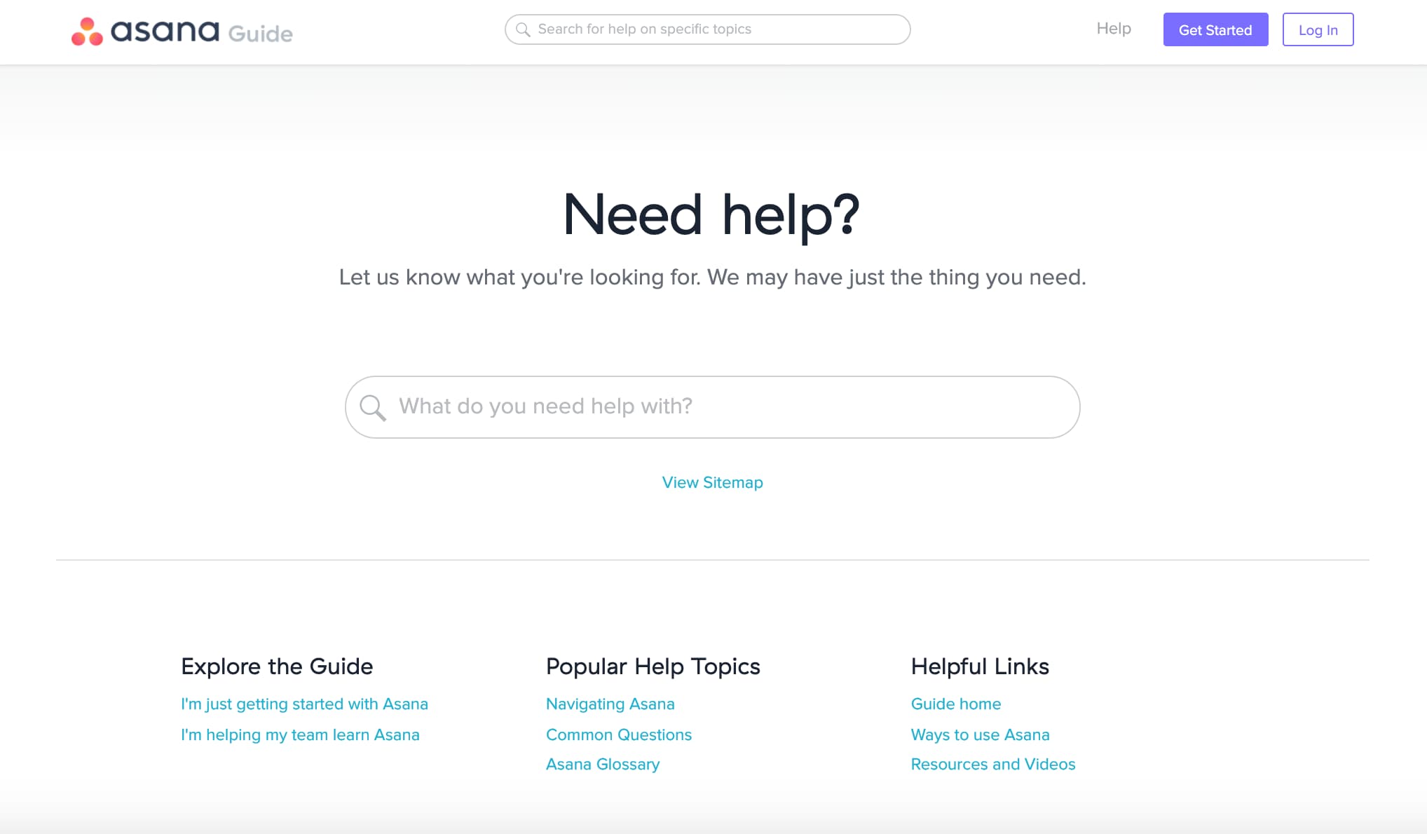
The Asana Guide is the brand's fully searchable, centralized content hub of best practices to help bring teams up to speed with their product. As a growing resource, it features a wide range of educational content to help teams with Asana onboarding.
SaaS onboarding example from Asana
Image from Asana

Asana’s dedicated Search page allows users to quickly identify themselves as “just getting started with Asana” or “helping my team learn Asana” to be served relevant, contextual help outside of the app.

User drop-off in the product-adoption phase is one of the most challenging aspects of retention. That’s why Asana provides checklists, templates, webinar links, and step-by-step instructions to address common reasons for user drop-off. The brand's thoughtful “Help your team adopt Asana” guide is a great example of how Asana helps their new users get through product adoption.

For anyone with teammates who learn by doing or by talking it out, Asana’s Guide can also connect colleagues to live Q&As with trainers or self-paced online courses that remove the intimidation from the implementation.

What you can learn from Asana’s SaaS onboarding

Asana knows that frictionless onboarding doesn’t always happen. Users may get distracted and leave their onboarding flow temporarily, or worse—permanently. Asana wants users to complete the onboarding flow, so they use simple prompts.

If users lose patience and navigate elsewhere on your product, a prompt (such as a team onboarding checklist embedded into an Asana adoption guide) can bring them back into the app as an active user.

Whether an Asana Tip leads a customer to design their first in-app collaborative workflow or their team gets up to speed in 15 minutes by watching an Asana Lessons series together, Asana guides users back to their workspaces loaded with new knowledge and renewed navigational confidence.

2. HubSpot: Personalizes SaaS user onboarding with surveys

If Rod Stewart wrote a song about HubSpot’s CRM, he might’ve sang that it was “forever free.” That’s because their CRM is free...forever. That presents a unique challenge because users have no “skin in the game.” They haven’t paid for anything, and they never have to. Product adoption is tough in these instances, so HubSpot has to have their user onboarding dialed in.

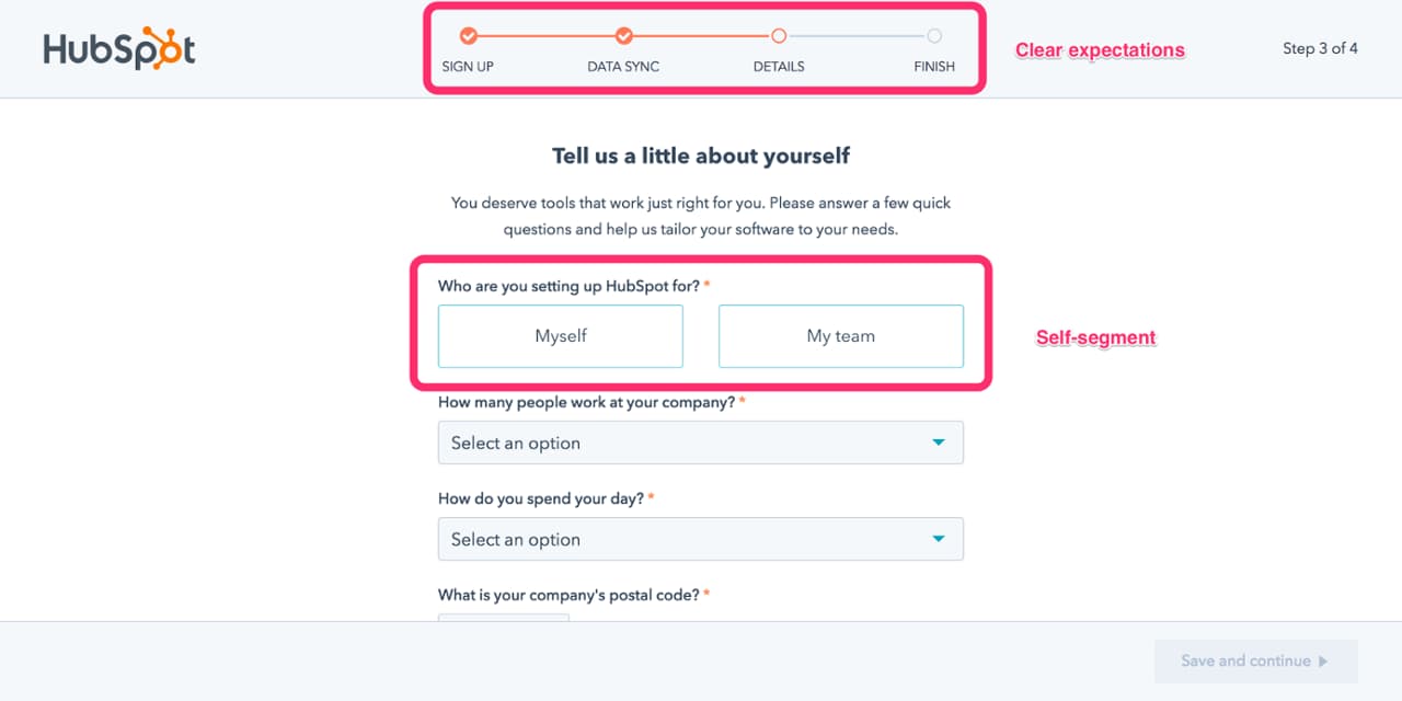
HubSpot onboards and retains users by personalizing the onboarding experience based on user survey responses. The SaaS tool sends new users a getting-to-know-you Q&A session with no more than four multiple-choice questions.
SaaS onboarding example from HubSpot
Image from HubSpot

HubSpot requests details about the user’s role and company and what they’ll be using the tool for. This information is then used to personalize the customer’s dashboard and online workspace. Product managers can personalize a user’s learning curve based on their job function when they better understand what motivates and pushes the user to action.

HubSpot’s CRM encourages customers to stay active on their dashboard by indicating what value they’ll gain in return for feedback or data. This could be learning a new skill that’s essential to their job, gaining insight into who is the most productive on the team and why, and setting quotas to visualize progress.

What you can learn from HubSpot’s SaaS onboarding

When users are new to your product, remind them every step of the way that taking action leads to progress (visualized in a checklist, progress bar, percentage value), progress leads to action, and a certain number of actions in a specified timeframe lead to accomplishment.

When customers feel productive in the digital workspaces that are set up for all their day-to-day tasks, they’ll be more likely to encourage other team members to come on board and join them.

3. Notion: Onboards users with an interactive, task-based product tour

Released in 2016 by Ivan Zhao, Notion is a collaborative workspace and productivity tool that helps you and your team write, plan, and get organized.

To onboard users, Notion offers a guided tour filled with tasks on the "Getting Started" page. This onboarding approach encourages users to learn the valuable core functions anyone will need to start collaborating and creating as soon as possible in the software.

SaaS onboarding example from Notion
Image from Notion

During the onboarding process, users can choose templates that help them build Notion pages—budgets, meeting agendas, and more. These templates encourage users to build collaborative content and systems based on the team’s purpose and business needs.

Notion encourages actively exploring and practicing on prebuilt pages to build confidence with the product. Their onboarding flow is designed as a to-do list on a private Notion page. Users can play, test, and learn by discovering interactive hover states with more detailed walk-throughs.

What you can learn from Notion’s SaaS onboarding

By making the onboarding flow a “Get Started” to-do list, the document serves two purposes for new customers: they learn how to click through and make progress on a basic use case (a to-do list that can benefit any team function), and Notion makes it clear what basics need mastering to gain value straightaway (for example, keyboard shortcuts).

During Notion’s onboarding survey, customers explain what their job function is and who they’ll use Notion with (either solo or with teams). Accordingly, Notion pre-populates a workspace with relevant templates and encourages users to check them out via friendly tooltip messaging.

Customize onboarding templates for different teams, cultures, and contexts as needed. Users can try them out as a jumping-off point for using your product for the first time in a way that’s relevant to their needs.

4. Webflow: Uses tooltips to show people how to get started

Tooltips may seem small, but they’re one of the most versatile and powerful tools at your disposal. They pull double duty by directing people’s eyes to specific parts of your UI and offer a dedicated place where you instruct and educate your users. They’re so versatile that the majority of Webflow’s onboarding process runs on tooltips.

Webflow’s onboarding is split into three sections, with each one focusing on different aspects of creating a website.

SaaS onboarding example from WebFlow
Image from Webflow

The copy on this tooltip sets expectations—telling users what they will learn and roughly how long it will take. It also provides an easy exit point where more advanced users can skip the onboarding altogether and get straight to the good stuff.

The tooltips within each section guide users through basic website building tasks.

SaaS onboarding example from WebFlow 2
Image from Webflow

The tooltip tells you exactly what to do and makes it clear where you need to go to adjust these settings. As you complete a task, another tooltip pops up with the next thing you can do to build your website. By the end of the three sections, you’ll have experience adding buttons, adjusting container sizes, and much more.

What you can learn from Webflow’s SaaS onboarding

Tooltips are a powerful way to educate users and get them familiar with your UI at the same time. Webflow knows that there are a lot of symbols and tools on their website builder interface. Their onboarding can’t just tell people that they can do certain things with the builder. It also has to show them where to access these options and how to use them.

When designing your onboarding flow, consider how to employ UI patterns to familiarize your users with your UI. Tooltips, modals, and hotspots can all play a role in ensuring that your users are prepared from day one to use your product like a pro.

5. Guru: Creates resources that’ll help users hit the ground running

Guru is a knowledge management software that makes it easy for your company to keep resources and best practices easily accessible to the entire company. Anyone who has worked with this kind of software knows that one of the hardest parts is just getting everything created. There are usually mountains and mountains of docs you need to get published. And until these documents are created, it’s hard for companies to see the value that Guru brings.

Guru helps solve this problem by doing a lot of the work for you. In their onboarding materials lives a treasure trove of templates you are free to use to get your database off the ground quickly.

Each template is organized by topic, and there are a ton to choose from.

SaaS onboarding example from Guru
Image from Guru

Click through to these templates, and you’ll find a quality resource that someone has put a lot of time and thought into (so you don’t have to).

SaaS onboarding example from Guru 2
Image from Guru

This template on “How to Use Slack” is over 500 words long and goes over some of the major points new employees should know about your Slack channel. Because it’s already formatted, it’s easy enough for new users to go in and adjust it to fit their company’s policies. Now a project that might’ve taken a couple of hours if you had to write this from scratch now takes about 10 or 20 minutes.

What you can learn from Guru’s SaaS onboarding

SaaS onboarding helps users get to value quicker. It could take months for a company to create their knowledge base, but that job will go much faster with templates. Users will see value from the knowledge base more quickly and be more likely to renew their contract when the time comes. Templates may not be suitable for your SaaS product, but don't be afraid to think outside the box in pursuit of helping users get more out of your product right out of the gate.

6. Sprout Social: Removes roadblocks proactively on the way to product activation

Sprout Social requires access to data from multiple social media accounts to be useful to their customers. They need that data to help users coordinate social posts and analyze their results, showing them the value of the product. However, getting that data isn’t always easy, especially when Sprout Social can’t control if users will say yes.

Instead of throwing their hands up and saying “oh well” when users say no, Sprout Social proactively addresses user concerns.

SaaS onboarding example from Sprout Social
Image from Sprout Social

They address user concerns through a well-written modal. The copy addresses how Sprout Social will use this data, tells users what happens if they say no, and offers them a chance to change their minds. If they do, Sprout Social has potentially saved a user because they pushed back when a user was at risk of going down a road that would ultimately lead to churn.

What you can learn from Sprout Social’s SaaS onboarding

Your main onboarding goal is to guide users to activation events that lead to long-term retention. Part of that process is identifying points where users stray off that path. By using a well-placed modal, Sprout Social has done what it can to shepherd users to a more successful outcome.

Use your data to find these negative user journeys and UI patterns to intervene where possible. Your churn rate will thank you.

7. Wealthfront: Displays the long-term rewards of sticking with them  

Wealthfront is an investment app that aims to bring the benefits of long-term financial practices to the masses. One clear challenge Wealthfront’s onboarding needed to face was showing users in their 20s the value of investing for their retirement.

The answer: interactive graphs!

SaaS onboarding example from Wealthfront
Image from Wealthfront

Wealthfront shows users how much they’ll have if they set aside a certain amount each month. It may not be a concrete benefit, but seeing that you’ll be a millionaire by 65 is enough value to get some people to commit until they start to see real results that’ll justify staying with Wealthfront.

What you can learn from Wealthfront’s SaaS onboarding

Value does not always need to be concrete. Concrete value is always better, but if you sell people a good story about the future value your product will bring, it’ll buy you time until that value arrives.

Invest time into visuals, data, and UX copy to sell these stories. Wealthfront’s graph works because it highlights how much money they’ll earn (“You’ll have $2.4M”) and because it's based on the basic math that users see when they manipulate the graph.

8. Deputy: Provides multiple ways to learn

Product marketers often refer to what users learn in onboarding and not how users learn when they discuss personalization. But by providing multiple ways to interact with the onboarding materials, you give people the chance to learn in the way they choose at the speed they prefer.

The scheduling and timesheet product Deputy includes both written and video instructions on how to use their features. They include a minute-long video for people who want a quick visual overview of how Deputy’s News Feed works.

SaaS onboarding example from Deputy
Image from Deputy

However, they also have a long-form article if that’s the style a user prefers

SaaS onboarding example from Deputy
Image from Deputy

The long-form article goes into more in-depth discussions on how the News Feed works, while the video is great for getting a quick introduction and learning on your own.

What you can learn from Deputy’s SaaS onboarding

Make your onboarding materials as easy to engage with as possible. One way to do this is to follow Deputy’s lead and publish your learning materials in multiple formats that might appeal to different kinds of users.

Not only is it convenient to be offered a choice of how to learn, but it also makes your product more accessible. People with visual or auditory impairments or second language learners might prefer one version over another. You want your onboarding to be effective for all of your users, and providing multiple formats for your learning materials is one of the easiest ways to do that.

Embrace the unknowns of what makes the “best” onboarding process

Customers don’t just hope for good onboarding—they expect to be blown away in those early interactions. SaaS companies like HubSpot, Notion, and Asana have leveraged how-to guides, personalized user flows, and template libraries to map out positive outcomes and productive solutions by rewarding customers for the right behavior early on.

But as Margaret Kelsey, OpenView's VP of marketing, said, "There's no definitive best user onboarding because users' experiences vary so much from product to product." Instead, product managers should focus on understanding what their customers believe is a great onboarding experience based on their unmet needs.

By learning to meet your customers where they’re at (even if they’re at risk of leaving), you’ll be able to take on the role of a thoughtful tour guide who can guide them back to finding value and making the most of your product.

Want to master the art of user onboarding? Complete our free User Onboarding 101 Certification course.

Ramli John
Director of Content at Appcues
Ramli John is the Director of Content at Appcues and author of the bestselling book Product-Led Onboarding. He’s also a PLG Coach at ProductLed, where he’s worked with Mixpanel, Microsoft, and more to accelerate their growth.
You might also like...