← Visit Appcues.com
×
×

What working in retail taught me about building great user experiences
Somewhere along my journey to customer success, I spent a summer interning at the National Eating Disorders Association. At seventeen...
Skip to section:

Skip to section:

Somewhere along my journey to customer success, I spent a summer interning at the National Eating Disorders Association. At seventeen, I wanted to apply my textbook knowledge of mental illness to help a population in need of support. 

To fund the costs of my unpaid internship, I took a part-time job at J. Crew. My time in retail was fun, but it was just a way to support my interests in psych and helping others.

Back then if you asked me what I did in a day at J. Crew, I would’ve told you I welcomed customers, offered a few outfit suggestions, and prepared the shop for the next day’s customers.

Now as I reflect back on my experience on Madison Avenue, I realize my learning that summer was two-fold. I enjoyed my job and did well as a sales associate because I extended consideration for customers and gave genuine forethought for their goals as shoppers.

As a customer success manager at Appcues, I often get asked what the best strategies are for effective in-app messaging and I can't help but relate back to my experience in retail.

We all know that a pushy worker can get in the way of a great shopping experience. Yet every national retailer, from hypermarkets to high-end boutiques, continues to employ sales associates. When trained to deliver the right information to best serve customers, associates increase sales, strengthen customer relationships, and build brand loyalty. 

In-app messaging is no different. Poorly targeted, impersonal messages can drive users away (and faster than it would take to run out a physical store). To be effective, in-app messages, like good sales associates, have to be friendly and helpful, without getting in the way of customer exploration.

Here are a few lessons, taken from retail, that can help you build effective in-app messages and create a better user experience.  

Show your users around

Welcome new users

Some UI can be straight-forward, while others are more complex and full-featured; so can brick-and-mortars. 

A good sales associate at a ritzy boutique will provide highly personalized service. Customers here anticipate spending more of their money and time with expectations of buying the perfect item. Associates at large retailers will instead focus their guests' attention quickly (think greeters at Wal-Mart). Associates here have a small window to make an impact on shoppers who are often on a quick run and know what they need.

Create a welcoming experience that highlights your product’s strengths and caters to what new users are seeking. If your platform is client-centric, get personal and don’t waste your users’ time on features that won’t help them.

Casengo provides a big, friendly welcome to new users and promptly gives them options to get started.
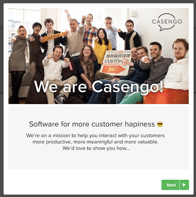
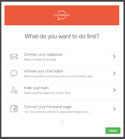
Casengo welcome modal built with Appcues
Casengo modal built with Appcues

Orient returning visitors to what's new

Store fronts and displays change all the time, just like platforms and products going through an update or entering a new version.

J. Crew has several classic items that customers always asked for. Whenever we moved them around, it was up to us as sales associates to remember where they were to quickly redirect customers.

Some users might want to soak in all the beautiful changes you’ve made on your site, but be thoughtful for those who are stopping by to get a job done. Make it easy for  them by clearly pointing out the changes you’ve made and showing them where they can find the features they rely on.

When Stripe revamped its product, they created several in-app messages, both before and after the platform changes, to inform users of the updates. This modal window gives an overview of three new features worth noting.
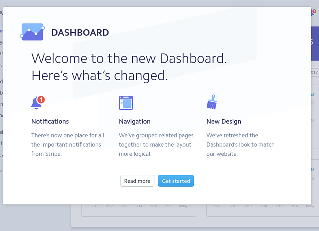
stripe modal window new feature announcement

Don’t over-employ or overwhelm

Nothing makes a customer leave a store faster than being made uncomfortable. If a shopper is bombarded by associates, they’ll become avoidant of your employees and disappear in a heartbeat, potentially for good. 

When asking users to do too much, they might not do anything at all. Do users a favor by limiting the number of messages you share. Overwhelming messages may come in the form of competing CTAs or a product tour that's one too many steps long.

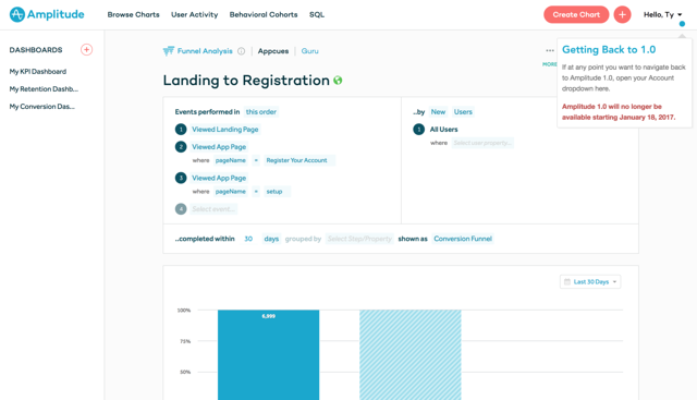
More subtle patterns, like hotspots, can help users elicit guidance on their own terms. 

When launching their new 2.0 platform, Amplitude used a hotspot to help users who specifically wanted to seek out their old dashboards. This unobtrusive UI pattern can be easily ignored otherwise.
amplitude hotspot

Upsell and cross-sell with customers' interest in mind

I initially had a hard time with this one. It took me a while to consider how upselling or cross-selling could be to customers' benefit rather than just mine. After working with hundreds of customers, I realized that many were willing to spend extra money on items they really did want but didn’t know existed.

There’s a tactful way to upsell or cross-sell your customers, and chances are you have the data to do so. If you know that customers who add on certain services or features to their package are more likely to succeed, tell them. Just be sure to target the right features to the rights users, otherwise your customers might become blind to your “upgrade now!” prompts.

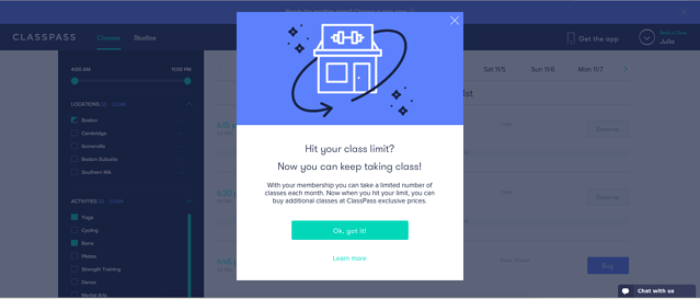
When a user books their max amount of classes, ClassPass suggests purchasing add-on classes. Add-ons are cheaper than individual class purchases, making this a win-win for ambitious customers and the company.
classpass upgrade modal

Celebrate your customers

Re-affirm buyer decisions

Before working the floor at J. Crew, I went through several training sessions which included watching Creative Director Jenna Lyons thoughtfully reflecting on the traditional crafting and quality standards that structure each Italian cashmere piece. Jenna was so excited about the cashmere line that (I must admit) she sold me firmly on its greatness and inspired me to celebrate these purchases with customers.

Watching your hard-earned cash disappear in one swipe isn’t easy, but having another person reassure your investment can make all the difference. Whether it’s their time or company’s cash, your users are taking a risk and giving your software a chance. Help them turn a potentially perceived risk into an empowering decision and feel-good moment.

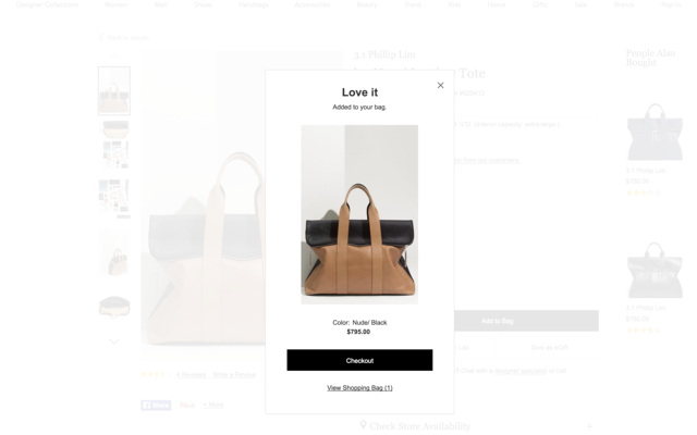
Nordstrom sends some good vibes to users once they’ve added an item to their bag. While the header of this is a compliment about the users’ taste, the modal window also fast-tracks a purchase: shoppers can check out immediately or take a look at their bag.
nordstrom reaffirmation celebration modal

Appreciate your customers

J. Crew might be a large national brand but it is not the only one in its class. Although I worked at one of the busiest locations on Madison Avenue, many visitors were just stopping by as part of a larger shopping tour on Manhattan. While shoppers might not make a purchase every visit, it’s important to appreciate the time they chose to spend with you. 

Customers have a choice in where they spend their time and money, and as great as you know your platform, team, and mission is, there will always be competitors with similar products and values.

Encourage and reciprocate brand loyalty by showing your thankfulness and commitment to your customers. An easy way to do this is by celebrating customer milestones. Thank them for spending a year with you and your team, or give frequent users a special offer.

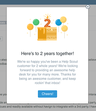
Help Scout uses a quick and personal message to celebrate customer anniversaries. It's a nice touch that makes users feel a little more connected with the brand and reminds them of the value they've received. 
helpscout modal window celebration

Helping customers achieve their goals 

In every one of my roles, I’ve learned to be actively empathetic towards the clients I serve. While my stint in retail lasted for just a summer, the motivation and mindset that I had towards helping shoppers isn’t too different from how I think about helping product teams improve their user experiences. 

If you’re creating in-app messages, you are in a great position to help your users and your company succeed. Take what you know about your customers and your product and apply that knowledge to create the most relevant and helpful messages. Whenever you get stuck, just consider yourself a customer to your company’s storefront and think about what you came in for.

Melissa Straus
Customer Success Manager at Appcues (2015-2016)
Skip to section:

Skip to section:

Somewhere along my journey to customer success, I spent a summer interning at the National Eating Disorders Association. At seventeen, I wanted to apply my textbook knowledge of mental illness to help a population in need of support. 

To fund the costs of my unpaid internship, I took a part-time job at J. Crew. My time in retail was fun, but it was just a way to support my interests in psych and helping others.

Back then if you asked me what I did in a day at J. Crew, I would’ve told you I welcomed customers, offered a few outfit suggestions, and prepared the shop for the next day’s customers.

Now as I reflect back on my experience on Madison Avenue, I realize my learning that summer was two-fold. I enjoyed my job and did well as a sales associate because I extended consideration for customers and gave genuine forethought for their goals as shoppers.

As a customer success manager at Appcues, I often get asked what the best strategies are for effective in-app messaging and I can't help but relate back to my experience in retail.

We all know that a pushy worker can get in the way of a great shopping experience. Yet every national retailer, from hypermarkets to high-end boutiques, continues to employ sales associates. When trained to deliver the right information to best serve customers, associates increase sales, strengthen customer relationships, and build brand loyalty. 

In-app messaging is no different. Poorly targeted, impersonal messages can drive users away (and faster than it would take to run out a physical store). To be effective, in-app messages, like good sales associates, have to be friendly and helpful, without getting in the way of customer exploration.

Here are a few lessons, taken from retail, that can help you build effective in-app messages and create a better user experience.  

Show your users around

Welcome new users

Some UI can be straight-forward, while others are more complex and full-featured; so can brick-and-mortars. 

A good sales associate at a ritzy boutique will provide highly personalized service. Customers here anticipate spending more of their money and time with expectations of buying the perfect item. Associates at large retailers will instead focus their guests' attention quickly (think greeters at Wal-Mart). Associates here have a small window to make an impact on shoppers who are often on a quick run and know what they need.

Create a welcoming experience that highlights your product’s strengths and caters to what new users are seeking. If your platform is client-centric, get personal and don’t waste your users’ time on features that won’t help them.

Casengo provides a big, friendly welcome to new users and promptly gives them options to get started.

Casengo welcome modal built with Appcues
Casengo modal built with Appcues

Orient returning visitors to what's new

Store fronts and displays change all the time, just like platforms and products going through an update or entering a new version.

J. Crew has several classic items that customers always asked for. Whenever we moved them around, it was up to us as sales associates to remember where they were to quickly redirect customers.

Some users might want to soak in all the beautiful changes you’ve made on your site, but be thoughtful for those who are stopping by to get a job done. Make it easy for  them by clearly pointing out the changes you’ve made and showing them where they can find the features they rely on.

When Stripe revamped its product, they created several in-app messages, both before and after the platform changes, to inform users of the updates. This modal window gives an overview of three new features worth noting.

stripe modal window new feature announcement

Don’t over-employ or overwhelm

Nothing makes a customer leave a store faster than being made uncomfortable. If a shopper is bombarded by associates, they’ll become avoidant of your employees and disappear in a heartbeat, potentially for good. 

When asking users to do too much, they might not do anything at all. Do users a favor by limiting the number of messages you share. Overwhelming messages may come in the form of competing CTAs or a product tour that's one too many steps long.

More subtle patterns, like hotspots, can help users elicit guidance on their own terms. 

When launching their new 2.0 platform, Amplitude used a hotspot to help users who specifically wanted to seek out their old dashboards. This unobtrusive UI pattern can be easily ignored otherwise.

amplitude hotspot

Upsell and cross-sell with customers' interest in mind

I initially had a hard time with this one. It took me a while to consider how upselling or cross-selling could be to customers' benefit rather than just mine. After working with hundreds of customers, I realized that many were willing to spend extra money on items they really did want but didn’t know existed.

There’s a tactful way to upsell or cross-sell your customers, and chances are you have the data to do so. If you know that customers who add on certain services or features to their package are more likely to succeed, tell them. Just be sure to target the right features to the rights users, otherwise your customers might become blind to your “upgrade now!” prompts.

When a user books their max amount of classes, ClassPass suggests purchasing add-on classes. Add-ons are cheaper than individual class purchases, making this a win-win for ambitious customers and the company.

classpass upgrade modal

Celebrate your customers

Re-affirm buyer decisions

Before working the floor at J. Crew, I went through several training sessions which included watching Creative Director Jenna Lyons thoughtfully reflecting on the traditional crafting and quality standards that structure each Italian cashmere piece. Jenna was so excited about the cashmere line that (I must admit) she sold me firmly on its greatness and inspired me to celebrate these purchases with customers.

Watching your hard-earned cash disappear in one swipe isn’t easy, but having another person reassure your investment can make all the difference. Whether it’s their time or company’s cash, your users are taking a risk and giving your software a chance. Help them turn a potentially perceived risk into an empowering decision and feel-good moment.

Nordstrom sends some good vibes to users once they’ve added an item to their bag. While the header of this is a compliment about the users’ taste, the modal window also fast-tracks a purchase: shoppers can check out immediately or take a look at their bag.

nordstrom reaffirmation celebration modal

Appreciate your customers

J. Crew might be a large national brand but it is not the only one in its class. Although I worked at one of the busiest locations on Madison Avenue, many visitors were just stopping by as part of a larger shopping tour on Manhattan. While shoppers might not make a purchase every visit, it’s important to appreciate the time they chose to spend with you. 

Customers have a choice in where they spend their time and money, and as great as you know your platform, team, and mission is, there will always be competitors with similar products and values.

Encourage and reciprocate brand loyalty by showing your thankfulness and commitment to your customers. An easy way to do this is by celebrating customer milestones. Thank them for spending a year with you and your team, or give frequent users a special offer.

Help Scout uses a quick and personal message to celebrate customer anniversaries. It's a nice touch that makes users feel a little more connected with the brand and reminds them of the value they've received. 

helpscout modal window celebration

Helping customers achieve their goals 

In every one of my roles, I’ve learned to be actively empathetic towards the clients I serve. While my stint in retail lasted for just a summer, the motivation and mindset that I had towards helping shoppers isn’t too different from how I think about helping product teams improve their user experiences. 

If you’re creating in-app messages, you are in a great position to help your users and your company succeed. Take what you know about your customers and your product and apply that knowledge to create the most relevant and helpful messages. Whenever you get stuck, just consider yourself a customer to your company’s storefront and think about what you came in for.

Melissa Straus
Customer Success Manager at Appcues (2015-2016)
You might also like...