← Visit Appcues.com
×
×

Product tour UI/UX: Best onboarding flow patterns, with tips & examples
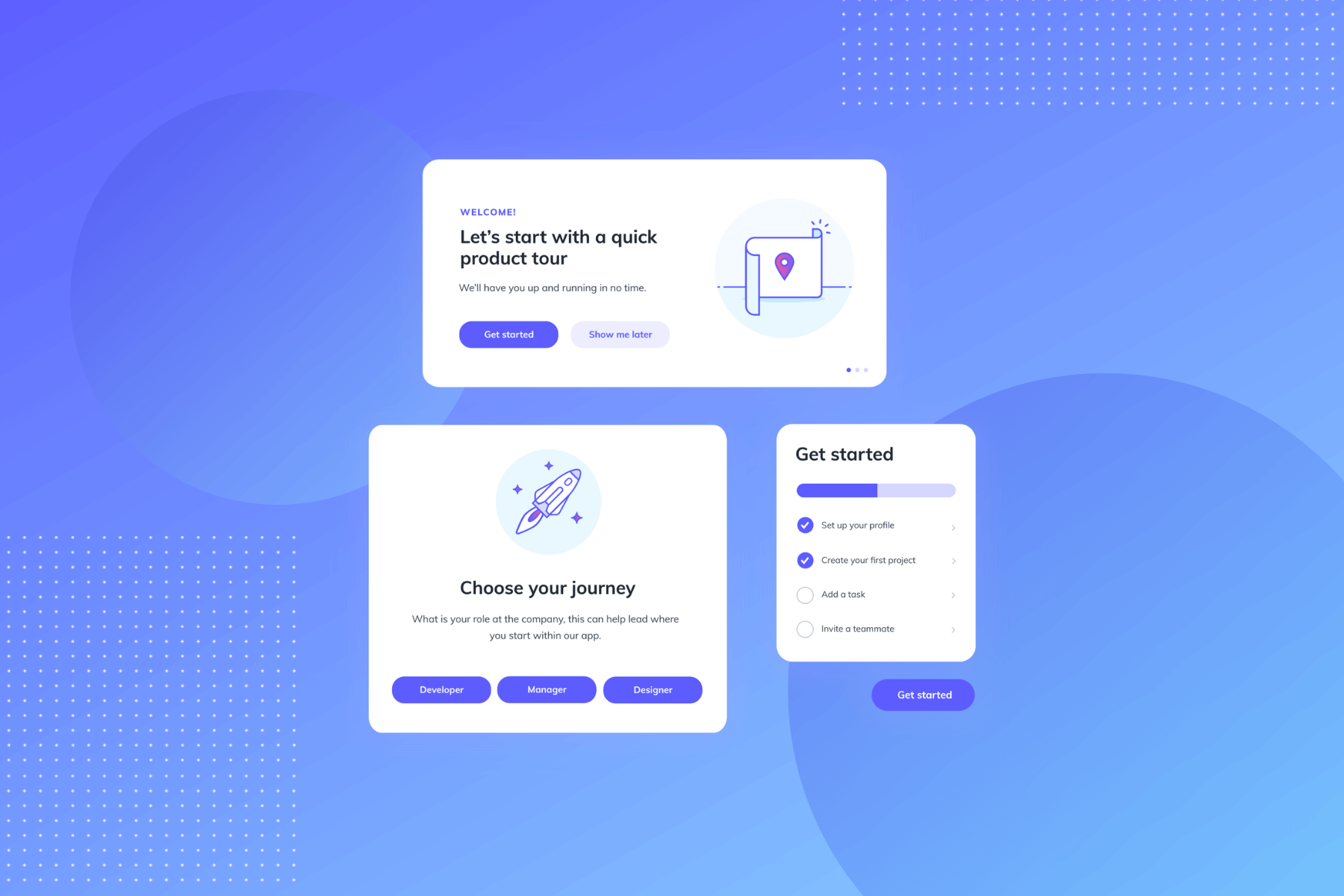
Learn how to use product tour UI patterns to design user onboarding tours. Increase activation, adoption, and retention rates.
Skip to section:

Skip to section:

You’ve come to expect a tour when you check out an apartment for rent, start a new job, or even visit a friend’s house for the first time.

There’s a reason for that: Tours help us get our bearings and understand where we are and what’s going on. 

But what about when we use new products? 

Too many products skip the product tour. Not only are they missing a big opportunity to introduce users to the product and turn their onboarding power up to 11, but users expect to see them in your onboarding.

We chatted with Fellow.App's Implementation Manager, Candice (Sookoo) Seegobin, and she said it's the first thing she looks for whenever she trials a new product:

"After starting a free trial, the first thing I would look for in an onboarding experience is a product guide to help get me started using the tool effectively."

A product tour can introduce new users to your interface, draw attention to product launches, and nudge users closer to their aha moment.

That’s a fair amount of sunshine and roses. But the product tour UX can go wrong. And when it does, it ends up feeling like a snarky backseat driver.

(No one likes a backseat driver.)

There’s no "best" UI for all product tours, but there are a couple of overarching principles to keep in mind:

  • The best product tours usually involve 3–5 steps
  • It takes the average lead 3–5 days to schedule a sales demo, and most sales demos last 30 minutes to an hour. More time waiting = more interest lost for your prospect. Product tours should decrease time-to-value—so keep them brief and punchy 

Used correctly, the right UI pattern can turn a heavy-handed product tour into one that not only helps your users achieve value, but fosters an immediate connection with your product.

Key things to consider for your product tour UI

Here’s the problem with designing a product walkthrough: You can’t just look at someone else’s product tour and copy it for your product.

Well, you can. But it won’t work well.

That’s because product tour UI design is specific to both the product itself and that product’s users.

You’re speaking to your users about your product at a very specific moment in time—when they’re learning how to use the product.

That means you have to really meet your users where they are. You have to tailor the UI to their in-this-moment experience.

To do that, consider the following:

Product functionality

When you look at your product, do you see a hammer or a Swiss army knife?

If it’s a hammer, it’s got basically one major function. If it’s the knife, it’s got a lot of functions.

The more functions your product has to offer, the more selective you’ll have to be about what you include in your product tour.

Why? Remember:

  • Shorter is better
  • Users don’t owe you their attention

Keep it brief and focused on the functions that matter most. And it’s up to you to pick the ones that matter most.

If you’re worrying over the adoption of the features you don’t include in your initial product tour, some good news: You can have more than one product tour. And you can set the tours to initiate at highly targeted moments of the user experience.

The uniqueness of your UI

Have your users ever seen anything like your product’s interface before? Be honest. It’s OK if the answer is yes.

You’re still offering value, and you may even have a leg up. If users are already familiar with interfaces like the one your product has, you may not need to do as much hand-holding in the product tour.

But what about those unicorn interfaces—the ones never before seen by human eyes? 

It’s possible that you and Lucy are in the same boat and you have some (product) explaining to do. But it’s also possible that you’re overthinking it.

A higher degree of interface uniqueness doesn’t always mean it’s harder to learn or use. This might be a moment to turn to product testing data. Use it to determine just how much your product tour really needs to explain.

User motivation

Put yourself in your users’ mindsets at the moment you envision your product tour beginning. How motivated are you to complete the product tour?

Up to this point, what all has happened to make you care enough to finish the tour?

Motivation of this kind could come from simple marketing efforts or a product launch email. It could be about eliminating barriers to app usage. It could even be about receiving some cash.

It’s unique to your product. But you need to understand it.

Why? Because you need to know how motivated your users are to understand what they will and won’t abide in your product tour.

If they’re highly motivated, you might get away with more steps. If they aren’t, short and sweet is probably the ticket.

User tech-savviness

Try to place your product within the ecosystem of products surrounding it. Do the users of your product already use products that require a similar level of technical knowledge? And how high is the required level of tech-savviness in the first place?

If you’re pretty sure your users will be familiar with UI patterns like yours, that should inform your product tour. It should lead to less hand-holding on the “how-to” side of the equation.

If this is a unique and technically challenging experience for your typical user, you know what to do: Be specific, keep it as simple as possible, and walk them through what matters most.

Choosing the right onboarding UX pattern

User attention is like a fragile glass vase high up on a shelf: One small bump can send it to pieces.

Your onboarding UX should cradle it—not bump it. But achieving that is easier said than done.

The fundamental question to ask yourself: How much attention should I ask of my users?

Once you know, choose the guided tour UX that asks that much attention and enhances onboarding (and hopefully retention).

Here are the product tour UI patterns you have to choose from, from the most attention-grabbing to the most subtle:

1. The personal trainer: Action-driven tooltips

This one is arguably the most popular UI pattern for product tours. It puts tooltips—those little callout boxes that highlight specific product elements—to work.

Tooltips can be action-driven, which means users have to perform the requested task before they are taken to the next tooltip.

Because action-driven tooltips involve heavy hand-holding, they’re good for encouraging users to take necessary actions or walking users through complex account setups that require doing things in a certain order.

When used in product tours correctly, action-driven tooltips can create a highly engaging and informative interactive experience. 

Employee management system Humanity uses action-driven tooltips to sequentially guide users through key actions that help them achieve value faster.
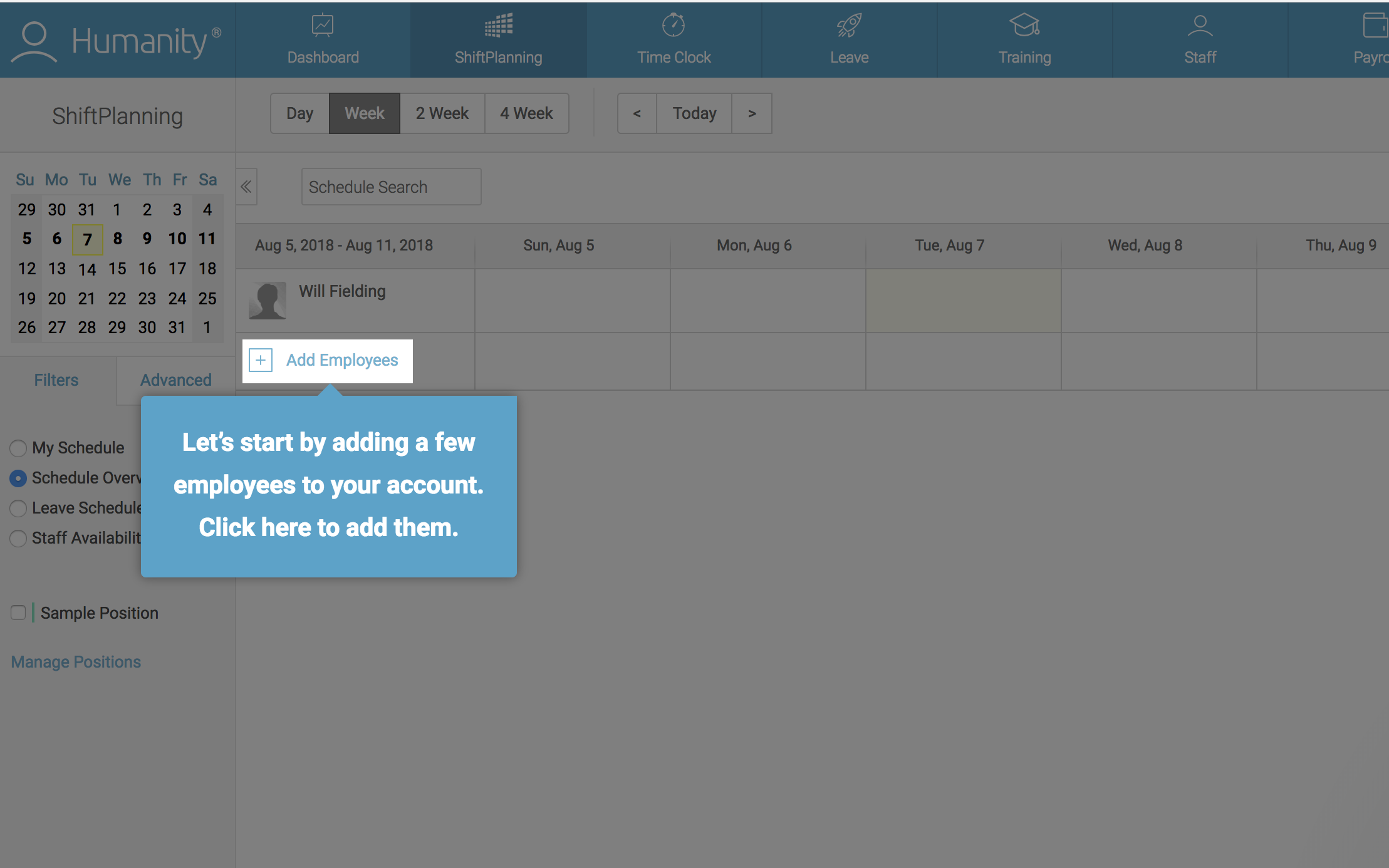
this is a screenshot image of employee management tool humanity. it shows a product tour that uses an action-driven tooltip ui pattern. in this example a user has to click on an element on the screen to progress to the next step in the user onboarding tour

But use these bad boys sparingly. Action-driven tooltips can feel heavy-handed and overbearing when you use them on non-critical features. No need to cause undue user frustration.

2. The tutor: Tooltips

Tooltips that are not action-driven provide contextual help that is slightly less demanding of user attention. Users can still follow “regular” tooltips sequentially without performing an action.

These tooltips don’t require an action (other than clicking “Next”). They’re useful for conveying information that is good to know but not critical at that moment.

IBM’s Cognos Analytics used Appcues to give new users a short and sweet tour of key features. 

Their tooltips contain helpful information meant to guide users toward success. Here’s the more reserved part: Users aren’t required to stop and perform all the actions to get value from the tour.
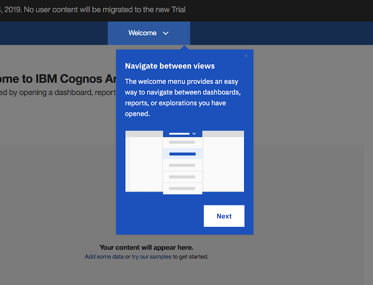
ibm cognos analytic tooltip made with appcues

The app tour UI doesn’t always have to happen immediately after account creation. In fact, for products with multiple functionalities, onboarding users to each feature as they progress through your product (rather than all at once) can be much more effective.

InVision uses this technique of progressive disclosure to onboard new users to its design tools. When users open up the InVision prototyping tool for the first time, they are greeted with a minimalistic tooltip product tour that runs them through a selection of key features.
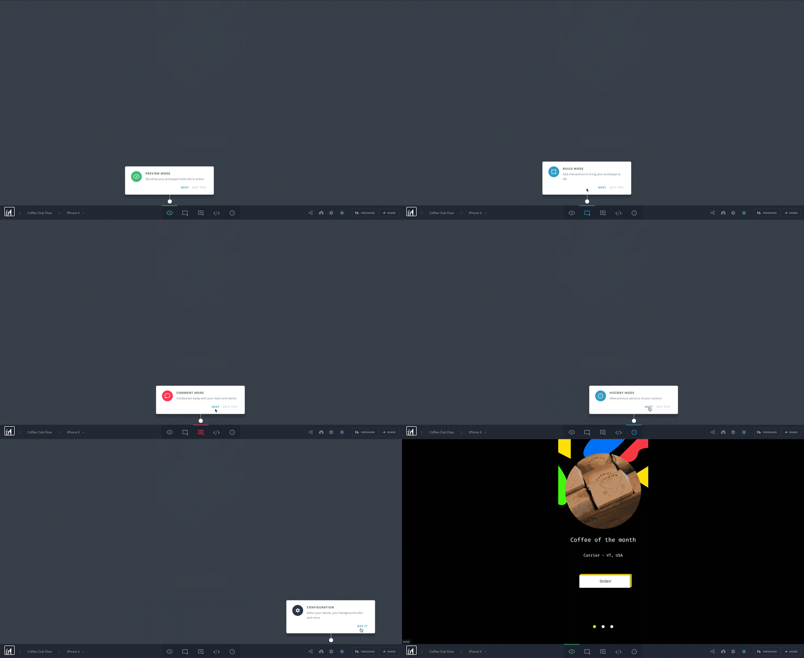
this is a gif image of design tool invision's user onboarding product tour that shows a series of tooltips used to introduce new users to a toolbar. this is a good example of using the right ui pattern for toolbar onboarding

Tooltip UI tours can:

  • Reduce burdens on support teams
  • Scale up usability 

They are highly specific and contextual. Use them as annotations to the underlying interface. 

Like other UI patterns, they can also be targeted to specific audiences:

  • New users
  • Users who haven’t performed a certain action
  • Users who haven't logged into your product in X days
  • And so on

That way, you can be sure that you're providing guidance where it counts.

Pro tip: When designing tooltips, think about how you can make them stand out from the core product while maintaining your brand’s styling. It could be background blurring, distinctive (but on theme) colors, or any number of other style choices.

Check out our guide—”Tooltips: How to create and use the mighty UI pattern”—for more suggestions and examples. Ready to start building your own tooltip-driven guided tour UI? Learn more about Appcues tooltips.

3. The welcome committee: Modal windows

Modal windows sit on top of a product’s main interface. They allow you to communicate with users without disrupting the underlying workflow. You can use them in product tours to provide a high-level overview of your product. 

Modals are great for adding visuals when walking your users every step of the way isn’t necessary.

For example, Qordoba used Appcues’s product tour software to give new users an overview of their product with a series of welcome modals:
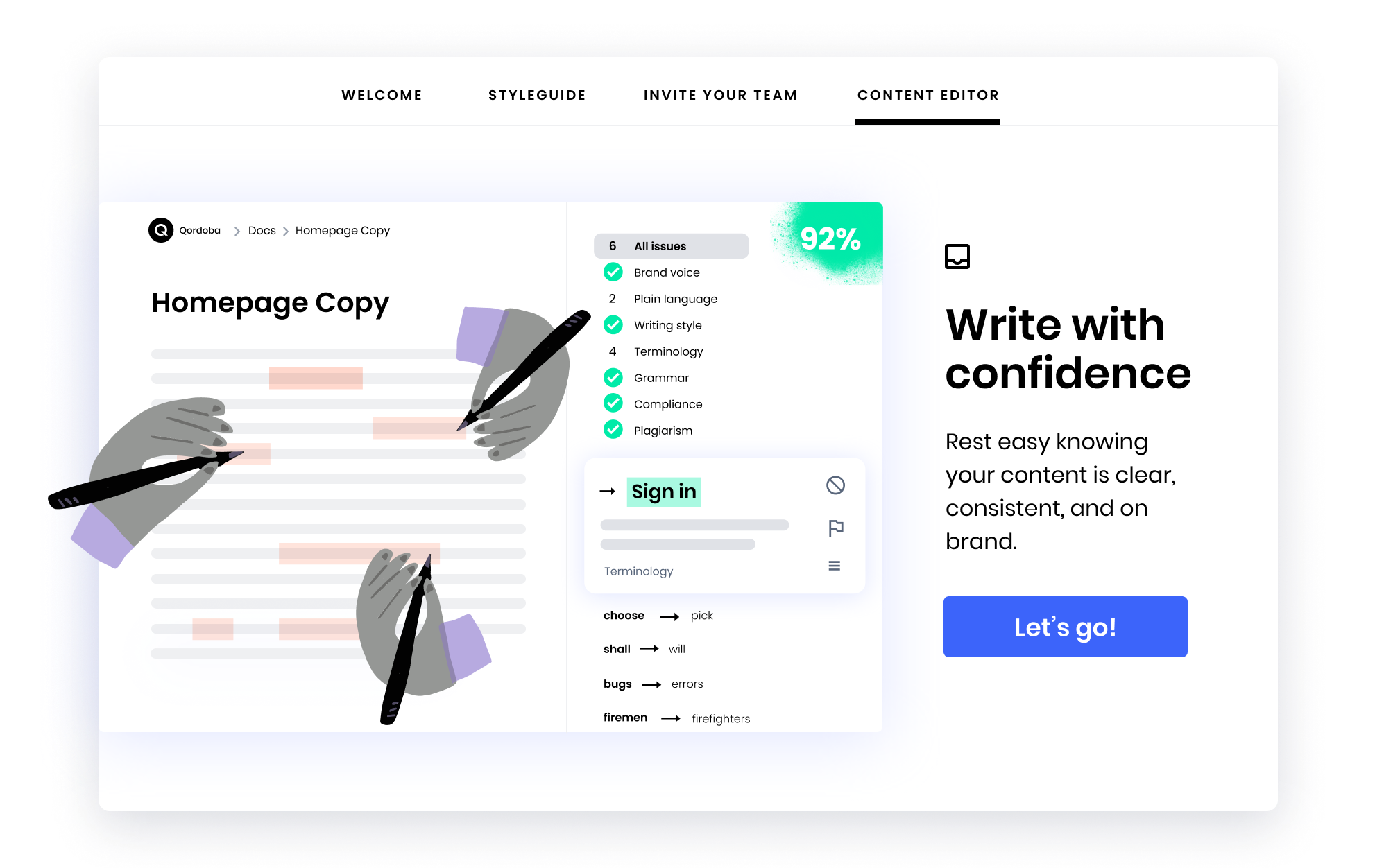
qoroba user onboarding welcome modal example made with appcues

Yotpo also used Appcues to create their user onboarding sequence. They take users on a product tour via an introductory video. This approach cuts the number of steps down, but it does require an attentive audience who is willing to sit and watch the video in full.
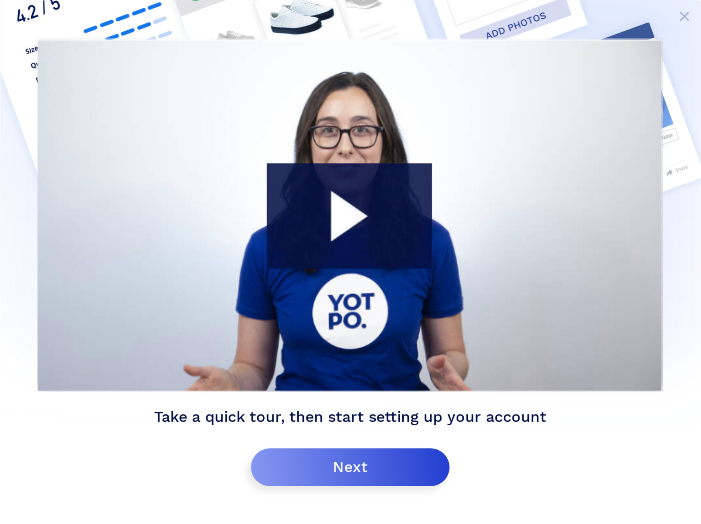
yotpo user onboarding modal video

Remember: Modal tours are bold UI patterns. They’re inherently disruptive—great for making a splash, less so for contextual help. 

As with tooltips, your modal windows should stand out from the main interface. But they have to look native to your product.

Check out “Big, bold UX—using modal windows for in-app user engagement” for more examples and advice about using this in-app messaging pattern. Or jump right in with Appcues modals and start building your own product tours, no coding required.

.cta-container { margin: 15px !important; display: flex; width: 100%; height: 350px; background-image: linear-gradient(to right, #5C5CFF , #8960FF); overflow: none !important; border-radius: 8px !important; justify-content: space-between; font-family: 'Mulish', 'Muli'; color: #ffffff !important; font-size: 15px !important; line-height: 1em !important;}.cta-left-content { margin: 15px 40px !important; width: 60%; height: 100%; display: flex; flex-direction: column; align-items: flex-start; justify-content: flex-start;}.cta-left-content h5 { text-transform: uppercase; font-weight: 700; font-size: 12px; line-height: 1em;}.cta-left-content h4 { font-weight: 700; font-size: 30px; margin: 0px; line-height: 1em;}.inline-cta-btn { border: none; border-radius: 8px; padding: 15px 40px 15px 40px; color: #5C5CFF !important; background-color: #ffffff; transition-duration: 300ms; cursor: pointer; font-weight: 600 !important;}.inline-cta-btn a { text-decoration: none; color: #5C5CFF !important; font-weight: 600 !important;}.inline-cta-btn a:visited { color: #5C5CFF !important;}.inline-cta-btn:hover { box-shadow: 0 0.5em 0.5em -0.4em var(--hover) #000000; transform: translateY(-0.25em); transition-duration: 300ms;}.inline-cta-list { list-style-type: none !important; margin: 15px -50px !important; line-height: 1em !important; color: #ffffff !important;}.inline-cta-list li { background:url("https://cdn.prod.website-files.com/61df2e51e1b1284b1537064a/624fac036a4986633c5fe071_check-white.svg") no-repeat 0 50%; background-size: 15px; padding-left: 25px; margin: 10px; line-height: 1em; color: #ffffff !important; font-weight: 400 !important;}.cta-right-image { width: 40%; display: flex; align-items: center;}.cta-right-image img { width: 100%; max-height: 400px; max-width: 420px;}@media only screen and (max-width: 700px) { .cta-right-image { width: 50%; } .cta-left-content { width: 50%; } .cta-left-content h4 { font-size: 23px; margin: 0px; }}@media only screen and (max-width: 600px) { .inline-cta-list { display: none; } .cta-right-image { width: 35%; } .cta-left-content h4 { font-size: 30px; margin-bottom: 30px; }}@media only screen and (max-width: 500px) { .cta-right-image img { display: none; } .cta-right-image { width: 0%; } .cta-left-content { width: 100%; }}
PICK YOUR PATTERN

Tooltips, and modals, and hotspots, oh my!

  • Appcues helps you dream up the most effective product tour for your business *and* empowers you to build it yourself 💪
I got this →
Charts and graphs

4. The friendly reminder: Hotspots

Hotspots are small icons, often circles, that hint at more information behind certain elements. They are a cross between notification badges and tooltips that require users to click to engage.

They require users to actively opt in. That makes hotspots the least invasive UI pattern for product tours. 

It’s a thing of beauty: Users who need the extra help will have access to information, while users who don’t can ignore the tour altogether.

Make hotspots a standalone pattern on the page. Or combine them with other UI patterns to create a lightweight but effective product tour.

Here’s an example of that second one from marketing content stream Zest:
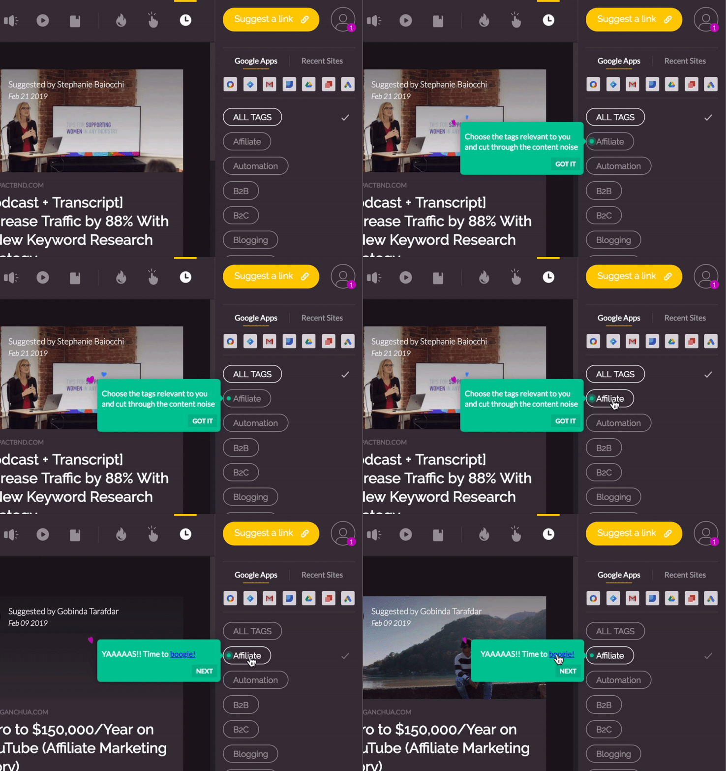
this is a gif image of an animated hotstpot and tooltip. this is an example of a fun ui pattern that is really good ux. it shows a green hotspot on a ui element that turns into tooltips with animations when the user clicks

Hotspots can also encourage discovery. Grammarly’s learn-by-doing demo document does that nicely by introducing new users to the editing tool’s myriad features:
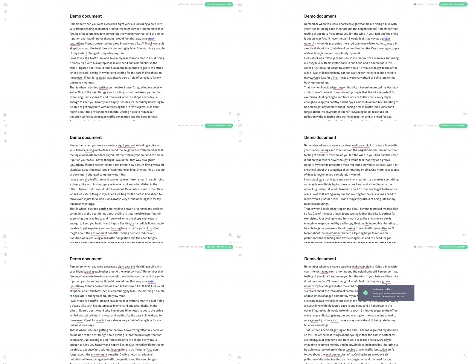
this is a gif image of grammarly editor's new user onboarding demo document that demonstrates a learn by doing apparoach to user onboarding. there are pulsating hotspots aka beacons that open into tooltips when a user clicks on them

There are drawbacks to subtlety, though. 

Behance uses hotspots to aid feature discovery, which is nice and unobtrusive—but the combination of a small UI pattern with white-on-light coloring makes the hotspots hard to see. 

That doesn’t mean you can’t make it work. Add a pulsing animation and visual contrast to make your hotspots stand out. Simple.
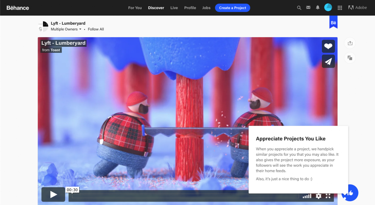
this is an image from behance's user onboarding flow that shows the use of hotspot and tooltip ui patterns. the hotspot is white against a white background which makes it hard to see

Want more info? We categorized over 500 user onboarding experiences into 8 UI/UX patterns, including hotspots. If you’re interested in integrating hotspots into your own product tour—good news! Appcues offers hotspots, too.

Measure, experiment, and improve

As with any user experience, shipped ≠ done. 

Once you’ve implemented a product tour, use analytics to track and measure its effect. Amplitude and Mixpanel are just a couple popular tools for diving into user data for this purpose.

If you notice that users are running into bottlenecks or roadblocks, experiment with different UI patterns and UX copy. And don't be afraid to mix and match. 

For instance, when Slack updated their interface in 2020, they used a novel mix of small modals and hotspots to introduce the new experience.
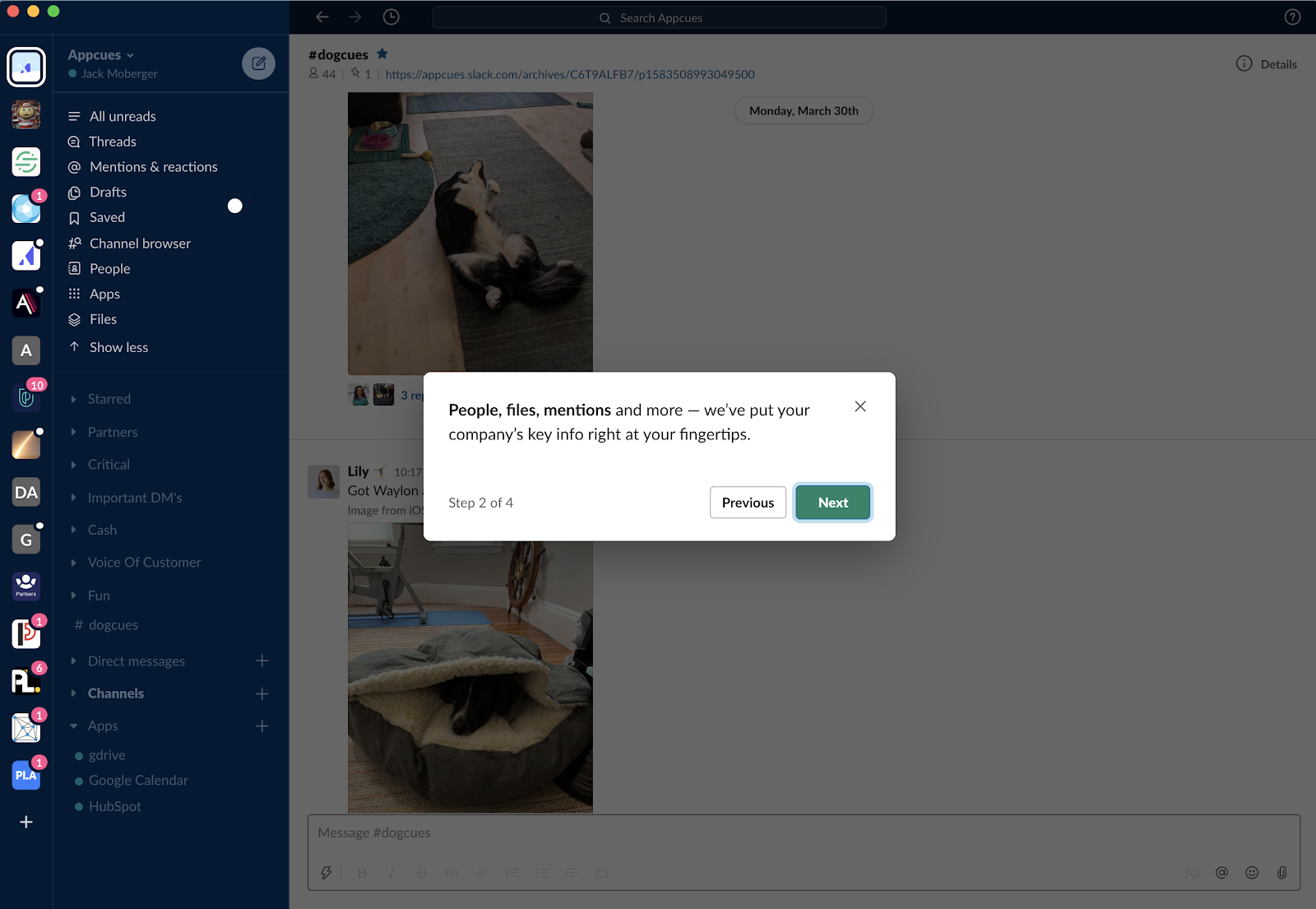
slack new version onboarding tour

Never forget: The best user onboarding experiences increase activation and shorten the user’s time to value. 

This typically takes multiple iterations to perfect—once your product tour is published, be prepared to revisit it and fine-tune the experience again and again. 

You’ll know you’ve gotten your product tour UI right when you are driving users to measurable value in as few steps as possible.
The ultimate guide to user onboarding. Discover user onboarding definitions, examples, best practices, and resources.

Katryna Balboni
Content and Community Director at User Interviews
Katryna is the Content and Community Director at User Interviews. Before User Interviews, she made magic happen with all things content at Appcues. Her non-work time is spent traveling to new places, befriending street cats, and baking elaborate pies.
Skip to section:

Skip to section:

You’ve come to expect a tour when you check out an apartment for rent, start a new job, or even visit a friend’s house for the first time.

There’s a reason for that: Tours help us get our bearings and understand where we are and what’s going on. 

But what about when we use new products? 

Too many products skip the product tour. Not only are they missing a big opportunity to introduce users to the product and turn their onboarding power up to 11, but users expect to see them in your onboarding.

We chatted with Fellow.App's Implementation Manager, Candice (Sookoo) Seegobin, and she said it's the first thing she looks for whenever she trials a new product:

"After starting a free trial, the first thing I would look for in an onboarding experience is a product guide to help get me started using the tool effectively."

A product tour can introduce new users to your interface, draw attention to product launches, and nudge users closer to their aha moment.

That’s a fair amount of sunshine and roses. But the product tour UX can go wrong. And when it does, it ends up feeling like a snarky backseat driver.

(No one likes a backseat driver.)

There’s no "best" UI for all product tours, but there are a couple of overarching principles to keep in mind:

  • The best product tours usually involve 3–5 steps
  • It takes the average lead 3–5 days to schedule a sales demo, and most sales demos last 30 minutes to an hour. More time waiting = more interest lost for your prospect. Product tours should decrease time-to-value—so keep them brief and punchy 

Used correctly, the right UI pattern can turn a heavy-handed product tour into one that not only helps your users achieve value, but fosters an immediate connection with your product.

Key things to consider for your product tour UI

Here’s the problem with designing a product walkthrough: You can’t just look at someone else’s product tour and copy it for your product.

Well, you can. But it won’t work well.

That’s because product tour UI design is specific to both the product itself and that product’s users.

You’re speaking to your users about your product at a very specific moment in time—when they’re learning how to use the product.

That means you have to really meet your users where they are. You have to tailor the UI to their in-this-moment experience.

To do that, consider the following:

Product functionality

When you look at your product, do you see a hammer or a Swiss army knife?

If it’s a hammer, it’s got basically one major function. If it’s the knife, it’s got a lot of functions.

The more functions your product has to offer, the more selective you’ll have to be about what you include in your product tour.

Why? Remember:

  • Shorter is better
  • Users don’t owe you their attention

Keep it brief and focused on the functions that matter most. And it’s up to you to pick the ones that matter most.

If you’re worrying over the adoption of the features you don’t include in your initial product tour, some good news: You can have more than one product tour. And you can set the tours to initiate at highly targeted moments of the user experience.

The uniqueness of your UI

Have your users ever seen anything like your product’s interface before? Be honest. It’s OK if the answer is yes.

You’re still offering value, and you may even have a leg up. If users are already familiar with interfaces like the one your product has, you may not need to do as much hand-holding in the product tour.

But what about those unicorn interfaces—the ones never before seen by human eyes? 

It’s possible that you and Lucy are in the same boat and you have some (product) explaining to do. But it’s also possible that you’re overthinking it.

A higher degree of interface uniqueness doesn’t always mean it’s harder to learn or use. This might be a moment to turn to product testing data. Use it to determine just how much your product tour really needs to explain.

User motivation

Put yourself in your users’ mindsets at the moment you envision your product tour beginning. How motivated are you to complete the product tour?

Up to this point, what all has happened to make you care enough to finish the tour?

Motivation of this kind could come from simple marketing efforts or a product launch email. It could be about eliminating barriers to app usage. It could even be about receiving some cash.

It’s unique to your product. But you need to understand it.

Why? Because you need to know how motivated your users are to understand what they will and won’t abide in your product tour.

If they’re highly motivated, you might get away with more steps. If they aren’t, short and sweet is probably the ticket.

User tech-savviness

Try to place your product within the ecosystem of products surrounding it. Do the users of your product already use products that require a similar level of technical knowledge? And how high is the required level of tech-savviness in the first place?

If you’re pretty sure your users will be familiar with UI patterns like yours, that should inform your product tour. It should lead to less hand-holding on the “how-to” side of the equation.

If this is a unique and technically challenging experience for your typical user, you know what to do: Be specific, keep it as simple as possible, and walk them through what matters most.

Choosing the right onboarding UX pattern

User attention is like a fragile glass vase high up on a shelf: One small bump can send it to pieces.

Your onboarding UX should cradle it—not bump it. But achieving that is easier said than done.

The fundamental question to ask yourself: How much attention should I ask of my users?

Once you know, choose the guided tour UX that asks that much attention and enhances onboarding (and hopefully retention).

Here are the product tour UI patterns you have to choose from, from the most attention-grabbing to the most subtle:

1. The personal trainer: Action-driven tooltips

This one is arguably the most popular UI pattern for product tours. It puts tooltips—those little callout boxes that highlight specific product elements—to work.

Tooltips can be action-driven, which means users have to perform the requested task before they are taken to the next tooltip.

Because action-driven tooltips involve heavy hand-holding, they’re good for encouraging users to take necessary actions or walking users through complex account setups that require doing things in a certain order.

When used in product tours correctly, action-driven tooltips can create a highly engaging and informative interactive experience. 

Employee management system Humanity uses action-driven tooltips to sequentially guide users through key actions that help them achieve value faster.

this is a screenshot image of employee management tool humanity. it shows a product tour that uses an action-driven tooltip ui pattern. in this example a user has to click on an element on the screen to progress to the next step in the user onboarding tour

But use these bad boys sparingly. Action-driven tooltips can feel heavy-handed and overbearing when you use them on non-critical features. No need to cause undue user frustration.

2. The tutor: Tooltips

Tooltips that are not action-driven provide contextual help that is slightly less demanding of user attention. Users can still follow “regular” tooltips sequentially without performing an action.

These tooltips don’t require an action (other than clicking “Next”). They’re useful for conveying information that is good to know but not critical at that moment.

IBM’s Cognos Analytics used Appcues to give new users a short and sweet tour of key features. 

Their tooltips contain helpful information meant to guide users toward success. Here’s the more reserved part: Users aren’t required to stop and perform all the actions to get value from the tour.

ibm cognos analytic tooltip made with appcues

The app tour UI doesn’t always have to happen immediately after account creation. In fact, for products with multiple functionalities, onboarding users to each feature as they progress through your product (rather than all at once) can be much more effective.

InVision uses this technique of progressive disclosure to onboard new users to its design tools. When users open up the InVision prototyping tool for the first time, they are greeted with a minimalistic tooltip product tour that runs them through a selection of key features.

this is a gif image of design tool invision's user onboarding product tour that shows a series of tooltips used to introduce new users to a toolbar. this is a good example of using the right ui pattern for toolbar onboarding

Tooltip UI tours can:

  • Reduce burdens on support teams
  • Scale up usability 

They are highly specific and contextual. Use them as annotations to the underlying interface. 

Like other UI patterns, they can also be targeted to specific audiences:

  • New users
  • Users who haven’t performed a certain action
  • Users who haven't logged into your product in X days
  • And so on

That way, you can be sure that you're providing guidance where it counts.

Pro tip: When designing tooltips, think about how you can make them stand out from the core product while maintaining your brand’s styling. It could be background blurring, distinctive (but on theme) colors, or any number of other style choices.

Check out our guide—”Tooltips: How to create and use the mighty UI pattern”—for more suggestions and examples. Ready to start building your own tooltip-driven guided tour UI? Learn more about Appcues tooltips.

3. The welcome committee: Modal windows

Modal windows sit on top of a product’s main interface. They allow you to communicate with users without disrupting the underlying workflow. You can use them in product tours to provide a high-level overview of your product. 

Modals are great for adding visuals when walking your users every step of the way isn’t necessary.

For example, Qordoba used Appcues’s product tour software to give new users an overview of their product with a series of welcome modals:

qoroba user onboarding welcome modal example made with appcues

Yotpo also used Appcues to create their user onboarding sequence. They take users on a product tour via an introductory video. This approach cuts the number of steps down, but it does require an attentive audience who is willing to sit and watch the video in full.

yotpo user onboarding modal video

Remember: Modal tours are bold UI patterns. They’re inherently disruptive—great for making a splash, less so for contextual help. 

As with tooltips, your modal windows should stand out from the main interface. But they have to look native to your product.

Check out “Big, bold UX—using modal windows for in-app user engagement” for more examples and advice about using this in-app messaging pattern. Or jump right in with Appcues modals and start building your own product tours, no coding required.

.cta-container { margin: 15px !important; display: flex; width: 100%; height: 350px; background-image: linear-gradient(to right, #5C5CFF , #8960FF); overflow: none !important; border-radius: 8px !important; justify-content: space-between; font-family: 'Mulish', 'Muli'; color: #ffffff !important; font-size: 15px !important; line-height: 1em !important;}.cta-left-content { margin: 15px 40px !important; width: 60%; height: 100%; display: flex; flex-direction: column; align-items: flex-start; justify-content: flex-start;}.cta-left-content h5 { text-transform: uppercase; font-weight: 700; font-size: 12px; line-height: 1em;}.cta-left-content h4 { font-weight: 700; font-size: 30px; margin: 0px; line-height: 1em;}.inline-cta-btn { border: none; border-radius: 8px; padding: 15px 40px 15px 40px; color: #5C5CFF !important; background-color: #ffffff; transition-duration: 300ms; cursor: pointer; font-weight: 600 !important;}.inline-cta-btn a { text-decoration: none; color: #5C5CFF !important; font-weight: 600 !important;}.inline-cta-btn a:visited { color: #5C5CFF !important;}.inline-cta-btn:hover { box-shadow: 0 0.5em 0.5em -0.4em var(--hover) #000000; transform: translateY(-0.25em); transition-duration: 300ms;}.inline-cta-list { list-style-type: none !important; margin: 15px -50px !important; line-height: 1em !important; color: #ffffff !important;}.inline-cta-list li { background:url("https://cdn.prod.website-files.com/61df2e51e1b1284b1537064a/624fac036a4986633c5fe071_check-white.svg") no-repeat 0 50%; background-size: 15px; padding-left: 25px; margin: 10px; line-height: 1em; color: #ffffff !important; font-weight: 400 !important;}.cta-right-image { width: 40%; display: flex; align-items: center;}.cta-right-image img { width: 100%; max-height: 400px; max-width: 420px;}@media only screen and (max-width: 700px) { .cta-right-image { width: 50%; } .cta-left-content { width: 50%; } .cta-left-content h4 { font-size: 23px; margin: 0px; }}@media only screen and (max-width: 600px) { .inline-cta-list { display: none; } .cta-right-image { width: 35%; } .cta-left-content h4 { font-size: 30px; margin-bottom: 30px; }}@media only screen and (max-width: 500px) { .cta-right-image img { display: none; } .cta-right-image { width: 0%; } .cta-left-content { width: 100%; }}
PICK YOUR PATTERN

Tooltips, and modals, and hotspots, oh my!

  • Appcues helps you dream up the most effective product tour for your business *and* empowers you to build it yourself 💪
I got this →
Charts and graphs

4. The friendly reminder: Hotspots

Hotspots are small icons, often circles, that hint at more information behind certain elements. They are a cross between notification badges and tooltips that require users to click to engage.

They require users to actively opt in. That makes hotspots the least invasive UI pattern for product tours. 

It’s a thing of beauty: Users who need the extra help will have access to information, while users who don’t can ignore the tour altogether.

Make hotspots a standalone pattern on the page. Or combine them with other UI patterns to create a lightweight but effective product tour.

Here’s an example of that second one from marketing content stream Zest:

this is a gif image of an animated hotstpot and tooltip. this is an example of a fun ui pattern that is really good ux. it shows a green hotspot on a ui element that turns into tooltips with animations when the user clicks

Hotspots can also encourage discovery. Grammarly’s learn-by-doing demo document does that nicely by introducing new users to the editing tool’s myriad features:

this is a gif image of grammarly editor's new user onboarding demo document that demonstrates a learn by doing apparoach to user onboarding. there are pulsating hotspots aka beacons that open into tooltips when a user clicks on them

There are drawbacks to subtlety, though. 

Behance uses hotspots to aid feature discovery, which is nice and unobtrusive—but the combination of a small UI pattern with white-on-light coloring makes the hotspots hard to see. 

That doesn’t mean you can’t make it work. Add a pulsing animation and visual contrast to make your hotspots stand out. Simple.

this is an image from behance's user onboarding flow that shows the use of hotspot and tooltip ui patterns. the hotspot is white against a white background which makes it hard to see

Want more info? We categorized over 500 user onboarding experiences into 8 UI/UX patterns, including hotspots. If you’re interested in integrating hotspots into your own product tour—good news! Appcues offers hotspots, too.

Measure, experiment, and improve

As with any user experience, shipped ≠ done. 

Once you’ve implemented a product tour, use analytics to track and measure its effect. Amplitude and Mixpanel are just a couple popular tools for diving into user data for this purpose.

If you notice that users are running into bottlenecks or roadblocks, experiment with different UI patterns and UX copy. And don't be afraid to mix and match. 

For instance, when Slack updated their interface in 2020, they used a novel mix of small modals and hotspots to introduce the new experience.

slack new version onboarding tour

Never forget: The best user onboarding experiences increase activation and shorten the user’s time to value. 

This typically takes multiple iterations to perfect—once your product tour is published, be prepared to revisit it and fine-tune the experience again and again. 

You’ll know you’ve gotten your product tour UI right when you are driving users to measurable value in as few steps as possible.

The ultimate guide to user onboarding. Discover user onboarding definitions, examples, best practices, and resources.

Katryna Balboni
Content and Community Director at User Interviews
Katryna is the Content and Community Director at User Interviews. Before User Interviews, she made magic happen with all things content at Appcues. Her non-work time is spent traveling to new places, befriending street cats, and baking elaborate pies.
You might also like...