← Visit Appcues.com
×
×

The 4 key features of a product-led app experience

The 4 most important things you need to deliver a product-led UX that will keeps user engagement high and app abandonment low.
Skip to section:

Skip to section:

It wasn’t long ago that brands dictated the relationship with consumers, telling them what they wanted through (not-so-subliminal) advertising. 

These days, the consumer is in the driver’s seat. App users demand a personalized, first-class experience on their own terms—which is why intuitive, self-service applications top the charts around the world. 

What is a product-led user experience?

A product-led user experience is—wait for it—led by the product. Plot twist, we know. 

What that means is the product or app experience takes center stage earlier in the user journey, and maintains that important role most or all of the way through. 

So instead of going through a long prelude involving marketing, sales, and support touchpoints, users are able to get into the app much sooner. And things that traditionally happened outside the app like conveying value (marketing), facilitating upgrades to paid or higher tiers (sales), or walking users through setup and troubleshooting (support) happen within the app itself.

In order for your app to be product-led, you need to accomplish 3 things:  

  1. Prove your app’s value quickly (i.e. have a short time to value)
  2. Provide a personalized experience that adjusts to the needs of each user
  3. Allow users to be self-sufficient (but offer support where needed)

There’s no simple formula for accomplishing those goals, and every app will put its own spin on the product-led approach. That said, there are some key features that any product-led app should have to keep users engaged—and by doing so, fuel more sustainable business growth.

Below, we’ll take a look at the 4 key features of product-led UX, along with examples of mobile apps that get it right 

1. Onboarding

First impressions matter just as much in the app world as they do in real life. Competition is fierce, and wowing users from the get-go is critical to combating app abandonment and promoting long-term user retention. 

You can accomplish this by having a solid mobile app onboarding experience. A good user onboarding experience will excite users, get them to the critical aha moment quickly, and set them up for success. 

Mindfulness app Headspace’s user onboarding encapsulates all the key elements of a powerful app onboarding UX, including real-time personalization. Their pleasant onboarding sequence captures plenty of data to personalize the user’s meditation journey and create a tailored  app experience from day one. 
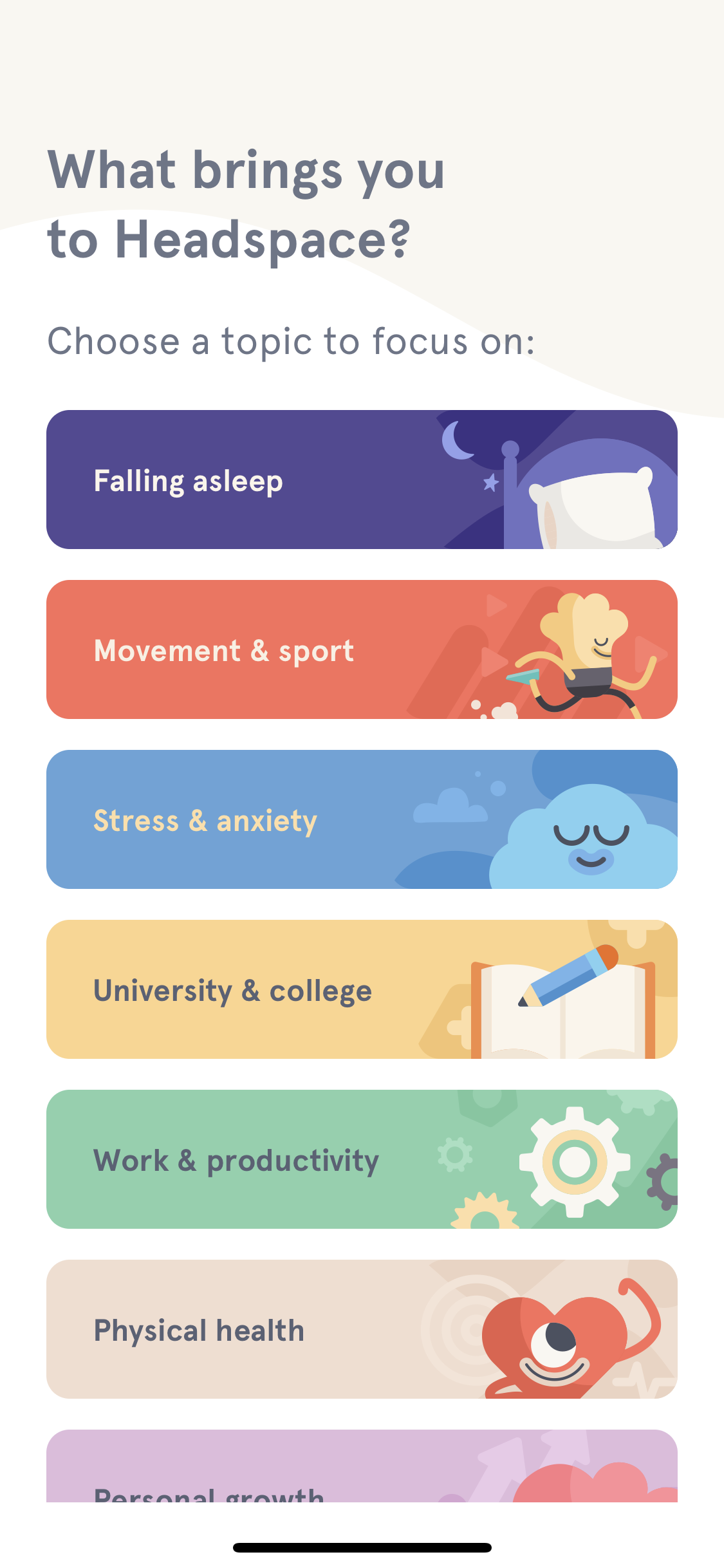
Headspace app user onboarding UX example
Headspace's charming user onboarding is all about personalization

2. Personalized in-app messaging and experiences

Guiding new users to their first aha moment within your app is critical to improving activation and adoption. And as we learned from Headspace, one of the best ways to accomplish this is through personalization. 

But there’s no reason for personalization to end after onboarding (in fact, it’s a lot easier to deliver tailored experiences to returning users, as you gradually gather more data about their in-app behavior and preferences. Personalized lifecycle messaging—like content recommendations and feature nudges—can add delight to the user experience on an ongoing basis.
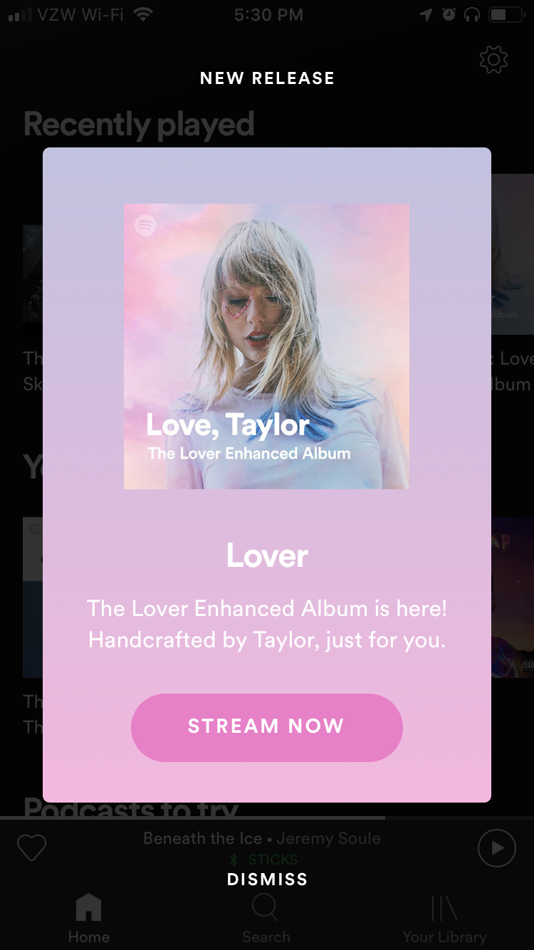
spotify new release modal mobile app ux example
Spotify utilizes user data to send updates based on listening habits

And this is where mobile apps have a real advantage. In general, mobile apps are able to capture data more effectively than their web counterparts App product owners have the privilege of really getting to know their users. What users demand in exchange for their data is a fully personalized in-app experience—they want their apps to remember their preferences and what they’ve done previously so that every session seamlessly builds on the last.

3. Ongoing in-app education and support

While app onboarding is essential for getting new users up and running, that doesn’t mean existing users won’t expect or require additional help along the way. Great apps don’t stop teaching after the initial onboarding sequence. Users should encounter helpful tips and pointers throughout their app user journey—especially for more complex products, or when introducing new features or functionalities. 
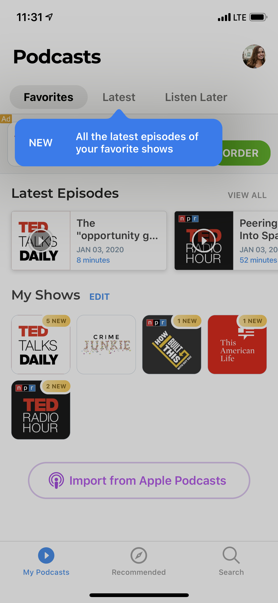
podcast app single tooltip new feature announcement
The Podcast App uses a single tooltip to point out a new feature

Communicating new feature releases and updates sends a clear message to users that you are actively making improvements to their in-app experience. A brief feature walkthrough or tutorial will help increase adoption of new rollouts. And if you have underutilized features in your app, a simple tooltip tour can help existing users discover features they might have otherwise overlooked. 

4. Self-service upgrade paths

Many (if not most) mobile apps offer a freemium or free trial version of their product. Getting users to upgrade to a paid plan is critical to earning back the cost of building and maintaining your app. Beyond simply breaking even, expansion revenue is one of the most effective ways to grow a subscription-based app.

Luckily, it’s far easier to sell to people who already believe in your product and find value in it than it is to acquire net new users in a crowded market. 

In a product-led app, the nudge to upgrade should come from within the app itself. Encourage users to upgrade by highlighting the value that premium features can provide. All the better if you can adjust messaging based off of their personal preferences or activity within your app. 
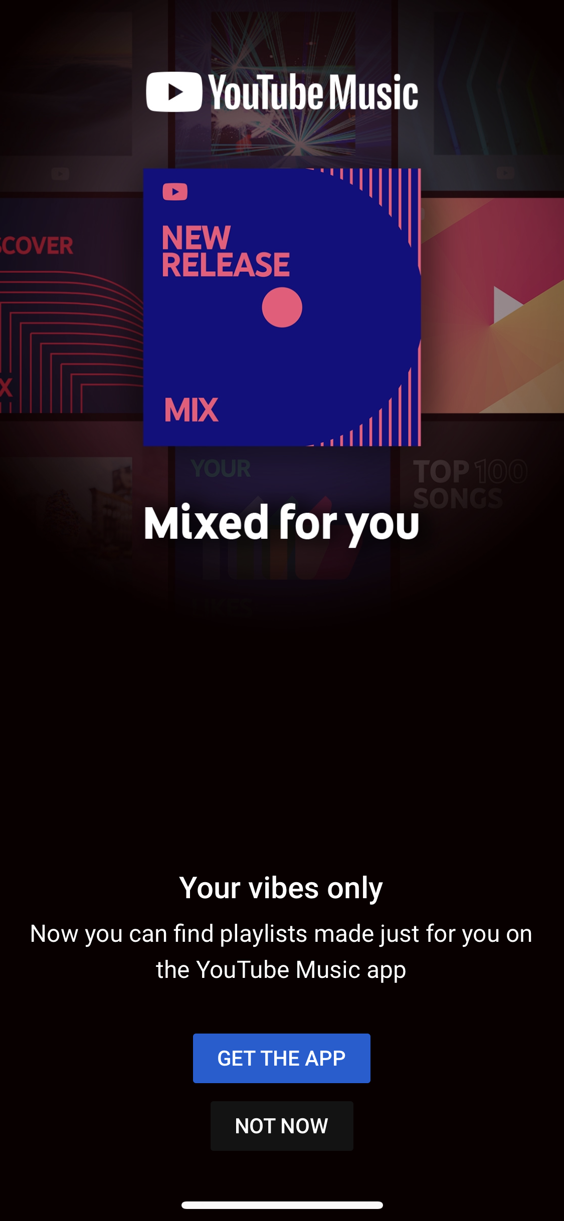
youtube music upgrade prompt ux example
YouTube appeals to users' love of personalization by offering customized playlists in the YouTube Music app.

Timing is everything with upsells. They need to be relevant to the end user and presented when they’re primed to take the next step which is why they’re best directed at actively engaged users. Ideally, time your upgrade prompt to coincide with a moment of high user satisfaction and motivation—like right after they achieve a goal.

Benefits of being product-led

A lot has changed in the way users interact with software over the past decade or so.  In fact, in a recent survey we conducted of 350 SaaS professionals, we learned that 82% believe product-led user expectations have risen in the past 2 years.
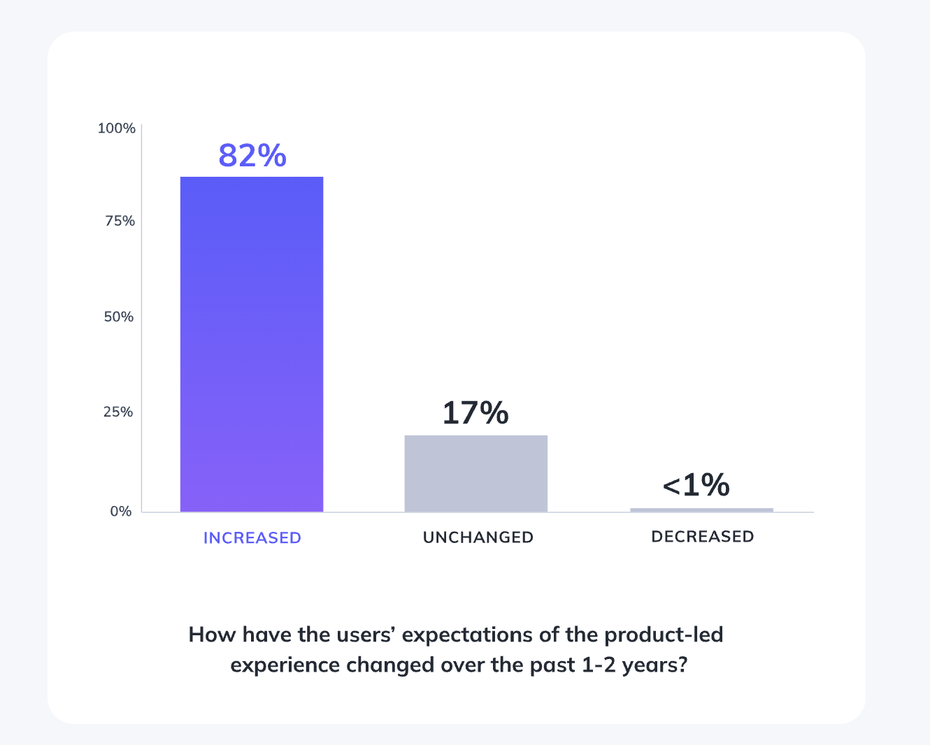
Chart of Product-led user expectations increasing over the past 2 years

A better user experience ultimately turns more of your users into product champions who will bring in new users through referrals, invites, and positive reviews. (And just as you provide self-service upgrade opportunities, you should provide happy users with easy ways to share your app with friends and colleagues.)
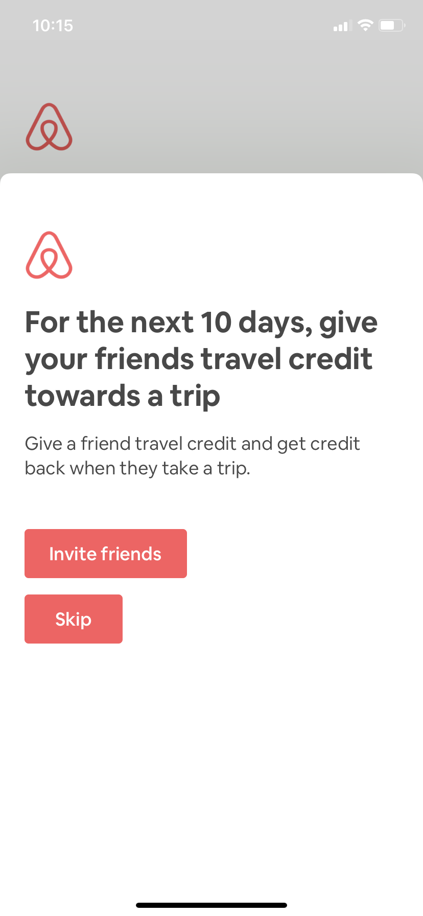
airbnb customer referral ux example
Airbnb regularly runs customer referral campaigns in their app

Product-led apps deliver the friction-less, personalized experiences the modern day consumer demands. For app owners, that means lower app abandonment rates, increased retention (aka decreased churn), and higher user engagement throughout the user journey. For businesses, that can mean lower acquisition costs, fewer support tickets, healthier unit economics, and more sustainable growth.

⚡️To dive deeper into what product-led experience user expectations, check out our 2023 Product-Led Experience Report.  

Appcues for Mobile

Ready to optimize your own in-app experience? Appcues for Mobile lets you create, edit, and deliver beautiful in-app content, without relying on dev cycles—and without re-submitting to the App Store.

👉 Get started with Appcues for Mobile today.👈

Jonathan Kim
Co-Founder at Appcues
Skip to section:

Skip to section:

It wasn’t long ago that brands dictated the relationship with consumers, telling them what they wanted through (not-so-subliminal) advertising. 

These days, the consumer is in the driver’s seat. App users demand a personalized, first-class experience on their own terms—which is why intuitive, self-service applications top the charts around the world. 

What is a product-led user experience?

A product-led user experience is—wait for it—led by the product. Plot twist, we know. 

What that means is the product or app experience takes center stage earlier in the user journey, and maintains that important role most or all of the way through. 

So instead of going through a long prelude involving marketing, sales, and support touchpoints, users are able to get into the app much sooner. And things that traditionally happened outside the app like conveying value (marketing), facilitating upgrades to paid or higher tiers (sales), or walking users through setup and troubleshooting (support) happen within the app itself.

In order for your app to be product-led, you need to accomplish 3 things:  

  1. Prove your app’s value quickly (i.e. have a short time to value)
  2. Provide a personalized experience that adjusts to the needs of each user
  3. Allow users to be self-sufficient (but offer support where needed)

There’s no simple formula for accomplishing those goals, and every app will put its own spin on the product-led approach. That said, there are some key features that any product-led app should have to keep users engaged—and by doing so, fuel more sustainable business growth.

Below, we’ll take a look at the 4 key features of product-led UX, along with examples of mobile apps that get it right 

1. Onboarding

First impressions matter just as much in the app world as they do in real life. Competition is fierce, and wowing users from the get-go is critical to combating app abandonment and promoting long-term user retention. 

You can accomplish this by having a solid mobile app onboarding experience. A good user onboarding experience will excite users, get them to the critical aha moment quickly, and set them up for success. 

Mindfulness app Headspace’s user onboarding encapsulates all the key elements of a powerful app onboarding UX, including real-time personalization. Their pleasant onboarding sequence captures plenty of data to personalize the user’s meditation journey and create a tailored  app experience from day one. 

Headspace app user onboarding UX example
Headspace's charming user onboarding is all about personalization

2. Personalized in-app messaging and experiences

Guiding new users to their first aha moment within your app is critical to improving activation and adoption. And as we learned from Headspace, one of the best ways to accomplish this is through personalization. 

But there’s no reason for personalization to end after onboarding (in fact, it’s a lot easier to deliver tailored experiences to returning users, as you gradually gather more data about their in-app behavior and preferences. Personalized lifecycle messaging—like content recommendations and feature nudges—can add delight to the user experience on an ongoing basis.

spotify new release modal mobile app ux example
Spotify utilizes user data to send updates based on listening habits

And this is where mobile apps have a real advantage. In general, mobile apps are able to capture data more effectively than their web counterparts App product owners have the privilege of really getting to know their users. What users demand in exchange for their data is a fully personalized in-app experience—they want their apps to remember their preferences and what they’ve done previously so that every session seamlessly builds on the last.

3. Ongoing in-app education and support

While app onboarding is essential for getting new users up and running, that doesn’t mean existing users won’t expect or require additional help along the way. Great apps don’t stop teaching after the initial onboarding sequence. Users should encounter helpful tips and pointers throughout their app user journey—especially for more complex products, or when introducing new features or functionalities. 

podcast app single tooltip new feature announcement
The Podcast App uses a single tooltip to point out a new feature

Communicating new feature releases and updates sends a clear message to users that you are actively making improvements to their in-app experience. A brief feature walkthrough or tutorial will help increase adoption of new rollouts. And if you have underutilized features in your app, a simple tooltip tour can help existing users discover features they might have otherwise overlooked. 

4. Self-service upgrade paths

Many (if not most) mobile apps offer a freemium or free trial version of their product. Getting users to upgrade to a paid plan is critical to earning back the cost of building and maintaining your app. Beyond simply breaking even, expansion revenue is one of the most effective ways to grow a subscription-based app.

Luckily, it’s far easier to sell to people who already believe in your product and find value in it than it is to acquire net new users in a crowded market. 

In a product-led app, the nudge to upgrade should come from within the app itself. Encourage users to upgrade by highlighting the value that premium features can provide. All the better if you can adjust messaging based off of their personal preferences or activity within your app. 

youtube music upgrade prompt ux example
YouTube appeals to users' love of personalization by offering customized playlists in the YouTube Music app.

Timing is everything with upsells. They need to be relevant to the end user and presented when they’re primed to take the next step which is why they’re best directed at actively engaged users. Ideally, time your upgrade prompt to coincide with a moment of high user satisfaction and motivation—like right after they achieve a goal.

Benefits of being product-led

A lot has changed in the way users interact with software over the past decade or so.  In fact, in a recent survey we conducted of 350 SaaS professionals, we learned that 82% believe product-led user expectations have risen in the past 2 years.

Chart of Product-led user expectations increasing over the past 2 years

A better user experience ultimately turns more of your users into product champions who will bring in new users through referrals, invites, and positive reviews. (And just as you provide self-service upgrade opportunities, you should provide happy users with easy ways to share your app with friends and colleagues.)

airbnb customer referral ux example
Airbnb regularly runs customer referral campaigns in their app

Product-led apps deliver the friction-less, personalized experiences the modern day consumer demands. For app owners, that means lower app abandonment rates, increased retention (aka decreased churn), and higher user engagement throughout the user journey. For businesses, that can mean lower acquisition costs, fewer support tickets, healthier unit economics, and more sustainable growth.

⚡️To dive deeper into what product-led experience user expectations, check out our 2023 Product-Led Experience Report.  

Appcues for Mobile

Ready to optimize your own in-app experience? Appcues for Mobile lets you create, edit, and deliver beautiful in-app content, without relying on dev cycles—and without re-submitting to the App Store.

👉 Get started with Appcues for Mobile today.👈

Jonathan Kim
Co-Founder at Appcues
You might also like...