%2520(1).png)
.png)
Good product launches build a much-needed buzz ahead of your product’s release—but not all product launches inspire such awe. A hastily thrown-together announcement on LinkedIn and a handful of “Look what we’ve got here!” emails sent to your worn-out lead list are unlikely to thrill your target audience. (Not to mention a lack of excitement over even the greatest product doesn’t bode well for your app’s future adoption.)
I know because I've experienced this all myself. Last year, I spearhead 20 product launches, and I've learned the hard way what makes them successful—and what makes them fall flat.
I'm not alone. Hundreds of SaaS products launch every day, which means it's never been more important to coordinate a differentiated product launch to cut through the noise.
After a lot of trial and error, I've put together eight product launch examples that highlight some of the innovative ways that companies have successfully announced their new offerings. Plus, I've included my Product Launch Notion template that shows you my exact dashboard I use to keep all my product launches organized.
While these eight examples of successful product launches may not fit your exact approach, I hope they can inspire your next big release.
Customer service SaaS company Feefo decided it was time to fully redesign its control center for customers. But anyone who's endured a UI redesign knows you face a large churn risk and potential disruption.
It would be a shock to some to log into a platform they used every day and find that it had changed completely—a shock that could very easily result in a loss of productivity and churn. That's why Feefo mitigated this risk and communicated with customers ahead of the upcoming change.
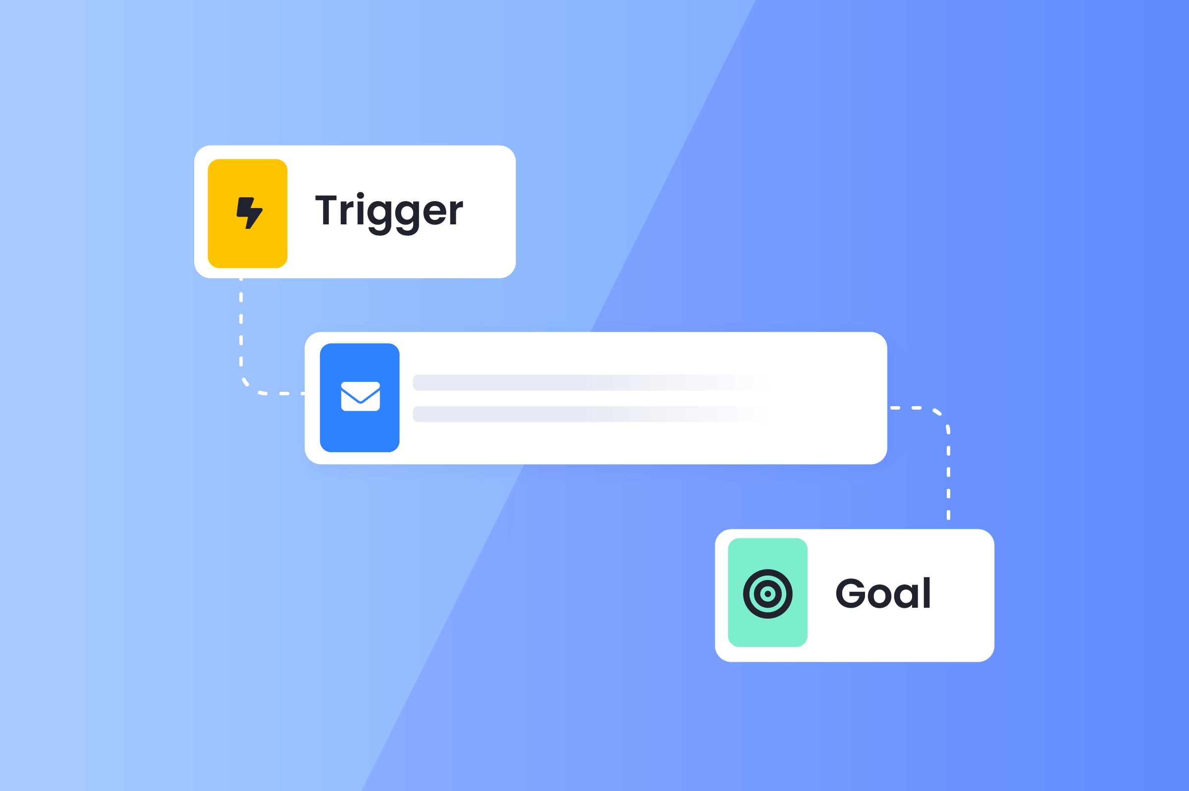
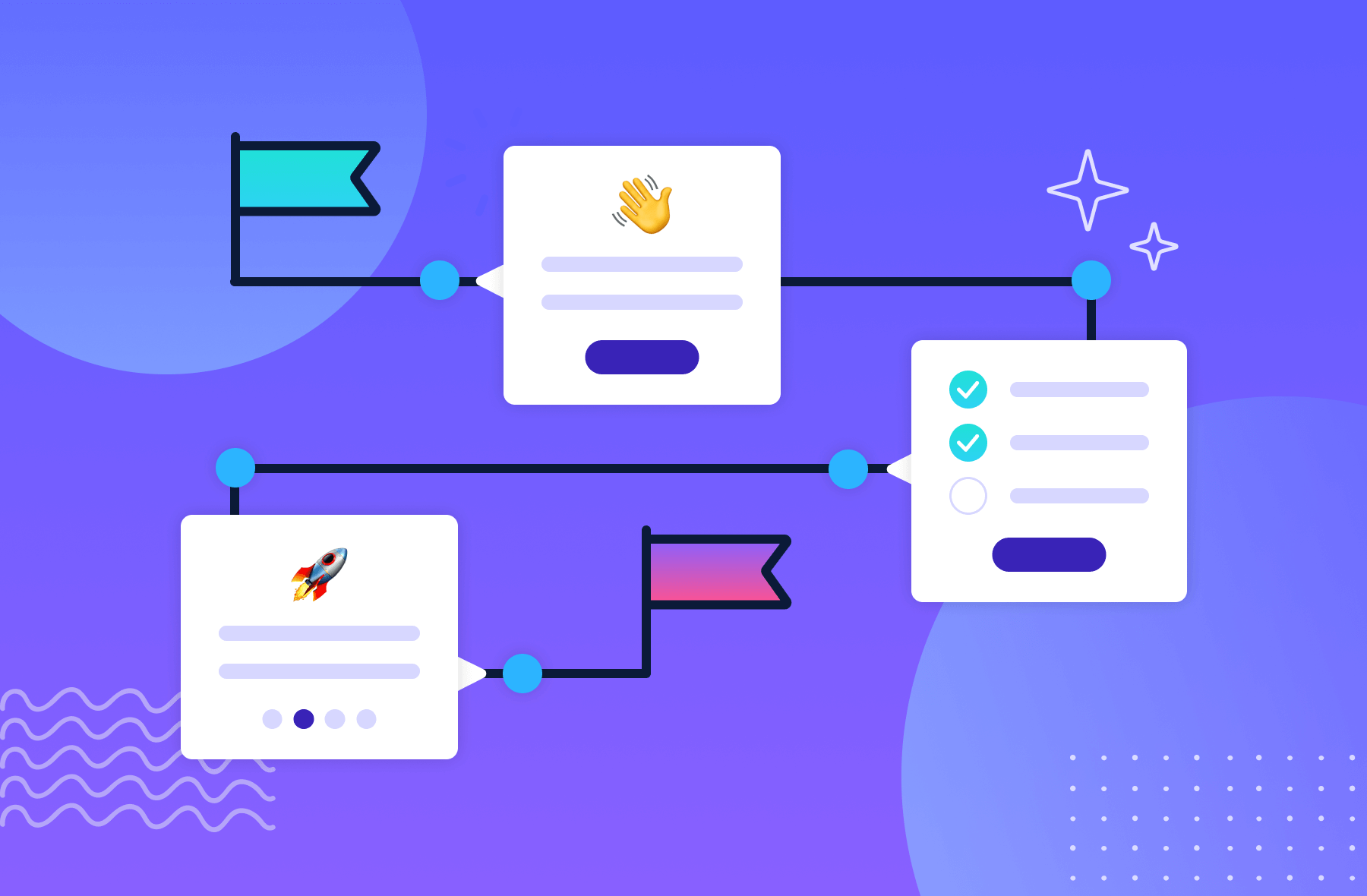
They started by teasing the redesign launch using Appcues—strategically keeping customers informed while they were already using their software. The messaging was upbeat and focused on how the changes would improve the customer experience.
Following the teasers, Feefo let users try out the new interface before the official launch. Not only did this help prepare customers for the change, but Feefo also collected feedback on the redesign by prompting users for feedback.
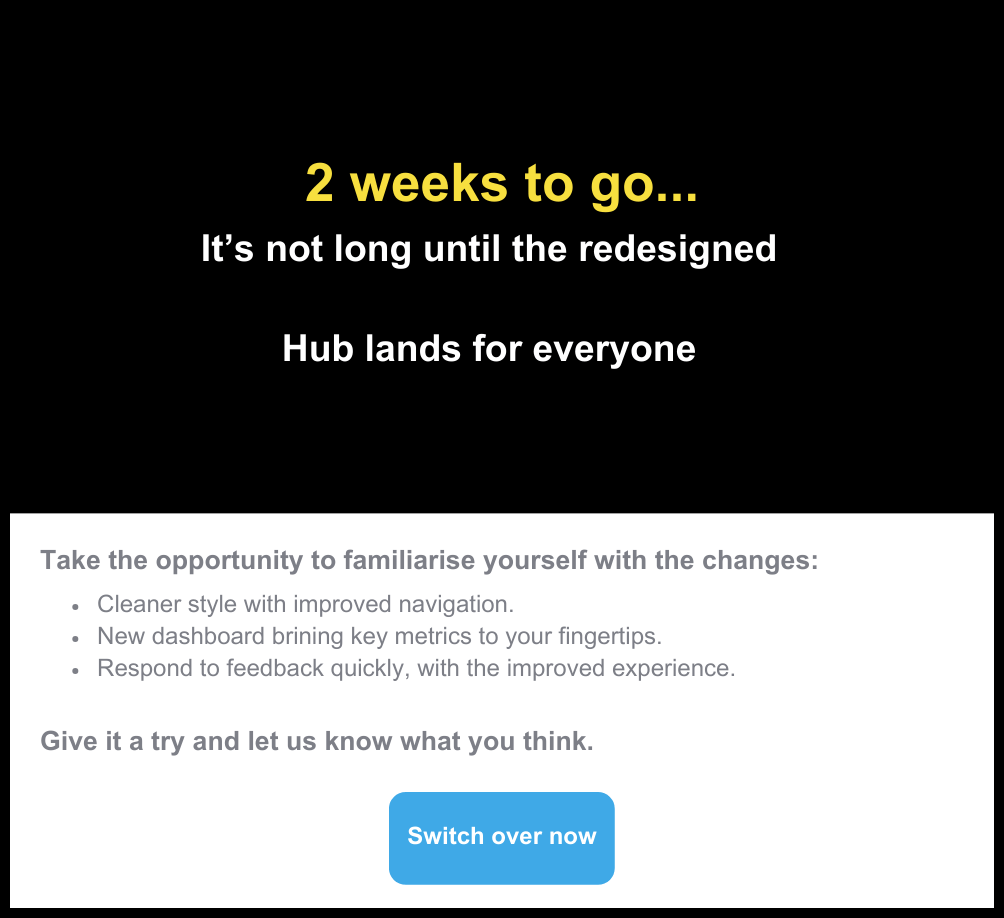
When the launch was two weeks away, they updated their messaging to build anticipation.
When asked why Feefo chose this tactic for its new product launch, product manager Neil Terry said:
“We needed to be in close touch with our customers to get their feedback. It was essential to keep them aware of what was going on to avoid upsetting them and potentially losing them.”
And it worked.
Feefo not only achieved a 30% opt-in rate for the new UI, but they also gained a lot of useful customer feedback they could use to improve their redesign while minimizing customer churn. Customers also became a more invested in the outcome since they had a voice in the changes being made.
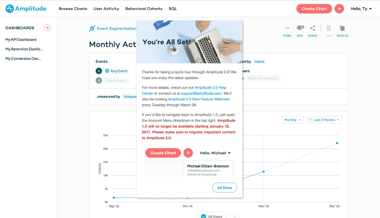
Emails help communicate product redesigns to existing customers, but not everyone opens, reads, and retains the information. That's why Amplitude opted to use in-app messaging to announce its Amplitude 2.0 redesign launch. The company trusted that a few well-placed modals and slideouts would highlight new features and point out UI changes as users actively engaged with them.
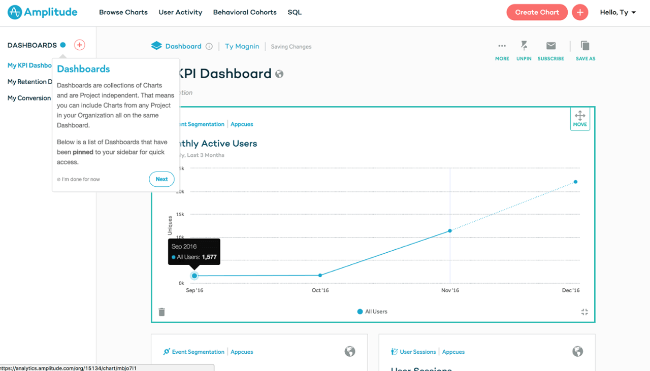
If you think this product redesign announcement looks suspiciously like a product tour, you’re absolutely right. Amplitude gave users a contextual heads-up on the changes from version 1.0 while taking the opportunity to explain how and why users should use 2.0’s newest and most valuable features. This helped customers use the app ASAP while minimizing the number of disruptions to the user experience.
But Amplitude understood that its Frankenstein product announcement/tour might not assuage the anxieties of every loyal user. That’s why the company wrapped up the tour with a modal window that linked to additional help resources for those who needed more info. They also allowed users to temporarily use Amplitude 1.0 if they needed more time to adjust to the new product launch.
When Airbnb was still a fledgling startup, they faced a crucial challenge: how do you attract both hosts and guests to a brand-new rental platform? Their solution was as creative as it was effective—turning to the widely used Craigslist to find potential hosts.
Airbnb's strategy began with a direct email campaign targeting homeowners who were listing their properties on Craigslist. This wasn't your typical, dry sales pitch either—it was personalized, engaging, and presented Airbnb as an exciting, novel way to rent out their spaces.
These emails were designed to inform and capture potential hosts' imaginations, enticing them with the prospect of joining an emerging and innovative rental community.
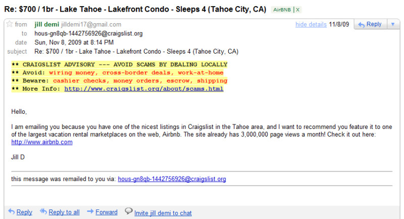
But Airbnb didn't just rely on the charm of their emails. They used the responses from these initial contacts to feed an algorithm, which then automated the process of finding and reaching out to new potential hosts on Craigslist. This move showed a blend of technological savvy and marketing acumen, significantly expanding their reach during the critical pre-launch phase.
After the platform launched, Airbnb kept the engagement going strong with a referral program. Hosts and guests were incentivized with credits for bringing new users into their platform. This strategy fostered a sense of community and belonging among users, turning them into active and enthusiastic champions for Airbnb's brand.
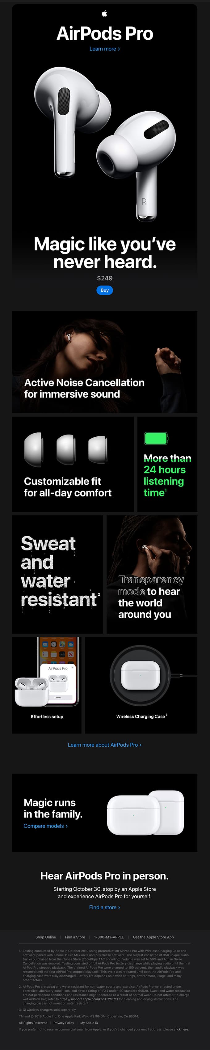
Apple has built a technology empire designed with clean, simple lines—making it sleek and desirable. The tech giant’s AirPods Pro announcement email reflected that style and it's both eye-catching and easy to scan.
The email was set up like an infographic, with few words and plenty of graphics. Why does this work? I asked Appcues Senior Marketing and Operations Manager Jared DeLuca for his take and he explained:
“Minimal copy and sleek imagery allow the product to take center stage.” The text focused on the experience: “magic like you’ve never heard,” “immersive sound,” and “all-day comfort.”
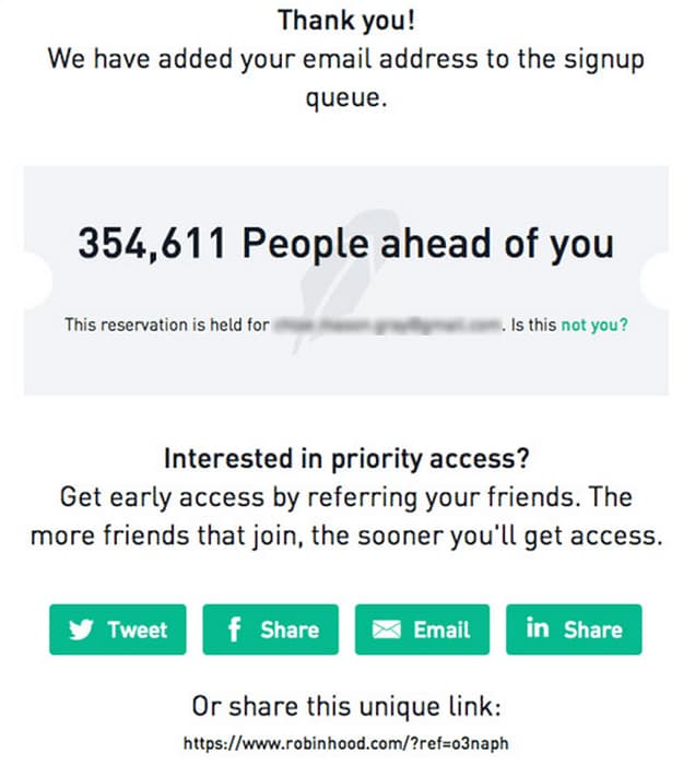
In 2013, Robinhood needed a way to entice consumers to sign up. So, they offered consumer perks for signing up more people on their behalf.
The company placed new signups on a waiting list for a YEAR before their launch, promising consumers access sooner if they got their family and friends to sign up as well. The more people a consumer signed up, the sooner they got access to the new service.
It turned waiting into a challenge that worked so well that the company had almost 1 million opt-ins on launch day.
Social proof platform and Appcues customer Yotpo found that after installing the software, customers didn’t know what to do next. (And a customer who can’t figure out how to use new software quickly abandons it.)
I chatted with Director of Growth Omer Linhard and he said:
“We watched a lot of videos inside of the product and saw that users were completing the installation inside the admin and then they were lost. Completely lost... There was no one to guide them and they would leave,”
The Yotpo team discovered the solution was to help new users create a habit of using the software. They knew if they could increase product adoption, revenue would follow.
Yotpo used Appcues to improve its user onboarding process. The team taught customers about important features using in-app messaging. The company also created customer emails that were triggered by customers’ actions in the onboarding process that encouraged users to reach the next milestone in the process.
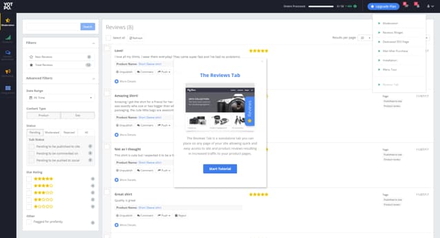
Yotpo showed customers how to use its product step by step to increase new user product adoption—like with this tutorial on the reviews tab pictured above.
The results?
So, did revenue follow? You bet it did! Yotpo saw unique new users increase by 42%.
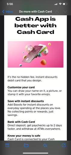
Companies with existing product lines don’t always need to launch new products to completely new audiences. Take Cash App, which developed its Cash Card as a complement to its core peer-to-peer payment product. The Cash Card serves as a debit card specifically for those with a Cash App account, so it wouldn’t make much sense to focus a Cash Card product launch campaign on anyone except existing users.
That’s why Cash App sent an email blast to existing users that highlighted the Cash Card’s benefits. It didn’t explain what the Cash App did because account holders already knew that. The email included a simple but attractive picture illustrating the card’s key aesthetic feature: its extreme customizability. The copy was short and sweet and focused on value above all else before leading to a quick CTA to sign up to receive the card.
These email features may seem simply like best practices but remember: Cash App undoubtedly has reams of marketing and product data on its existing user base. The company knows what kinds of emails its customers prefer to receive and likely built this email accordingly.
The bulk of most product launch marketing efforts focuses on a carefully researched demographic. Marketing and product analytics identify best-fit buyer personas, and the marketing collateral and distribution channels are chosen to accommodate them. However, many existing users will likely find a new product handy even if they don’t fit this best-fit mold. That’s why it helps to use your connections with existing users to let them know there’s something good coming down the pipes.
Take enterprise data catalog data.world. The company sends regular updates to prospects and users via email. These newsletters tackle topics ranging from upcoming events to links to recent articles and more. data.world timed the release of its August 2022 newsletter to coincide with the release of its new Eureka Explorer Lineage product. The announcement of the new technical lineage experience occupied the first position in the newsletter.
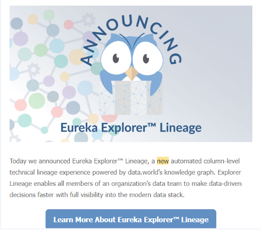
This above-the-fold placement made it impossible for regular readers of the newsletter to miss the announcement. The marketing team kept the copy below the headline and the image short, sweet, and value focused. This enabled interested readers to get the gist while allowing others to easily skip on to more standard content. And for those readers who wanted to learn more about the great new product, the blurb included a CTA that linked back to a blog that explained the product in far more detail.
Your launch needs to make a tangible impact. This means not just a spike in website traffic or a flurry of social media mentions (though those are great!), but real, meaningful interactions with your product. Are people signing up, downloading, or making purchases? Are they engaging with your content in a way that suggests genuine interest and not just a passing glance? Are your content marketing efforts really speaking to their pain points?
It's all in the KPIs (Key Performance Indicators). These are the metrics that will tell you whether your party was a hit or a miss.
This Notion template brings order to the controlled chaos of product launches by centralizing all critical details into one place. With streamlined access to information, teams communicate better and execute product launches more effectively together.
This template was a labor of love I worked on for many years to get it right. Here's a peak at what's inside—but I've got an entire video walkthrough that explains exactly how to use it here.
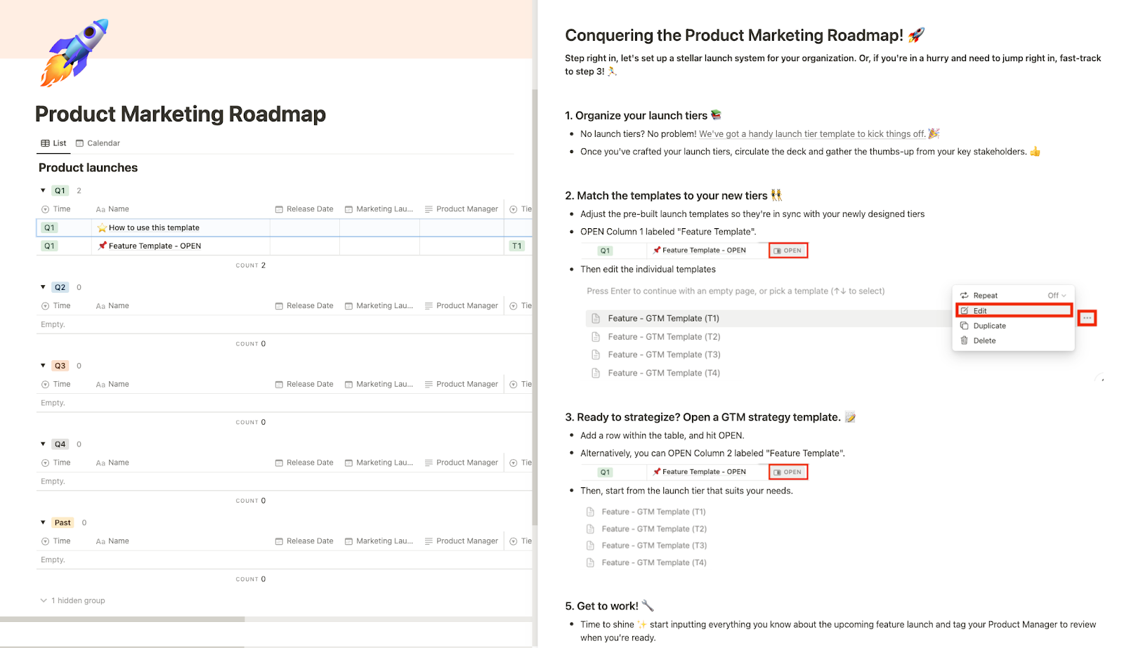
As you're going through the Notion template, keep these product launch steps in mind.
Launching your product is just the beginning. To truly succeed, it's essential to continuously measure and adapt. Data is your compass here, guiding you through the user behaviors and preferences that shape your product's journey. Understanding what features your users love, what they ignore, and what they're craving next is crucial. It’s not just about making a splash—it’s about sustaining the momentum.