← Visit Appcues.com
×
×

5 ways to personalize your user onboarding experience

There's more to personalization than adding a {First name} token to your emails. Here are 5 ways to personalize your onboarding UX.
Skip to section:

Skip to section:

Users are people. People are unique. Personalization is important... 

At this point, you've probably heard it all before, and you understand that personalized user experiences are the key to creating more successful, engaging, and stickier products. But how do you actually go about designing a personalized onboarding UX? What does well-done personalization look like?

Personalizing your user onboarding isn't just about adding a first name token to your emails. It's about understanding each users' individual journey toward reaching their goals—and how your product can make them more successful and help them reach their goals faster and smarter.

Getting personal with marketing and onboarding isn't exactly new: In a 1998 interview with the Washington Post, Jeff Bezos explained that the success of electronic retail hinges on the creation of unique experiences for each and every customer. “If we have 4.5 million customers, we shouldn't have one store,” he told the Post; “we should have 4.5 million stores.”

What has changed is how easy it is to personalize your onboarding and in-app experiences. Modern marketing tools have come a long, long way since 1998. Tools like Appcues, Clearbit, and Customer.io make it easier than ever to collect user data and to use that data to automatically personalize just about every part of the user experience.

In this article we'll talk about how you can:

  1. Pepper in user data throughout your user onboarding sequence
  2. Segment users by behavior or use case to deliver a more relevant experience
  3. Tap into user motivations with a personalized plan for success
  4. Engage users with personalized emails for a multi-channel experience
  5. Use webinars and 1-1 demos to create a connections

But first...

Why is personalization important?

"The best onboarding experience is the one that feels like it was designed just for you."

—Head of Product Umashankar Shivanand

Personalization keeps users engaged, creates deeper relationships with customers, and increases activation and retention rates. And improving activation—which takes place when users first experience the value you promised—by just 25% can result in a 34.30% lift in monthly recurring revenue (MRR).

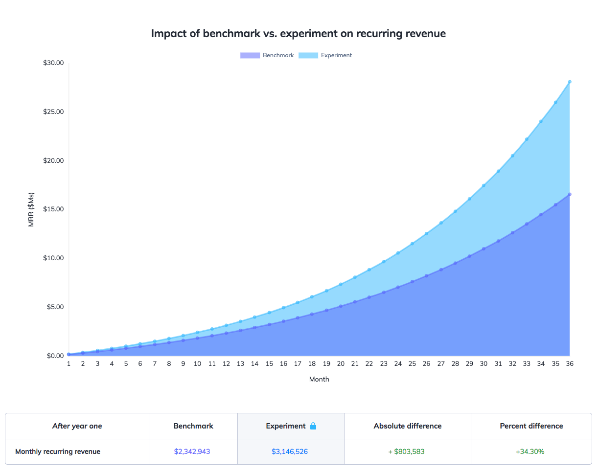
this is a chart comparing the 5 pirate metrics: acquisition, activation, revenue, retention, and referral
This is a graph showing the impact of activation on monthly recurring revenue, demonstrating why improving activation rates is so important.
Use our Pirate Metrics Calculator to compare the impact of acquisition, activation, revenue, retention, and referrals (AARRR) on your MRR.

This is particularly important for SaaS companies in which customers come from a wide range of industries, each with different motivations and goals that they're hoping to achieve with your product. Personalized onboarding not only helps you direct users where they need to go, it also builds stronger customer-company relationships.

If you jealously guard your Netflix account so family members don't “mess up your recommendations” or if you look forward to listening to your algorithmically generated “Discover Weekly” Spotify playlist every Monday, then you've experienced the power of personalization at work. When it comes to your own product, that sense of personal ownership and delight could mean the difference between loyal customers and churned accounts.

How to create personalized user onboarding

We've put together a list of 5 tactics that successful companies use to personalize their user onboarding, along with examples of how you can use your customer data to provide a concierge onboarding experience at scale.

1. Pepper in user data throughout your onboarding experience

Most sign-up forms ask for basic user information like name, email, company, and job title. Sprinkling some of this data throughout the initial user experience can help make users feel more connected to your product and it starts the relationship off on a great note.

One easy but effective way to personalize the onboarding experience is to create a welcome page that greets users by their name. And there are plenty of ways to take this simple personalization further: Coupled with a meaningful action or a reminder of value, for example, a “welcome {First name}” greeting can motivate users to make progress.

Social media conversion tool Sniply welcomes new users by name on their first visit, reminding them of the value they're about to experience (“create your first snip”) and guiding them towards a product tour that explains how to get started.
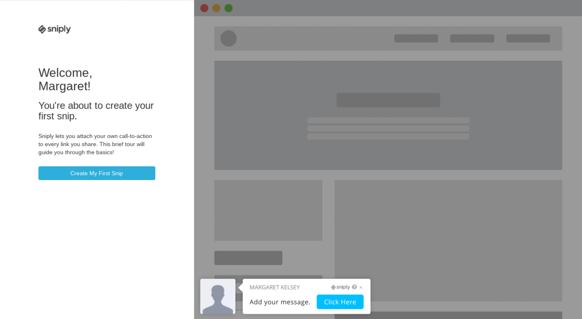
this is a screenshot of media conversion tool sniply's welcome screen. The image shows an empty state wireframe on the right and a message on the left that says "welcome, margaret!" with a blue call to action button that reads "create my first snip". This is an example of simple personalization techniques for user onboarding.

You can also use tools like Clearbit to collect additional data about each new user. From a visitor's name and IP address, it is possible to learn:

  • Which company they work for
  • How many employees work there
  • Their title and role within their company
  • Which industry their business serves
  • Where they're physically located
  • What technology they use as part of their marketing stack

All of this data can be used to tailor and simplify the onboarding experience for the individual user. For example, the team behind the webinar platform Livestorm used auto-gathered information to cut trim their signup form down to 5 fields—3 of which autofilled after the user entered their work email. By simplifying the form and removing manual inputs Livestorm, improved form completion rates by 40-60%.
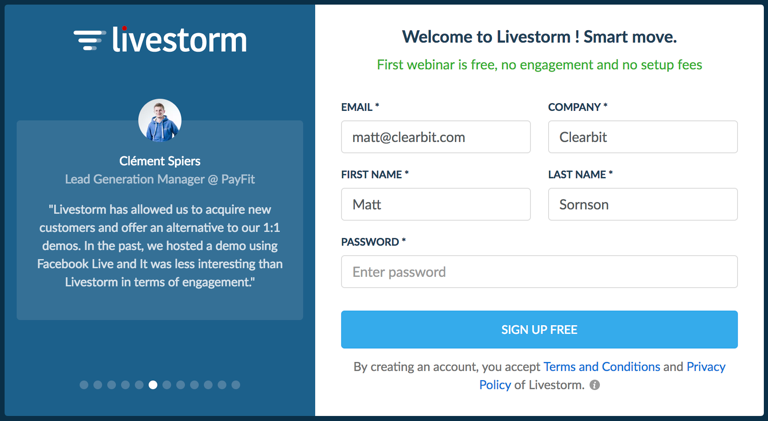
this is an image of a signup form with only a few fields that are autofilled by pulling user data from clearbit. There is a signup form with personalization on the right and a customer testimonial with headshot and company logo on the left.
Livestorm used user data to simplify their lead gen forms. (Image courtesy of Clearbit)


Using data to personally welcome users and simplify your onboarding can help users feel like your product was designed specifically for them.

2. Segment users by behavior or use case

Another great tactic for creating a more personalized onboarding experience is to segment users based on the data you've collected or the actions they take in your app.

By send new users down a path specifically tailored to their needs, you can activate users earlier and reduce early abandonment. Segmentation is a great approach for feature-rich products that cover many different use cases.

"Understanding what the user aims to achieve with the product and their primary pain points are the 2 most important things to know in order to effectively personalize the onboarding experience and expedite the journey to the "Aha!" moment."

—Head of Product Umashankar Shivanand

You can create user segments automatically based on the user data you collect during onboarding or by letting users customize their experience and "choose their own adventure". Meditation app Headspace lets users self-select their path after signing up. Based on their choices, the app recommends a different set of meditation exercises for users to complete each day, creating a more personalized product experience.
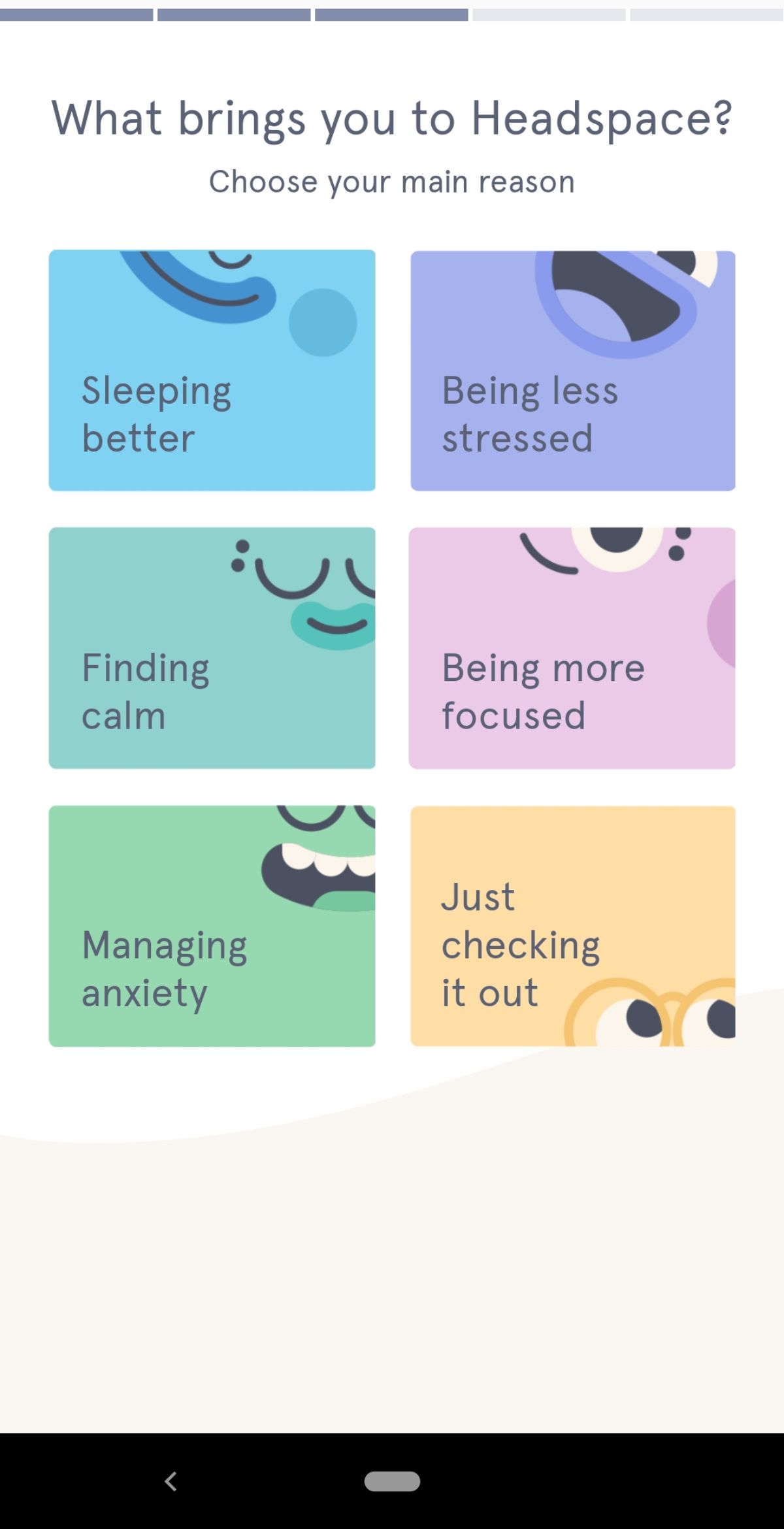
this is a screenshot of headspace's mobile app onboarding that shows customization options. The image shows a question "what brings you to headspace" and there are 6 options that let users segment themselves by use case. This is an example of using customization UX to create more personalized experiences.


It's important not to overwhelm users with too many choices. With 6 options, Headspace is actually on the high end of recommended number of options—fewer options prevent choice paralysis and helps users reach their aha moment faster, reducing time to value and improving activation.

You can hard-code the logic and data loops into your app using an open-source tool, or you can save time by creating persona-based user onboarding with Appcues. Either way, personalizing your onboarding for different user segments helps steer new users in the right direction.

3. Tap into user motivations with a personalized plan for success

For products that help people reach a far-reaching, daunting goal, the user onboarding experience doesn’t just have to convey the product’s value—it also has to boost the user’s confidence and make the goal seem feasible.

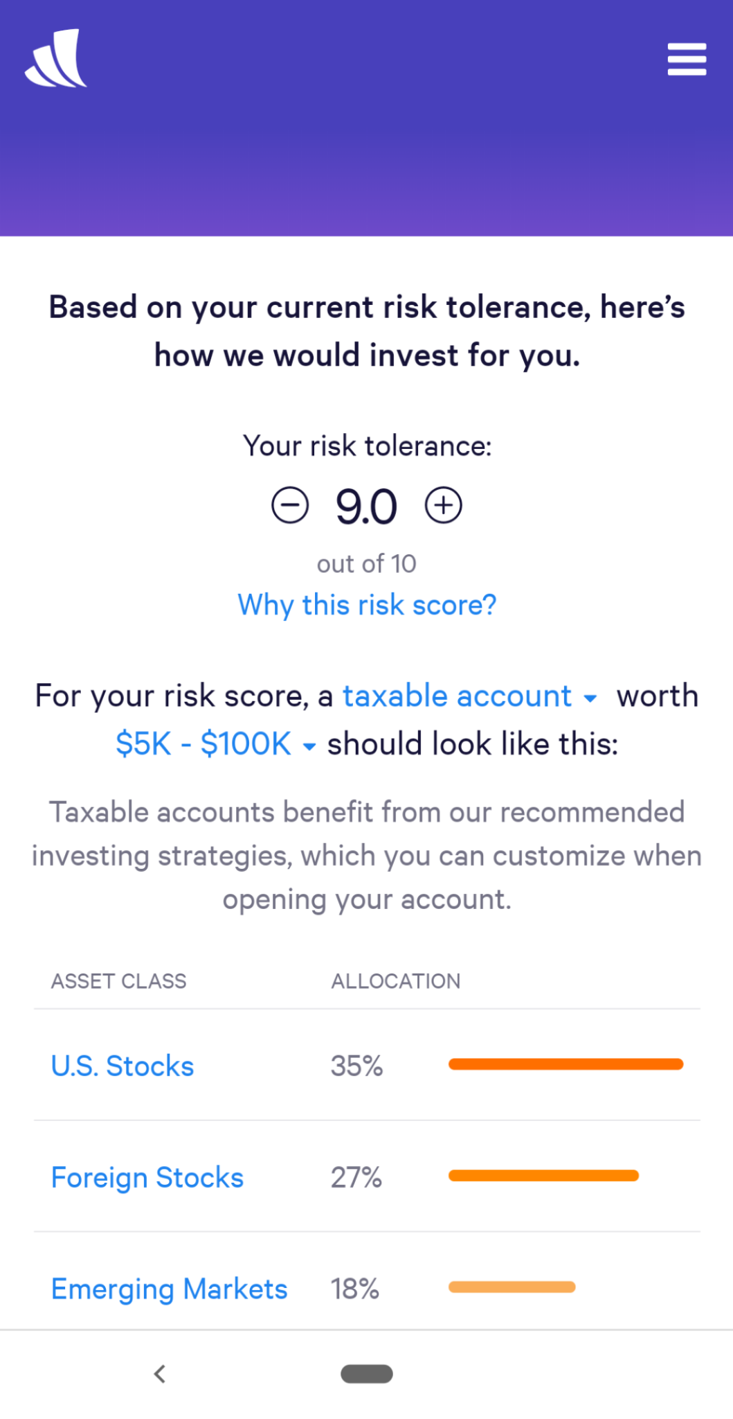
Wealthfront uses personalization to reduce friction and keep users motivated throughout the onboarding experience. Early on, users are asked to choose from a limited number of common financial goals. Their selection is then used to provided personalized, targeted UX copy that builds trust and reminds users of the objective they're trying to achieve:
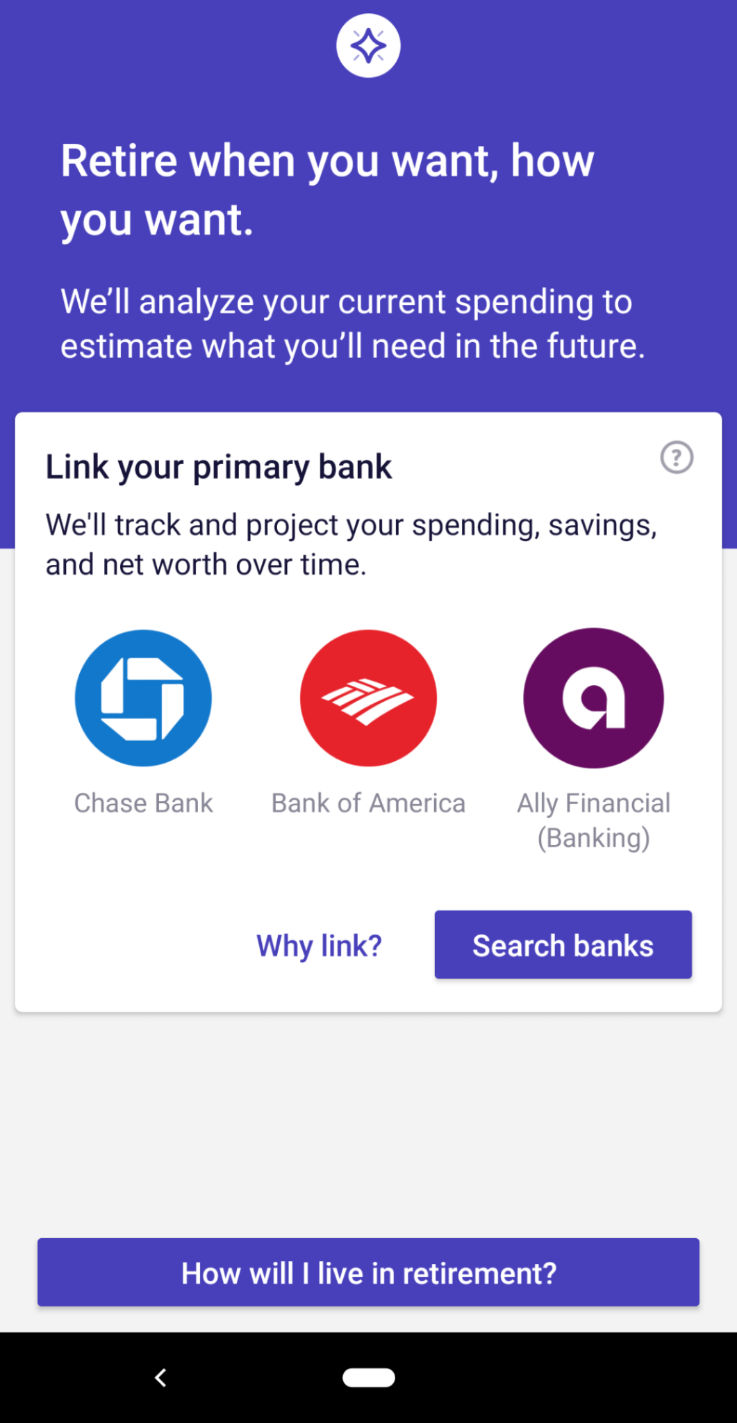
This is a screenshot of wealthfront's mobile app that shows an example of personalized UX copy as part of a good mobile UX. The copy reads "retire when you want, how you want" and prompts the user to link their bank account.
This is a screenshot of wealthfront's mobile app that shows an example of personalized UX copy as part of a good mobile UX. This screen uses user input data to provide a customized risk tolerance score for investing.


Another great example comes from communications platform Twilio. Even though Twilio's API is built for developers, the complex process of setting up the app means that many users are best served by using an existing software tool that offers access to Twilio. Instead of forcing every new user to go through the technical setup process, users are asked a simple question: “Do you write code?” Based on their answer, they're automatically directed to either the Twilio console, the plugin version, or a list of Twilio partner products.
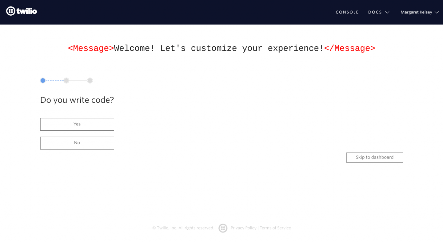
This is a screenshot image of twilio's user onboarding that shows a simple segmenting question to offer users more customized, personalized onboarding based on experience level. The screen says "welcome! let's customize your experience!" and then asks "do you write code"

These personalized onboarding approaches work because they make onboarding tasks feel achievable for users of varying levels of experience and confidence, keeping users motivated to the end.

4. Engage users outside your app with personalized onboarding emails

Personalized and automated onboarding emails are a great way to welcome new users or bring inactive users back to your app. Targeted and personalized emails are much more effective than the “spray and pray” onboarding approach used by many companies—according to Experian, personalized emails generate 6 times higher transaction rates.

Onboarding emails work best when they are timely and contextual—they should be triggered based on the events that a user performs in your app. For example, when a trial user logs in after a week of inactivity, they might automatically get a personalized email welcoming them back. Or, at the most basic level, new users should receive a friendly welcome email when they first sign up.

Every SaaS company should have at least three types of personalized emails as part of their onboarding sequence:

  • A warm welcome email
  • A re-engagement email (or series of emails)
  • A follow-up email (or series of emails)

Personalized welcome emails

The first onboarding email to personalize is your warm welcome email. Welcome emails have some of the highest open rates of any email, and a personalized email sent from the CEO or head of customer success can help give your welcome email a personal touch and build trust with new users.

Clearbit, for example, sends a warm and inviting welcome email to new users from their head of growth Matt Sornson:
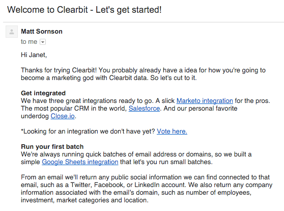
This is a welcome email example from clearbit. The subject line says "welcome to clearbit." This is a plain text email with personalization elements like a first name tag. This is a good plain text SaaS welcome email example.
Image courtesy of Amplitude

Personalized re-engagement emails

Next, you should have a re-engagement email (or series of emails) in place. This email is sent automatically to users who might have started but not completed a key activation task, with the goal of bringing them back to your app to complete the task. Screen recording tool Loom, for example, sends the following email to encourage users to download their desktop app:
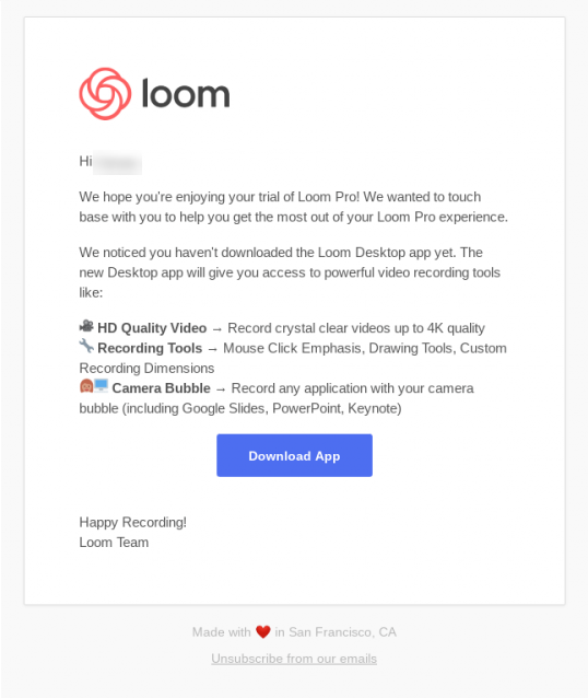
this is a reengagement email example from loom. this email has the company logo at the top, body text with emojis for bullet points, and a call to action button. This is a good re-engagement email example.

Personalized follow-up emails

Last but not least, send users a follow-up email to nudge them toward the next step in your sales funnel. For free trial or freemium users, you should encourage them to sign up for a paid account; for paying users, you might push them to switching to annual billing instead of monthly. No matter what your goal is, make sure you include a clear CTA, and remember to sprinkle in some of your brand's personality, like Airtable does in their free trial reminder:
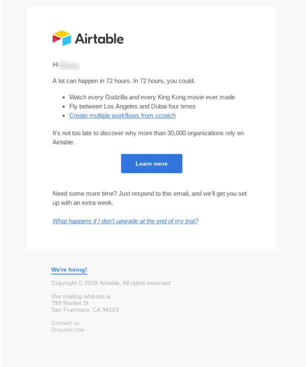
this is an example follow-up email from airtable. This email layot has the company logo, short body copy, a clear blue cta button, and links. This is an example of a personalized email to follow up with users and move them further down the sales or marketing funnel.

You can start building out your personalized and automated onboarding email sequences using tools like Customer.io. When used effectively, email can be a great way to extend the reach of your communications create more cohesive multi-channel experiences, and round out the user onboarding process.

5. Meet face-to-face with 1-1 demos and webinars

The goal of personalizing user onboarding is to build a stronger, more intimate onboarding experience for your users—and there's no better way to do that than to meet face-to-face (even if it's only virtually). Webinars, individual and group product demos, and pre-recorded walkthrough videos let you talk directly to your users.

Personalized demos and webinars tend to work best for products with steep learning curves—like product management software ProdPad, for example. Andrea Saez, head of customer success at ProdPad, explained how offering live demos has led to more engaged users and higher conversion rates:

“We’ve ramped up the amount of demos that we offer, and we can already see great results from them. We've found that users who engage personally with someone in the team are twice as more likely to sign up for a larger subscription than those that go through the onboarding process on their own without any help.”

ProdPad also offers “masterclass videos” as part of their onboarding. These short videos each detail a key feature within the app and explain why it's important for users to understand that area of the product. The upfront investment from the team in creating the videos continues to pay off with every new customer:

this is a screenshot of a slack message from prodpad that demonstrates the impact of webinars and video demos. It says "just demo'd to a guy who LOVES the masterclass videos"

But you don't need to dive straight into the deep end and record a collection of product videos like ProdPad. A few live webinars and demos can be a great way to ramp up onboarding personalization—and you'll likely capture a ton of customer feedback in the process. You can let trial users know about upcoming webinars via in-app messages or email (or both!) and follow up afterwards with an email prompting them to sign up for a paid account.

Personalization is the best growth hack in the game

Personalizing your user onboarding means understanding the needs of your users and helping them be more successful, earlier. By tailoring the user experience to individual needs, you can increase product activation and reduce time to value.

If you're starting from square one, the great thing about personalization is that it compounds: each little personal touch adds up. You don't have to tackle all 5 personalization tactics on the first day. Pick one to start, and focus on mastering that element before moving onto the others. Before you know it, your users will feel like you built your app just for them.
The ultimate guide to user onboarding. Discover user onboarding definitions, examples, best practices, and resources.

Katryna Balboni
Content and Community Director at User Interviews
Katryna is the Content and Community Director at User Interviews. Before User Interviews, she made magic happen with all things content at Appcues. Her non-work time is spent traveling to new places, befriending street cats, and baking elaborate pies.
Skip to section:

Skip to section:

Users are people. People are unique. Personalization is important... 

At this point, you've probably heard it all before, and you understand that personalized user experiences are the key to creating more successful, engaging, and stickier products. But how do you actually go about designing a personalized onboarding UX? What does well-done personalization look like?

Personalizing your user onboarding isn't just about adding a first name token to your emails. It's about understanding each users' individual journey toward reaching their goals—and how your product can make them more successful and help them reach their goals faster and smarter.

Getting personal with marketing and onboarding isn't exactly new: In a 1998 interview with the Washington Post, Jeff Bezos explained that the success of electronic retail hinges on the creation of unique experiences for each and every customer. “If we have 4.5 million customers, we shouldn't have one store,” he told the Post; “we should have 4.5 million stores.”

What has changed is how easy it is to personalize your onboarding and in-app experiences. Modern marketing tools have come a long, long way since 1998. Tools like Appcues, Clearbit, and Customer.io make it easier than ever to collect user data and to use that data to automatically personalize just about every part of the user experience.

In this article we'll talk about how you can:

  1. Pepper in user data throughout your user onboarding sequence
  2. Segment users by behavior or use case to deliver a more relevant experience
  3. Tap into user motivations with a personalized plan for success
  4. Engage users with personalized emails for a multi-channel experience
  5. Use webinars and 1-1 demos to create a connections

But first...

Why is personalization important?

"The best onboarding experience is the one that feels like it was designed just for you."

—Head of Product Umashankar Shivanand

Personalization keeps users engaged, creates deeper relationships with customers, and increases activation and retention rates. And improving activation—which takes place when users first experience the value you promised—by just 25% can result in a 34.30% lift in monthly recurring revenue (MRR).

this is a chart comparing the 5 pirate metrics: acquisition, activation, revenue, retention, and referral
This is a graph showing the impact of activation on monthly recurring revenue, demonstrating why improving activation rates is so important.
Use our Pirate Metrics Calculator to compare the impact of acquisition, activation, revenue, retention, and referrals (AARRR) on your MRR.

This is particularly important for SaaS companies in which customers come from a wide range of industries, each with different motivations and goals that they're hoping to achieve with your product. Personalized onboarding not only helps you direct users where they need to go, it also builds stronger customer-company relationships.

If you jealously guard your Netflix account so family members don't “mess up your recommendations” or if you look forward to listening to your algorithmically generated “Discover Weekly” Spotify playlist every Monday, then you've experienced the power of personalization at work. When it comes to your own product, that sense of personal ownership and delight could mean the difference between loyal customers and churned accounts.

How to create personalized user onboarding

We've put together a list of 5 tactics that successful companies use to personalize their user onboarding, along with examples of how you can use your customer data to provide a concierge onboarding experience at scale.

1. Pepper in user data throughout your onboarding experience

Most sign-up forms ask for basic user information like name, email, company, and job title. Sprinkling some of this data throughout the initial user experience can help make users feel more connected to your product and it starts the relationship off on a great note.

One easy but effective way to personalize the onboarding experience is to create a welcome page that greets users by their name. And there are plenty of ways to take this simple personalization further: Coupled with a meaningful action or a reminder of value, for example, a “welcome {First name}” greeting can motivate users to make progress.

Social media conversion tool Sniply welcomes new users by name on their first visit, reminding them of the value they're about to experience (“create your first snip”) and guiding them towards a product tour that explains how to get started.

this is a screenshot of media conversion tool sniply's welcome screen. The image shows an empty state wireframe on the right and a message on the left that says "welcome, margaret!" with a blue call to action button that reads "create my first snip". This is an example of simple personalization techniques for user onboarding.

You can also use tools like Clearbit to collect additional data about each new user. From a visitor's name and IP address, it is possible to learn:

  • Which company they work for
  • How many employees work there
  • Their title and role within their company
  • Which industry their business serves
  • Where they're physically located
  • What technology they use as part of their marketing stack

All of this data can be used to tailor and simplify the onboarding experience for the individual user. For example, the team behind the webinar platform Livestorm used auto-gathered information to cut trim their signup form down to 5 fields—3 of which autofilled after the user entered their work email. By simplifying the form and removing manual inputs Livestorm, improved form completion rates by 40-60%.

this is an image of a signup form with only a few fields that are autofilled by pulling user data from clearbit. There is a signup form with personalization on the right and a customer testimonial with headshot and company logo on the left.
Livestorm used user data to simplify their lead gen forms. (Image courtesy of Clearbit)


Using data to personally welcome users and simplify your onboarding can help users feel like your product was designed specifically for them.

2. Segment users by behavior or use case

Another great tactic for creating a more personalized onboarding experience is to segment users based on the data you've collected or the actions they take in your app.

By send new users down a path specifically tailored to their needs, you can activate users earlier and reduce early abandonment. Segmentation is a great approach for feature-rich products that cover many different use cases.

"Understanding what the user aims to achieve with the product and their primary pain points are the 2 most important things to know in order to effectively personalize the onboarding experience and expedite the journey to the "Aha!" moment."

—Head of Product Umashankar Shivanand

You can create user segments automatically based on the user data you collect during onboarding or by letting users customize their experience and "choose their own adventure". Meditation app Headspace lets users self-select their path after signing up. Based on their choices, the app recommends a different set of meditation exercises for users to complete each day, creating a more personalized product experience.

this is a screenshot of headspace's mobile app onboarding that shows customization options. The image shows a question "what brings you to headspace" and there are 6 options that let users segment themselves by use case. This is an example of using customization UX to create more personalized experiences.


It's important not to overwhelm users with too many choices. With 6 options, Headspace is actually on the high end of recommended number of options—fewer options prevent choice paralysis and helps users reach their aha moment faster, reducing time to value and improving activation.

You can hard-code the logic and data loops into your app using an open-source tool, or you can save time by creating persona-based user onboarding with Appcues. Either way, personalizing your onboarding for different user segments helps steer new users in the right direction.

3. Tap into user motivations with a personalized plan for success

For products that help people reach a far-reaching, daunting goal, the user onboarding experience doesn’t just have to convey the product’s value—it also has to boost the user’s confidence and make the goal seem feasible.

Wealthfront uses personalization to reduce friction and keep users motivated throughout the onboarding experience. Early on, users are asked to choose from a limited number of common financial goals. Their selection is then used to provided personalized, targeted UX copy that builds trust and reminds users of the objective they're trying to achieve:

This is a screenshot of wealthfront's mobile app that shows an example of personalized UX copy as part of a good mobile UX. The copy reads "retire when you want, how you want" and prompts the user to link their bank account.
This is a screenshot of wealthfront's mobile app that shows an example of personalized UX copy as part of a good mobile UX. This screen uses user input data to provide a customized risk tolerance score for investing.


Another great example comes from communications platform Twilio. Even though Twilio's API is built for developers, the complex process of setting up the app means that many users are best served by using an existing software tool that offers access to Twilio. Instead of forcing every new user to go through the technical setup process, users are asked a simple question: “Do you write code?” Based on their answer, they're automatically directed to either the Twilio console, the plugin version, or a list of Twilio partner products.

This is a screenshot image of twilio's user onboarding that shows a simple segmenting question to offer users more customized, personalized onboarding based on experience level. The screen says "welcome! let's customize your experience!" and then asks "do you write code"

These personalized onboarding approaches work because they make onboarding tasks feel achievable for users of varying levels of experience and confidence, keeping users motivated to the end.

4. Engage users outside your app with personalized onboarding emails

Personalized and automated onboarding emails are a great way to welcome new users or bring inactive users back to your app. Targeted and personalized emails are much more effective than the “spray and pray” onboarding approach used by many companies—according to Experian, personalized emails generate 6 times higher transaction rates.

Onboarding emails work best when they are timely and contextual—they should be triggered based on the events that a user performs in your app. For example, when a trial user logs in after a week of inactivity, they might automatically get a personalized email welcoming them back. Or, at the most basic level, new users should receive a friendly welcome email when they first sign up.

Every SaaS company should have at least three types of personalized emails as part of their onboarding sequence:

  • A warm welcome email
  • A re-engagement email (or series of emails)
  • A follow-up email (or series of emails)

Personalized welcome emails

The first onboarding email to personalize is your warm welcome email. Welcome emails have some of the highest open rates of any email, and a personalized email sent from the CEO or head of customer success can help give your welcome email a personal touch and build trust with new users.

Clearbit, for example, sends a warm and inviting welcome email to new users from their head of growth Matt Sornson:

This is a welcome email example from clearbit. The subject line says "welcome to clearbit." This is a plain text email with personalization elements like a first name tag. This is a good plain text SaaS welcome email example.
Image courtesy of Amplitude

Personalized re-engagement emails

Next, you should have a re-engagement email (or series of emails) in place. This email is sent automatically to users who might have started but not completed a key activation task, with the goal of bringing them back to your app to complete the task. Screen recording tool Loom, for example, sends the following email to encourage users to download their desktop app:

this is a reengagement email example from loom. this email has the company logo at the top, body text with emojis for bullet points, and a call to action button. This is a good re-engagement email example.

Personalized follow-up emails

Last but not least, send users a follow-up email to nudge them toward the next step in your sales funnel. For free trial or freemium users, you should encourage them to sign up for a paid account; for paying users, you might push them to switching to annual billing instead of monthly. No matter what your goal is, make sure you include a clear CTA, and remember to sprinkle in some of your brand's personality, like Airtable does in their free trial reminder:

this is an example follow-up email from airtable. This email layot has the company logo, short body copy, a clear blue cta button, and links. This is an example of a personalized email to follow up with users and move them further down the sales or marketing funnel.

You can start building out your personalized and automated onboarding email sequences using tools like Customer.io. When used effectively, email can be a great way to extend the reach of your communications create more cohesive multi-channel experiences, and round out the user onboarding process.

5. Meet face-to-face with 1-1 demos and webinars

The goal of personalizing user onboarding is to build a stronger, more intimate onboarding experience for your users—and there's no better way to do that than to meet face-to-face (even if it's only virtually). Webinars, individual and group product demos, and pre-recorded walkthrough videos let you talk directly to your users.

Personalized demos and webinars tend to work best for products with steep learning curves—like product management software ProdPad, for example. Andrea Saez, head of customer success at ProdPad, explained how offering live demos has led to more engaged users and higher conversion rates:

“We’ve ramped up the amount of demos that we offer, and we can already see great results from them. We've found that users who engage personally with someone in the team are twice as more likely to sign up for a larger subscription than those that go through the onboarding process on their own without any help.”

ProdPad also offers “masterclass videos” as part of their onboarding. These short videos each detail a key feature within the app and explain why it's important for users to understand that area of the product. The upfront investment from the team in creating the videos continues to pay off with every new customer:

this is a screenshot of a slack message from prodpad that demonstrates the impact of webinars and video demos. It says "just demo'd to a guy who LOVES the masterclass videos"

But you don't need to dive straight into the deep end and record a collection of product videos like ProdPad. A few live webinars and demos can be a great way to ramp up onboarding personalization—and you'll likely capture a ton of customer feedback in the process. You can let trial users know about upcoming webinars via in-app messages or email (or both!) and follow up afterwards with an email prompting them to sign up for a paid account.

Personalization is the best growth hack in the game

Personalizing your user onboarding means understanding the needs of your users and helping them be more successful, earlier. By tailoring the user experience to individual needs, you can increase product activation and reduce time to value.

If you're starting from square one, the great thing about personalization is that it compounds: each little personal touch adds up. You don't have to tackle all 5 personalization tactics on the first day. Pick one to start, and focus on mastering that element before moving onto the others. Before you know it, your users will feel like you built your app just for them.

The ultimate guide to user onboarding. Discover user onboarding definitions, examples, best practices, and resources.

Katryna Balboni
Content and Community Director at User Interviews
Katryna is the Content and Community Director at User Interviews. Before User Interviews, she made magic happen with all things content at Appcues. Her non-work time is spent traveling to new places, befriending street cats, and baking elaborate pies.
You might also like...