← Visit Appcues.com
×
×

Most popular GoodUX examples of 2022

Stay ahead of UX trends and get inspired with our most popular GoodUX examples of 2022.
Skip to section:

Skip to section:

Good user experience is the backbone of any product’s success. But if we've learned anything from studying user behavior over the past decade, it's that it's rarely predictable. That's exactly why we created GoodUX, our endlessly growing collection of visual examples to inspire you to build better product experiences.

This year, we gave GoodUX a makeover—retiring the domain ReallyGoodUX to launch its bolder, more informative counterpart: GoodUX 🥳.

We've got just as many inspiring UX examples with an upgraded search that makes it easier to sort and filter through our different examples.

While we collected dozens of examples to inspire your own UX adventures, these 3 snagged the most eyeballs 👀:

1. PandaDoc 🐼

Quick start templates make a great first impression

We all love (and turn to) high-quality templates. They're basically the ultimate work hack. They exist to help you get started on something quickly—or just get unstuck altogether—which is why they're so darn handy in user onboarding.

You want users to get value out of your product as quickly as possible—and that's exactly what PandaDoc does with their dazzling template library.
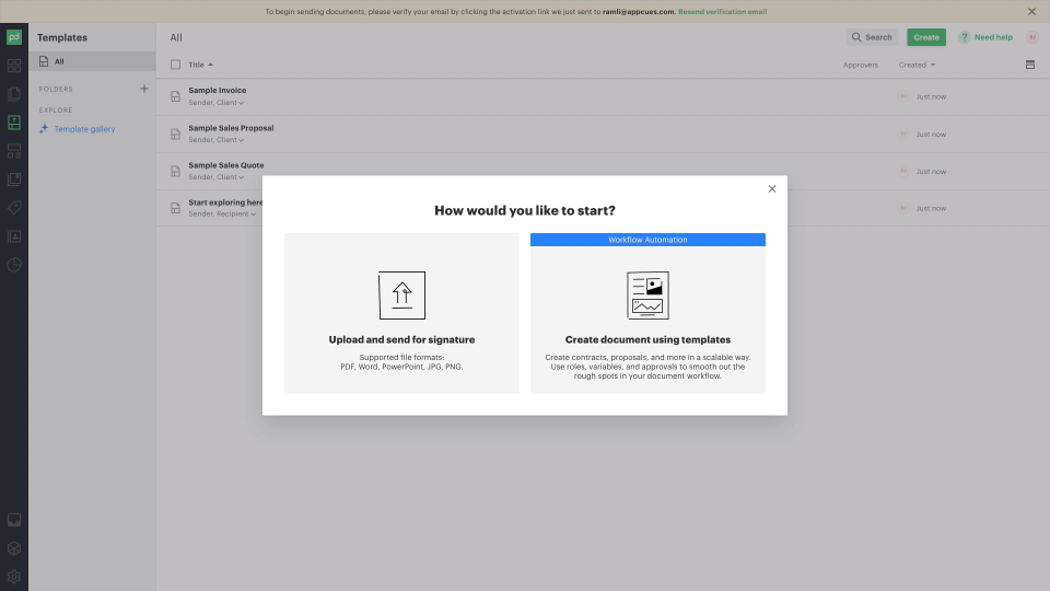
Screenshot of PandaDoc user onboarding templates

PandaDoc showcases their most popular templates from the jump, but users can also browse additional templates by category in the same window. This makes using a new product a lot less intimidating—it's always nice to see how much less work you have to do when you're not forced to start from scratch, am I right?

2. Gorgias

Achieve balance in the user onboarding force with human-assisted onboarding prompts

Like many SaaS companies, Gorgias struggled with keeping their new customers happy during their onboarding. The fix? They solved it with some good ol' fashioned human intervention: they funneled all their new users to a customer success manager.

Of course, high-touch experiences are hard to scale—so Gorgias cleverly automated a self-serve onboarding option to keep pace with their growing customer base. Best of both worlds! 🤗
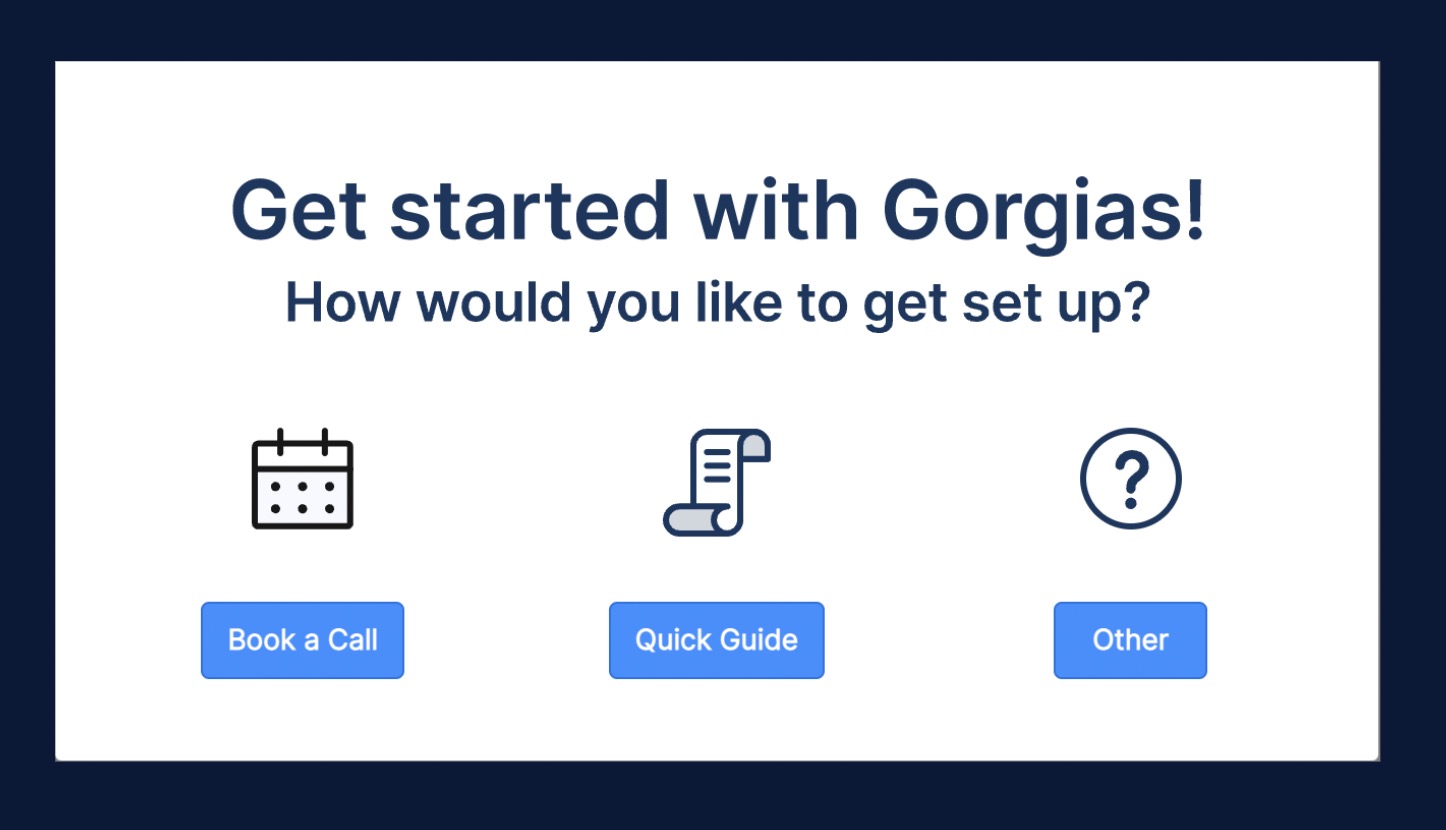
To their surprise, the self-serve option was incredibly popular. Here's a clip from our conversation with Gorgias’ Success Growth Lead Claudia Pravettoni:

“Our users are really interested in setting up on a self-serve basis. So the quick guide was definitely the most clicked option here. And that was really interesting to see, and I think a testament to both the work we're doing on the academy and the kind of the path forward towards more self-serve experience.”

Gorgias gives us a great example that demonstrates just how important it is to customize your user onboarding experience.

✨ Gorgias GoodUX Example ✨

For our full writeup on Gorigas, head on over to GoodUX.→

3. Thinkific

The jump-in, jump-out user onboarding checklist

Checklists make the user onboarding world go round—and Thinkific offers up a fantastic example. During Thinkific's user onboarding, they use checklists in their new user's dashboard that include built-in educational content—reflecting some of the high-level jobs a user might want to get done when using the product for the first time.

The jump-in, jump-out nature of their checklist makes it especially easy for users to get help when they need it, without forcing more experienced users to jump through unnecessary hoops.

Kay-Kay Clapp
Content & Communications Manager
Skip to section:

Skip to section:

Good user experience is the backbone of any product’s success. But if we've learned anything from studying user behavior over the past decade, it's that it's rarely predictable. That's exactly why we created GoodUX, our endlessly growing collection of visual examples to inspire you to build better product experiences.

This year, we gave GoodUX a makeover—retiring the domain ReallyGoodUX to launch its bolder, more informative counterpart: GoodUX 🥳.

We've got just as many inspiring UX examples with an upgraded search that makes it easier to sort and filter through our different examples.

While we collected dozens of examples to inspire your own UX adventures, these 3 snagged the most eyeballs 👀:

1. PandaDoc 🐼

Quick start templates make a great first impression

We all love (and turn to) high-quality templates. They're basically the ultimate work hack. They exist to help you get started on something quickly—or just get unstuck altogether—which is why they're so darn handy in user onboarding.

You want users to get value out of your product as quickly as possible—and that's exactly what PandaDoc does with their dazzling template library.

Screenshot of PandaDoc user onboarding templates

PandaDoc showcases their most popular templates from the jump, but users can also browse additional templates by category in the same window. This makes using a new product a lot less intimidating—it's always nice to see how much less work you have to do when you're not forced to start from scratch, am I right?

2. Gorgias

Achieve balance in the user onboarding force with human-assisted onboarding prompts

Like many SaaS companies, Gorgias struggled with keeping their new customers happy during their onboarding. The fix? They solved it with some good ol' fashioned human intervention: they funneled all their new users to a customer success manager.

Of course, high-touch experiences are hard to scale—so Gorgias cleverly automated a self-serve onboarding option to keep pace with their growing customer base. Best of both worlds! 🤗

To their surprise, the self-serve option was incredibly popular. Here's a clip from our conversation with Gorgias’ Success Growth Lead Claudia Pravettoni:

“Our users are really interested in setting up on a self-serve basis. So the quick guide was definitely the most clicked option here. And that was really interesting to see, and I think a testament to both the work we're doing on the academy and the kind of the path forward towards more self-serve experience.”

Gorgias gives us a great example that demonstrates just how important it is to customize your user onboarding experience.

✨ Gorgias GoodUX Example ✨

For our full writeup on Gorigas, head on over to GoodUX.→

3. Thinkific

The jump-in, jump-out user onboarding checklist

Checklists make the user onboarding world go round—and Thinkific offers up a fantastic example. During Thinkific's user onboarding, they use checklists in their new user's dashboard that include built-in educational content—reflecting some of the high-level jobs a user might want to get done when using the product for the first time.

The jump-in, jump-out nature of their checklist makes it especially easy for users to get help when they need it, without forcing more experienced users to jump through unnecessary hoops.

Kay-Kay Clapp
Content & Communications Manager
You might also like...