← Visit Appcues.com
×
×

Asking nicely: 3 strategies for successful mobile permission priming

Users grant mobile apps permission to access their data based on trust. Earn that trust with contextual, timely permission priming.
Skip to section:

Skip to section:

“Can we access your camera?”
“Would you like to receive push notifications?”
“Where are you located right now?”

Gaining access to your mobile app users' data requires a delicate balance of timing and education.

Though most mobile app users want to get through the onboarding process quickly (72% want the experience to take less than 60 seconds, according to a 2017 study by Clutch), they're also increasingly hesitant to grant apps permission to access their personal information.

For mobile developers, that's a catch-22. Users might need to grant access to their data before your app will work fully and correctly, but asking them to grant that permission requires trust. And that trust takes time to build... but users will abandon apps that take too long to set up. Tricky stuff.

Attempting to solve the problem, some apps bombard users with permission requests immediately after opening the app. But these confusing, irrelevant, and poorly timed  permission requests quickly destroy any trust users might have in a new app. It's a big part of why roughly 25% of users abandon new apps after only a single session.

Getting users to grant the permissions your mobile app needs isn't easy—but priming users to be more comfortable with granting permissions can help reduce abandonment, build trust, and create a better experience.

The most popular apps use a few simple tricks to increase users' trust and reduce abandonment. And because many of them require small tweaks, you can quickly implement these strategies within your own app.

Here's how you can get started.

Make sure your permission requests are timely and relevant

The success of your permissions request will depend on when you ask and whether the access you need is perceived as appropriate and relevant.

Generally speaking, you should ask users for permissions only when absolutely necessary and only after ensuring that users understand how granting this access will benefit them.

Google's Material Design guidelines suggest 2 different strategies for introducing permissions to users:
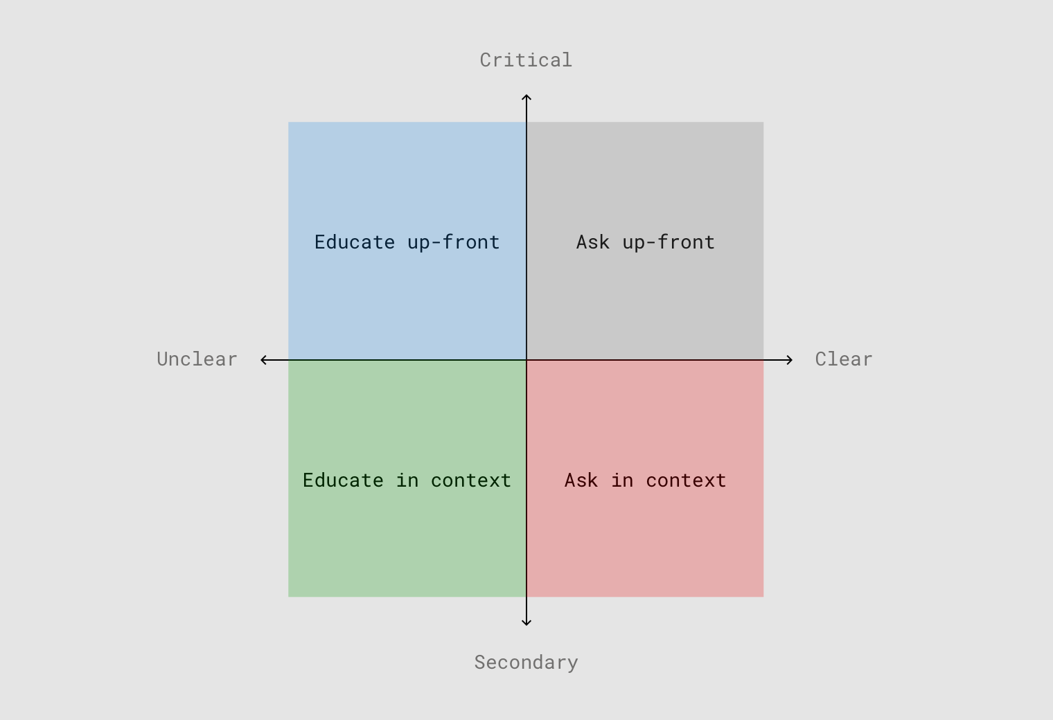
  • When the permission is critical to the functionality of the app, request permission early.
  • When the benefit of granting permission isn't immediately obvious, provide additional education.
A diagram with two axes: secondary to critical and unclear to clear. Ask up-front sits in the critical-clear quadrant. Ask in context sits in the secondary-clear quadrant. Educate up-front sits in the critical-unclear quadrant. And educate in context sits in the unclear-secondary quandrant.
Image courtesy of Material

While these 2 strategies assume the user intends to grant each request, the guidelines also suggest another strategy for handling the case when a user denies a request for permission:

  • When a user denies the permission request, provide feedback along with a method to quickly allow the permission.

Let's see how a few of the most popular mobile apps put these strategies into action.

1. Request device access only when needed

Timing is everything. Just as you wouldn't ask expect a stranger to give you access to their wallet, relying on users to grant permissions before they trust your app is destined to fail. Avoid asking for access until you truly need it.

The one exception is if a permission is critical to the functionality of the app. Navigation app Waze, for example, asks the user for location access immediately after the app is opened for the first time.

Since this ask is critical (it's impossible to offer accurate directions if you don't know where the user is) and contextual (the user knows Waze is a navigation app before installation), people are more likely to grant the request for location access.
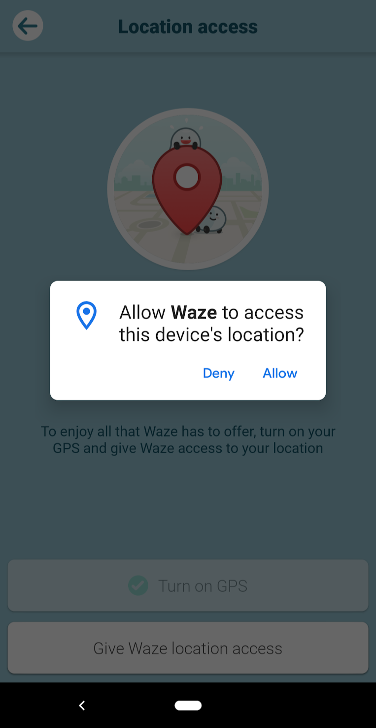
A screenshot of Waze's permission priming that says "Allow Waze to access this device's location?"


Secondary permissions are those that aren't critical to the app's functionality. It's best to tie those permission requests to a particular task or feature, only asking for access once the feature is used for the first time. Users are much more likely to grant the request when they're actively trying to use a particular feature.

For example, language learning app Babbel doesn't ask for microphone access during the initial onboarding lesson. They let users see the value of the app first. But once users reach the point in regular lessons where speaking practice is an option, they're asked to grant the app access to their mic. This request works because it's contextual, users are motivated, and they have the chance to decline it if they prefer. (Babbel does a great job at permission priming for other features, too.)
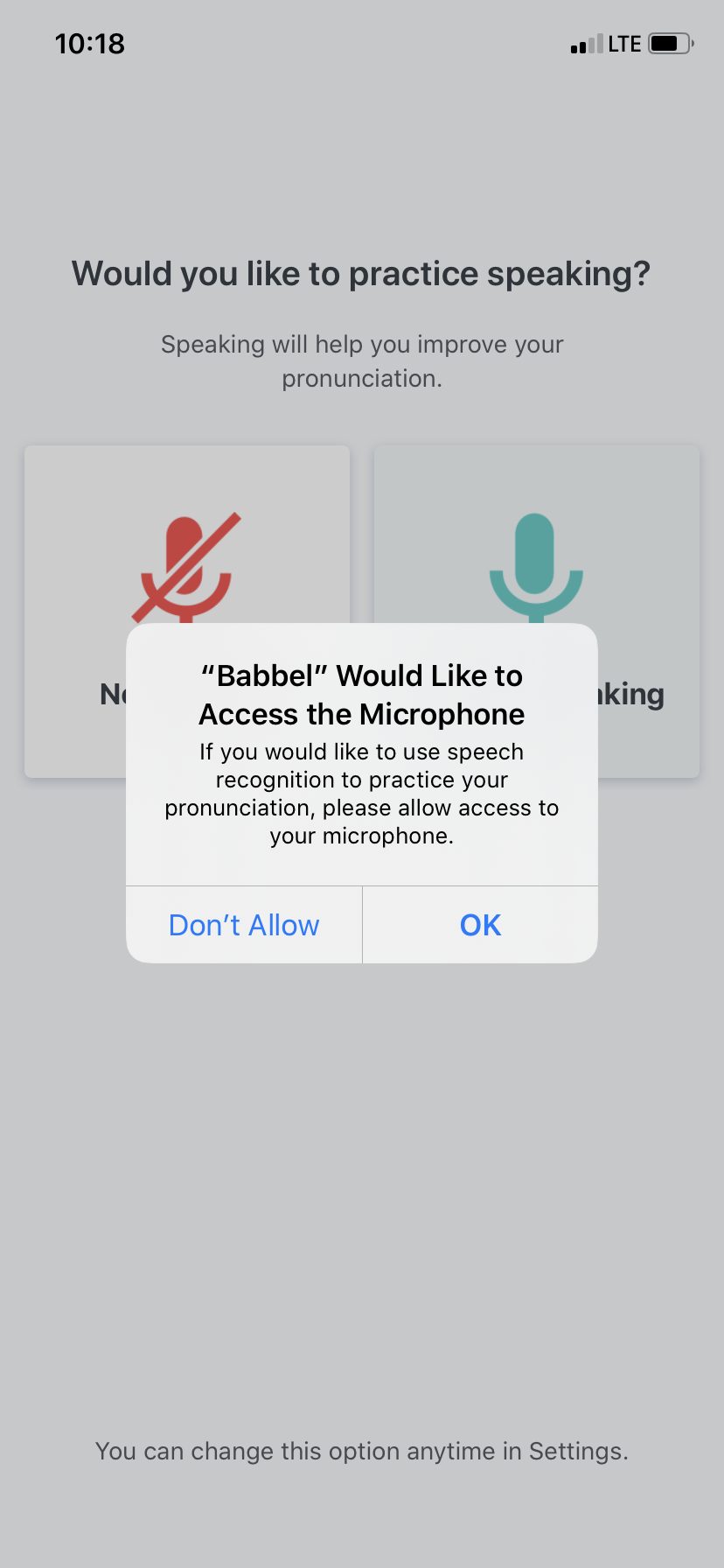
babbel microphone access permission priming context and mobile modal

Now that we've covered when to ask for access, let's look at how you should implement permission requests in your app.

2. Educate users and explain the benefits of granting permissions

Your onboarding sequence is a great opportunity to educate users and demonstrate the benefits of your app. You should approach permission priming in the same way: Each time your app requests a new permission, it's important to make clear to the user why the request is being made and what benefits the user will get in return.

In their onboarding videos, personal training app Zova explains how push notifications will unlock daily health and fitness videos and nutrition tips, helping users get more value from the app.

zova personal training app user onboarding videos mobile push notification opt in permission priming


For secondary permissions, it's best to give users information in context using educational microcopy and pre-permission overlays. Cluster co-founder Brenden Mulligan found that using pre-permission overlays in their app led to nearly every user granting access to their contact list (which is pretty wild):

"We first showed them a dialog about why we needed the access and gave them the choice to use the address book, or enter contact info manually themselves. . . . It was a bit of a pain to ask them twice, but when presented with the iOS dialog, no one ever hit “Don’t Allow.” Plus, when the people who tapped “I’ll Enter Contact Info” realized what a pain it was, we had another prompt that let them connect their address book at that point."

Be specific about why you're asking—make sure users know how granting permissions will benefit them. For example, Starbucks uses a modal to explain how turning on location services allows users to quickly find nearby stores and access regional menus.
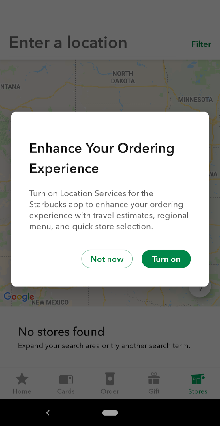
Starbuck's permission priming that says, "Enhance your ordering experience. Turn on location services for the Starbucks app to enhance your ordering experience with travel estimates, regional menu, and quick store selection."

By providing context and education to prime users before requesting access, both Zova and Starbucks are able to turn big asks into thoughtful requests.

Now, even though you're asking at the right time and in the right way, there's always a chance the user will still say no. Let's look at what to do when a user denies your permission request.

3. Make it easy for users to deny a permission request—and change their minds

Making permissions optional goes a long way toward building trust and putting users at ease. Some users will inevitably deny a permission request, and it's essential you handle those denials effectively.

Whenever a user denies a permission request, describe the effect their refusal will have and the benefits they'll forgo by denying permission. If the app can't run because the user has denied a critical permission, explain this and prompt users to re-enable the permission.

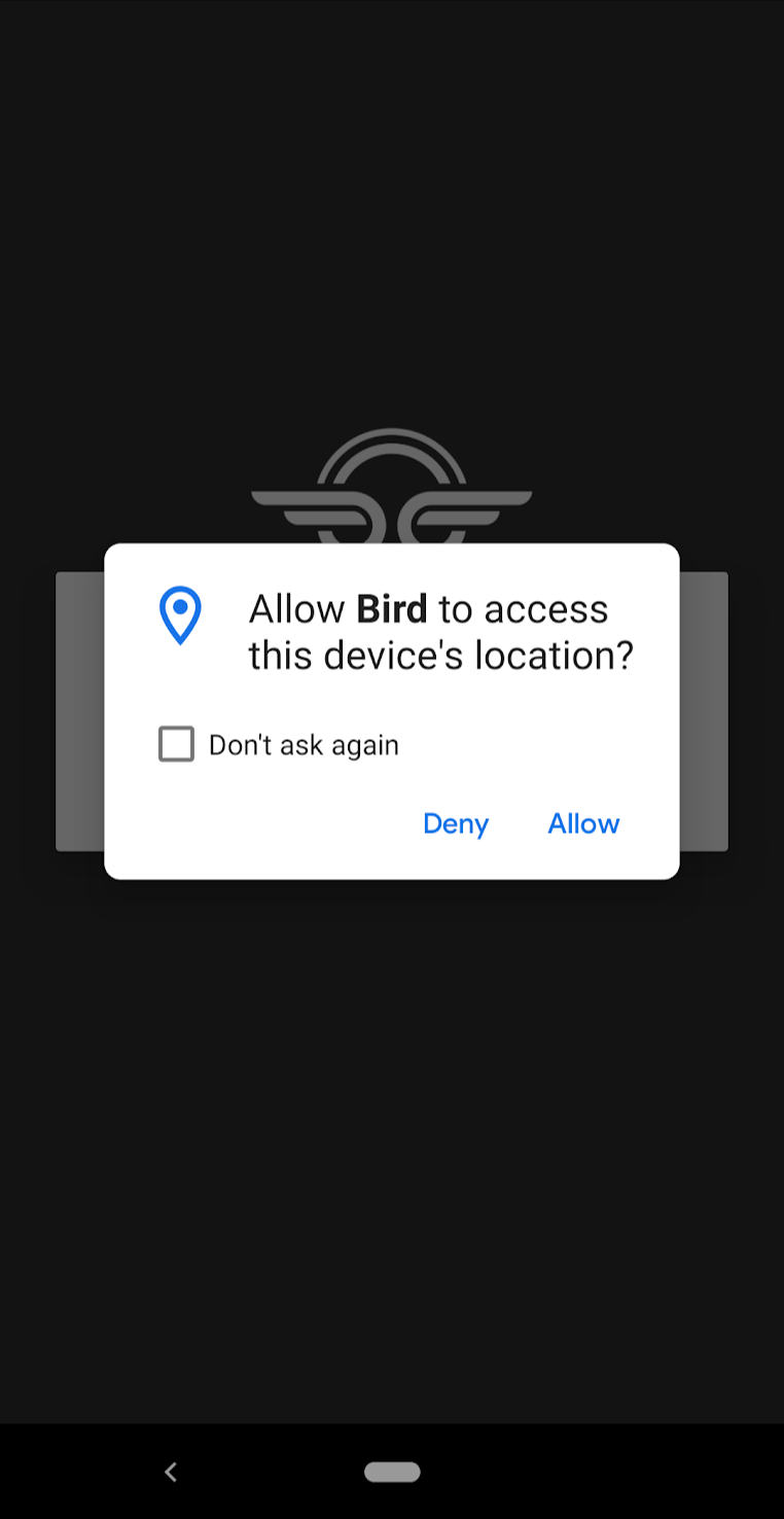
Scooter rental app Bird, for example, cannot run without access to the users' location—if a user denies location access, the app displays a warning explaining the problem, and prompts users to allow location access before letting them continue.
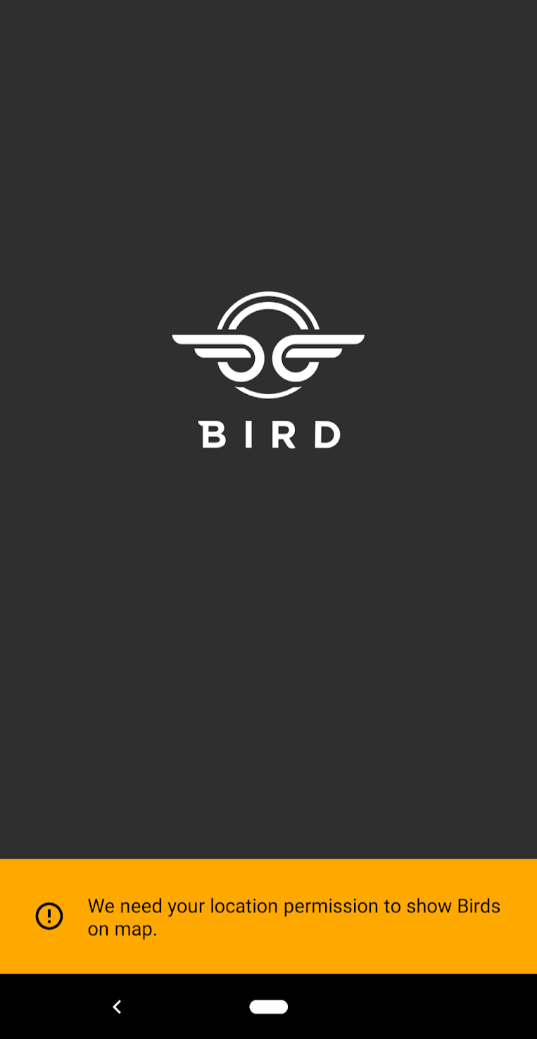
Bird's permission priming warning message that says, "We need your location permission to show Birds on map."

Bird's permission priming message that says, "Allow Bird to access this device's location?"

Sometimes, denying even secondary permissions can alter the entire user experience. Research firm Localytics found that users who opted into push notifications were nearly twice as likely to use an app 11 or more times than users who disabled push notifications.
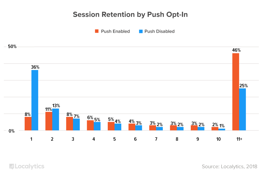
A graph from Localytics that shows users who opted into push notifications were nearly twice as likely to use an app 11 or more times than users who disabled push notifications

Meditation app Headspace relies on push notifications to help users form beneficial meditation habits. But instead of forcing users to enable notifications, at the end of each meditation session, Headspace reminds users of the benefits they're missing out on and allows them to opt into notifications and reminders.
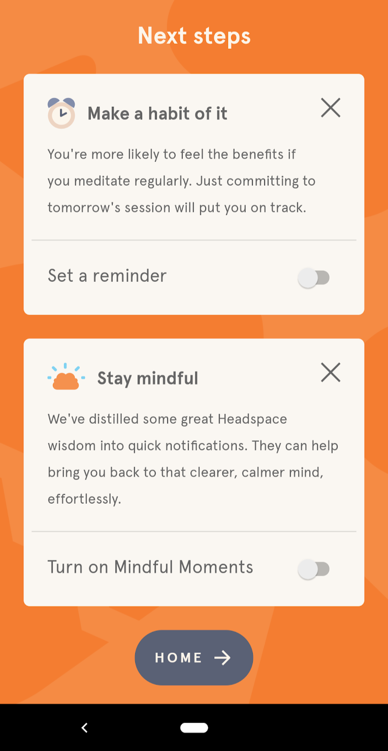
Headspace's permission priming that prompts a user to turn on "mindful moments".

The lesson here is not to give up on permissions to truly enhance the user experience and add value. Be sure to provide feedback whenever a user denies a permission request, and make it as easy as possible to get back on track.

Respect your users

You wouldn't barge into a friend's home and demand to see their photo albums or store items at their place without asking, would you? Of course not.

Why treat your users any differently? Just because it happens through a popup doesn't mean that mobile permission requests are any less important to your relationship.

As you build out your onboarding process, think about how you can work permission priming into your mobile app. Make sure you're never surprising users with unexpected requests, educate them on the benefits those permissions will unlock, and make it easy to change their minds. Basically, treat your users with respect—they're reward you for it in the end.

Jonathan Kim
Co-Founder at Appcues
Skip to section:

Skip to section:

“Can we access your camera?”
“Would you like to receive push notifications?”
“Where are you located right now?”

Gaining access to your mobile app users' data requires a delicate balance of timing and education.

Though most mobile app users want to get through the onboarding process quickly (72% want the experience to take less than 60 seconds, according to a 2017 study by Clutch), they're also increasingly hesitant to grant apps permission to access their personal information.

For mobile developers, that's a catch-22. Users might need to grant access to their data before your app will work fully and correctly, but asking them to grant that permission requires trust. And that trust takes time to build... but users will abandon apps that take too long to set up. Tricky stuff.

Attempting to solve the problem, some apps bombard users with permission requests immediately after opening the app. But these confusing, irrelevant, and poorly timed  permission requests quickly destroy any trust users might have in a new app. It's a big part of why roughly 25% of users abandon new apps after only a single session.

Getting users to grant the permissions your mobile app needs isn't easy—but priming users to be more comfortable with granting permissions can help reduce abandonment, build trust, and create a better experience.

The most popular apps use a few simple tricks to increase users' trust and reduce abandonment. And because many of them require small tweaks, you can quickly implement these strategies within your own app.

Here's how you can get started.

Make sure your permission requests are timely and relevant

The success of your permissions request will depend on when you ask and whether the access you need is perceived as appropriate and relevant.

Generally speaking, you should ask users for permissions only when absolutely necessary and only after ensuring that users understand how granting this access will benefit them.

Google's Material Design guidelines suggest 2 different strategies for introducing permissions to users:

  • When the permission is critical to the functionality of the app, request permission early.
  • When the benefit of granting permission isn't immediately obvious, provide additional education.
A diagram with two axes: secondary to critical and unclear to clear. Ask up-front sits in the critical-clear quadrant. Ask in context sits in the secondary-clear quadrant. Educate up-front sits in the critical-unclear quadrant. And educate in context sits in the unclear-secondary quandrant.
Image courtesy of Material

While these 2 strategies assume the user intends to grant each request, the guidelines also suggest another strategy for handling the case when a user denies a request for permission:

  • When a user denies the permission request, provide feedback along with a method to quickly allow the permission.

Let's see how a few of the most popular mobile apps put these strategies into action.

1. Request device access only when needed

Timing is everything. Just as you wouldn't ask expect a stranger to give you access to their wallet, relying on users to grant permissions before they trust your app is destined to fail. Avoid asking for access until you truly need it.

The one exception is if a permission is critical to the functionality of the app. Navigation app Waze, for example, asks the user for location access immediately after the app is opened for the first time.

Since this ask is critical (it's impossible to offer accurate directions if you don't know where the user is) and contextual (the user knows Waze is a navigation app before installation), people are more likely to grant the request for location access.

A screenshot of Waze's permission priming that says "Allow Waze to access this device's location?"


Secondary permissions are those that aren't critical to the app's functionality. It's best to tie those permission requests to a particular task or feature, only asking for access once the feature is used for the first time. Users are much more likely to grant the request when they're actively trying to use a particular feature.

For example, language learning app Babbel doesn't ask for microphone access during the initial onboarding lesson. They let users see the value of the app first. But once users reach the point in regular lessons where speaking practice is an option, they're asked to grant the app access to their mic. This request works because it's contextual, users are motivated, and they have the chance to decline it if they prefer. (Babbel does a great job at permission priming for other features, too.)

babbel microphone access permission priming context and mobile modal

Now that we've covered when to ask for access, let's look at how you should implement permission requests in your app.

2. Educate users and explain the benefits of granting permissions

Your onboarding sequence is a great opportunity to educate users and demonstrate the benefits of your app. You should approach permission priming in the same way: Each time your app requests a new permission, it's important to make clear to the user why the request is being made and what benefits the user will get in return.

In their onboarding videos, personal training app Zova explains how push notifications will unlock daily health and fitness videos and nutrition tips, helping users get more value from the app.

zova personal training app user onboarding videos mobile push notification opt in permission priming


For secondary permissions, it's best to give users information in context using educational microcopy and pre-permission overlays. Cluster co-founder Brenden Mulligan found that using pre-permission overlays in their app led to nearly every user granting access to their contact list (which is pretty wild):

"We first showed them a dialog about why we needed the access and gave them the choice to use the address book, or enter contact info manually themselves. . . . It was a bit of a pain to ask them twice, but when presented with the iOS dialog, no one ever hit “Don’t Allow.” Plus, when the people who tapped “I’ll Enter Contact Info” realized what a pain it was, we had another prompt that let them connect their address book at that point."

Be specific about why you're asking—make sure users know how granting permissions will benefit them. For example, Starbucks uses a modal to explain how turning on location services allows users to quickly find nearby stores and access regional menus.

Starbuck's permission priming that says, "Enhance your ordering experience. Turn on location services for the Starbucks app to enhance your ordering experience with travel estimates, regional menu, and quick store selection."

By providing context and education to prime users before requesting access, both Zova and Starbucks are able to turn big asks into thoughtful requests.

Now, even though you're asking at the right time and in the right way, there's always a chance the user will still say no. Let's look at what to do when a user denies your permission request.

3. Make it easy for users to deny a permission request—and change their minds

Making permissions optional goes a long way toward building trust and putting users at ease. Some users will inevitably deny a permission request, and it's essential you handle those denials effectively.

Whenever a user denies a permission request, describe the effect their refusal will have and the benefits they'll forgo by denying permission. If the app can't run because the user has denied a critical permission, explain this and prompt users to re-enable the permission.

Scooter rental app Bird, for example, cannot run without access to the users' location—if a user denies location access, the app displays a warning explaining the problem, and prompts users to allow location access before letting them continue.

Bird's permission priming warning message that says, "We need your location permission to show Birds on map."

Bird's permission priming message that says, "Allow Bird to access this device's location?"

Sometimes, denying even secondary permissions can alter the entire user experience. Research firm Localytics found that users who opted into push notifications were nearly twice as likely to use an app 11 or more times than users who disabled push notifications.

A graph from Localytics that shows users who opted into push notifications were nearly twice as likely to use an app 11 or more times than users who disabled push notifications

Meditation app Headspace relies on push notifications to help users form beneficial meditation habits. But instead of forcing users to enable notifications, at the end of each meditation session, Headspace reminds users of the benefits they're missing out on and allows them to opt into notifications and reminders.

Headspace's permission priming that prompts a user to turn on "mindful moments".

The lesson here is not to give up on permissions to truly enhance the user experience and add value. Be sure to provide feedback whenever a user denies a permission request, and make it as easy as possible to get back on track.

Respect your users

You wouldn't barge into a friend's home and demand to see their photo albums or store items at their place without asking, would you? Of course not.

Why treat your users any differently? Just because it happens through a popup doesn't mean that mobile permission requests are any less important to your relationship.

As you build out your onboarding process, think about how you can work permission priming into your mobile app. Make sure you're never surprising users with unexpected requests, educate them on the benefits those permissions will unlock, and make it easy to change their minds. Basically, treat your users with respect—they're reward you for it in the end.

Jonathan Kim
Co-Founder at Appcues
You might also like...