← Visit Appcues.com
×
×

How e-commerce apps entice users with laser-focused onboarding
In 1995, Clifford Stole voiced a popular opinion in the Tech & Science section of Newsweek:
Skip to section:

Skip to section:

In 1995, Clifford Stole voiced a popular opinion in the Tech & Science section of Newsweek:

We're promised instant catalog shopping—just point and click for great deals.... Stores will become obsolete. So how come my local mall does more business in an afternoon than the entire Internet handles in a month? Even if there were a trustworthy way to send money over the Internet—which there isn't—the network is missing a most essential ingredient of capitalism: salespeople.

Exactly 20 years later, e-commerce sales reached $395 billion, representing about 42% of all growth in retail. Stole wasn't alone in his skepticism about e-commerce. The idea that consumers would buy without salespeople, without beautiful storefront displays, without dressing rooms seemed absurd. But today, more and more shoppers are buying online, skipping the trip to the department store altogether.

The next step is to take that experience to mobile. Mobile apps only account for about a fourth of online sales, as thousands of apps are vying for the attention of about 77 million mobile shoppers. The challenge is no longer just earning a user's attention—it's keeping it.

The mobile environment is unique because a user's attention is much more scarce. A text message, a push notification, or a phone reminder will whisk them away. That's why the most successful e-commerce apps keep onboarding focused and quick, guiding users through the one use-case that will bring them back for a second visit.

Here's how four of the most successful e-commerce apps engage users for the long haul.

1. Jet gamifies saving money

Amazon is one of the toughest e-commerce companies to go up against. Leveraging economies of scale, they've been able to offer users the lowest prices across the board—whether it's for clothes, books or IT. But Jet, a company 1/10th the size, has developed a unique business model that finally offers a viable alternative.

Valued at $1.3 billion, Jet has achieved incredible growth thanks to their flexible price structure. Their site has a unique algorithm that adjusts prices based on what users purchase. Anything that's cheaper for Jet to distribute, is cheaper for the customer to buy. 

Their onboarding is designed to point users towards this unique approach to pricing. Within just a few taps, a user learns how to take advantage of this model and get the best deals. But the brilliance of this onboarding isn't in just getting users deals—it's in making users feel like they're a smart and savvy shopper, highlighting their slogan: “The Smartest Way to Shop.”
jet user onboarding
jet user onboarding


jet user onboarding


How Jet onboards

  • The first screen asks users whether they want to be notified about promotions. This lets Jet extend its core value past its app. Thrifty shoppers have the opportunity to jump on a deal, even when they're not on the site.
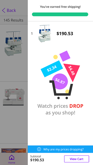
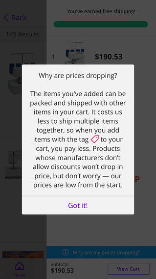
  • When you add the first item to the cart, you're hit with their value prop. Jet advertises that “prices DROP as you shop!” and gives you the opportunity to learn more.
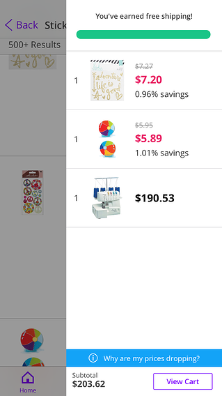
  • As you add items to your cart, you see a progress bar for free shipping. This bar incentivizes users to fill up their cart enough for shipping to pay for itself.
  • Browse first, sign in later. The browsing experience is totally frictionless, letting you hunt for the lowest prices and earn rewards so that you can see the value of the app before going through the trouble of digging around for your credit card.

Jet's onboarding gamifies the experience of thrifty shopping, by including a progress bar and the savings that each item earns. By solely focusing on saving money, Jet ensures that users see the distinct value of their platform from their first experience with it.

2. Etsy promotes personalization

Etsy is the internet's biggest boutique. The site is a marketplace that connects buyers with sellers that specialize in vintage and handmade goods. Their support for the creative community has earned them 1.4 million sellers, and their branding as the place to get the most unique and crafty items has earned them 19.8 million active buyers. Etsy emphasizes creativity, for both the buyer and the seller, so their entire onboarding flow centers on personalization. 

They drive engagement by showing users that Etsy provides the unique opportunity to express individualism with one-of-a-kind, fashionable items. Their ability to engage shows in the numbers: over half of the buyers of 2012 remained loyal to the brand three years later, in 2015.

etsy user onboarding

How Etsy onboards

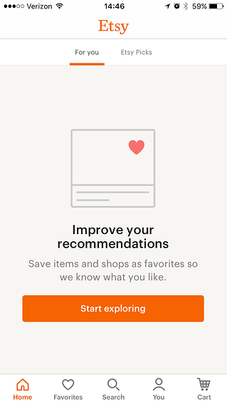
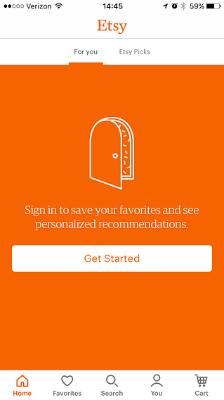
  • As soon as users open the app, Etsy nudges you to sign in. They make it clear that your success with the app (“getting personalized recommendations”) is contingent on you setting up your account. They use single sign-in to make this as simple as possible.
  • When you try to begin browsing, Etsy suggests saving items. While most shoppers don't save items they don't intend to buy, Etsy shows that storing items can improve recommendations (and get you to reconsider buying the items you passed on the first time).
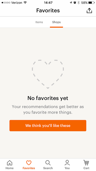
  • If your “Favorites” are empty, Etsy points you to “Editor Picks.” If you still haven't engaged in the behavior that they suggest, they point you to best-selling items that have gotten so many other users to build their list.

Etsy doesn't force shoppers to indicate their styles or preferences, but they have carefully placed nudges that encourage people to start a favorites list. Their onboarding gets users to give Etsy as much data as possible, so that they can further customize the experience. This focus is perceived as more and more valuable with every visit.

3. Zappos shows support

Zappos practically needs no introduction. Having gained an immensely loyal following thanks to their emphasis on customer support, the online shoe retail boasted $1 billion in revenue in 2009, right before getting acquired by Amazon for a reported $880 million

Despite the acquisition, Zappos remains true to its original branding as one of the most customer-centric retailers online.Zappos onboarding reveals their quirky, casual vibe that has helped the company form long-lasting relationships with their customers. Every step of the onboarding flow reminds the user that Zappos puts their experience first.

zappos user onboarding

How Zappos onboards

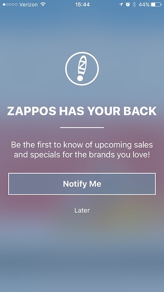
  • The first screen is “Zappos has your back,” asking you to enable push. This message is effective because it's user-focused, rather than company-focus. The messaging shows what the user gets out of the notification and how Zappos is just a means to that end.
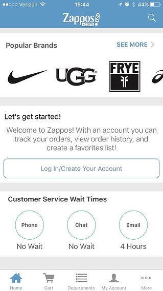
  • When you get to the home screen, the first thing you see is customer service wait times. The “no wait” phone and chat accessibility leaves a positive impression from the get-go.
  • As you start browsing, a “quick tips” module window quickly explains each icon. The module is unobtrusive and essentially offers a complete walkthrough in 1 step.

Zappos puts their greatest strength up front and center: customer relationships. From the messaging (“we've got your back”) to the customer service details being the first thing you see, they're highlighting the fact that customer satisfaction is their primary concern. Any shopper that has been placed on hold when calling a support line will remember this selling point.

4. REI extends their in-store experience

REI is one brick-and-mortar chain that doesn't seem to be going anywhere. While most shops are quickly losing value and getting squashed by digital powerhouses, REI's profits are growing year after year. In 2016, they achieved record revenues with their 16 million members that helped push one of their biggest competitors, Eastern Mountain Sports (EMS) out of business.

Part of REI's success is in its expansion to becoming a lifestyle company. They've started selling “adventures”— vacations for the type of active buyers that shop in their stores—and outdoor classes. The company champions a healthy, active lifestyle, and their app is an extension of this. 

As CIO Julie Averill explains, “Whether it’s buying the right kayak or meeting up with a guide and experiencing Machu Picchu, our goal is to give the best, most trusted experience.” The onboarding focuses on the adventure aspect, promoting the lifestyle and connecting the online experience with the in-store experience.

rei user onboarding
rei user onboarding
rei user onboarding

How REI onboards

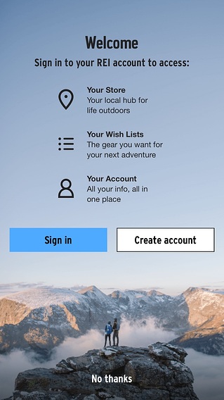
  • The welcome page prompts sign in for all-things-adventure. They advertise their store for “life outdoors,” and the wishlist for “your next adventure.”
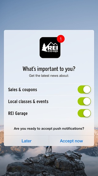
  • They offer personalized push notifications. While most brands request all-or-nothing permission, REI lets the user pick what they'd like to be notified about.
  • The last screen of onboarding maps out the three bullets presented on the welcome screen. In a module window similar to Zappos, they quickly explain the three integral components of their app that they mentioned at login.

The REI in-app experience is extremely similar to their in-store experience. They're promoting the same kind of adventurous lifestyle, and position their products as a means to getting that lifestyle. The onboarding quickly connects the two experiences to form one singular impression of the brand.

Users only need one reason to come back

Because many apps know that user onboarding is the most important part of a user's lifecycle, they often overdo it. They offer an extensive walkthrough, point out every button, and push users to get involved in every feature from day 1. If you look at all these successful e-commerce apps, however, you'll see that they all picked only one goal to push. 

For Jet, it was their save-as-you-buy pricing model, for Zappos it was their customer-centricity, etc. Your objective isn't to show off everything, it's to show off the best part of your software. Users only need one reason to return to your app. 

Once you get them to come back a second, third, and fourth time, you can continue to drive deeper user engagement.

Want to become a User Onboarding Master? Check out our free User Onboarding Academy!
Julia Chen
Skip to section:

Skip to section:

In 1995, Clifford Stole voiced a popular opinion in the Tech & Science section of Newsweek:

We're promised instant catalog shopping—just point and click for great deals.... Stores will become obsolete. So how come my local mall does more business in an afternoon than the entire Internet handles in a month? Even if there were a trustworthy way to send money over the Internet—which there isn't—the network is missing a most essential ingredient of capitalism: salespeople.

Exactly 20 years later, e-commerce sales reached $395 billion, representing about 42% of all growth in retail. Stole wasn't alone in his skepticism about e-commerce. The idea that consumers would buy without salespeople, without beautiful storefront displays, without dressing rooms seemed absurd. But today, more and more shoppers are buying online, skipping the trip to the department store altogether.

The next step is to take that experience to mobile. Mobile apps only account for about a fourth of online sales, as thousands of apps are vying for the attention of about 77 million mobile shoppers. The challenge is no longer just earning a user's attention—it's keeping it.

The mobile environment is unique because a user's attention is much more scarce. A text message, a push notification, or a phone reminder will whisk them away. That's why the most successful e-commerce apps keep onboarding focused and quick, guiding users through the one use-case that will bring them back for a second visit.

Here's how four of the most successful e-commerce apps engage users for the long haul.

1. Jet gamifies saving money

Amazon is one of the toughest e-commerce companies to go up against. Leveraging economies of scale, they've been able to offer users the lowest prices across the board—whether it's for clothes, books or IT. But Jet, a company 1/10th the size, has developed a unique business model that finally offers a viable alternative.

Valued at $1.3 billion, Jet has achieved incredible growth thanks to their flexible price structure. Their site has a unique algorithm that adjusts prices based on what users purchase. Anything that's cheaper for Jet to distribute, is cheaper for the customer to buy. 

Their onboarding is designed to point users towards this unique approach to pricing. Within just a few taps, a user learns how to take advantage of this model and get the best deals. But the brilliance of this onboarding isn't in just getting users deals—it's in making users feel like they're a smart and savvy shopper, highlighting their slogan: “The Smartest Way to Shop.”
jet user onboarding
jet user onboarding


jet user onboarding


How Jet onboards

  • The first screen asks users whether they want to be notified about promotions. This lets Jet extend its core value past its app. Thrifty shoppers have the opportunity to jump on a deal, even when they're not on the site.
  • When you add the first item to the cart, you're hit with their value prop. Jet advertises that “prices DROP as you shop!” and gives you the opportunity to learn more.
  • As you add items to your cart, you see a progress bar for free shipping. This bar incentivizes users to fill up their cart enough for shipping to pay for itself.
  • Browse first, sign in later. The browsing experience is totally frictionless, letting you hunt for the lowest prices and earn rewards so that you can see the value of the app before going through the trouble of digging around for your credit card.

Jet's onboarding gamifies the experience of thrifty shopping, by including a progress bar and the savings that each item earns. By solely focusing on saving money, Jet ensures that users see the distinct value of their platform from their first experience with it.

2. Etsy promotes personalization

Etsy is the internet's biggest boutique. The site is a marketplace that connects buyers with sellers that specialize in vintage and handmade goods. Their support for the creative community has earned them 1.4 million sellers, and their branding as the place to get the most unique and crafty items has earned them 19.8 million active buyers. Etsy emphasizes creativity, for both the buyer and the seller, so their entire onboarding flow centers on personalization. 

They drive engagement by showing users that Etsy provides the unique opportunity to express individualism with one-of-a-kind, fashionable items. Their ability to engage shows in the numbers: over half of the buyers of 2012 remained loyal to the brand three years later, in 2015.
etsy user onboarding

How Etsy onboards

  • As soon as users open the app, Etsy nudges you to sign in. They make it clear that your success with the app (“getting personalized recommendations”) is contingent on you setting up your account. They use single sign-in to make this as simple as possible.
  • When you try to begin browsing, Etsy suggests saving items. While most shoppers don't save items they don't intend to buy, Etsy shows that storing items can improve recommendations (and get you to reconsider buying the items you passed on the first time).
  • If your “Favorites” are empty, Etsy points you to “Editor Picks.” If you still haven't engaged in the behavior that they suggest, they point you to best-selling items that have gotten so many other users to build their list.

Etsy doesn't force shoppers to indicate their styles or preferences, but they have carefully placed nudges that encourage people to start a favorites list. Their onboarding gets users to give Etsy as much data as possible, so that they can further customize the experience. This focus is perceived as more and more valuable with every visit.

3. Zappos shows support

Zappos practically needs no introduction. Having gained an immensely loyal following thanks to their emphasis on customer support, the online shoe retail boasted $1 billion in revenue in 2009, right before getting acquired by Amazon for a reported $880 million

Despite the acquisition, Zappos remains true to its original branding as one of the most customer-centric retailers online.Zappos onboarding reveals their quirky, casual vibe that has helped the company form long-lasting relationships with their customers. Every step of the onboarding flow reminds the user that Zappos puts their experience first.
zappos user onboarding

How Zappos onboards

  • The first screen is “Zappos has your back,” asking you to enable push. This message is effective because it's user-focused, rather than company-focus. The messaging shows what the user gets out of the notification and how Zappos is just a means to that end.
  • When you get to the home screen, the first thing you see is customer service wait times. The “no wait” phone and chat accessibility leaves a positive impression from the get-go.
  • As you start browsing, a “quick tips” module window quickly explains each icon. The module is unobtrusive and essentially offers a complete walkthrough in 1 step.

Zappos puts their greatest strength up front and center: customer relationships. From the messaging (“we've got your back”) to the customer service details being the first thing you see, they're highlighting the fact that customer satisfaction is their primary concern. Any shopper that has been placed on hold when calling a support line will remember this selling point.

4. REI extends their in-store experience

REI is one brick-and-mortar chain that doesn't seem to be going anywhere. While most shops are quickly losing value and getting squashed by digital powerhouses, REI's profits are growing year after year. In 2016, they achieved record revenues with their 16 million members that helped push one of their biggest competitors, Eastern Mountain Sports (EMS) out of business.

Part of REI's success is in its expansion to becoming a lifestyle company. They've started selling “adventures”— vacations for the type of active buyers that shop in their stores—and outdoor classes. The company champions a healthy, active lifestyle, and their app is an extension of this. 

As CIO Julie Averill explains, “Whether it’s buying the right kayak or meeting up with a guide and experiencing Machu Picchu, our goal is to give the best, most trusted experience.” The onboarding focuses on the adventure aspect, promoting the lifestyle and connecting the online experience with the in-store experience.
rei user onboarding
rei user onboarding
rei user onboarding

How REI onboards

  • The welcome page prompts sign in for all-things-adventure. They advertise their store for “life outdoors,” and the wishlist for “your next adventure.”
  • They offer personalized push notifications. While most brands request all-or-nothing permission, REI lets the user pick what they'd like to be notified about.
  • The last screen of onboarding maps out the three bullets presented on the welcome screen. In a module window similar to Zappos, they quickly explain the three integral components of their app that they mentioned at login.

The REI in-app experience is extremely similar to their in-store experience. They're promoting the same kind of adventurous lifestyle, and position their products as a means to getting that lifestyle. The onboarding quickly connects the two experiences to form one singular impression of the brand.

Users only need one reason to come back

Because many apps know that user onboarding is the most important part of a user's lifecycle, they often overdo it. They offer an extensive walkthrough, point out every button, and push users to get involved in every feature from day 1. If you look at all these successful e-commerce apps, however, you'll see that they all picked only one goal to push. 

For Jet, it was their save-as-you-buy pricing model, for Zappos it was their customer-centricity, etc. Your objective isn't to show off everything, it's to show off the best part of your software. Users only need one reason to return to your app. 

Once you get them to come back a second, third, and fourth time, you can continue to drive deeper user engagement.

Want to become a User Onboarding Master? Check out our free User Onboarding Academy!
Julia Chen
You might also like...