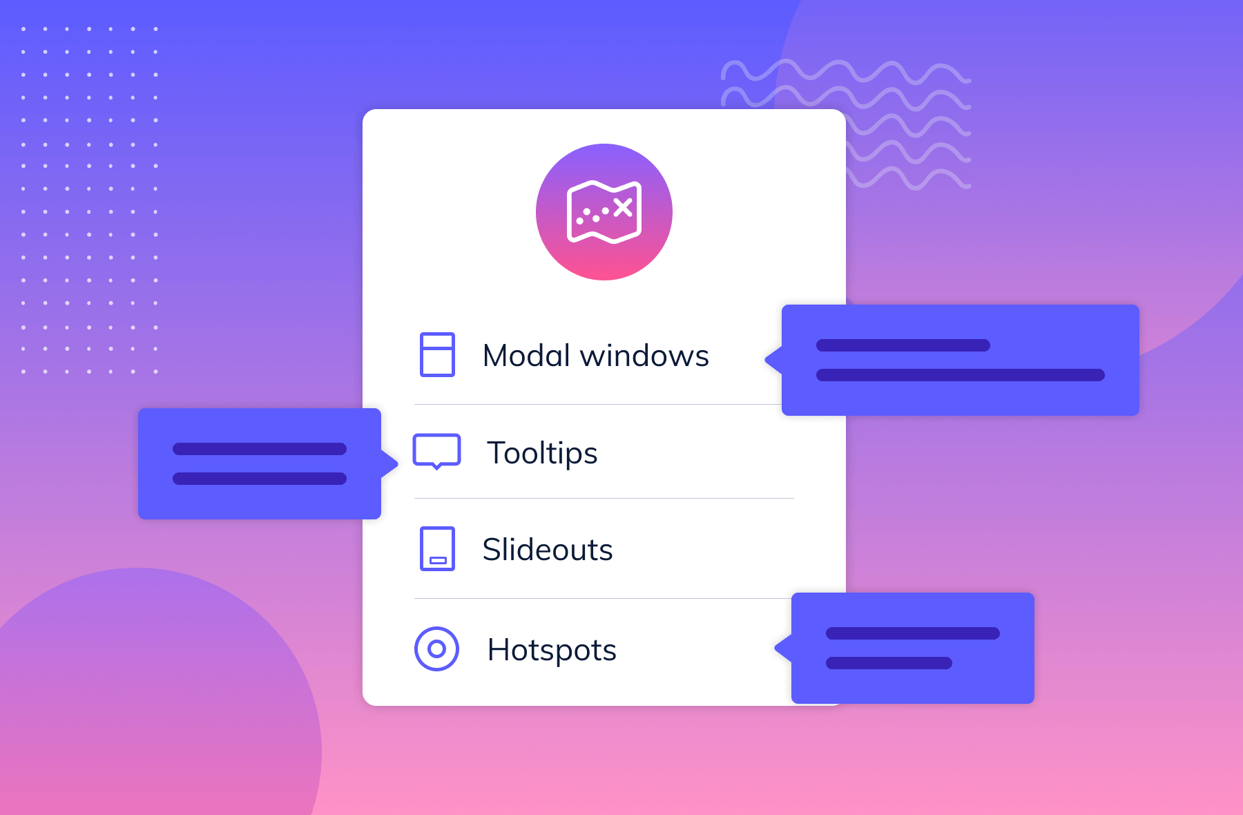
.png)
Great user onboarding is all about speed and clarity. Nobody wants to wade through endless tutorials or complicated instructions.
Instead, use new user onboarding to show off the core value of your app. Is it stellar at helping you edit photos lightning-fast? Meal planning made easy? Connecting with other book nerds? The sooner users get the benefit, the better the chance for you to drive user retention from the get-go.
Just like giving someone a sneak peek into the best part of a movie. A good trailer draws them into cliffhangers, which means the viewers will look forward to knowing the ending. An app does that through progressive onboarding: It gives a glimpse into the experience users will get out of the app, preparing them to use the tool's key features.
Think of it this way: The users are getting onboard faster and feeling like they understand the value of your app. This makes them more likely to engage and become loyal fans. You get higher retention rates, great reviews, and a growing user base.
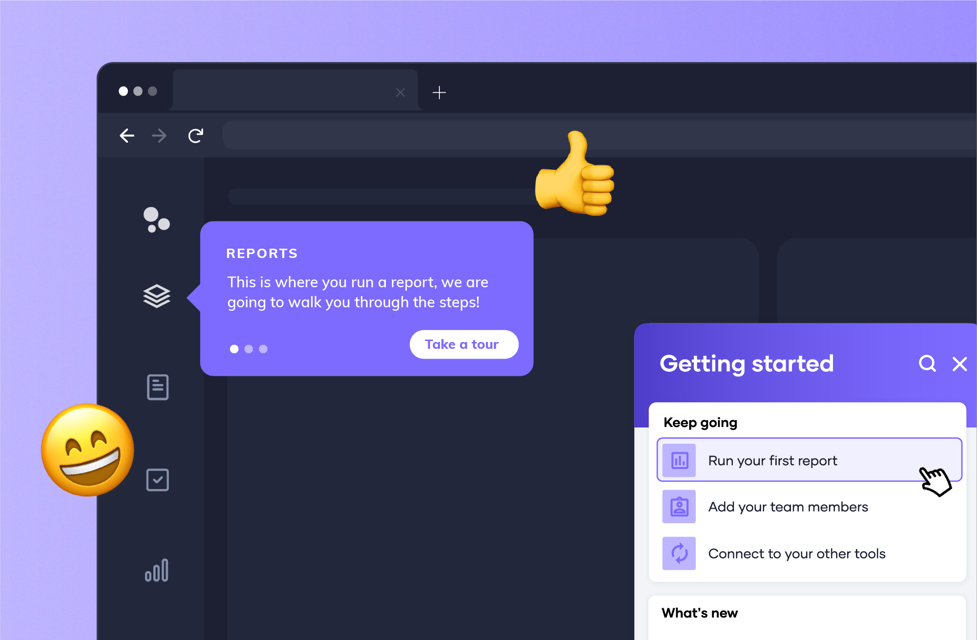
Your onboarding experience should immediately communicate value so you can establish trust.
Do this by:
Example:
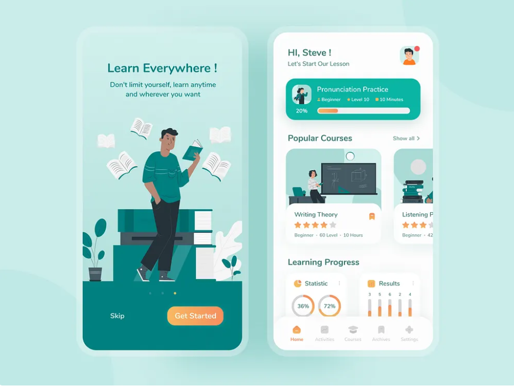
This language learning app starts its app with its opening screen that promises to let learners study at any time, from anywhere. This quickly helps users see the benefit of using the app and encourages them to push through with the onboarding process. The app will then be using consistent brand colors and typography for a clear, visually appealing experience.
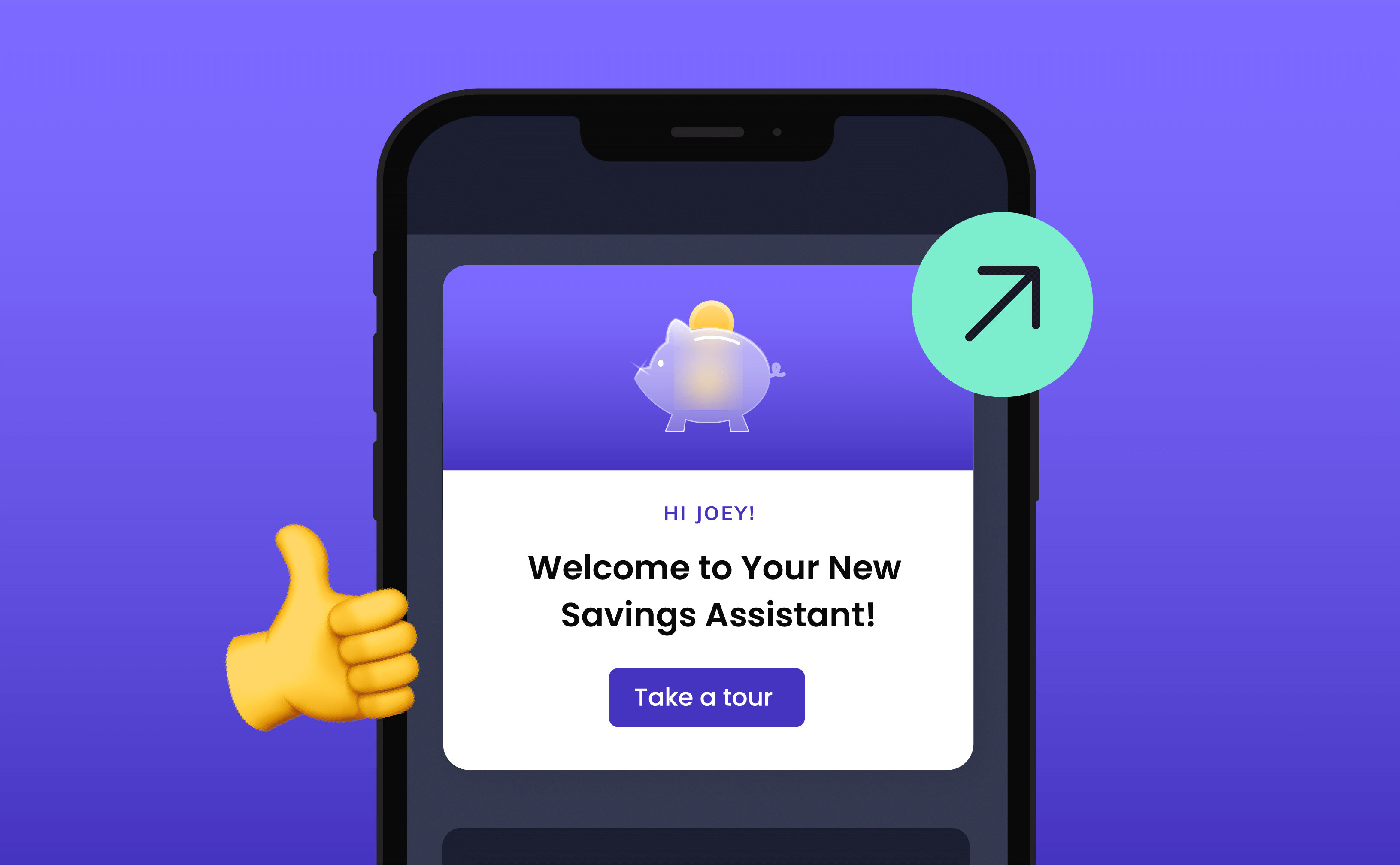
Users should know what to expect before they start onboarding.
Do this by:
Example:
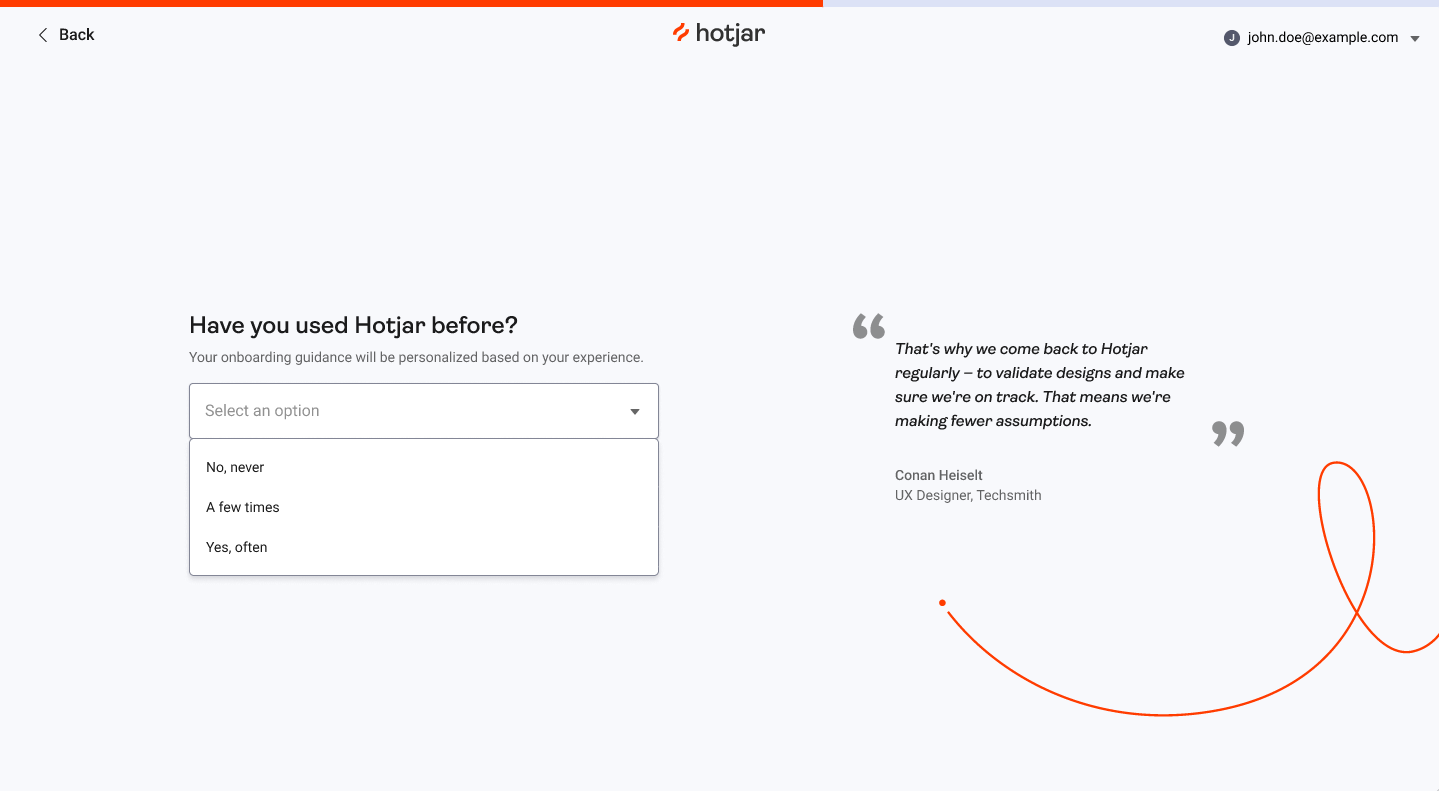
Hotjar made clear in the onboarding expectation that user drop-off points warranted a more customized approach. After seeing that users dropped off between creating the account and installing the Hotjar code, they changed the flow to clarify what to do next. In this, they introduced a tailored onboarding checklist that segmented users by experience level: Beginner, Intermediate, or Advanced. This approach increased installations by 26%.
A lengthy or complicated sign-up process can cause drop-offs.
Do this by:
Example:
Notion makes signing up extra fast by simply allowing you to connect via Google and Apple accounts you already have. That's besides the strong passkey and SSO options you get. The following mobile app onboarding flow is simplified with easy-to-skip steps that get users quickly towards the functions they might want to use straightway.
Instead of overwhelming users with all features at once, introduce them gradually.
Do this by:
Example:
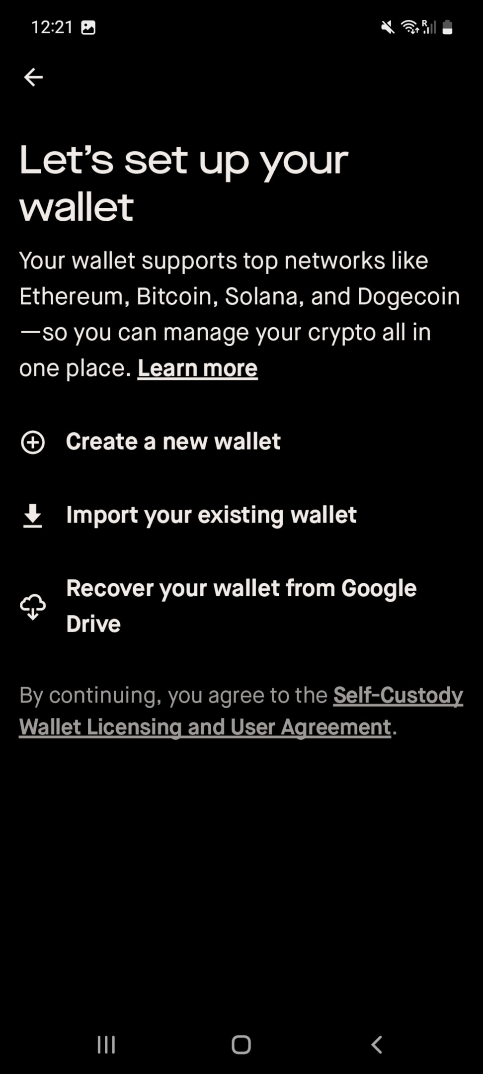
The Robinhood Wallet app onboarding process below is a perfect example of understanding your users can't do it all at the same time. By breaking down the app onboarding flow into different stages, users get to choose what works best for them. This also gives the Robinhood product team space to cater to different user segments (in this case: people who have vs. those who don't vs. those who lost a wallet).
Users engage more when onboarding feels tailored to them.
Do this by:
Example:
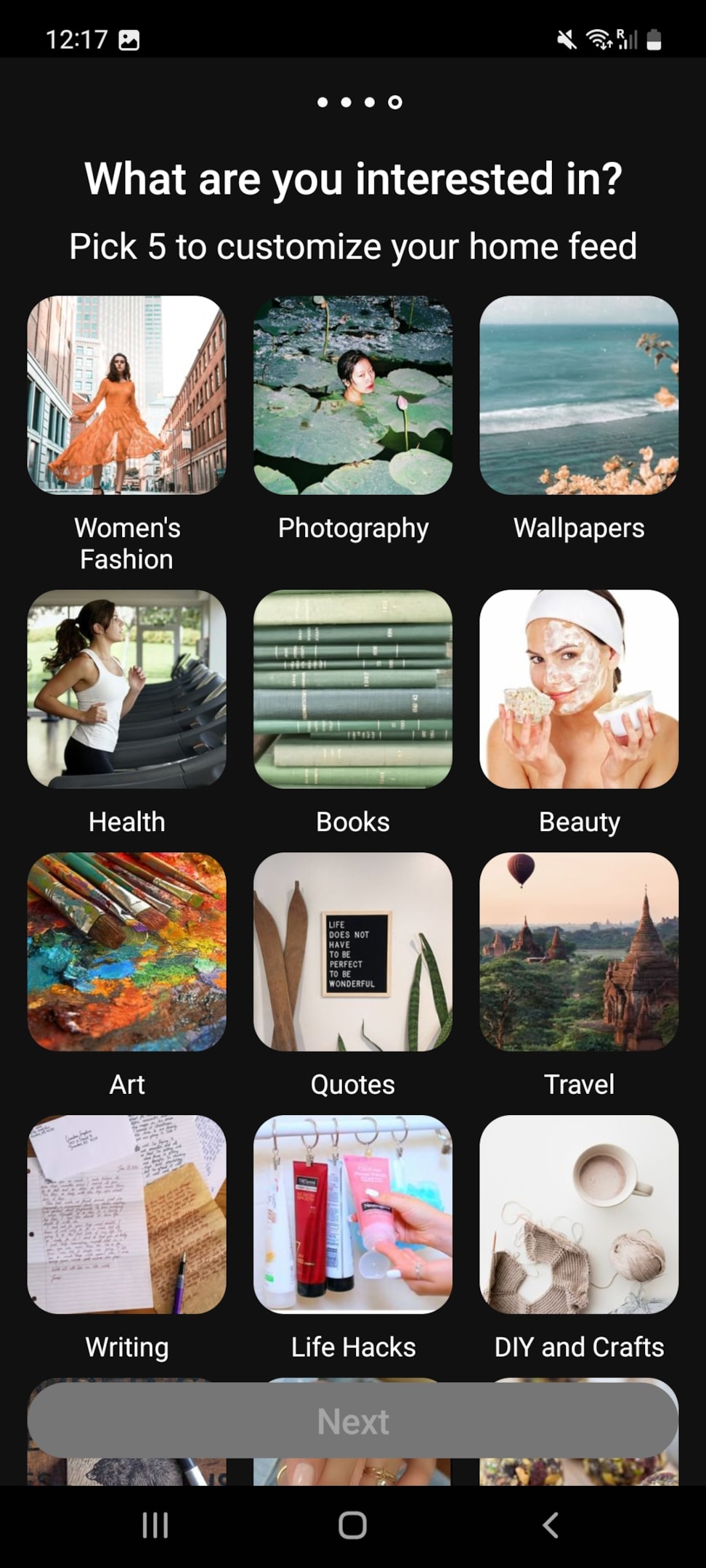
The way the Pinterest app in the following user onboarding flow example asks people to share their interests is one of the most straightforward ways to get to know your users from day one. Not only will you be able to tell what their preferences are, but you'll also get the data you need to actually deliver a personalized in-app product experience.
A good onboarding experience extends beyond the app itself.
Do this by:
Example:
You can use Appcues for combined in-app guidance with out-of-product messaging to create a cohesive onboarding experience. Start with an in-app product tour showing key features and an onboarding checklist that spurs completion.
In case a user exits, Appcues can trigger a follow-up email that sums up what the user has missed and provides an easy way for them to continue. Push notifications remind users to come back, and SMS messages give them an extra little push to engage in your app. This multi-channel approach keeps users open and engaged throughout your onboarding, resulting in higher activation and retention rates.
If users drop off during your mobile onboarding flows, bring them back strategically.
Do this by:
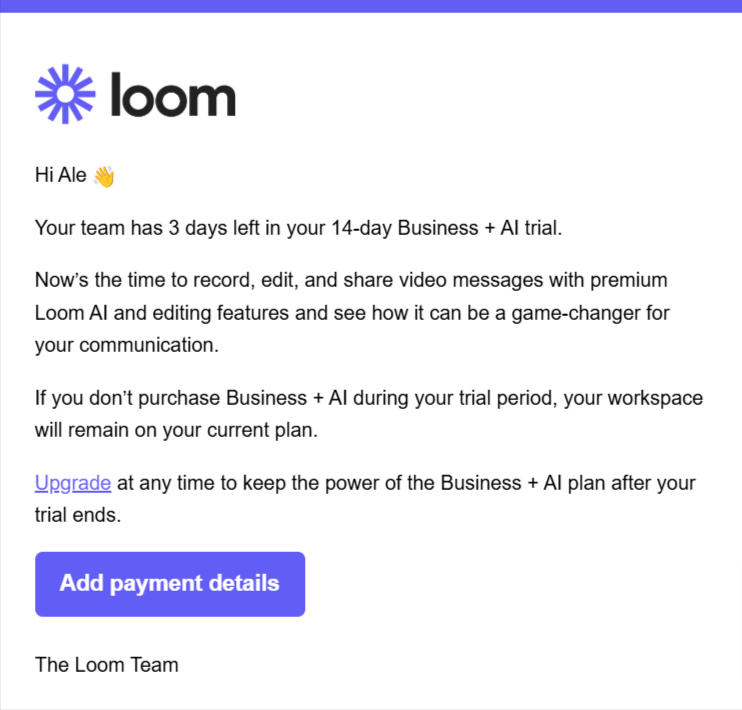
Example:
Loom opts to send regular email reminders if a user's free trial expires. The emails contain details on how users can upgrade to get more features. This is a method you can use if you want to upsell users on a free or lower plan. You can pair this with educational emails containing tips and best practices for using your platform to get them to try out some of your advanced plans.
Users are more likely to grant permissions when they understand why they’re needed.
Do this by:
Example:
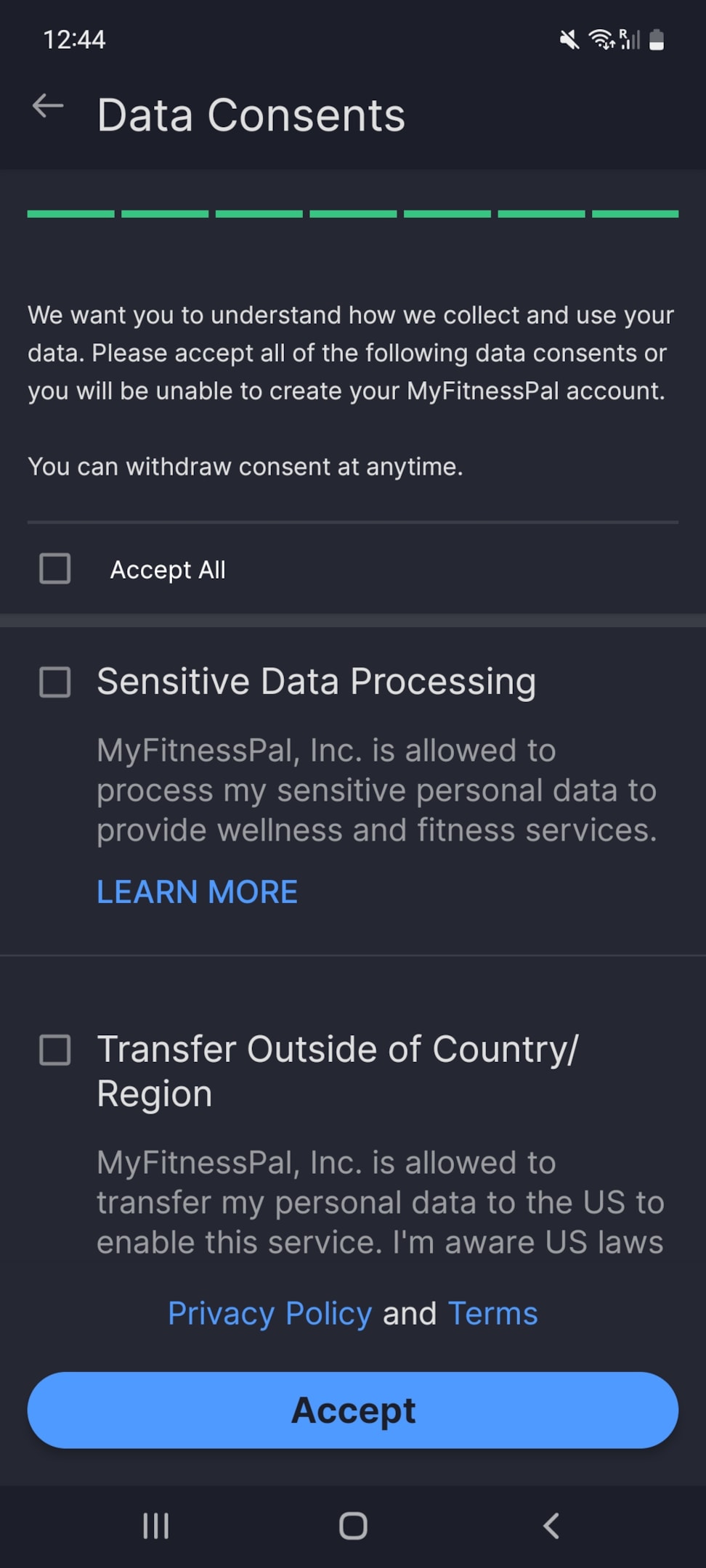
The app onboarding flow in MyFitnessPal has an entire step dedicated to helping users understand how their data is collected, stored, and used. This gives users all the information they need and the opportunity to consent to the app's data policies. They'll subsequently receive in-app notifications/emails whenever these policies change.
Monitor user behavior to refine the onboarding experience.
Do this by:
Example:
Use Appcues to analyze in-app behavior and identify drop-off points in the funnel or optimize for those issues. Conduct A/B testing to compare different onboarding flows and find the most effective one. Further refine messaging strategies to drive user activation using engagement data drawn from your emails, push notifications, and SMS. Continue analyzing user interactions and iterate upon onboarding elements to improve retention.
Ensure onboarding is consistent across web and mobile experiences.
Do this by:
Example:
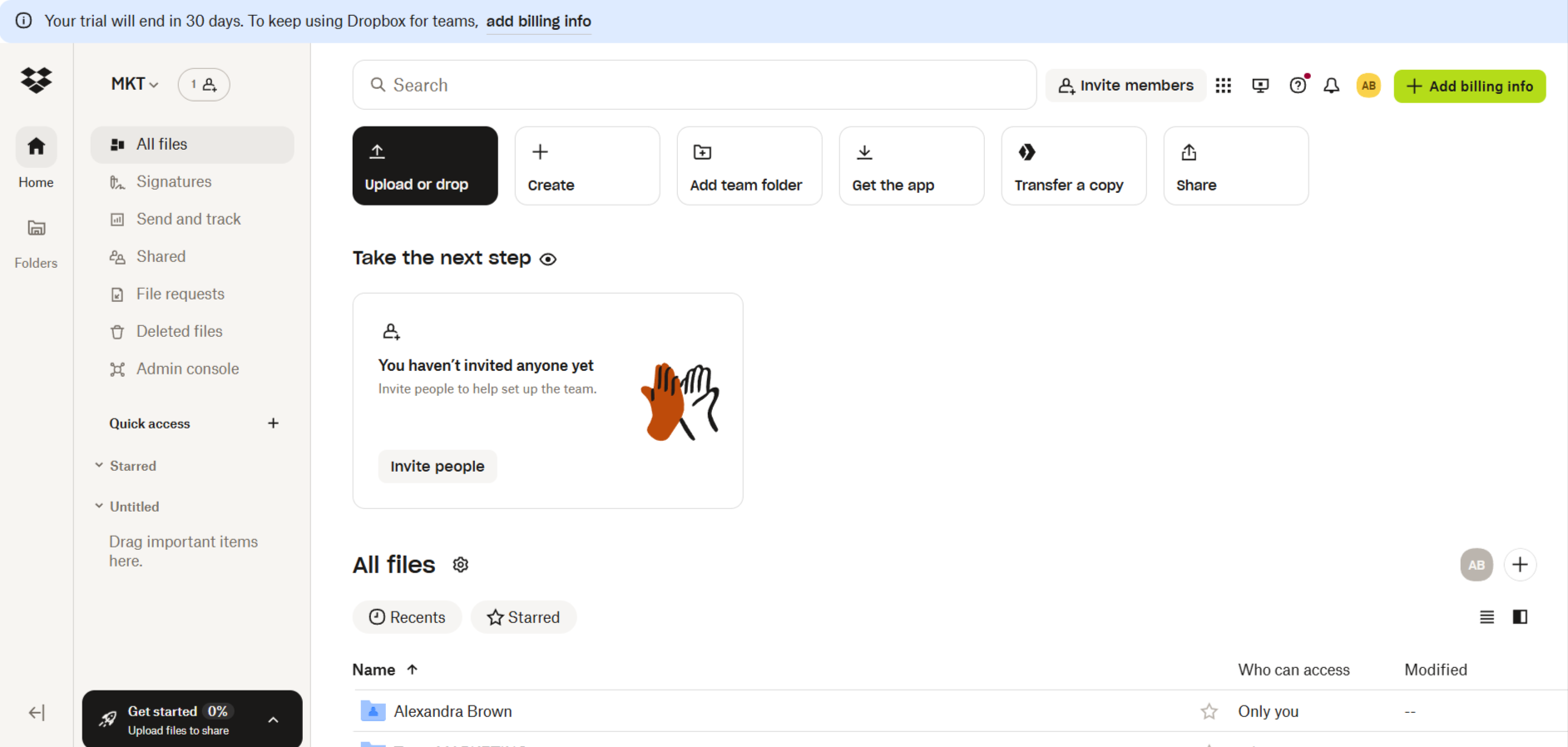
Once you complete the Dropbox app onboarding flow, you'll be prompted to choose what you want to do next in the onboarding process. Without forcing users, one of the highlighted points is getting the mobile app. This ensures people will be able to use the app beyond the mobile app's onboarding journey, no matter what device they choose.
It's also worth noting Dropbox users will have the same experience using the web, desktop, and mobile apps given the platform gives them access to the same functionalities on all platforms.
Mistakes in onboarding can lead to high churn rates.
Some common mistakes include:
Example:
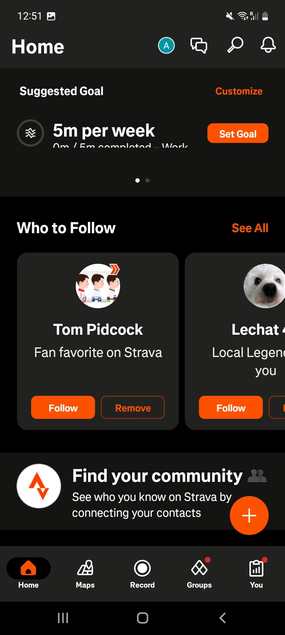
Surprisingly, the Strava app doesn't have an extensive onboarding process that filters users by type. So instead, users are left with a dashboard where they have to manually decide which groups they want to belong to (e.g. running, cycling, hiking), what athletes they want to follow, and so on.
Top apps use smart onboarding to boost retention. Remember Notion’s flexible onboarding? Or Slack’s interactive walkthroughs?
Example:
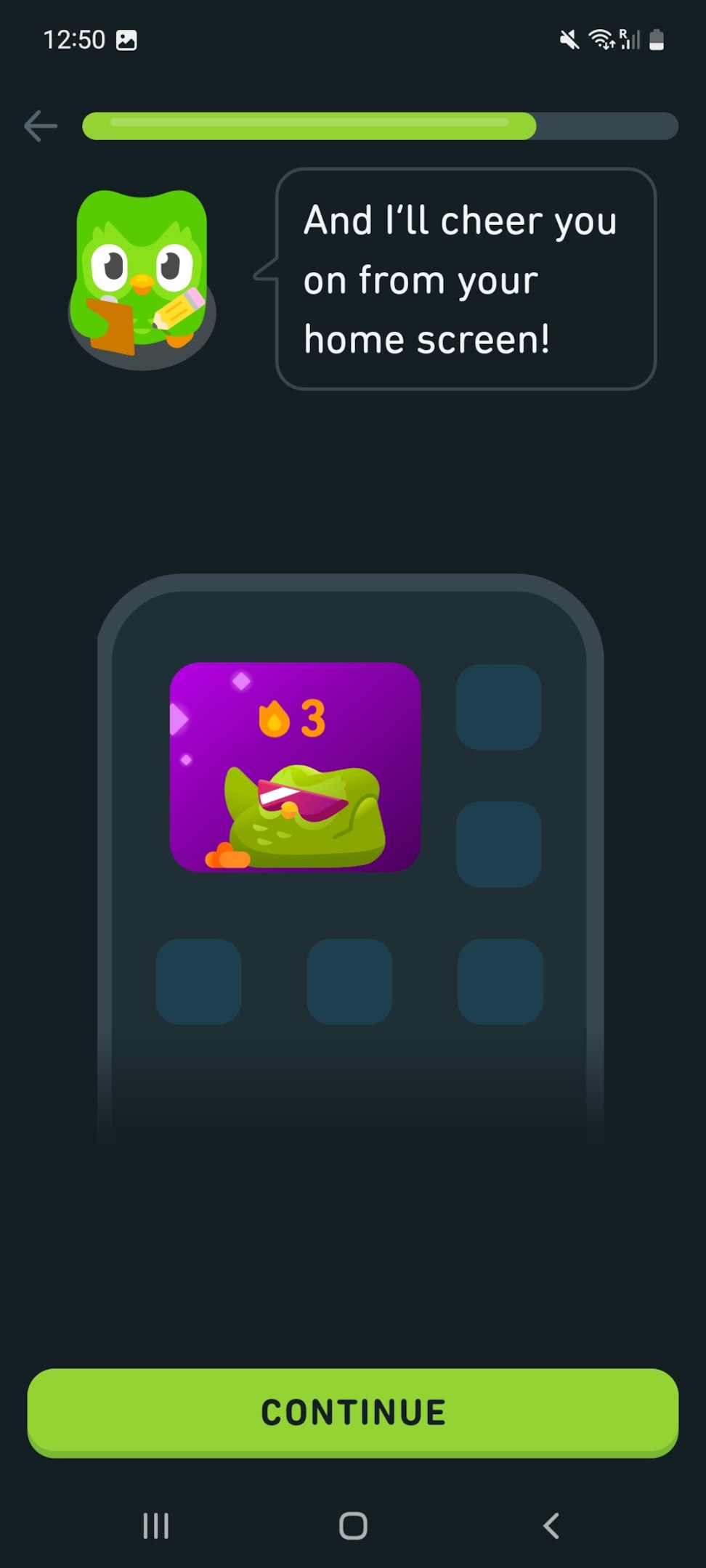
Here's another example of Duolingo’s gamified great onboarding experience. This app onboarding process keeps users engaged with streaks and rewards. They even prompt you to get extra fun add-ons that can support a memorable learning experience as early as the onboarding process.
By cultivating simplicity, interactivity, and engagement, you can turn a new user into an ardent supporter of your app. This is where good onboarding experiences stand out to help you score a lifetime user.
Remember: A smooth and engaging onboarding process is not just about showing users how to use the app; it's about showing them why they should.
A value proposition is presented through the picture of something they just discovered, which will make life easier, more fun, or more productive. That's the "aha!" moment you're looking to score!
The user journey won't just end here, though. Targeted push notifications or helpful emails are very smart ways of using out-of-product messaging to engage the user at a different level.
And the final point: Keep learning and iterating.
Always refine the onboarding process against user data and feedback. As users change, your app's onboarding should stay flexible to provide a welcome mat consistently inviting brand-new users into magic.