6 exceptional examples of mobile-first app UX
.png)

.png)
When's the last time you logged into your bank account on desktop to transfer money to a friend to repay them instead of using an app?
Assuming you're one of the 2.5 billion smartphone users out there, the answer could well be never.
Mobile apps are progressively becoming the new “first experience” for the majority of users. For many software companies, this has meant a massive change in the way they design their user experiences. In fact, many product leaders are choosing to forgo desktop versions altogether, building their business around the unique capabilities provided by mobile.
Companies are starting to realize that providing good mobile UX is vital to their business's success. Historically, software products have been designed first with desktop users in mind, then translated to mobile—an approach that led to mobile apps often feeling more like an afterthought than a polished product.
These days, though, more and more users are looking to mobile apps first and foremost to complete basic tasks like transferring money or ordering takeout. Companies (both B2B and B2C alike) are starting to capitalize on the fact that users' phones are often within arm's reach at all times. Product-led companies are taking advantage of the always-on mobile interface to create unique apps and user experiences that simply cannot be replicated on desktop.
Designing for mobile comes with plenty of unique challenges and constraints. But the opportunity to build creative and impactful experiences that users take with them on the go is well worth the extra lift.
Many of the apps below provide a mobile experience so good, the desktop version of the product is irrelevant. More and more companies are already making the move from mobile-first to mobile-only, choosing to forgo a desktop experience at all. It's these cutting-edge mobile user experiences that other software companies can learn from as they start their own journey into the mobile space, from product creation to onboarding their users.
Below, we’ve highlighted 6 of the best examples of mobile-first user experiences, along with key takeaways you can apply to your own product.
Developing for mobile devices first doesn't mean you need to limit functionality. Yes, features like user onboarding should often be simplified to account for the unique constraints that come with smaller devices. But apps like Nest prove that simple doesn't always mean limited.
.jpeg)
.jpeg)
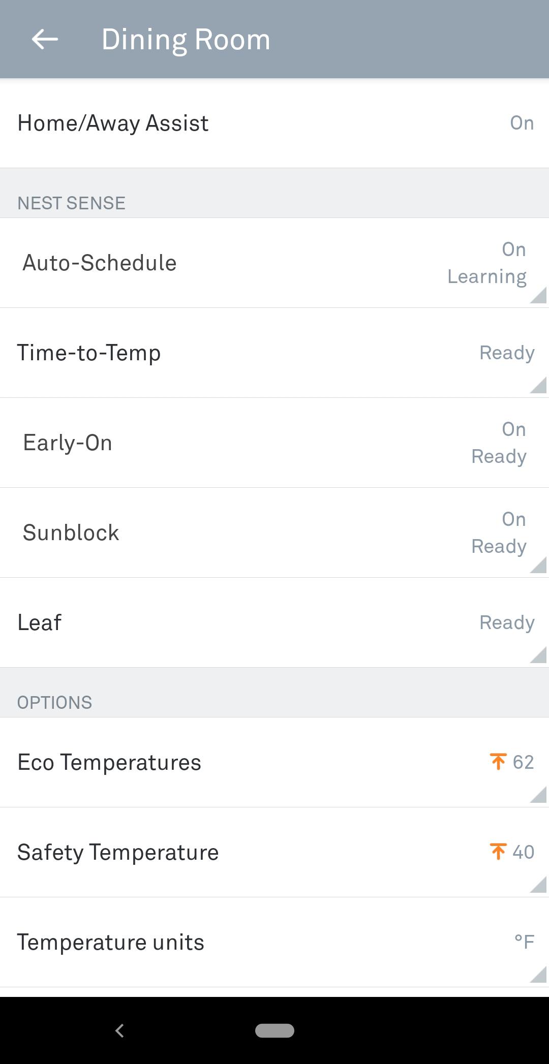
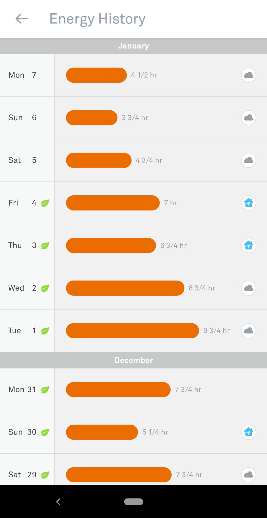
The Nest app gives users all the functionality they need to manage the security and comfort of their home from anywhere in the world. It's frequently easier to access the dozens of features using the phone screen than using the dial interface on the thermostat itself.
Key takeaways from Nest: When developing a mobile user experience, don't start by just thinking about all the features you could remove from the desktop version. Instead, consider how you can build the most valuable experience possible on mobile. If you do end up creating a desktop version, features will be easier to scale up.
The always-on nature of mobile devices opens up new opportunities for communication. Users are much more likely to pay attention to incoming notifications on their phone than on their desktop.
Coinbase takes advantage of these rapid alerts with their mobile cryptocurrency trading app. Cryptocurrencies like Bitcoin are highly volatile and prone to rapid fluctuations in value. Some have experienced drops in value of over 70% in only 3 days. Investors need to react quickly if drops like this occur, so Coinbase's mobile app makes it easy to set up customizable price alerts that are immediately pushed to users' phones.
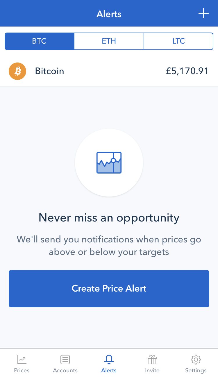


These mobile-only notifications ensure that investors never miss an opportunity, reducing the risk associated with investing in cryptocurrencies and providing a better experience for users.
Key takeaways from Coinbase: Use the unique capabilities of mobile devices—like always-on communication—to create user experiences that cannot be matched on desktop.
Remote workers, freelancers, and solo entrepreneurs frequently need a quiet space to work or hold meetings—but they often don't want to commit to a monthly coworking membership. Or perhaps they're traveling and only need the space for a few hours between the hotel and the airport.
Breather's mobile app solves this problem by allowing users to both book and access remote workspaces from their smartphone. Breather has seamlessly integrated their mobile app into the overall user experience of the service, allowing users to instantly book and use a space within minutes.
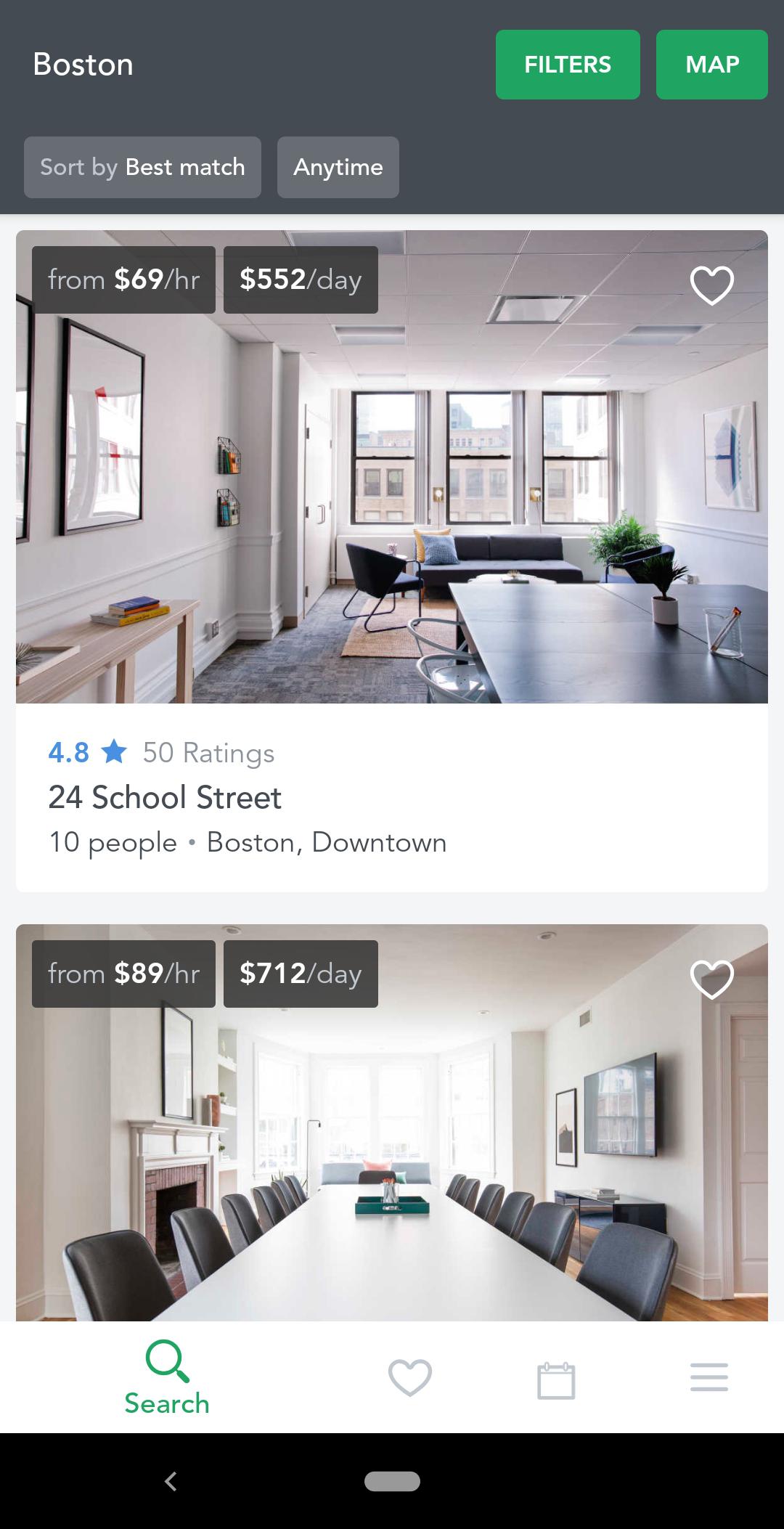
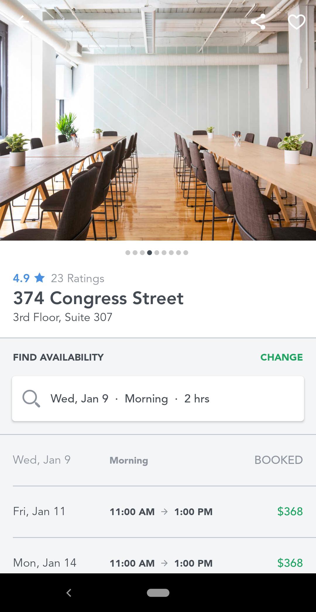
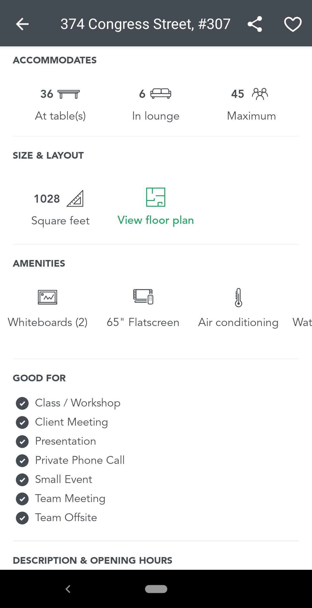
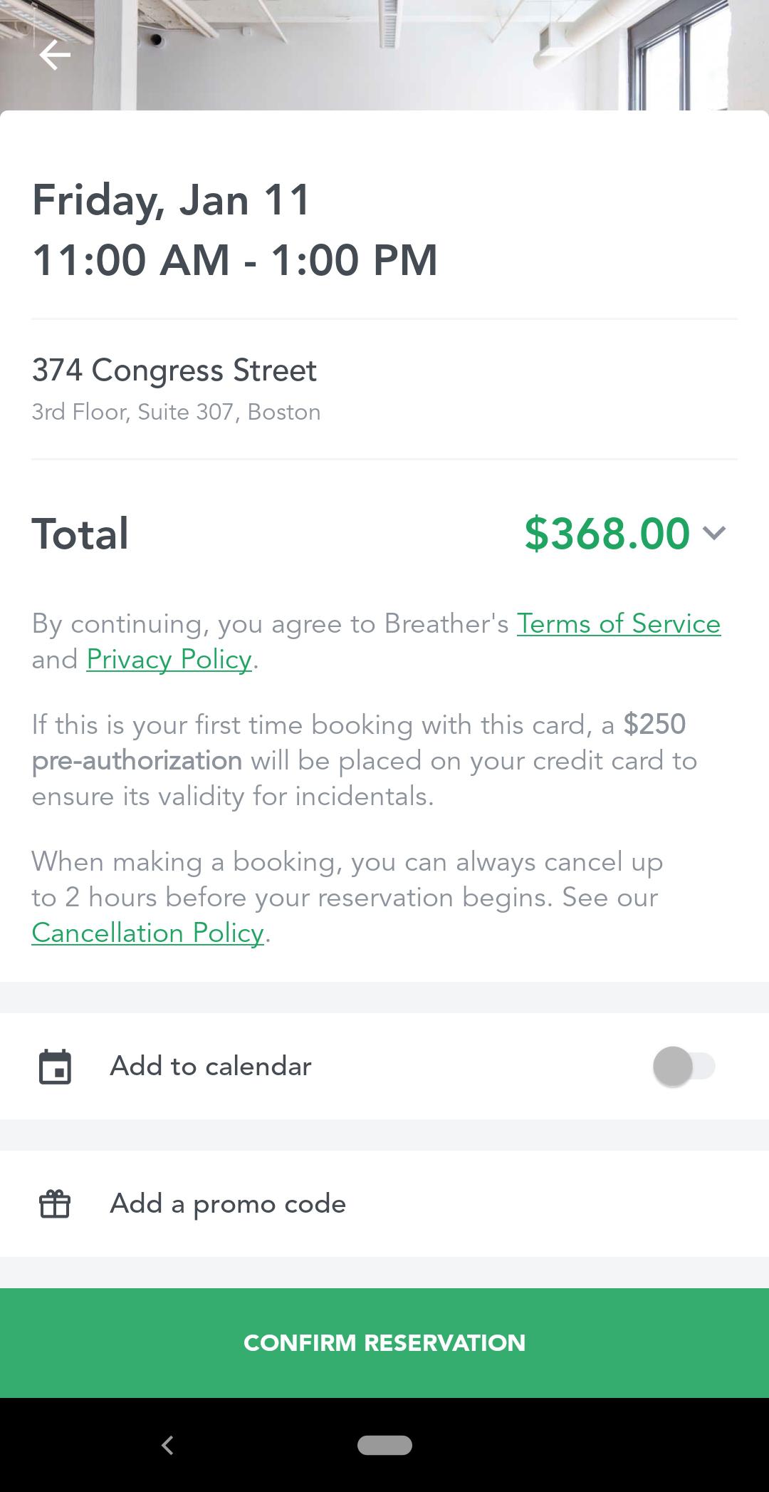
Key takeaways from Breather: By designing your service interface app for mobile, then extending the functionality to desktop, you can provide a more unified and standardized experience for users regardless of where they are.
For some people—like visually impaired users, for instance—mobile devices can provide a unique user experience that helps them live more independently. Higher-quality cameras and increased computing power have enabled companies like Envision to greatly improve the lives of blind and low-vision users.
Envision's mobile app strips away nearly the entire user interface while continuing to provide a unique user experience. The app instantly recognizes text on menus, signs, price tags, and more, reading it as audio in real-time. Users can also “teach” the app to recognize people and items as well as understand the context within a scene and provide the right information in straightforward language.
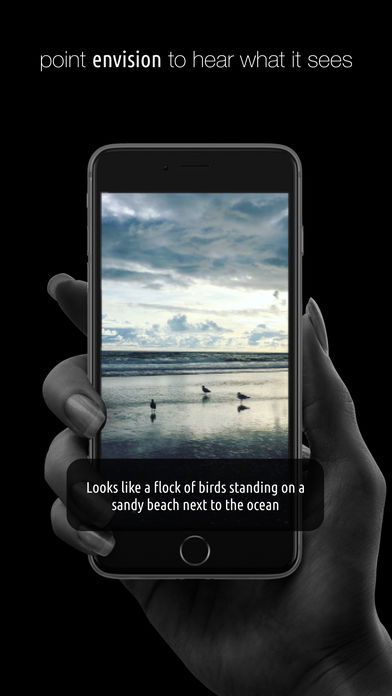
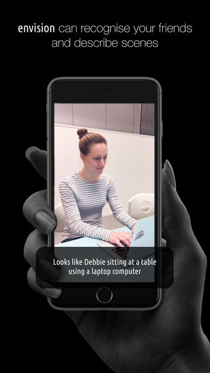
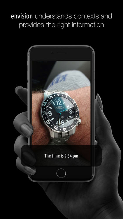
Key takeaways from Envision: In some unique cases, eliminating the user interface entirely can actually make for a better mobile user experience.
Aircraft manufacturers have traditionally marketed only to airlines, but these companies are beginning to see the value in extending their marketing efforts directly to consumers as well. By creating mobile apps to help customers get more out of their journey, Airbus is taking advantage of the unique capabilities of mobile to make the UX of travel more enjoyable.
The iflyA380 app uses the unique functionality available on mobile to provide a totally distinctive experience for travelers on the A380 aircraft. Users can explore the cabin in augmented reality as they travel, learn about the features of the aircraft, virtually visit the cockpit and lounges, and even track locations as they pass by outside the window.



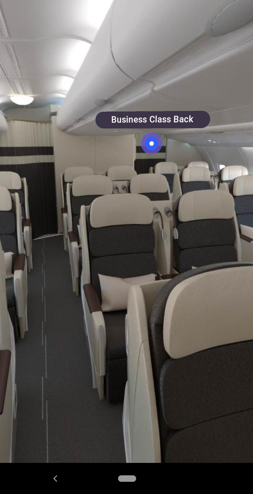
Key takeaways from iflyA380: Don't forget that the user experience often extends beyond the screen—mobile apps offer a great opportunity to improve user experience at every customer touchpoint.
One of the biggest barriers to starting a podcast is purchasing the right recording equipment. Bulky mixers and expensive microphones often lead to potential podcasters delaying their project until they can afford the “right” equipment—or scrapping the idea altogether.
Anchor solves this problem in a unique way, combining the best elements of both their mobile and desktop apps to create a simple podcasting solution that lets users get started quickly, and with little overhead.
Users can use the Anchor app as a mobile recording and creation interface, making it easy to get the audio they need without purchasing expensive equipment. The intelligent app begins recording audio automatically when they hold the phone up to their ear and stops when they remove the phone—a fairly foolproof system, even for novices. And the mobile app also integrates seamlessly with the web app for finalizing and publishing the podcast.
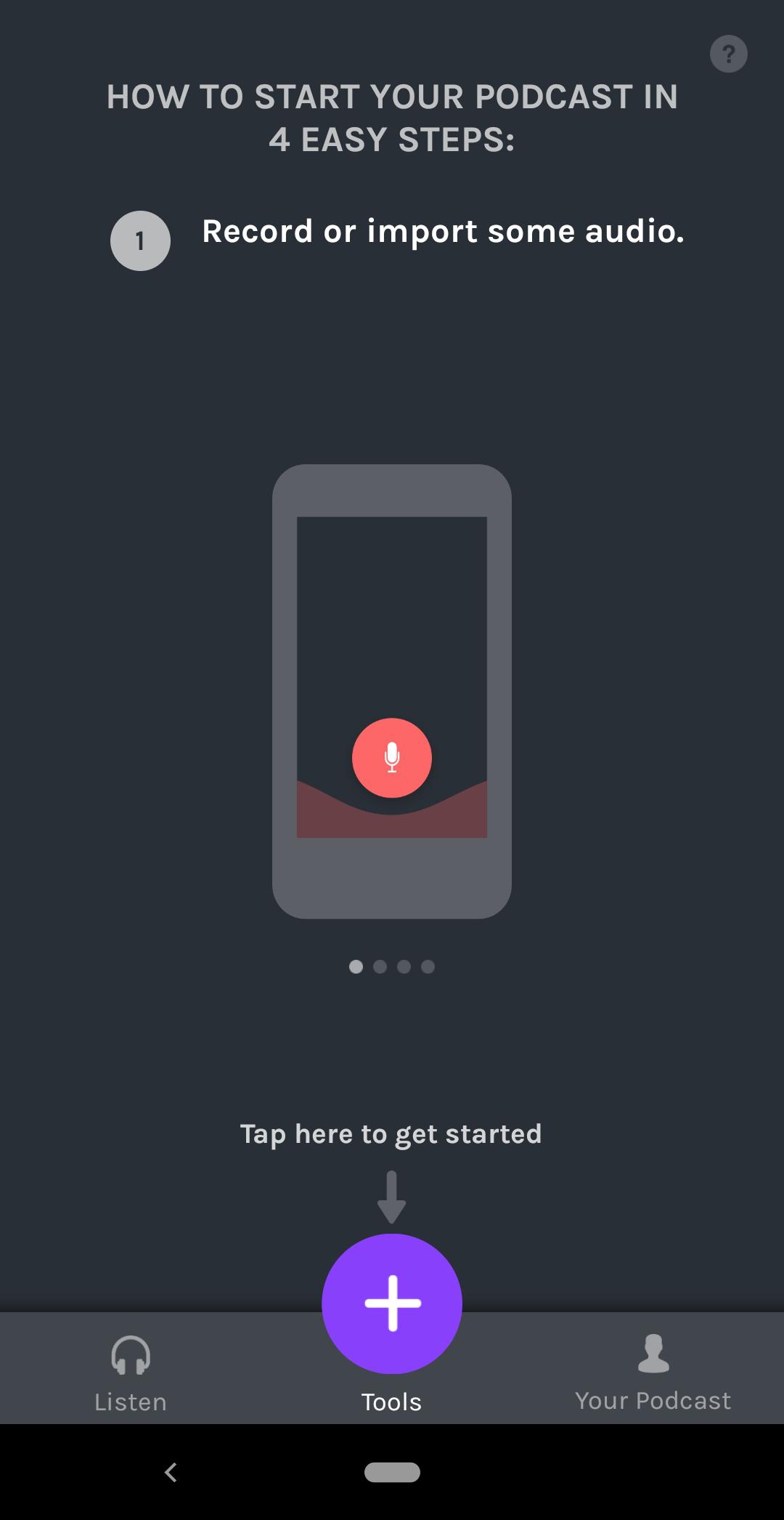
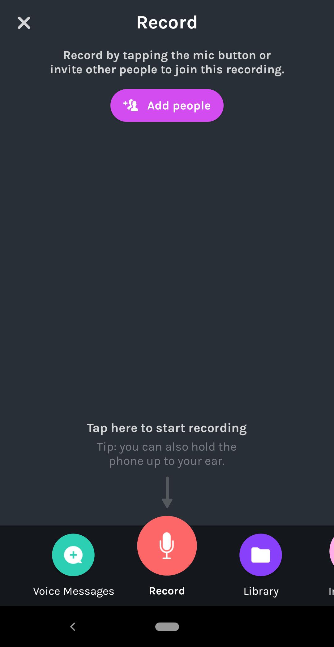
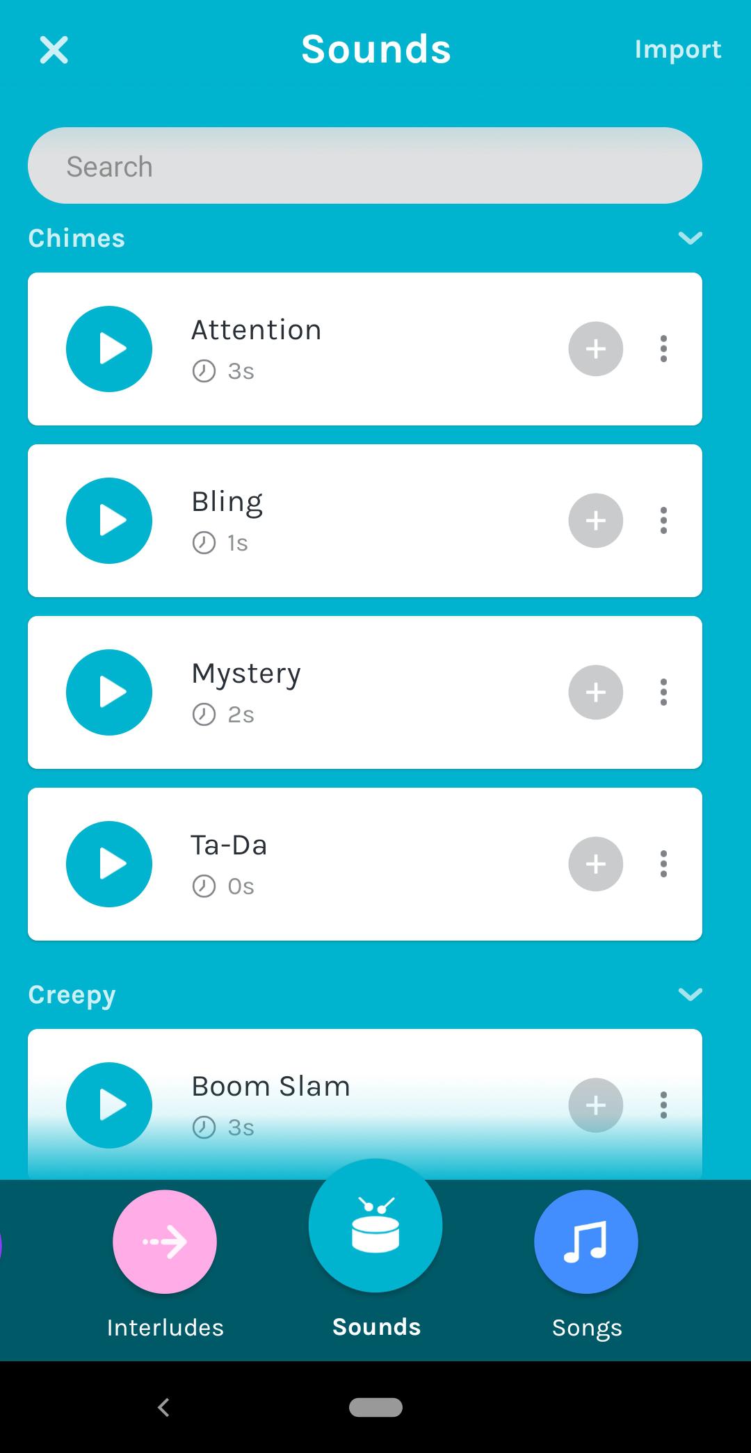
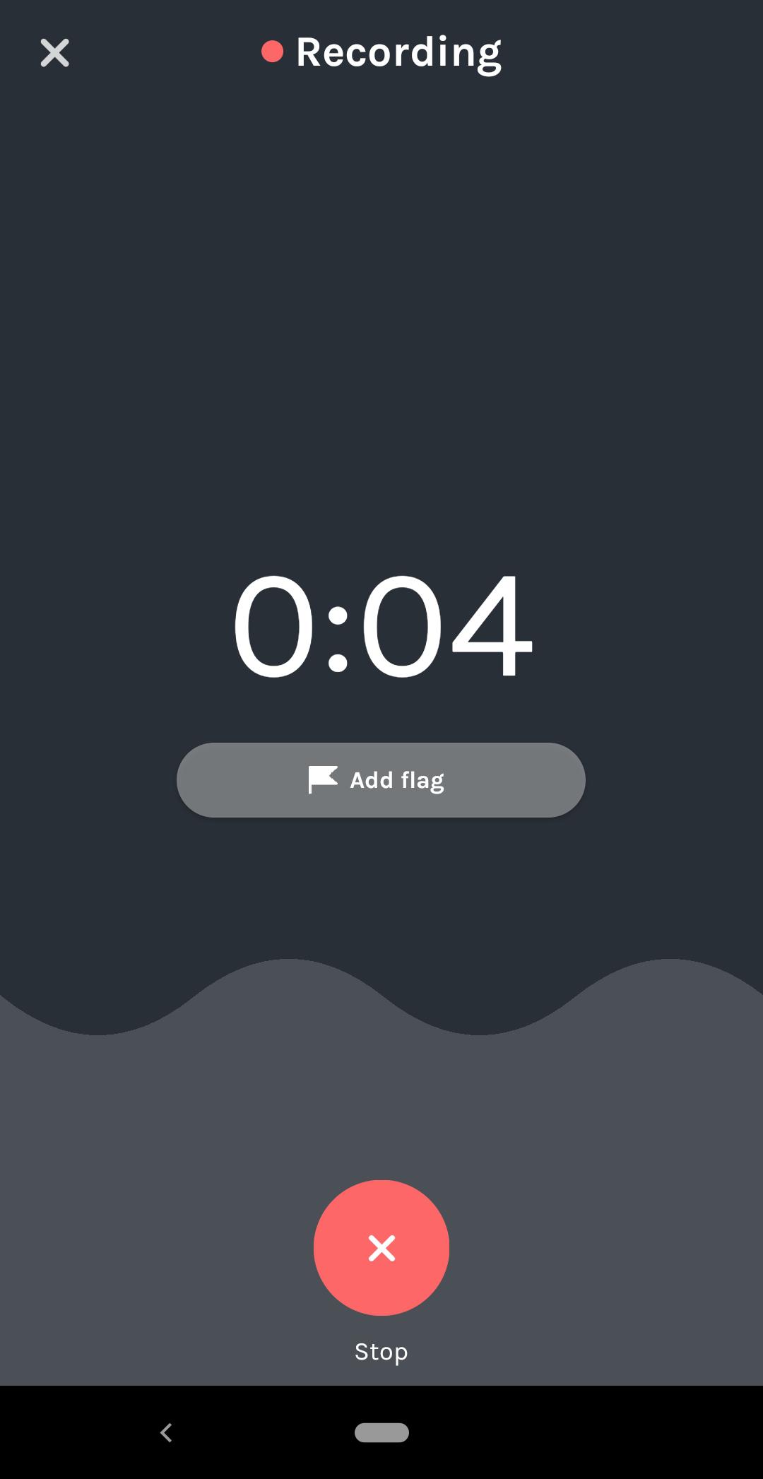
Key takeaways from Anchor: Not every piece of your app has to translate to mobile—you get to pick and choose the right features to utilize. You can often create a better UX by combining the best elements of both desktop and mobile into a unified solution, rather than looking for both formats to do all the same things.
The lines between mobile and desktop apps are increasingly blurred. Users expect a seamless UX across devices—otherwise, what’s the point of downloading multiple versions of the same product?
You should always start by understanding the needs of your users first. Then you can ask yourself: How does a mobile experience lend itself to solving those needs? How might that solution translate back to desktop? And how can it all work together to create a delightful UX that helps users get where they need to go, faster.