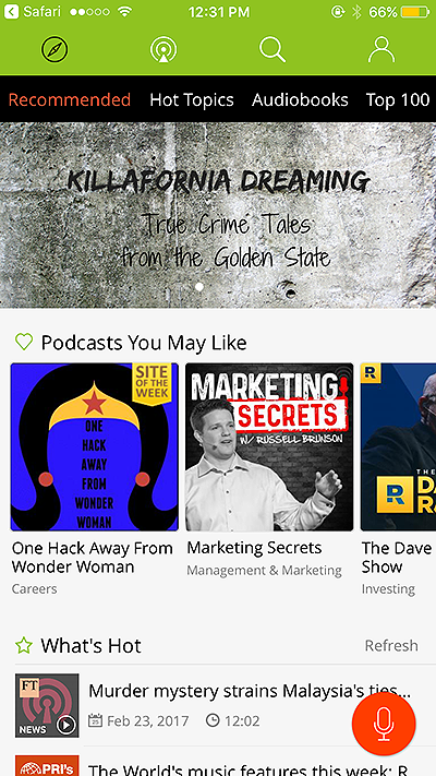
← Visit Appcues.com
×
×

Mobile app onboarding: 4 ideas for nudging new users to take action

Few moments matter more to an app’s success than onboarding: the process of orienting new users to your product and helping them achieve...
Skip to section:

Skip to section:

Few things matter more to an app’s success than user onboarding: the process of orienting new users to your product and helping them achieve value as soon as possible. However, we’ve all gone through labyrinthine onboarding that causes us to quit.

Efficient onboarding is a key part of good UX, especially since new users do care whether the experience is quick and painless. My company Clutch, a B2B research firm that helps businesses find software providers, and I surveyed 501 mobile device users to figure out what people want to see and do in those make-it-or-break-it first minutes inside an app.

Here’s what we found: 72% of respondents said that providing all required information in less than 60 seconds was somewhat to very important.

These stats mean that app developers and UX designers are competing against a ticking clock. They only have a minute or so to get new users inside their app and excited about using it.

The secret to making users stay? Getting the value proposition across as soon as possible.

The value proposition is what an app can do for its users. It’s not the features themselves, but what those features make possible. Uber and Lyft make transportation easy; Venmo lets users split checks without a headache. User onboarding is the first and most important time to make sure your app’s value proposition is as clear as possible, so don’t overlook the opportunity to win over users.

Here are four best practices for communicating your app’s value from the start. With successful execution of these tactics, you may even be able to onboard mobile users in under a minute.  

1. Give users an empty state to fill up

People like to make their mark on empty spaces, and not just those inside apps.

“Painters such as Bosch, Brueghel, and Duvet showed this need to fill up the ‘design space’ with elements — people, animals, buildings, trees, etc. They made busyness their business!” writes Mads Soegaard for the Interaction Design Foundation.

Look at Bosch’s “The Garden of Earthly Delights,” for example.

Bosch garden empty state

Just like Bosch, who filled up every corner of this space, your users will take advantage of your app’s features to fill the white space you give them.

Consider the breakout app Sarahah, which allows users to receive anonymous messages about themselves. It began as a way for employees to tell their managers how they could improve without fear of reprisal, but now it’s evolved into a burgeoning social network. Sarahah has recently topped the App Store charts.

After I signed up, I was taken to a screen that was empty except for a single number: 0. I had no messages. I’ll be honest: That made me wish I did have something in my inbox.
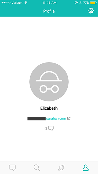
Sarahah mobile onboarding loading screen

The design seemed almost too minimalist—what was I supposed to do at this point? Cajole people into messaging me?—but the page did send a strong message.

I tapped on the number 0, which took me to this screen. I was supposed to persuade people to message me! Another empty page gave me a strong indication of how it would be filled if I invited my friends to join Sarahah.
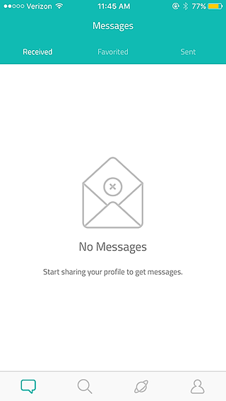
Sarahah mobile onboarding empty state

Although Sarahah only has one feature (messaging) and is still in its infancy, it uses empty space to its advantage. Sarahah serves as an example of how to guide users with an absence of instruction rather than too much instruction.

2. Let users test drive the app before sign-up

Another way to get new users excited right off the bat is to let them experience your app before you ask them to register.

As the value proposition is all about ‘show, don’t tell,’ show your users what an app can do, don’t tell them. Allow people to give some of your features a try. Once they can interact with your app, they’ll know what your app actually does for them, not just what it promises to do.

In Clutch’s survey, we asked respondents to tell us why they’d downloaded an app. The top reasons included: 

  • Fun/entertainment (44%)
  • Accessing products/services (23%)
  • Staying updated on information (10%)
  • Connecting with friends/family (9%)
  • Professional/work reasons (6%)

Think about which of these categories your app falls into, then consider how to prove that your app provides entertainment, social networking, or the latest news. Focus on the features which bring that message home and let users try those features during onboarding. 

The audio entertainment platform Audible, for example, gives users both fun and products. People pay for audiobooks, which they can then listen to anywhere. The app plays to its users’ desires by showing off its capabilities for free.

When I downloaded Audible, I was presented with a welcome screen that let me tap ‘get started’ before I had to turn over any information.

audible mobile onboarding welcome

Aside from a single (well-explained!) permission request to access my other audio books, the app wasn’t arm-wrestling me into giving personal data before I was ready. I didn’t have to sign up for an account or enter my credit card information.

Audible runs on a monthly subscription model, but it gave me an opportunity to start a trial.
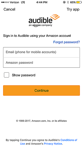
audible-mobile-onboarding-welcome-try-app.png

‘Try App’? Intriguing. I tapped that option.
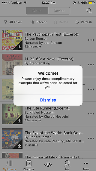
audible-mobile-onboarding-welcome-screen.png

Free audiobooks? Don’t mind if I do.

In less than a minute, I was listening to The Girl with the Dragon Tattoo. According to the audio player, I had 45 minutes of audio left before my trial ended – enough to last me a few days of commuting.

Audible let me experience the app’s main draw—quality, easy-to-access audiobooks—without promising anything I wasn’t ready to give. After 45 minutes of free audio, plenty of listeners will be persuaded to sign up for a monthly program. 

Consider your own app. If you were a user, what would impress you into keeping the application? Factor those features into your onboarding.

3. Master one feature before attempting to over-delight

Regardless of whether or not you let users try a feature for free, getting inside your app should still be easy and intuitive.

Include too much ‘gift wrapping,’ like extraneous copy, distracting graphics, and unnecessary forms, and users will lose interest. You want to wow them, but don’t put on a firework display so bright your users forget what they’re looking at.

In our survey, over 40% of respondents said that filling out forms with their personal information was slightly to very frustrating. Don’t give users a reason to jump ship at the very beginning because they’re frustrated! Sometimes, you can get away without asking for anything at all.

Consider Shazam, which lets people identify the name and artist of songs they hear anywhere. That’s its only major feature, though it can perform a few other helpful tasks. For example, once Shazam has identified a song, users can tap on buttons that let them buy or listen to the song elsewhere.

I put Shazam to the test by having it guess a random song my coworker played on Spotify.
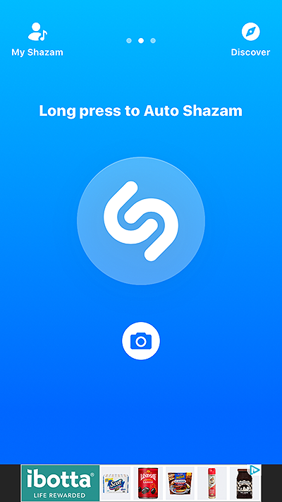
Shazam-onboarding.png

Upon opening, the interface showed a single call to action: hold down a button to make the app identify a tune. 

I pressed it, and…
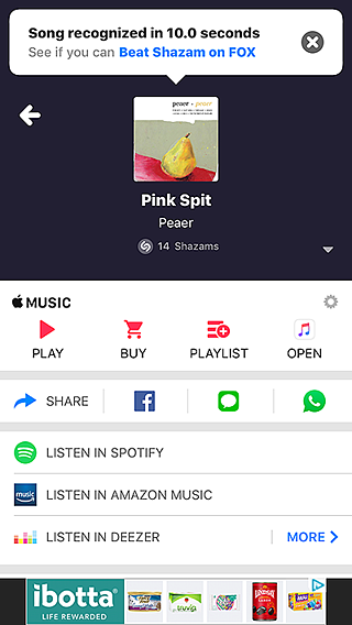
Shazan-onboarding-tooltip.png

Voila! Ten seconds later, I had the information I needed: Jack was playing “Pink Spit” by Peaer.

Sure, the interface on the discovery screen is a little crowded. Sure, the banner ads are slightly annoying. But Shazam never made me register or sign up. It didn’t ask me for anything. It got right down to business and proved its value in ten seconds.

I’ll take the banner ads if it means an app is this easy to use.

3. Encourage users to personalize their experience

When an app shows new users other people’s activity, those users can become inspired to investigate. What can the app do? What have other people done with it so far?

This technique works especially well for apps that allow users to upload audio files, images, and stories of any kind. During the onboarding experience, Tumblr displays art its users have submitted. New users are asked to choose topics they’re interested in, and Tumblr displays popular accounts tagged with that topic. Tumblr’s onboarding demonstrates value while users are making profiles.

Podbean is another mobile application that allows users to poke around, taking advantage of the sheer variety of podcasts the app offers.

When I opened Podbean for the first time, I was pleasantly surprised by how little information I had to give before I could genre-hop with abandon. All the app asked me for was an email address and password (and push notification permission, which was annoying, but I could handle that).

Once I’d completed that simple signup, the app asked me about my favorite types of podcasts.
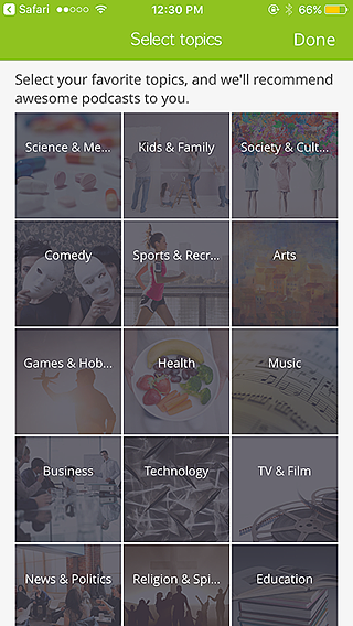
Podbean-mobile-onboarding-personalization.png

Easy enough. I tapped ‘Business.’

Podbean-mobile-onboarding-browse.png

Podbean presented me with a treasure trove of business-related podcasts, all of which I could listen and subscribe to. 

It took less than fifteen seconds for me to get inside the app and browse its entire podcast library. Podbean’s value became clear right away, since the app gave me some pointers on what it thought I might like and then let me take the reins.

Lay your cards on the (onboarding) table

When it comes to presenting your value proposition during mobile app onboarding, there’s no need to hide the aspects that make your app unique.  After all, according to my survey respondents, people don’t want to waste time and prefer short onboarding experiences.

By taking advantage of blank space, keeping your app simple, and letting users browse and/or try features, you can make the most of the time you have. Show your users the difference your app can make in their lives, and they’re much more likely to return day after day.

Author's picture
Elizabeth Ballou
Content Developer, Writer, Essayist
Skip to section:

Skip to section:

Few things matter more to an app’s success than user onboarding: the process of orienting new users to your product and helping them achieve value as soon as possible. However, we’ve all gone through labyrinthine onboarding that causes us to quit.

Efficient onboarding is a key part of good UX, especially since new users do care whether the experience is quick and painless. My company Clutch, a B2B research firm that helps businesses find software providers, and I surveyed 501 mobile device users to figure out what people want to see and do in those make-it-or-break-it first minutes inside an app.

Here’s what we found: 72% of respondents said that providing all required information in less than 60 seconds was somewhat to very important.

These stats mean that app developers and UX designers are competing against a ticking clock. They only have a minute or so to get new users inside their app and excited about using it.

The secret to making users stay? Getting the value proposition across as soon as possible.

The value proposition is what an app can do for its users. It’s not the features themselves, but what those features make possible. Uber and Lyft make transportation easy; Venmo lets users split checks without a headache. User onboarding is the first and most important time to make sure your app’s value proposition is as clear as possible, so don’t overlook the opportunity to win over users.

Here are four best practices for communicating your app’s value from the start. With successful execution of these tactics, you may even be able to onboard mobile users in under a minute.  

1. Give users an empty state to fill up

People like to make their mark on empty spaces, and not just those inside apps.

“Painters such as Bosch, Brueghel, and Duvet showed this need to fill up the ‘design space’ with elements — people, animals, buildings, trees, etc. They made busyness their business!” writes Mads Soegaard for the Interaction Design Foundation.

Look at Bosch’s “The Garden of Earthly Delights,” for example.

Bosch garden empty state

Just like Bosch, who filled up every corner of this space, your users will take advantage of your app’s features to fill the white space you give them.

Consider the breakout app Sarahah, which allows users to receive anonymous messages about themselves. It began as a way for employees to tell their managers how they could improve without fear of reprisal, but now it’s evolved into a burgeoning social network. Sarahah has recently topped the App Store charts.

After I signed up, I was taken to a screen that was empty except for a single number: 0. I had no messages. I’ll be honest: That made me wish I did have something in my inbox.

Sarahah mobile onboarding loading screen

The design seemed almost too minimalist—what was I supposed to do at this point? Cajole people into messaging me?—but the page did send a strong message.

I tapped on the number 0, which took me to this screen. I was supposed to persuade people to message me! Another empty page gave me a strong indication of how it would be filled if I invited my friends to join Sarahah.

Sarahah mobile onboarding empty state

Although Sarahah only has one feature (messaging) and is still in its infancy, it uses empty space to its advantage. Sarahah serves as an example of how to guide users with an absence of instruction rather than too much instruction.

2. Let users test drive the app before sign-up

Another way to get new users excited right off the bat is to let them experience your app before you ask them to register.

As the value proposition is all about ‘show, don’t tell,’ show your users what an app can do, don’t tell them. Allow people to give some of your features a try. Once they can interact with your app, they’ll know what your app actually does for them, not just what it promises to do.

In Clutch’s survey, we asked respondents to tell us why they’d downloaded an app. The top reasons included: 

  • Fun/entertainment (44%)
  • Accessing products/services (23%)
  • Staying updated on information (10%)
  • Connecting with friends/family (9%)
  • Professional/work reasons (6%)

Think about which of these categories your app falls into, then consider how to prove that your app provides entertainment, social networking, or the latest news. Focus on the features which bring that message home and let users try those features during onboarding. 

The audio entertainment platform Audible, for example, gives users both fun and products. People pay for audiobooks, which they can then listen to anywhere. The app plays to its users’ desires by showing off its capabilities for free.

When I downloaded Audible, I was presented with a welcome screen that let me tap ‘get started’ before I had to turn over any information.

audible mobile onboarding welcome

Aside from a single (well-explained!) permission request to access my other audio books, the app wasn’t arm-wrestling me into giving personal data before I was ready. I didn’t have to sign up for an account or enter my credit card information.

Audible runs on a monthly subscription model, but it gave me an opportunity to start a trial.

audible-mobile-onboarding-welcome-try-app.png

‘Try App’? Intriguing. I tapped that option.

audible-mobile-onboarding-welcome-screen.png

Free audiobooks? Don’t mind if I do.

In less than a minute, I was listening to The Girl with the Dragon Tattoo. According to the audio player, I had 45 minutes of audio left before my trial ended – enough to last me a few days of commuting.

Audible let me experience the app’s main draw—quality, easy-to-access audiobooks—without promising anything I wasn’t ready to give. After 45 minutes of free audio, plenty of listeners will be persuaded to sign up for a monthly program. 

Consider your own app. If you were a user, what would impress you into keeping the application? Factor those features into your onboarding.

3. Master one feature before attempting to over-delight

Regardless of whether or not you let users try a feature for free, getting inside your app should still be easy and intuitive.

Include too much ‘gift wrapping,’ like extraneous copy, distracting graphics, and unnecessary forms, and users will lose interest. You want to wow them, but don’t put on a firework display so bright your users forget what they’re looking at.

In our survey, over 40% of respondents said that filling out forms with their personal information was slightly to very frustrating. Don’t give users a reason to jump ship at the very beginning because they’re frustrated! Sometimes, you can get away without asking for anything at all.

Consider Shazam, which lets people identify the name and artist of songs they hear anywhere. That’s its only major feature, though it can perform a few other helpful tasks. For example, once Shazam has identified a song, users can tap on buttons that let them buy or listen to the song elsewhere.

I put Shazam to the test by having it guess a random song my coworker played on Spotify.

Shazam-onboarding.png

Upon opening, the interface showed a single call to action: hold down a button to make the app identify a tune. 

I pressed it, and…

Shazan-onboarding-tooltip.png

Voila! Ten seconds later, I had the information I needed: Jack was playing “Pink Spit” by Peaer.

Sure, the interface on the discovery screen is a little crowded. Sure, the banner ads are slightly annoying. But Shazam never made me register or sign up. It didn’t ask me for anything. It got right down to business and proved its value in ten seconds.

I’ll take the banner ads if it means an app is this easy to use.

3. Encourage users to personalize their experience

When an app shows new users other people’s activity, those users can become inspired to investigate. What can the app do? What have other people done with it so far?

This technique works especially well for apps that allow users to upload audio files, images, and stories of any kind. During the onboarding experience, Tumblr displays art its users have submitted. New users are asked to choose topics they’re interested in, and Tumblr displays popular accounts tagged with that topic. Tumblr’s onboarding demonstrates value while users are making profiles.

Podbean is another mobile application that allows users to poke around, taking advantage of the sheer variety of podcasts the app offers.

When I opened Podbean for the first time, I was pleasantly surprised by how little information I had to give before I could genre-hop with abandon. All the app asked me for was an email address and password (and push notification permission, which was annoying, but I could handle that).

Once I’d completed that simple signup, the app asked me about my favorite types of podcasts.

Podbean-mobile-onboarding-personalization.png

Easy enough. I tapped ‘Business.’

Podbean-mobile-onboarding-browse.png

Podbean presented me with a treasure trove of business-related podcasts, all of which I could listen and subscribe to. 

It took less than fifteen seconds for me to get inside the app and browse its entire podcast library. Podbean’s value became clear right away, since the app gave me some pointers on what it thought I might like and then let me take the reins.

Lay your cards on the (onboarding) table

When it comes to presenting your value proposition during mobile app onboarding, there’s no need to hide the aspects that make your app unique.  After all, according to my survey respondents, people don’t want to waste time and prefer short onboarding experiences.

By taking advantage of blank space, keeping your app simple, and letting users browse and/or try features, you can make the most of the time you have. Show your users the difference your app can make in their lives, and they’re much more likely to return day after day.

Author's picture
Elizabeth Ballou
Content Developer, Writer, Essayist
You might also like...