← Visit Appcues.com
×
×

8 examples of great mobile modals that will delight and engage your app users
How 8 popular apps use modals to onboard users, make in-app announcements, generate user reviews, and more.
Skip to section:

Skip to section:

If you frequent our blog, you know that turning your product into an engine for growth requires engaging your users where they are—in your app—with the right messaging, and at the right moment in their journey. 

We’ve talked about how you can use tooltips to do this—on both web and mobile—and we’ve discussed ways to use modal windows effectively in a web or desktop application. Now, let’s look at how modals can be used to improve onboarding, increase engagement, boost conversions, and encourage social sharing on mobile apps, specifically.

What is a mobile modal? 

Mobile modals (also known as modal windows, overlays, or pop-up messages) are a type of in-app messaging. They are large UI elements that sit on top of an application’s main window—often with a layer of transparency behind them to give users a peek into the main app. 

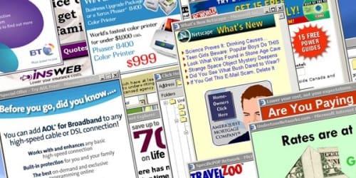
While modals are a pretty straightforward UI pattern, proper execution is tricky. This is because the very nature of mobile modals is intrusive—they disrupt the user experience. As seasoned internet users who remember the days of seemingly infinite pop-ups, we’re hardwired to reject and dismiss most disruptions as spammy ads.

internet explorer pop up ads
Image source

But mobile modals are far more than spam-filled pop-ups. When used correctly, they serve as helpful tools that enrich a user’s in-app experience and can even help propel them towards long-term engagement and retention. 

Because definitions can get tricky in a rapidly evolving industry, let’s define what we consider the 3 types of mobile modals:

1. Pop-ups

These are the default messages that pop up and ask users for things like push notification permissions, location services opt-ins, or App Store reviews. Arguably the most common type of mobile modals, they’re also the least beloved.

But pop-ups generally serve an important purpose. For instance, user reviews are critical to an app’s success in the marketplace. And, even more urgently, an app’s functionality often falters unless users grant permissions.

The good news is that this UI element doesn’t need to stand alone. Instead of relying on the standard grey pop-up in isolation, you can use either a branded overly (partial screen) or fullscreen modal to prime users for the permissions request. For example, Babbel primes users to grant device permissions with a branded request first. Only if users say that yes, they would like to grant microphone access, are they shown the standard iOS pop-up—at which point they've already been plenty of context for the ask.
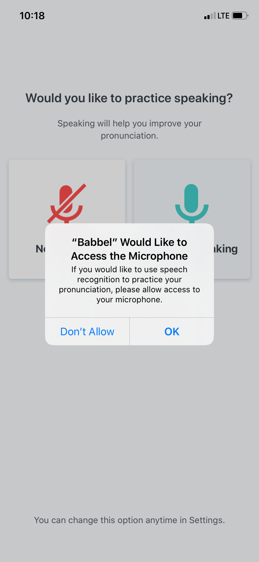
babbel microphone access permission priming pop up

2. Partial overlays

Overlays are commonly used for in-app tutorials, such as walking users through new or updated features. They can also be used to make exciting announcements within the app. 

Since overlays only take up part of the screen, they can feel somewhat less disruptive than a fullscreen modal (although, functionally, they’re the same).
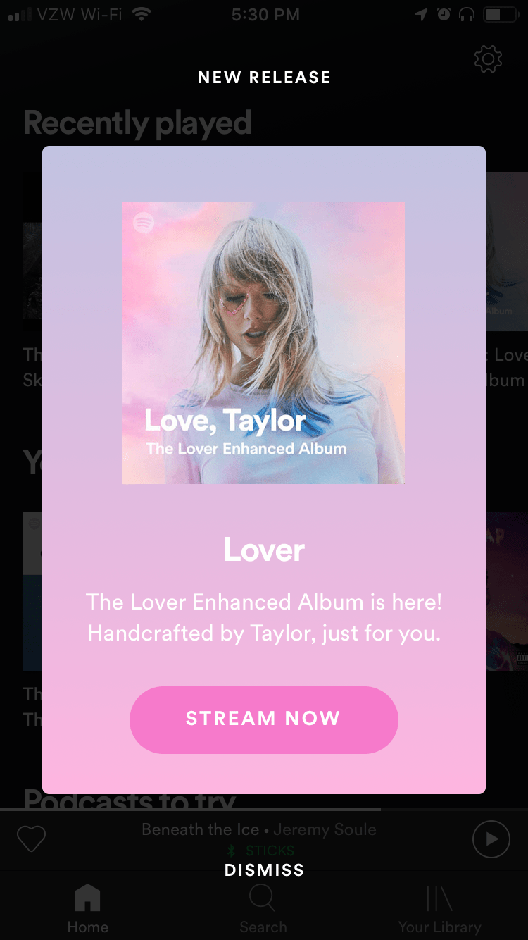
spotify partial screen modal window new release announcement

3. Fullscreen

Fullscreen modals are for messages you consider so important that they deserve a user’s undivided attention—like exceptional app feature updates or confirmation of  critical actions.
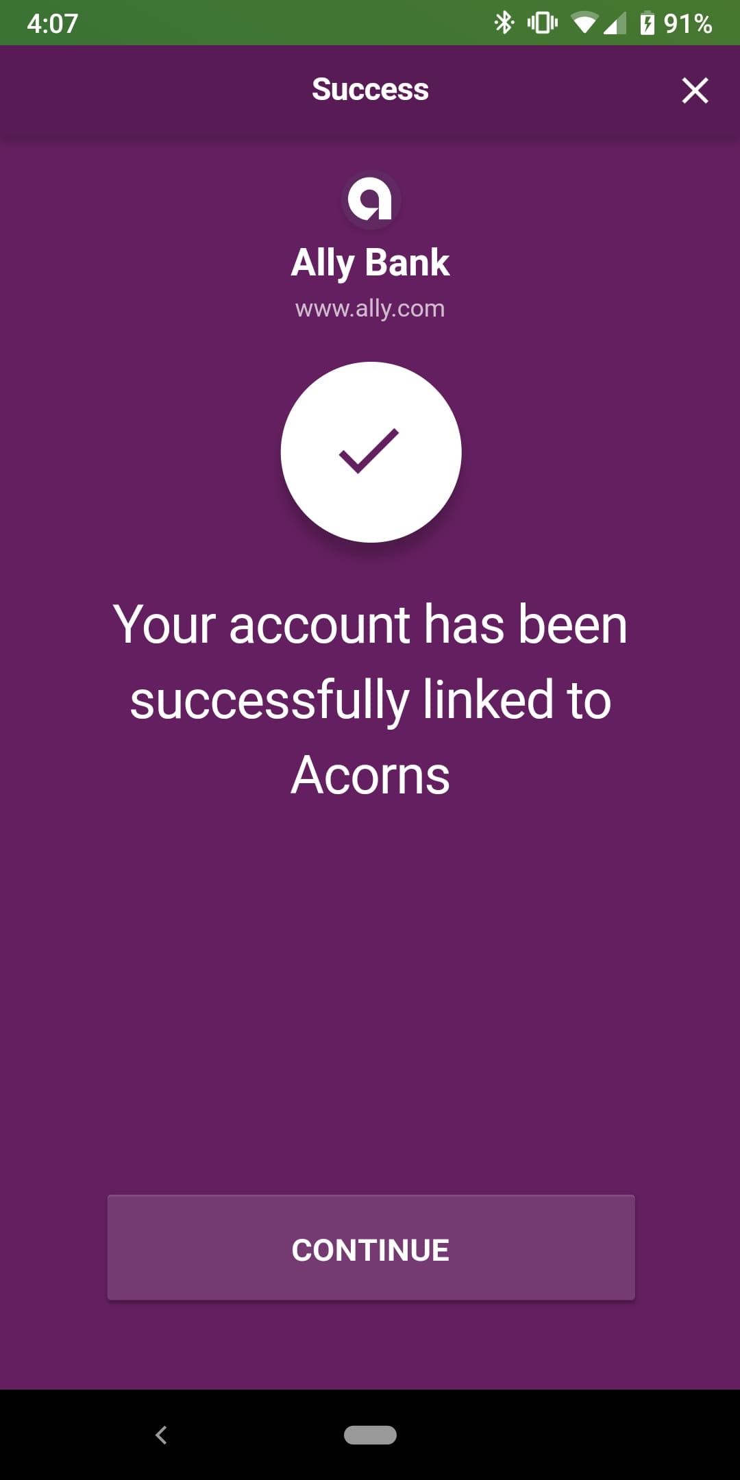
acorns mobile app linking bank account success message

So, what does a good mobile modal look like?

Modals are not exclusive to mobile applications. But the way modals behave on mobile versus desktop—and the impact they have on the user experience—can be quite different, depending on the device.  

In some ways, modals are perfect for the limited real estate that mobile devices offer: Mobile modals will fully grab the user’s attention since they’re the only thing that fits on the screen. The challenge facing marketers and app owners is that the timing and execution of modals is even more critical on mobile than on desktop. 

Here are a few tips mobile app owners can use to make the best of their condensed creative space:

Branded, customized design that looks native to your app

We’ve all seen the standard iOS and Android permission requests. For iOS, it looks like this:
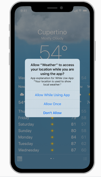
Apple standard notification

Apple can get away with this because they’re well, Apple. But for everyone else, using a series of standard pop-ups looks like you’re phoning it in.
Adding your own style and personality to your in-app messages is an important part of an effective app marketing strategy. Users are far more likely to pay attention to modals that feel like a natural, intentional part of the app experience.

Strong copy and compelling CTA

The messaging of your mobile modal is just as important as its design. You should treat the copy with the same weight you would any piece of marketing, because that’s precisely what it is. 

Relevant timing and targeting

The message is half the battle. The other half? Timing. You want to reach users at a moment when they’re primed to take action We’ll do a deep dive into this in a bit, but the TL;DR is that in-app messaging should be timed and tailored to where users are in the user journey.

Fun visuals

Using images in your mobile modals allows you to get your point across in a succinct and creative manner. And branded graphics can really help a modal feel like an intentional part of the app UX.

8 awesome examples of mobile modal windows

Now that we know what goes into creating a great mobile modal, let's take a look at some examples of real apps that use this UI pattern effectively:

1. Gmail’s new look intro

Gmail effectively used an overlay in-app message to relay some very important news to users—their UI got a fresh makeover with 3 different layout options to choose from. In this example, Gmail hits all the right notes with consistent branding and succinct copy that creates  a compact onboarding experience that excites and informs users.
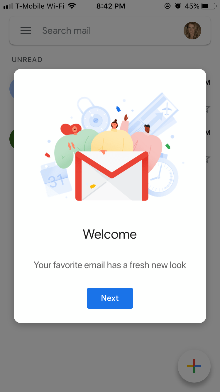
gmail mobile app new look announcement welcome modal window
gmail mobile app new look announcement welcome modal window choose a view options

Remember, while your team might be excited about app updates that enhance the user experience any change can be jarring to end-users. By using in-app messaging  effectively, you can mitigate the risk of churn associated with redesigns or major changes to your UI. 

2. Youtube TV’s push notification opt-in

Youtube’s permission request is among the best we’ve seen. Rather than ask for permission without context, the app positions notifications as a must-have feature. The messaging effectively conveys the benefits of opting in to push notifications (and taps into users’  fears of missing out).

spotify google home pairing notification listen to flosik on smart home device

3. Spotify’s smart home feature nudge  

The beauty of Spotify’s mobile modal lies in its simplicity. The messaging is clear—you can stream your favorite artists from Spotify on Google Home. Though it seems effortless to the end-user, it’s clear a lot of thought went into the timing of this message, which only appears when a user is listening to music near a Google Home device,ensuring the message is relevant and helpful to the user in the moment.

Spotify knows that being able to stream their app on multiple devices equates to better retention and revenue. Their straightforward modal does a great job at keeping this engaging app feature top of mind.

4. Sephora’s simple redesign communication

Sephora used a fantastically simple modal to inform users about changes to the app’s menu bar. We like that this brief FYI doesn’t leave much for interpretation and emphasizes the that there’s been a conscious improvement made to the user’s navigational experience.

sephora mobile app redesign notification modal window design

5. Venmo’s attractive upsell

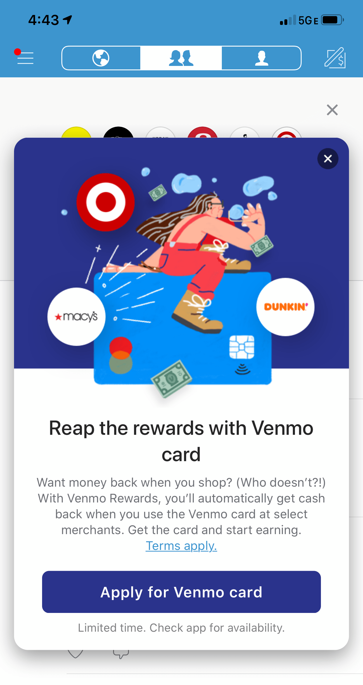
Upselling is an important yet challenging part of an effective app marketing strategy. Venmo uses a compelling mobile modal to let users know about (and sign up for) the company's unique card.

venmo card in app promotion modal message

Eye-catching imagery, compelling copy, and a prominent CTA make this a very appealing offer for frequent Venmo users.

6. Caviar’s customized cravings offer

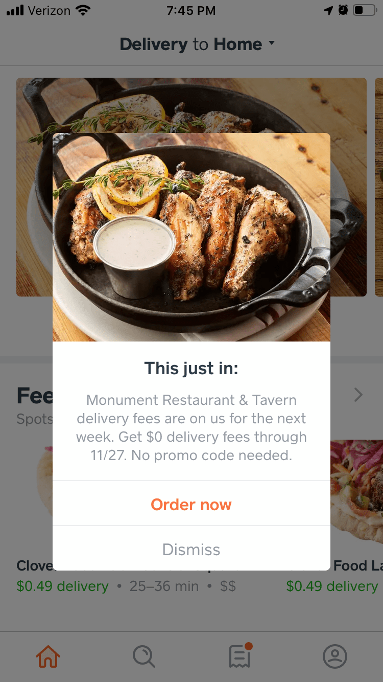
Caviar utilizes users’ location info and app settings to better satisfy their cravings with a personalized in-app message. Caviar uses an overlay modal to promote newly added restaurants by letting users know that delivery fees for a new, nearby restaurant are free for a limited time. A tempting image catches the eye and gives hungry users a reason to click through.

caviar personalized mobile  in app message location services

The in-app promotion works well for 2 different audiences:

  1. latent Caviar users who need that final push to place an order
  2. power Caviar users who deserve a reward for their loyalty

In-app messages like this can do wonders for revenue and retention rates.

7. Nike Run Club’s gamified in-app achievements

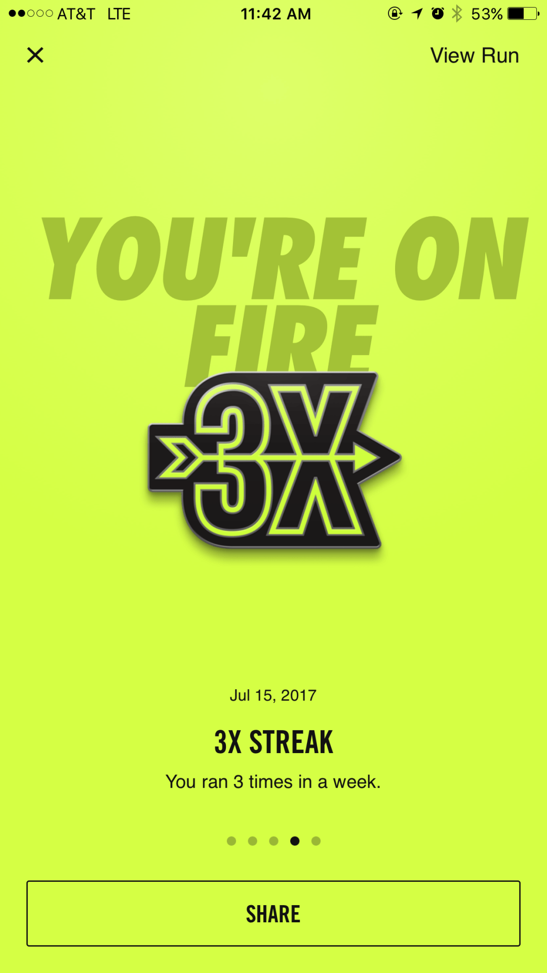
Nike’s running app does a great job of recognizing and rewarding users for hitting in-app milestones. These feel-good messages, combined with other elements of gamification like “running streaks,” encourage more frequent in-app sessions.

nike run club user achievement success messge full screen modal window

Another bonus of an achievement modal like this? Social sharing. Encouraging users to share their success on social platforms is an easy and organic way to promote your app. 

8. OpenTable’s in-app user review prompt

Let’s face it: Getting users to provide feedback in any format is fairly difficult (unless they’re fuming mad, of course, in which case people have a lot to say!). But for apps like OpenTable, user generated content is essential. That’s why they strive to make contributing opinions as seamless as possible.

opentable in app user review prompt star rating pop up window

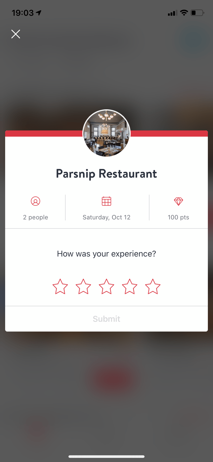
OpenTable’s use of a mobile modal as a portal to providing feedback is clever and effective. It’s clever because it doubles as a reminder about the last time the user received value from the app (their most recent restaurant reservation), and it’s effective because using a small overlay gives users the impression that this will be a quick and easy experience (which it should be). 

Mobile modals are your ticket to better engagement & retention

How often do you have a direct, uninterrupted line of communication to your audience? Mobile in-app messaging is unmatched in its ability to reach users in a contextual and time-sensitive format. But with great power comes great responsibility. 

Use modals wisely, and you’ll enjoy long-term, predictable app revenue and retention growth. Use them foolishly, and you risk app abandonment and user churn.  

Katryna Balboni
Content and Community Director at User Interviews
Katryna is the Content and Community Director at User Interviews. Before User Interviews, she made magic happen with all things content at Appcues. Her non-work time is spent traveling to new places, befriending street cats, and baking elaborate pies.
Skip to section:

Skip to section:

If you frequent our blog, you know that turning your product into an engine for growth requires engaging your users where they are—in your app—with the right messaging, and at the right moment in their journey. 

We’ve talked about how you can use tooltips to do this—on both web and mobile—and we’ve discussed ways to use modal windows effectively in a web or desktop application. Now, let’s look at how modals can be used to improve onboarding, increase engagement, boost conversions, and encourage social sharing on mobile apps, specifically.

What is a mobile modal? 

Mobile modals (also known as modal windows, overlays, or pop-up messages) are a type of in-app messaging. They are large UI elements that sit on top of an application’s main window—often with a layer of transparency behind them to give users a peek into the main app. 

While modals are a pretty straightforward UI pattern, proper execution is tricky. This is because the very nature of mobile modals is intrusive—they disrupt the user experience. As seasoned internet users who remember the days of seemingly infinite pop-ups, we’re hardwired to reject and dismiss most disruptions as spammy ads.

internet explorer pop up ads
Image source

But mobile modals are far more than spam-filled pop-ups. When used correctly, they serve as helpful tools that enrich a user’s in-app experience and can even help propel them towards long-term engagement and retention. 

Because definitions can get tricky in a rapidly evolving industry, let’s define what we consider the 3 types of mobile modals:

1. Pop-ups

These are the default messages that pop up and ask users for things like push notification permissions, location services opt-ins, or App Store reviews. Arguably the most common type of mobile modals, they’re also the least beloved.

But pop-ups generally serve an important purpose. For instance, user reviews are critical to an app’s success in the marketplace. And, even more urgently, an app’s functionality often falters unless users grant permissions.

The good news is that this UI element doesn’t need to stand alone. Instead of relying on the standard grey pop-up in isolation, you can use either a branded overly (partial screen) or fullscreen modal to prime users for the permissions request. For example, Babbel primes users to grant device permissions with a branded request first. Only if users say that yes, they would like to grant microphone access, are they shown the standard iOS pop-up—at which point they've already been plenty of context for the ask.

babbel microphone access permission priming pop up

2. Partial overlays

Overlays are commonly used for in-app tutorials, such as walking users through new or updated features. They can also be used to make exciting announcements within the app. 

Since overlays only take up part of the screen, they can feel somewhat less disruptive than a fullscreen modal (although, functionally, they’re the same).

spotify partial screen modal window new release announcement

3. Fullscreen

Fullscreen modals are for messages you consider so important that they deserve a user’s undivided attention—like exceptional app feature updates or confirmation of  critical actions.

acorns mobile app linking bank account success message

So, what does a good mobile modal look like?

Modals are not exclusive to mobile applications. But the way modals behave on mobile versus desktop—and the impact they have on the user experience—can be quite different, depending on the device.  

In some ways, modals are perfect for the limited real estate that mobile devices offer: Mobile modals will fully grab the user’s attention since they’re the only thing that fits on the screen. The challenge facing marketers and app owners is that the timing and execution of modals is even more critical on mobile than on desktop. 

Here are a few tips mobile app owners can use to make the best of their condensed creative space:

Branded, customized design that looks native to your app

We’ve all seen the standard iOS and Android permission requests. For iOS, it looks like this:

Apple standard notification

Apple can get away with this because they’re well, Apple. But for everyone else, using a series of standard pop-ups looks like you’re phoning it in.

Adding your own style and personality to your in-app messages is an important part of an effective app marketing strategy. Users are far more likely to pay attention to modals that feel like a natural, intentional part of the app experience.

Strong copy and compelling CTA

The messaging of your mobile modal is just as important as its design. You should treat the copy with the same weight you would any piece of marketing, because that’s precisely what it is. 

Relevant timing and targeting

The message is half the battle. The other half? Timing. You want to reach users at a moment when they’re primed to take action We’ll do a deep dive into this in a bit, but the TL;DR is that in-app messaging should be timed and tailored to where users are in the user journey.

Fun visuals

Using images in your mobile modals allows you to get your point across in a succinct and creative manner. And branded graphics can really help a modal feel like an intentional part of the app UX.

8 awesome examples of mobile modal windows

Now that we know what goes into creating a great mobile modal, let's take a look at some examples of real apps that use this UI pattern effectively:

1. Gmail’s new look intro

Gmail effectively used an overlay in-app message to relay some very important news to users—their UI got a fresh makeover with 3 different layout options to choose from. In this example, Gmail hits all the right notes with consistent branding and succinct copy that creates  a compact onboarding experience that excites and informs users.
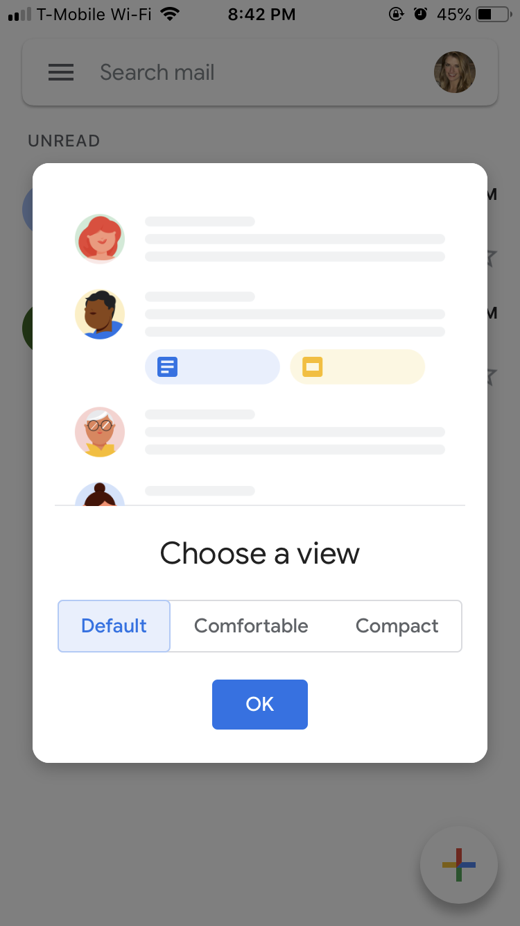
gmail mobile app new look announcement welcome modal window
gmail mobile app new look announcement welcome modal window choose a view options

Remember, while your team might be excited about app updates that enhance the user experience any change can be jarring to end-users. By using in-app messaging  effectively, you can mitigate the risk of churn associated with redesigns or major changes to your UI. 

2. Youtube TV’s push notification opt-in

Youtube’s permission request is among the best we’ve seen. Rather than ask for permission without context, the app positions notifications as a must-have feature. The messaging effectively conveys the benefits of opting in to push notifications (and taps into users’  fears of missing out).
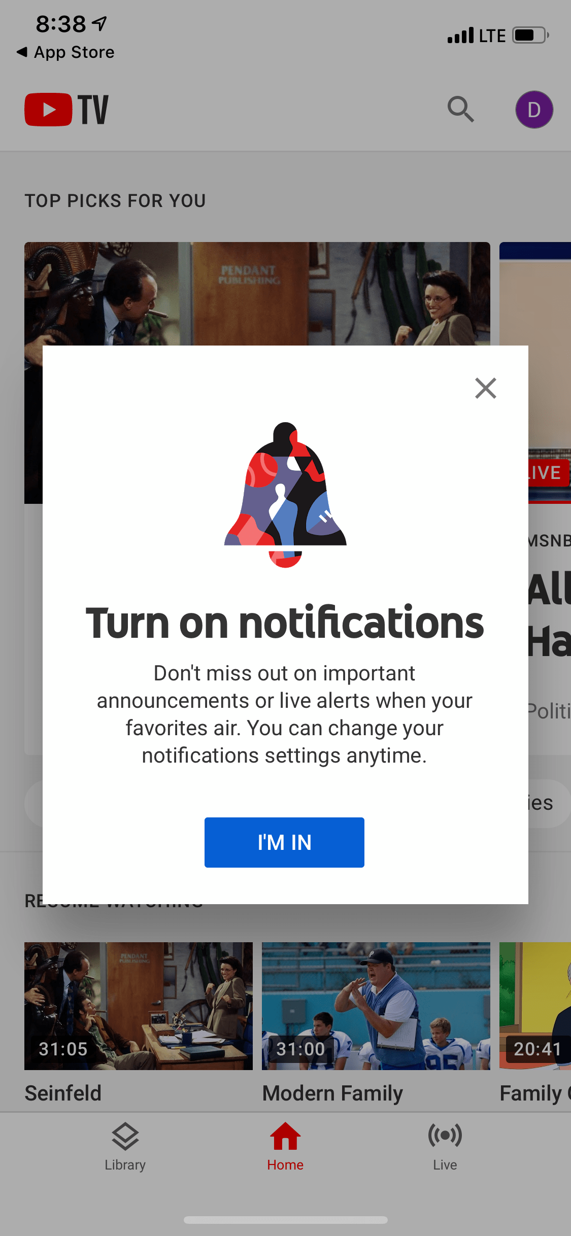
spotify google home pairing notification listen to flosik on smart home device

3. Spotify’s smart home feature nudge  

The beauty of Spotify’s mobile modal lies in its simplicity. The messaging is clear—you can stream your favorite artists from Spotify on Google Home. Though it seems effortless to the end-user, it’s clear a lot of thought went into the timing of this message, which only appears when a user is listening to music near a Google Home device,ensuring the message is relevant and helpful to the user in the moment.
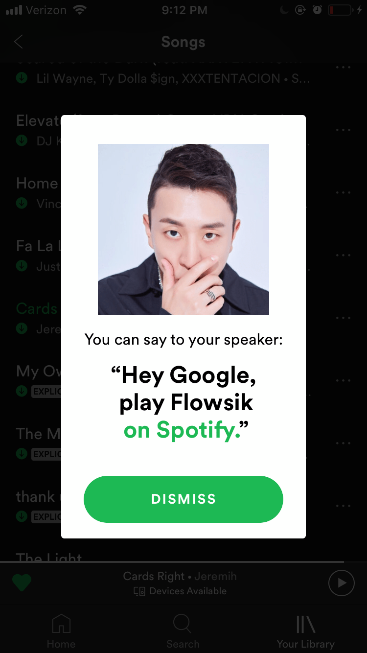
Spotify knows that being able to stream their app on multiple devices equates to better retention and revenue. Their straightforward modal does a great job at keeping this engaging app feature top of mind.

4. Sephora’s simple redesign communication

Sephora used a fantastically simple modal to inform users about changes to the app’s menu bar. We like that this brief FYI doesn’t leave much for interpretation and emphasizes the that there’s been a conscious improvement made to the user’s navigational experience.
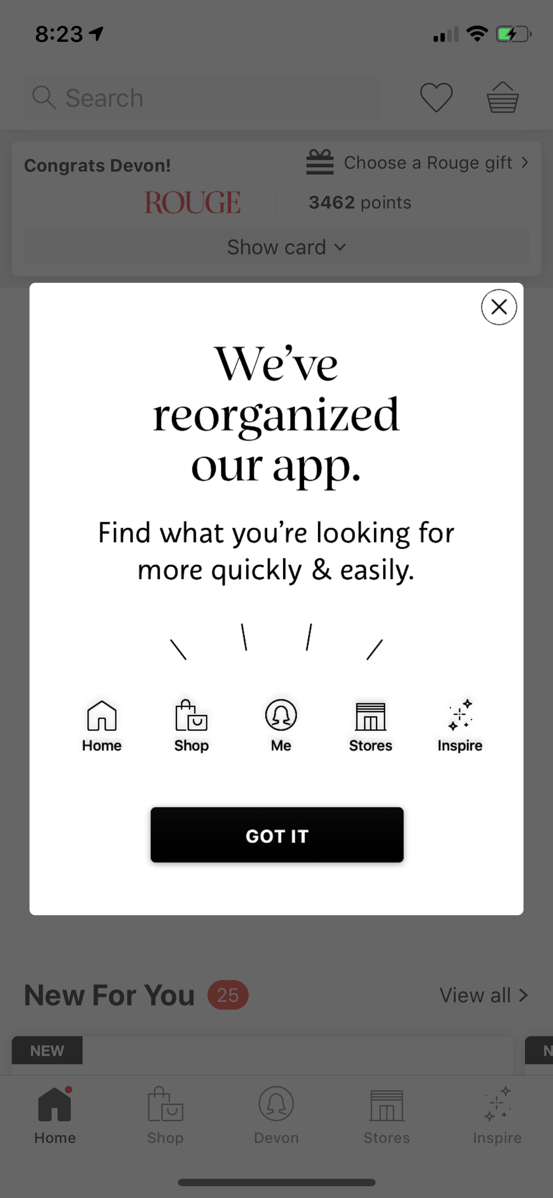
sephora mobile app redesign notification modal window design

5. Venmo’s attractive upsell

Upselling is an important yet challenging part of an effective app marketing strategy. Venmo uses a compelling mobile modal to let users know about (and sign up for) the company's unique card.
venmo card in app promotion modal message

Eye-catching imagery, compelling copy, and a prominent CTA make this a very appealing offer for frequent Venmo users.

6. Caviar’s customized cravings offer

Caviar utilizes users’ location info and app settings to better satisfy their cravings with a personalized in-app message. Caviar uses an overlay modal to promote newly added restaurants by letting users know that delivery fees for a new, nearby restaurant are free for a limited time. A tempting image catches the eye and gives hungry users a reason to click through.
caviar personalized mobile  in app message location services

The in-app promotion works well for 2 different audiences:

  1. latent Caviar users who need that final push to place an order
  2. power Caviar users who deserve a reward for their loyalty

In-app messages like this can do wonders for revenue and retention rates.

7. Nike Run Club’s gamified in-app achievements

Nike’s running app does a great job of recognizing and rewarding users for hitting in-app milestones. These feel-good messages, combined with other elements of gamification like “running streaks,” encourage more frequent in-app sessions.
nike run club user achievement success messge full screen modal window

Another bonus of an achievement modal like this? Social sharing. Encouraging users to share their success on social platforms is an easy and organic way to promote your app. 

8. OpenTable’s in-app user review prompt

Let’s face it: Getting users to provide feedback in any format is fairly difficult (unless they’re fuming mad, of course, in which case people have a lot to say!). But for apps like OpenTable, user generated content is essential. That’s why they strive to make contributing opinions as seamless as possible.
opentable in app user review prompt star rating pop up window

OpenTable’s use of a mobile modal as a portal to providing feedback is clever and effective. It’s clever because it doubles as a reminder about the last time the user received value from the app (their most recent restaurant reservation), and it’s effective because using a small overlay gives users the impression that this will be a quick and easy experience (which it should be). 

Mobile modals are your ticket to better engagement & retention

How often do you have a direct, uninterrupted line of communication to your audience? Mobile in-app messaging is unmatched in its ability to reach users in a contextual and time-sensitive format. But with great power comes great responsibility. 

Use modals wisely, and you’ll enjoy long-term, predictable app revenue and retention growth. Use them foolishly, and you risk app abandonment and user churn.  

Katryna Balboni
Content and Community Director at User Interviews
Katryna is the Content and Community Director at User Interviews. Before User Interviews, she made magic happen with all things content at Appcues. Her non-work time is spent traveling to new places, befriending street cats, and baking elaborate pies.
You might also like...