Are you MapQuest or Google Maps?

.png)

.png)
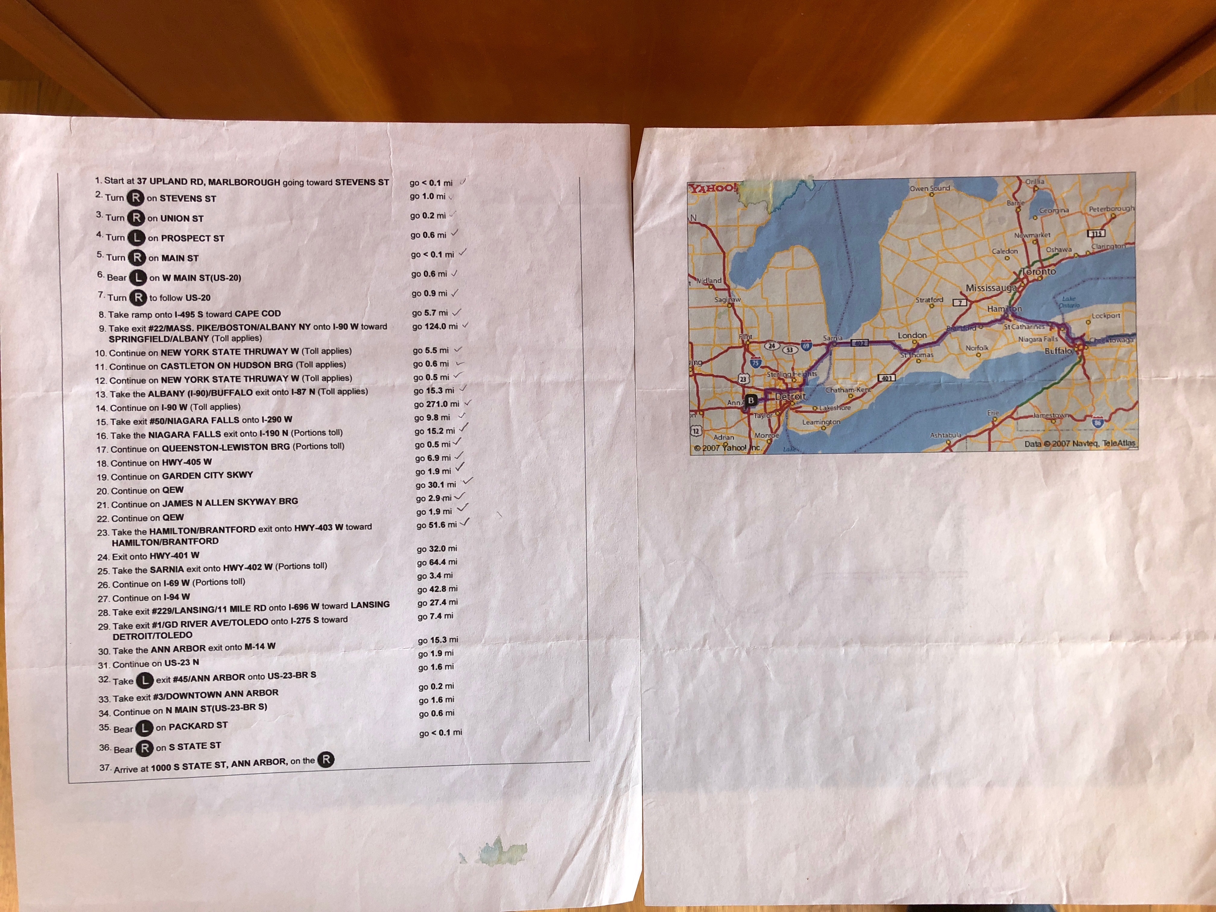
If you ever went on a roadtrip in the early 2000’s, before fueling up on Sunny D, Capri Sun, and cashews (the superior nut), it probably started on your home computer printing out something like this:

This was standard practice. Just 37 steps?
No problem.
In the trunk of every Toyota Corolla once lived an Atlas of America—300 pages long and challenging the threshold of how small text can be before it is painfully illegible. And if your driver was anything like my father, getting lost a few times got factored into the expected arrival time.
These were all accepted challenges, because what was our alternative?
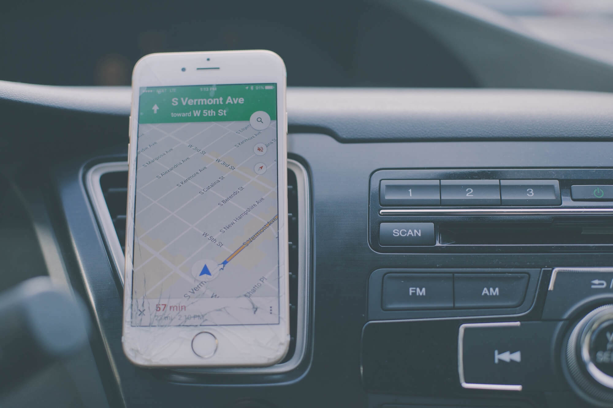
Fast-forward to 2018 and thanks to Google Maps—RIP everything that once lived on paper. What Google did to personal travel exemplifies the market shift we all know and love: people expect products to do more for them.
We will not reroute ourselves. We will not pull out the atlas we (hopefully) recycled decades ago. We won’t even know the address of point B until we get in our car and Google it. And we certainly don’t have the patience to get lost now that it’s exponentially easier to stay on course.
Now let’s shift gears to modern technology and specifically to the abundance of new SaaS products on the market today. Has that world leapfrogged over the MapQuest era that it (supposedly) missed? Is modern-day SaaS a 'Google Maps' experience?
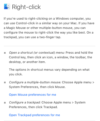
Maybe not, because we are still being directed like this:

Remind you of anyone?
Granted, this is much less than 37 steps, but still puts the onus on the user to reconcile help from an article with where the action needs to take place. Sounds a lot like that MapQuest + Atlas toggle we ditched years ago.
If you read the Appcues blog regularly, you’ve been exposed to some of the trends on our map. My favorite insight: “Companies will continue down the path of being design-driven to fulfill their destiny of becoming product-led—meaning they let their product be their sales force.”
The question is not why our expectations are changing as consumers, but more so, how does a SaaS business perform successfully in a more demanding marketplace?
The ever-changing answer: Bring more insight and meaning into your product and adopt conceptual learning based on attributes you can target.
Here are three ways you can think about this philosophical shift with your product and users in mind:
Every SaaS user has a goal, let’s call this goal Point B. And while many of us would love to take that 3 hour walk in the middle of the day and people watch with a delicious (dry) cappuccino in hand, very few of us actually do.
When it comes to SaaS users, you think of them as people who would love to see anything and everything that your gorgeously designed product has to offer—but realistically—that is the exception not the rule. If you could get us to point B first, then maybe next time we’ll take a detour and see what else your product can offer.
We need to assume our user has finite time, and we should use what we know about them and what they have formerly done inside of our product to constantly redefine point B—with the same flexibility and contextual learning as Google Maps. It is time for SaaS products to become more prescriptive and help me spend less time in their product to get the result I want.
How does Google Maps do it?
They know where I am. Without making this into an article about the creepiness of data (👋 hi, Facebook), Google quite literally always knows where I am. Since they know my environment, it’s remarkably easy to navigate and change with me as I get lost in the one-ways of Boston’s downtown.
How should you do it?
First ask yourself, how are you learning about your users? It may be impossible to know where they are at all times, and perhaps it should be impossible to know that. But what are some of the things we can learn today?
I would encourage asking yourself about the five driving actions to becoming a power user—the things that your most dedicated users are doing to find value in your product and most likely pay more because of that. Once you know some of these actions and the types of users who should be taking them, it becomes a task of execution alone to build these “maps” inside of your product with Appcues.
As with anything in life, users will adjust and expect more. Humanity can’t even be bothered to drive our own cars anymore! It won’t be long before Google Maps becomes the MapQuest to a new world.
It can feel overwhelming to keep up, but constant iteration is an inevitable truth to developing products people love long-term. The thing I absolutely love about Google Maps, above all else, is how aware it is of my personal environment and how that awareness brings me better results regardless of my location, my destination, or how many times I take the wrong exit.
It adapts.
Today, your product should be adapting and taking on a different identity based on who is navigating through it.
The on-going friction may always be there. Our engineers will build amazing products, those products will not get fully adopted by busy, confused, or perhaps less sophisticated users. They will get lost, they will get frustrated, they will think the product doesn’t do what they need because that’s easier than teaching themselves something new.
Think of new ways to engage users through in-app feedback and gathering NPS ratings in the moment when users are most engaged. You can take the opportunity to ask questions triggered from behaviors taken or not taken and build a truly relevant in-app feedback mechanism. Think about congratulating someone when they reach point B. Everybody loves a little confetti!
So ask yourself: Are you contextually learning and adapting to your user? When it comes to bridging the gap between what exists and what gets used, are you emulating MapQuest and an atlas, or are you emulating Google Maps?