← Visit Appcues.com
×
×

LinkedIn's user onboarding: The good, the bad, and the ugly
Everyone knows LinkedIn as the “world’s largest professional network,” but it hopes to become much more...
Skip to section:

Skip to section:

Everyone knows LinkedIn as the “world’s largest professional network,” but it hopes to become much more. 

The Microsoft-owned platform has been chipping away at enterprise features and has slowly started to look more and more like a CRM. LinkedIn’s B2B potential was a major reason for its acquisition by Microsoft in 2016. If successful, it could become a formidable challenge to Salesforce.

At over 500 million users across the globe, LinkedIn’s user base is certainly impressive. But underneath that statistic is an unexpected, and worrisome, one: only 25% users log in every month.

If LinkedIn wants to make a dent in the billion-dollar CRM market, improving engagement and getting people to adopt new enterprise features will be key.

To see what LinkedIn’s doing right, and where it could improve, we decided to take a close look at how the platform onboards new users and drives feature adoption. We found some of LinkedIn’s tactics to be best-in-class, while—to our surprise—others may be detrimental to their growth ambitions.

The good: Personalized welcome messages

New user onboarding

LinkedIn’s new user onboarding flow does a great job of steering users towards value and sets the stage for a meaningful and personalized product experience. 

After users fill out the initial sign-up forms and security questions, LinkedIn immediately asks about users’ interest. 
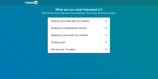
LinkedIn personalize experience
The onboarding copy is excellent in anticipating and relieving potential anxiety image caption here (optional).Type

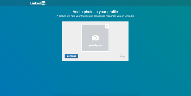
LinkedIn then directs users towards finding connections via email and uploading a profile picture. 

Think about how important these two steps are for engagement. If users do both, they’ll have a profile ready in minutes.
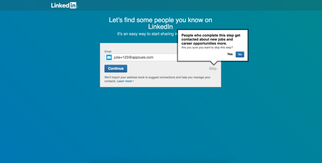
LinkedIn invite onboarding
Tooltip reinforces the value of connecting with other users. 

LinkedIn profile picture onboarding
By isolating each step on a single screen, LinkedIn creates a clear, distraction-free experience.

LinkedIn continues to ask a few more questions to further personalize the experience, carefully building up a robust profile for users with each onboarding step. 
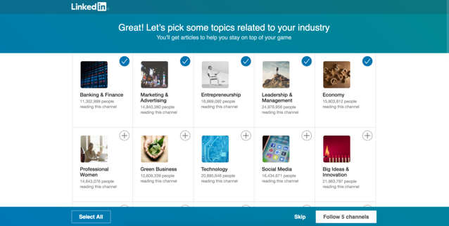
LinkedIn-personalize-topics.png
Tumblr, Quora, and Netflix all use this visual-heavy form to obtain more information about new users too.

LinkedIn personalization thought leaders onboarding
These options are pre-checked, making it super easy to continue. 

Once users are done with the onboarding questions, they’re dropped into a personalized dashboard that’s filled with content to explore.

LinkedIn_progress_bars.png
The progress bar is a clear reminder of key actions that the user still needs to take.

Interested in more onboarding examples? Check our picks for the 5 best.

Effective welcome messages for returning users

LinkedIn extends an onboarding-like welcome to users who haven’t logged in for a while. This small acknowledgement is a nice way to greet users who aren’t yet convinced of the product’s value. By including a question, LinkedIn uses this welcome modal to also update user data. 

linkedin-welcome-back-modal-2.png
Notice that the prompt and the categories match the new user onboarding question.

LinkedIn has a mastery over onboarding best practices, from the first onboarding flow to onboarding for more advanced use cases. LinkedIn knows how to funnel users towards aha! moments and set the stage for further product engagement. 

The bad: Poorly targeted announcements

Lackluster product tour

LinkedIn uses several types of UI patterns to introduce new and regular users to its many features. One of these is LinkedIn Groups. Within a user’s first session, LinkedIn shows a feature announcement that describes Groups and offers to take users on a product tour

So far, so good.

LinkedIn groups slideout .png
Nice slideout and skeleton screens in the background.

The “quick tour” takes users to a tooltip that points to a still-empty element. While there are no highlights, the tooltip promises “some amazing groups to join.” 

Still pretty promising, but... 

LinkedIn groups slideout -1.png
The slideout → tooltip flow is popular for product tours.

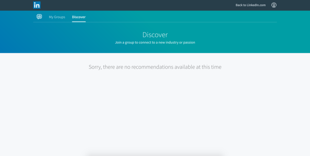
...it leads to an empty dashboard.

Linkedin groups dashboard.png
:(

The lack of reward is a big de-motivator for someone who just signed up for the product and completed a product tour. If these recommendations are based on answers to the upfront preference questions, LinkedIn could have set the product tour to show up only when the user completed x task.

Even if LinkedIn wasn’t able to dynamically target the product tour, showing some broad content here would be better than nothing at all. 

Repetitive feature announcements

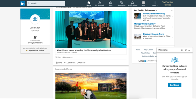
After browsing around a bit more, new users see a tooltip that points to a chat bar.

linkedin-tooltip-messaging-1.png
This single tooltip for feature discovery is trending now. 

linkedin-tooltip-messaging-2-1.png
Clicking the “Got It” CTA opens up the chat.

While this is a great feature to point out, LinkedIn shows the tooltip several times within a few minutes. This kind of repetitive announcement can get annoying, especially since the chat interface is a familiar one for many people. 

LinkedIn continues to make this mistake throughout the user lifecycle. Regular users of LinkedIn saw this feature announcement every time they went to the messaging platform during a period of time.

linkedin_new_feature_modal.png
A great, but repetitive, feature announcement.

Similar to the chat feature, read receipts and typing indications aren’t new concepts. While this feature release is great and worthy of an announcement once, hitting users with the same message over and over again is a surefire way to annoy them.

The ugly: Botched HTML

LinkedIn provides a steady stream of things for users to do (endorse someone for a skill, congratulate someone on a work anniversary, etc.). These little actions aren’t necessary for value, but they do get users more and more invested with the platform. 

After all the hard work of building out a functionality, the last thing you want to do is mess up the look of the announcement. 

LinkedIn-modal-html.png
A good feature deserves a flawless announcement.

It’s impressive that LinkedIn is able to dynamically produce these elements for individual users, and the botched HTML on this modal is a small, but unfortunate, way to announce a pretty nifty functionality.

User onboarding has many moving parts

LinkedIn’s new user experience shows a deep expertise of onboarding best practices. LinkedIn knows where and how to direct brand new users towards finding value. Since activation is the most important part of the user journey, this can make a big difference on the bottom line. 

LinkedIn starts to run into some trouble with targeting their in-app messages. With such a large user base, it can be hard to maintain all the components—from targeting the right users at the right time to designing the final UI pattern—that make up a seamless onboarding experience. Small hiccups in design are easy fixes, but if LinkedIn wants to grow and get users to come back more often, not annoying users is a crucial start.

Companies with fewer engineers and much smaller user bases often avoid these mistakes and effectively onboard users with the right tool. Appcues powers millions of user onboarding experiences every month. Try it today for free.

Want to become a User Onboarding Master? Check out our free User Onboarding Academy!
Julia Chen
Skip to section:

Skip to section:

Everyone knows LinkedIn as the “world’s largest professional network,” but it hopes to become much more. 

The Microsoft-owned platform has been chipping away at enterprise features and has slowly started to look more and more like a CRM. LinkedIn’s B2B potential was a major reason for its acquisition by Microsoft in 2016. If successful, it could become a formidable challenge to Salesforce.

At over 500 million users across the globe, LinkedIn’s user base is certainly impressive. But underneath that statistic is an unexpected, and worrisome, one: only 25% users log in every month.

If LinkedIn wants to make a dent in the billion-dollar CRM market, improving engagement and getting people to adopt new enterprise features will be key.

To see what LinkedIn’s doing right, and where it could improve, we decided to take a close look at how the platform onboards new users and drives feature adoption. We found some of LinkedIn’s tactics to be best-in-class, while—to our surprise—others may be detrimental to their growth ambitions.

The good: Personalized welcome messages

New user onboarding

LinkedIn’s new user onboarding flow does a great job of steering users towards value and sets the stage for a meaningful and personalized product experience. 

After users fill out the initial sign-up forms and security questions, LinkedIn immediately asks about users’ interest. 

LinkedIn personalize experience
The onboarding copy is excellent in anticipating and relieving potential anxiety image caption here (optional).Type

LinkedIn then directs users towards finding connections via email and uploading a profile picture. 

Think about how important these two steps are for engagement. If users do both, they’ll have a profile ready in minutes.

LinkedIn invite onboarding
Tooltip reinforces the value of connecting with other users. 

LinkedIn profile picture onboarding
By isolating each step on a single screen, LinkedIn creates a clear, distraction-free experience.

LinkedIn continues to ask a few more questions to further personalize the experience, carefully building up a robust profile for users with each onboarding step. 
LinkedIn-personalize-topics.png
Tumblr, Quora, and Netflix all use this visual-heavy form to obtain more information about new users too.

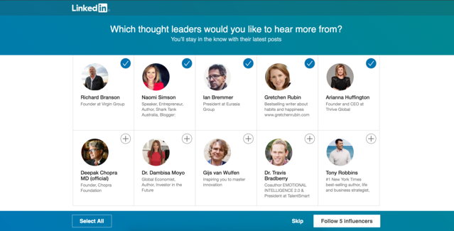
LinkedIn personalization thought leaders onboarding
These options are pre-checked, making it super easy to continue. 

Once users are done with the onboarding questions, they’re dropped into a personalized dashboard that’s filled with content to explore.
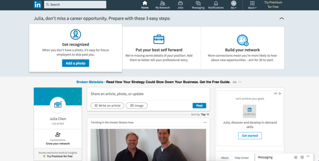
LinkedIn_progress_bars.png
The progress bar is a clear reminder of key actions that the user still needs to take.

Interested in more onboarding examples? Check our picks for the 5 best.

Effective welcome messages for returning users

LinkedIn extends an onboarding-like welcome to users who haven’t logged in for a while. This small acknowledgement is a nice way to greet users who aren’t yet convinced of the product’s value. By including a question, LinkedIn uses this welcome modal to also update user data. 
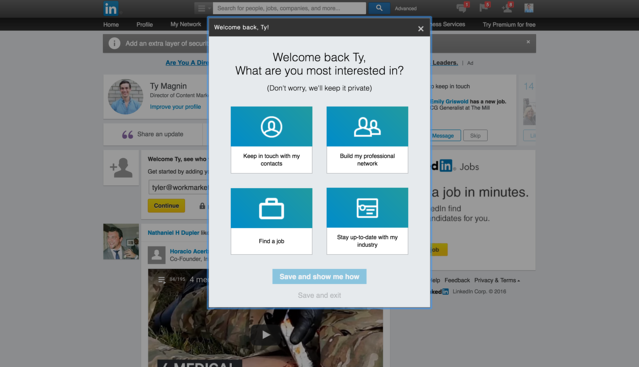
linkedin-welcome-back-modal-2.png
Notice that the prompt and the categories match the new user onboarding question.

LinkedIn has a mastery over onboarding best practices, from the first onboarding flow to onboarding for more advanced use cases. LinkedIn knows how to funnel users towards aha! moments and set the stage for further product engagement. 

The bad: Poorly targeted announcements

Lackluster product tour

LinkedIn uses several types of UI patterns to introduce new and regular users to its many features. One of these is LinkedIn Groups. Within a user’s first session, LinkedIn shows a feature announcement that describes Groups and offers to take users on a product tour

So far, so good.

LinkedIn groups slideout .png
Nice slideout and skeleton screens in the background.

The “quick tour” takes users to a tooltip that points to a still-empty element. While there are no highlights, the tooltip promises “some amazing groups to join.” 

Still pretty promising, but... 
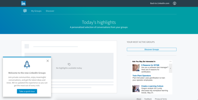
LinkedIn groups slideout -1.png
The slideout → tooltip flow is popular for product tours.

...it leads to an empty dashboard.

Linkedin groups dashboard.png
:(

The lack of reward is a big de-motivator for someone who just signed up for the product and completed a product tour. If these recommendations are based on answers to the upfront preference questions, LinkedIn could have set the product tour to show up only when the user completed x task.

Even if LinkedIn wasn’t able to dynamically target the product tour, showing some broad content here would be better than nothing at all. 

Repetitive feature announcements

After browsing around a bit more, new users see a tooltip that points to a chat bar.
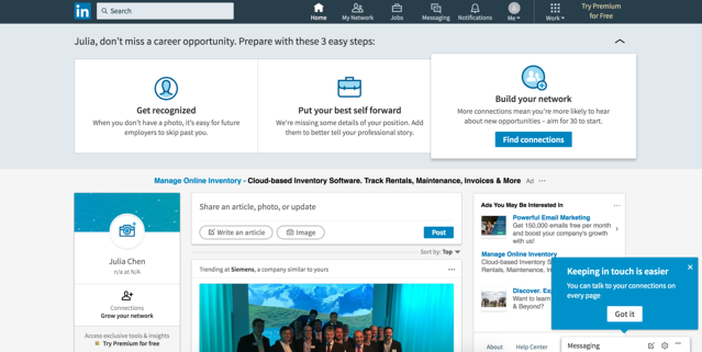
linkedin-tooltip-messaging-1.png
This single tooltip for feature discovery is trending now. 

linkedin-tooltip-messaging-2-1.png
Clicking the “Got It” CTA opens up the chat.

While this is a great feature to point out, LinkedIn shows the tooltip several times within a few minutes. This kind of repetitive announcement can get annoying, especially since the chat interface is a familiar one for many people. 

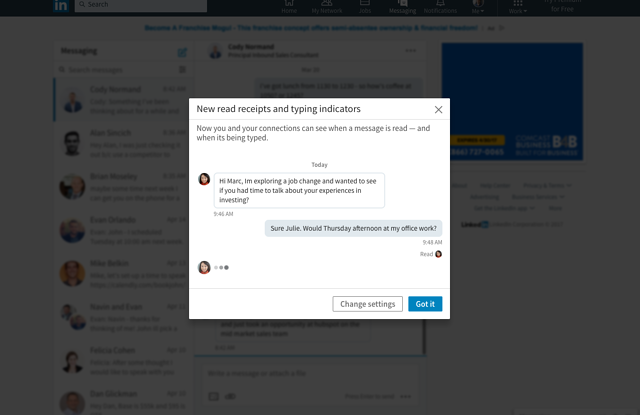
LinkedIn continues to make this mistake throughout the user lifecycle. Regular users of LinkedIn saw this feature announcement every time they went to the messaging platform during a period of time.
linkedin_new_feature_modal.png
A great, but repetitive, feature announcement.

Similar to the chat feature, read receipts and typing indications aren’t new concepts. While this feature release is great and worthy of an announcement once, hitting users with the same message over and over again is a surefire way to annoy them.

The ugly: Botched HTML

LinkedIn provides a steady stream of things for users to do (endorse someone for a skill, congratulate someone on a work anniversary, etc.). These little actions aren’t necessary for value, but they do get users more and more invested with the platform. 

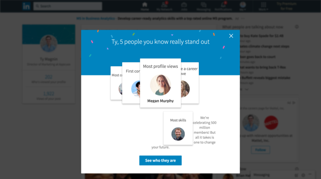
After all the hard work of building out a functionality, the last thing you want to do is mess up the look of the announcement. 
LinkedIn-modal-html.png
A good feature deserves a flawless announcement.

It’s impressive that LinkedIn is able to dynamically produce these elements for individual users, and the botched HTML on this modal is a small, but unfortunate, way to announce a pretty nifty functionality.

User onboarding has many moving parts

LinkedIn’s new user experience shows a deep expertise of onboarding best practices. LinkedIn knows where and how to direct brand new users towards finding value. Since activation is the most important part of the user journey, this can make a big difference on the bottom line. 

LinkedIn starts to run into some trouble with targeting their in-app messages. With such a large user base, it can be hard to maintain all the components—from targeting the right users at the right time to designing the final UI pattern—that make up a seamless onboarding experience. Small hiccups in design are easy fixes, but if LinkedIn wants to grow and get users to come back more often, not annoying users is a crucial start.

Companies with fewer engineers and much smaller user bases often avoid these mistakes and effectively onboard users with the right tool. Appcues powers millions of user onboarding experiences every month. Try it today for free.

Want to become a User Onboarding Master? Check out our free User Onboarding Academy!
Julia Chen
You might also like...